


Description
02
The Core Challenge
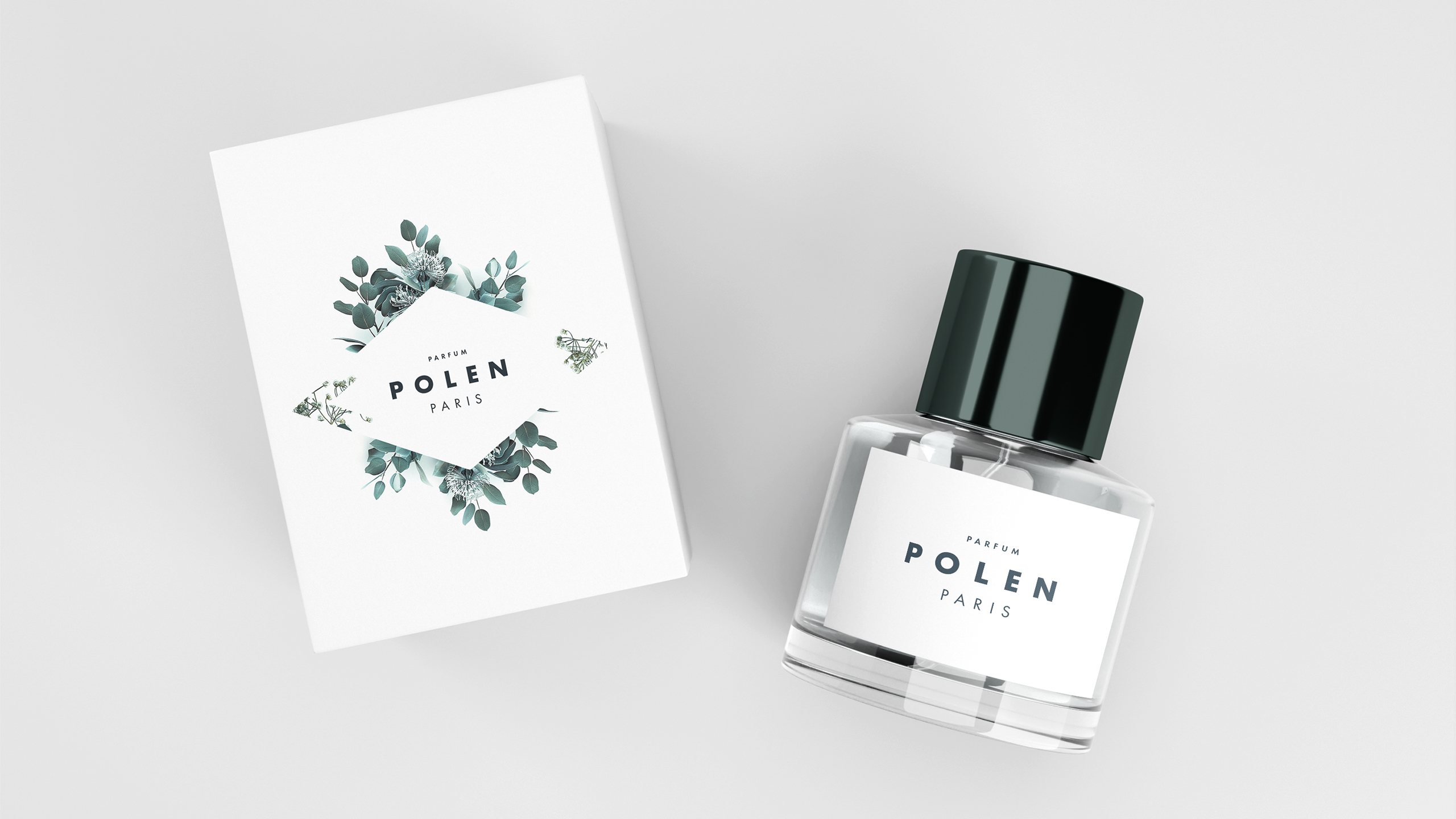
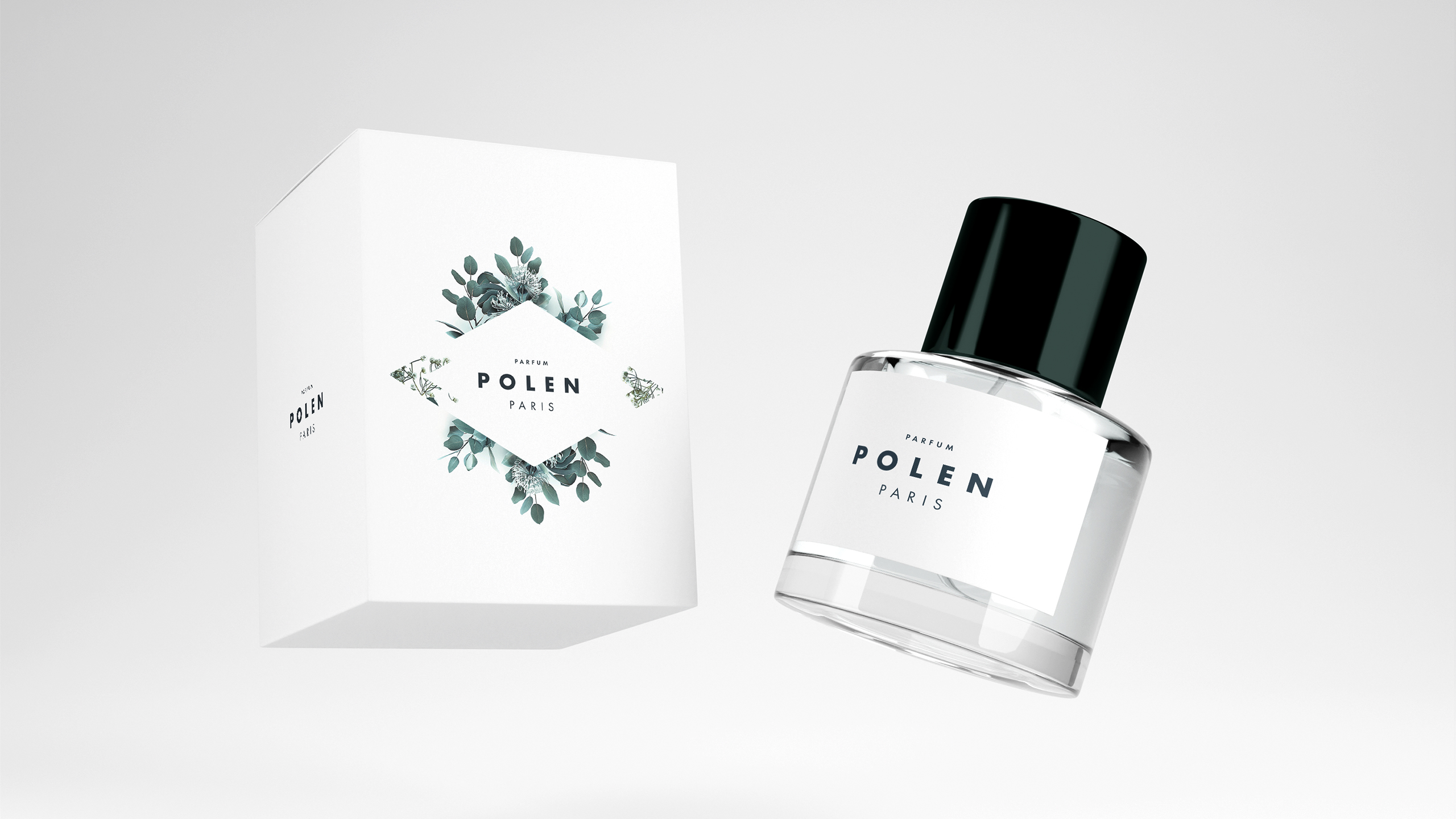
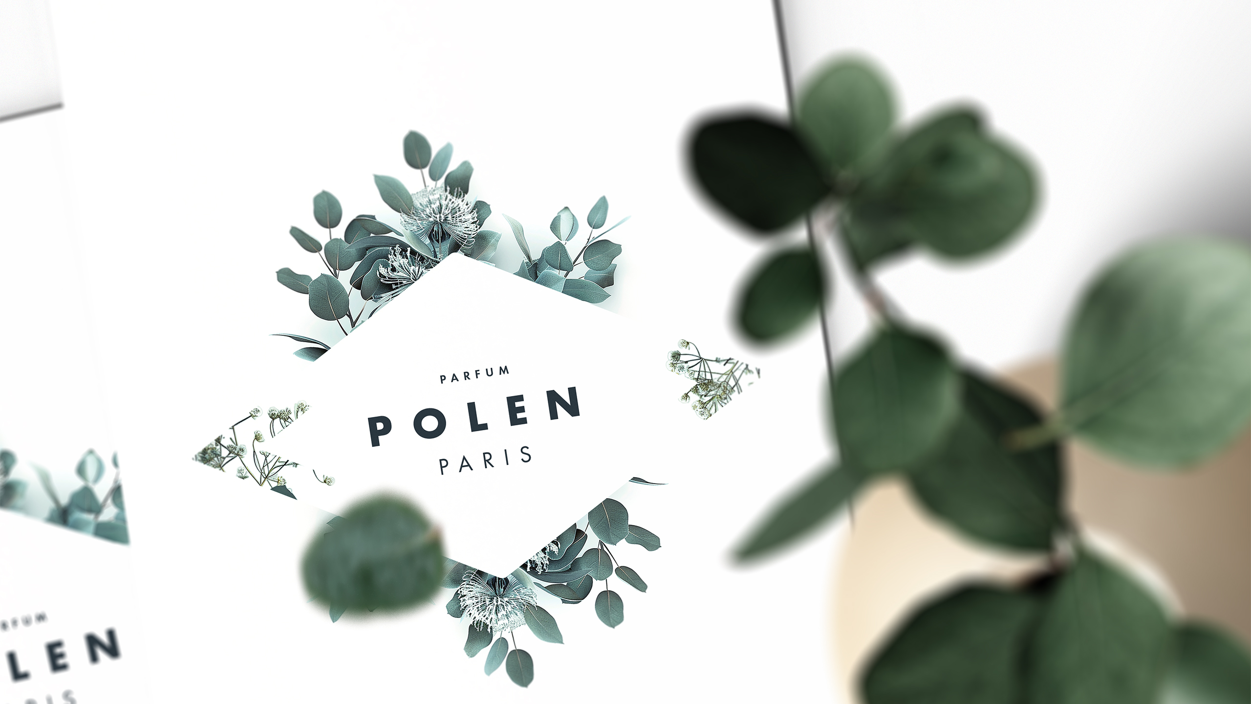
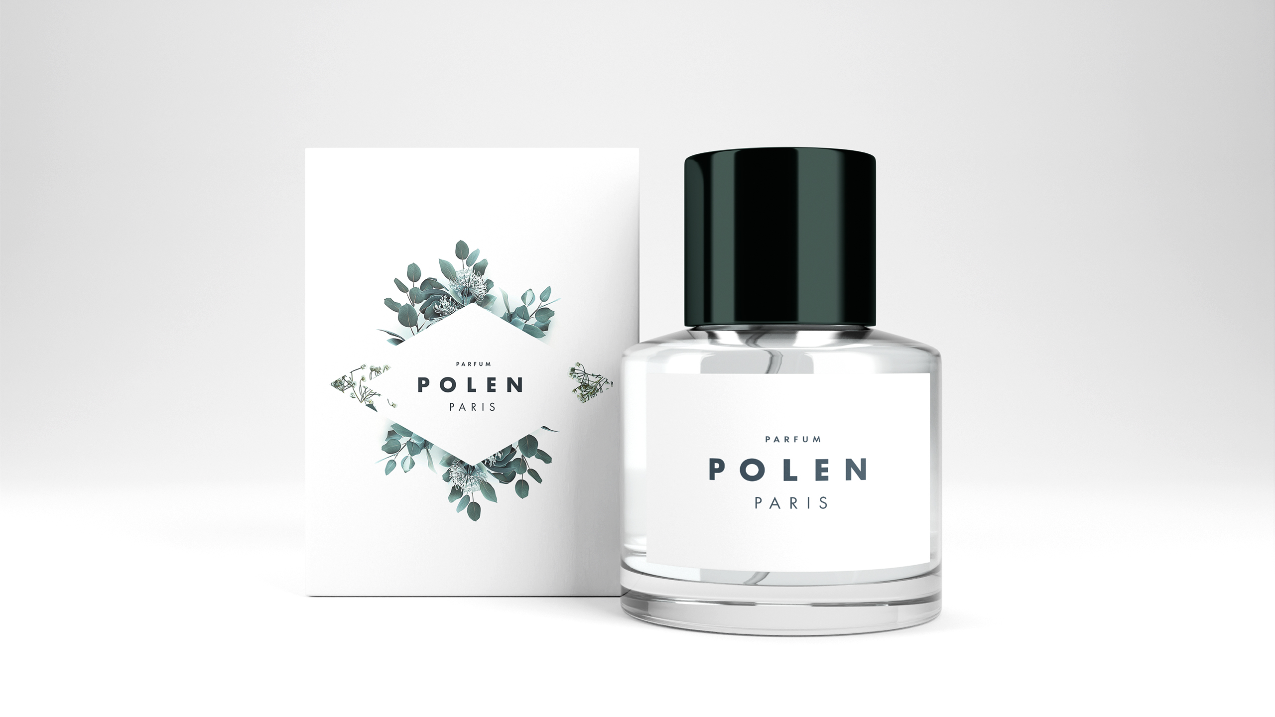
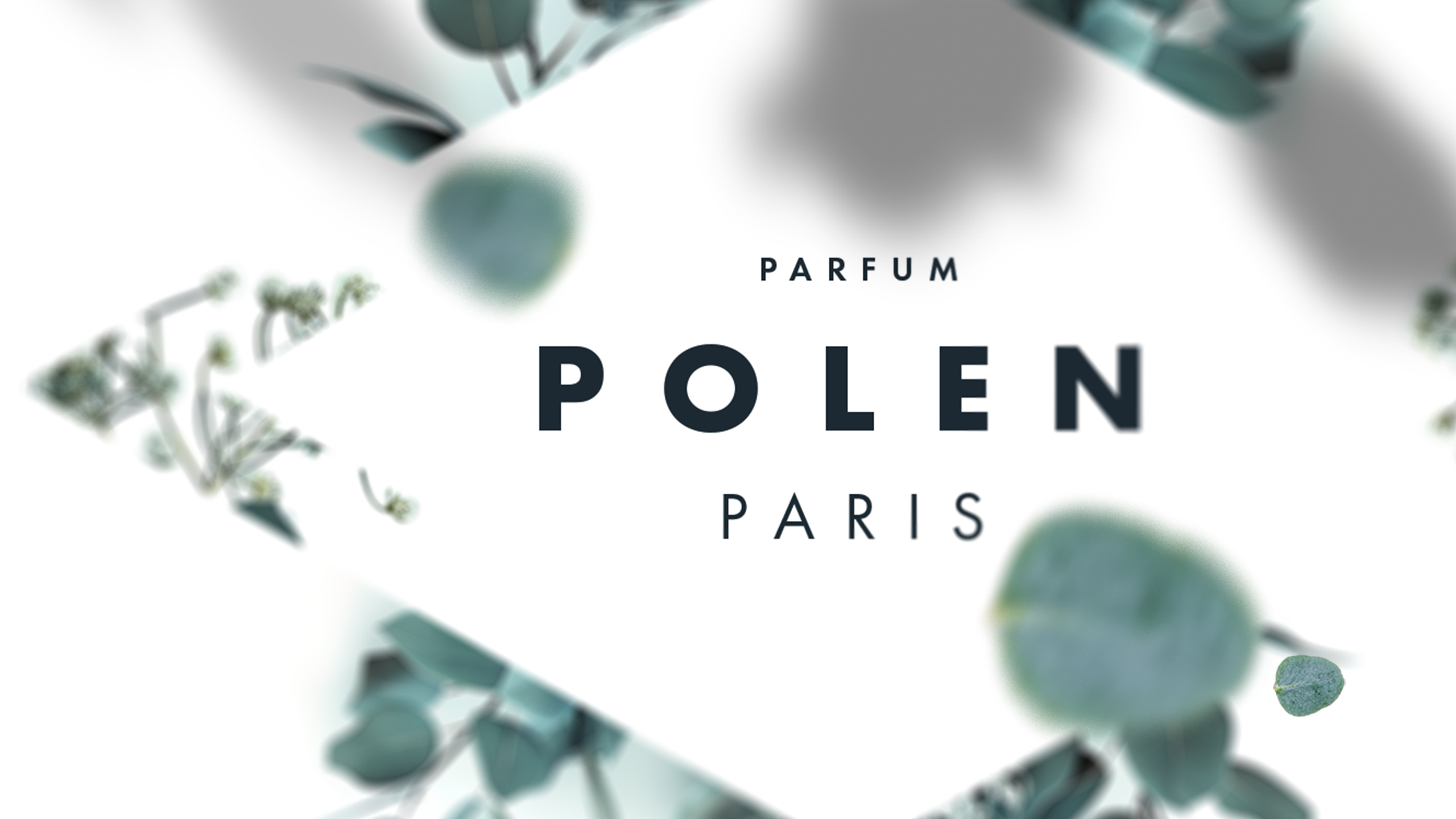
How to balance minimalism with nature's poetry? Polen's design uses white and green with subtle floral motifs and geometric framing, creating a refined identity that highlights purity and delicate beauty.
Visual Language and Concept
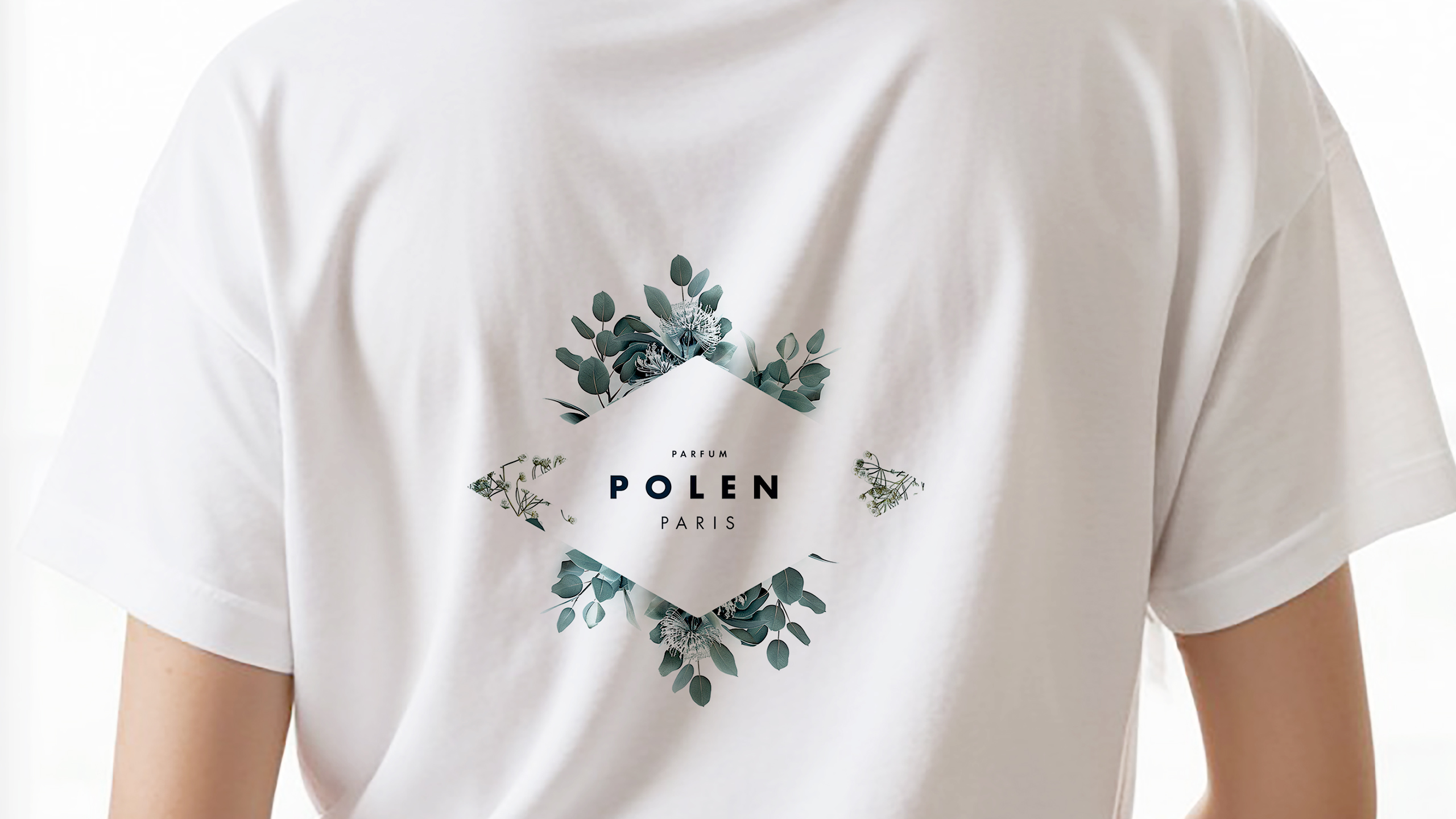
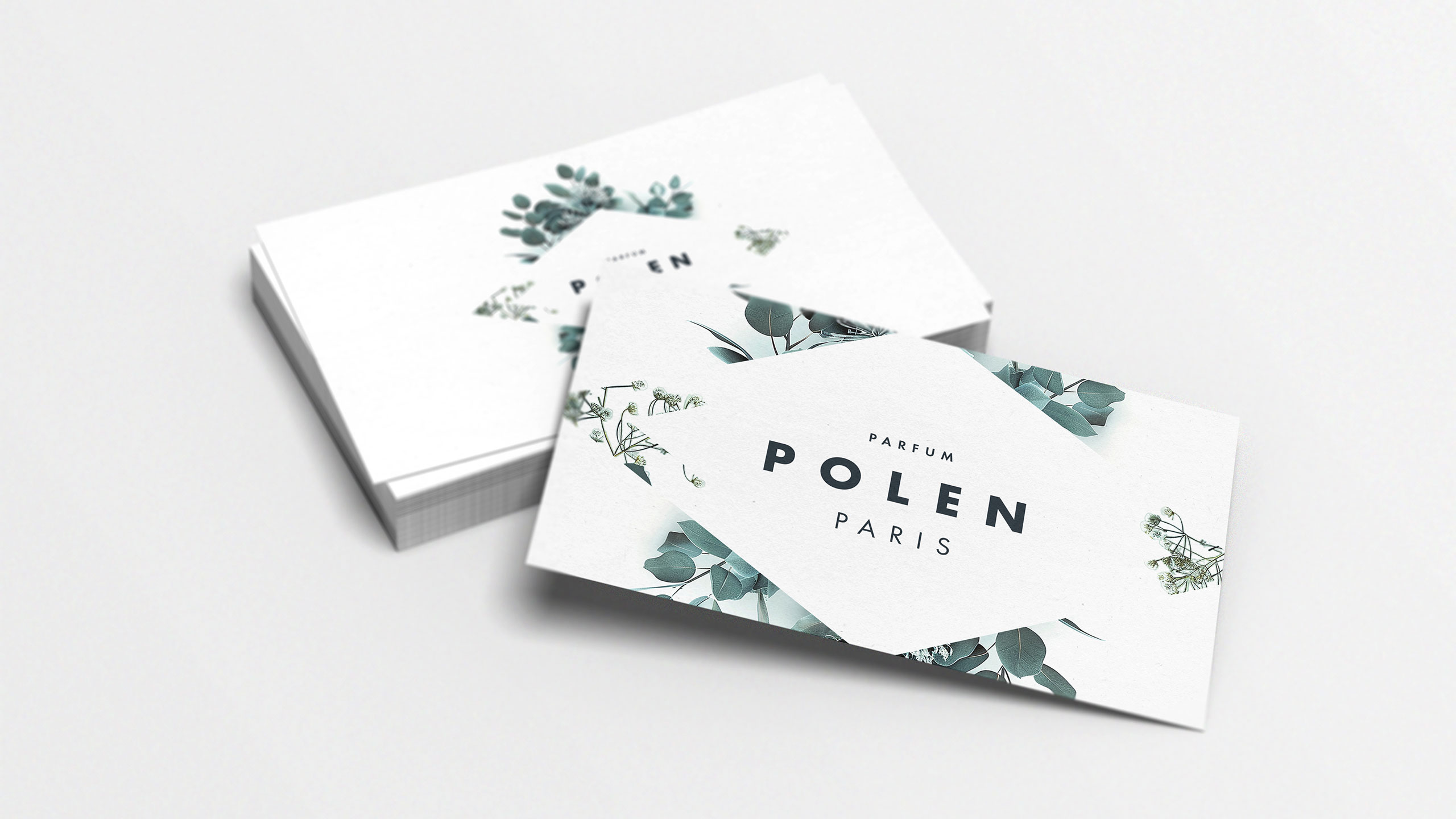
The graphic design of Polen, a flower-inspired perfume brand, combines minimalism and nature. Seen on bottles, boxes, business cards, t-shirts, and tote bags, it uses a white and green palette symbolizing purity and simplicity. The logo features a clean, elegant typeface subtly framed within an invisible diamond—like a hidden gem—surrounded by delicate floral motifs that evoke the lightness of pollen drifting in the wind.
Geometry and Identity
This subtle geometry adds a touch of sophistication, while the floral elements highlight the natural origins of the fragrance. The result is a refined, poetic visual identity that captures the product's simple and precious beauty.
Related
03
Whether you prefer a quick call or a detailed message, we're here to listen.

OVER

Café Lenoirs

Blen-Beck

Whare House