


Description
02
The Core Challenge
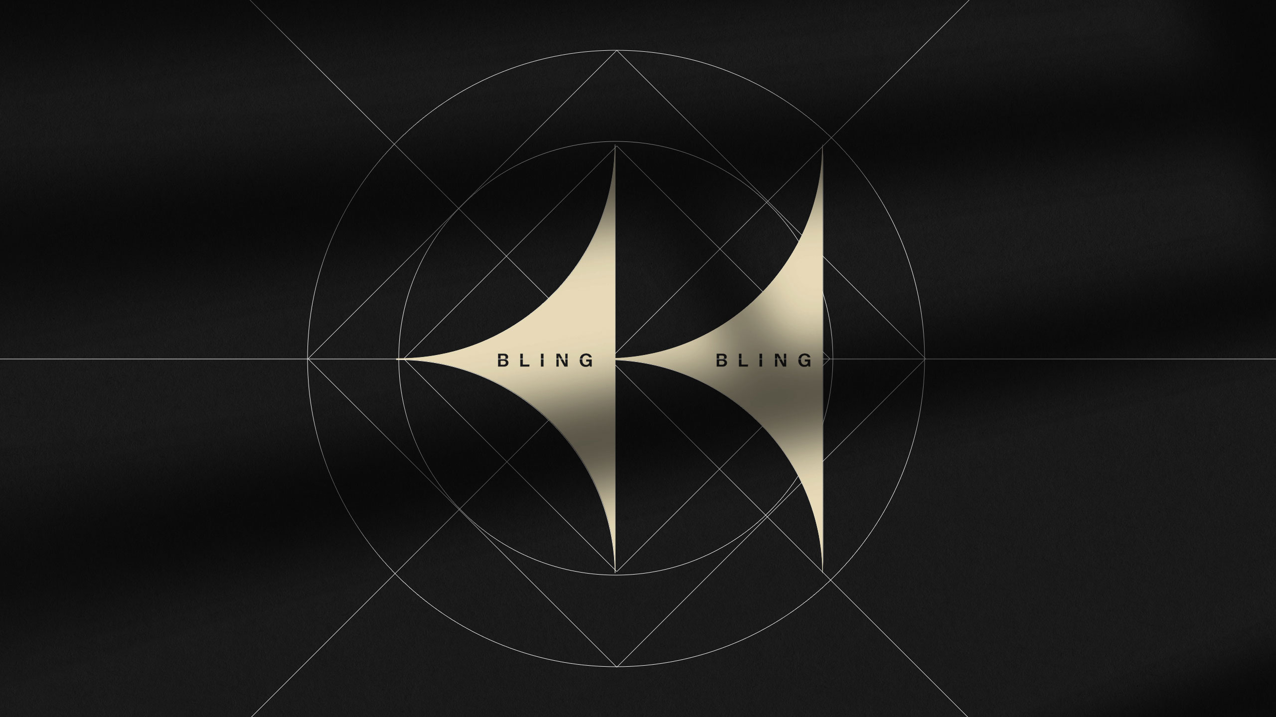
How can graphic design balance boldness and refinement? Bling Bling's identity uses black and gold contrasts with symbolic typography to explore luxury, elegance, and the mystique of timeless regal power.
Visual Language and Symbolism
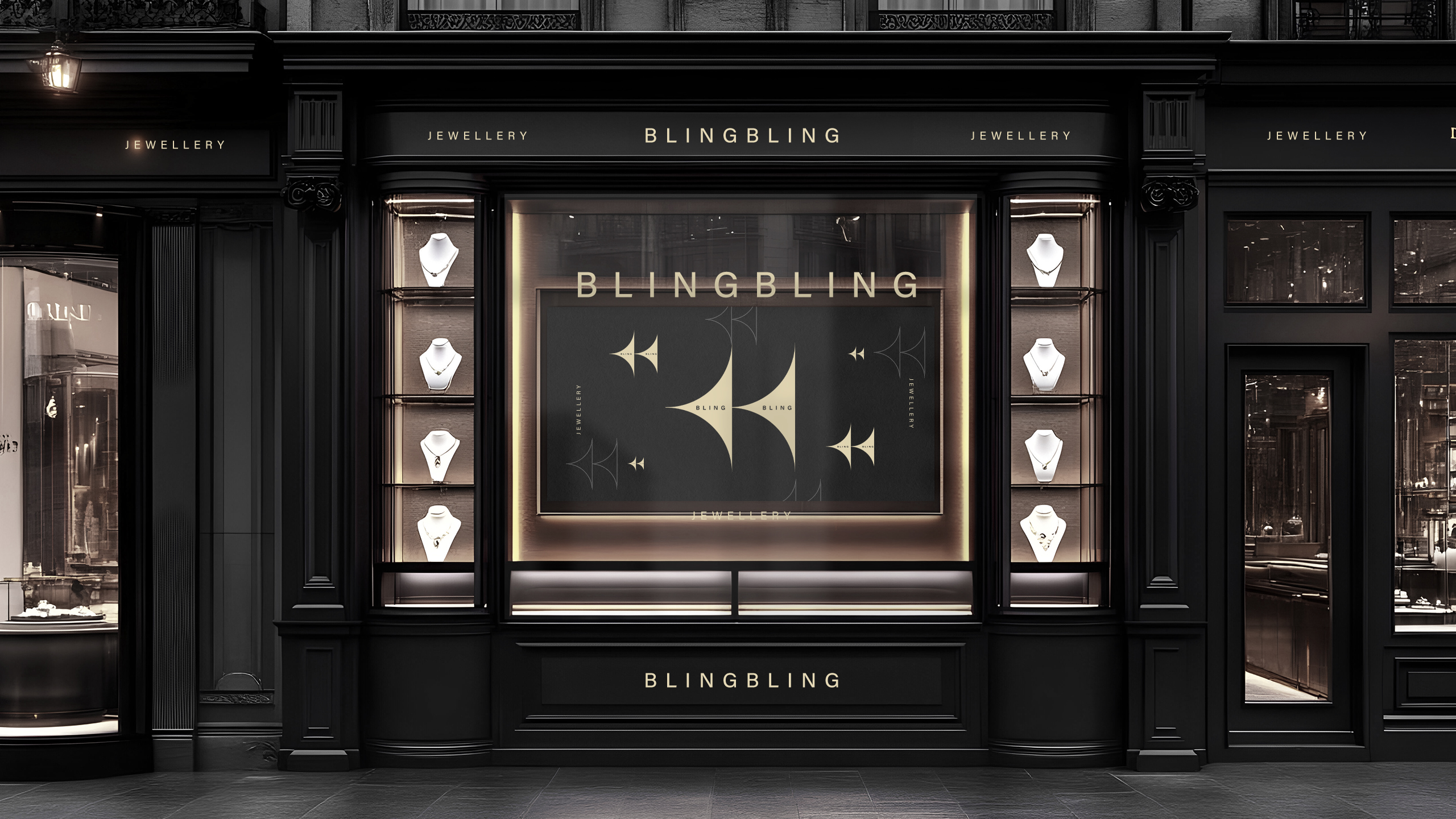
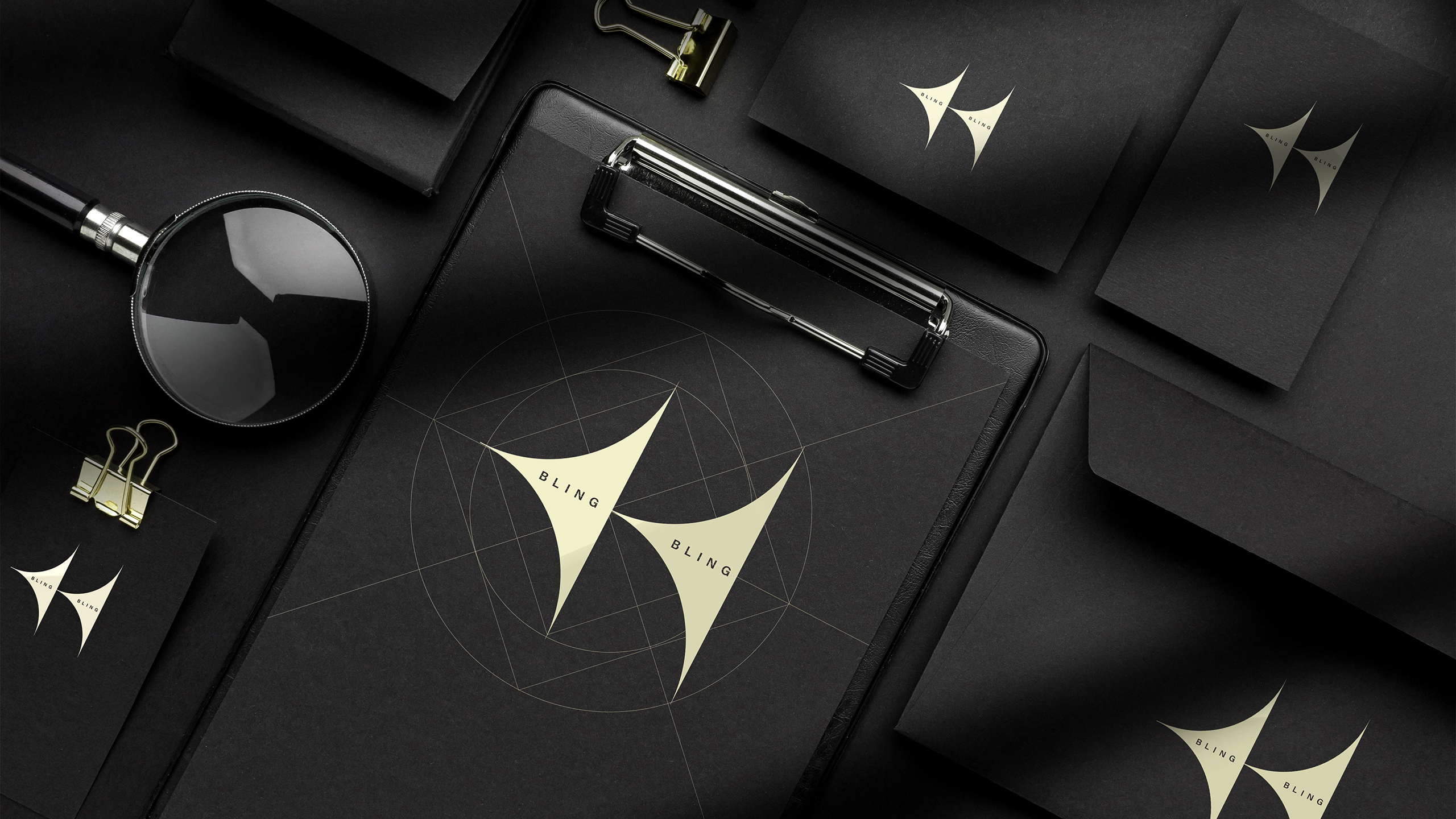
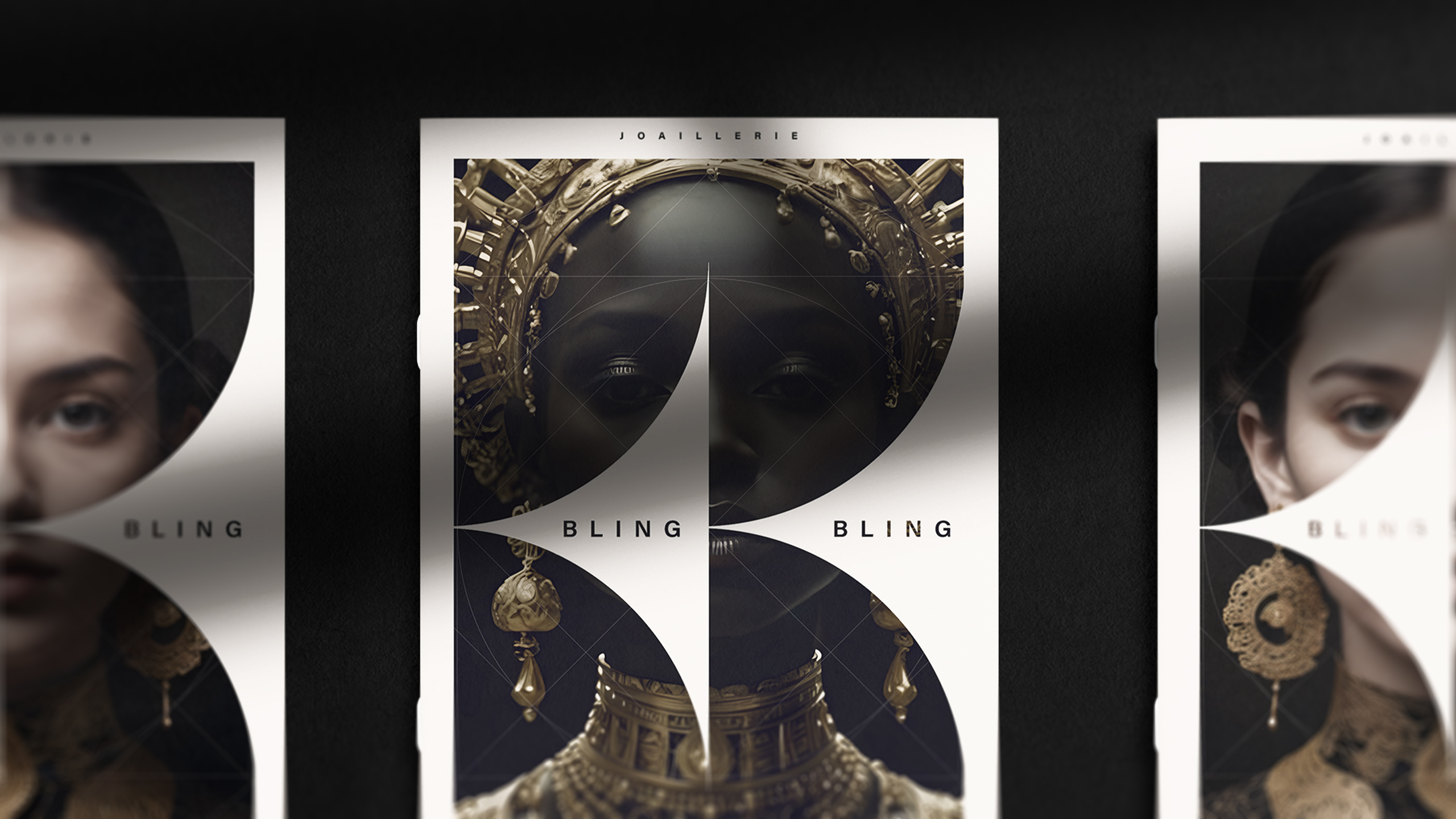
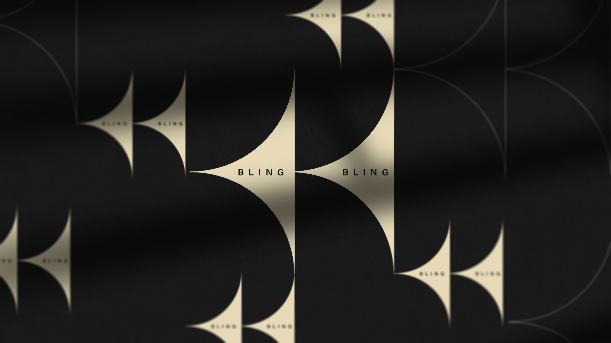
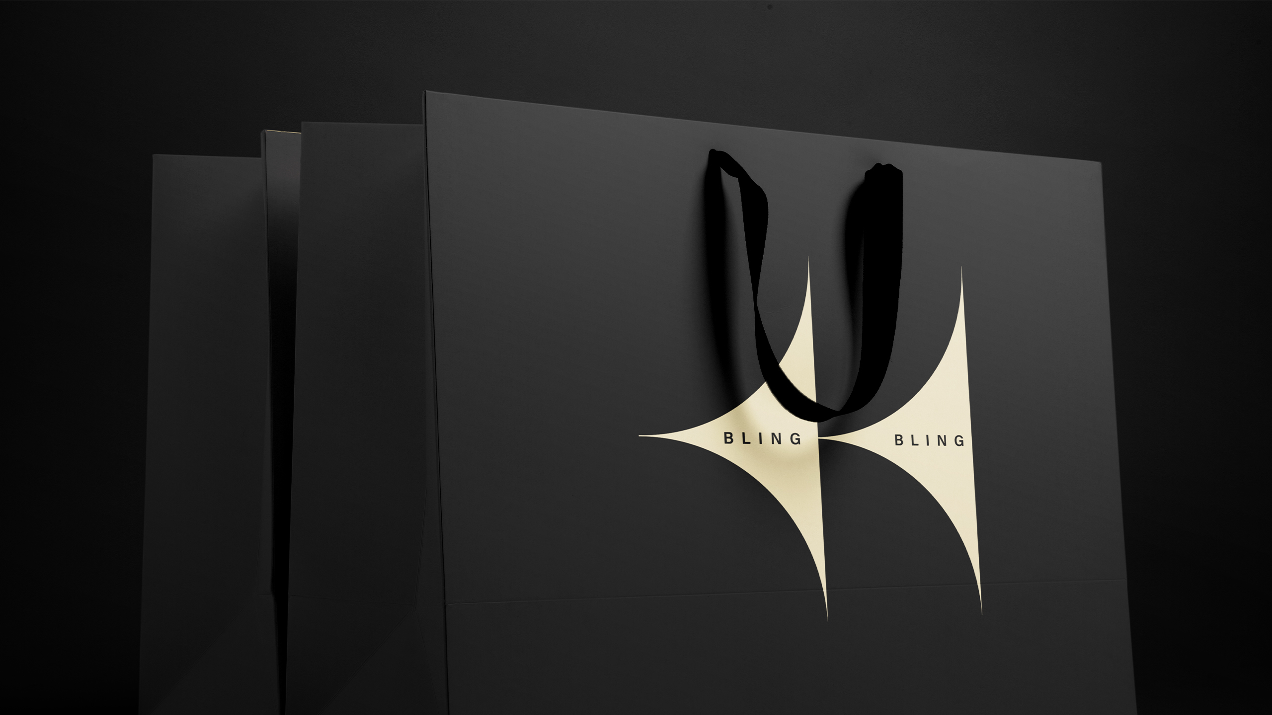
The visual identity of the Bling Bling brand appears on stationery, jewelry boxes, and paper bags, featuring a design that is both bold and refined. Dominated by black and gold, the creation plays with contrasts and symbolism. The name "Bling Bling" is subtly embedded within the initials BB, revealing an unexpected double arrow. These same letters frame the images of two queens adorned with jewelry.
Style and Identity
The gold line-art style brings delicacy and lightness, like a lace veil covering the richness of the ornaments. Combined with black, the overall design evokes a sense of timeless, mystical majesty.
Related
03
Whether you prefer a quick call or a detailed message, we're here to listen.

OVER

Café Lenoirs

Blen-Beck

Whare House