


Description
02
The Core Challenge
How can a travel brand balance clarity, movement, and meaning in one bold graphic system? TO's challenge: symbolize both journey and destination, with a name that says it all—literally.
Visual Language and Concept
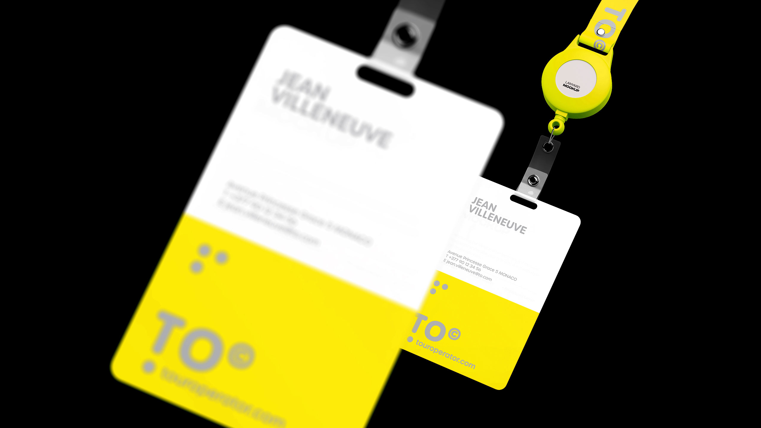
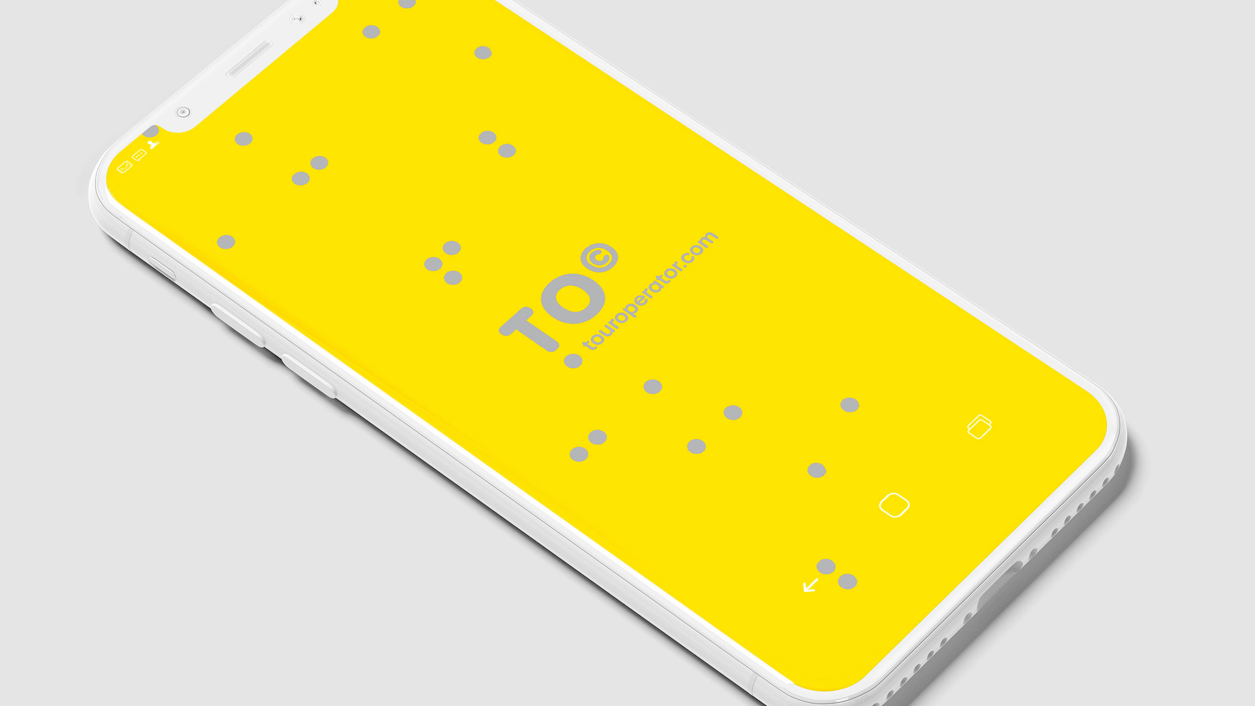
TO—short for Tour Operator and the English preposition "to"—builds its identity around the symbolic power of the dot. Seen on tickets, caps, badges, posters, and airplane livery, the dot becomes a destination marker, a point of connection, a radar blip. Bold yellow and silver enhance visibility and energy.
Message and Identity
The graphic system is sleek, modern, and full of direction. Ironically, TO flips the old saying—"it's not the destination, it's the journey"—as a wink: here, what matters is where you're going. The brand simplifies travel to its essence with one clear message: get to the point.
Related
03
Whether you prefer a quick call or a detailed message, we're here to listen.

OVER

Café Lenoirs

Blen-Beck

Whare House