


Description
02
The Core Challenge
How can Opéra Parade's graphic design blend classical elegance with nomadic playfulness, turning each performance into a visual postcard that celebrates movement, music, and shared cultural journeys?
Visual Language and Structure
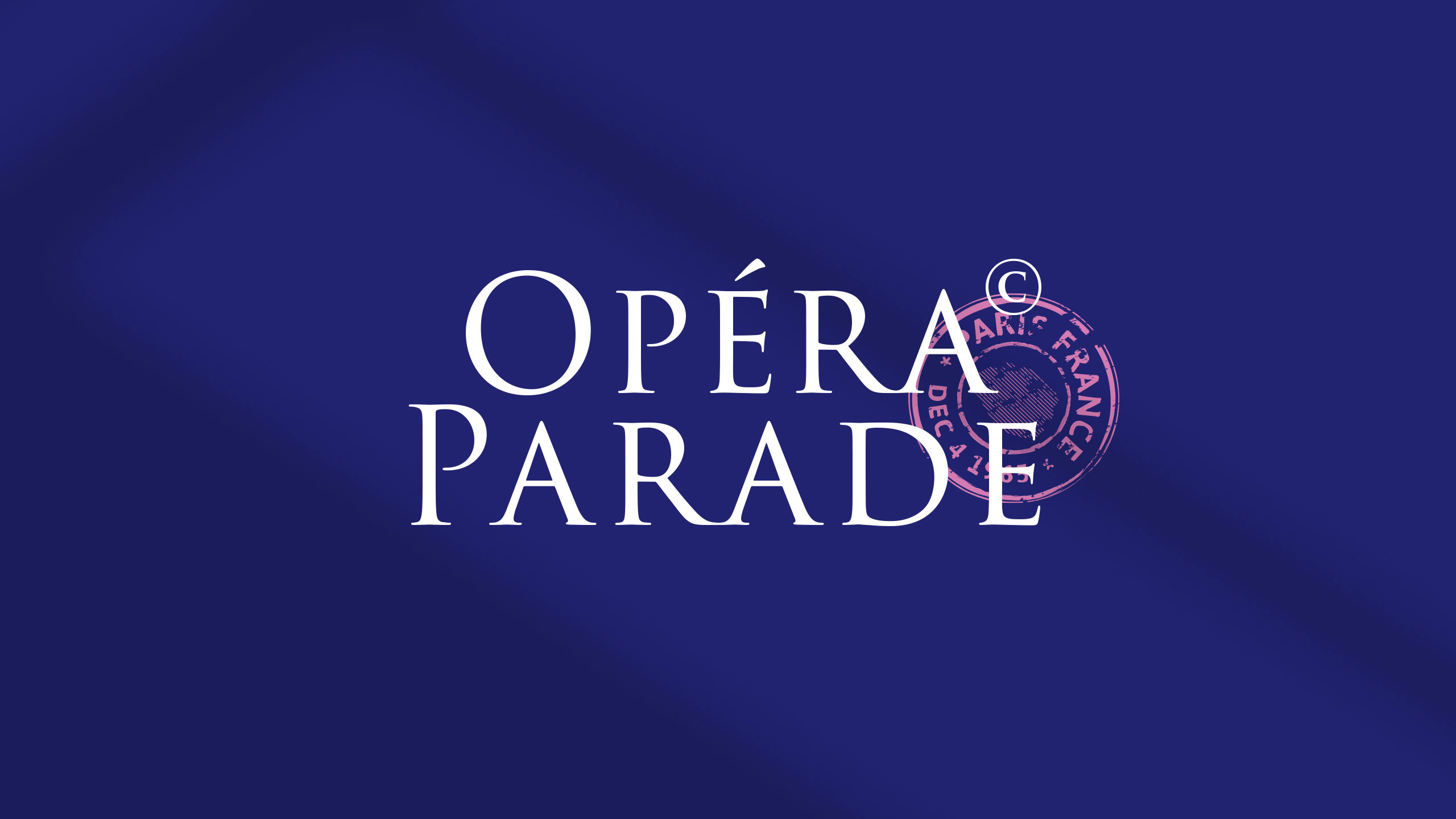
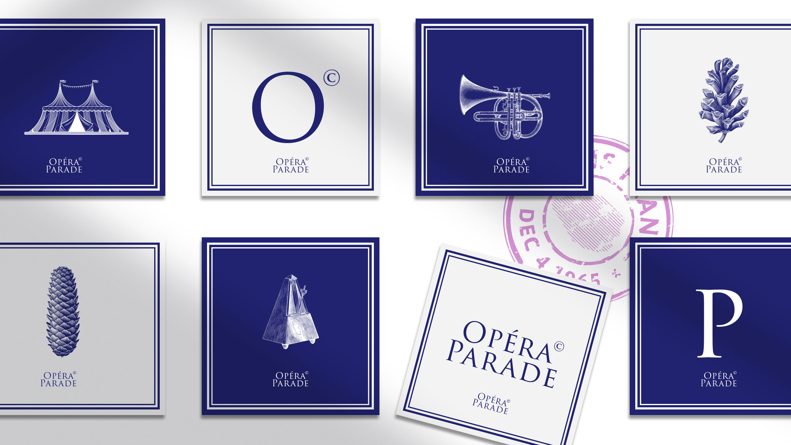
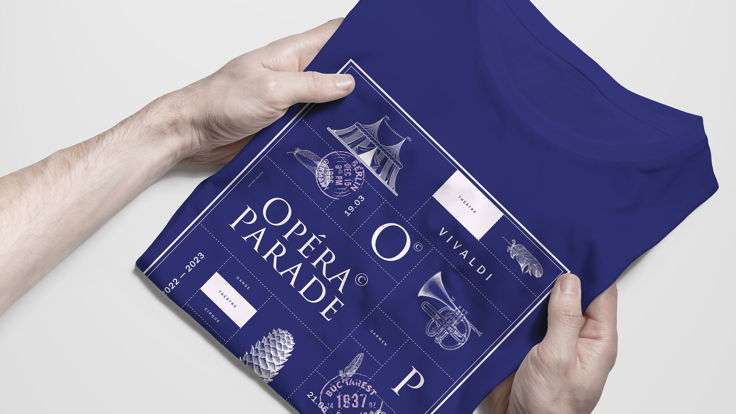
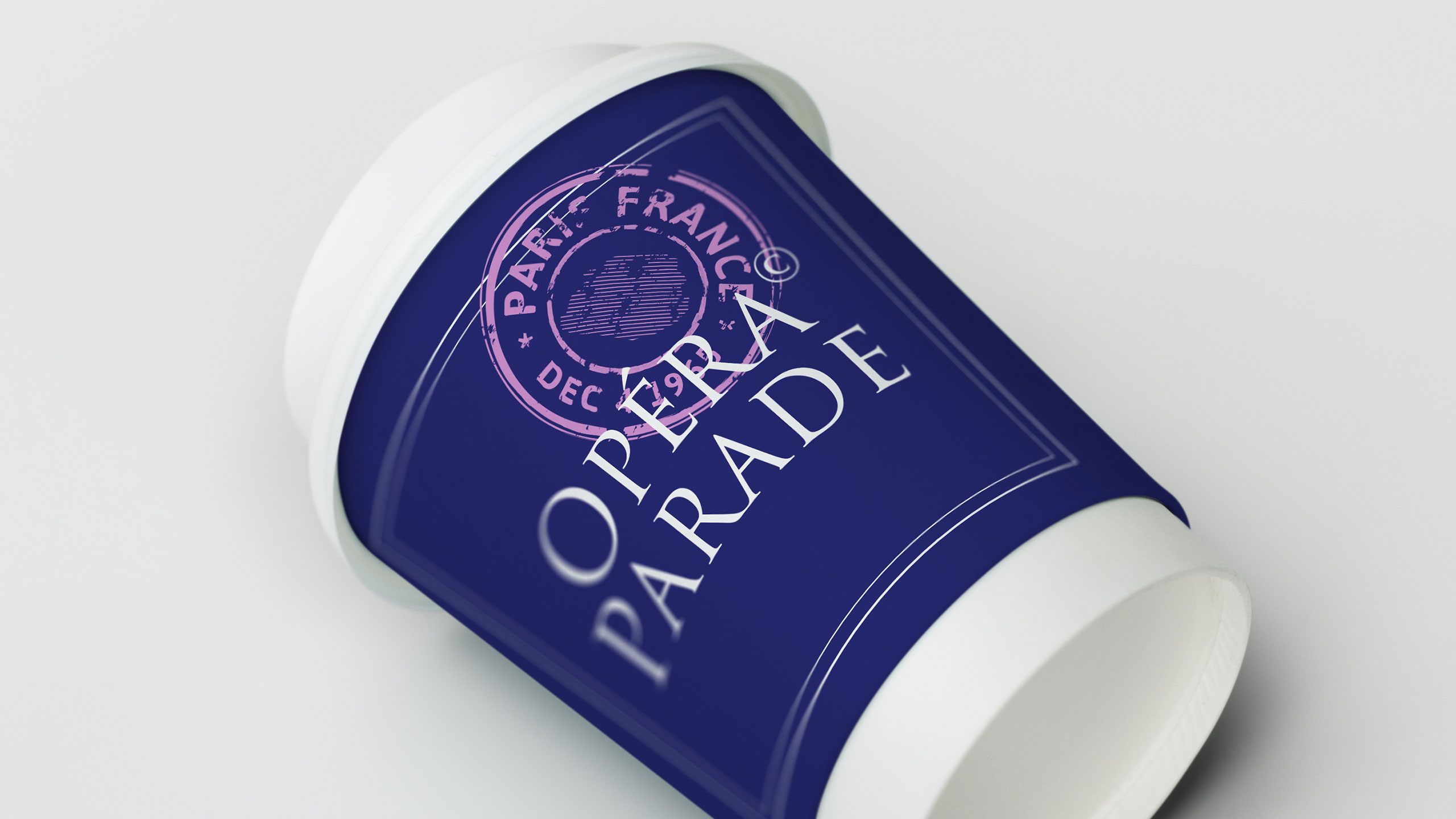
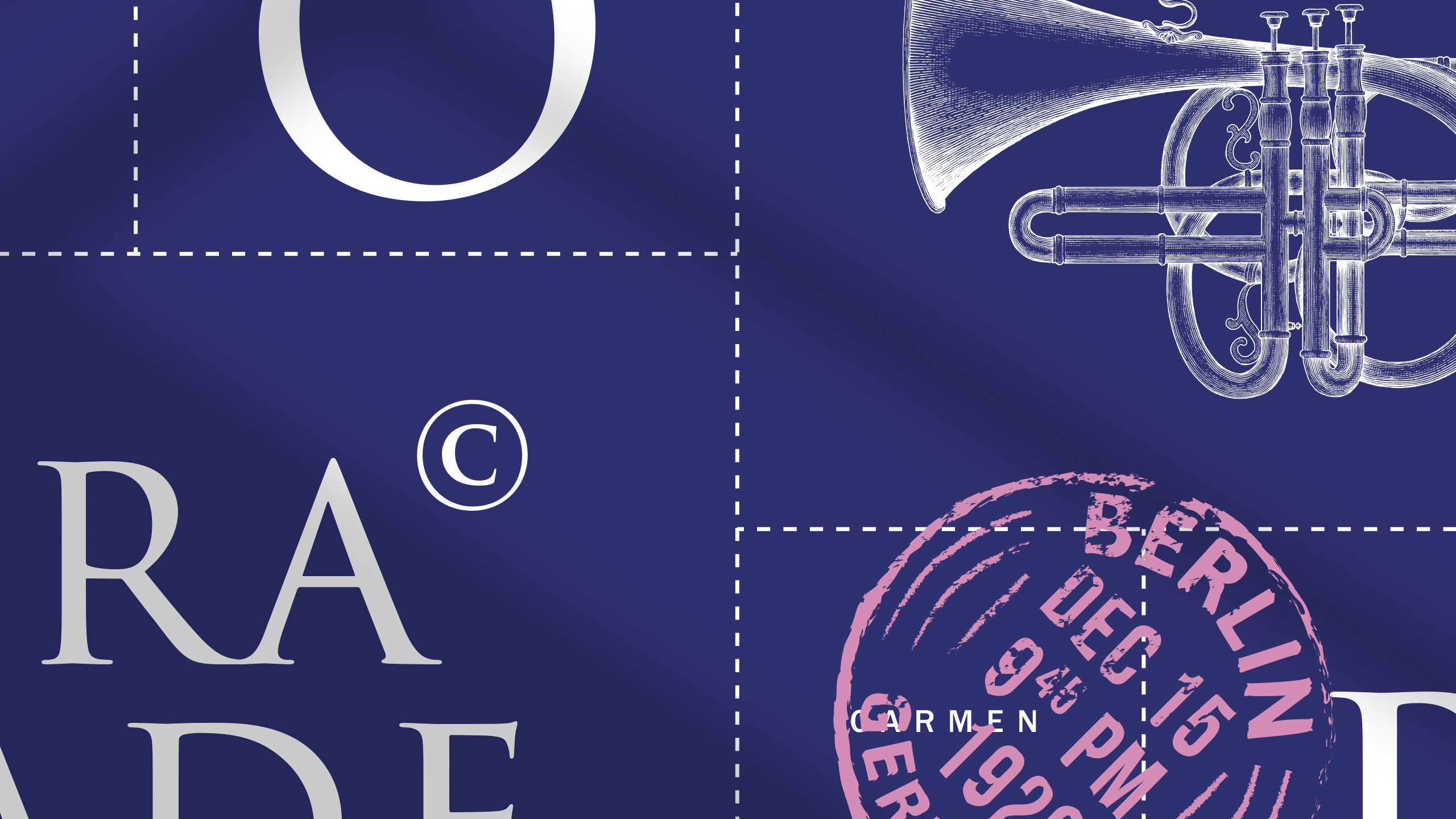
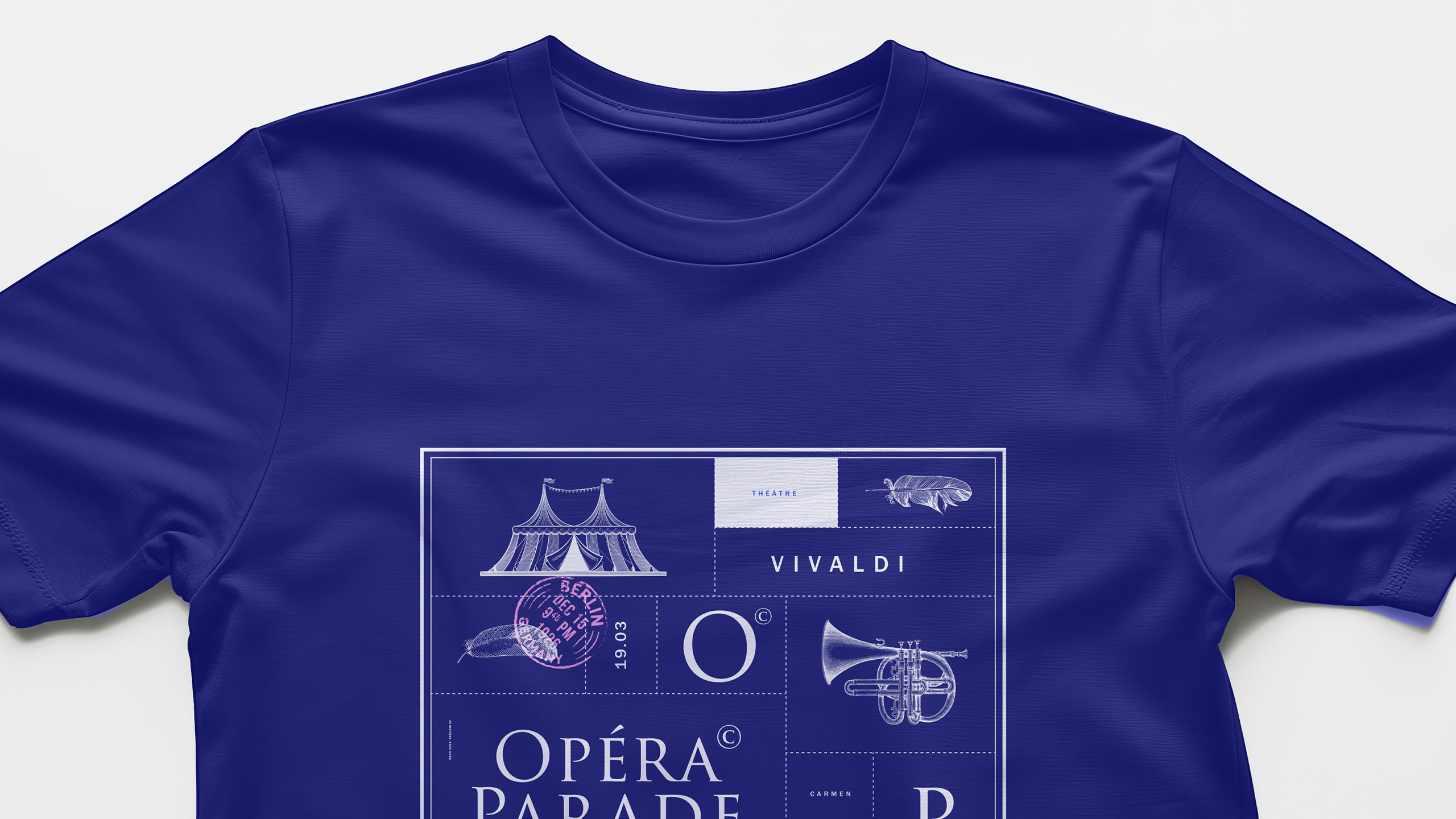
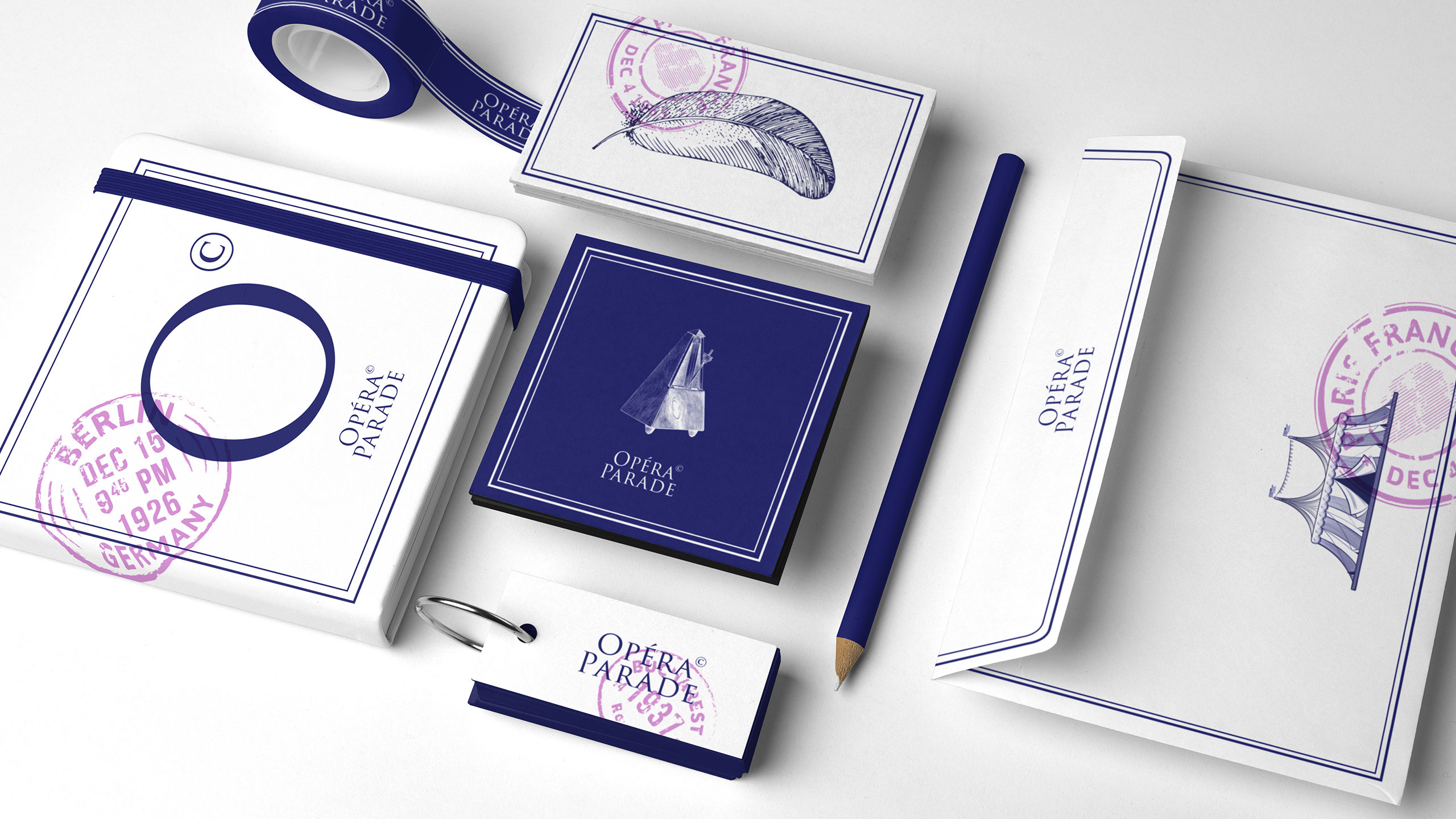
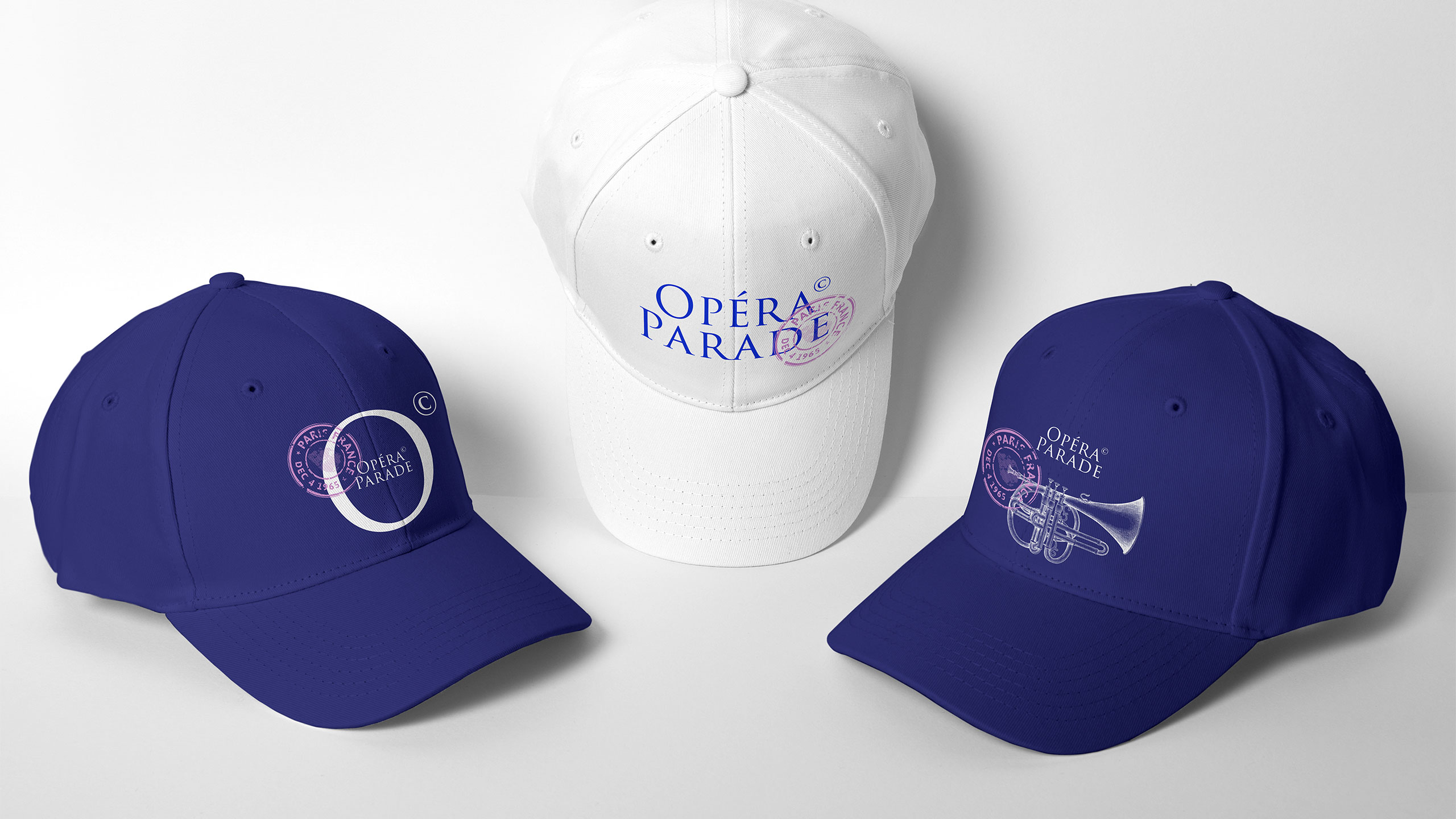
The graphic identity for Opéra Parade, a traveling musical performance, is both vintage and contemporary. Dominated by white and blue, the design is structured with animated cartouches that frame informative text and engraved-style visuals evoking classical music. These refined illustrations bring a nostalgic yet fresh tone to the overall look.
Concept and Application
The entire layout is overlaid with postal-style stamps marking the names and dates of each performance, reminiscent of a well-traveled postcard. This playful and poetic concept celebrates movement, culture, and communication. The identity is consistently applied across posters, t-shirts, cups, caps, and stationery, creating a unified and memorable visual experience.
Related
03
Whether you prefer a quick call or a detailed message, we're here to listen.

OVER

Café Lenoirs

Blen-Beck

Whare House