


Description
02
The Core Challenge
How can Over's graphic design balance playful structure and cultural symbolism to transform travel into an engaging, memorable journey that visually guides and excites its audience?
Visual Language and Concept
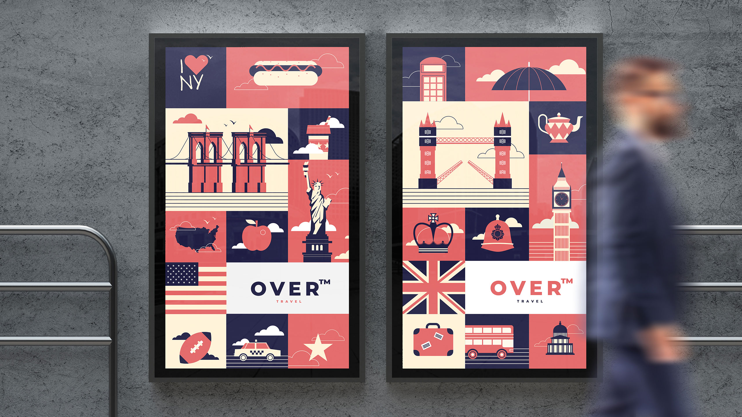
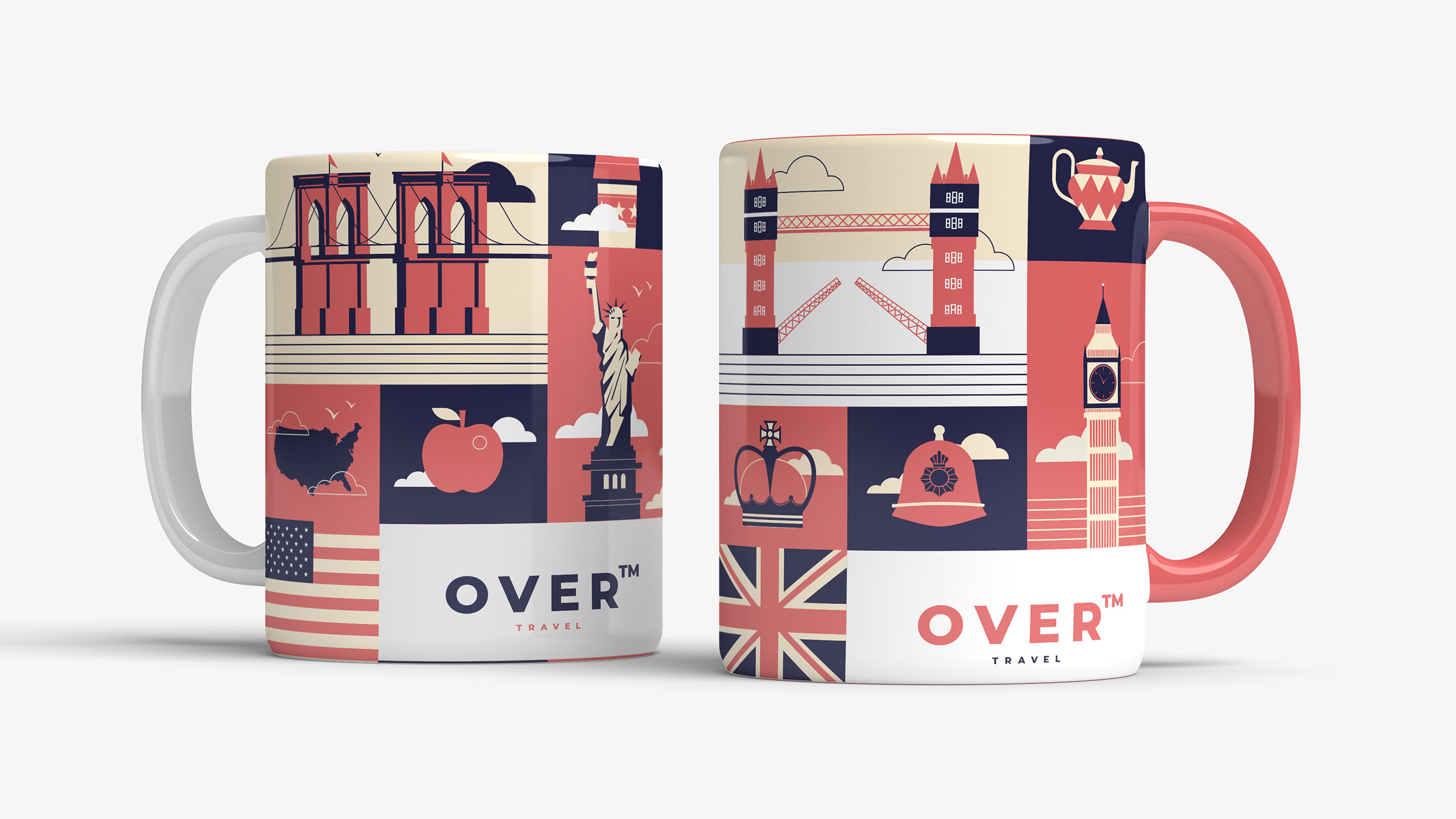
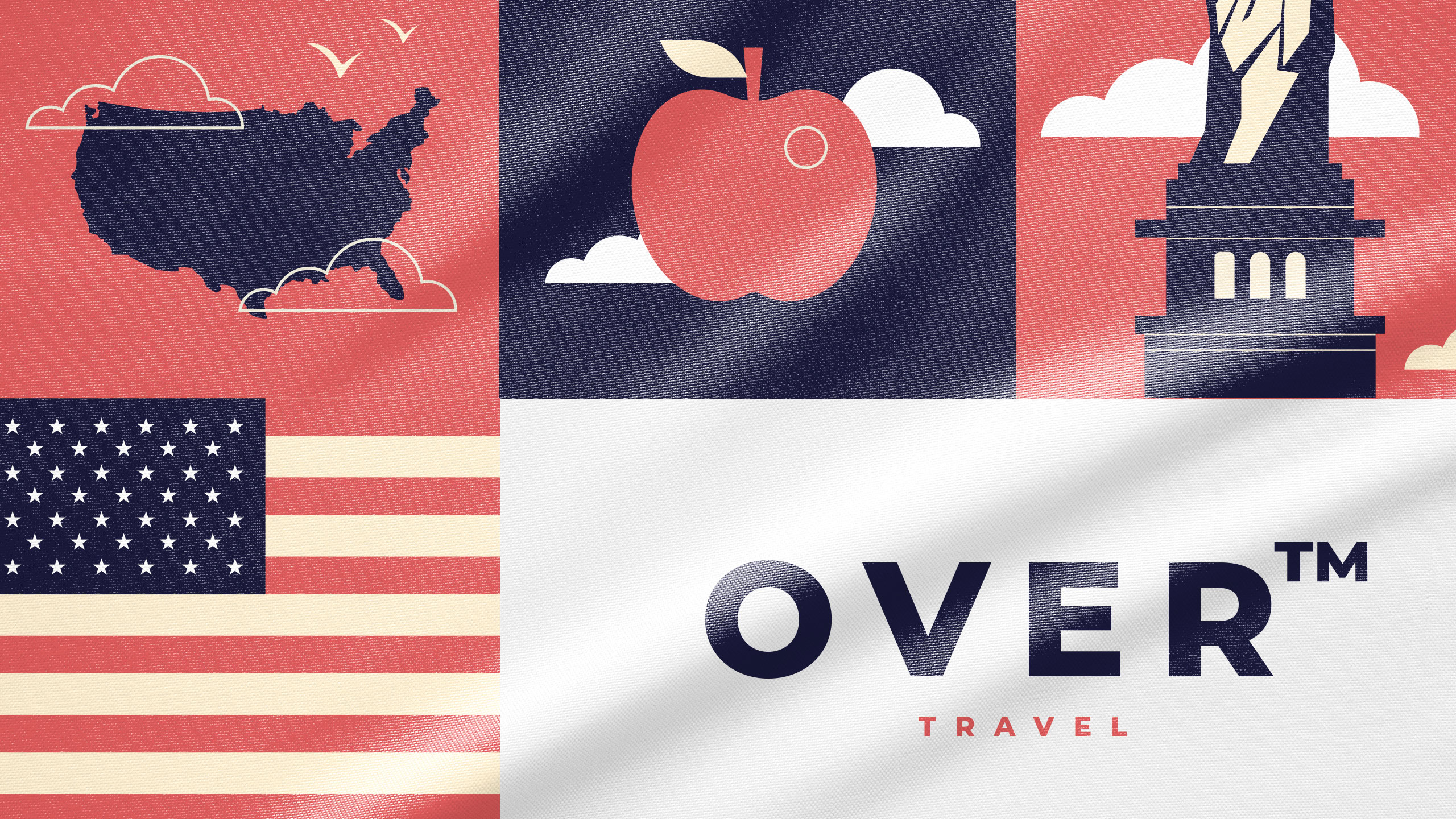
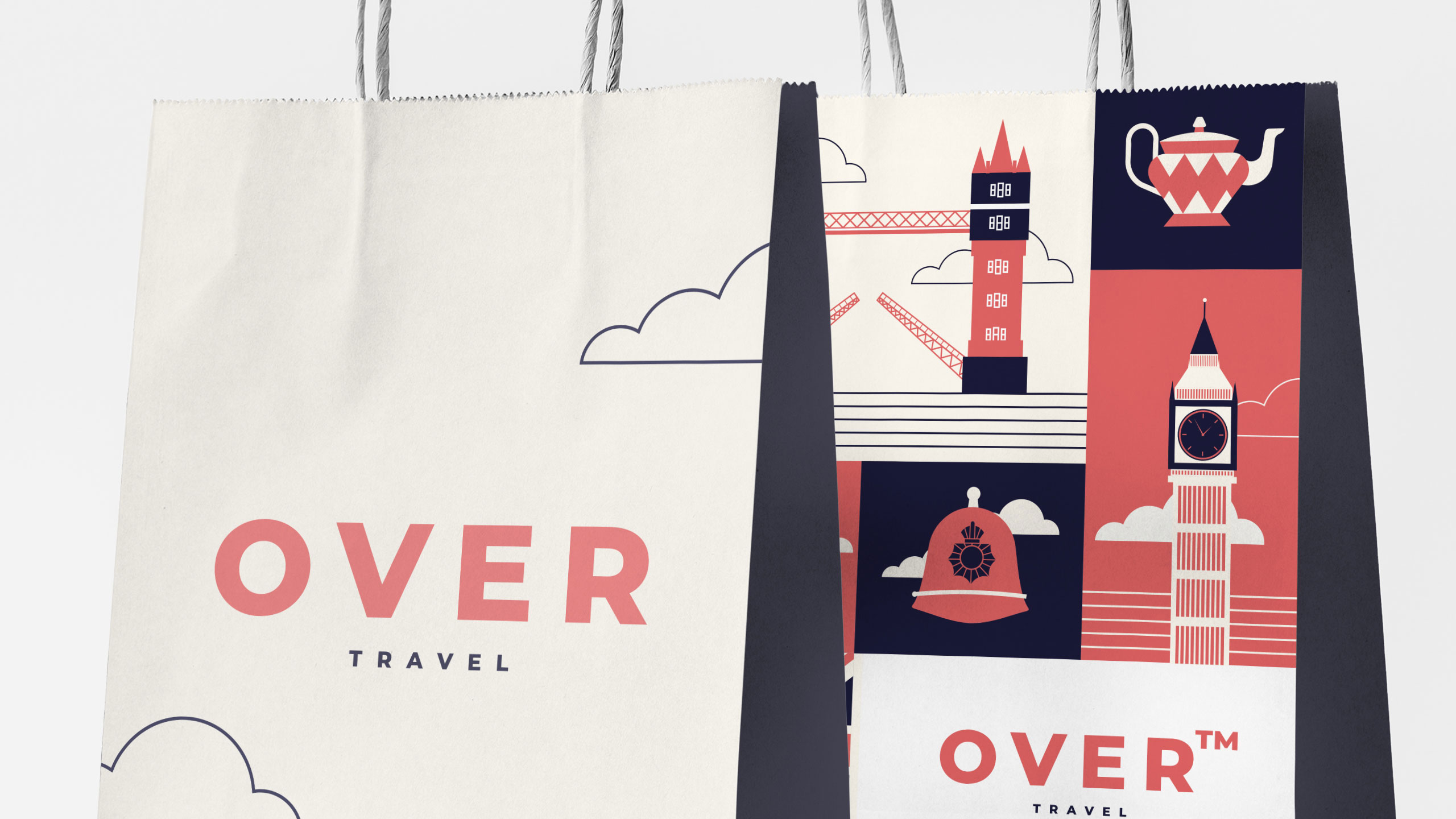
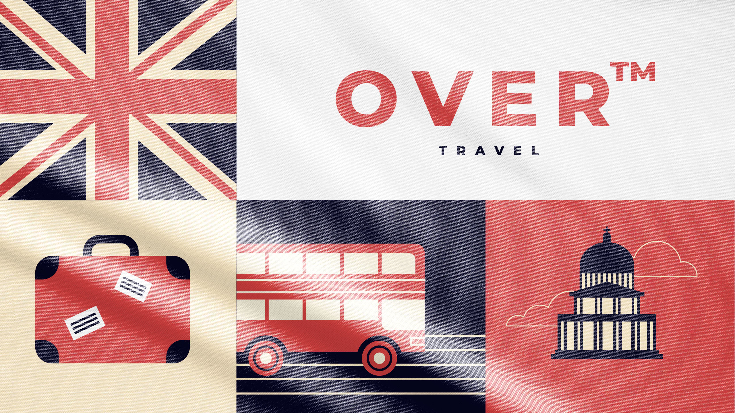
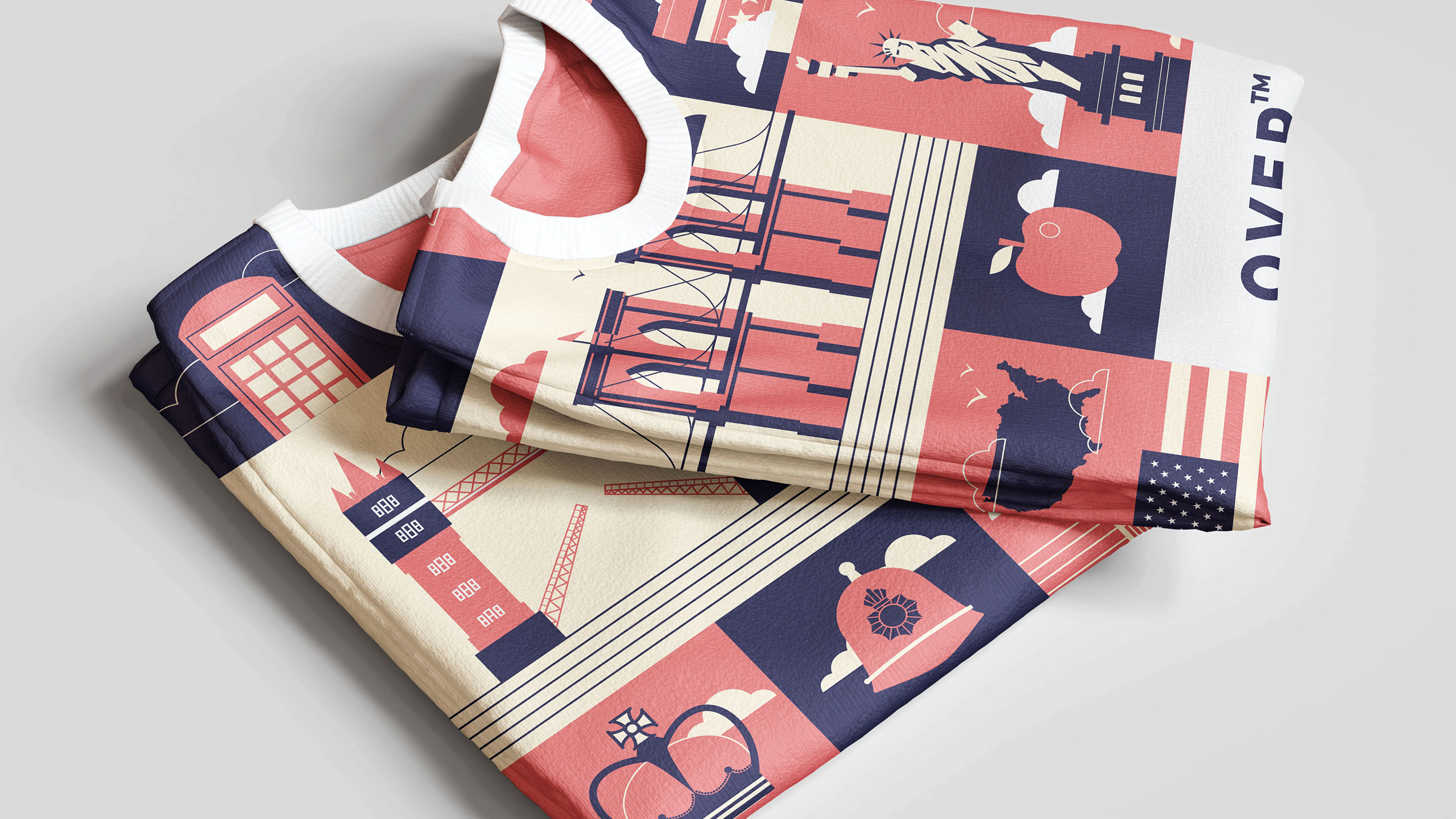
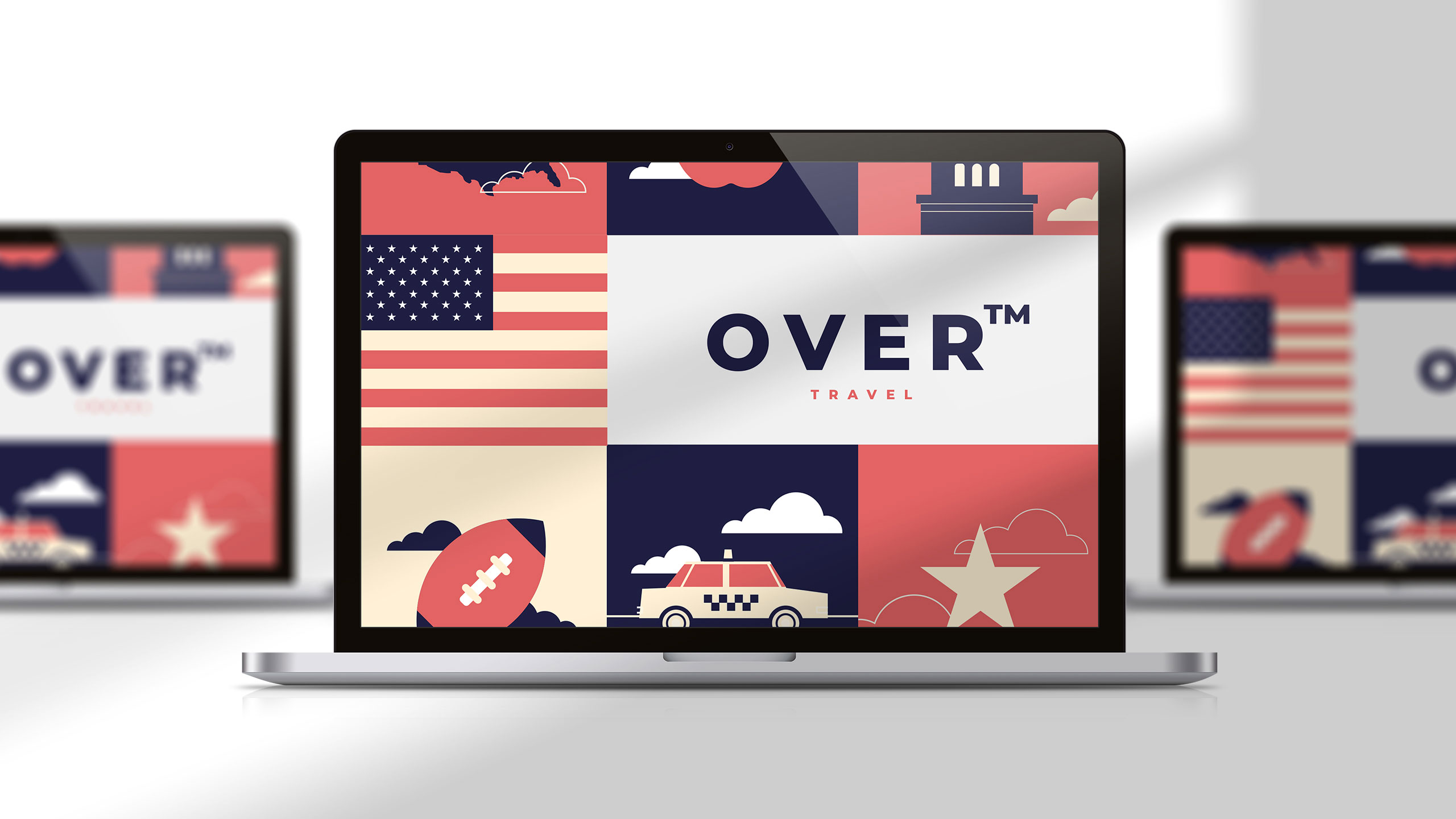
The graphic design for Over, a travel agency, uses a playful and structured visual approach. Applied to t-shirts, posters, badges, bags, and mugs, the identity features a red and blue color palette representing American and British destinations. The core concept revolves around flat design illustrations depicting iconic symbols from the countries offered in the agency's travel packages.
Structure and Storytelling
Each symbol is placed within a square, like spaces on a board game, evoking a journey step by step. This visual storytelling technique reinforces the sense of adventure, discovery, and progression, turning travel into an engaging experience that feels both fun and memorable.
Related
03
Whether you prefer a quick call or a detailed message, we're here to listen.

OVER

Café Lenoirs

Blen-Beck

Whare House