


Description
02
The Core Challenge
How can graphic design create a sense of intimacy and natural elegance in the beauty industry? Fi explores minimalism, softness, and personal symbolism to form a deeply emotional brand experience.
Visual Language and Application
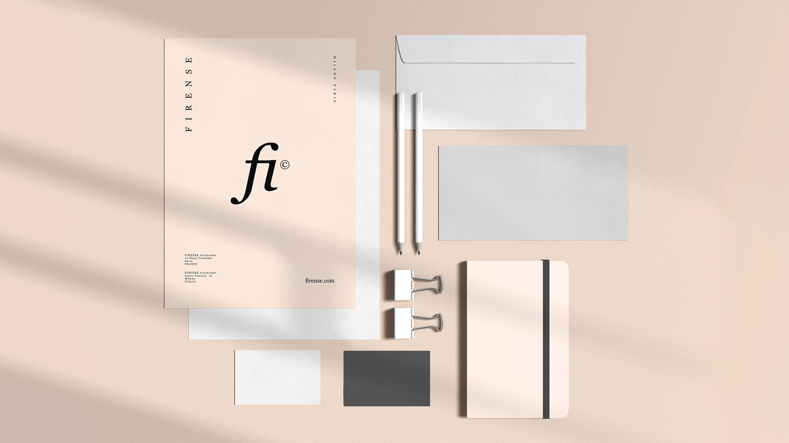
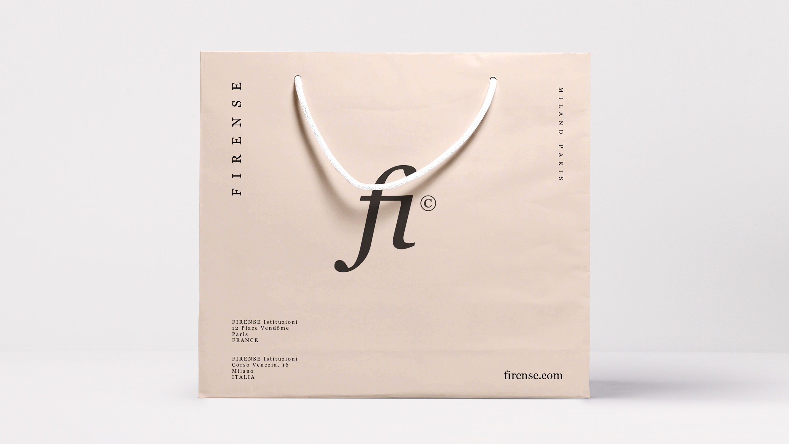
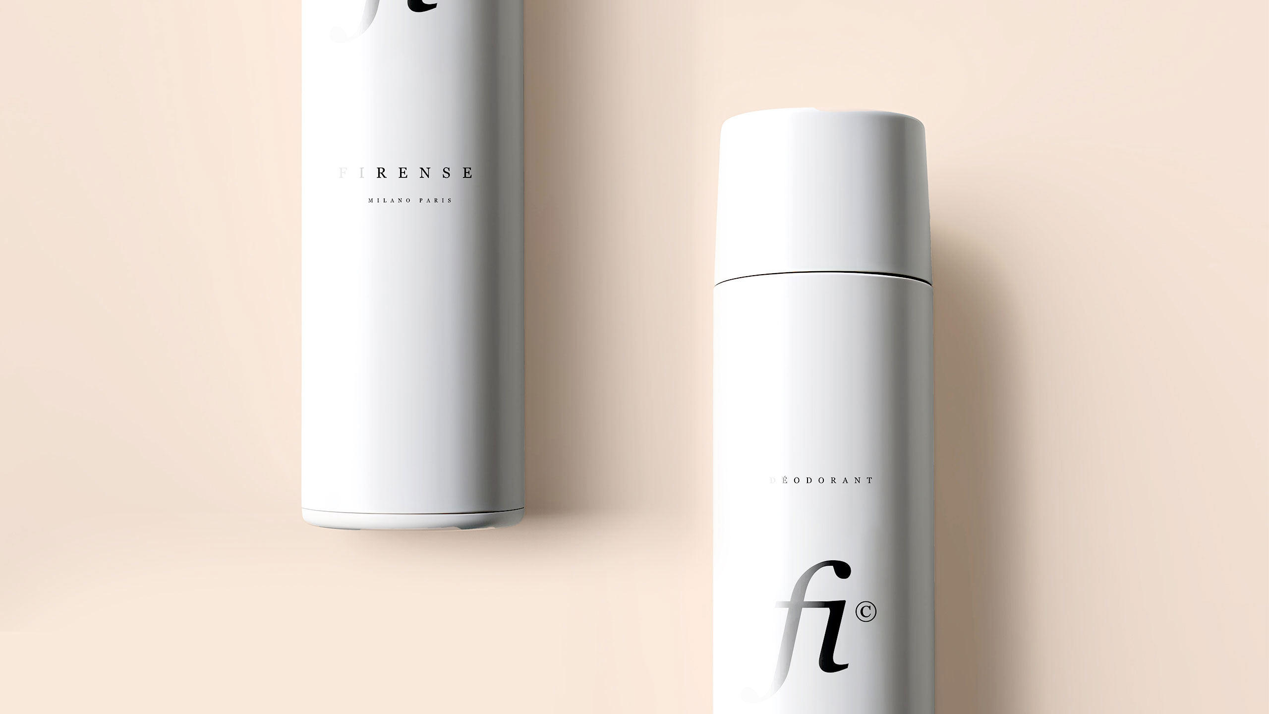
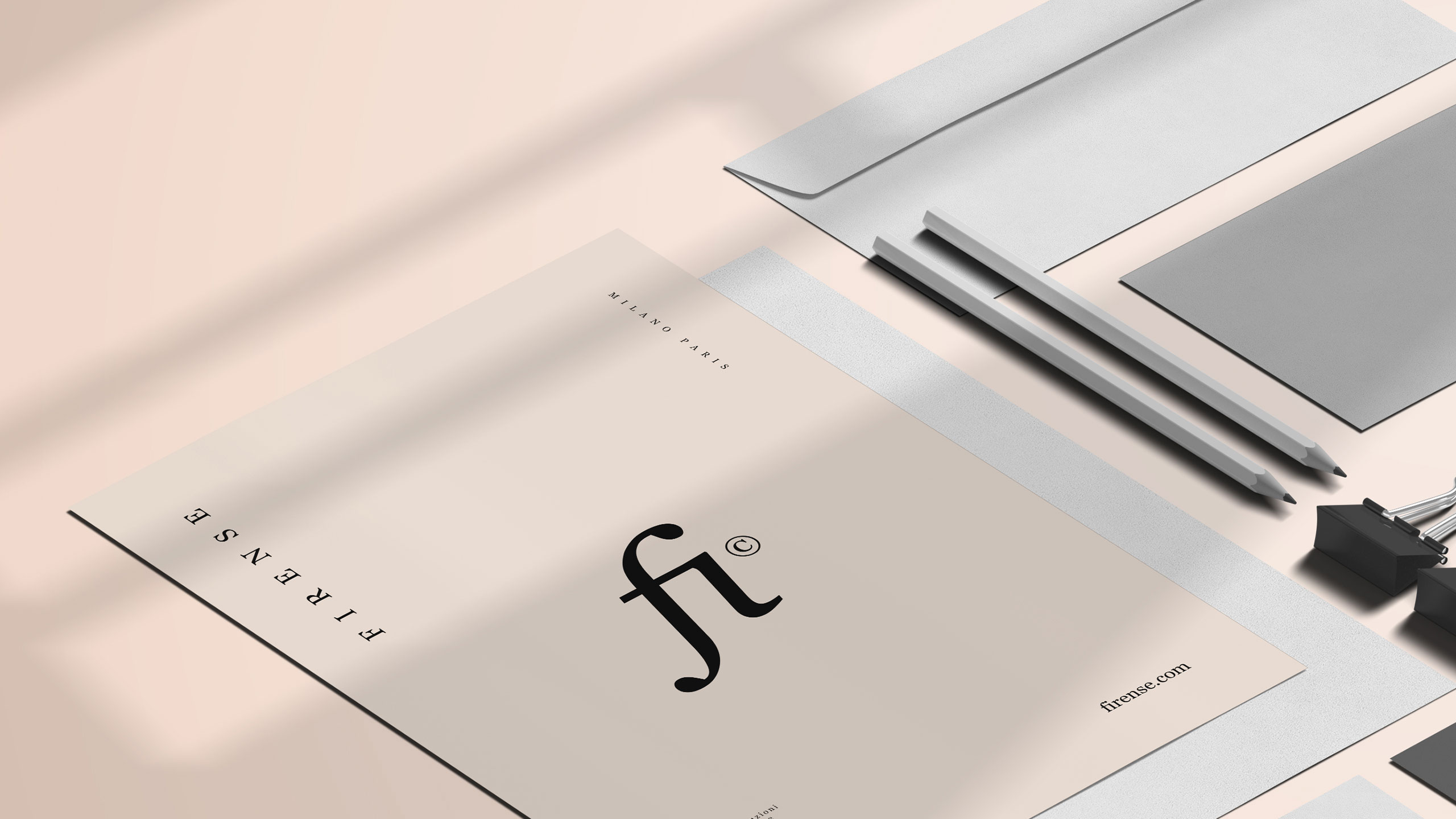
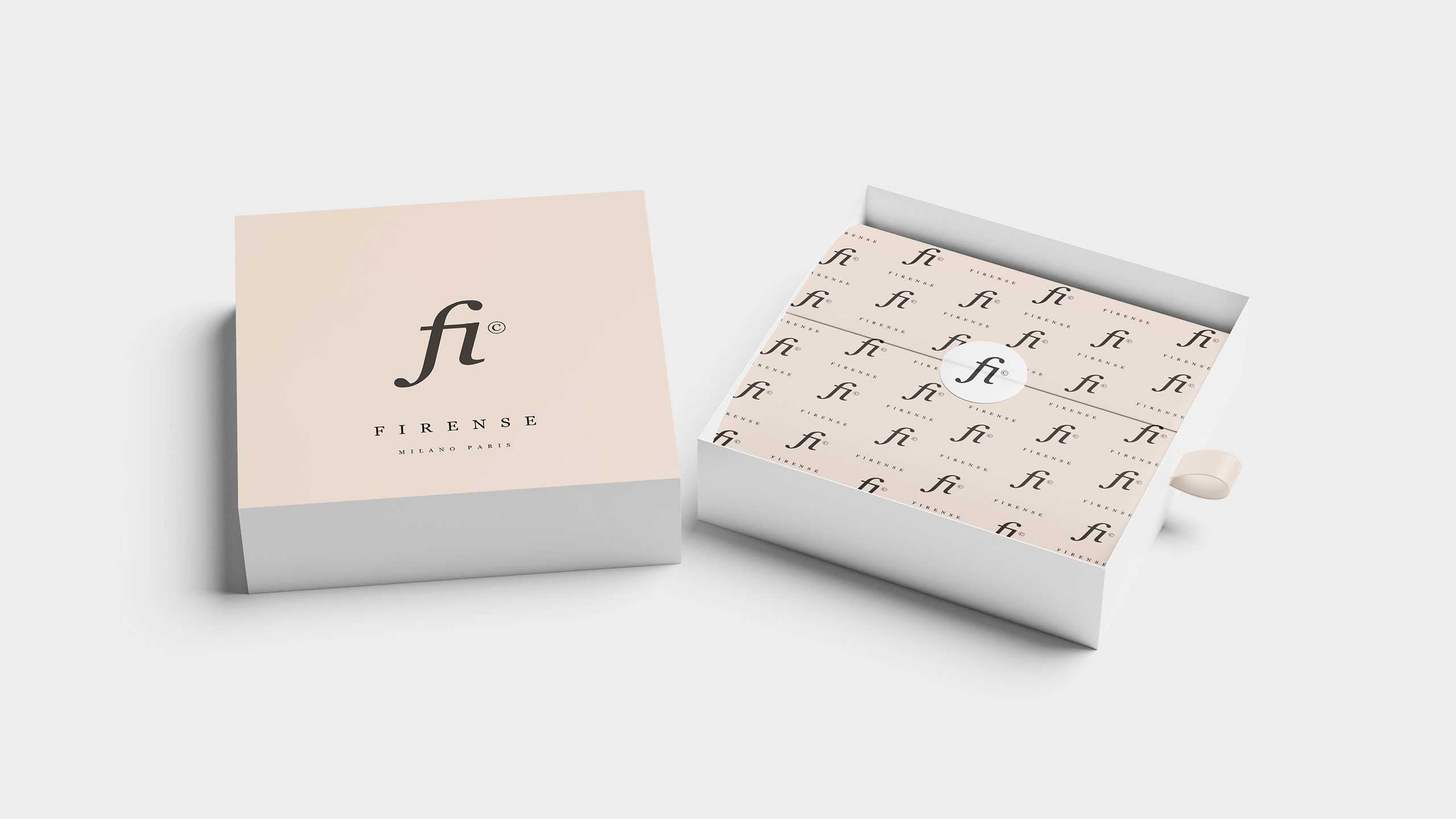
The graphic design for Fi by Firense, a brand specializing in cosmetics and perfumery, is applied across various supports such as packaging, bags, booklets, and posters. The dominant colors are white and light beige, symbolizing purity and nature. The design follows minimalism and natural elegance, with soft, feminine typography in the logo.
Concept and Intimacy
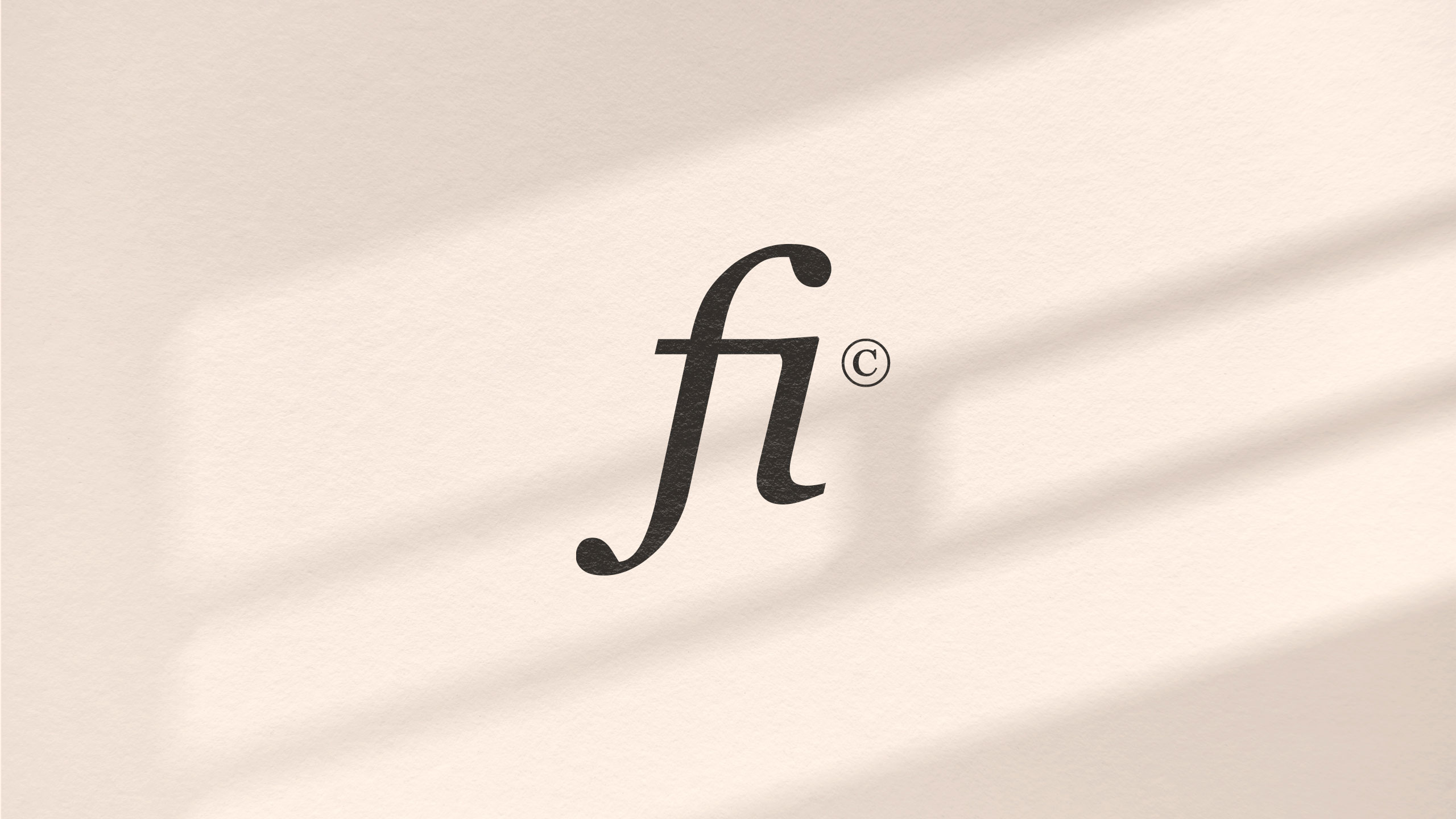
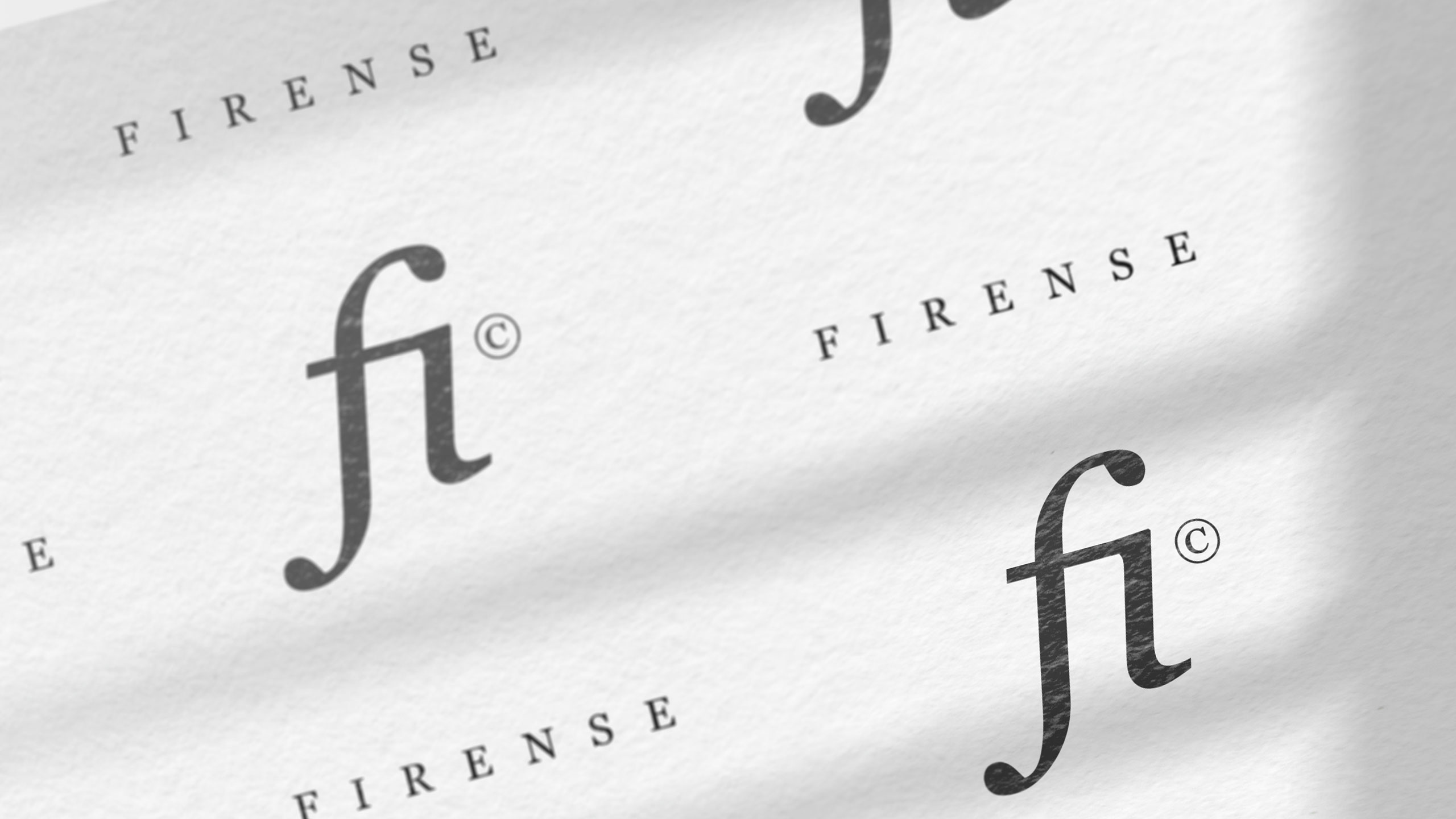
The "Fi" ligature creates a strong visual identity, fostering intimacy with the consumer, almost like a personal nickname. It invites the consumer into the private world of the brand. Perfume, inherently intimate, enhances this personal connection, evoking a secret garden.
Related
03
Whether you prefer a quick call or a detailed message, we're here to listen.

Unbrake

Flo

Factory

Blackjack 8