


Description
02
The Core Challenge
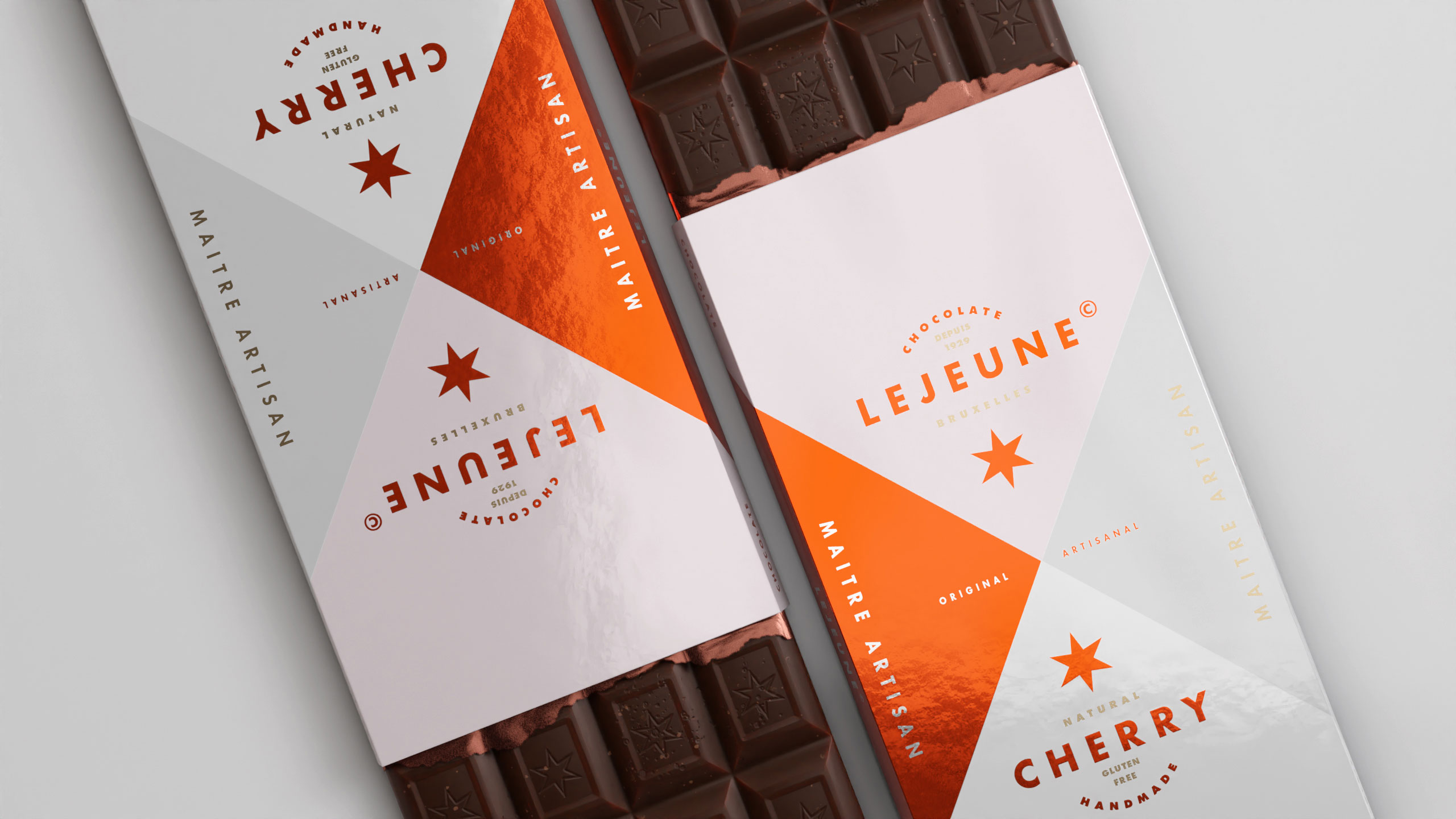
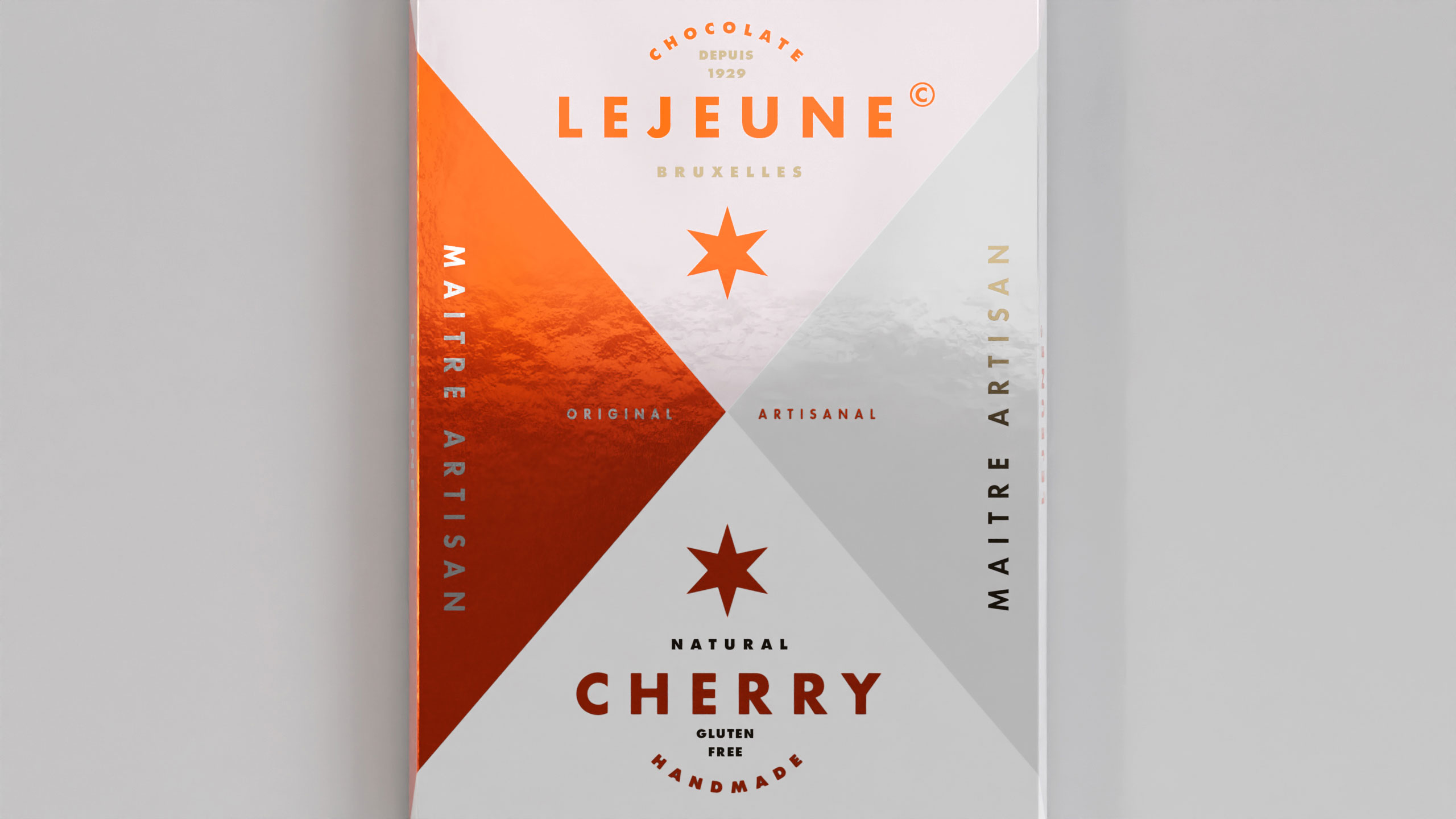
How can a chocolate packaging communicate artisanal excellence while standing out on modern shelves? Lejeune solves this by merging geometric purity, heritage cues, and premium finishes into a timeless graphic identity.
Visual Language and Structure
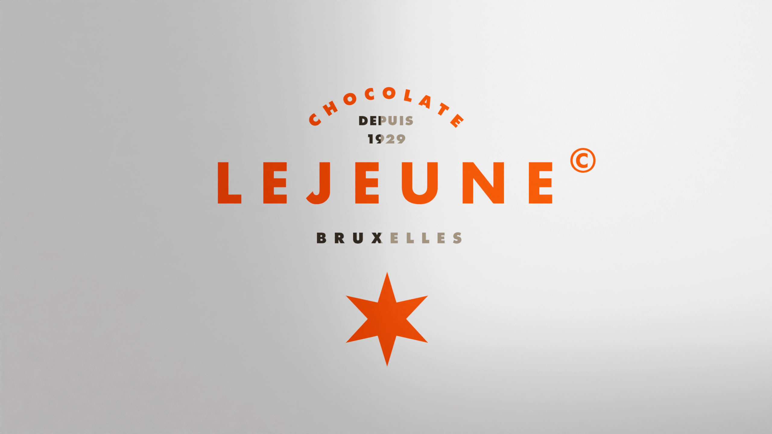
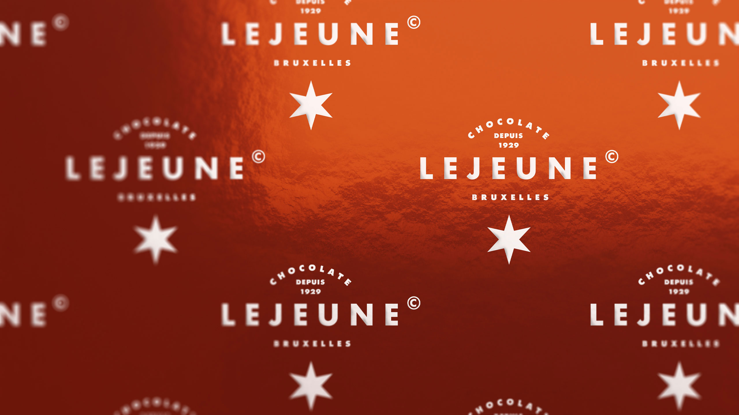
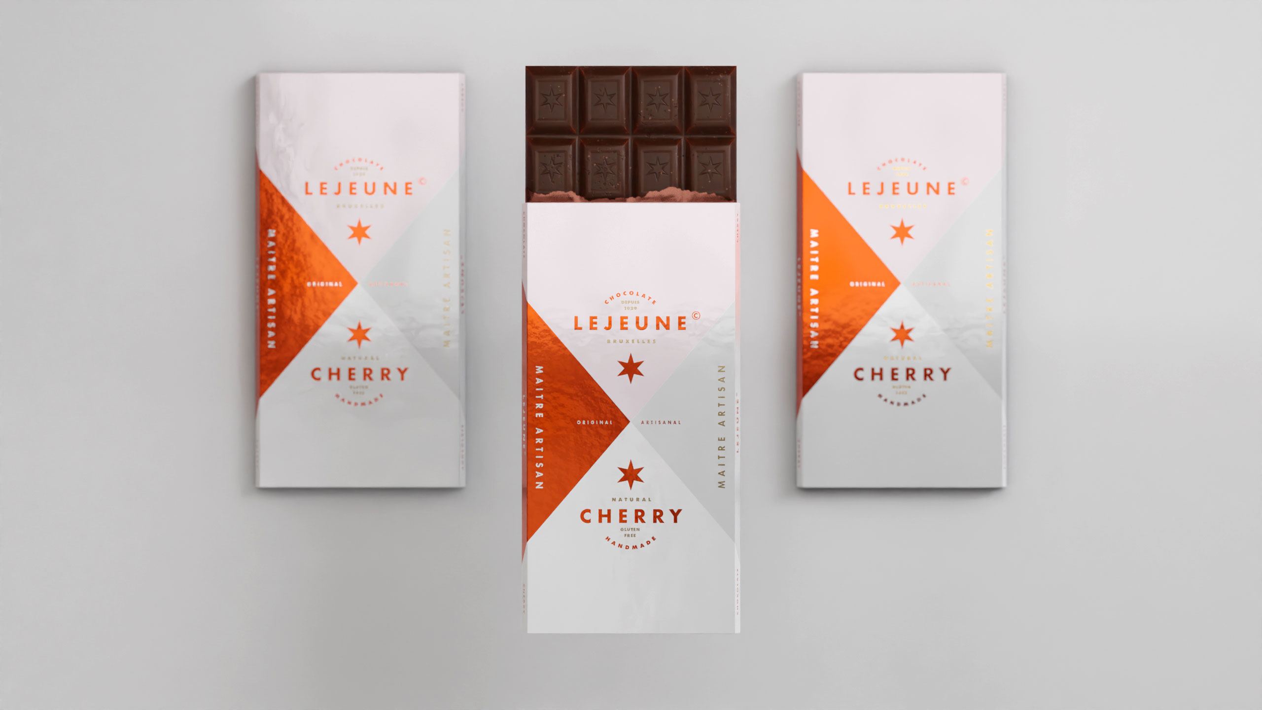
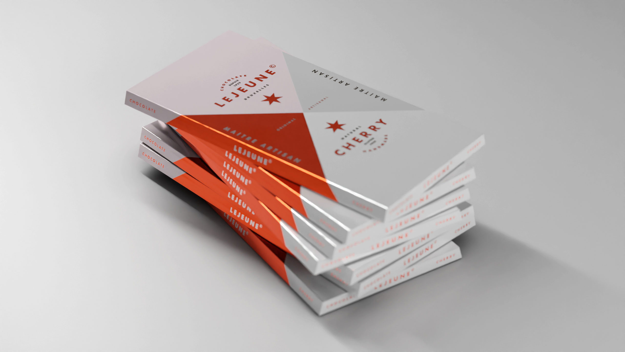
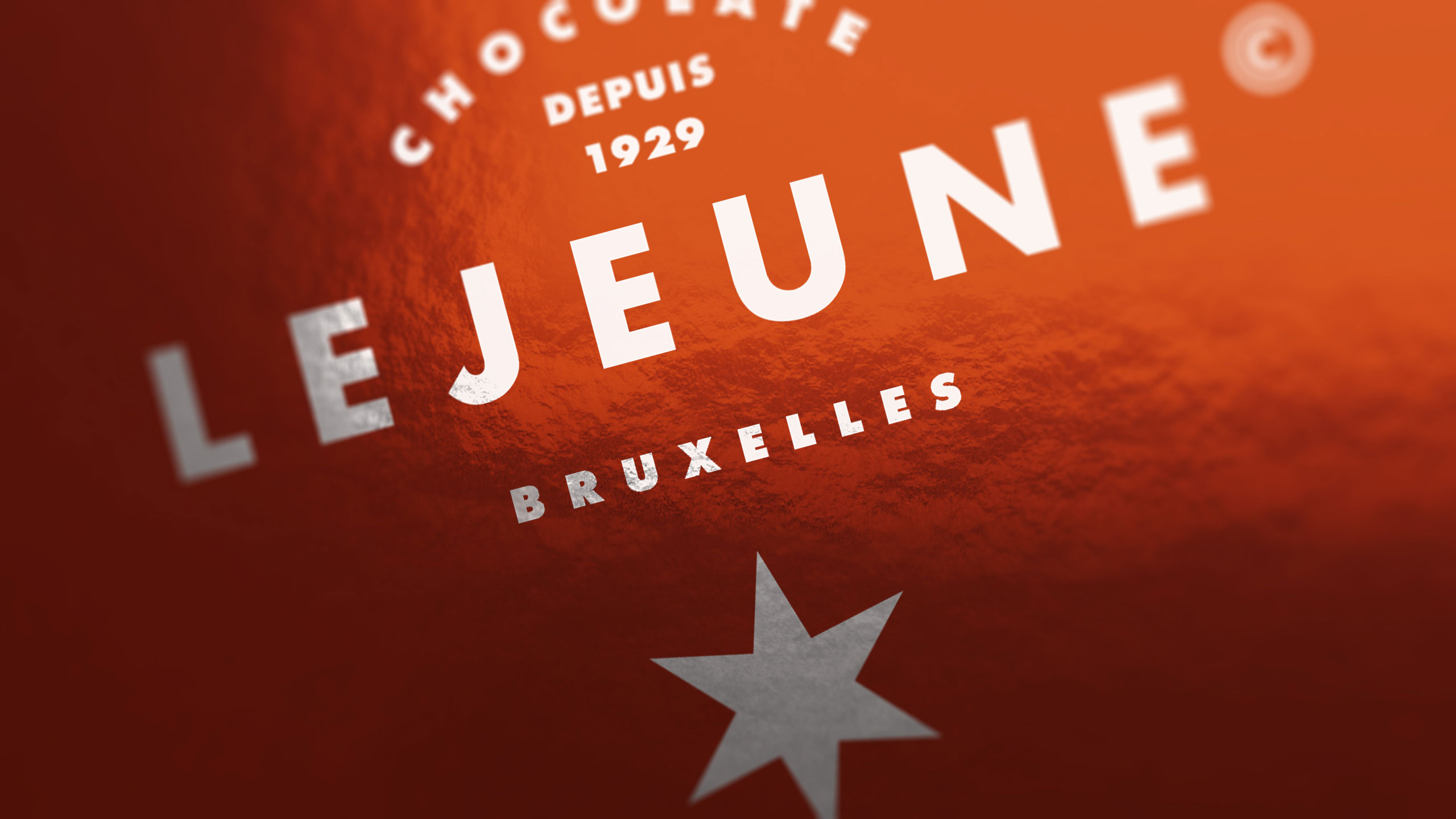
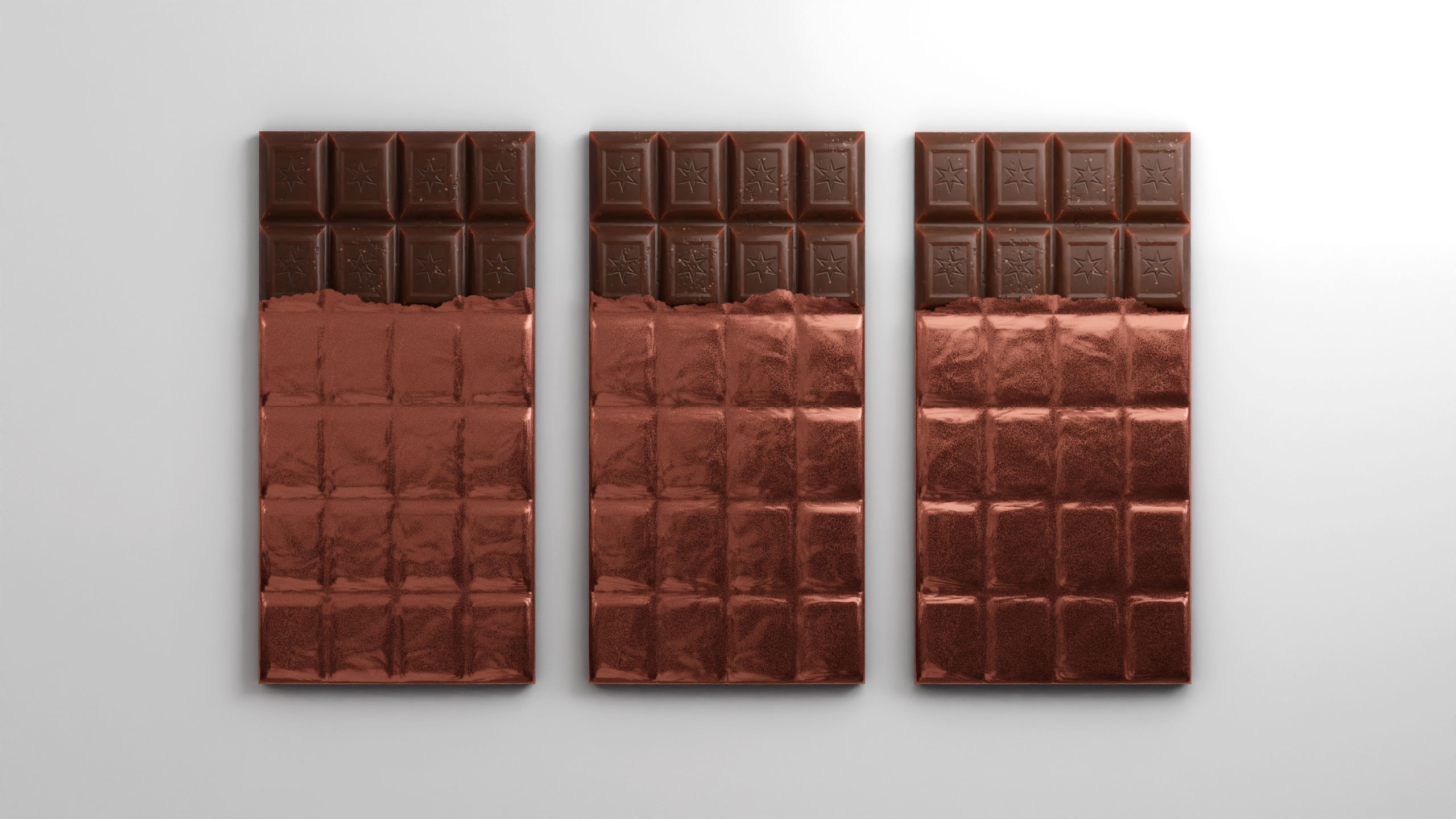
The packaging design for Lejeune chocolate blends minimalism and elegance through a bold geometric cross layout in white, matte silver, and bright metallic copper foil. This artisan brand from Brussels emphasizes its handcrafted quality through symmetrical type placement, clean typography, and the use of the eight-pointed star as a signature mark.
Finishes and Positioning
The diagonal split of the wrapper both frames and enhances the brand name and flavor (cherry), elevating perception of quality. The copper shine evokes premium tradition while the restraint of the layout speaks of refinement. It feels both classic and contemporary—a design as refined as the chocolate it protects.
Related
03
Whether you prefer a quick call or a detailed message, we're here to listen.

Unbrake

Flo

Factory

Blackjack 8