


Description
02
The Core Challenge
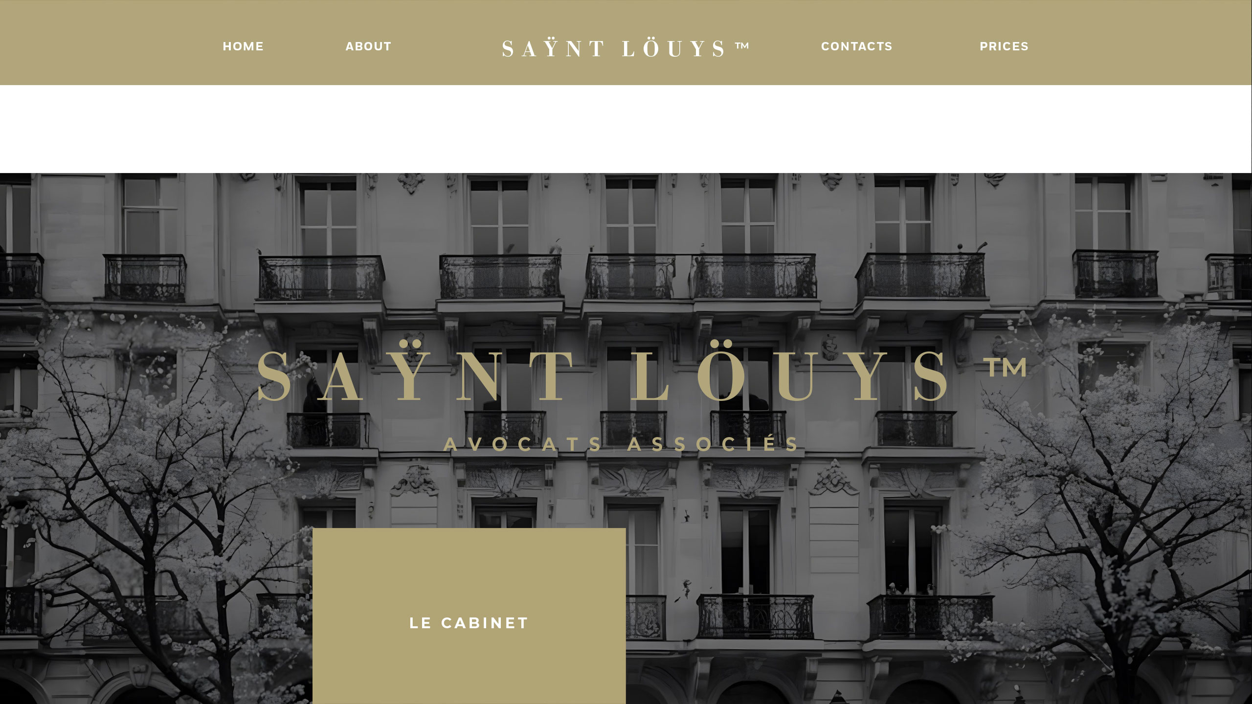
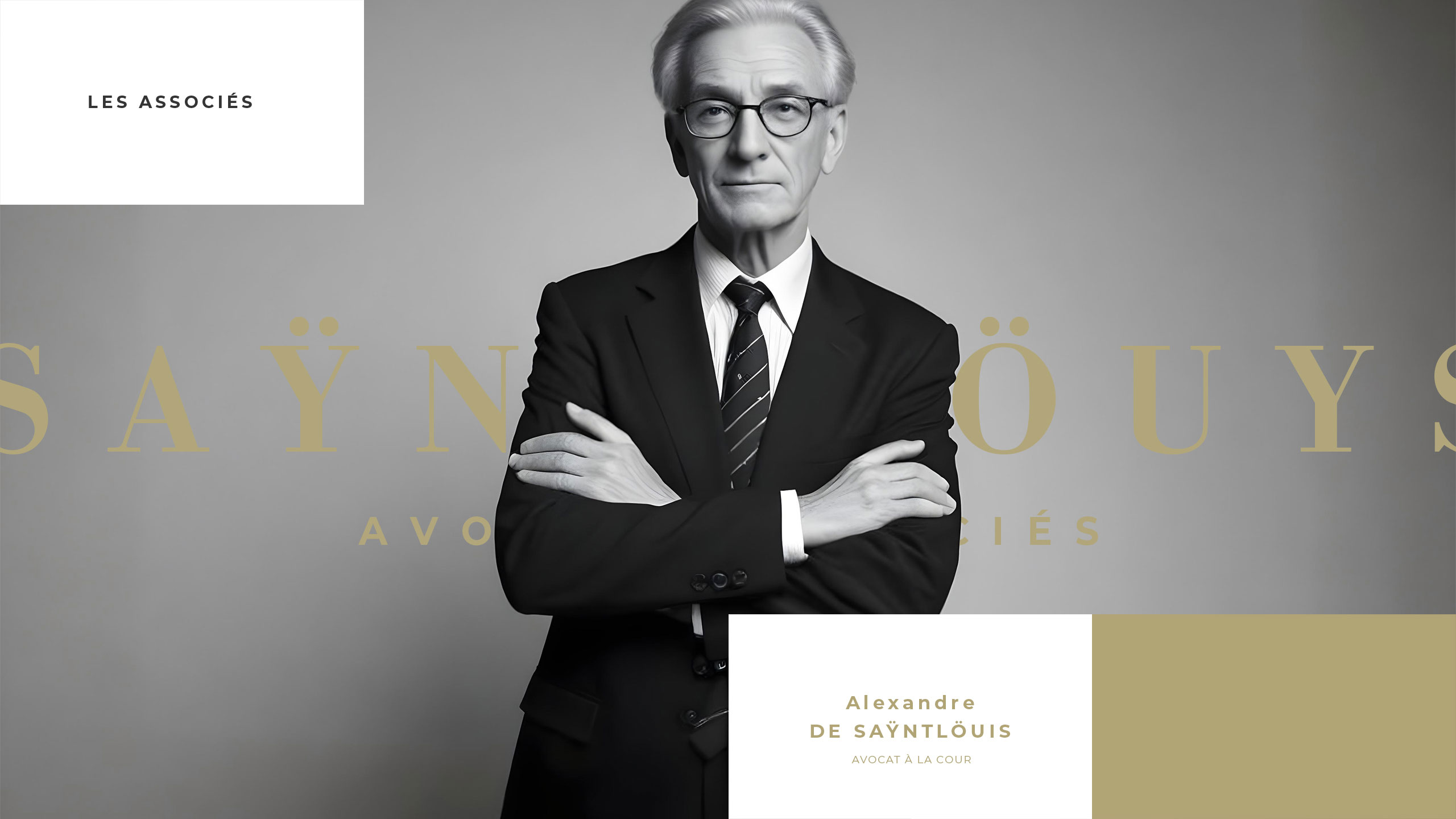
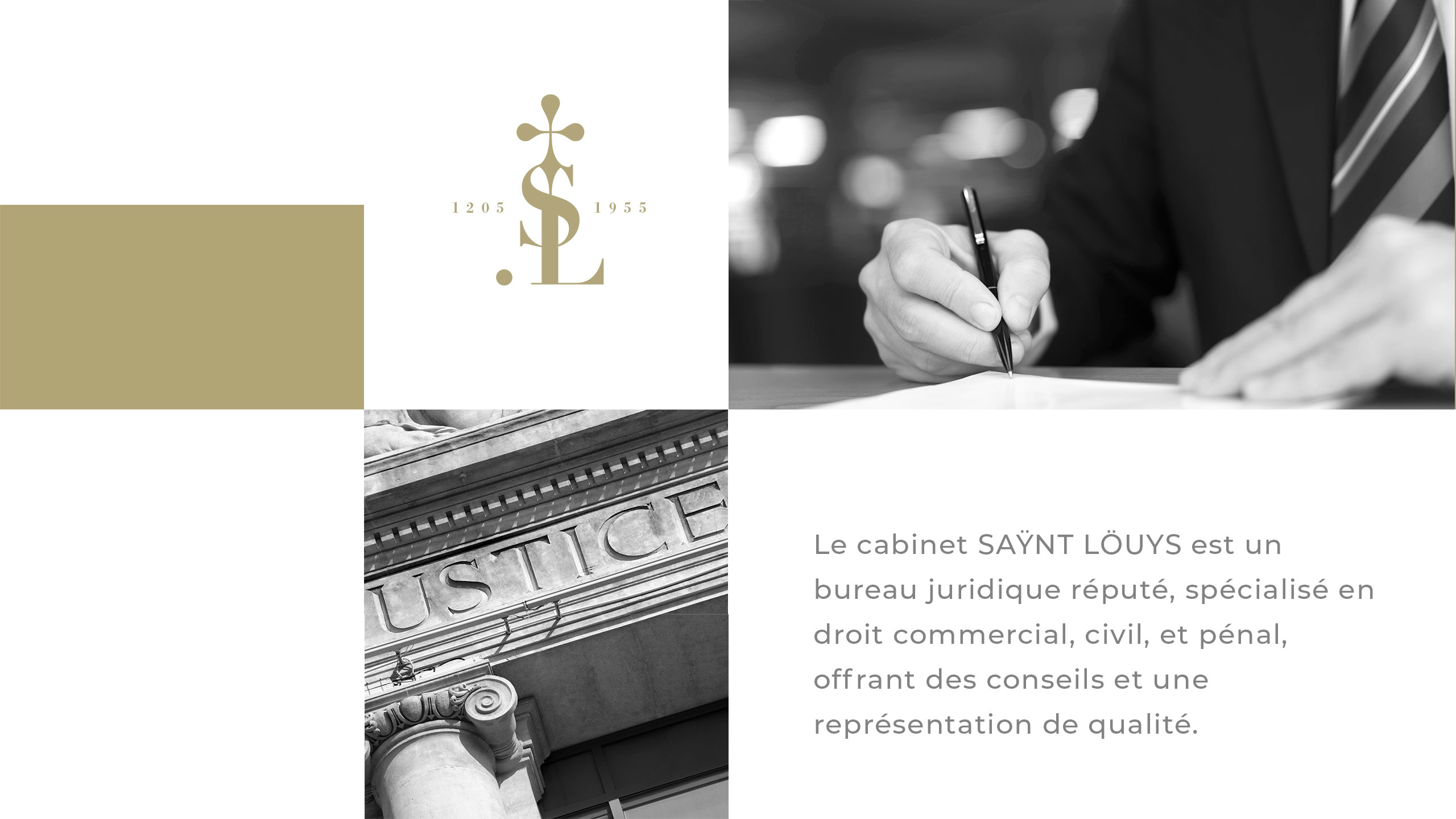
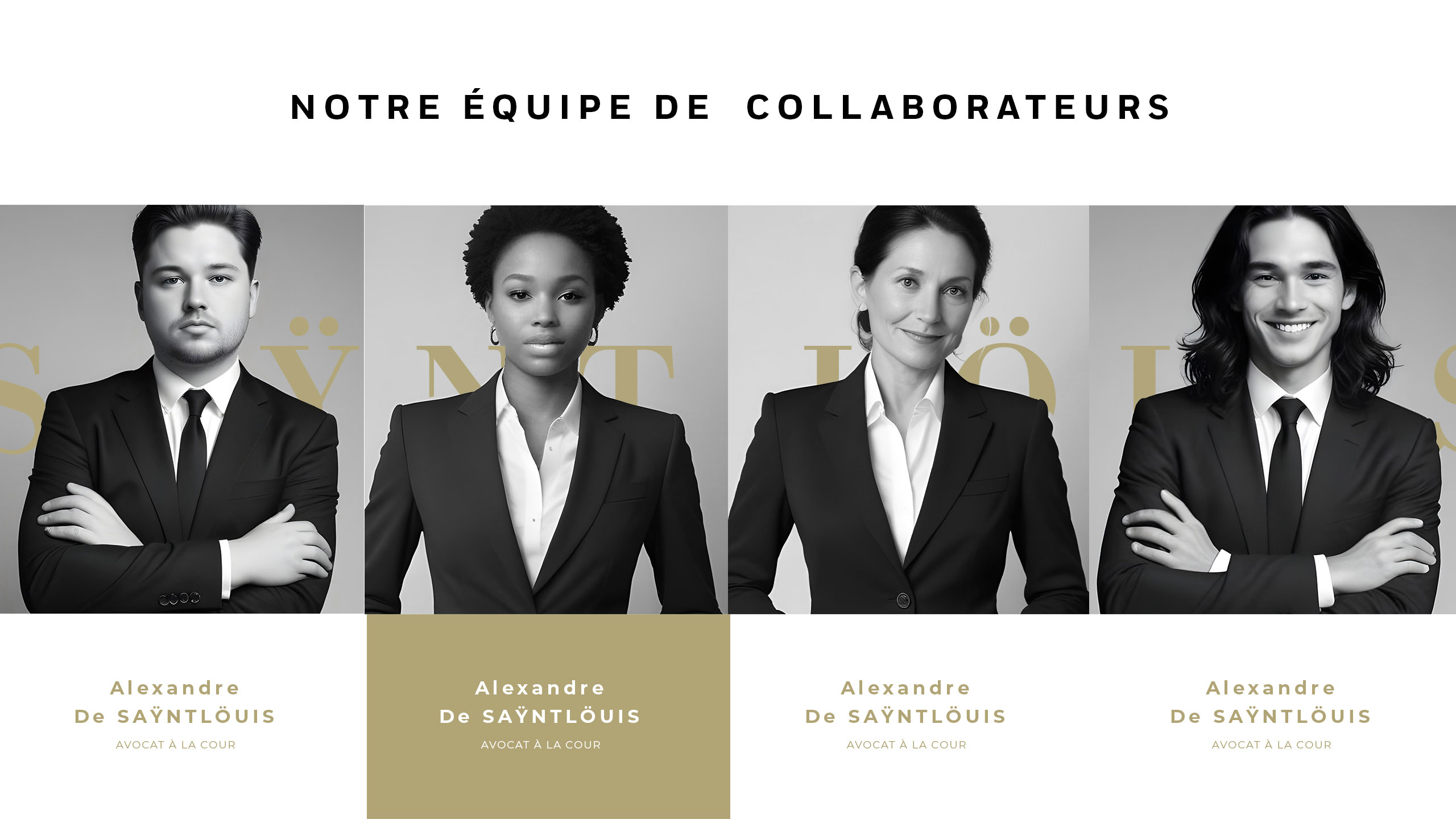
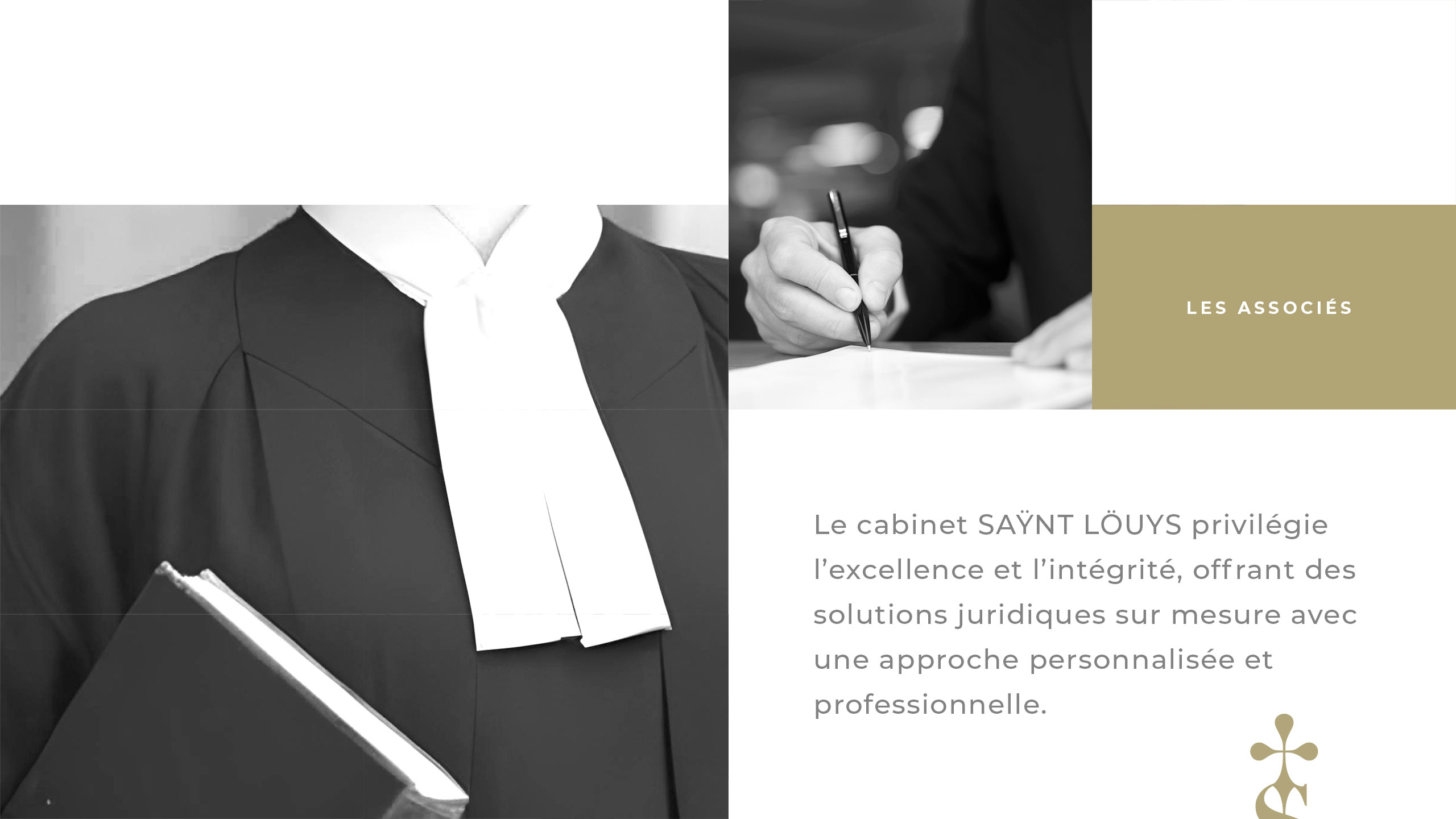
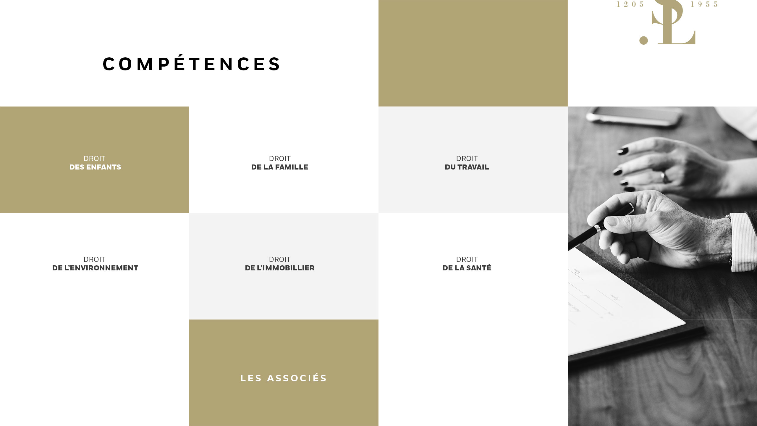
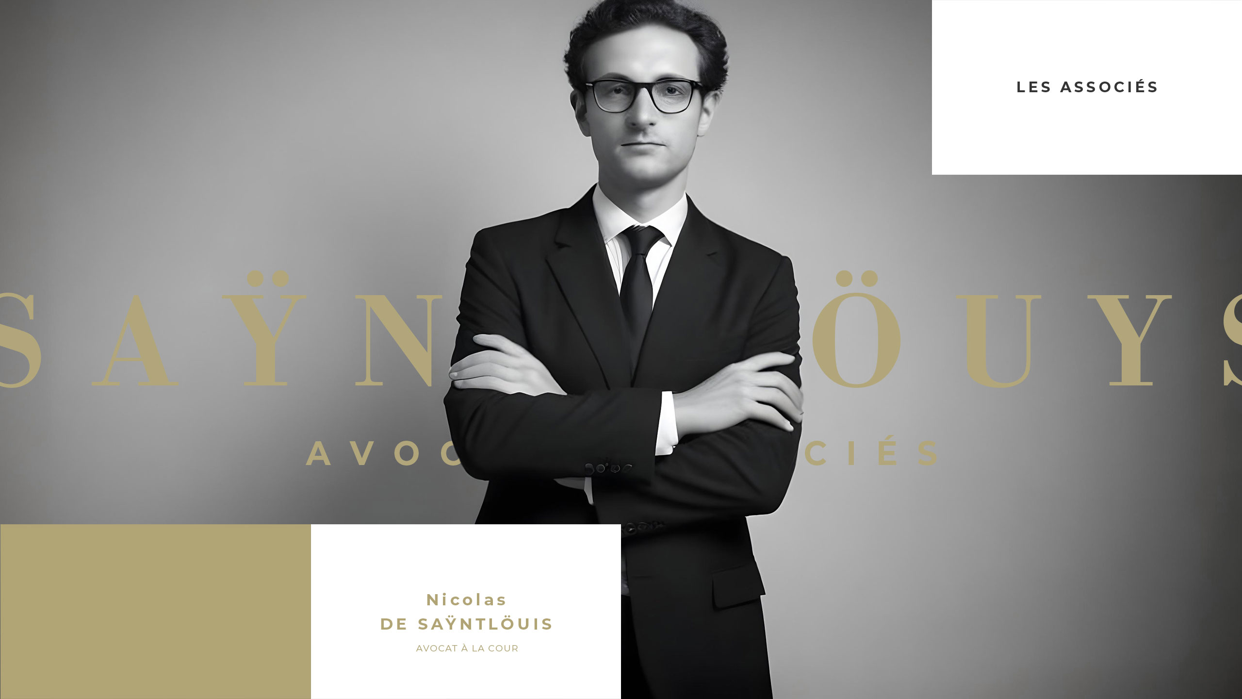
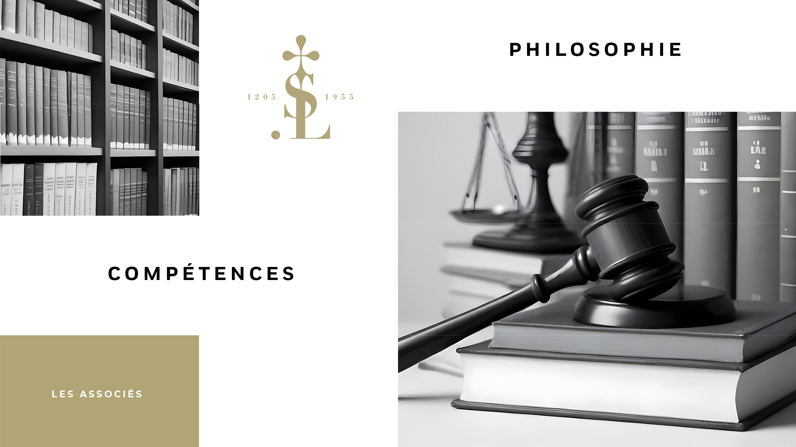
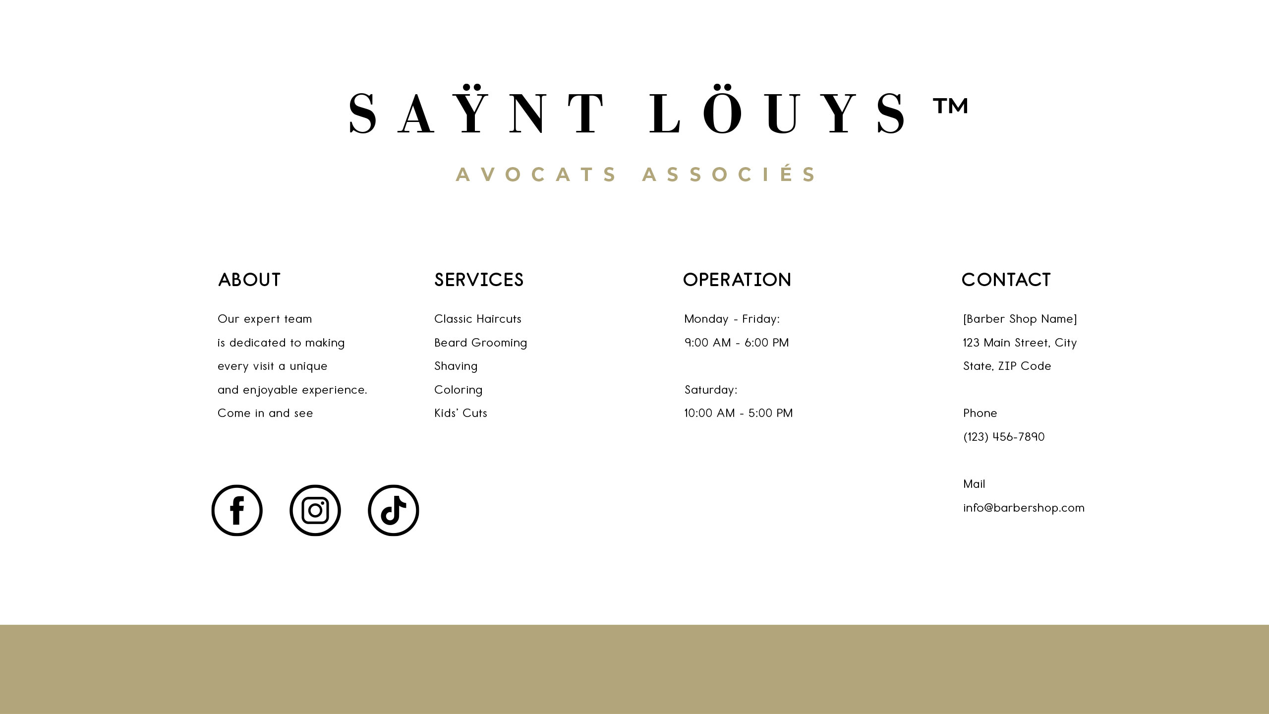
Saÿnt Löuys' graphic design blends classic black and gold to evoke timeless prestige. Its emblem, inspired by justice and royal heritage, crafts a dignified, authoritative identity for the law firm.
Visual Language and Emblem
The graphic design for Saÿnt Löuys, a law firm, conveys timeless prestige through a classic visual identity. Featured on business cards, a seal, and the website, the design uses a refined black and gold color palette, evoking elegance and authority. At its center is a monogram symbolizing a balance of justice, topped with a cross, subtly intertwined with an "S" resembling a caduceus.
Heritage and Identity
This emblem also appears as a royal seal, referencing Saint Louis—King of France and historic figure of divine justice. The design reflects heritage, dignity, and the noble roots of law, blending symbolism with sober sophistication.
Related
03
Whether you prefer a quick call or a detailed message, we're here to listen.

Bombyx

HoverSpeed

Kerozen

Eighteen