


Description
02
The Core Challenge
How can ecological certification be visually translated into a recognizable, trustworthy emblem—one that conveys sustainable values and speaks meaningfully to both producers and consumers through form, color, and material?
Visual Language and Symbolism
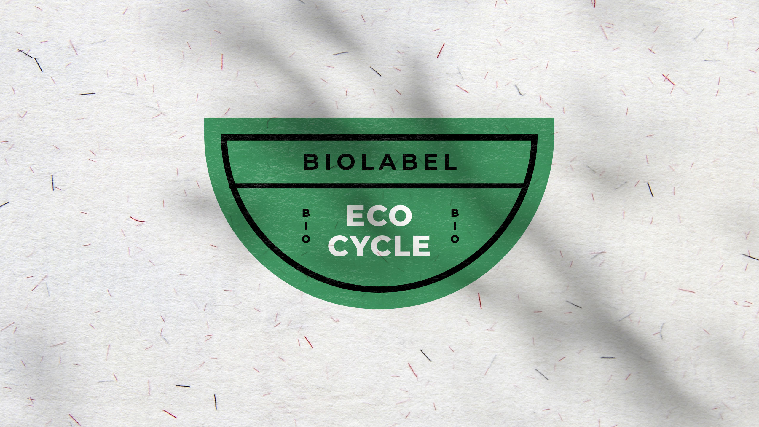
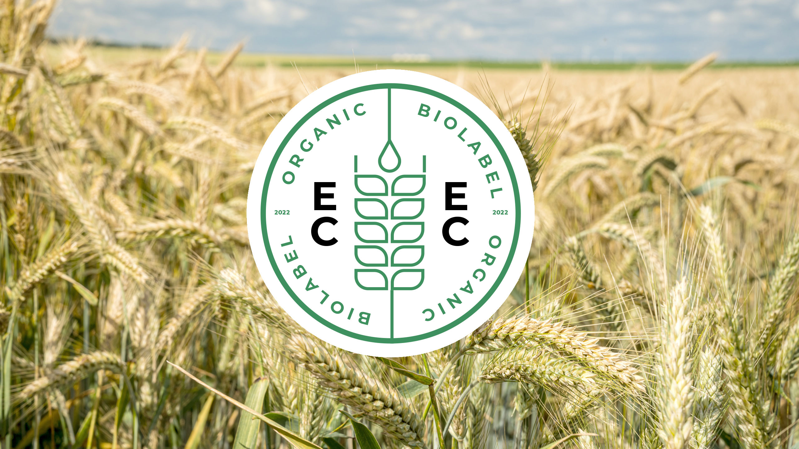
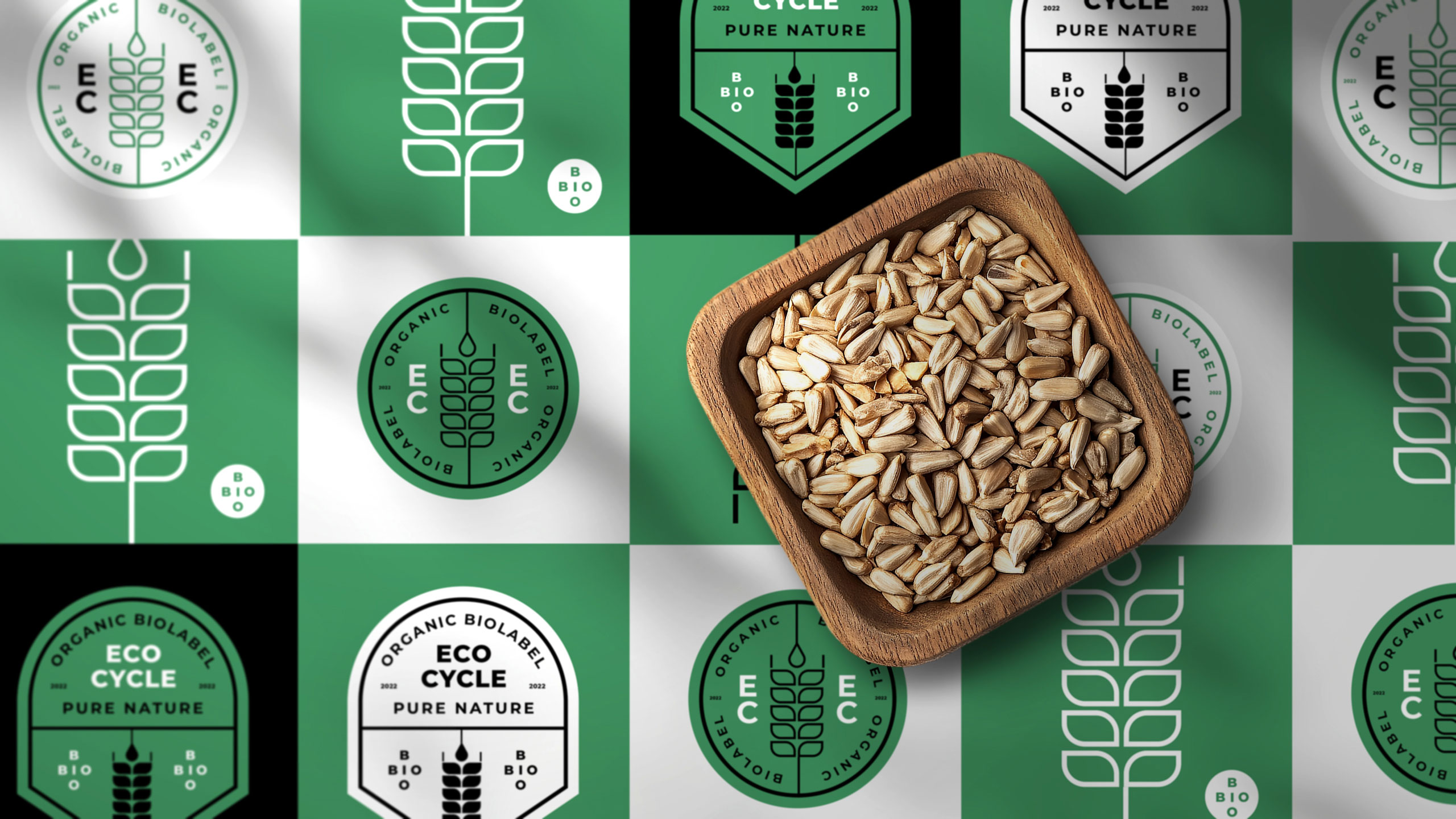
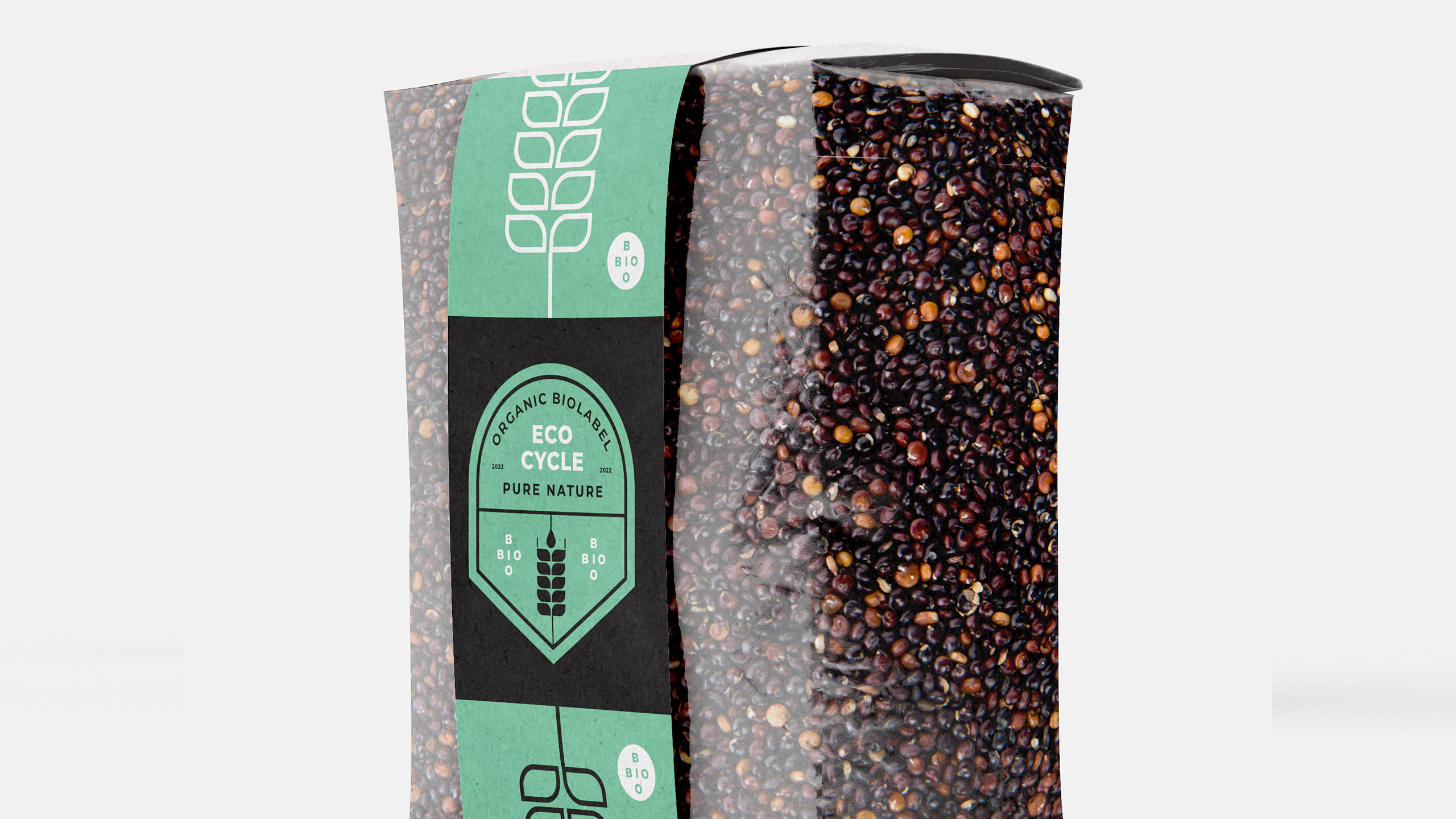
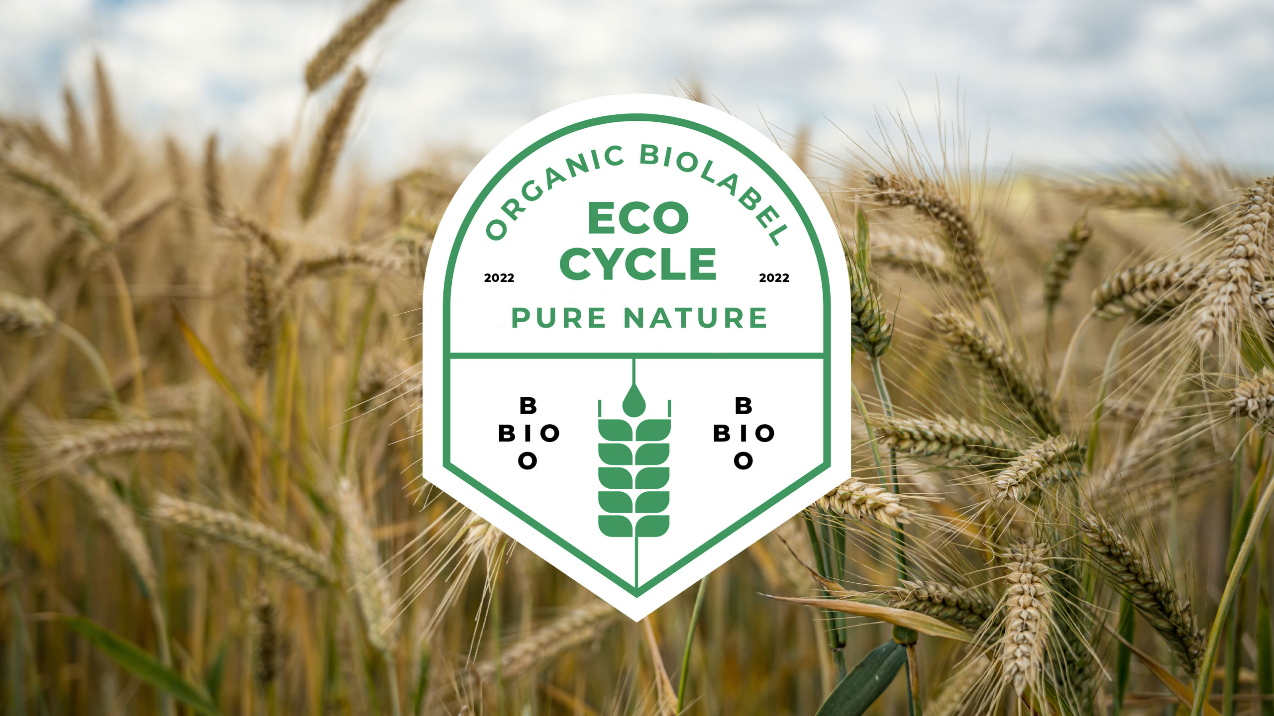
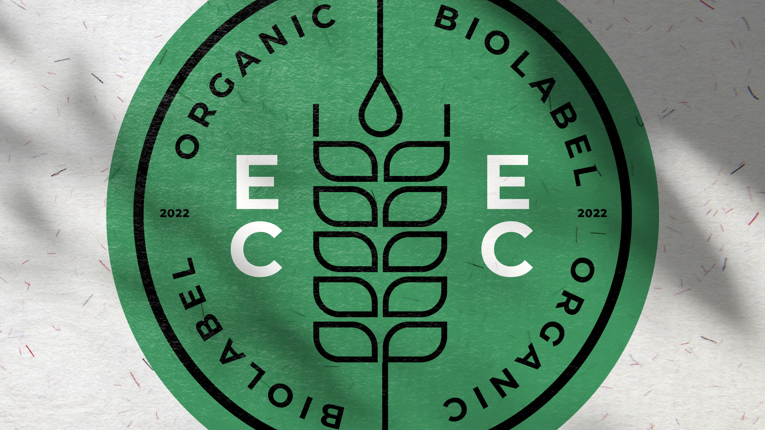
At the center of Eco Cycle's identity, a stylized geometric wheat ear symbolizes certification, reward, and ecological commitment. Designed as a formal emblem, the motif evokes the prestige of a diploma or seal of approval, reinforcing the trustworthiness of the organic label. The dominant colors—green and ecru—highlight natural values and sustainable practices.
Application and Message
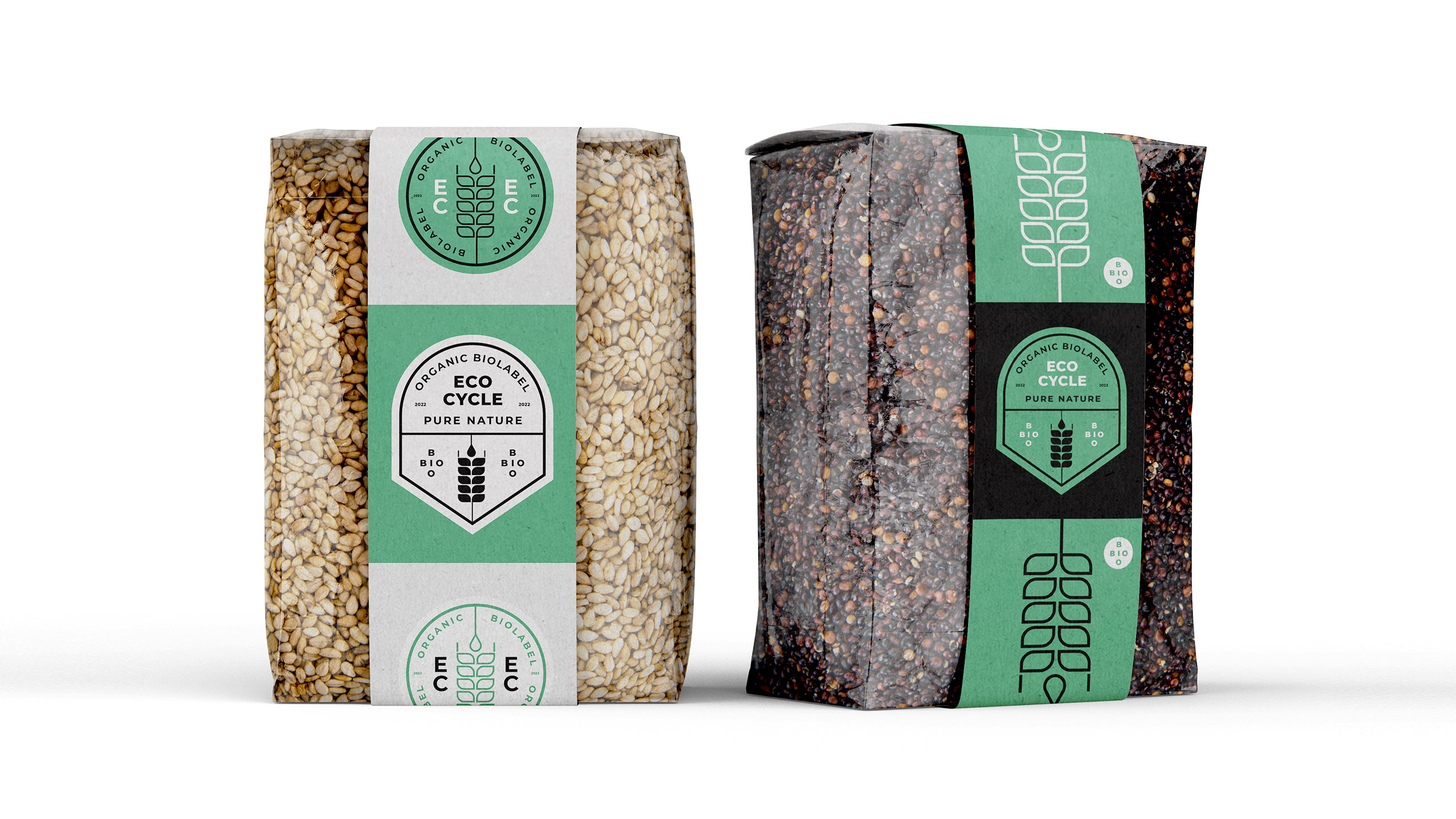
Applied to seed packets, bags, and caps, the design combines clarity with symbolic strength. The use of recycled paper in communication materials further emphasizes the label's environmental integrity. This visual language speaks to producers and consumers alike: certification not just as a stamp, but as a promise to the Earth.
Related
03
Whether you prefer a quick call or a detailed message, we're here to listen.

OVER

Café Lenoirs

Blen-Beck

Whare House