


Description
02
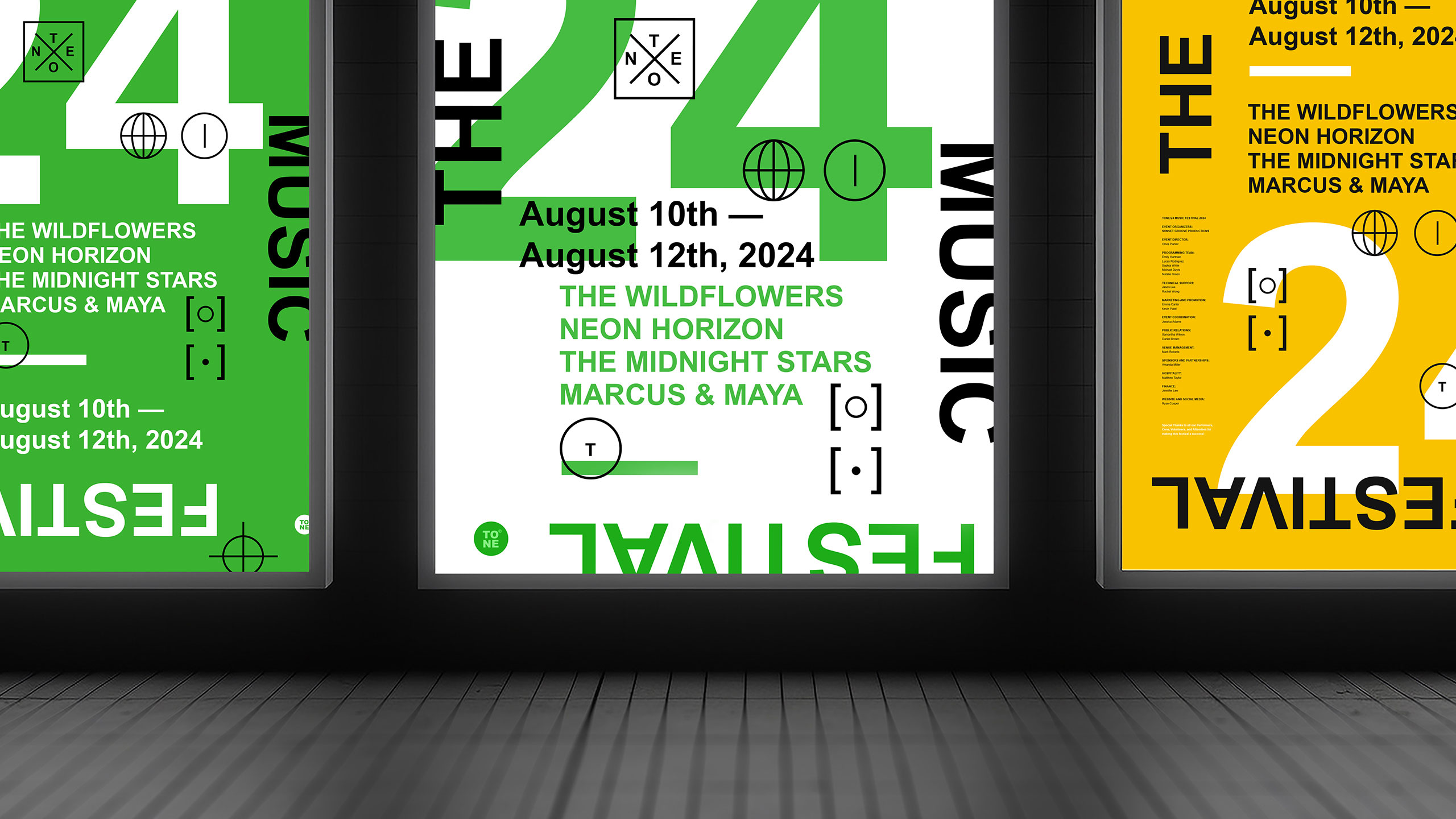
The Core Challenge
How can graphic design capture youthful energy and spontaneity for a music festival? TONE 24 uses bright colors and dynamic typography, creating a playful, DIY aesthetic that celebrates rhythm and
Visual Language and Concept
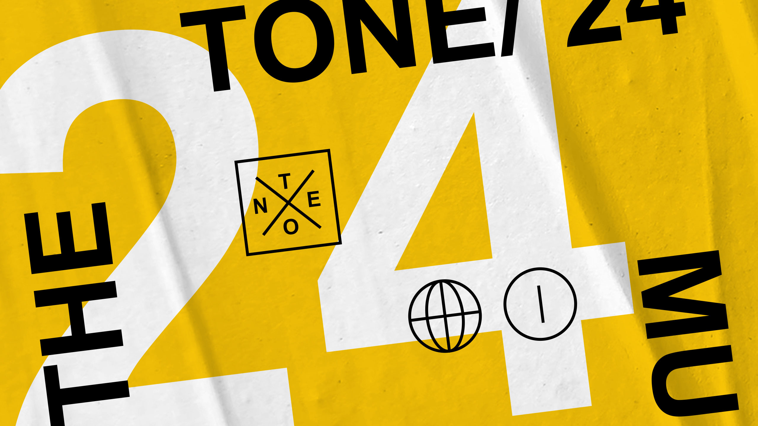
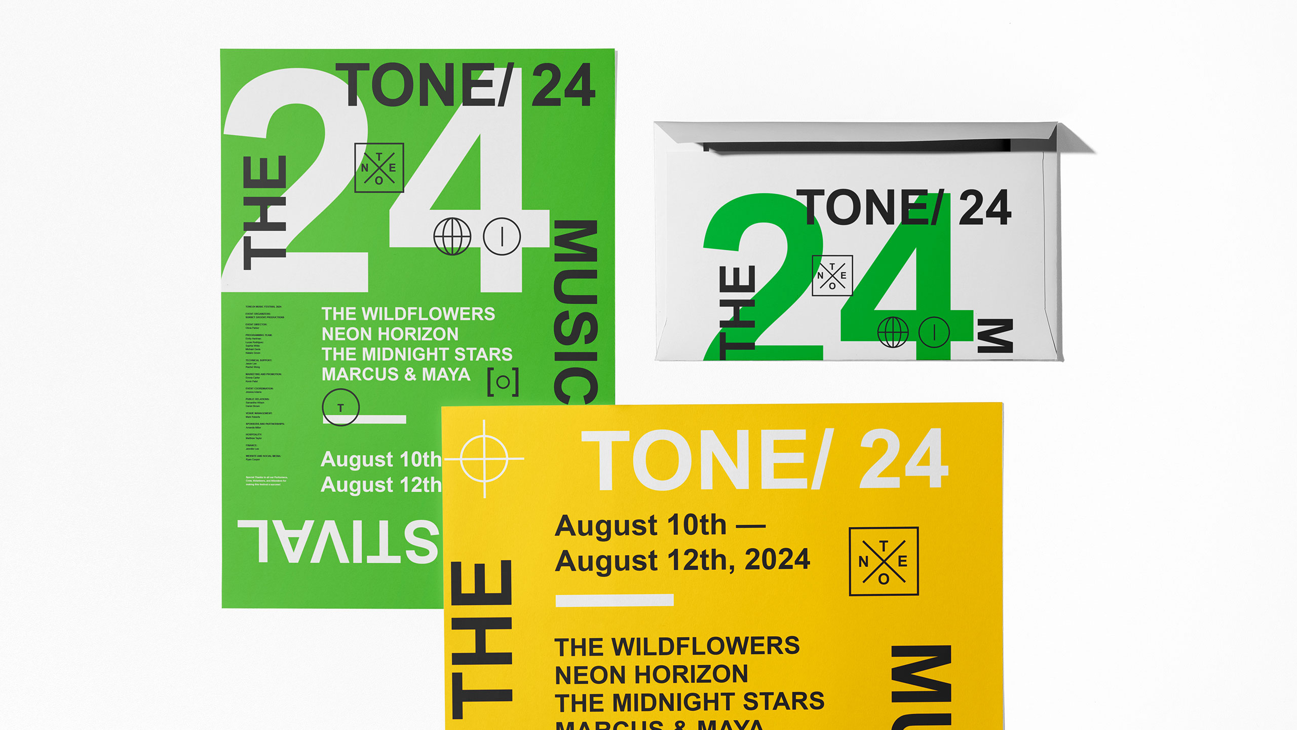
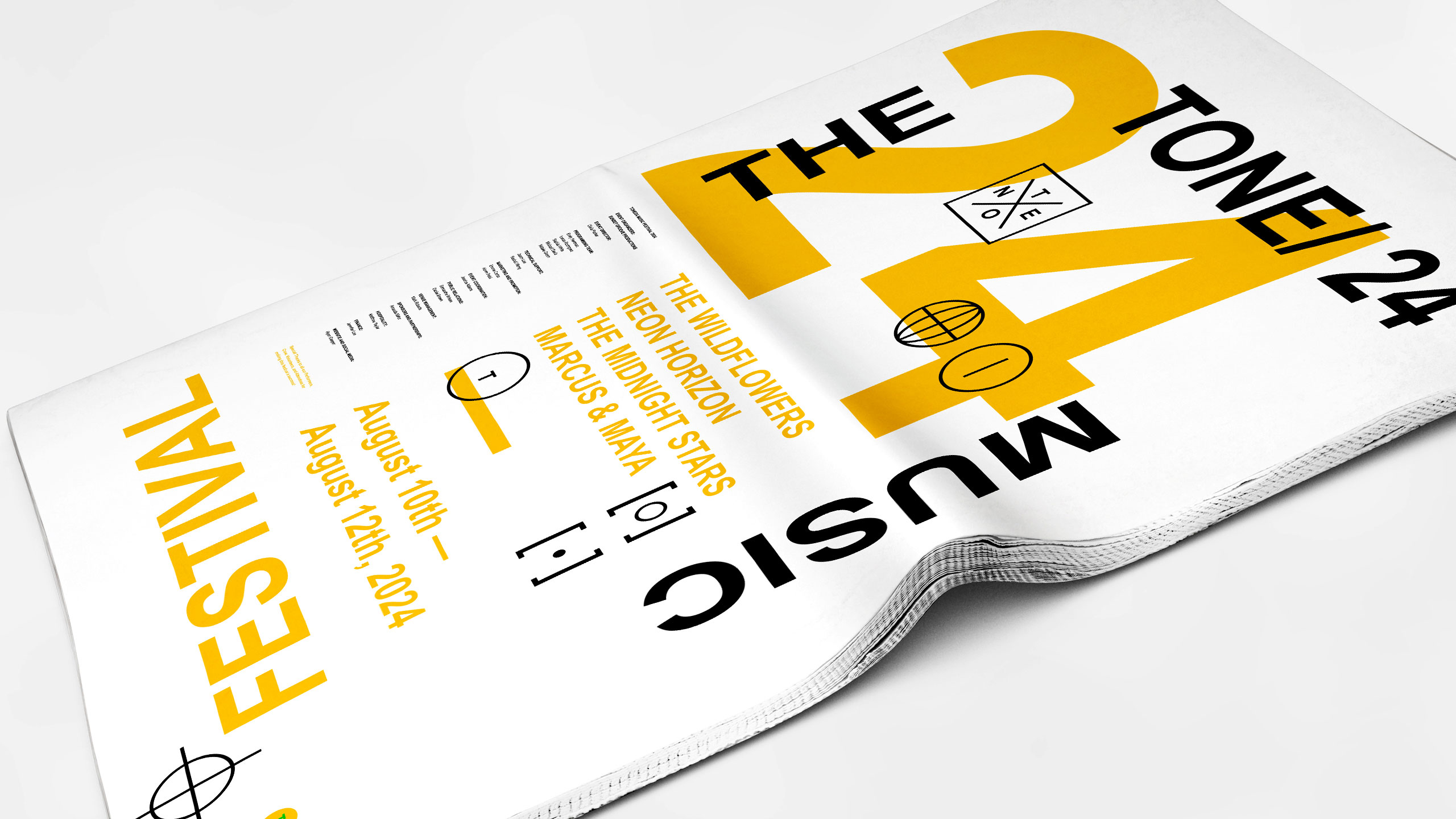
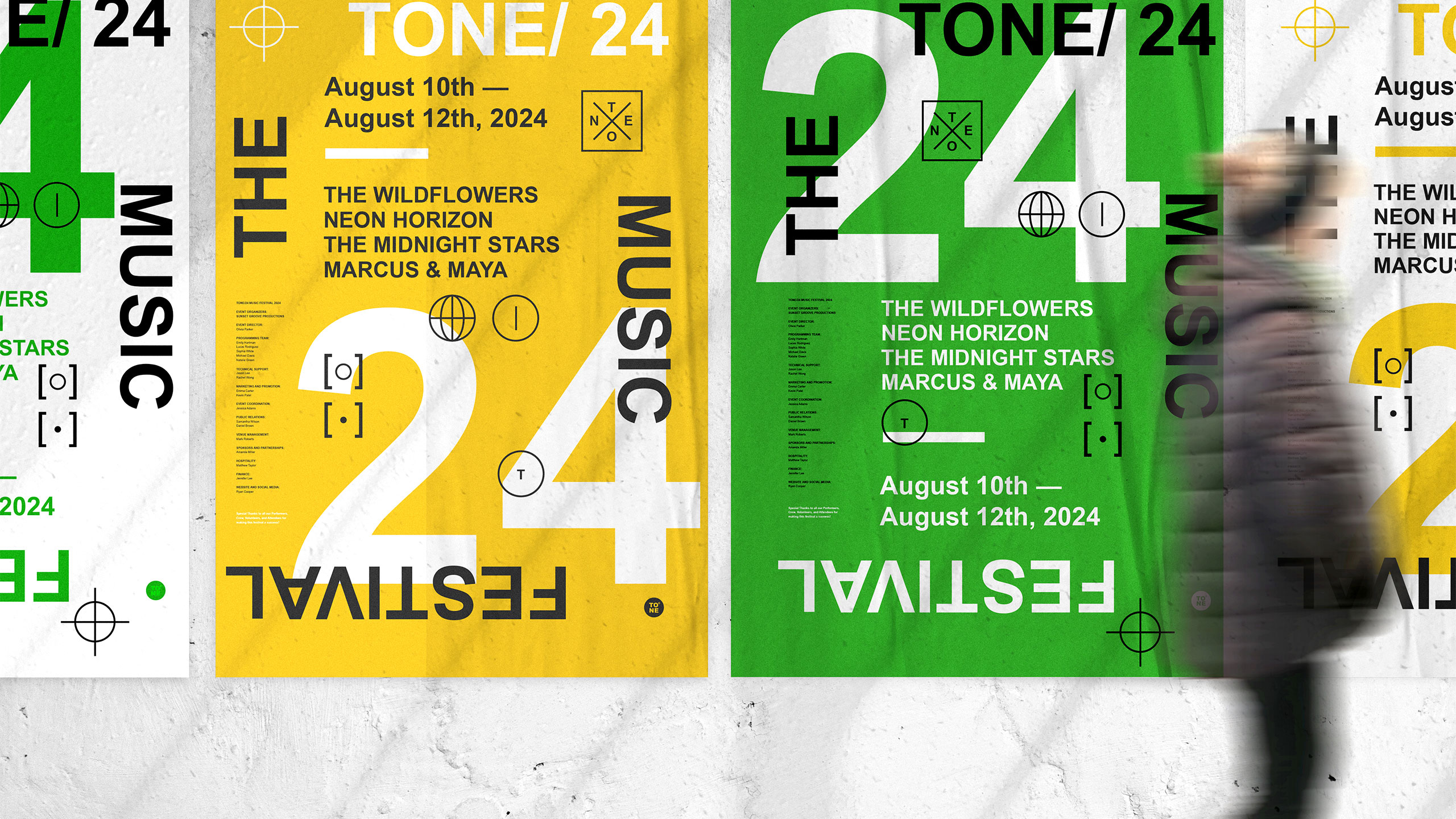
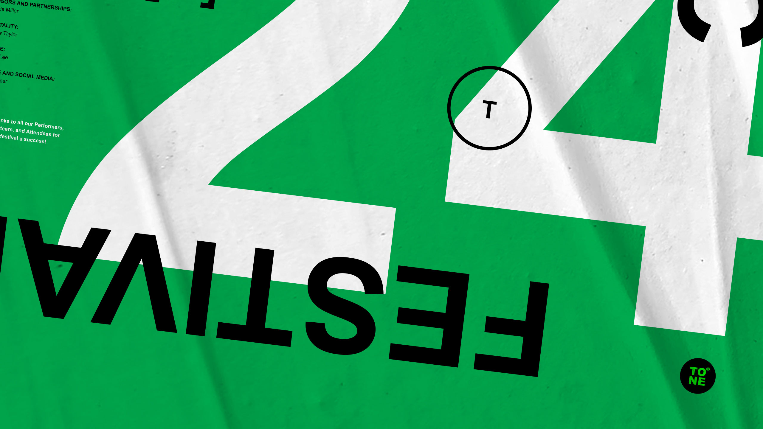
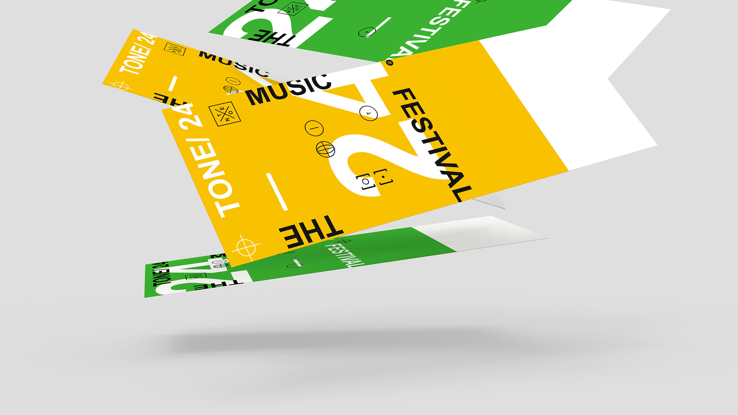
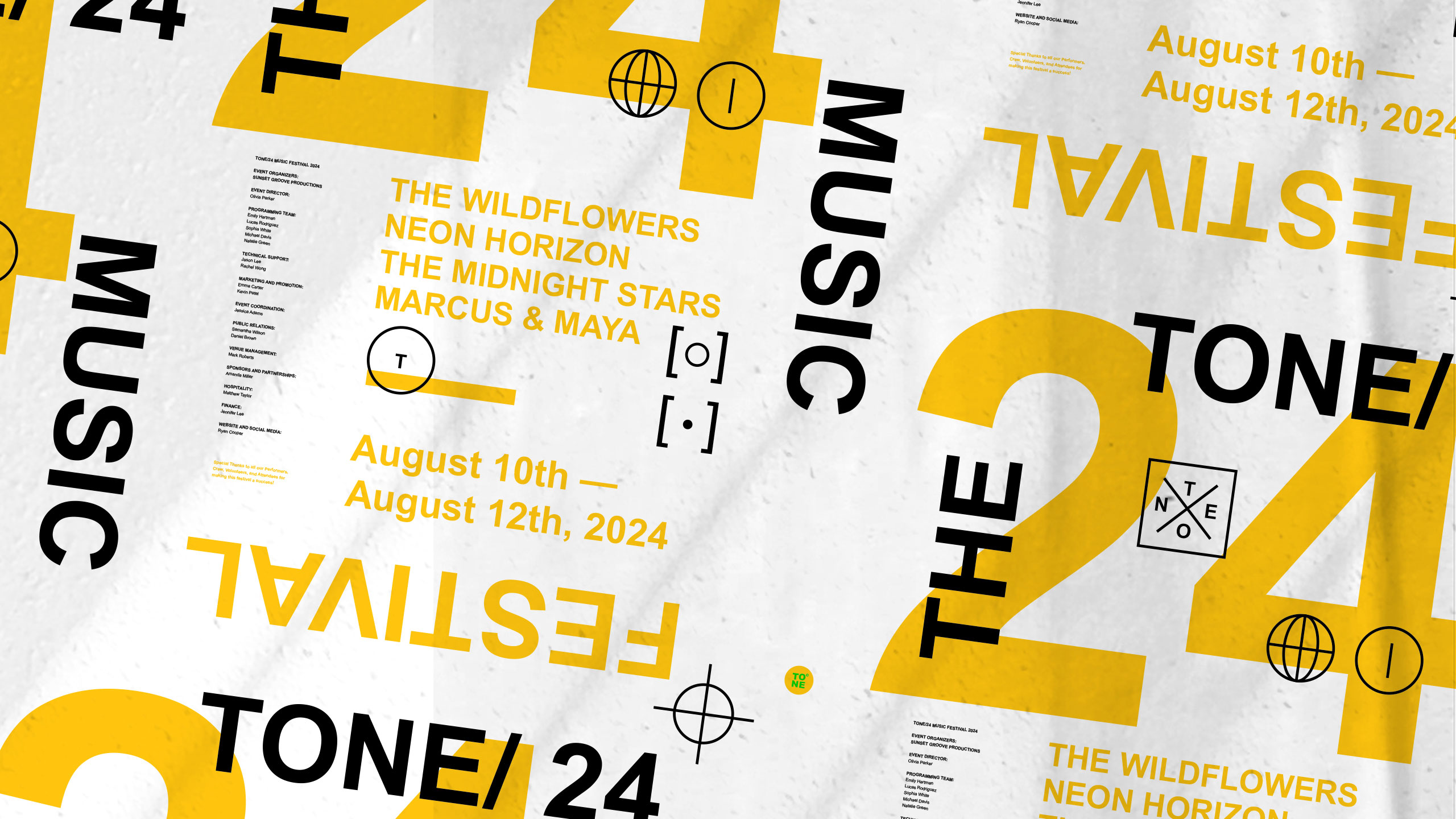
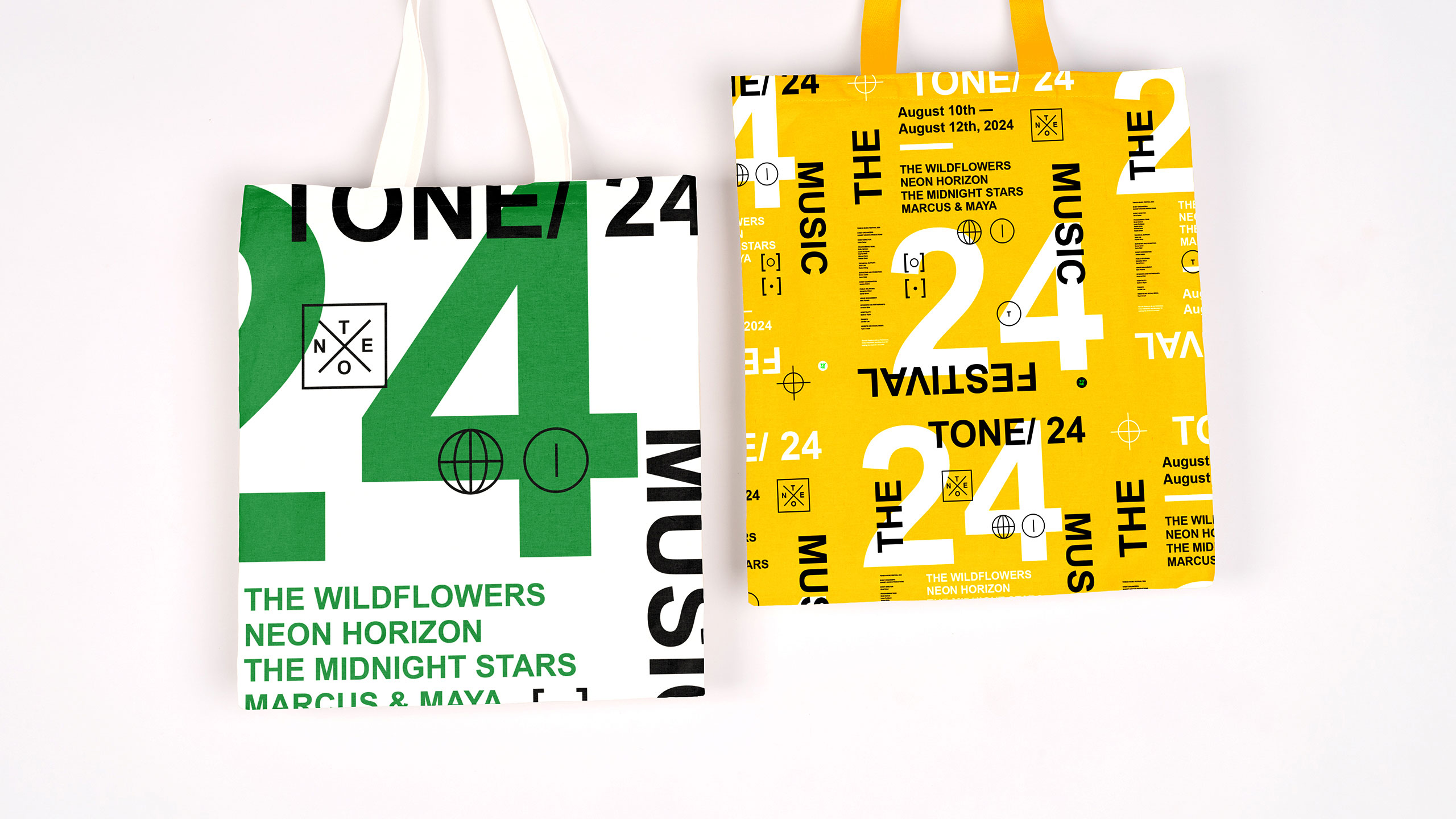
The visual identity of TONE 24, a music festival, is energetic and youthful, reflecting the vibrancy of live performance. Dominated by bright, saturated colors, the graphic design captures the spirit of celebration and rhythm. The number "24" — representing this year's edition — becomes the central design element, animated through playful, dynamic typography. The layout is reminiscent of student flyers, with an informal, DIY aesthetic that adds spontaneity and approachability.
Application and Cohesion
This bold and expressive identity is rolled out across posters, t-shirts, tote bags, tickets, books, stationery, and newspapers, uniting all touchpoints of the festival under one lively and distinctive visual language.
Related
03
Whether you prefer a quick call or a detailed message, we're here to listen.

OVER

Café Lenoirs

Blen-Beck

Whare House