


Description
02
The Core Challenge
How can editorial design embody architectural thinking? AREA Magazine's brochure uses layered, intersecting forms and unexpected imagery to mirror the structural logic and creative spontaneity that define the built environment.
Visual Language and Structure
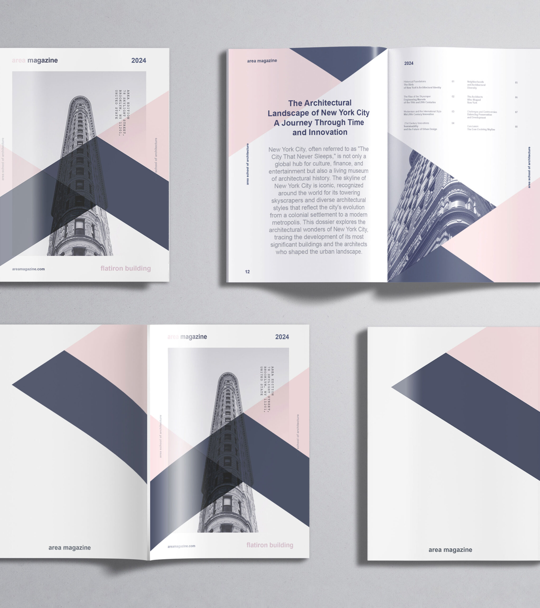
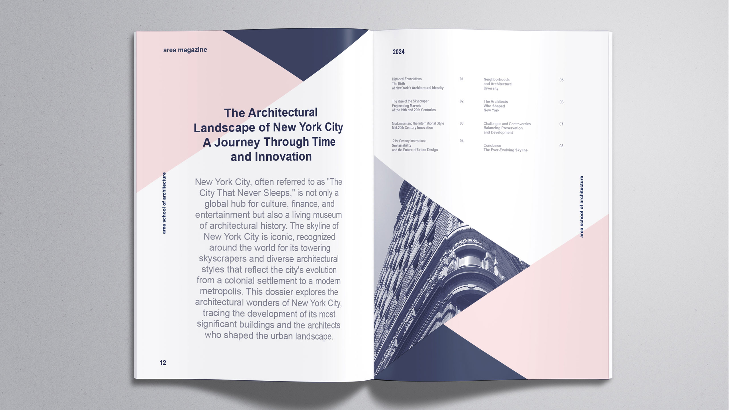
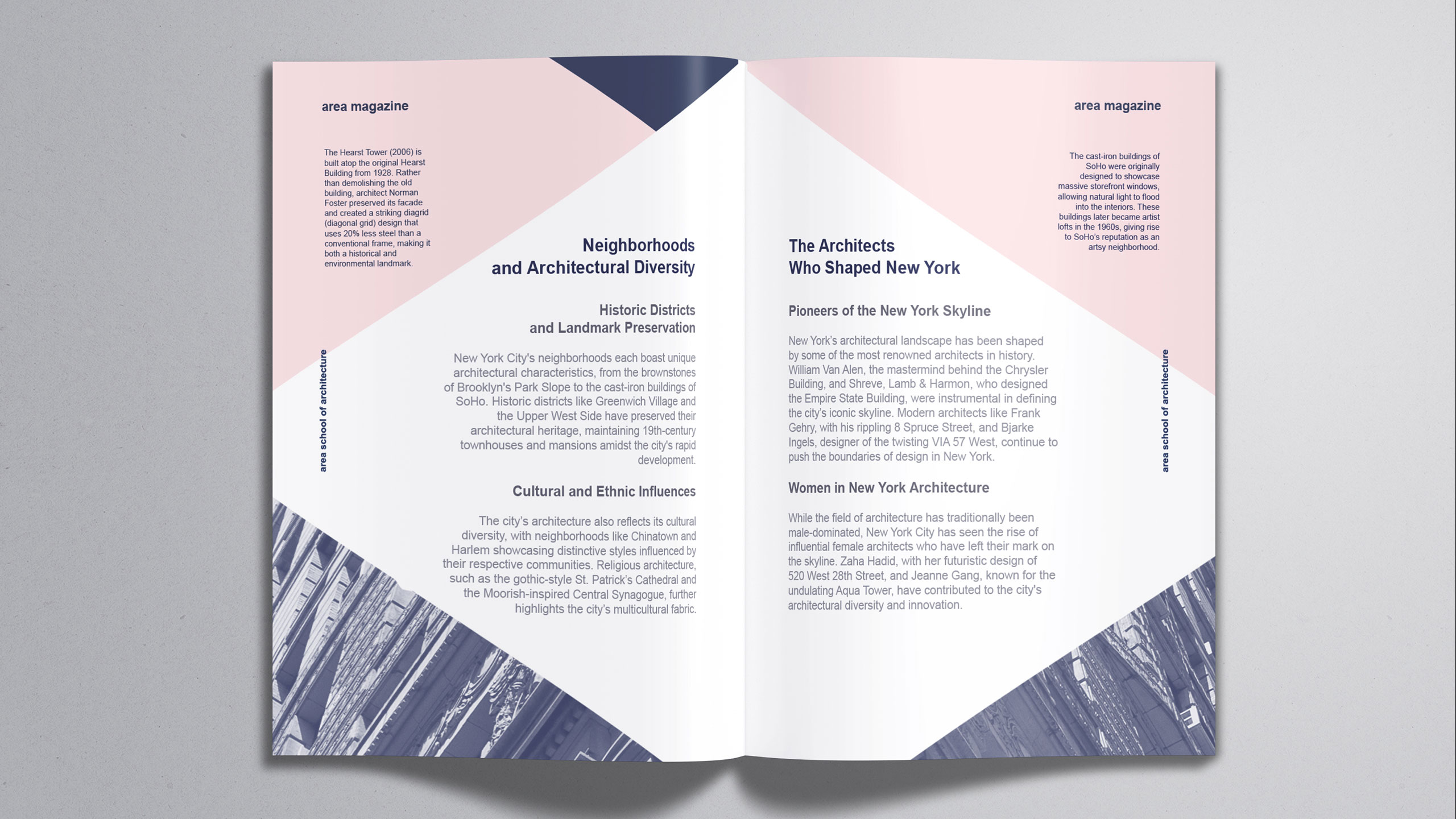
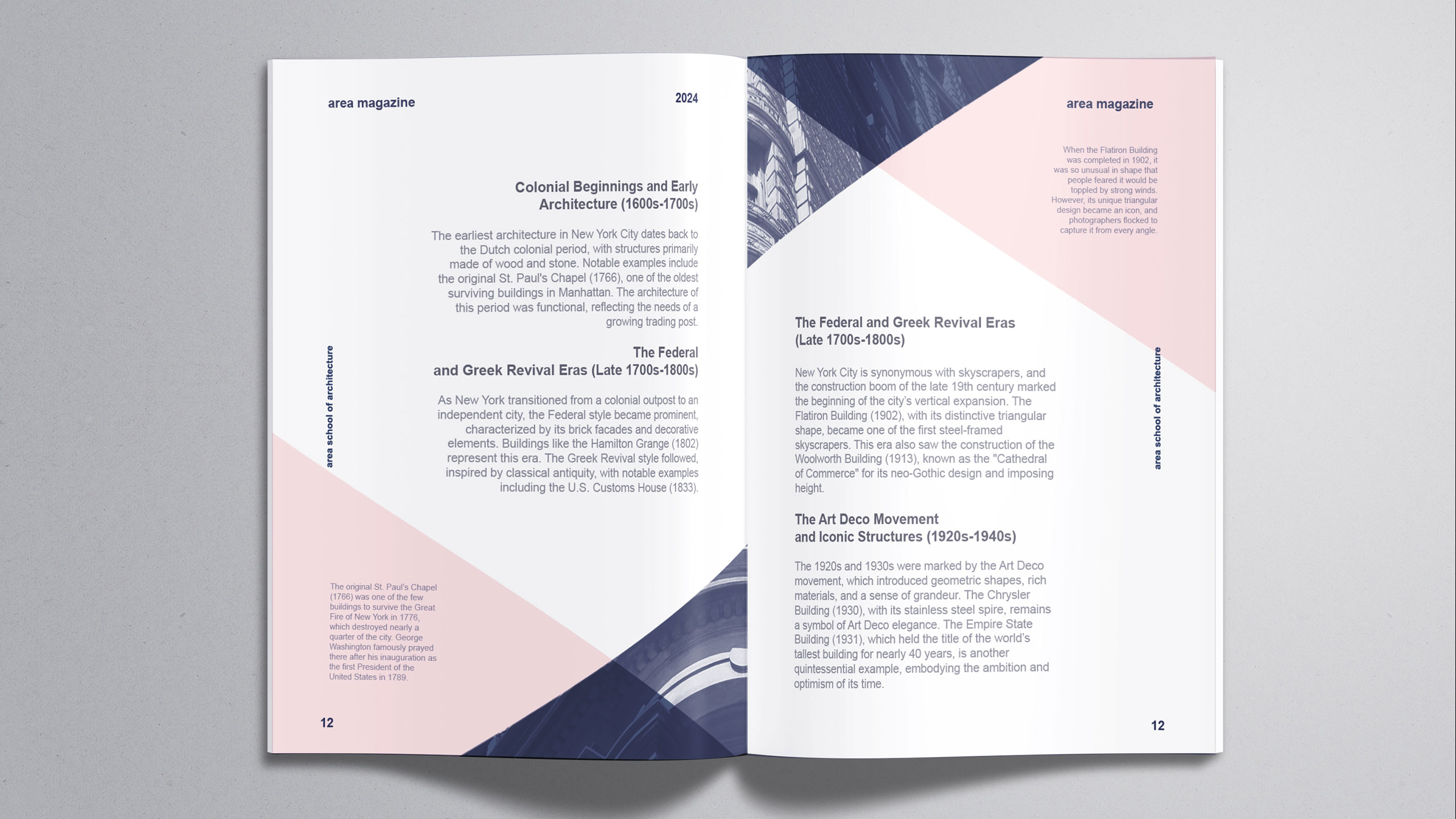
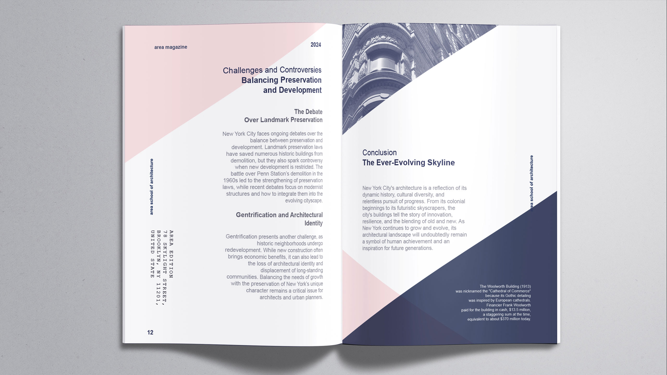
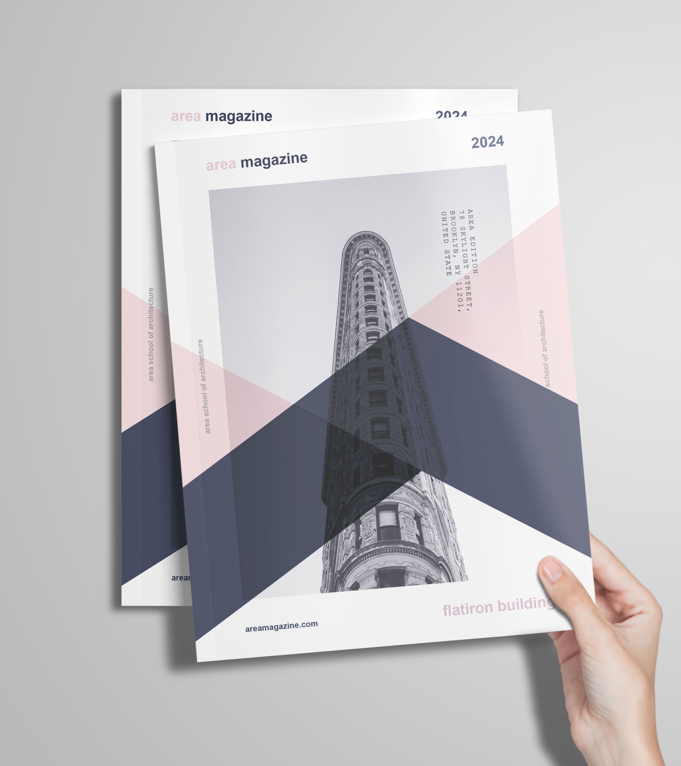
The graphic design of the AREA Magazine brochure adopts a bold corporate aesthetic, using pale pink and deep violet—colors that break away from traditional architectural tones. The layout features interwoven, intersecting forms that create a modular, dynamic structure. Architectural visuals emerge unpredictably through the overlaps, evoking a sense of discovery.
Concept and Identity
These intersecting layers suggest abstract stone assemblies or masonry patterns, reinforcing the material and structural essence of architecture. The design blends order with spontaneity, echoing the creative process of architectural composition. AREA Magazine thus becomes both a visual object and a conceptual space, where form and content are intricately intertwined.
Related
03
Whether you prefer a quick call or a detailed message, we're here to listen.

Whois

White Spirit

Inkonito

X-Ray