


Description
02
The Core Challenge
How can Junior Junior's graphic design capture playful nostalgia while appealing to children and adults alike, blending vintage charm with modern joy through colorful, whimsical packaging?
Visual Language and Design
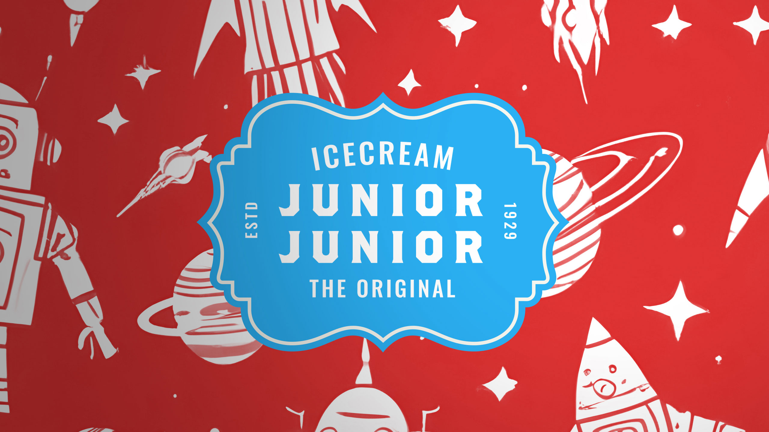
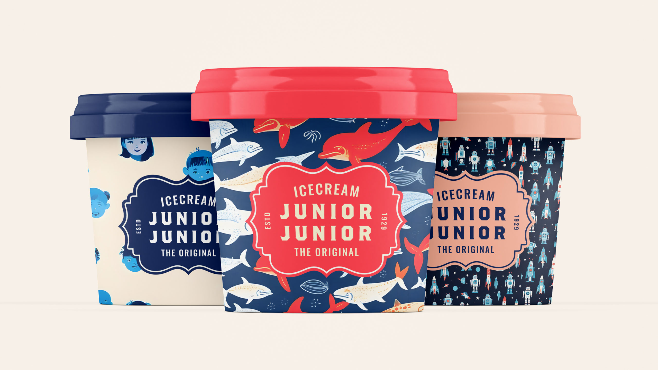
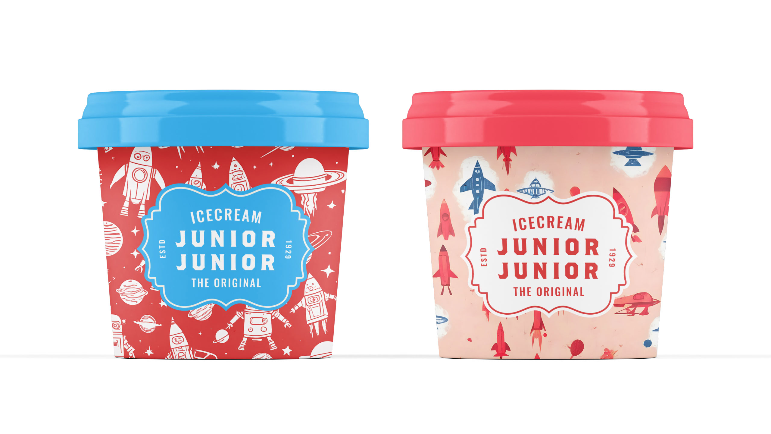
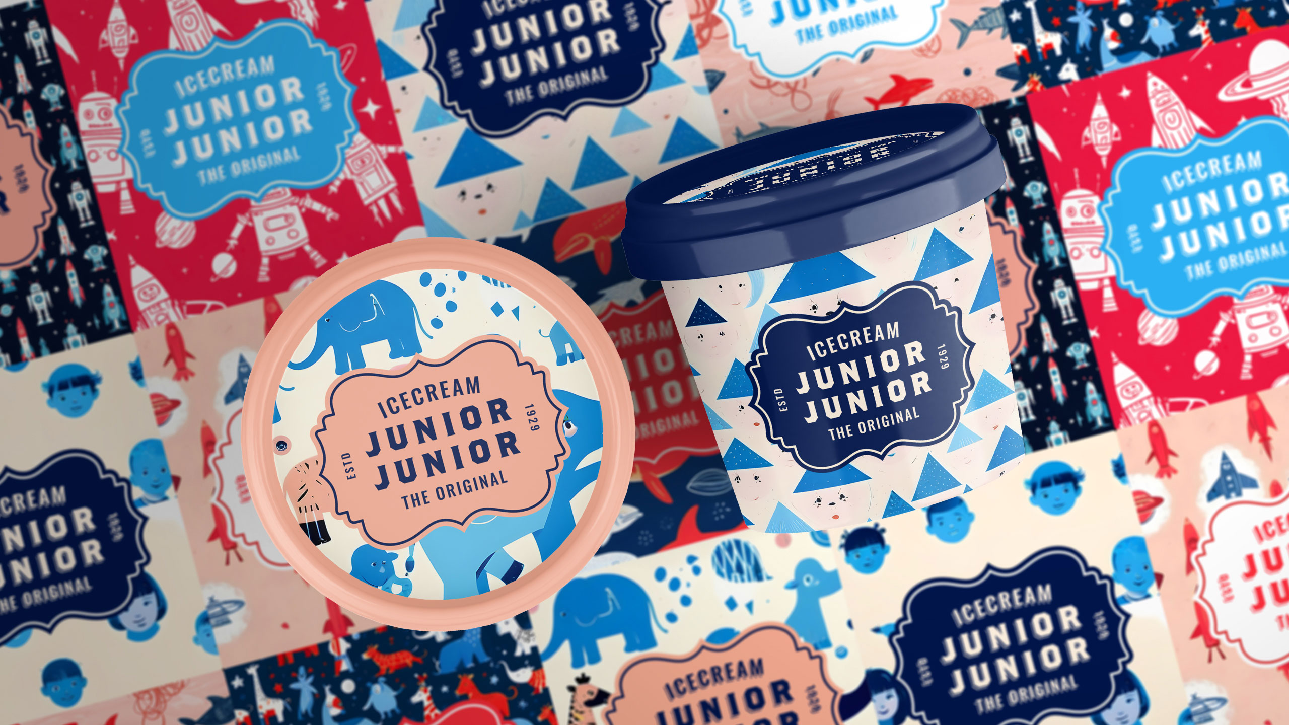
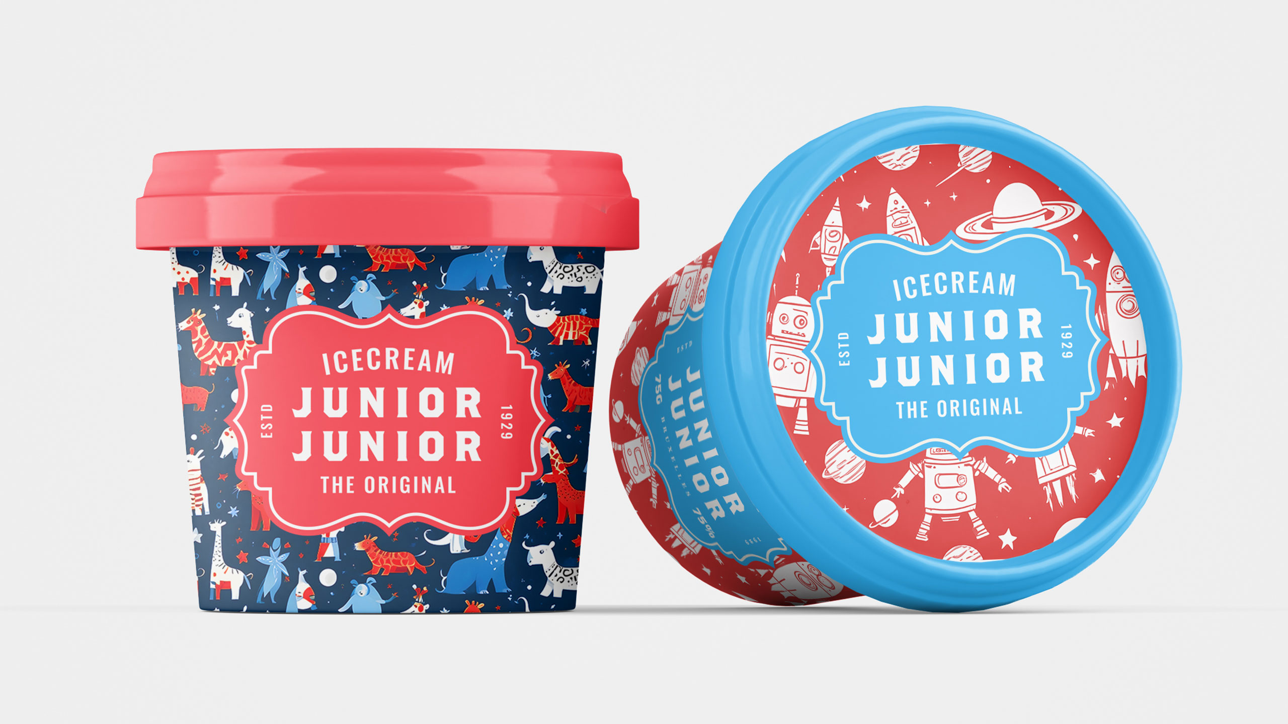
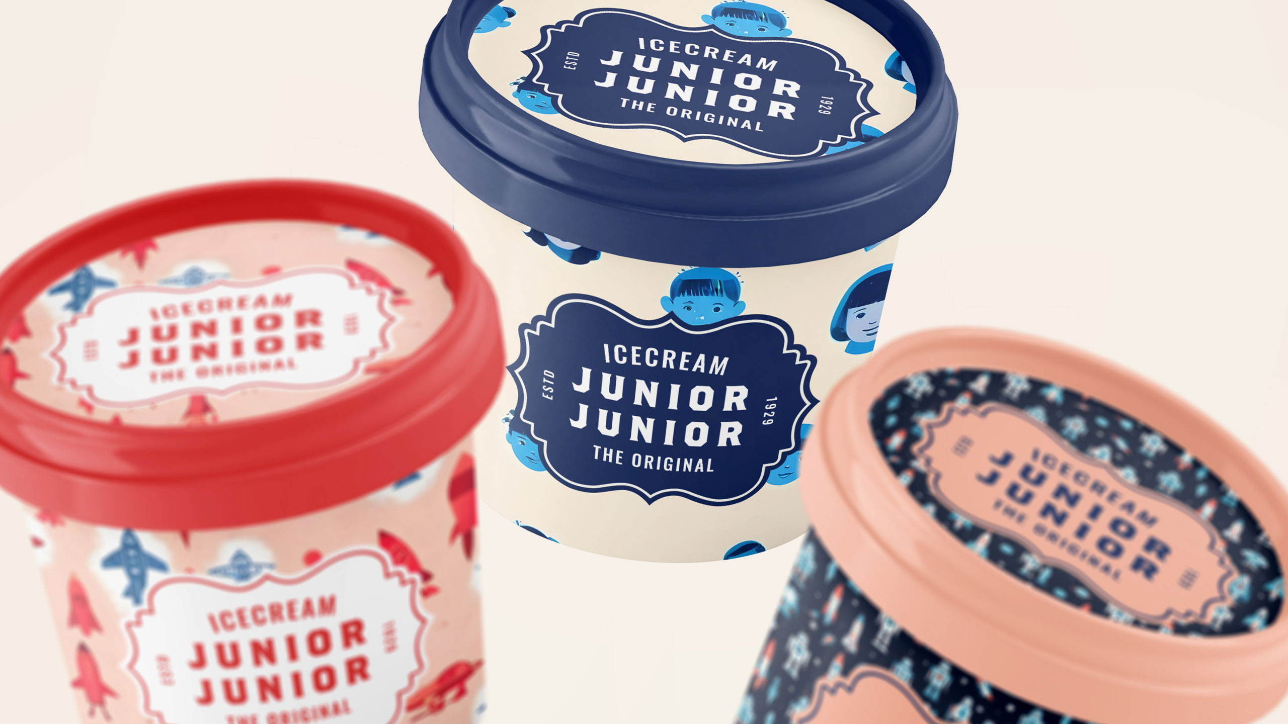
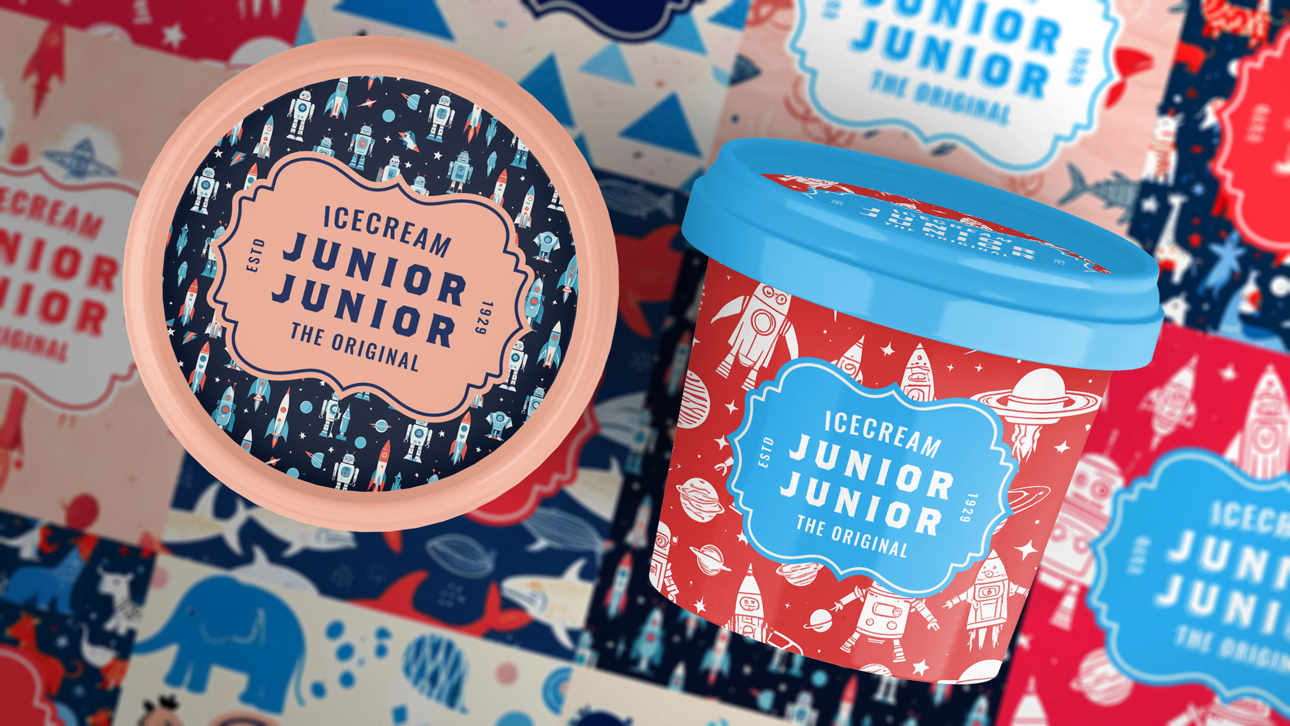
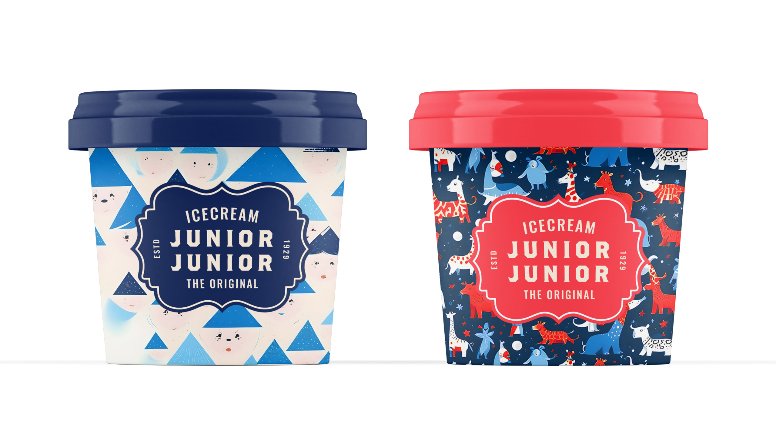
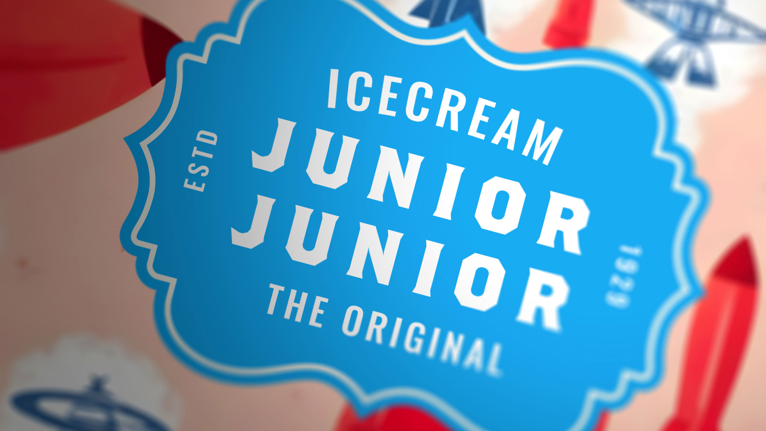
Junior Junior brings a burst of playful nostalgia to its ice cream packaging. Designed with a cheerful, colorful aesthetic, each small pot features lighthearted illustrations inspired by childhood — themes like animals, space, and the circus. The style leans subtly vintage, referencing the joyful cartoon era of the 1950s and 60s.
Concept and Identity
Rounded fonts, pastel tones, and soft textures create a unified range that is both fun and comforting. Every flavor becomes a little world of its own, inviting smiles and memories. Junior Junior is not just ice cream — it's a scoop of imagination with a retro twist.
Related
03
Whether you prefer a quick call or a detailed message, we're here to listen.

Unbrake

Flo

Factory

Blackjack 8