


Description
02
The Core Challenge
How can Soltiz N°4's design balance bold creativity with clarity? The graphic identity merges minimalism and controlled chaos, crafting a refined yet raw look that captivates without overwhelming.
Visual Language and References
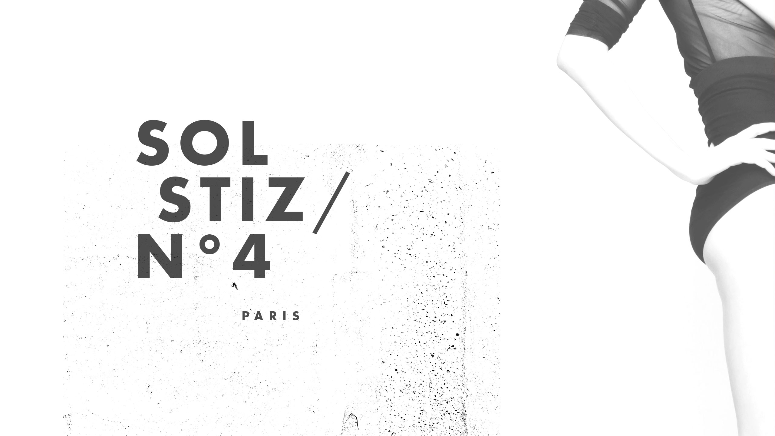
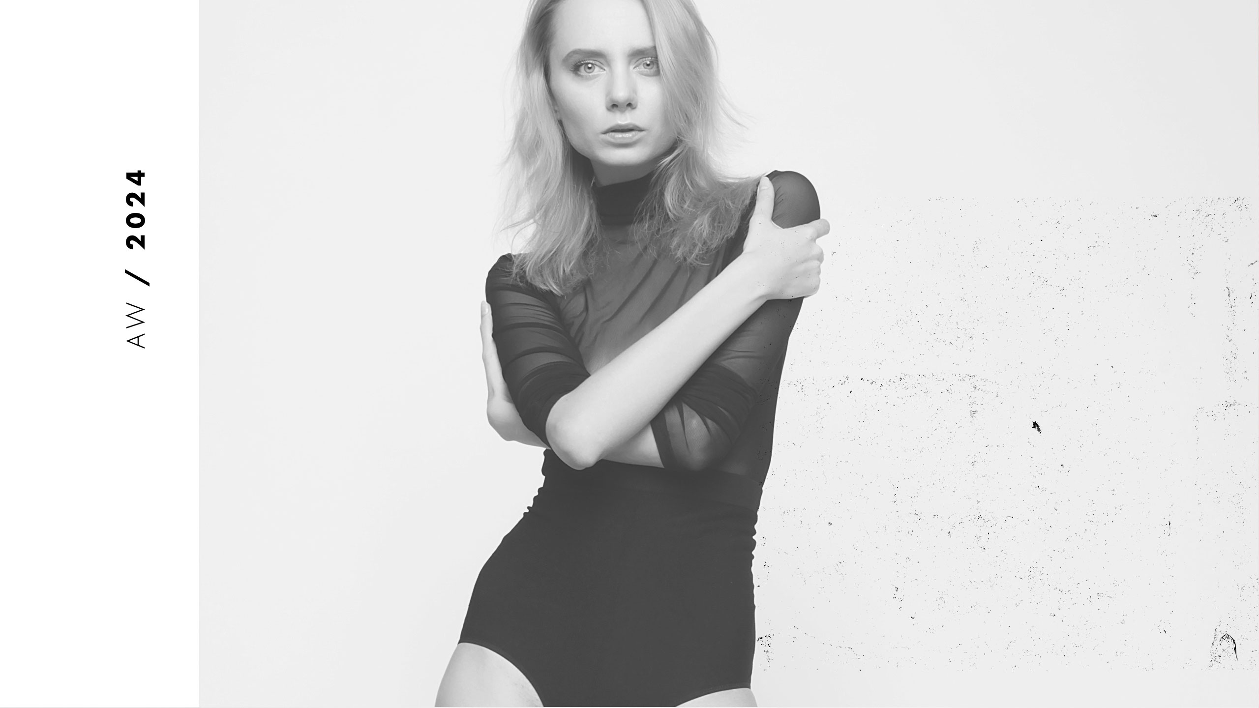
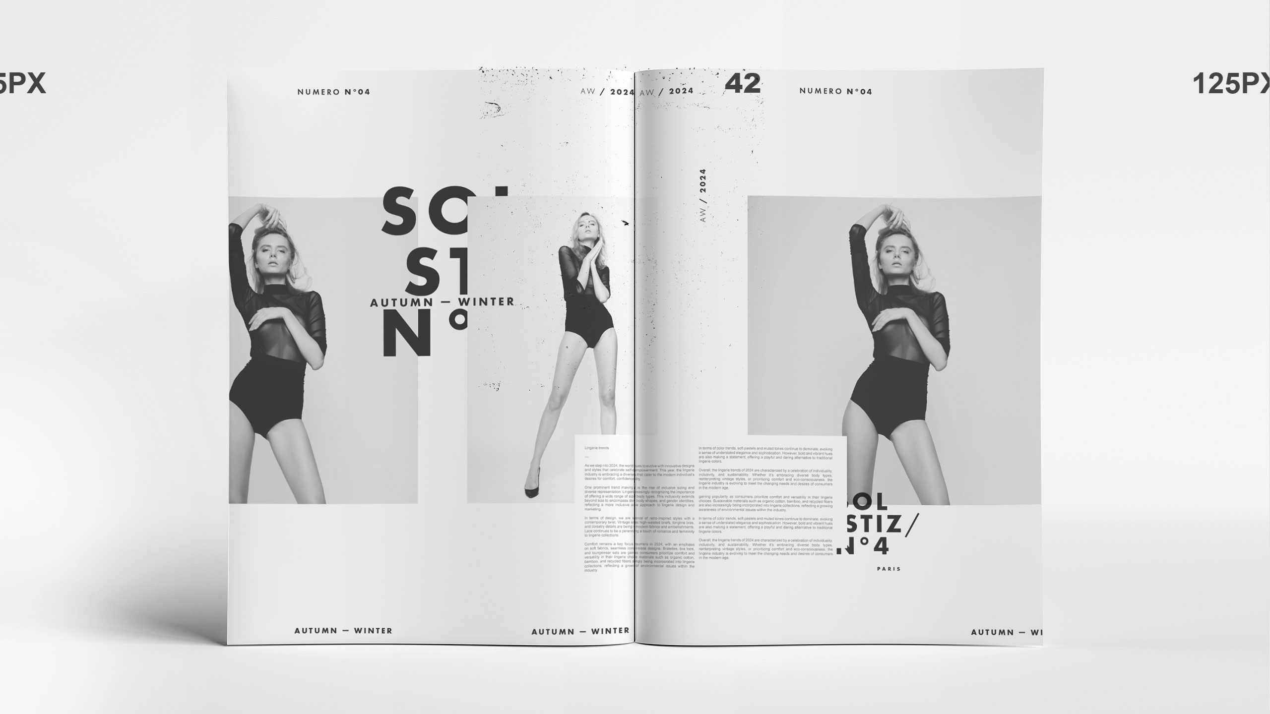
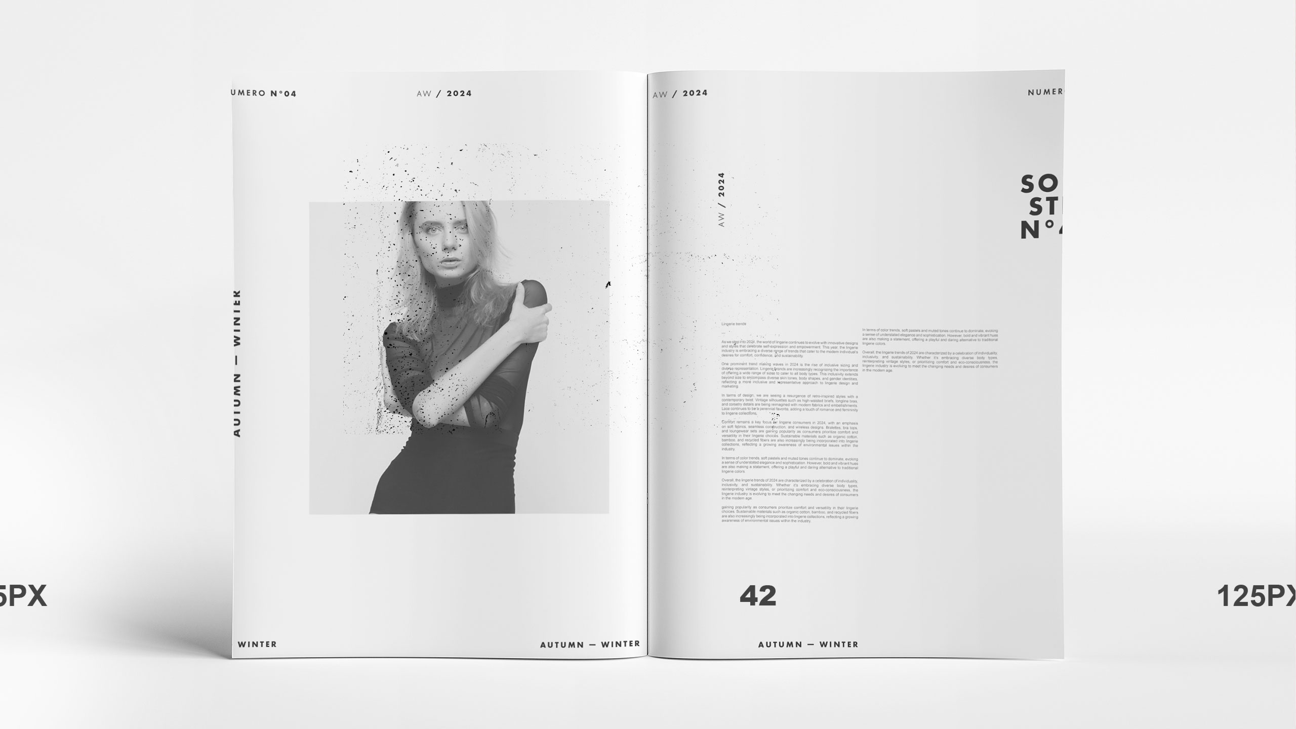
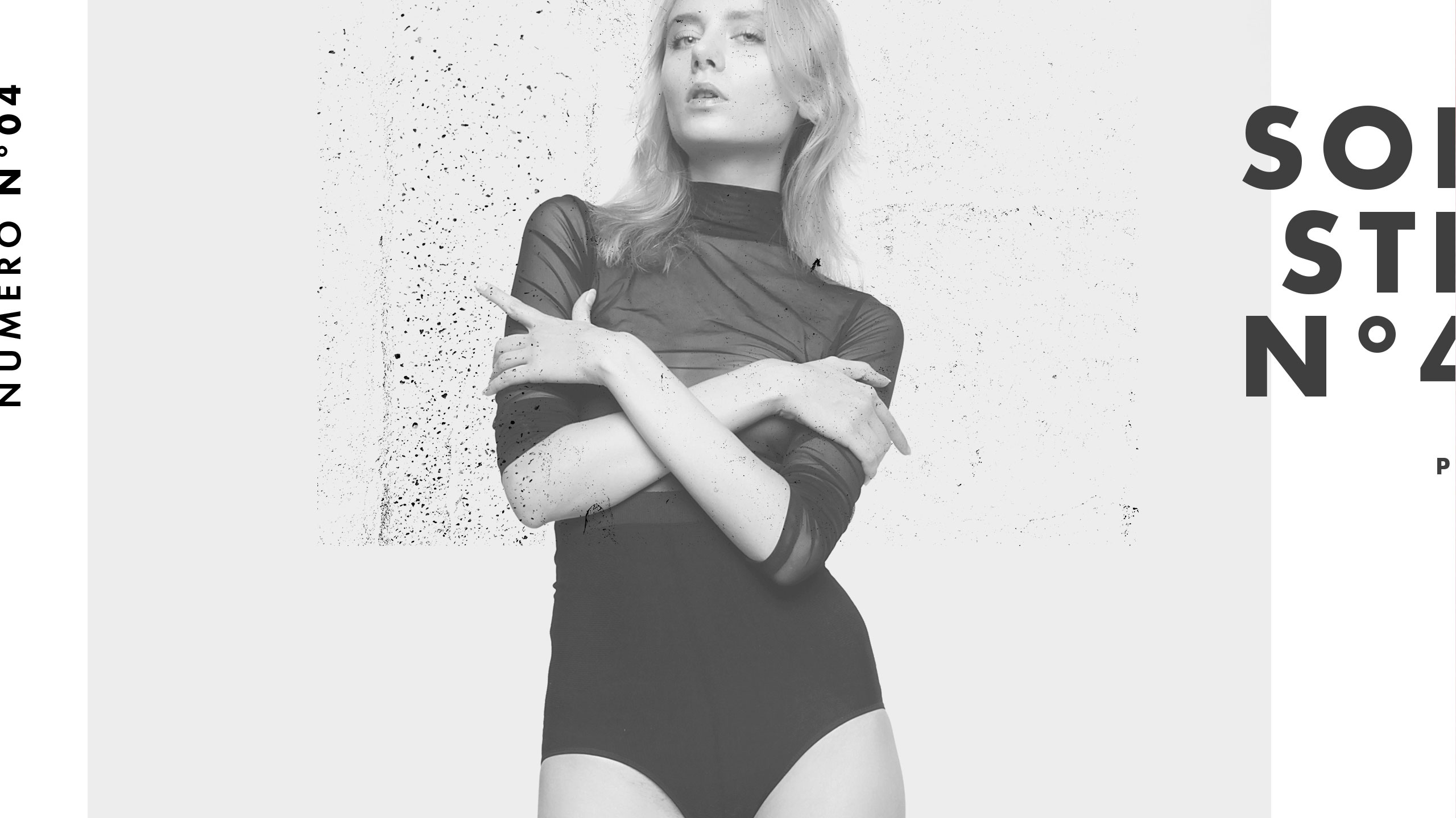
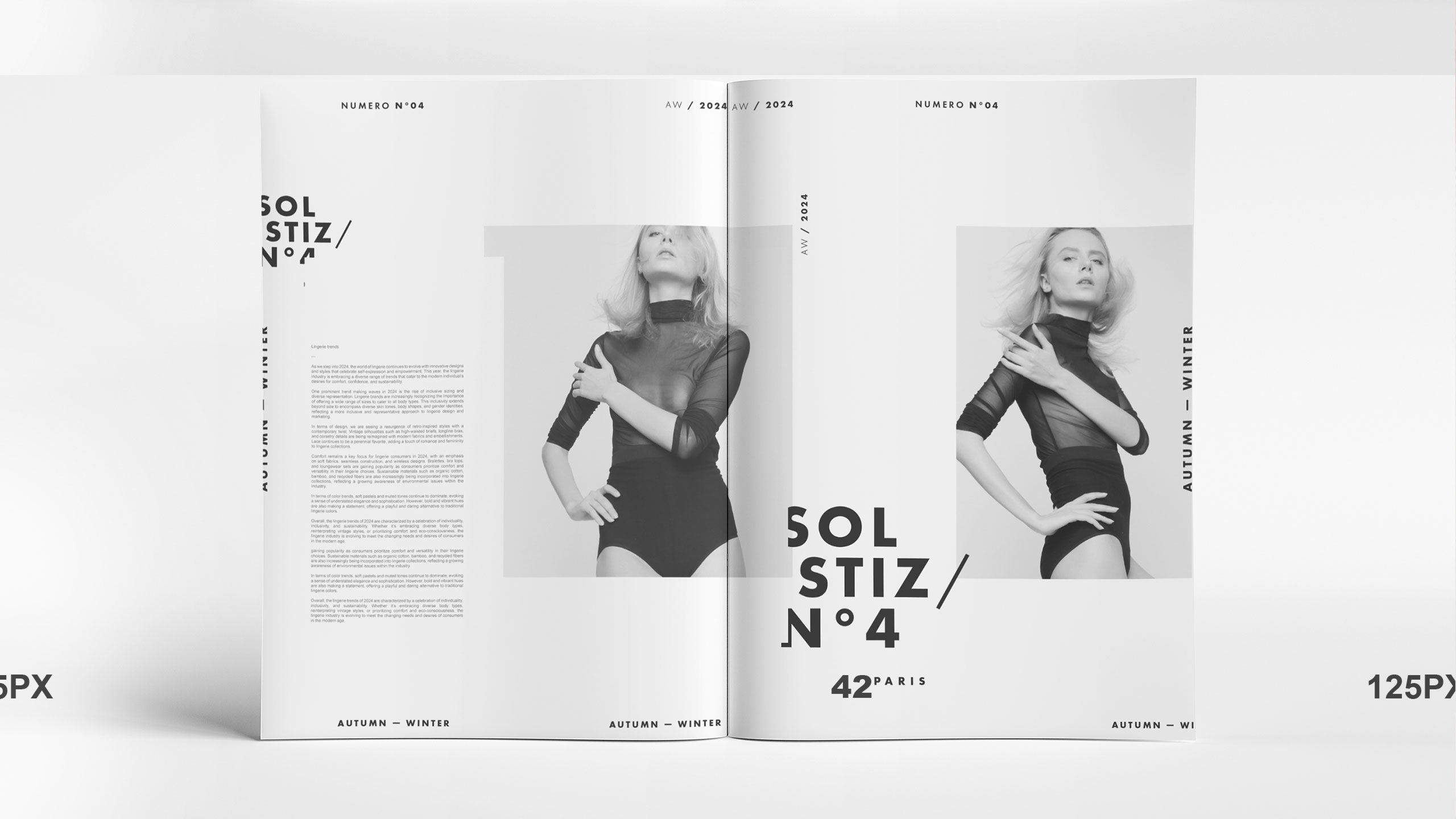
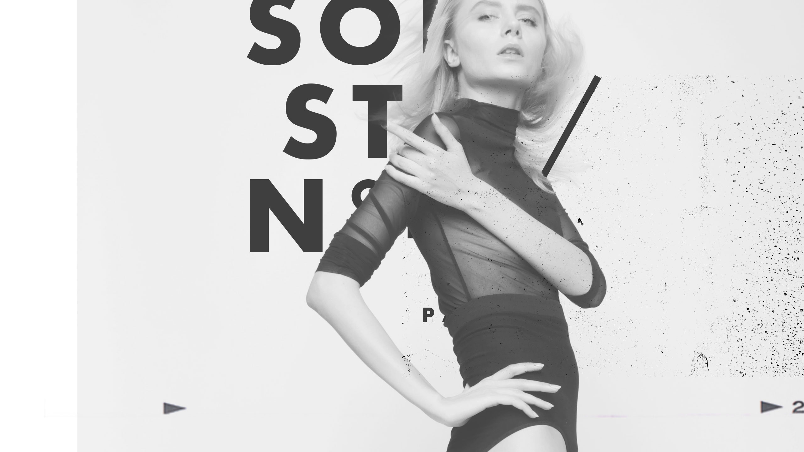
The graphic design of Soltiz N°4, alternating seasonally with EquinoKs, defines a bold fashion magazine identity. Dominated by black and white, the layout embraces a minimalist, deceptively chaotic aesthetic with a subtle sense of anarchy. It evokes a fragile balance and total creative freedom, inspired by David Carson's Ray Gun, but in a far more refined, stripped-back style.
Composition and Tension
Large white margins frame the model visuals, enhancing their impact while providing breathing space for the reader's eye. This thoughtful emptiness avoids visual overload, creating a tension between structure and disorder that feels both modern and intentionally raw.
Related
03
Whether you prefer a quick call or a detailed message, we're here to listen.

Whois

White Spirit

Inkonito

X-Ray