


Description
02
The Core Challenge
How can graphic design express both ecological sensitivity and scientific rigor? Ecogena balances organic motifs with structured layouts, crafting a visual identity that feels both natural and technical—designed for serious, sustainable growers.
Visual Language and Structure
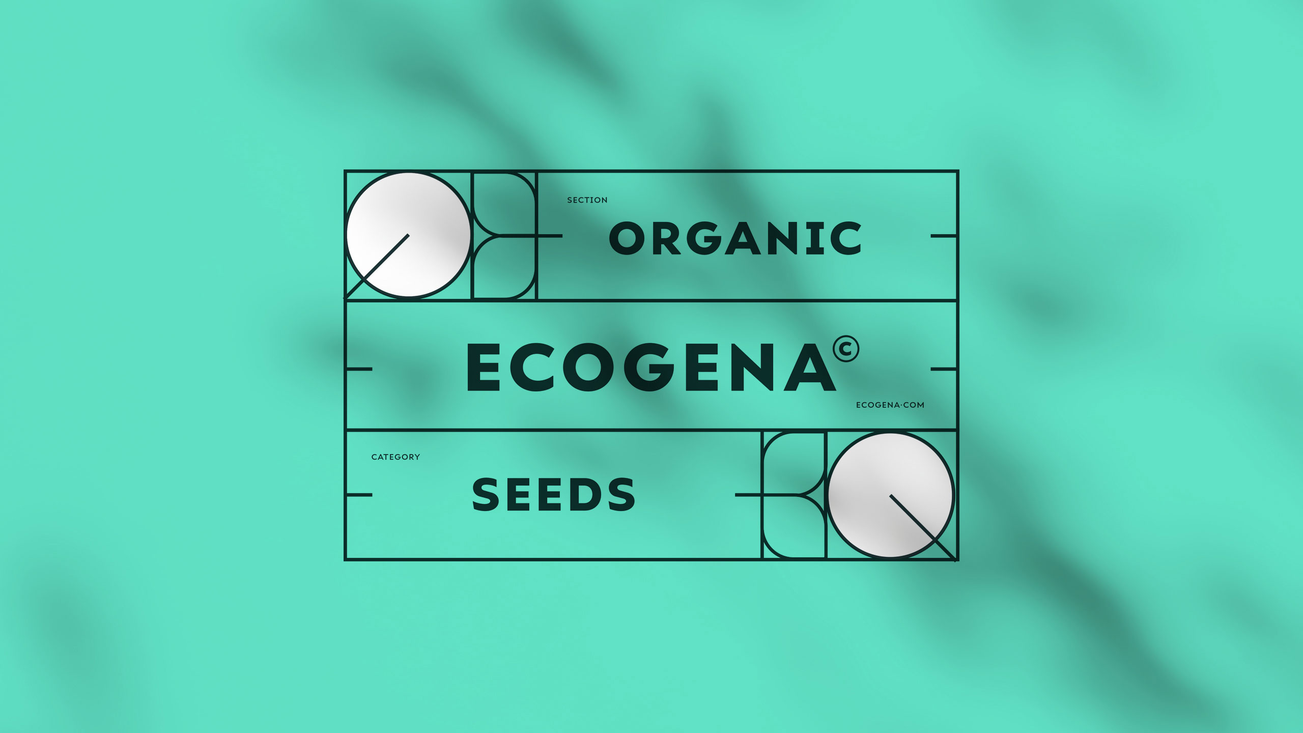
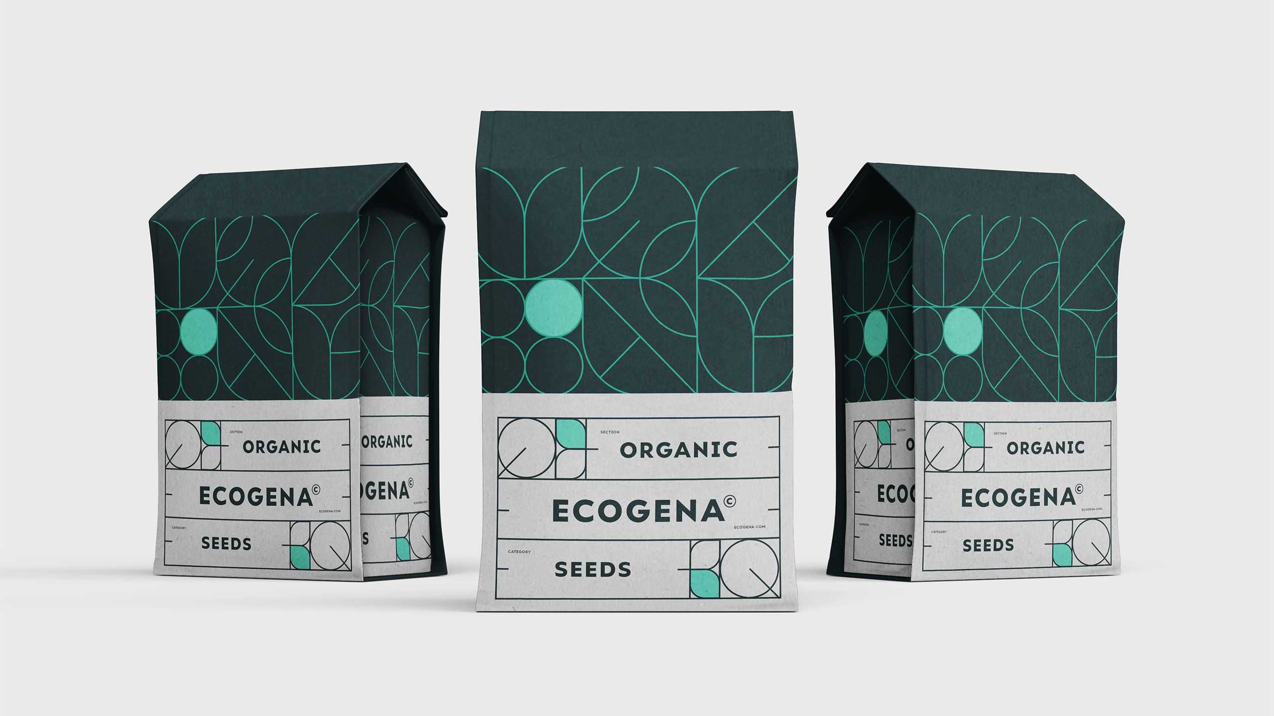
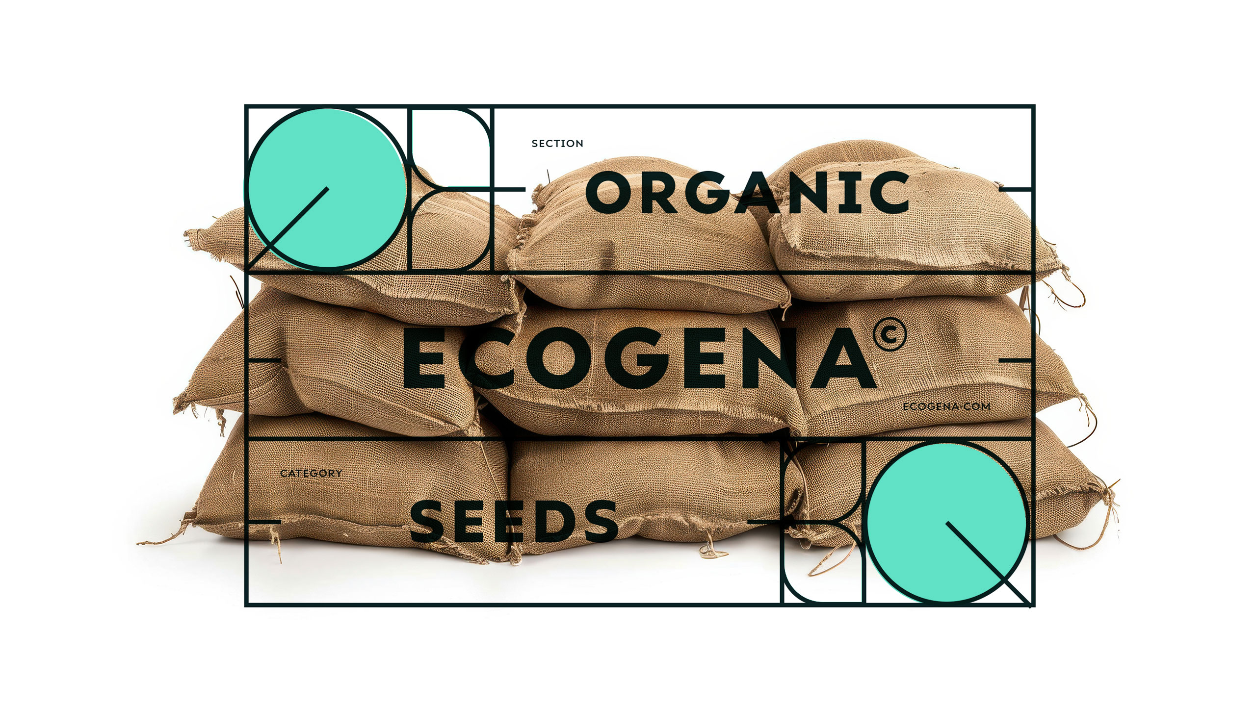
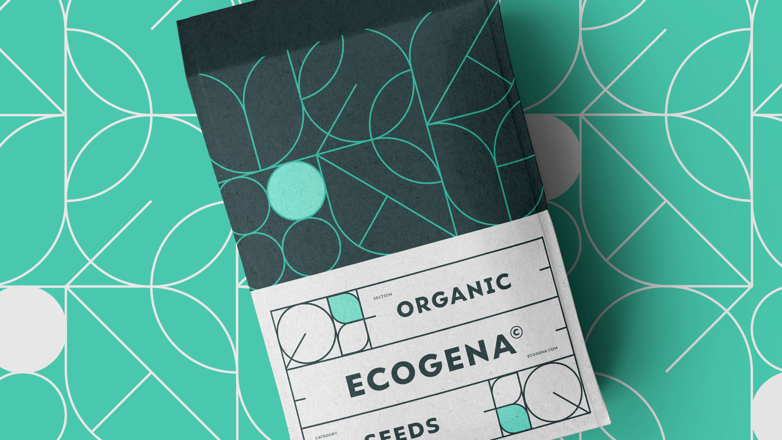
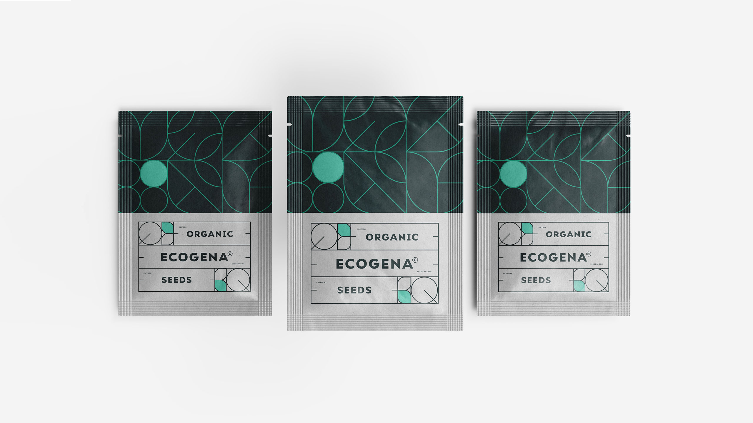
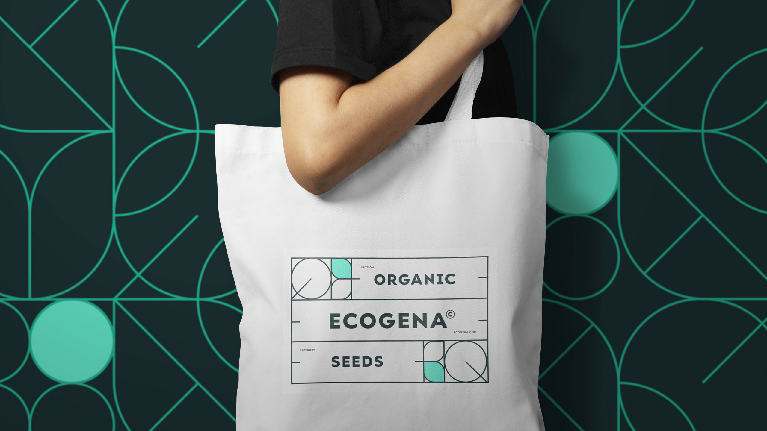
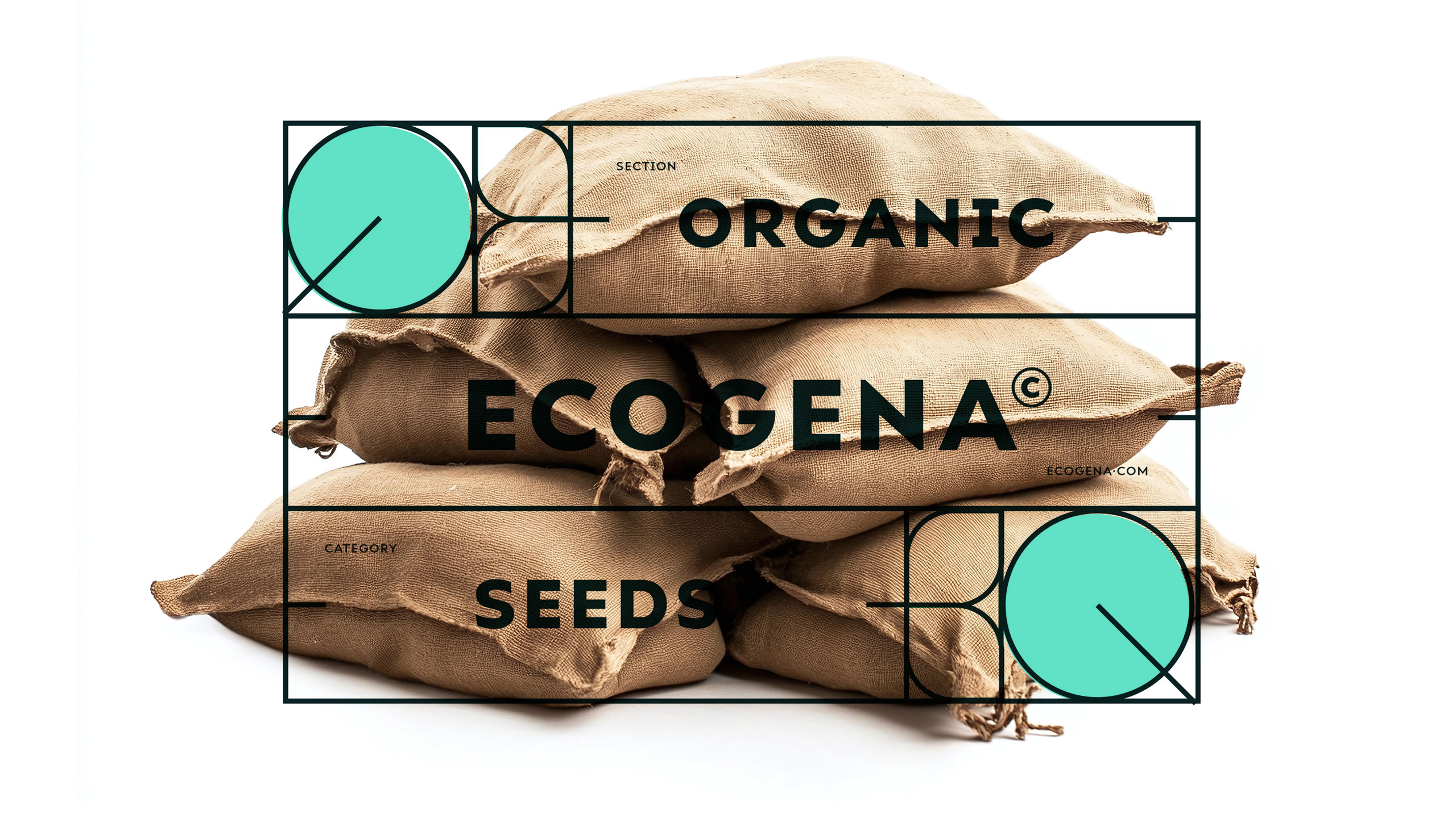
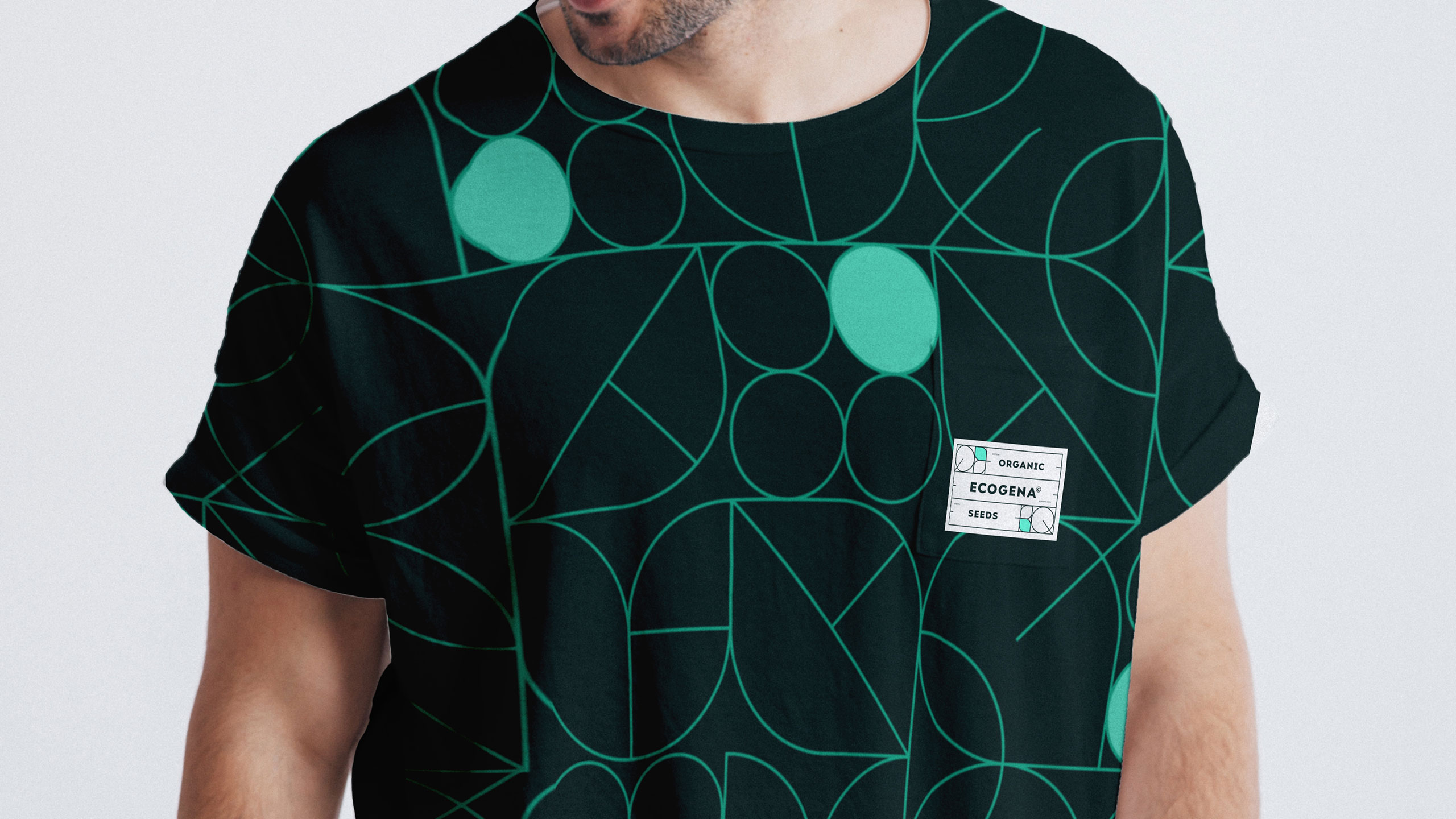
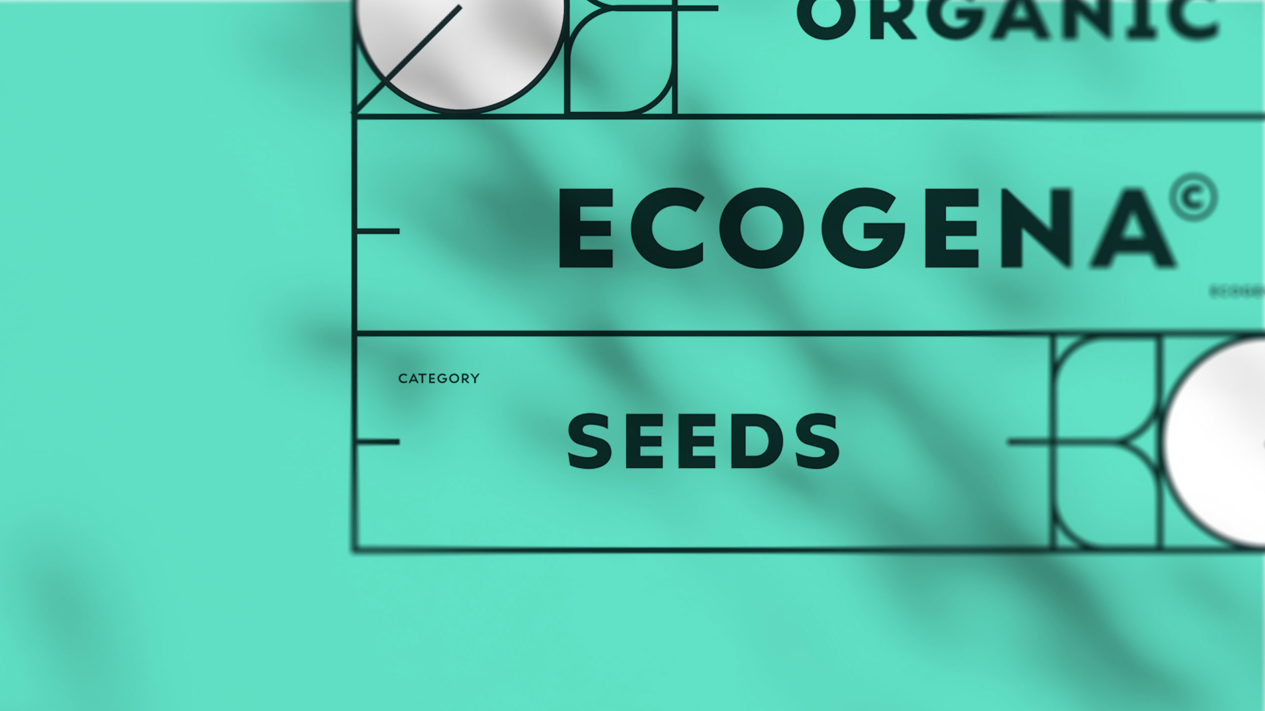
On a backdrop of geometric leaf-inspired patterns, ecogena presents a clean and functional visual identity. The dominant green color reinforces its ecological commitment, while the graphic system combines nature and structure. A prominent cartouche displays essential product information, emphasizing the technical precision of these organic seed varieties.
Application and Balance
This clear visual block also allows for consistent and scalable variations across the range—whether on seed packs, pouches, tote bags, or T-shirts. The result is both natural and rational, reflecting a brand that respects the rhythms of nature while providing professional-grade products for conscious growers and gardeners.
Related
03
Whether you prefer a quick call or a detailed message, we're here to listen.

Unbrake

Flo

Factory

Blackjack 8