


Description
02
The Core Challenge
How can SIN⁶⁹'s design express sensuality while maintaining elegance? The minimalist typography and subtle typographic twist balance provocative meaning with refined visual restraint, creating a compelling, intimate brand identity.
Visual Language and Typographic Concept
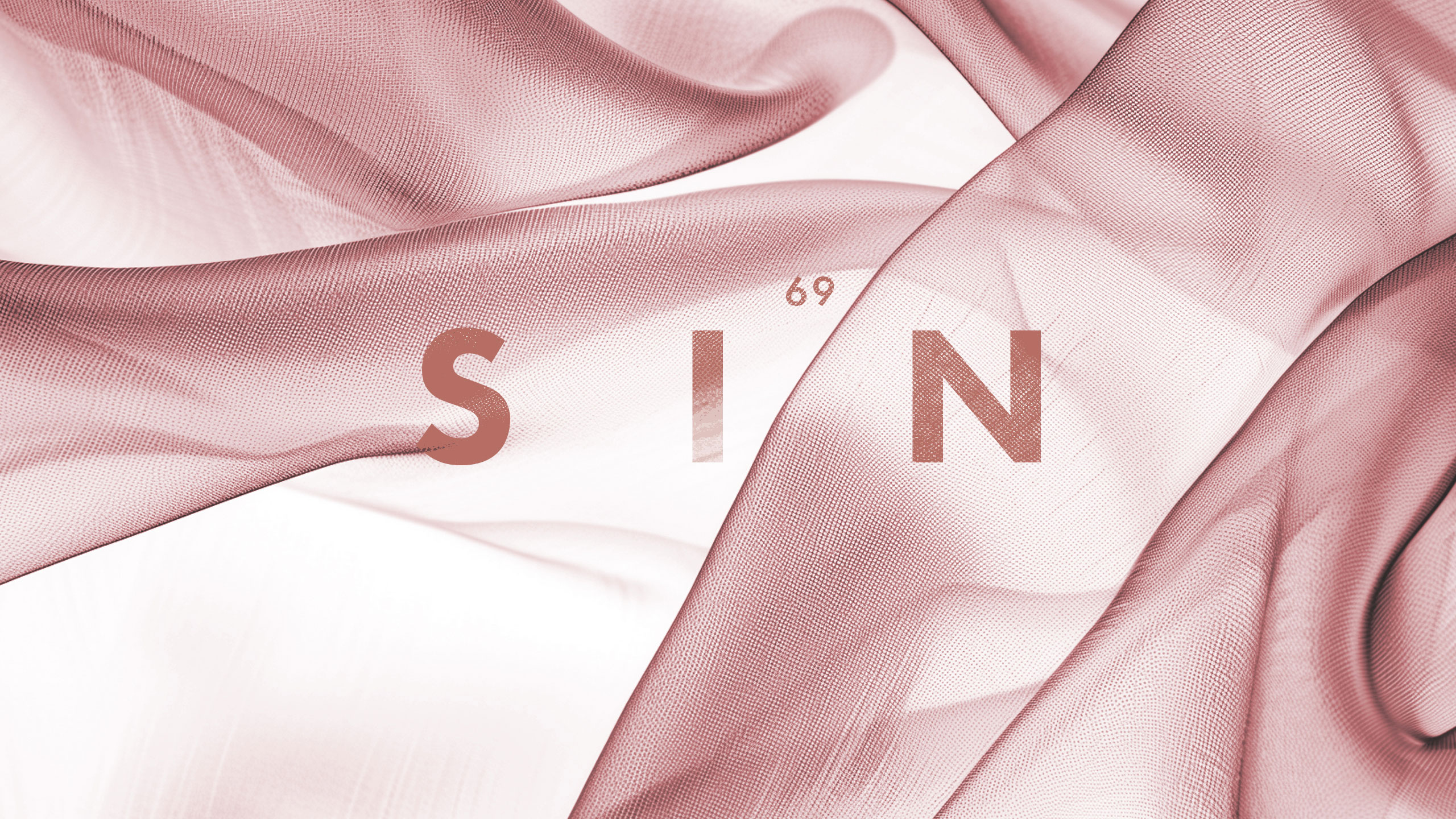
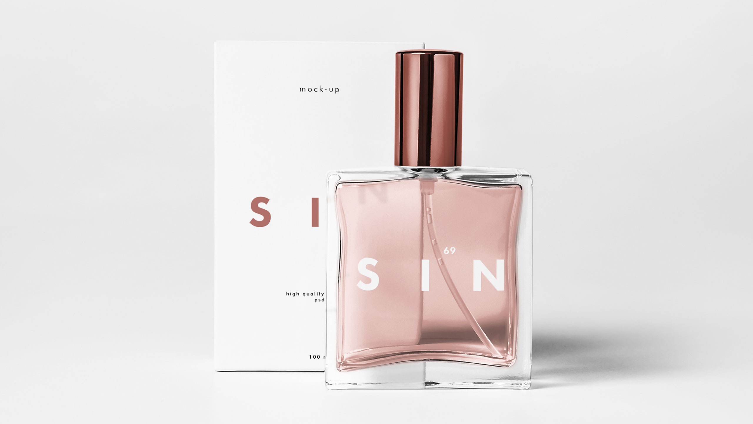
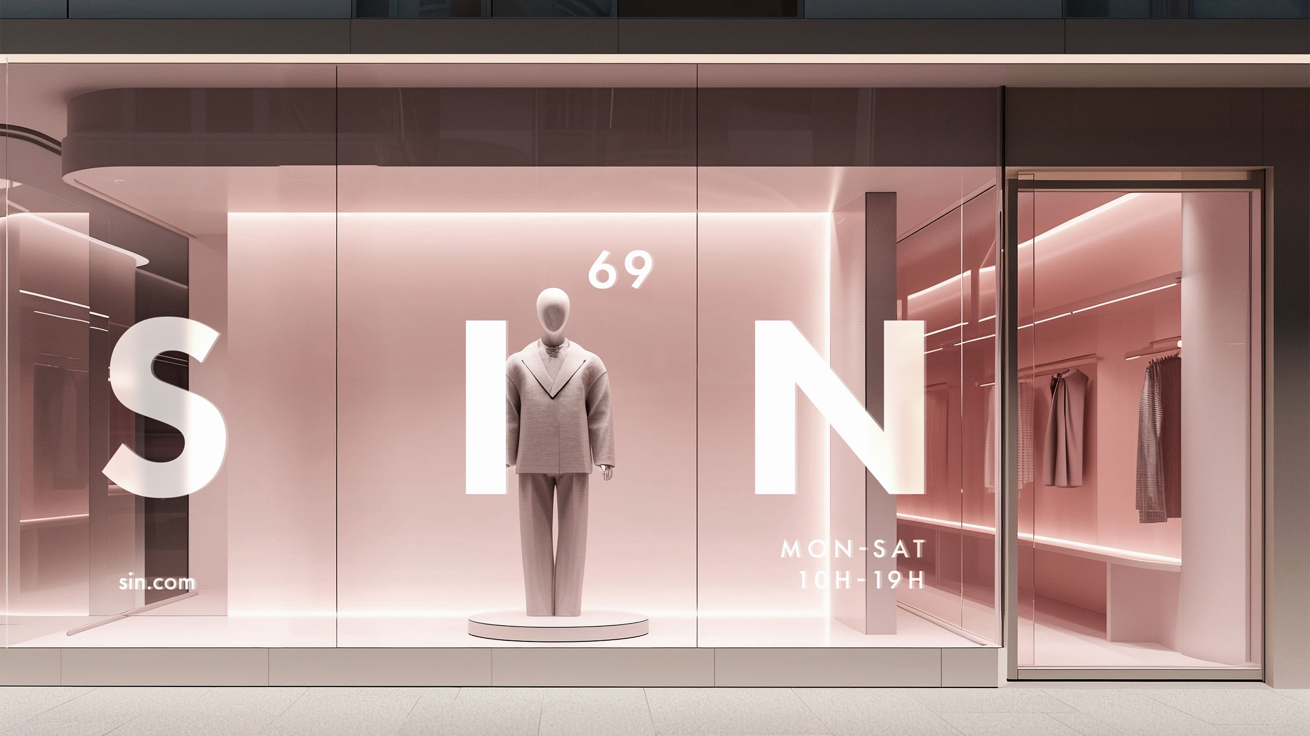
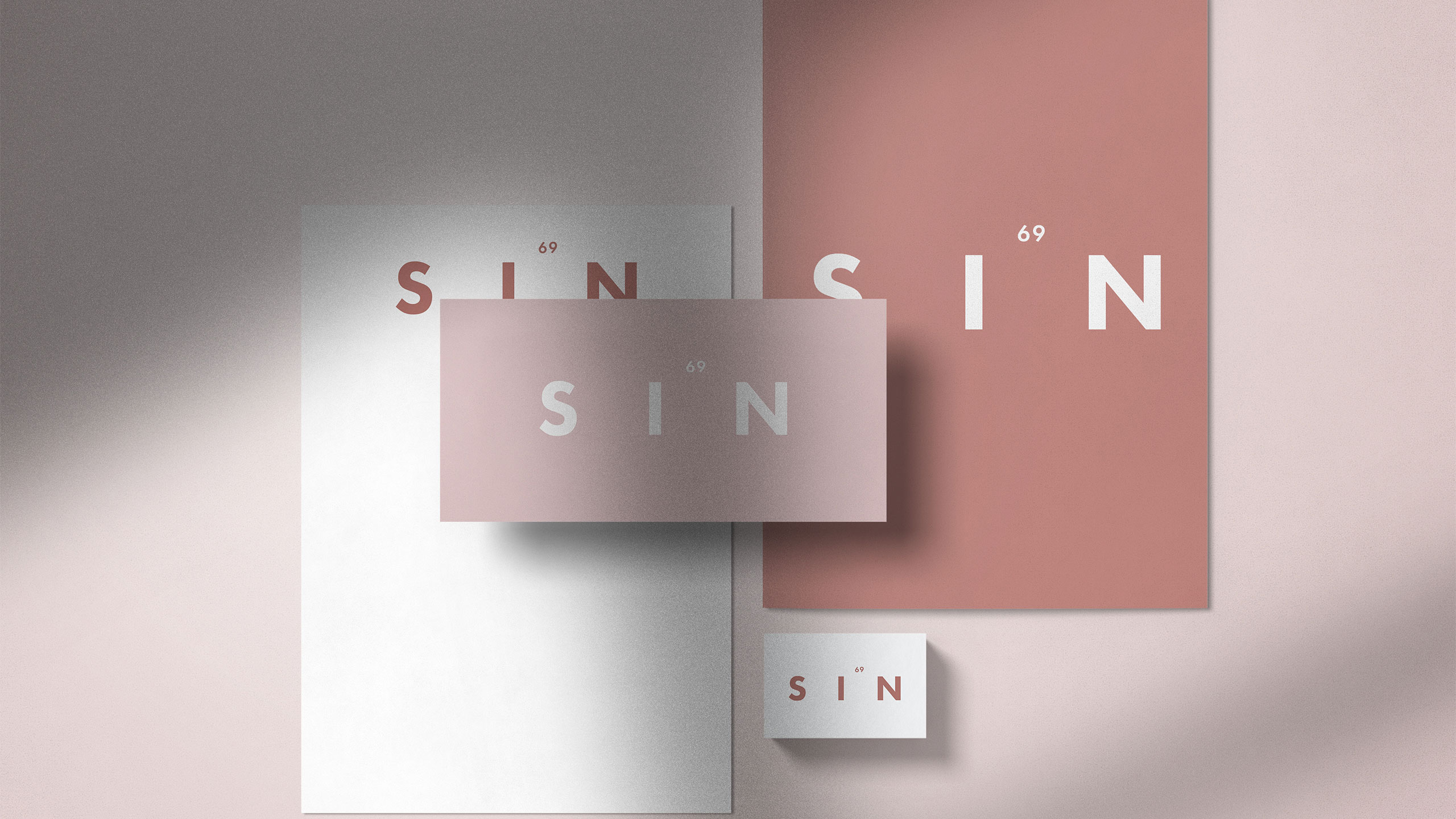
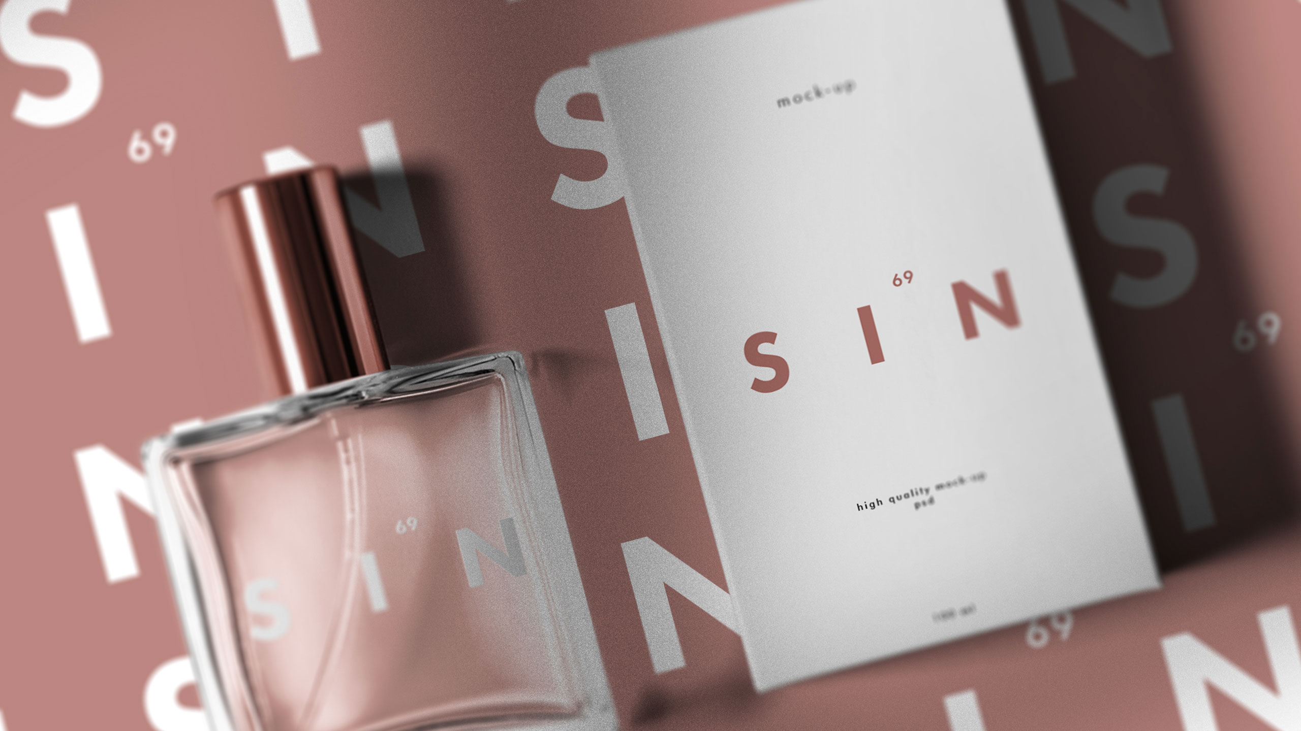
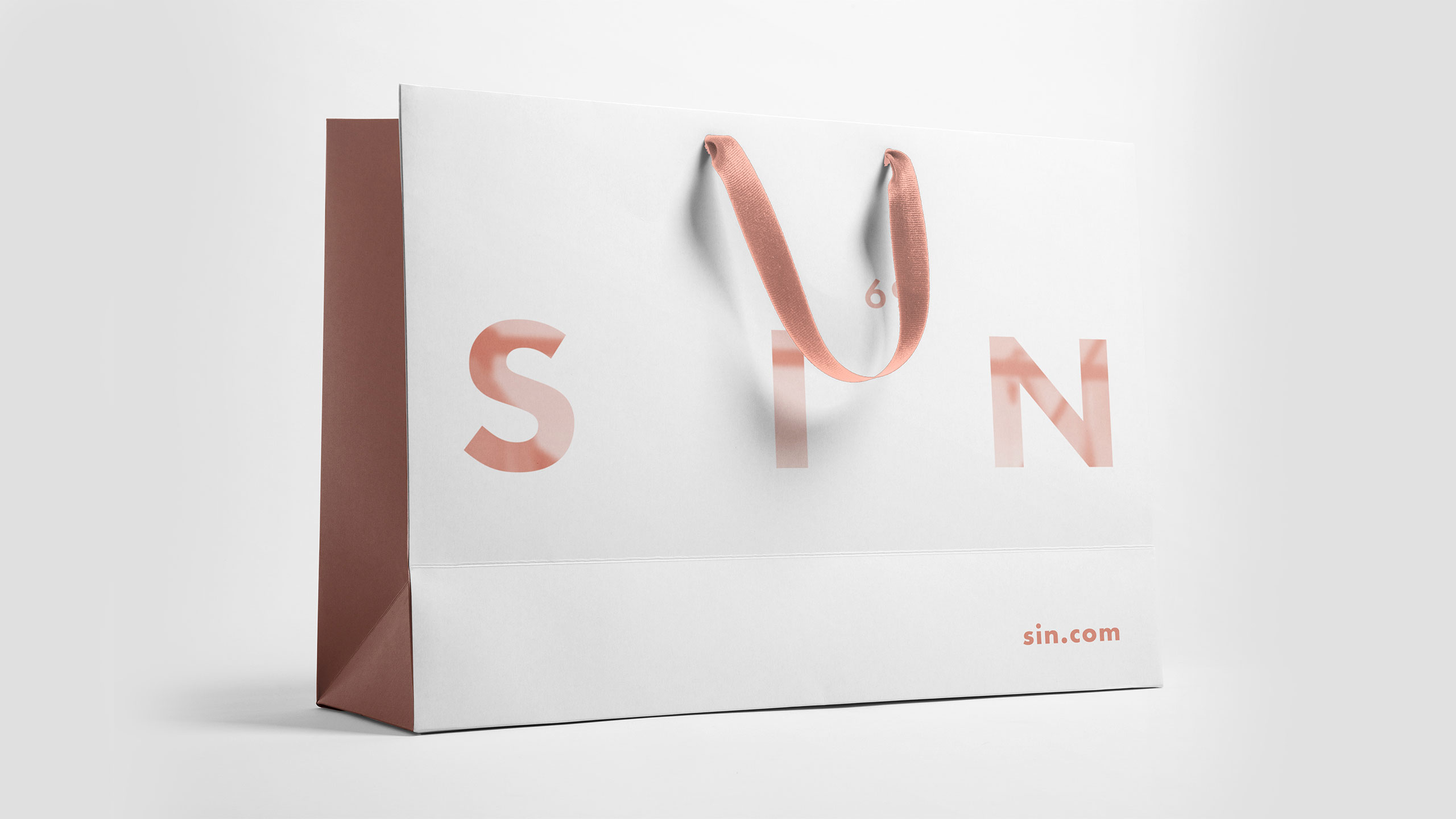
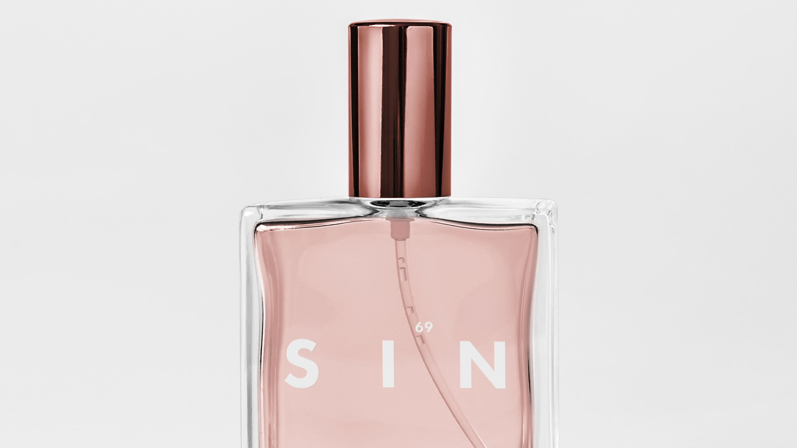
The graphic design for SIN⁶⁹, a perfume brand, embraces a minimalist yet provocative aesthetic. Applied to stationery, posters, perfume packaging, bags, and signage, the identity is built around the brand's three-letter name with an unexpected typographic twist: the "69" appears as a superscript oddly placed between the "i" and the "n," replacing the dot of the "i" in a subtly disturbing way.
Color, Meaning, and Identity
Rendered in a rose-copper tone, the design suggests elegance tinged with sensuality. The number references both the boutique's address and a suggestive position, while the visuals hint at veiled passion—intimate desires simmering beneath a restrained, refined exterior.
Related
03
Whether you prefer a quick call or a detailed message, we're here to listen.

OVER

Café Lenoirs

Blen-Beck

Whare House