


")

Description
03
The Core Challenge
How can intercity travel feel simple, joyful, and stress-free? Cityzen answers with a playful, colorful identity and cheerful visuals that turn booking transport into a light, carefree experience across all platforms.
Name, Concept, and Palette
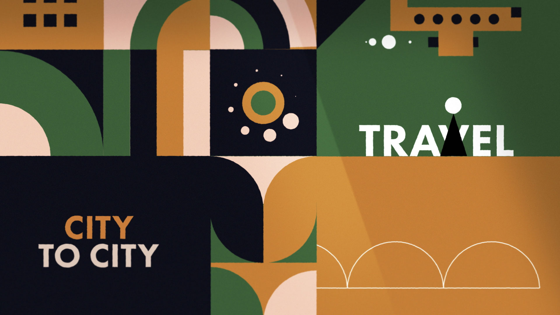
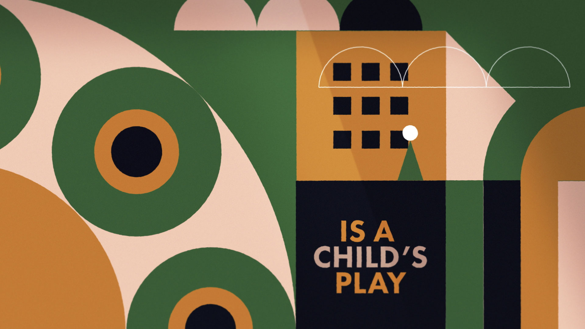
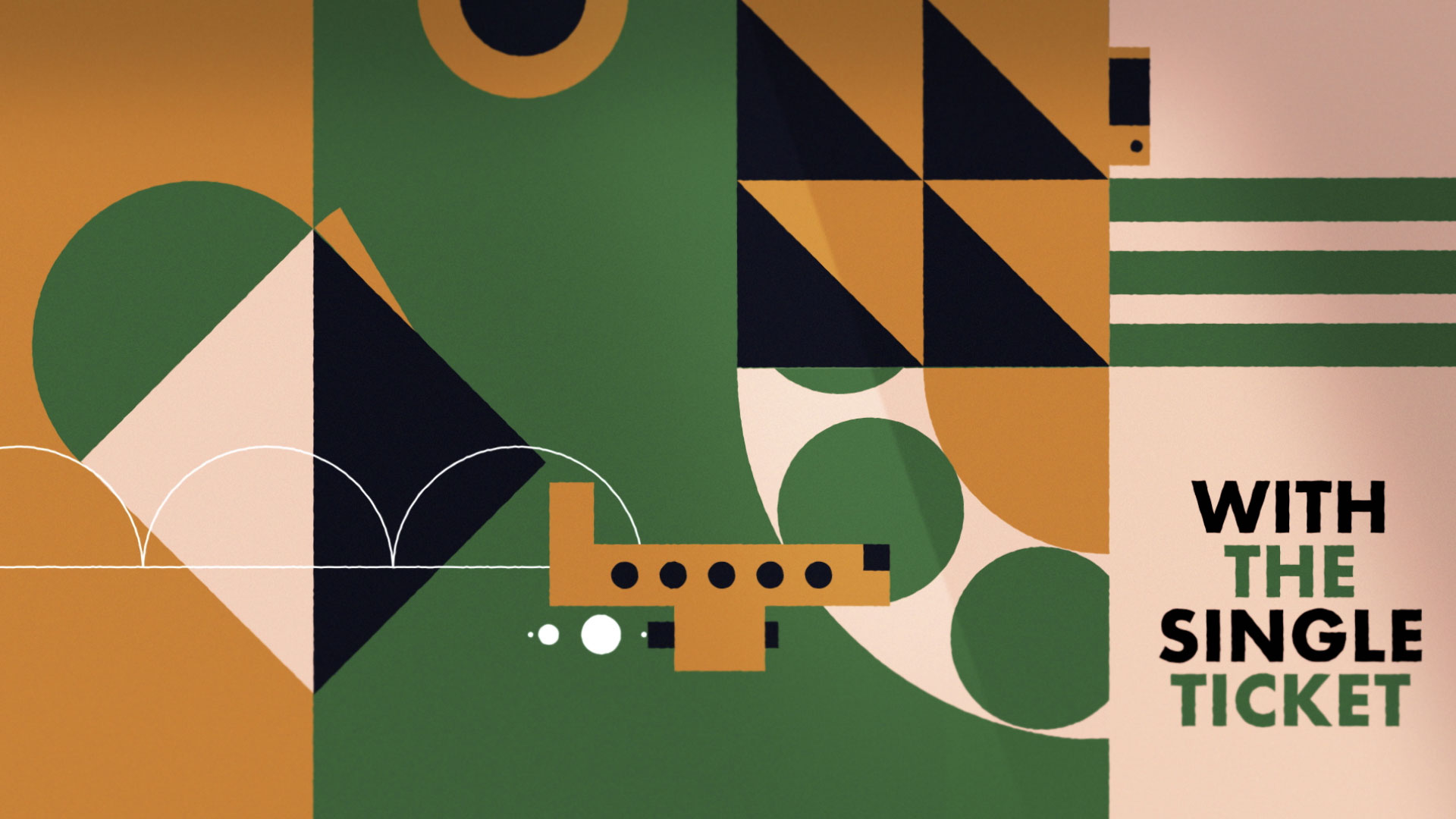
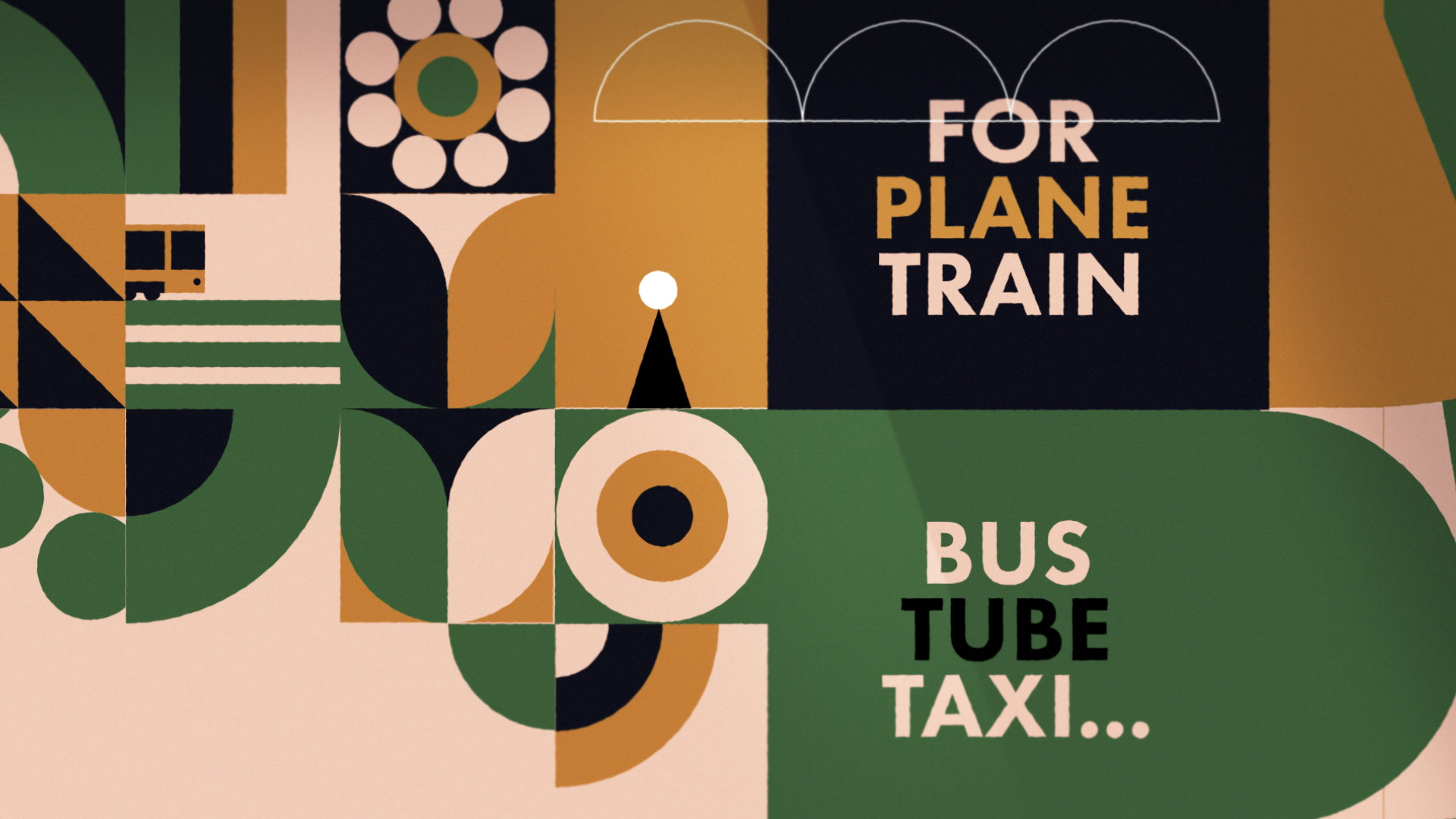
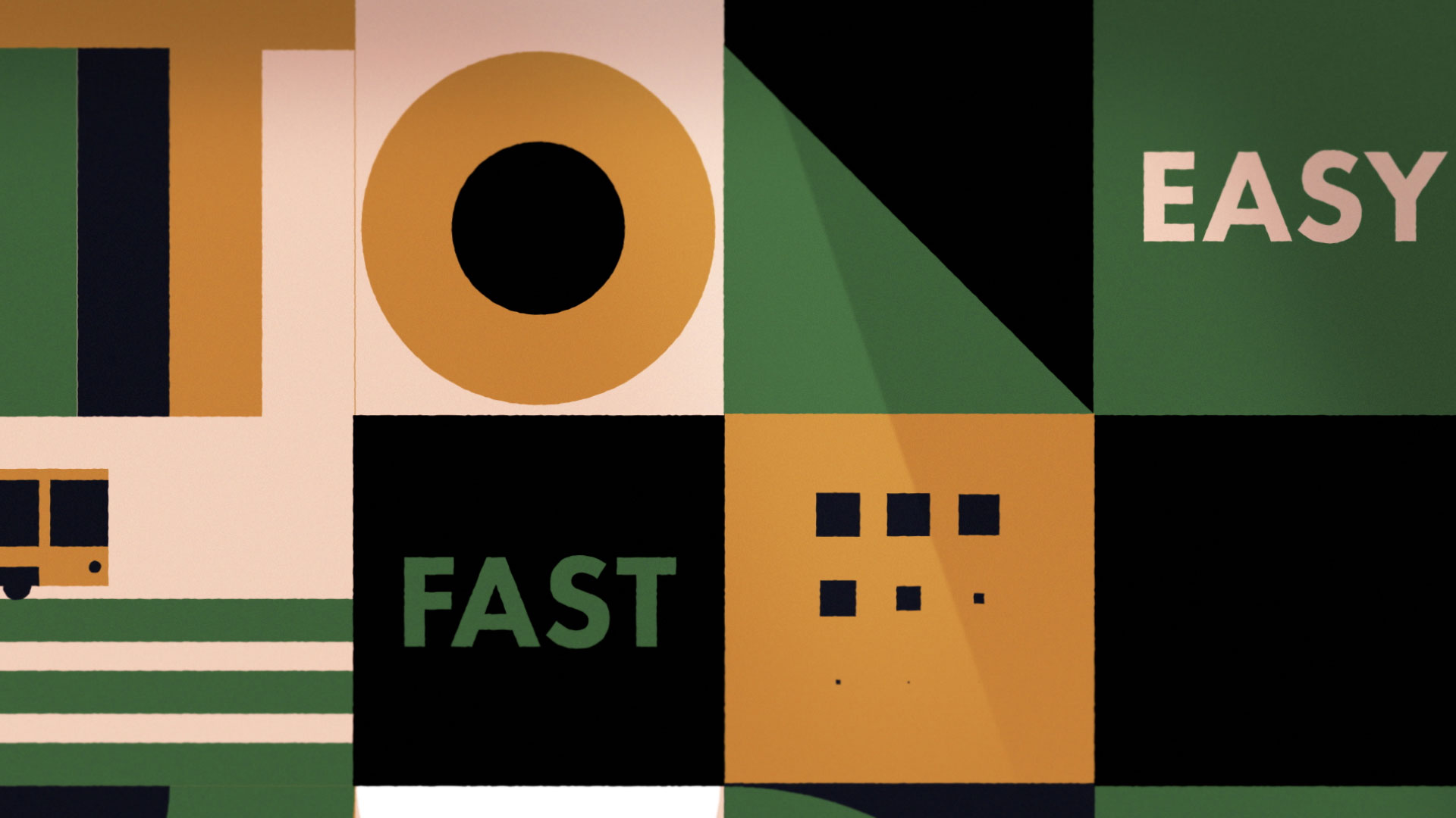
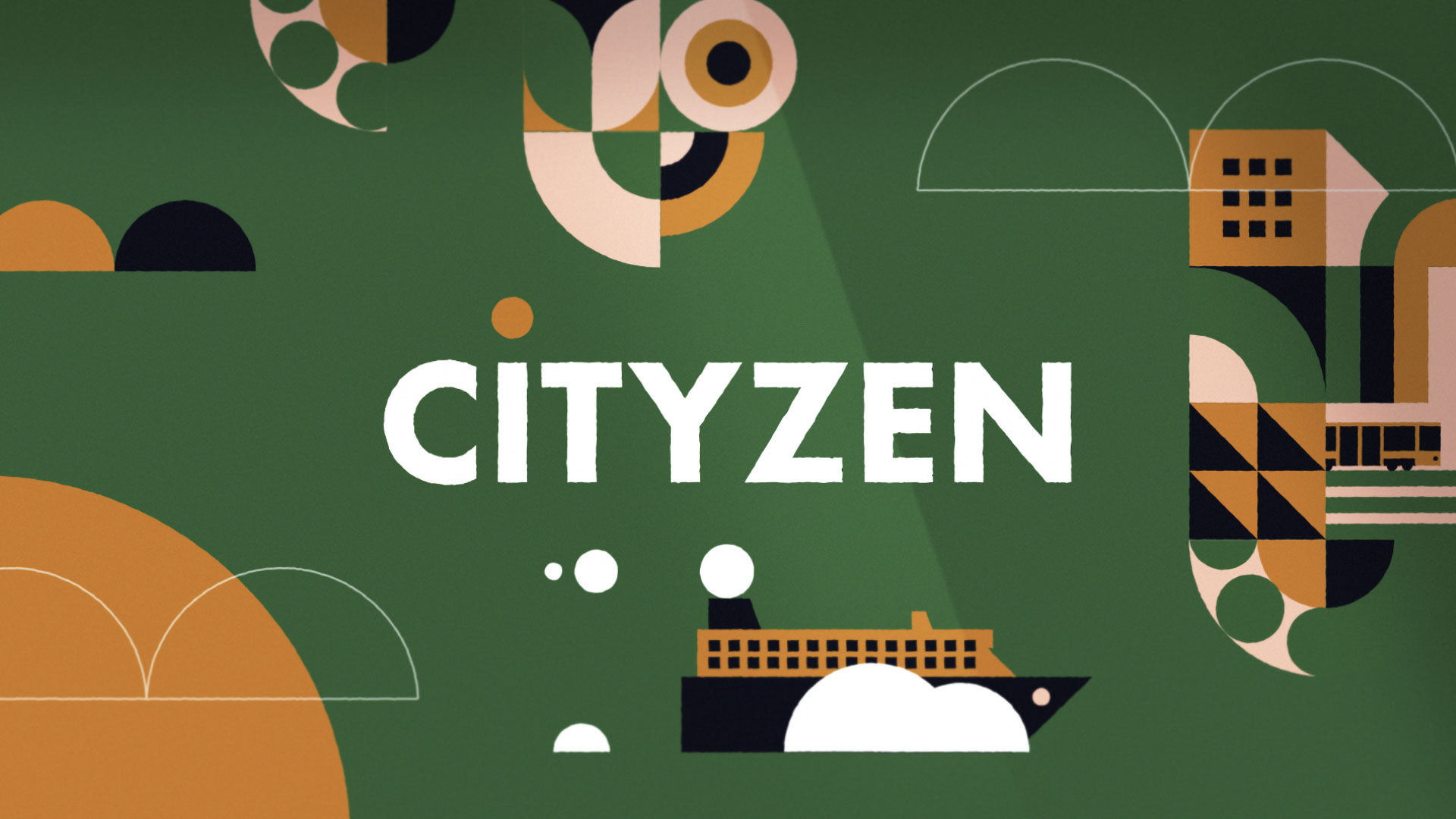
The brand identity for Cityzen, an intercity transport ticket booking app, features a cheerful and playful graphic design applied across multiple media. The name blends "city" and "zen," reflecting stress-free urban travel. The dominant colors — green, pale yellow, and soft pink — create a light, welcoming atmosphere.
Visual Language and Film
The visual language is built around geometric, childlike illustrations that evoke a sense of carefree adventure, suggesting that using the app makes travel simple and joyful. This whimsical tone is reinforced in promotional videos through the use of music with playful, childlike tones, further emphasizing ease, positivity, and the pleasant experience of moving between cities.
Related
03
Whether you prefer a quick call or a detailed message, we're here to listen.

Surf1rst

Bombyx

One

Acropolis