


Description
02
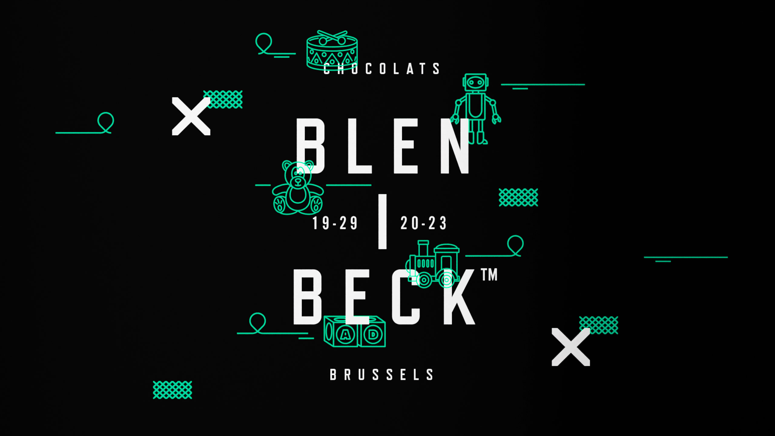
The Core Challenge
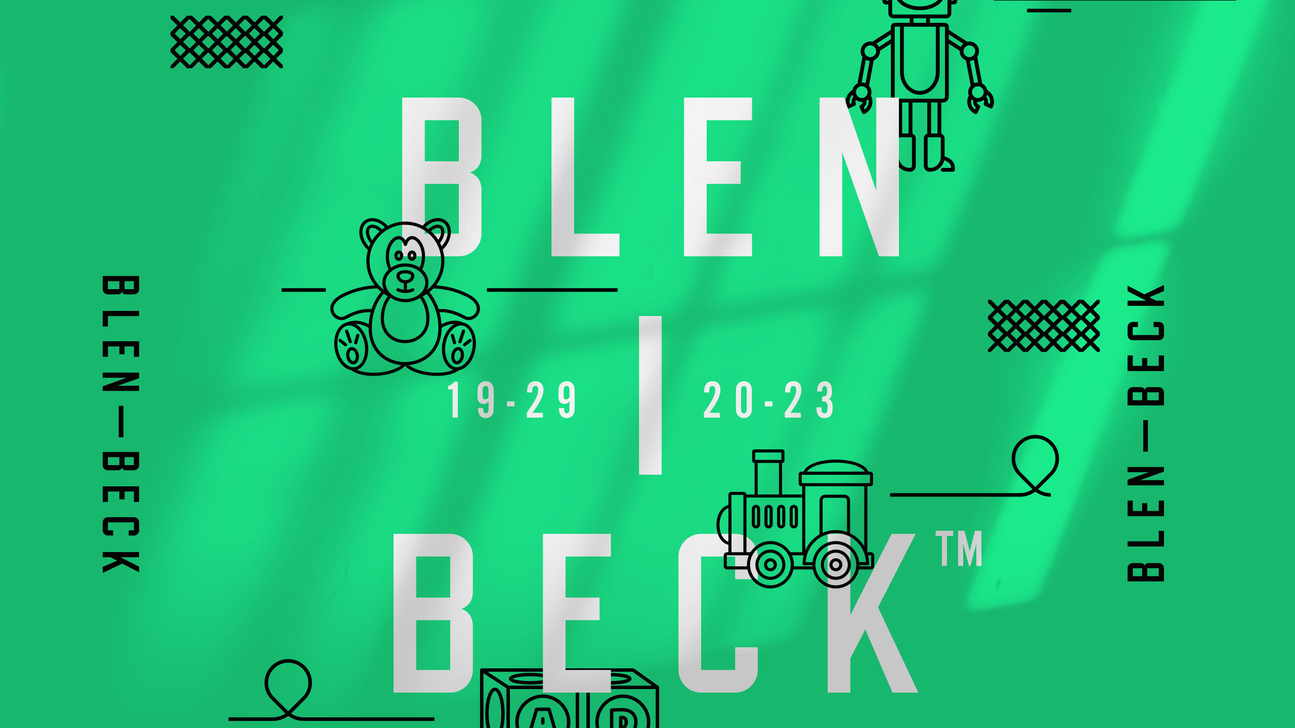
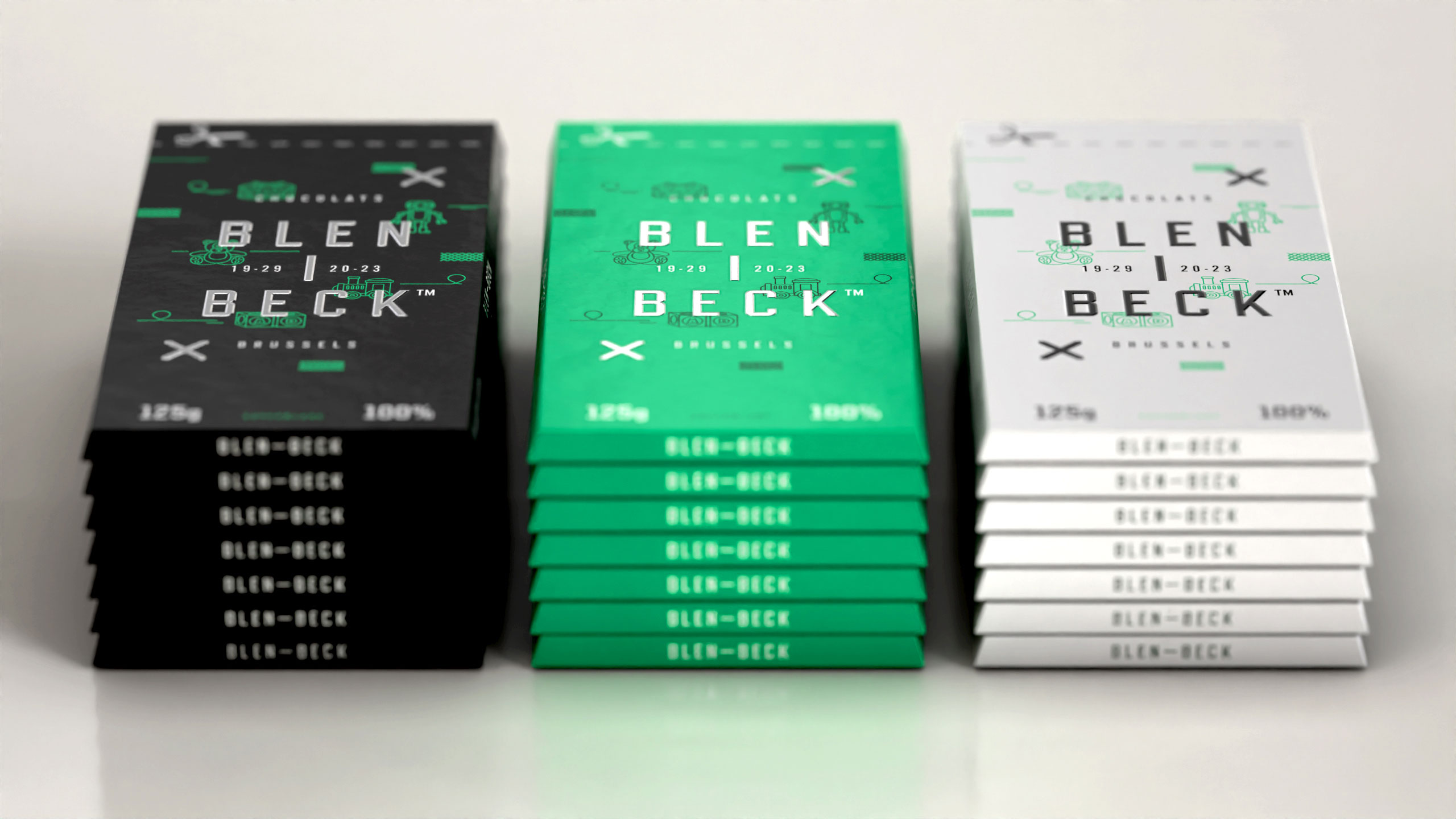
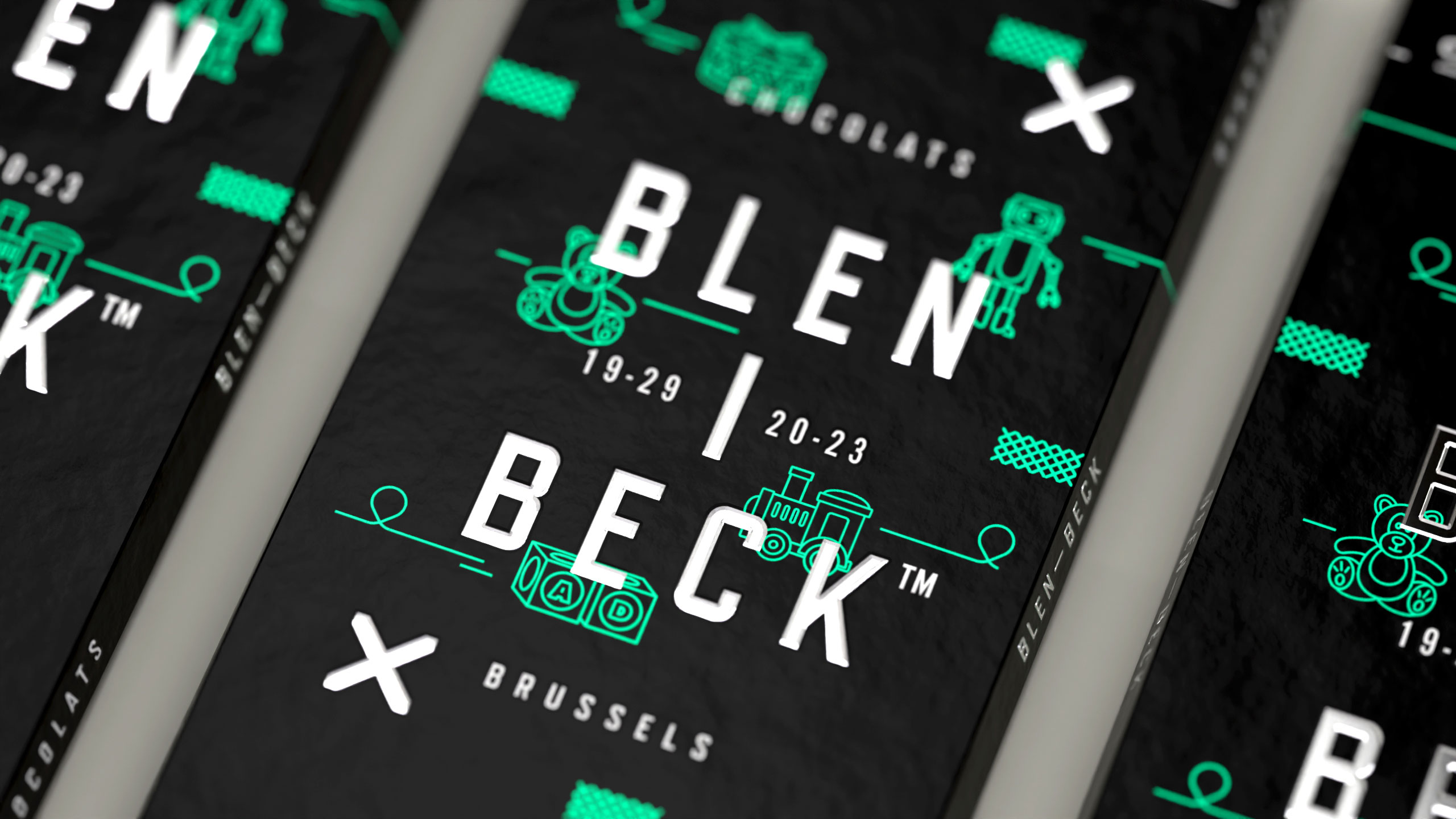
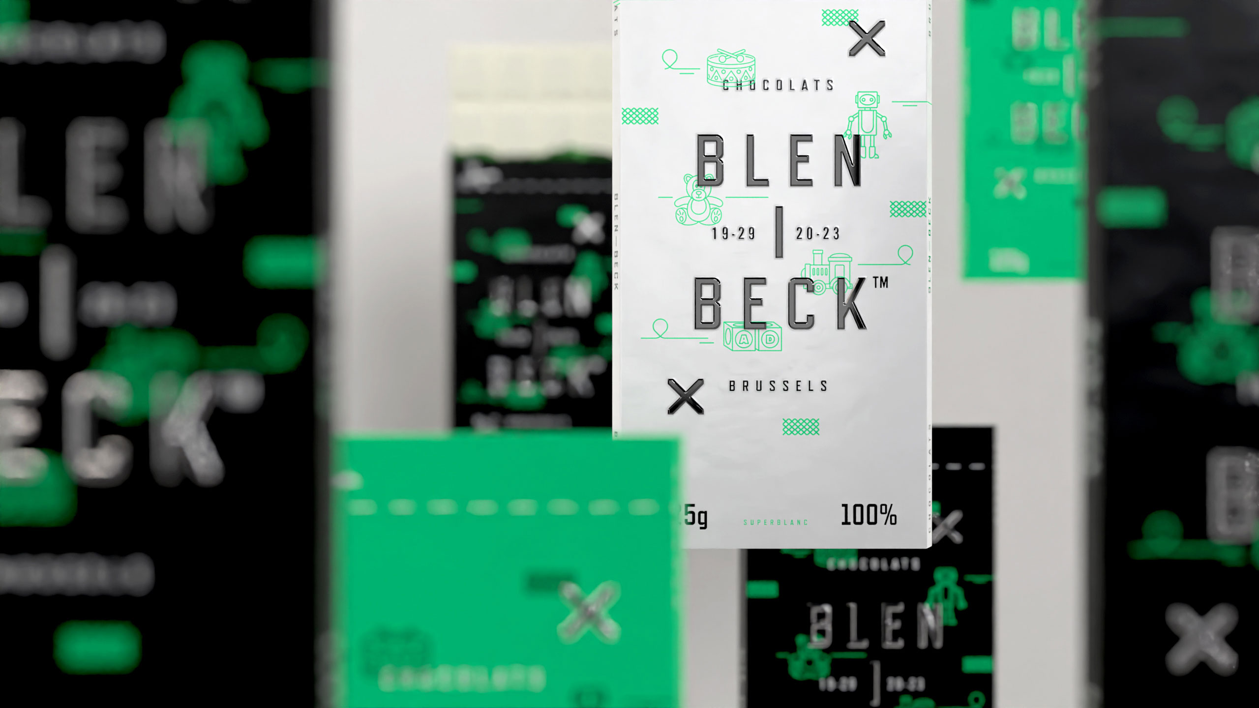
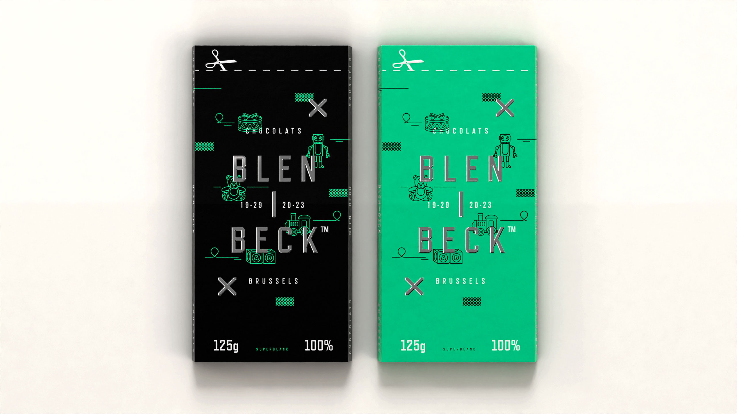
How can packaging express playful sophistication? Blen-Beck's bold black, bright green, and silver colors with whimsical toy illustrations create a joyful, mischievous identity, reflecting a fun Belgian chocolate that breaks conventions.
Visual Language and Palette
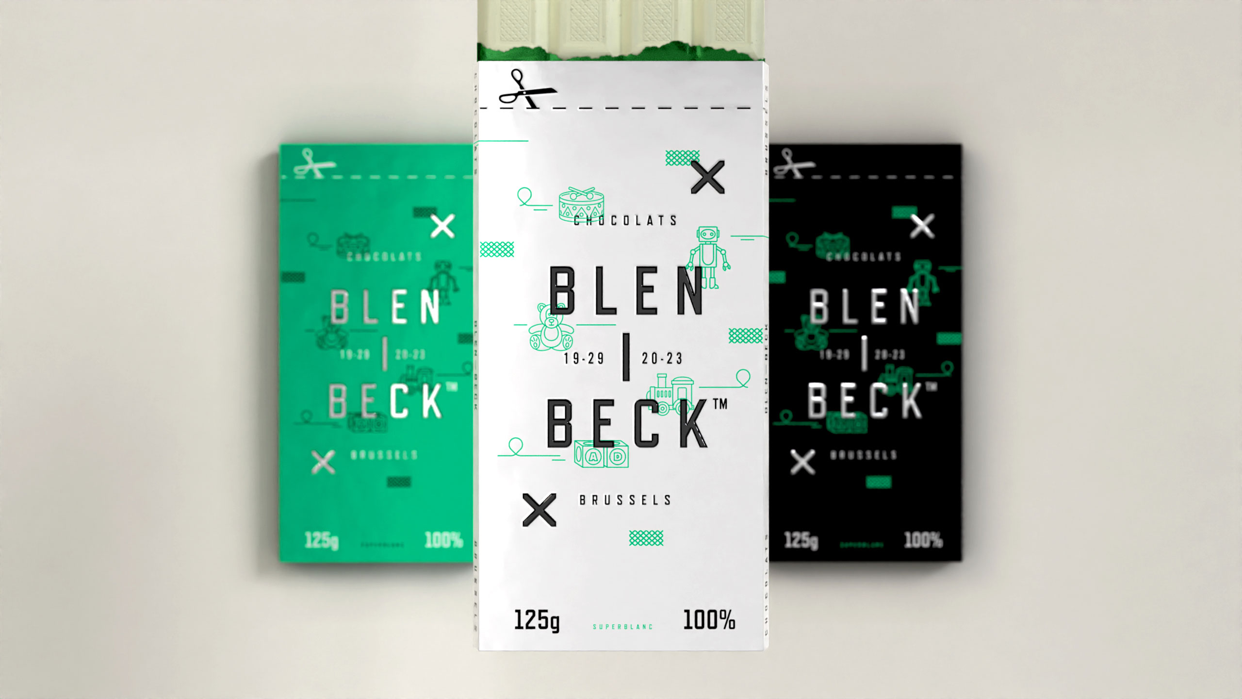
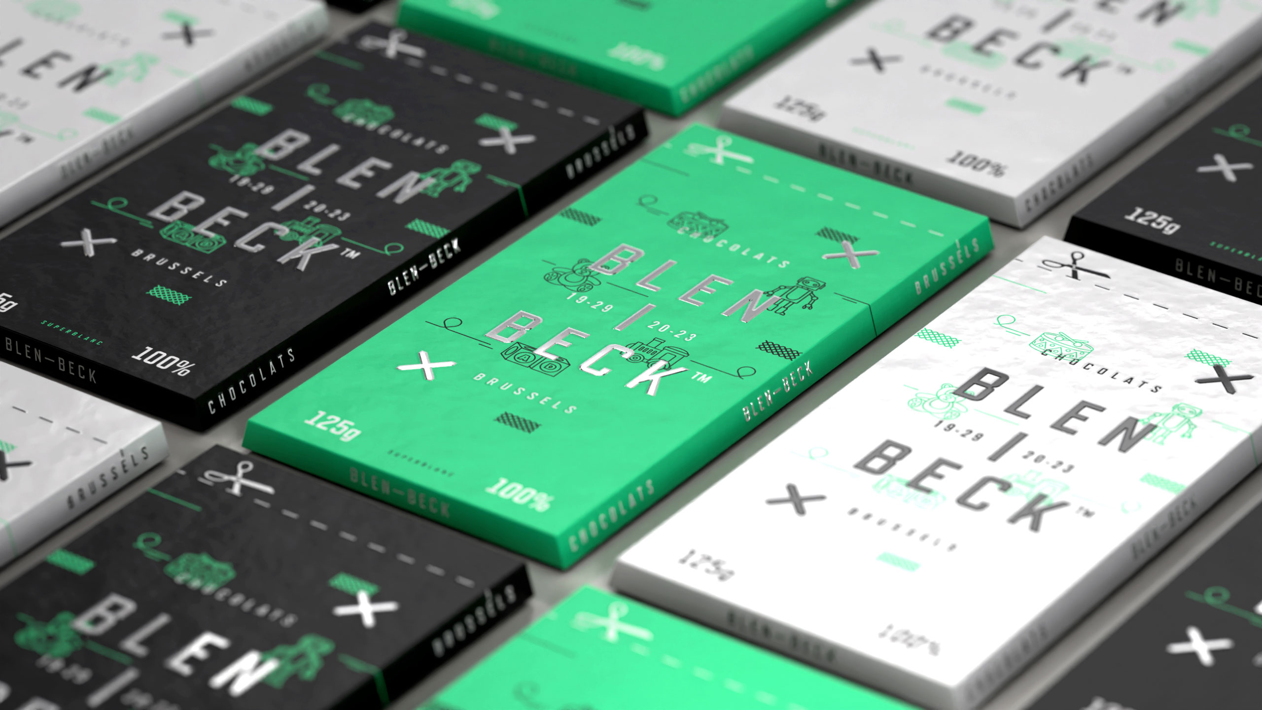
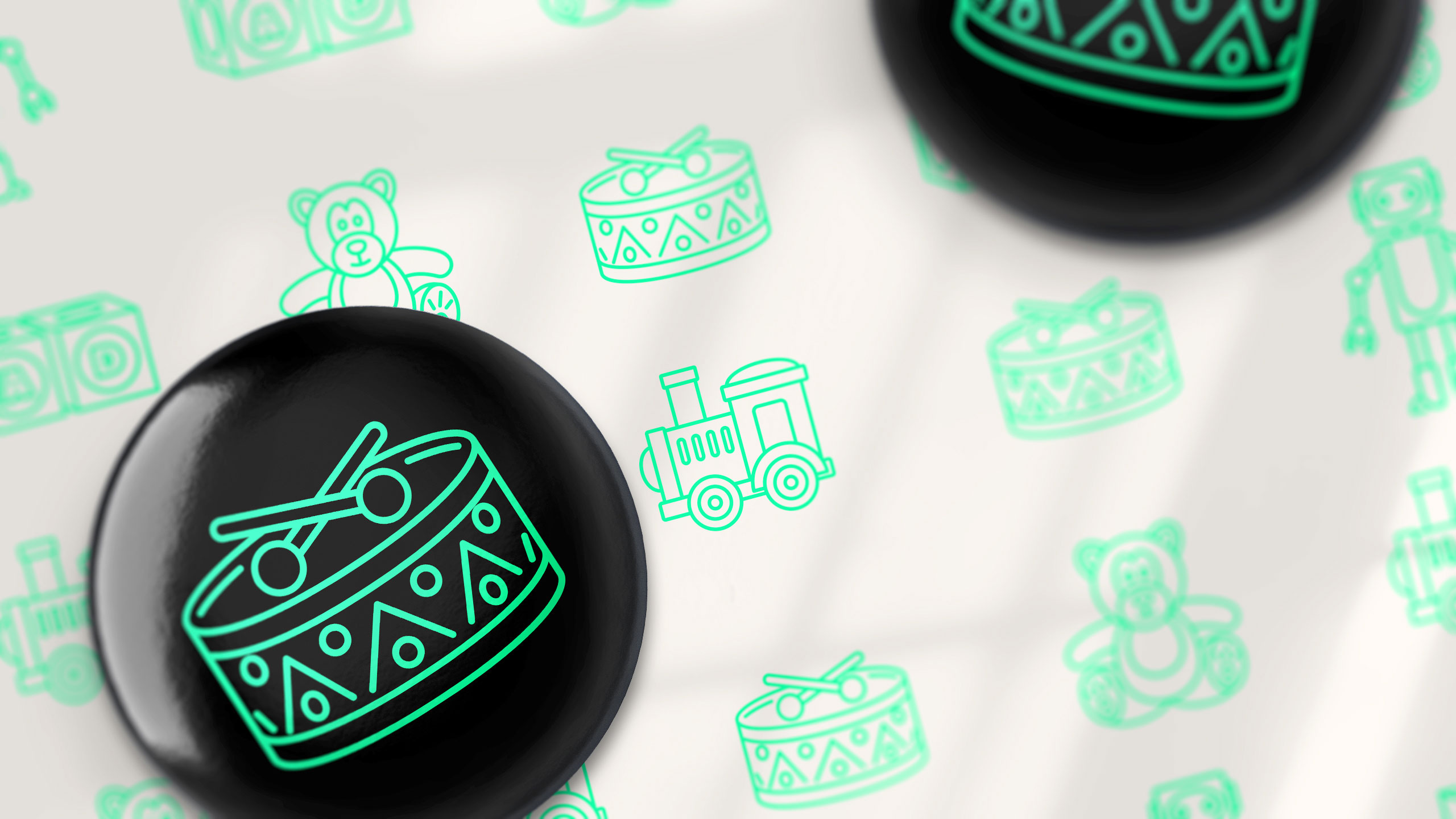
The 125g chocolate bar packaging for "Blen-Beck" features a playful, modern graphic design with a fun and whimsical vibe. The packaging, which comes in three variations—Black, Bright Green, and Silver — incorporates childlike toy illustrations to create a lighthearted, joyful aesthetic. The dominant colors of black, bright green (unconventional for chocolate packaging), and silver make a bold, unexpected statement, emphasizing the fun and vibrant character of the brand.
Name and Spirit
The design reflects a Belgian chocolate that doesn't take itself too seriously, much like its name, which combines two Flemish-sounding words evoking a cheeky nature of a mischievous, inexperienced (green) child, or "blanc-bec" in French.
Related
03
Whether you prefer a quick call or a detailed message, we're here to listen.

Unbrake

Flo

Factory

Blackjack 8