


Description
02
The Core Challenge
How can a graphic identity balance elegance and intensity, using color, typography, and composition to express both romance and danger while maintaining a refined, luxurious brand presence?
Visual Language and Palette
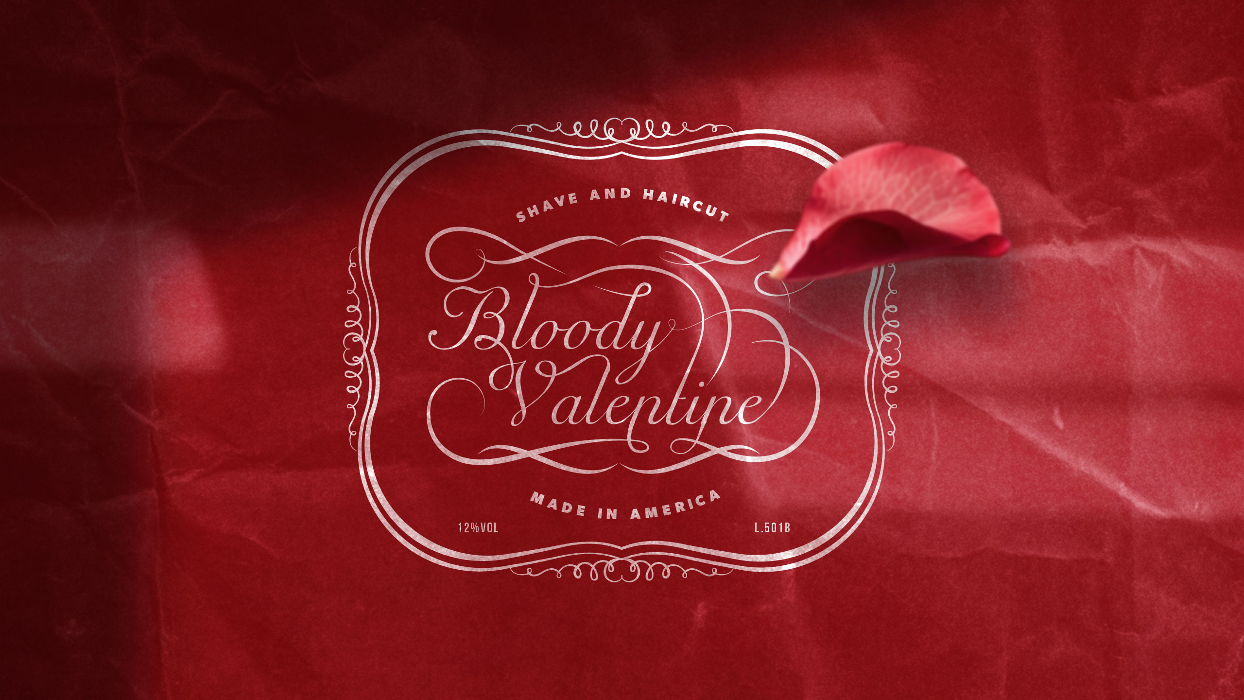
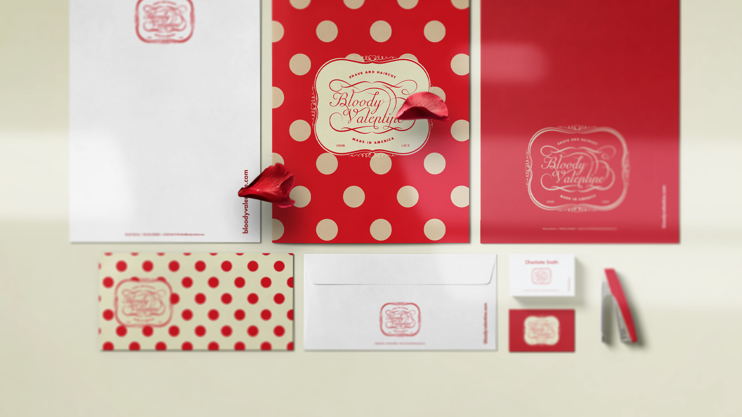
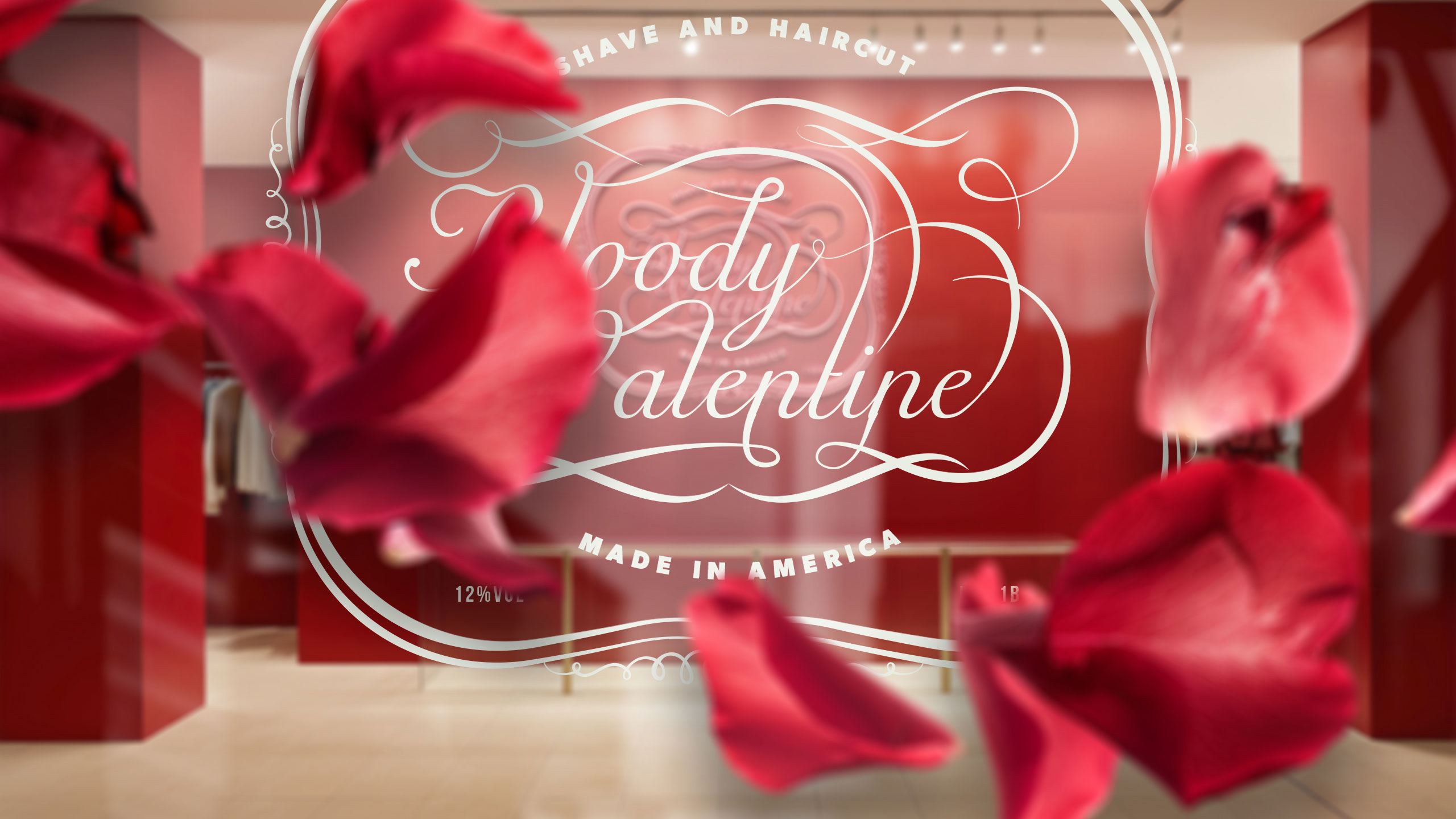
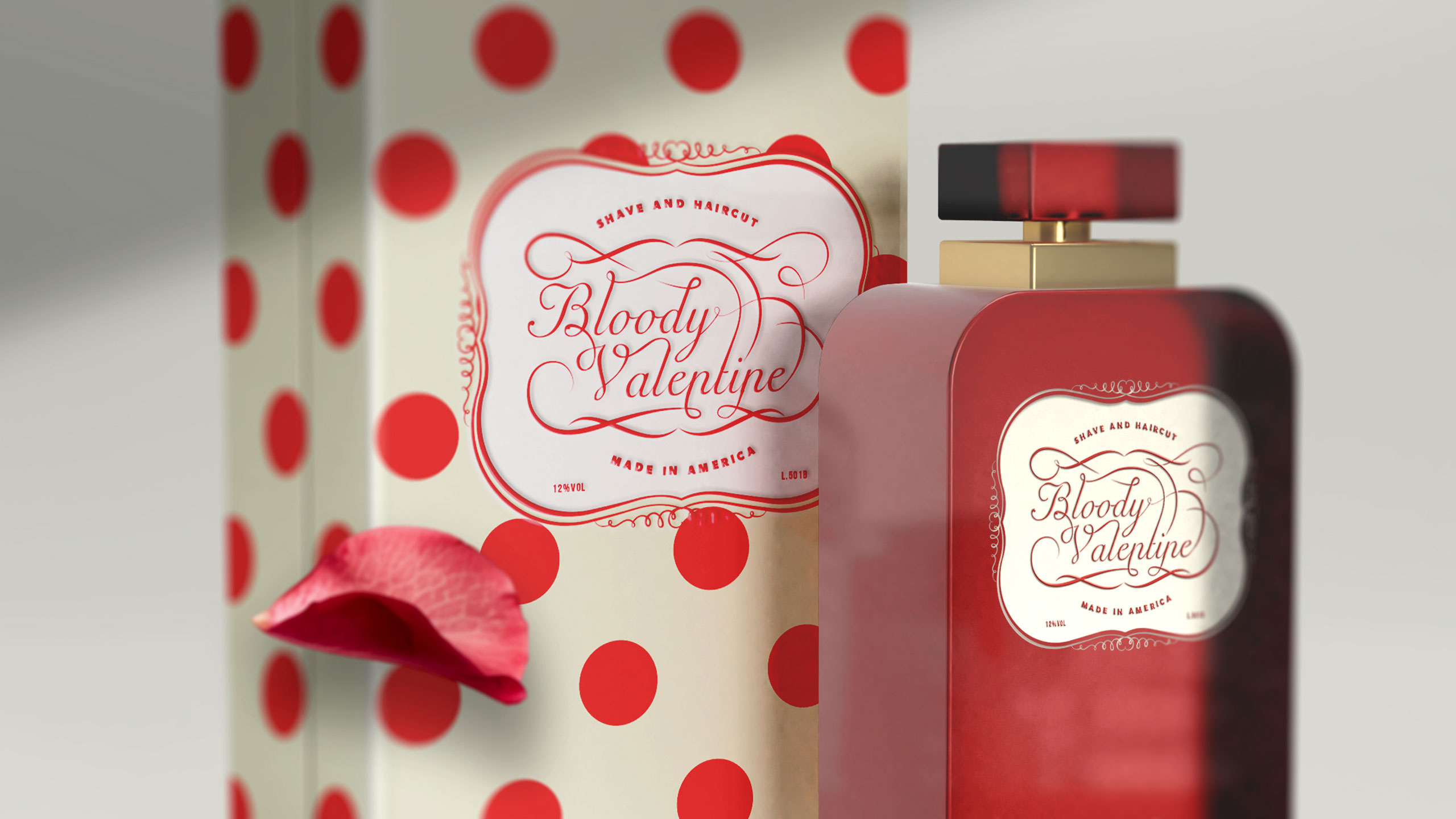
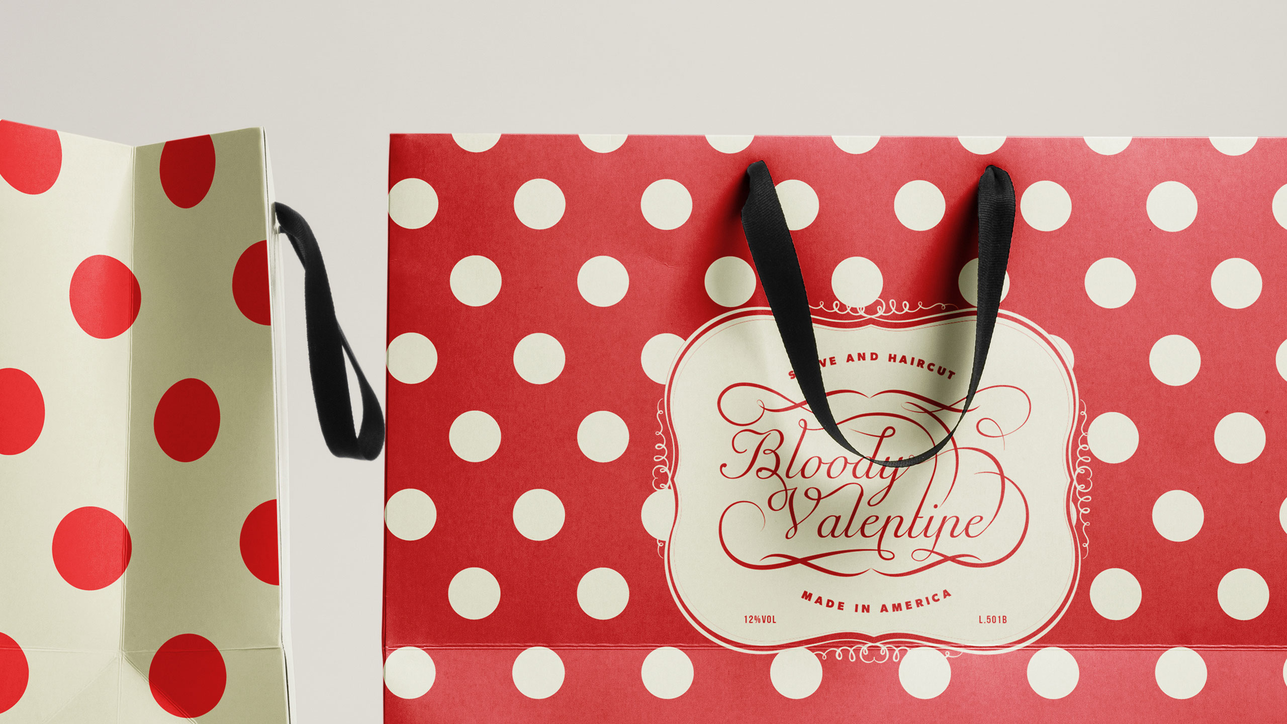
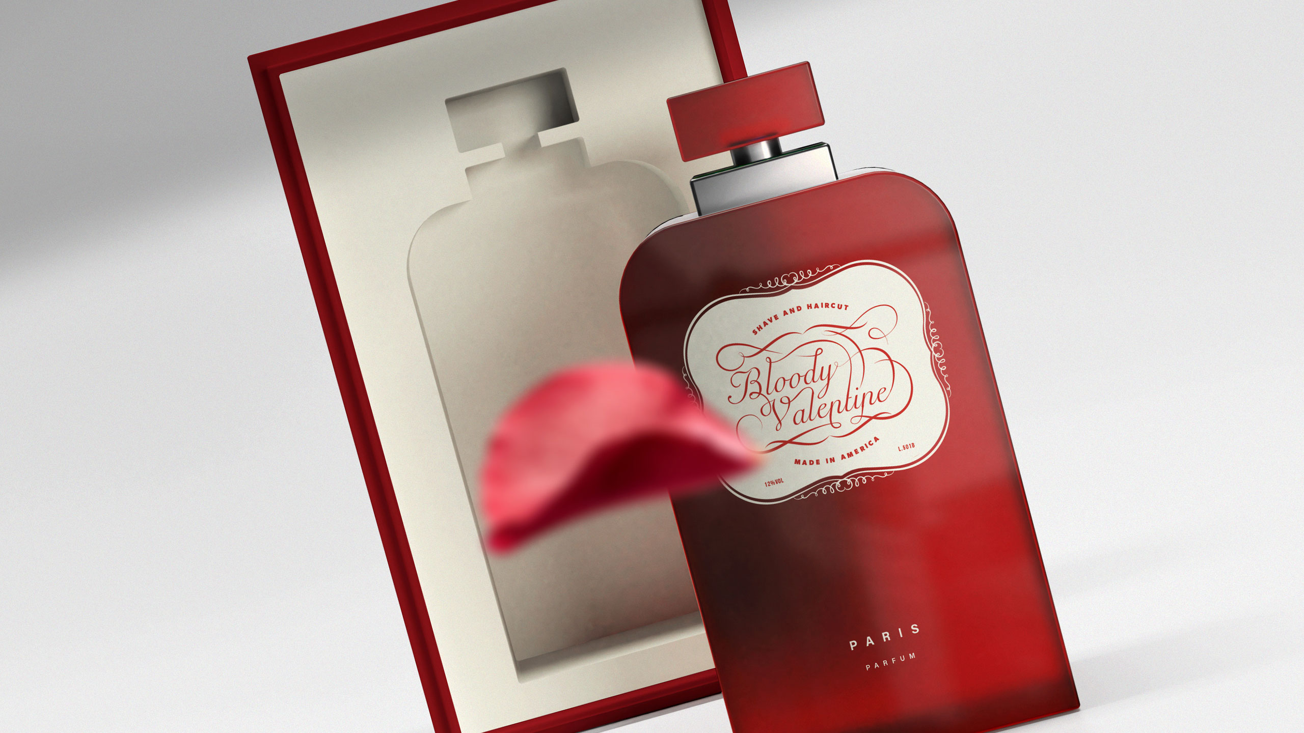
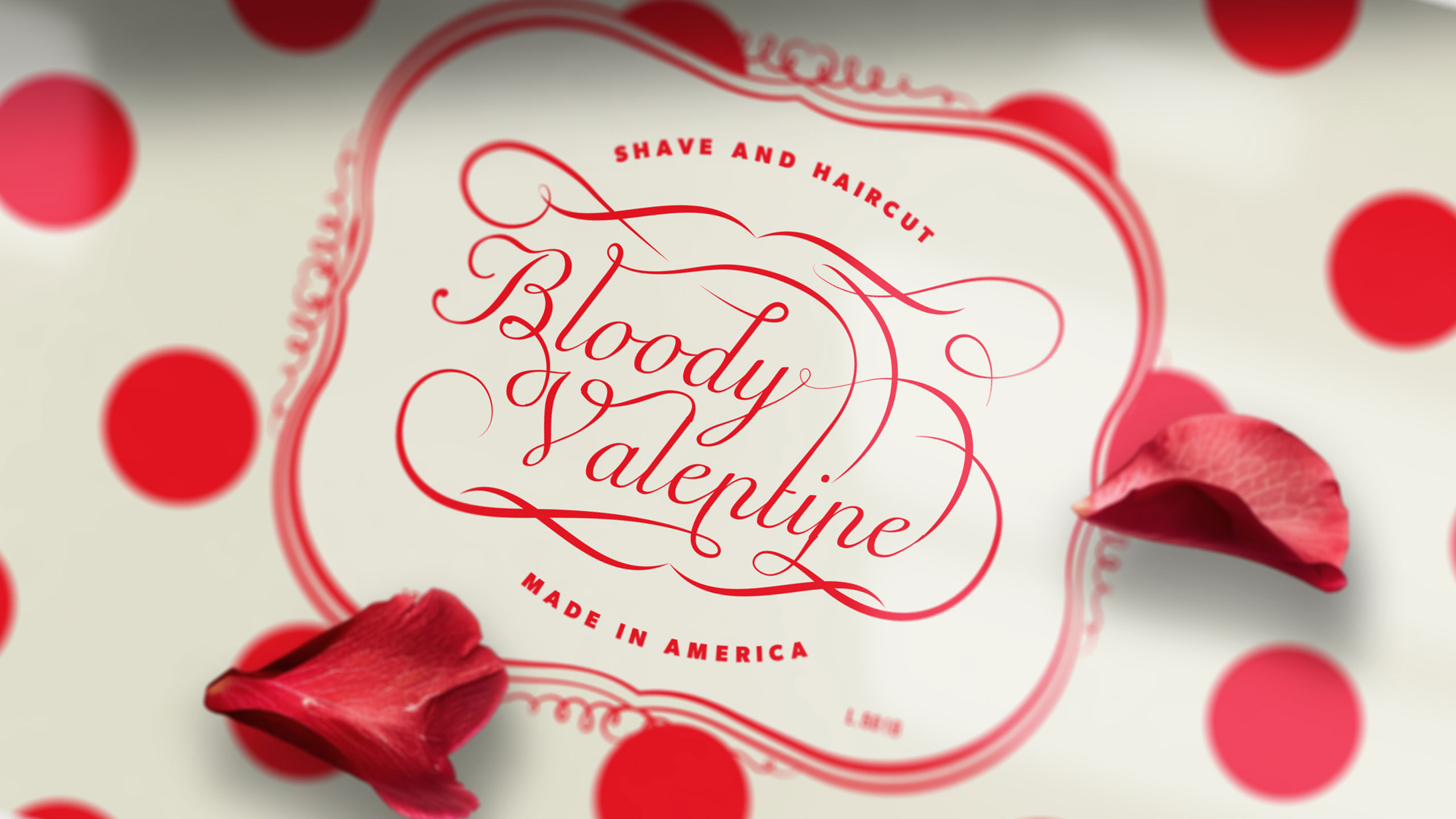
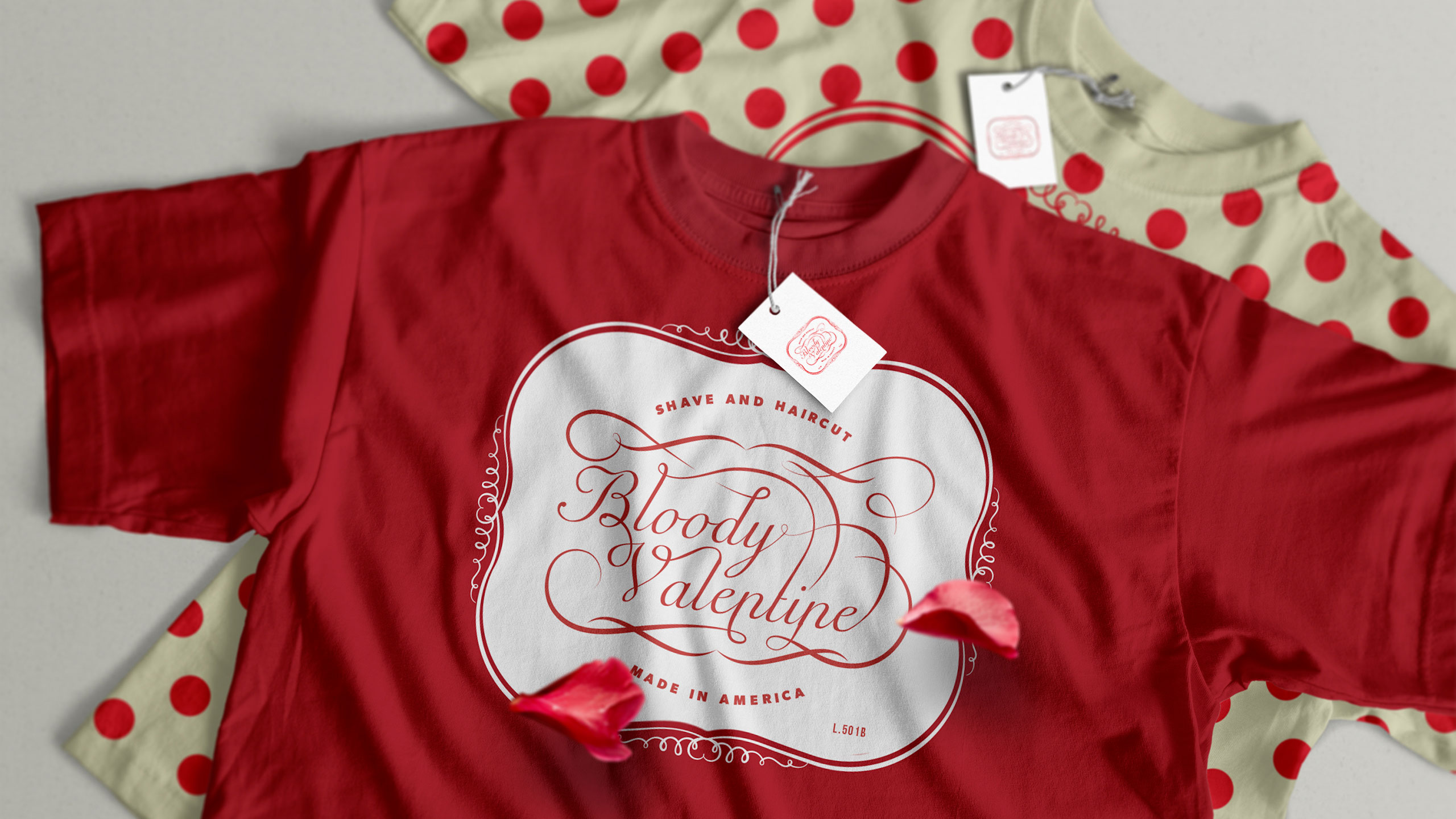
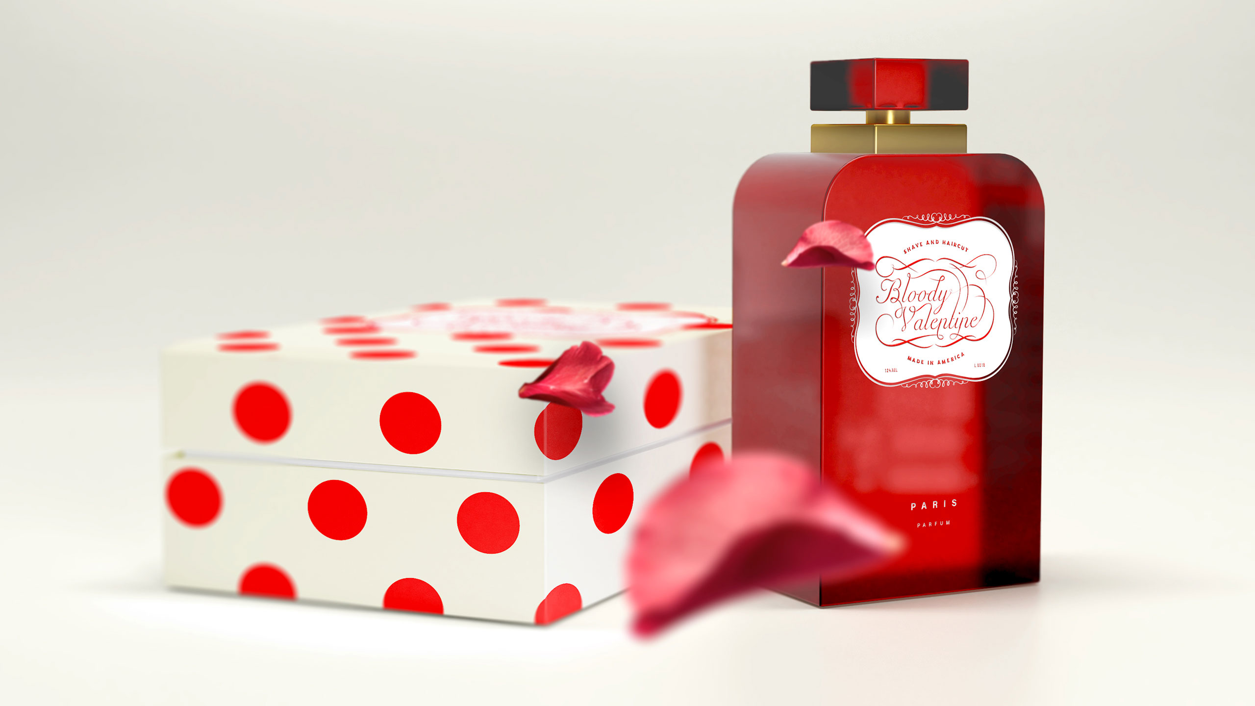
The Bloody Valentine branding concept blends elegance and provocation through a bold visual identity. The design uses deep reds, delicate calligraphy, and fluid curves to merge romance with intensity. Each element — from the packaging to the apparel and fragrance bottle — echoes a vintage sophistication tinged with modern sensuality. The contrast of pure white and vivid crimson evokes both passion and precision.
Typography and Experience
The refined typography, framed by ornamental flourishes, suggests a handcrafted attention to detail. This graphic system transforms the brand into an experience — one that is simultaneously luxurious, daring, and emotionally charged, leaving a lasting visual impression.
Related
03
Whether you prefer a quick call or a detailed message, we're here to listen.

OVER

Café Lenoirs

Blen-Beck

Whare House