


Description
02
The Core Challenge
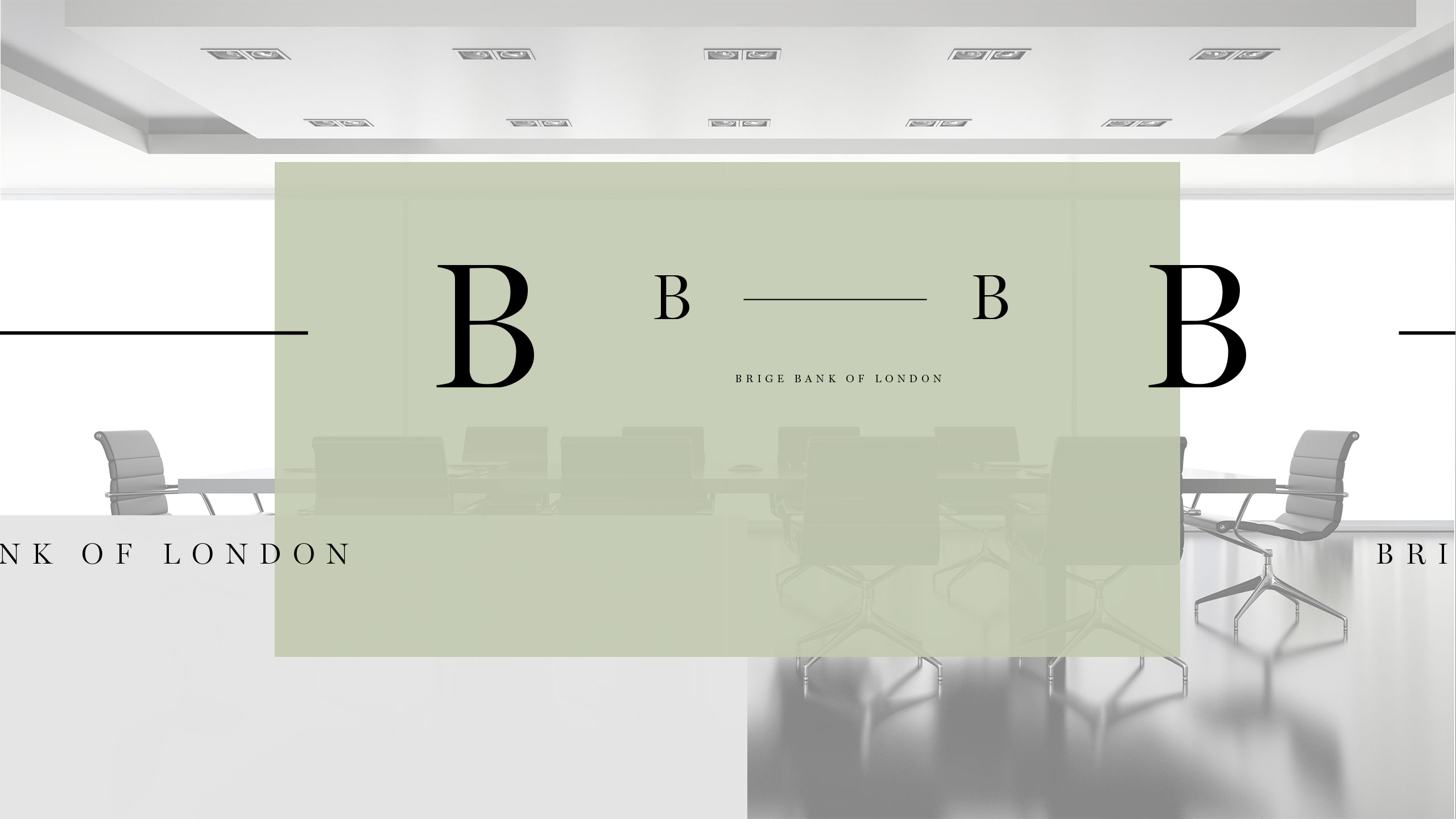
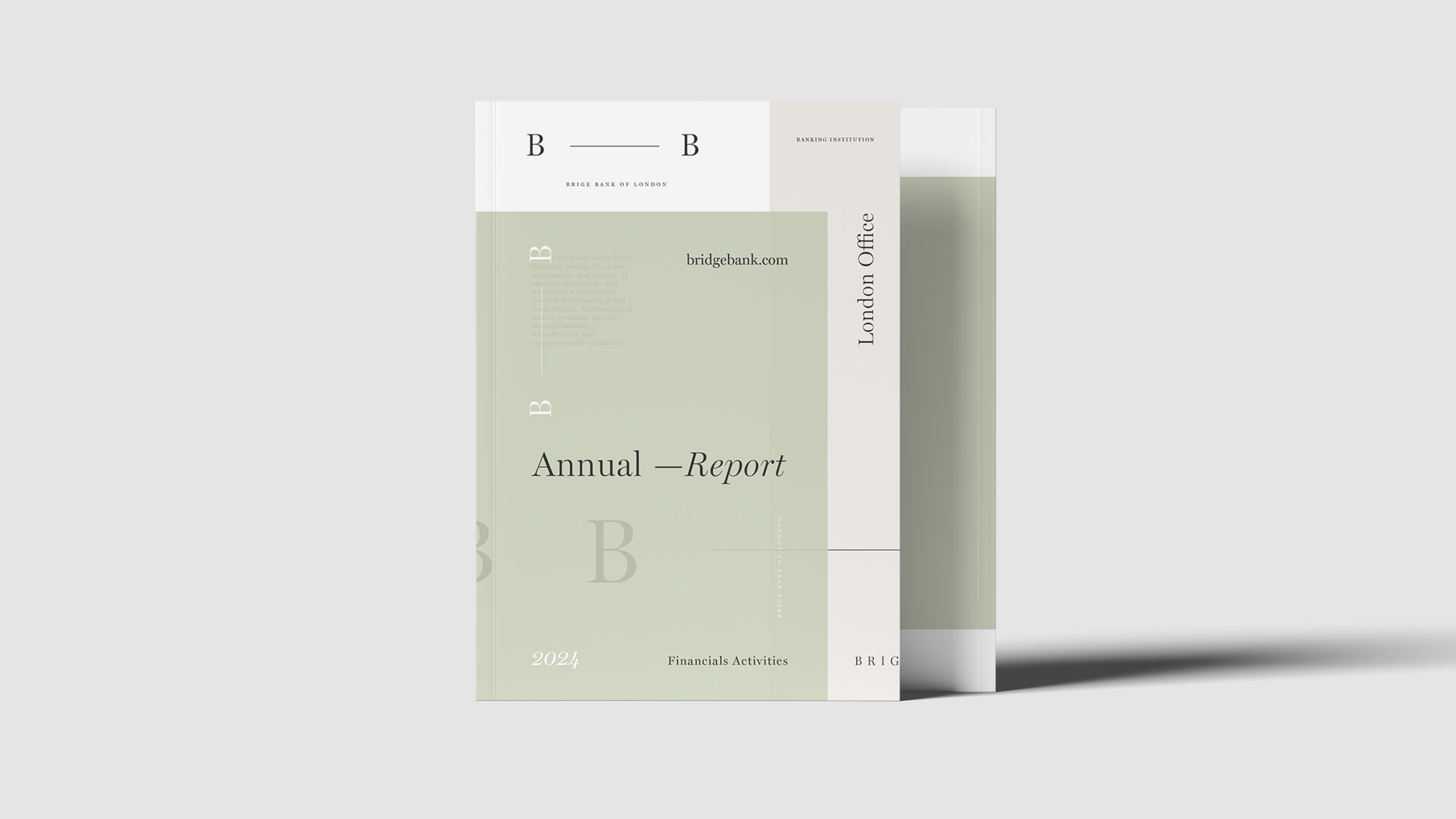
Bridge Bank's identity centers on the dash linking its two Bs—a metaphorical bridge and connection. How can visual design express trust and relationship within a contemporary banking image?
Visual Language and Symbolism
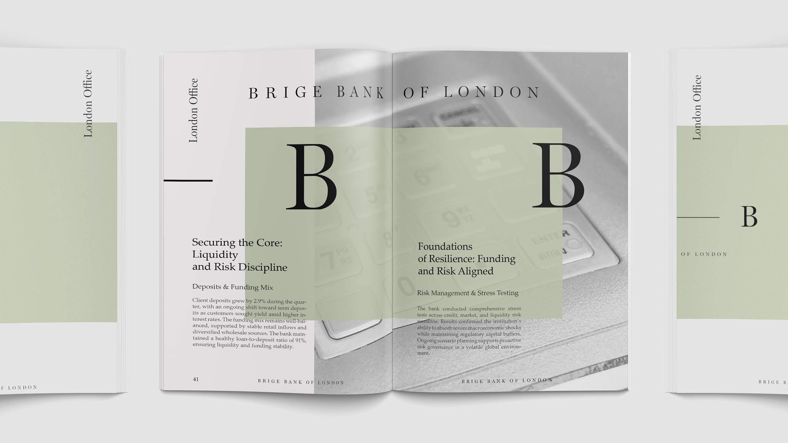
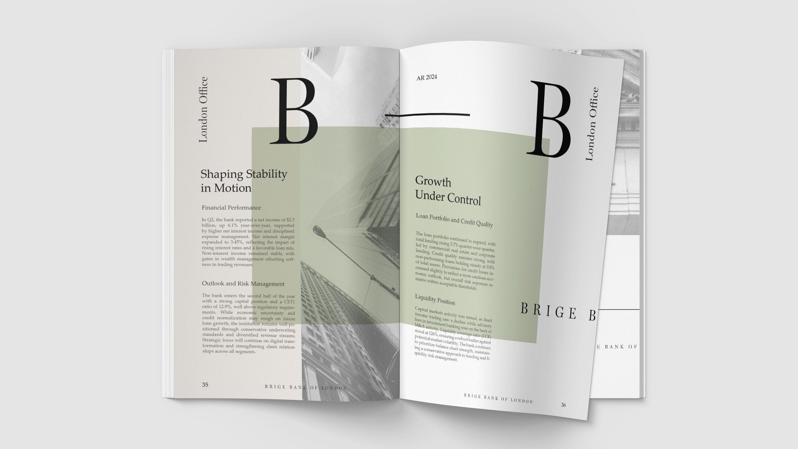
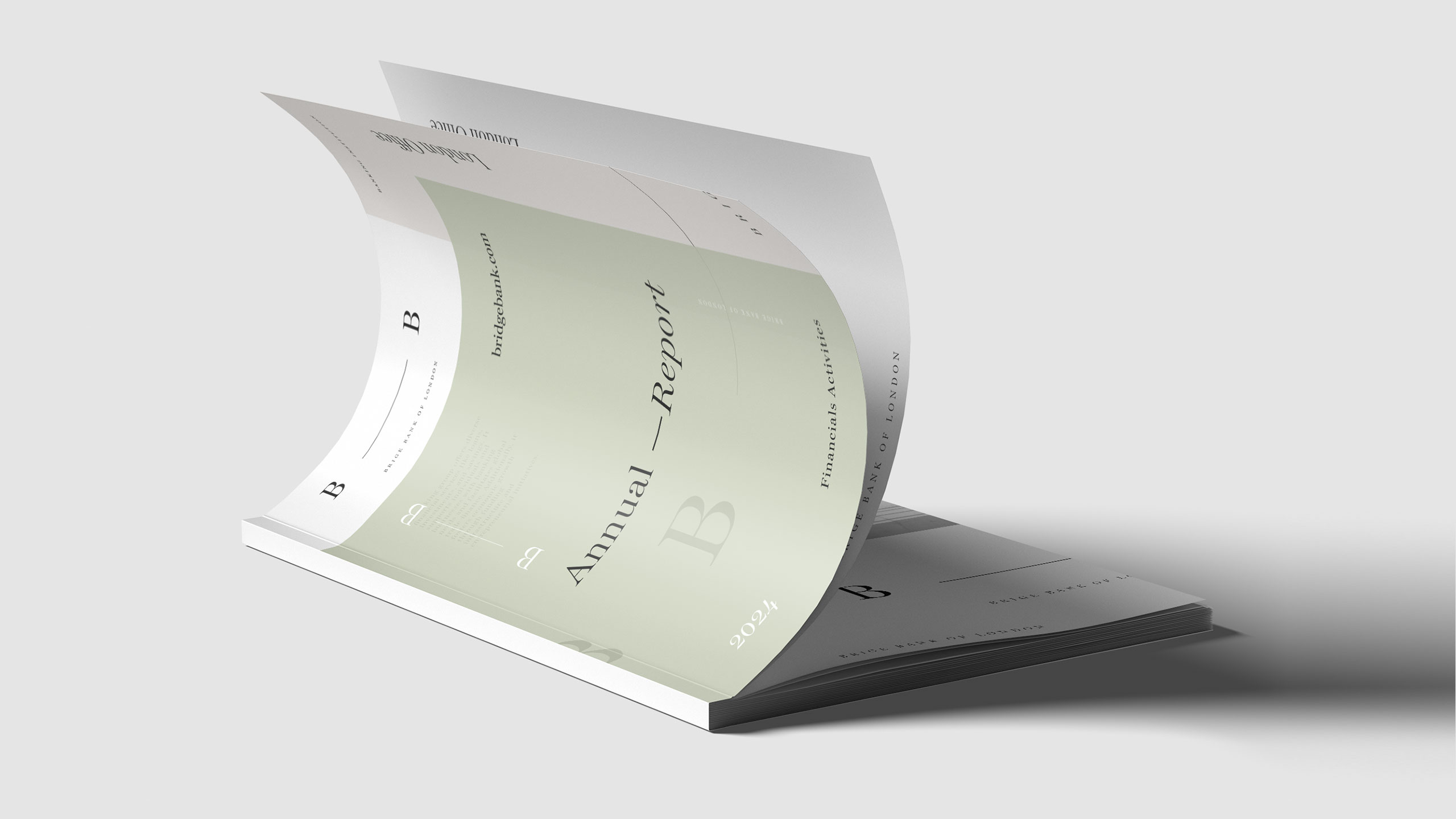
The Bridge Bank of London Annual Report centers its design on the dash linking the two "B"s—a visual bridge symbolizing trust, connection, and continuity. The soft green palette, reminiscent of currency, subtly reinforces themes of prosperity and financial stability. This hue also echoes the London Bridge, an emblem of the city's heritage, aristocratic refinement, and global financial prestige.
Structure and Identity
Structured typography and minimal layouts convey order and discipline, while spacious composition invites clarity and confidence. The report reflects Bridge Bank's B2B identity: a bridge between tradition and innovation, uniting clients and institutions through enduring values of trust and excellence.
Related
03
Whether you prefer a quick call or a detailed message, we're here to listen.

OVER

Café Lenoirs

Blen-Beck

Whare House