


Description
02
The Core Challenge
How can Clover's magazine graphic design balance minimalist Swiss modernism with ecological symbolism, integrating the helix logo to reflect clean energy and sustainability while maintaining elegance and clarity?
Visual Language and Structure
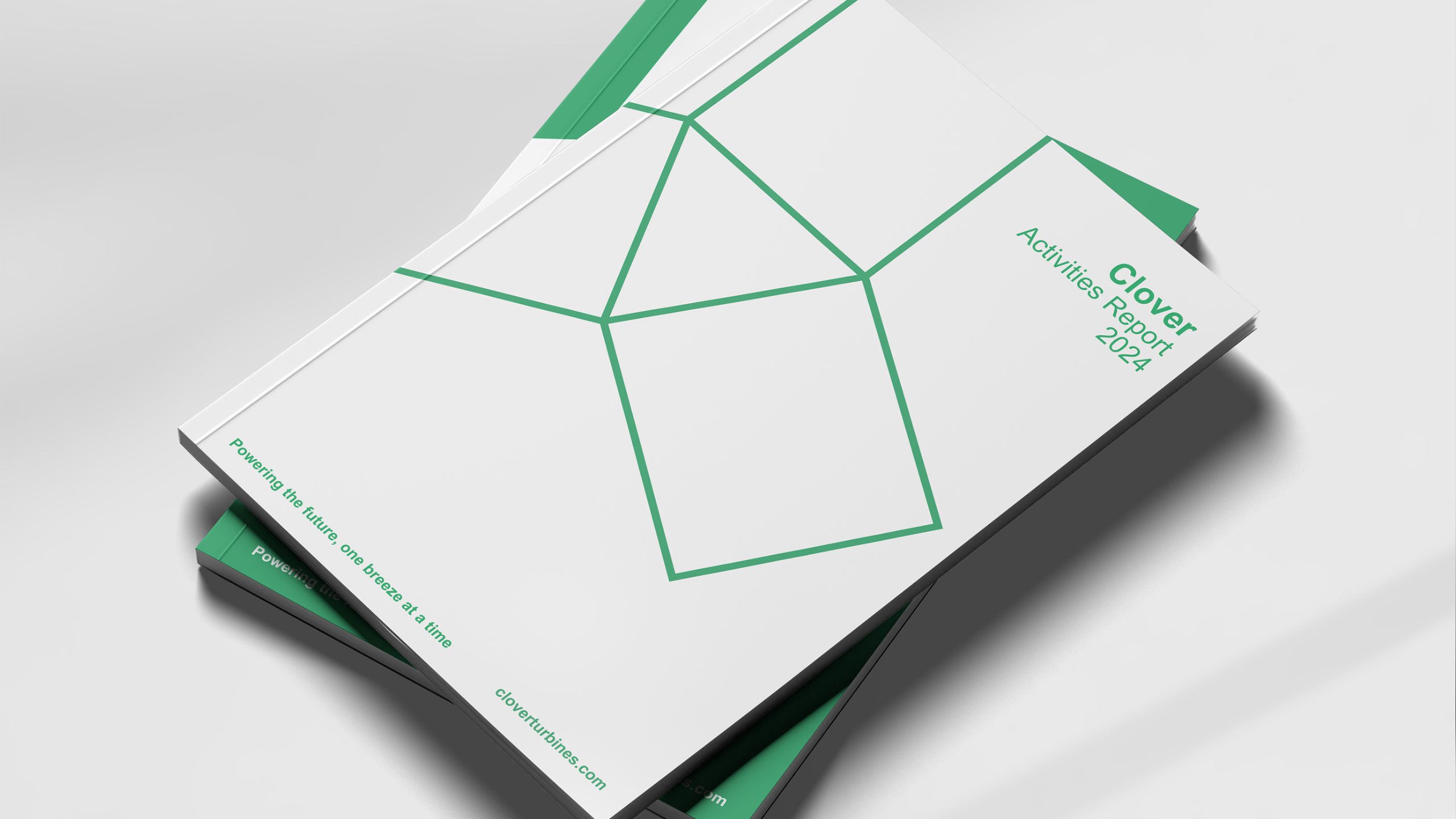
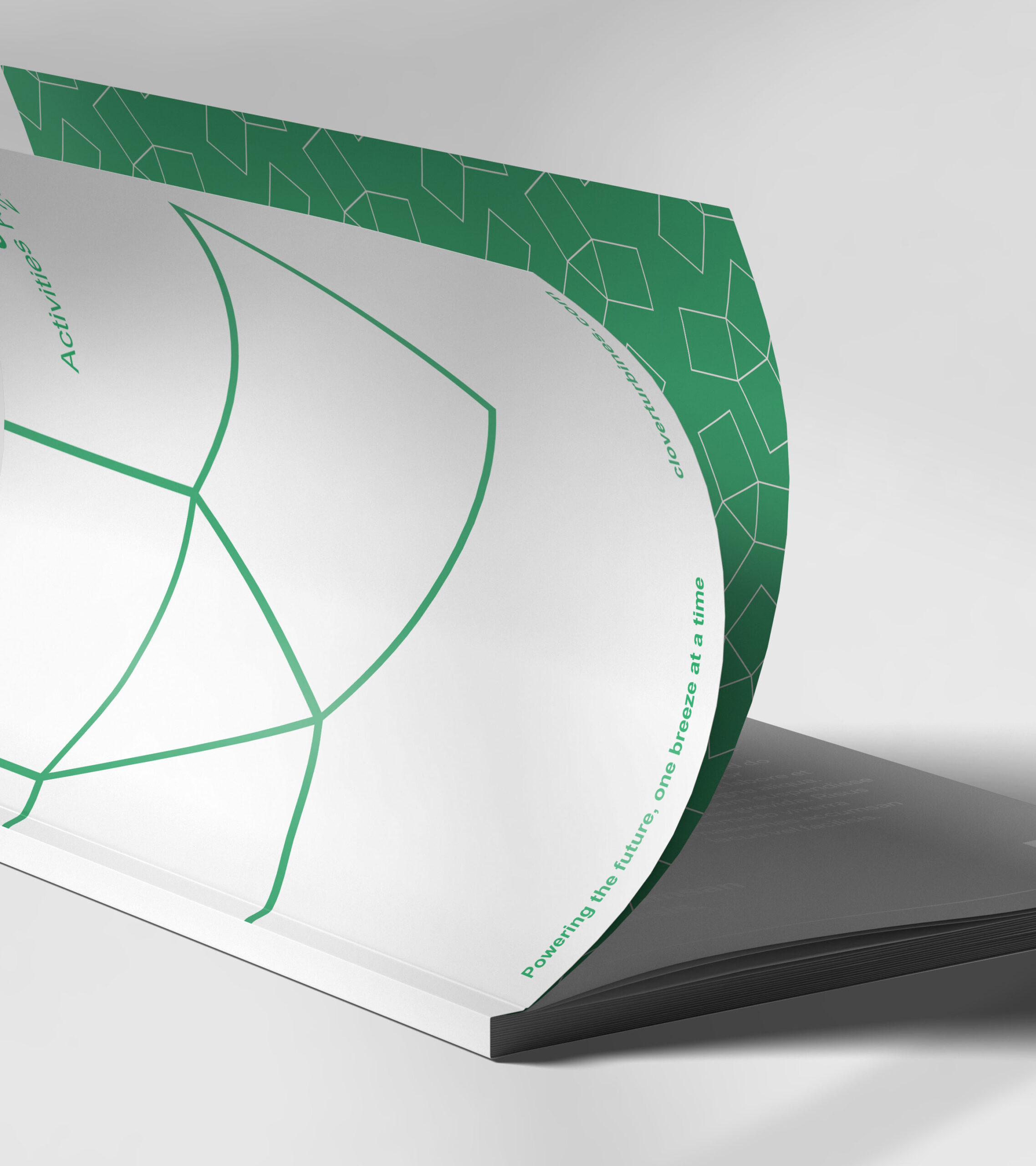
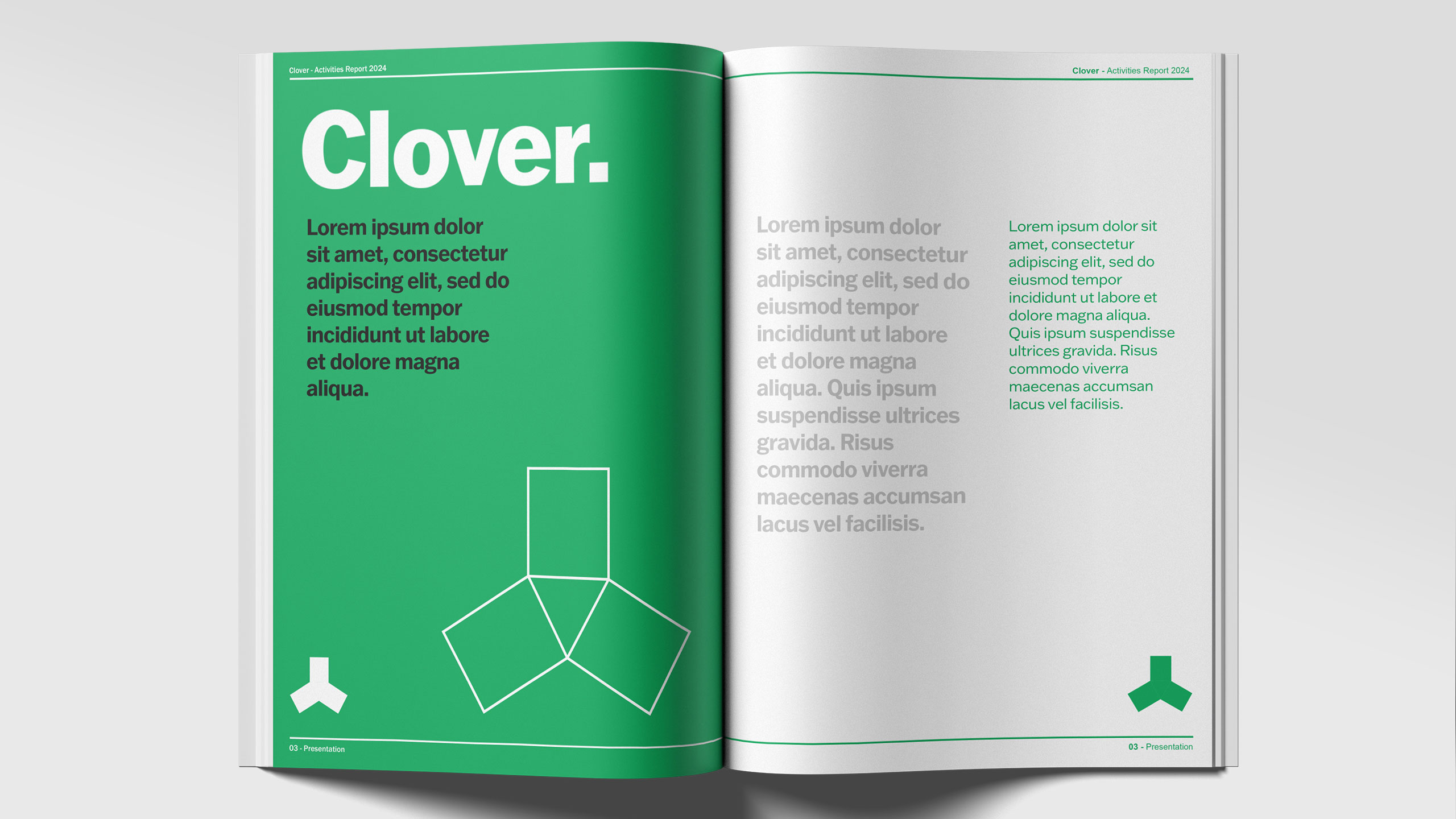
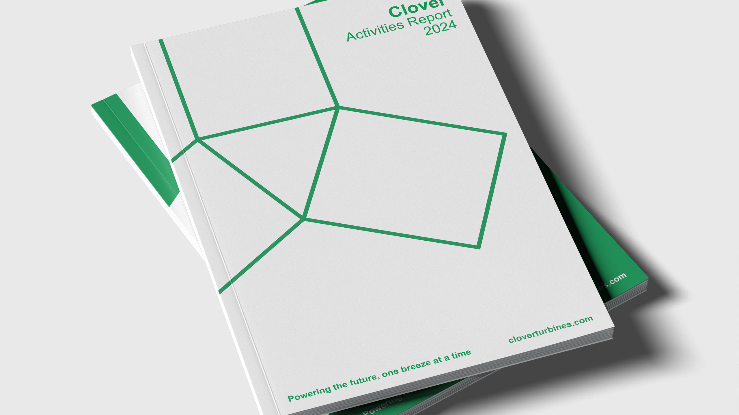
The magazine for Clover, a wind-powered electricity distribution company, features a clean and timeless graphic design inspired by Swiss modernism. The layout is minimalist and structured, prioritizing clarity and function while maintaining an elegant, professional look. The dominant color is green, symbolizing ecology, sustainability, and the brand's clover namesake.
Logo Integration and Concept
A distinctive visual element is the use of the company's helix-shaped logo—reminiscent of both a clover and a wind turbine blade — as a framing device for photographs throughout the magazine. This thoughtful integration of form and function reflects Clover's commitment to clean energy and intelligent, forward-thinking design.
Related
03
Whether you prefer a quick call or a detailed message, we're here to listen.

OVER

Café Lenoirs

Blen-Beck

Whare House