


Description
02
The Core Challenge
How can editorial design elevate a luxury watch brand's aviation heritage? Esquadron translates precision, adventure, and identity into visuals that echo cockpit geometry and evoke sky-bound elegance and technical mastery.
Visual Language and Palette
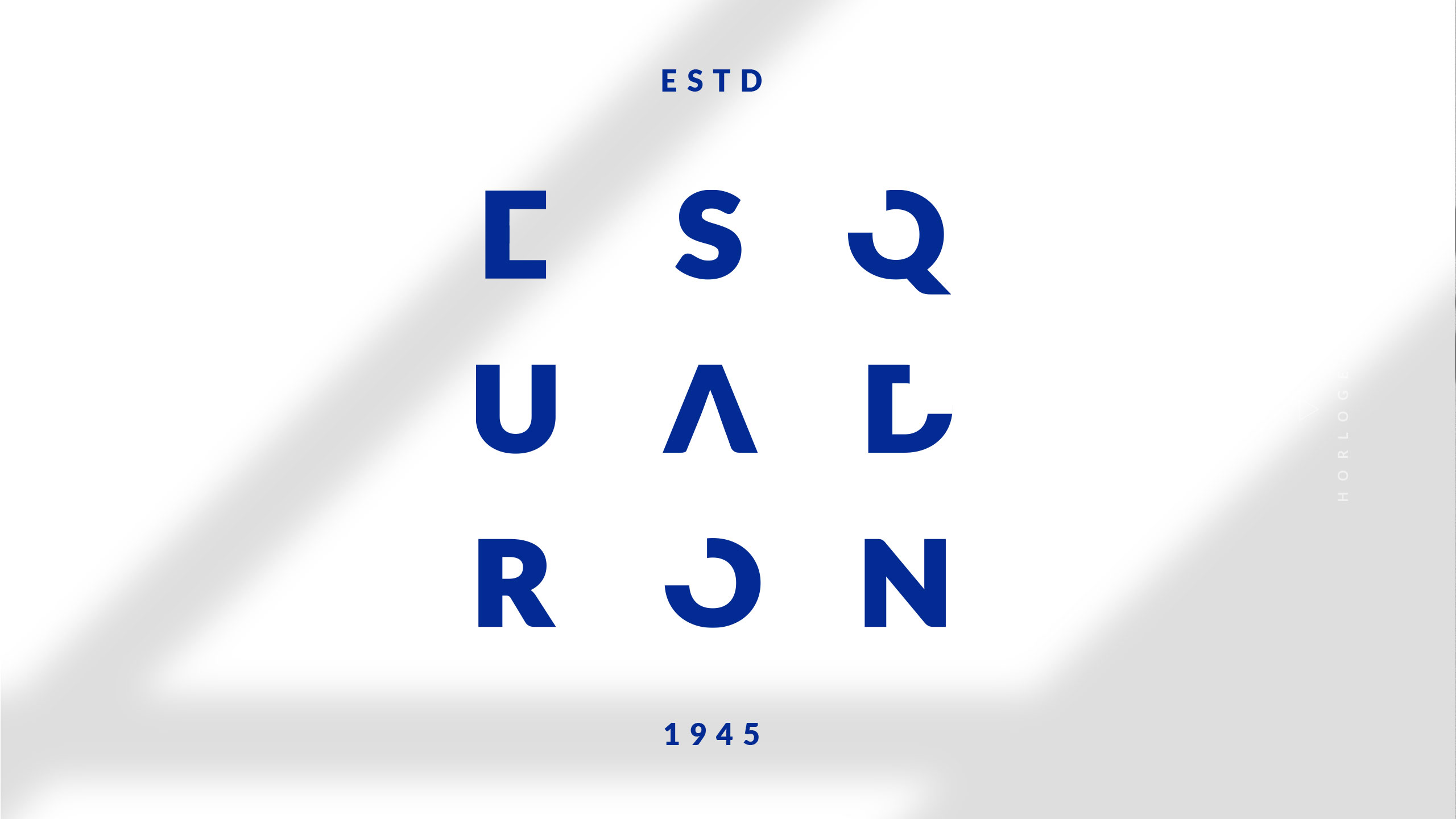
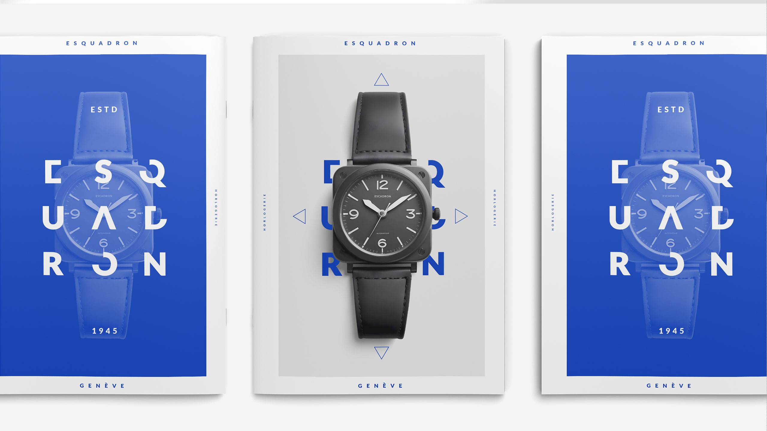
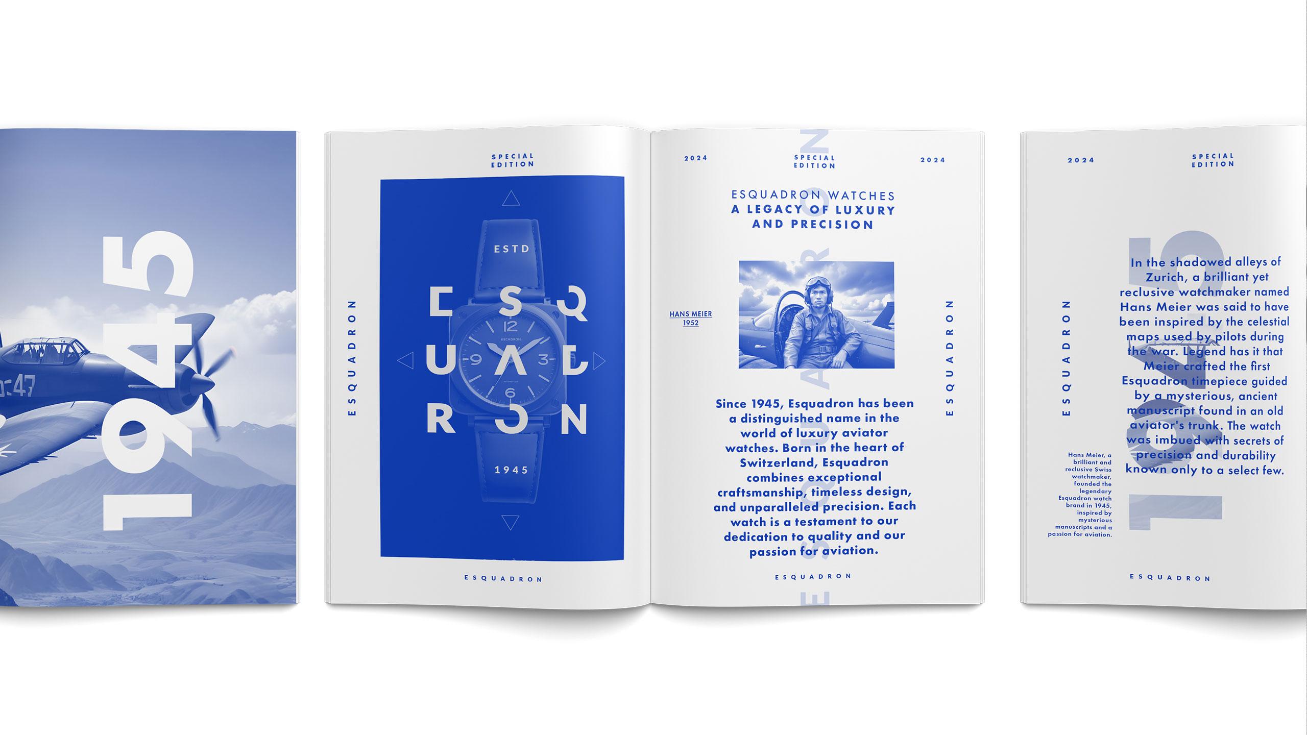
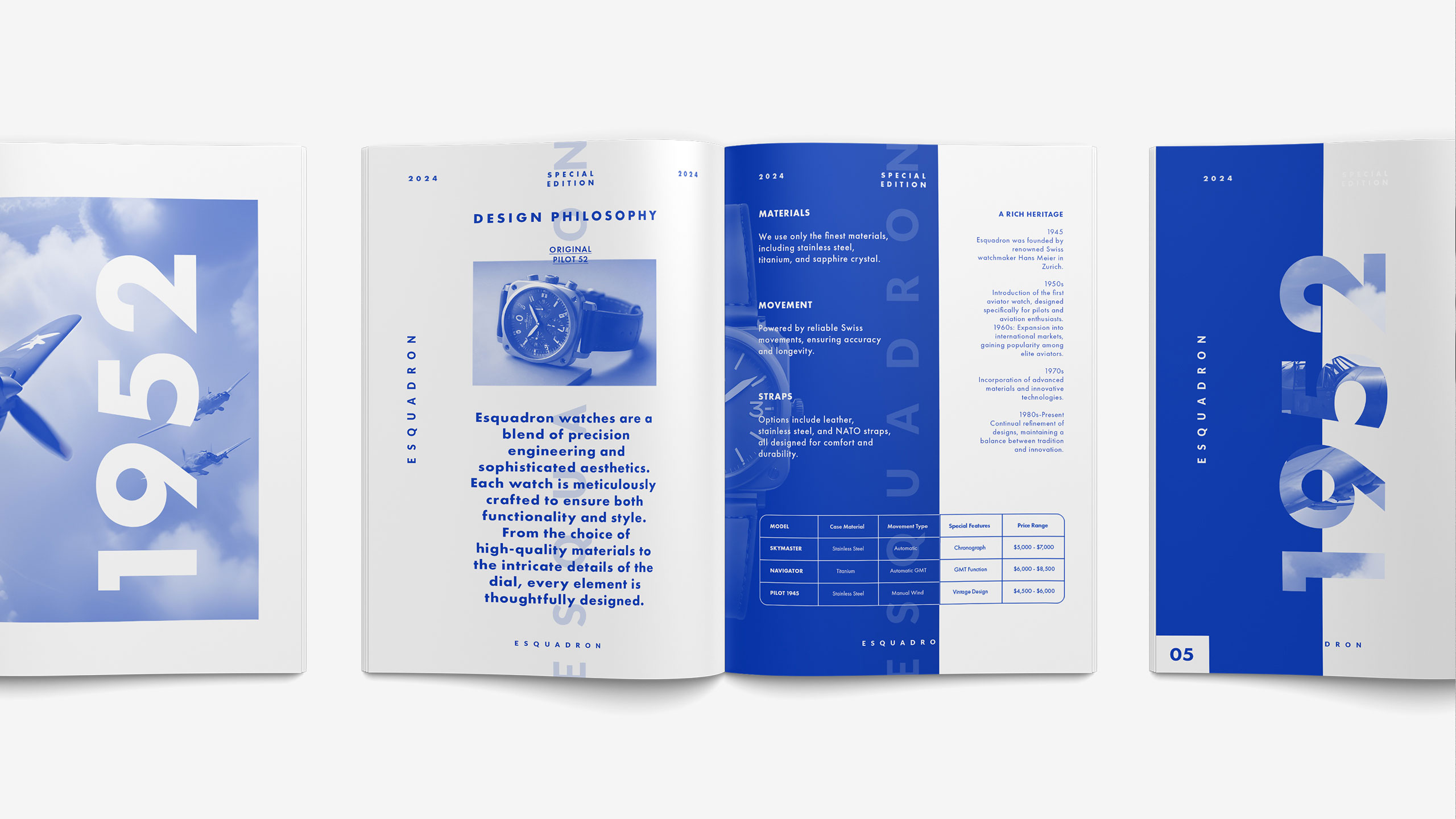
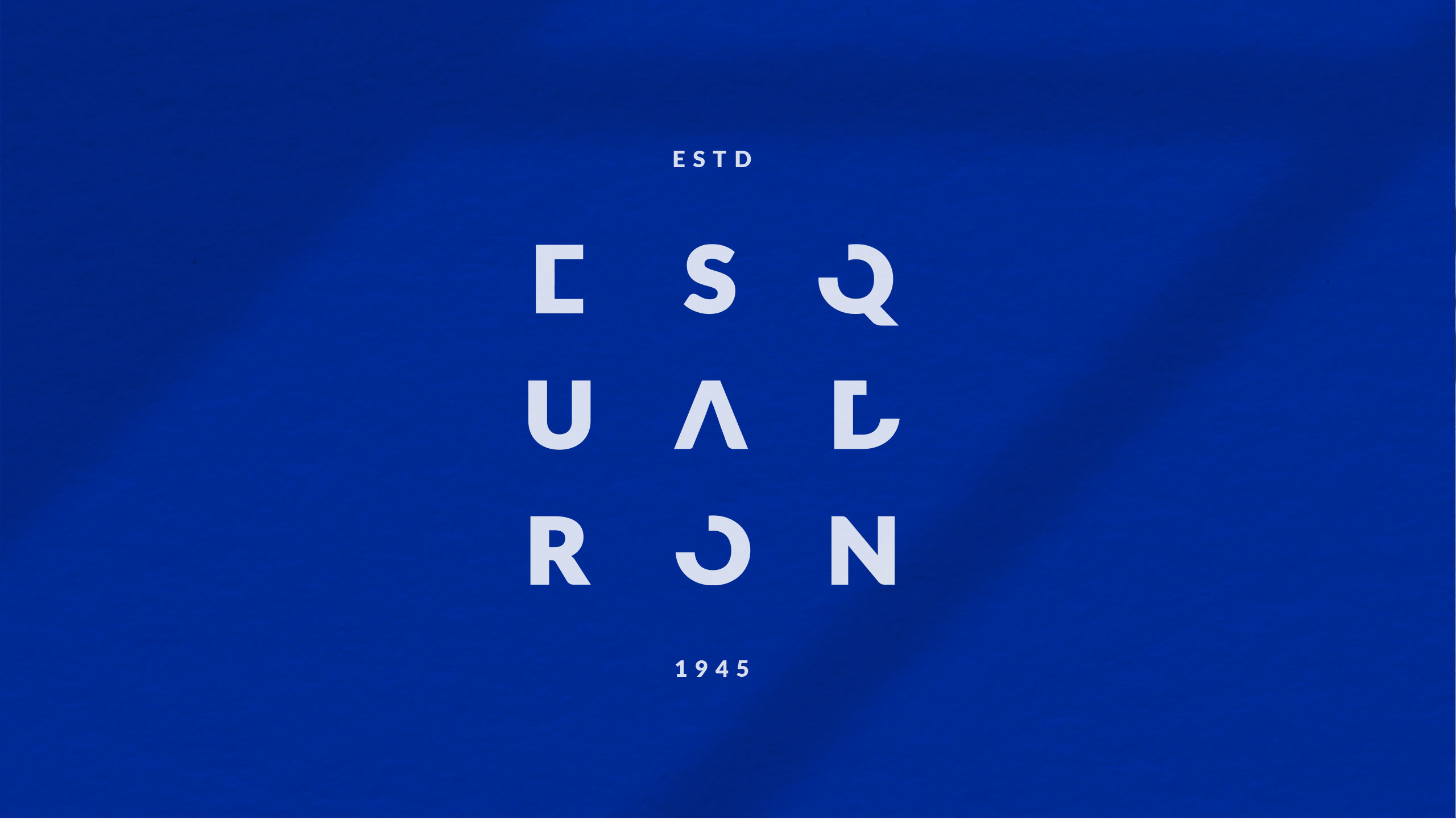
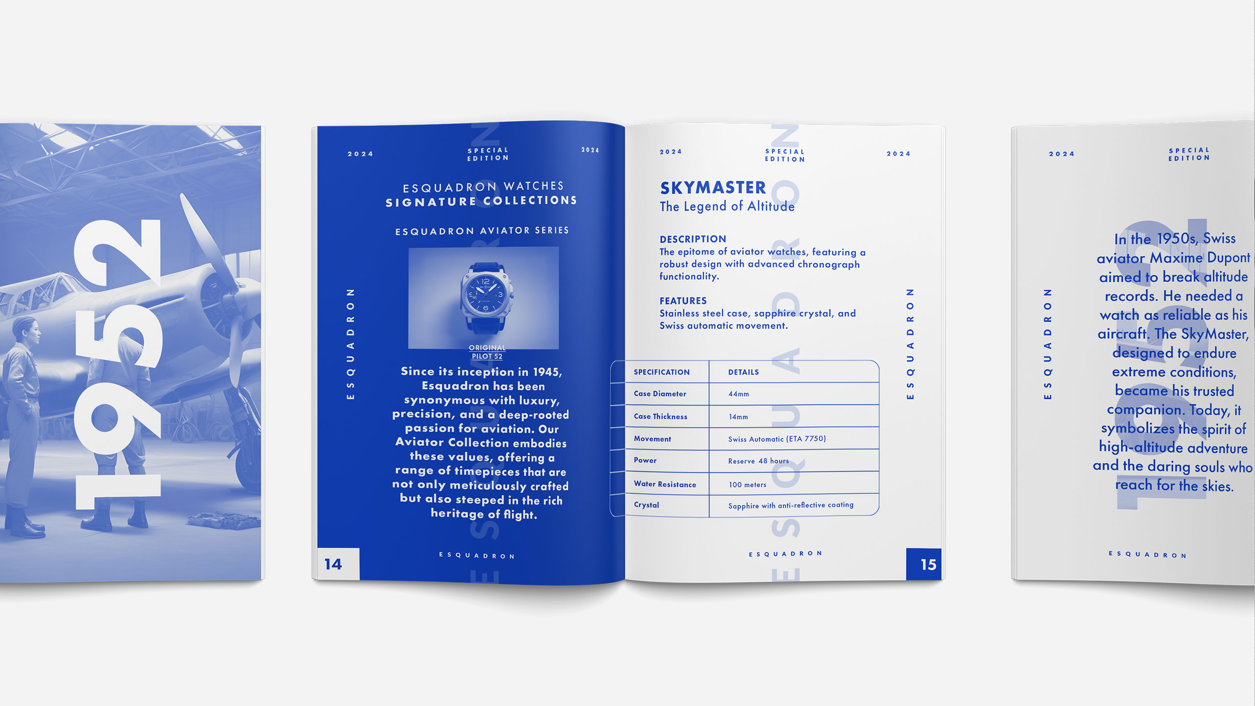
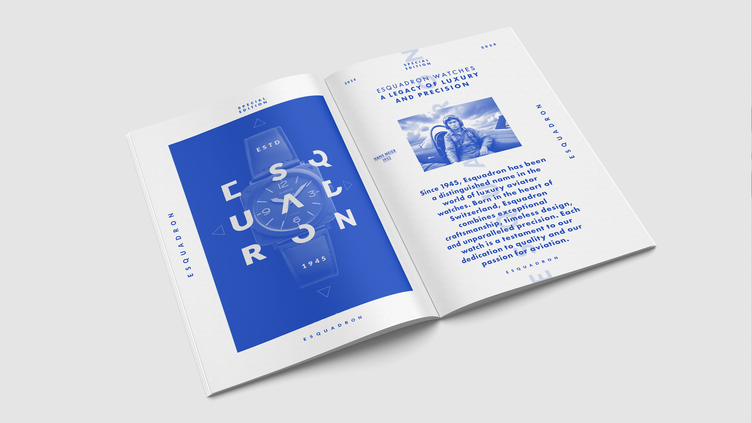
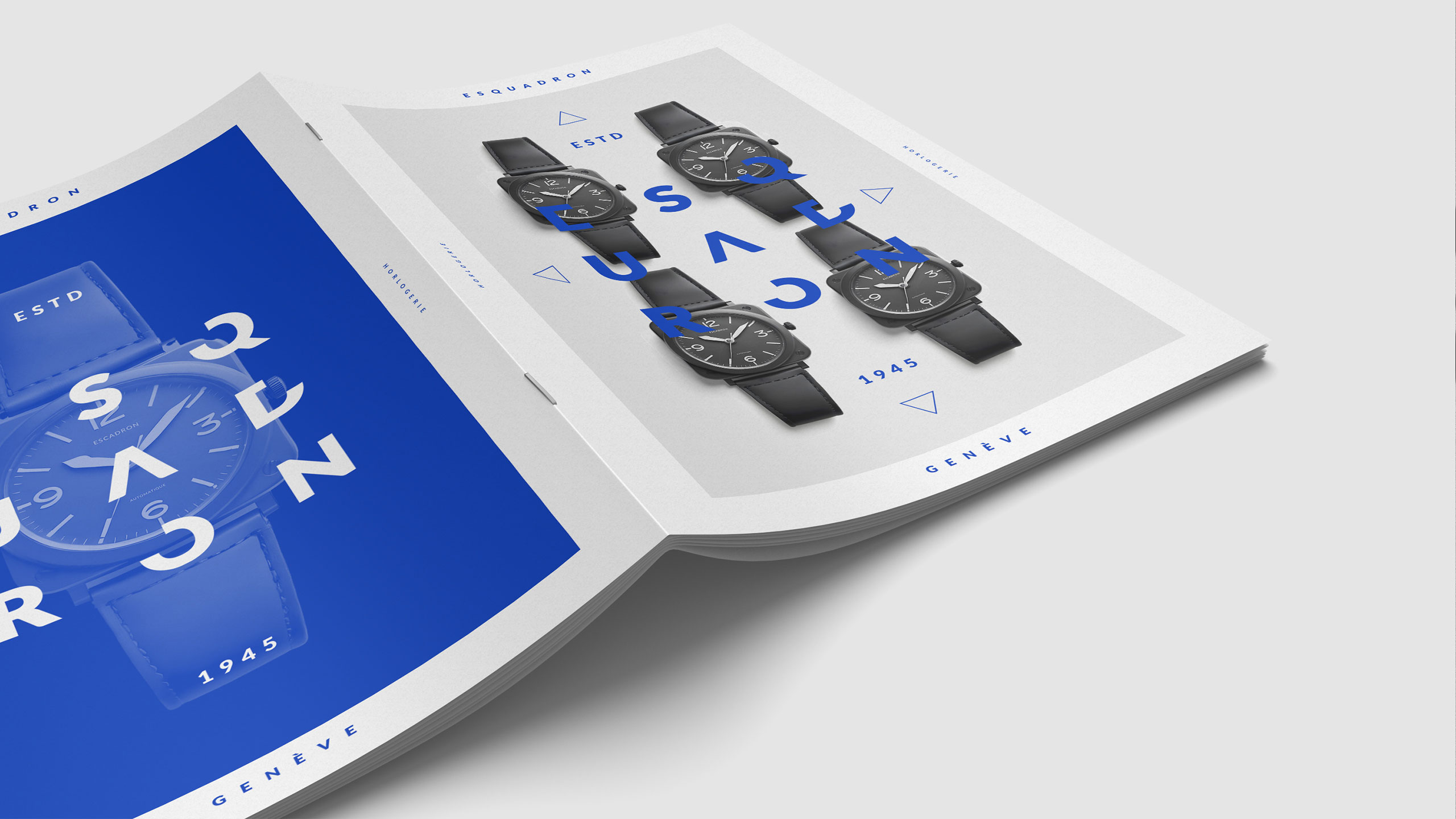
Esquadron is a special edition magazine for the luxury Swiss watch brand, showcasing legendary timepieces inspired by aviation — precision, performance, adventure, navigation, courage, and camaraderie. The dominant color is sky blue, evoking a sense of openness and clarity.
Form, Logo, and Concept
The design emphasizes the unique "round in square" shape of the watches, inspired by vintage aircraft cockpit instruments. This shape is also echoed in the logo, where the letterforms are structured to mirror the square. The word "escadron" itself carries connotations of precision and unity, reinforcing the aviation theme with both form and meaning in the graphic design.
Related
03
Whether you prefer a quick call or a detailed message, we're here to listen.

Whois

White Spirit

Inkonito

X-Ray