


Description
02
The Core Challenge
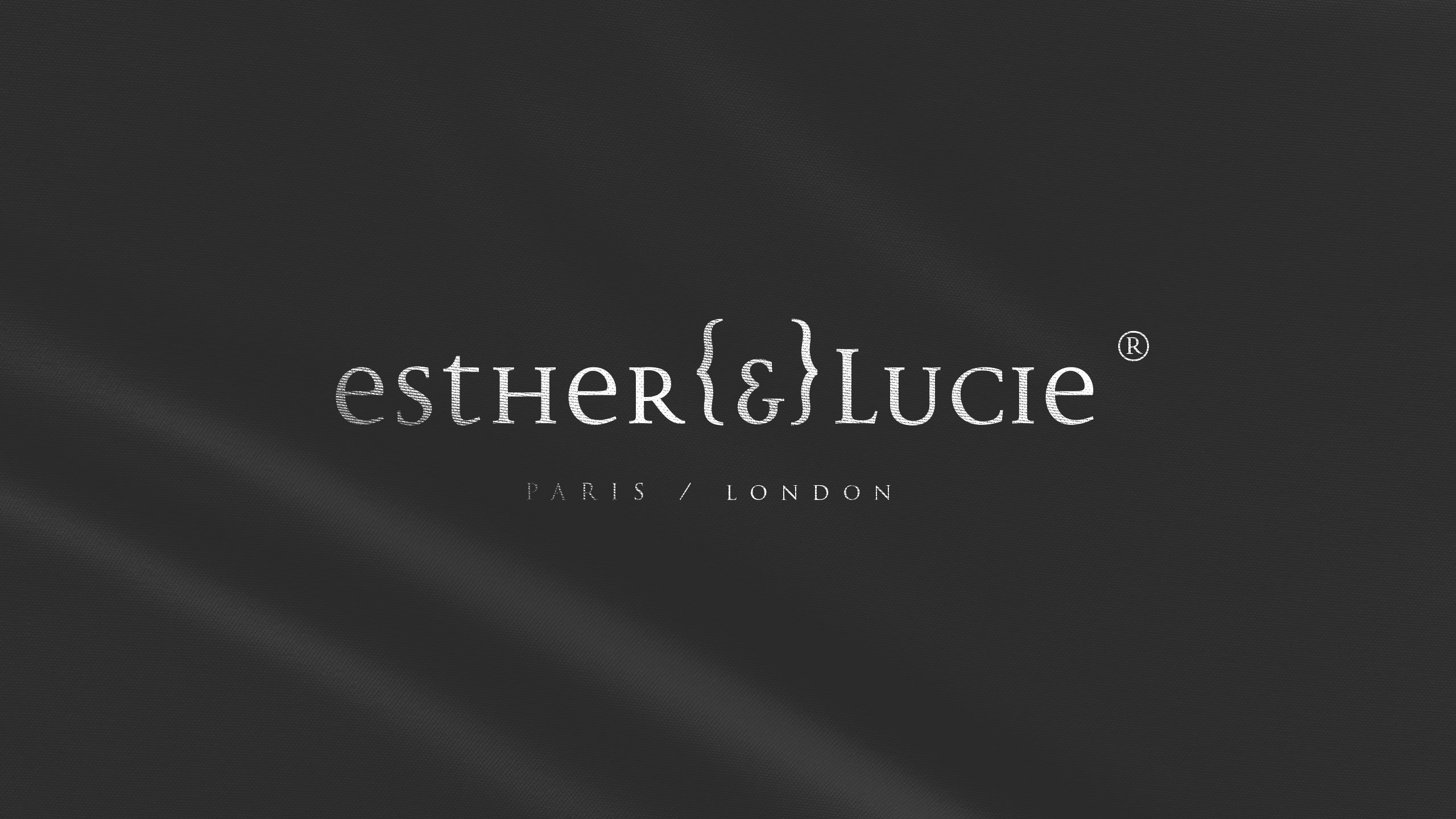
How can a cosmetics brand embody individuality, irreverence, and friendship through design? Esther {&} Lucie merges personal storytelling, punk-inspired ink marks, and hand-drawn portraits into a playful, rebellious visual identity.
Visual Language and Characters
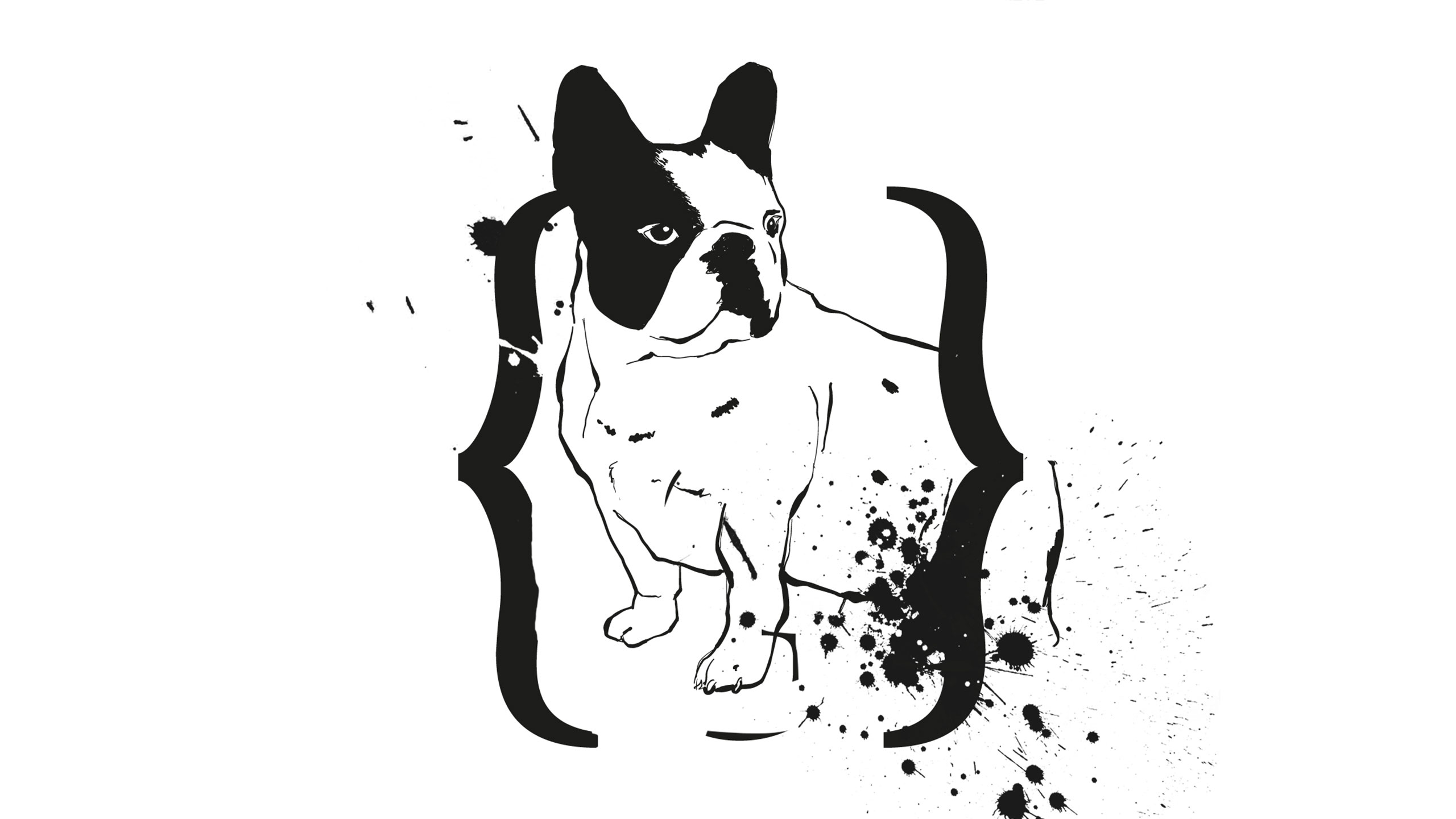
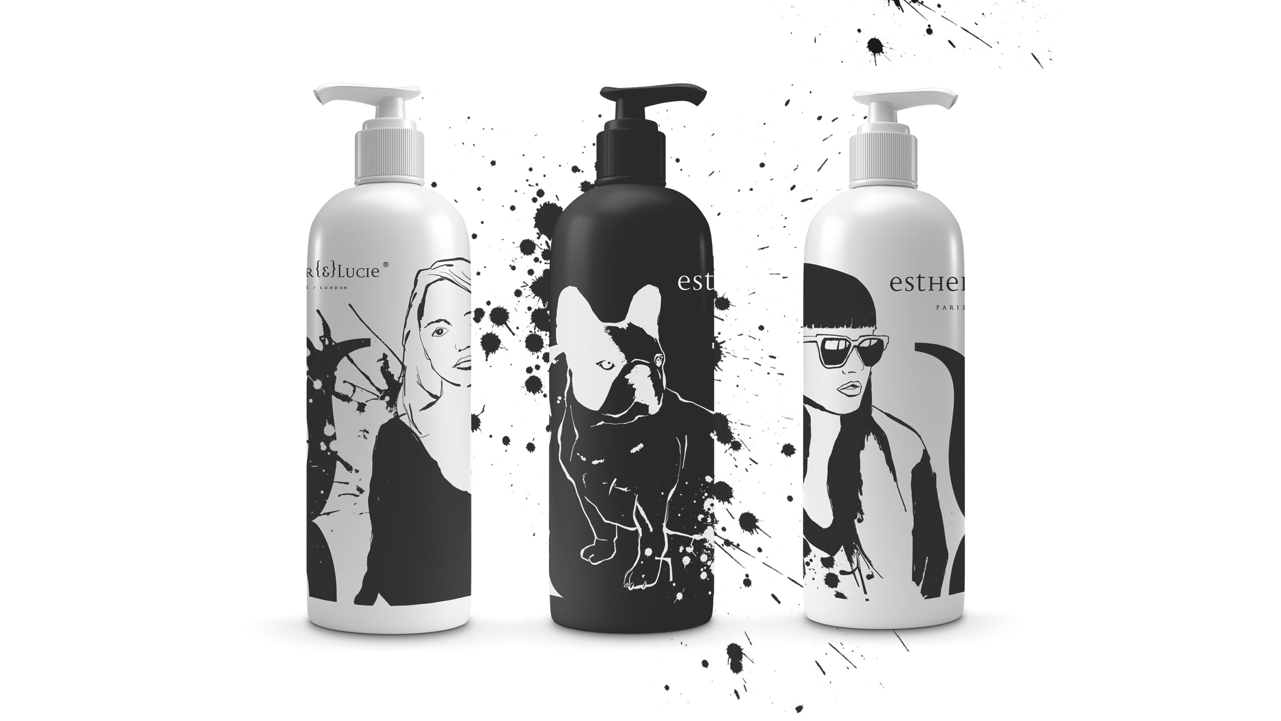
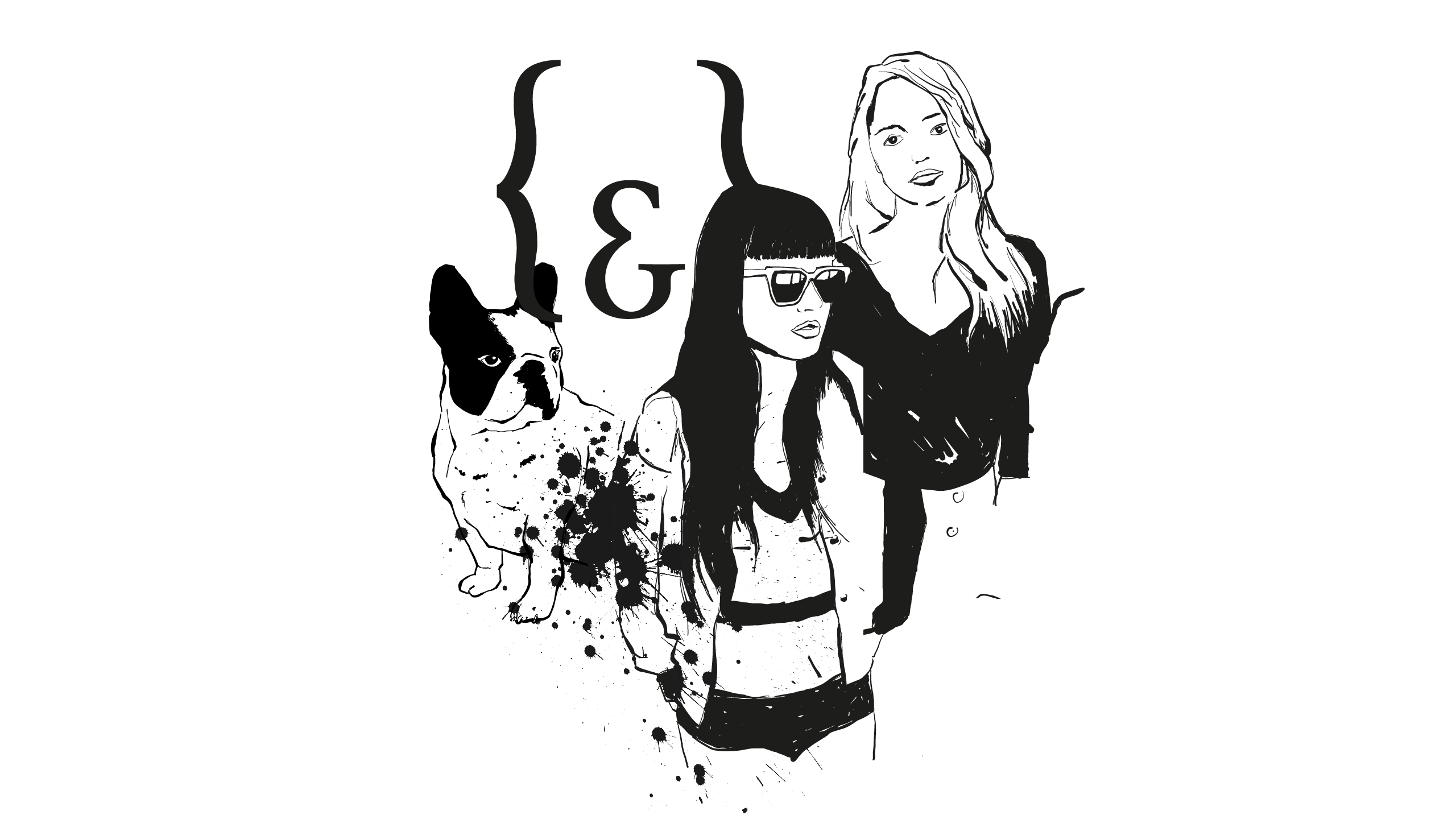
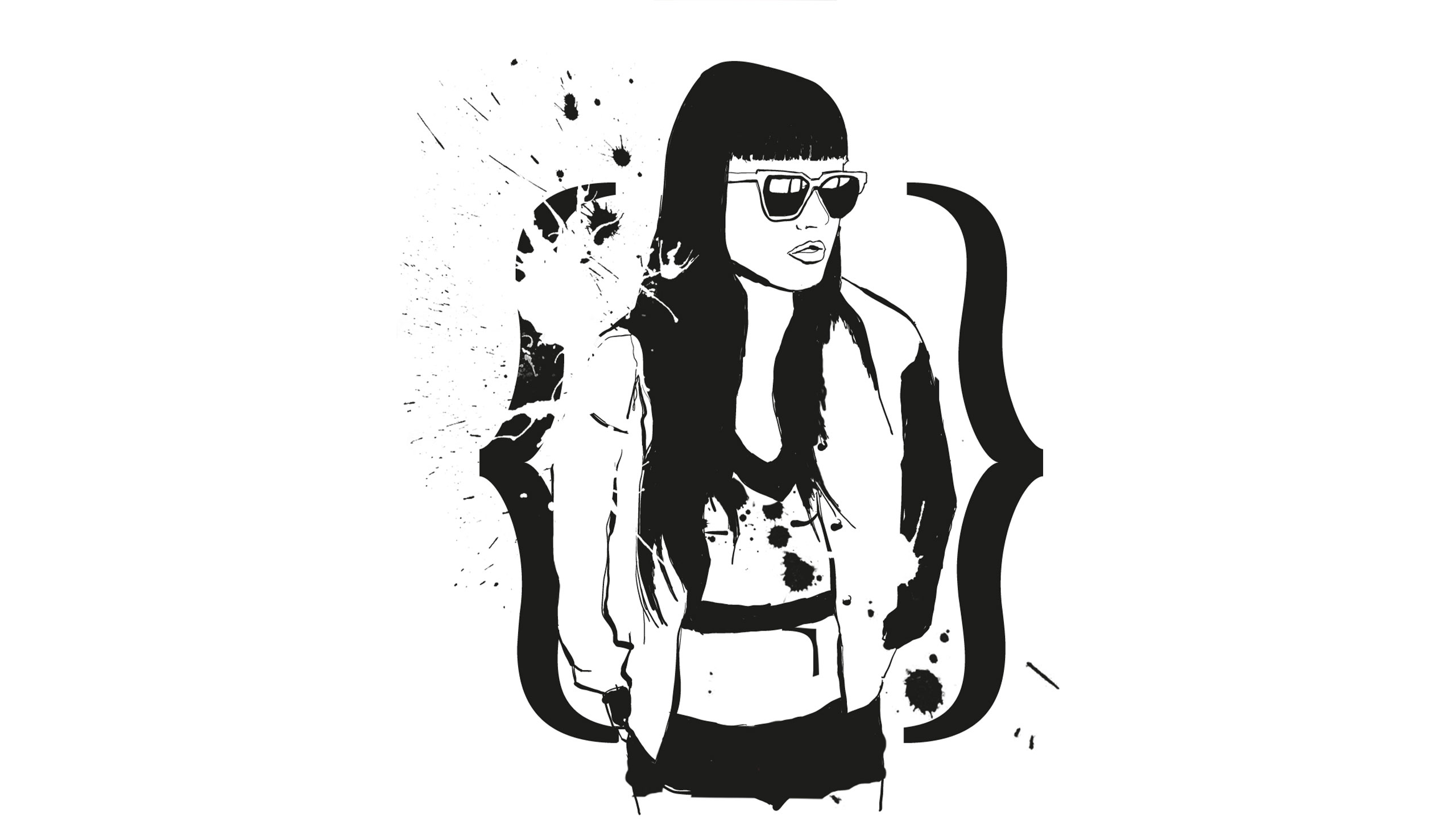
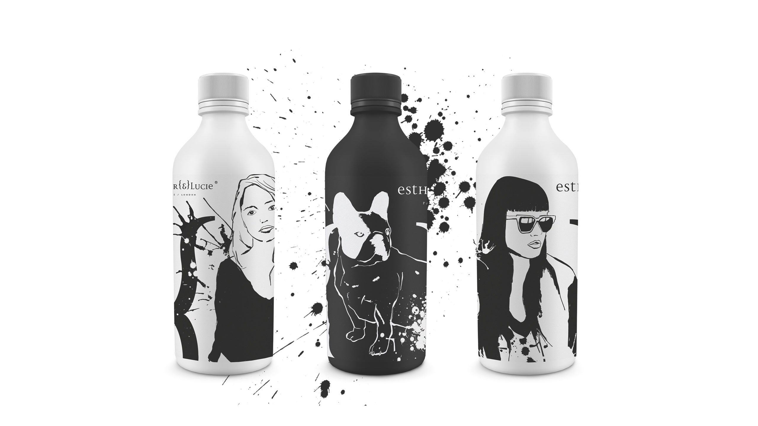
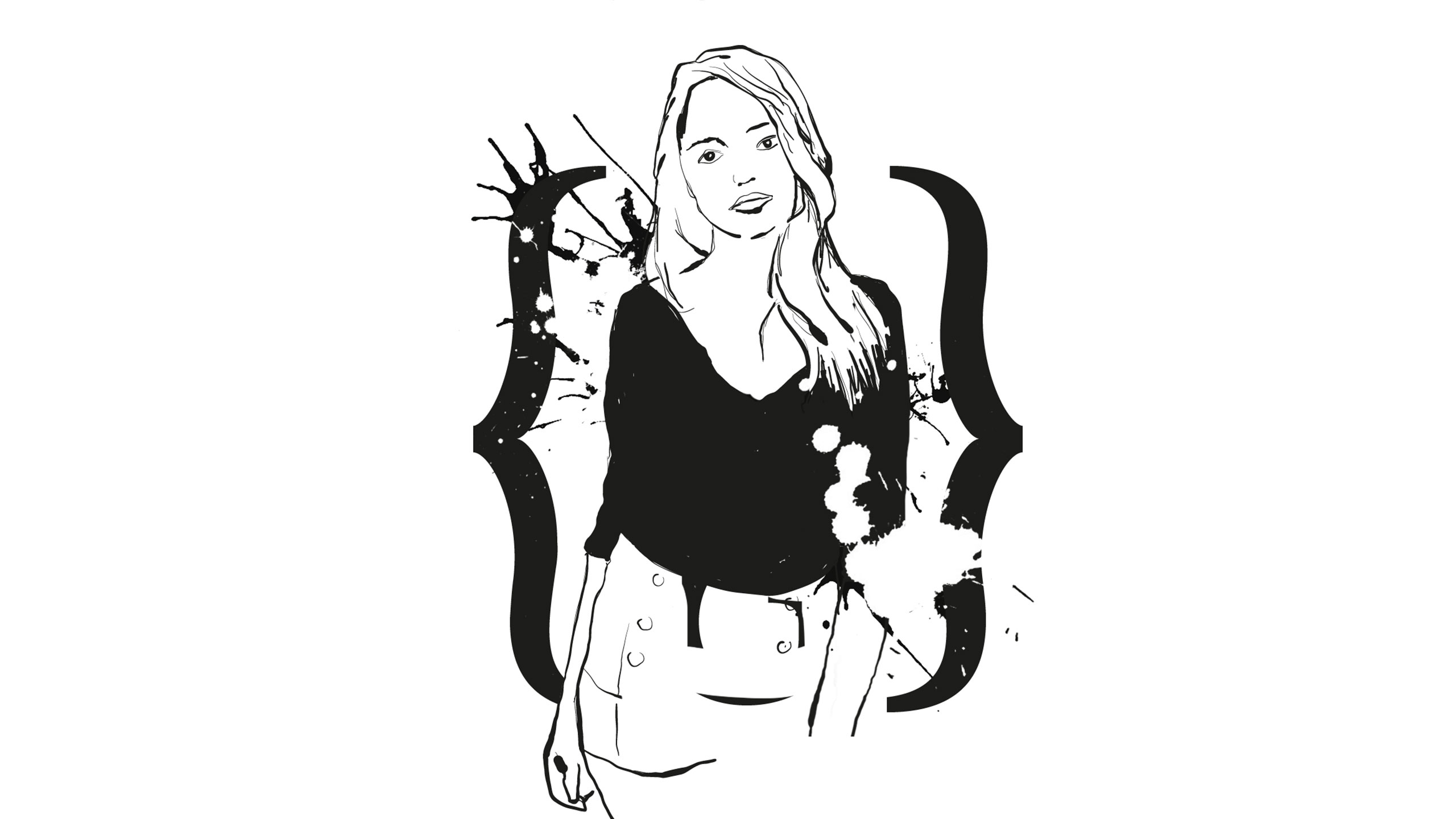
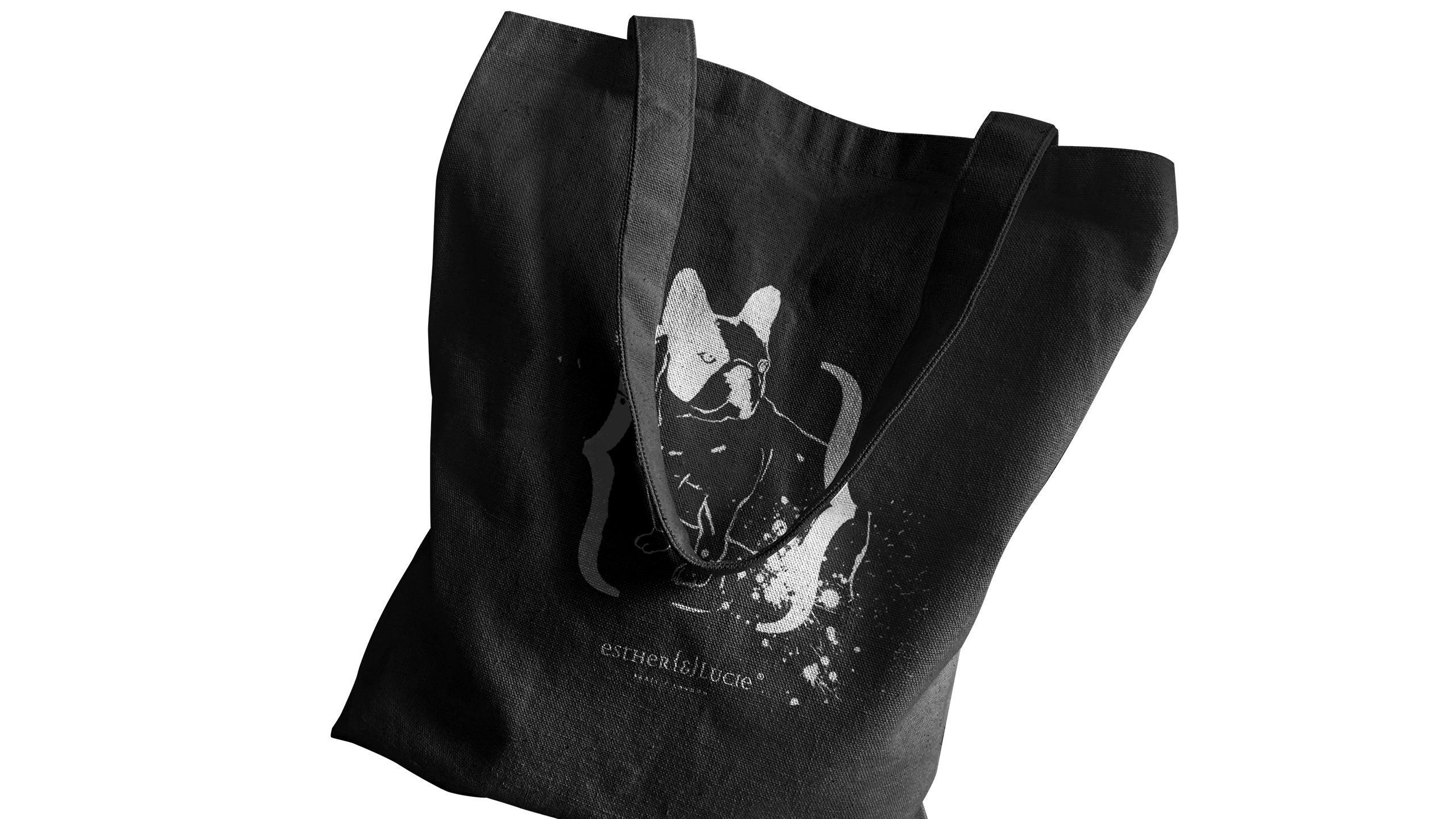
Loose ink illustrations depict Esther and Lucie — the founders — alongside their spirited French bulldog, named "&" (rendered in typographic brackets). This drawn trio becomes the face of the brand, Esther {&} Lucie, bringing a personal and gently rebellious tone to their cosmetic line. Ink splatters, reminiscent of 80s/90s punk graphics, accentuate a sense of freedom and creative nonconformity.
Values and Application
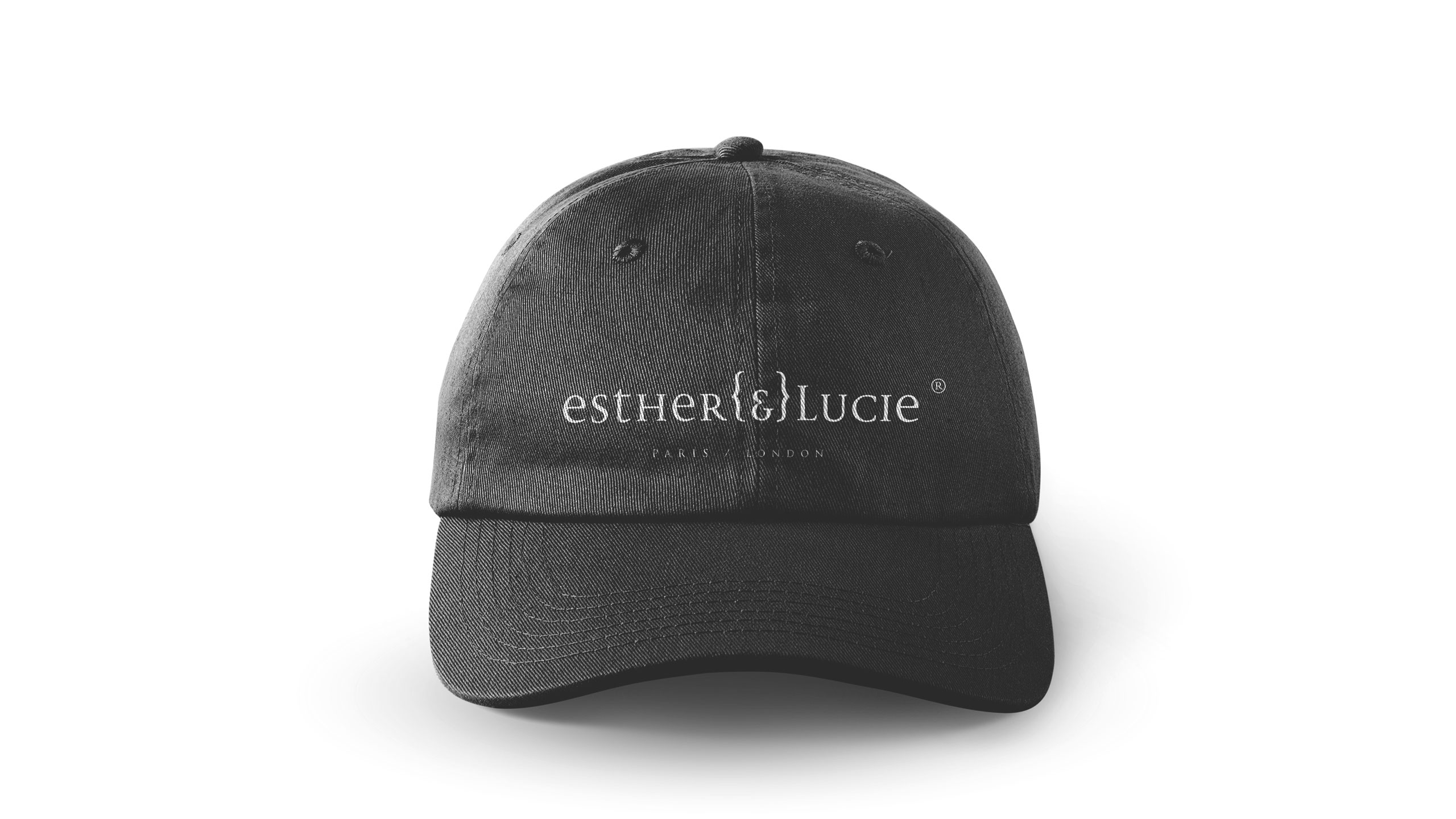
The design celebrates individuality and a carefree attitude, reflecting the duo's liberated lifestyle and playful irreverence. Applied to packaging, T-shirts, and tote bags, the visual identity combines charm, spontaneity, and a joyful sense of anarchy.
Related
03
Whether you prefer a quick call or a detailed message, we're here to listen.

OVER

Café Lenoirs

Blen-Beck

Whare House