


Description
02
The Core Challenge
How can Jerry Khane's graphic design balance vintage sophistication and artisanal rawness, combining aristocratic heritage with modern rebellion through textured visuals and a refined yet rugged identity?
Visual Language and Symbolism
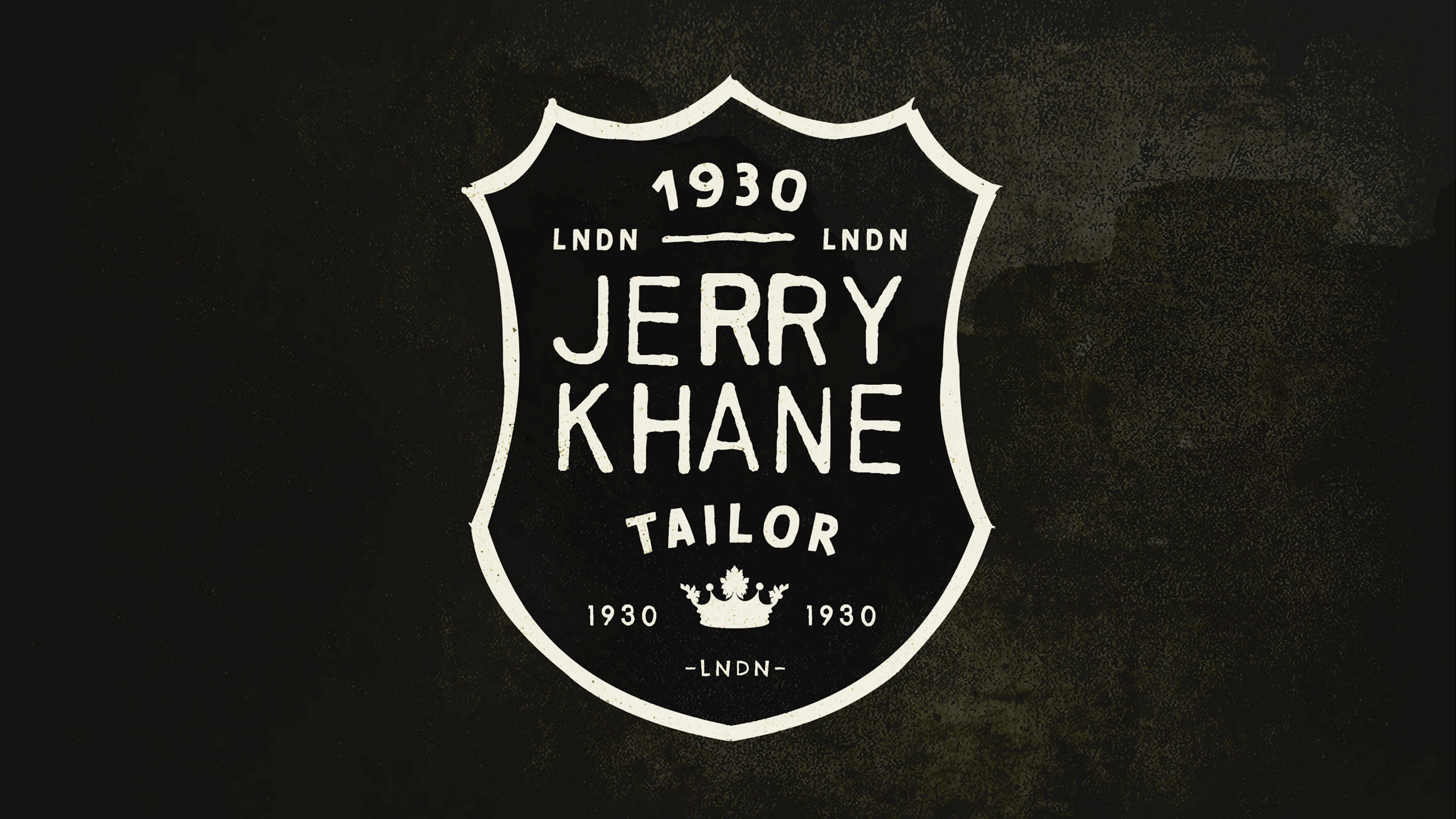
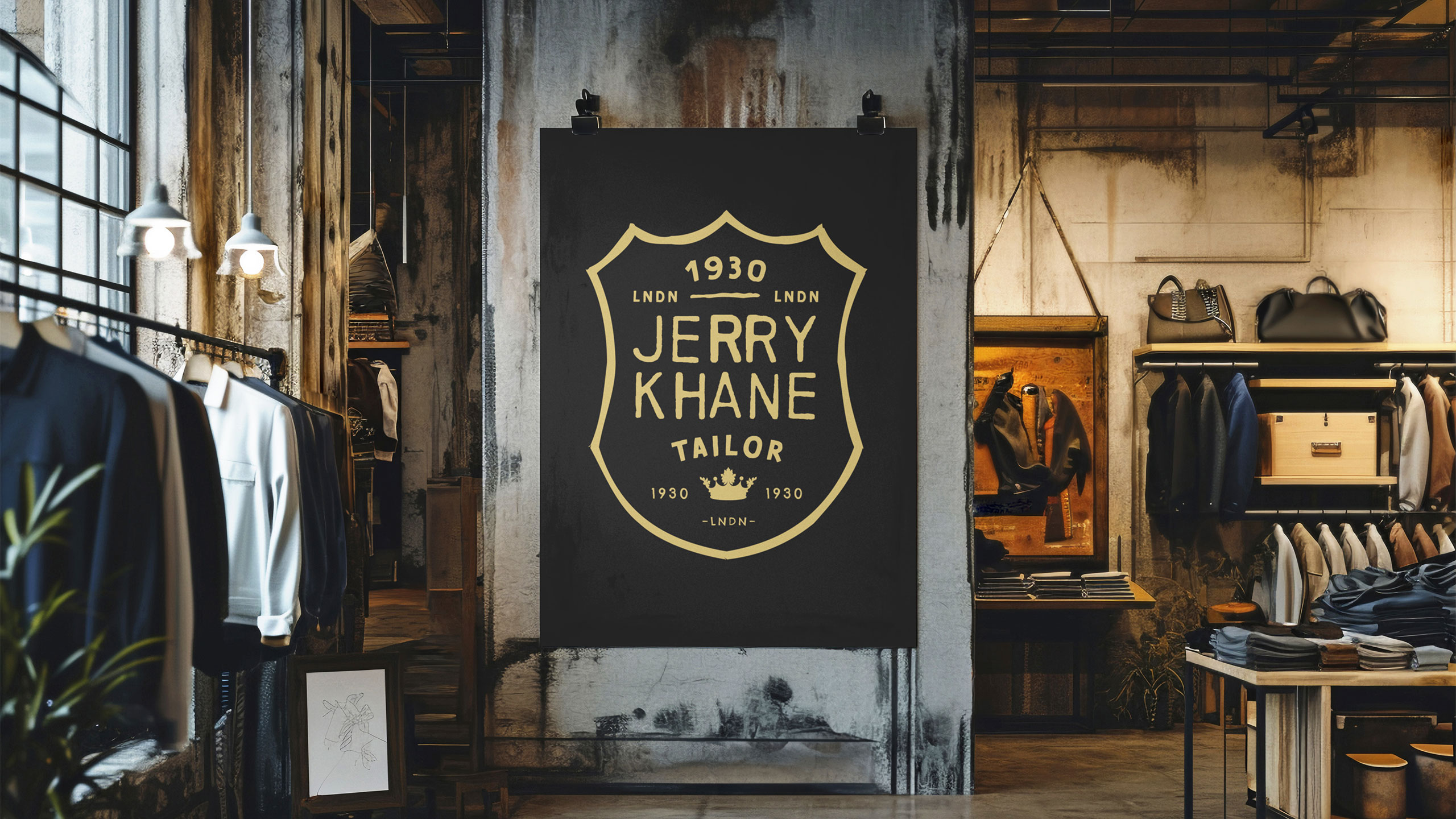
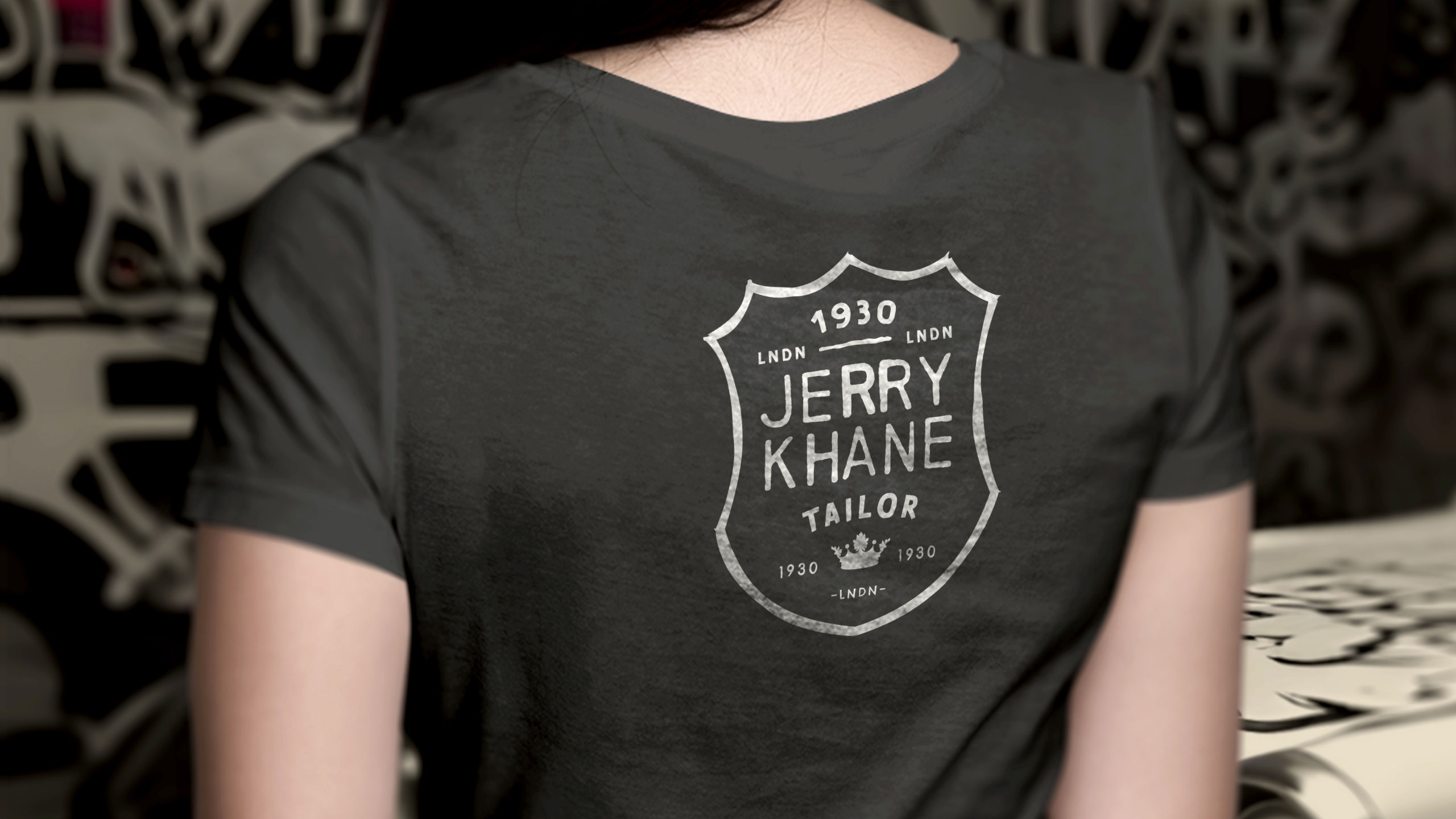
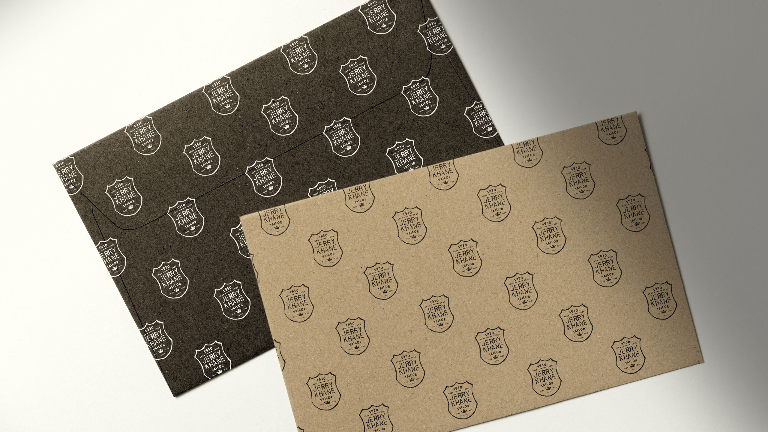
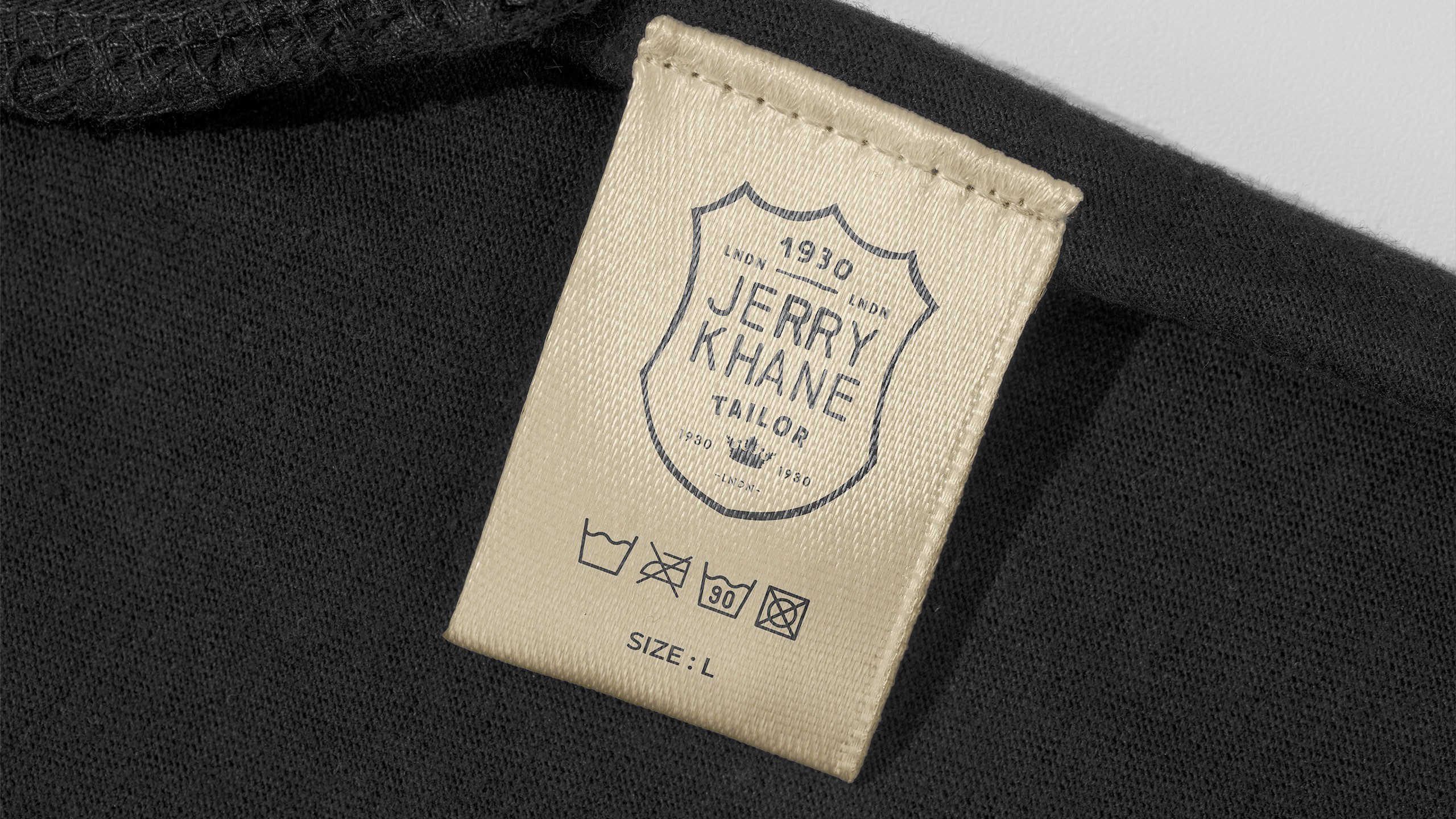
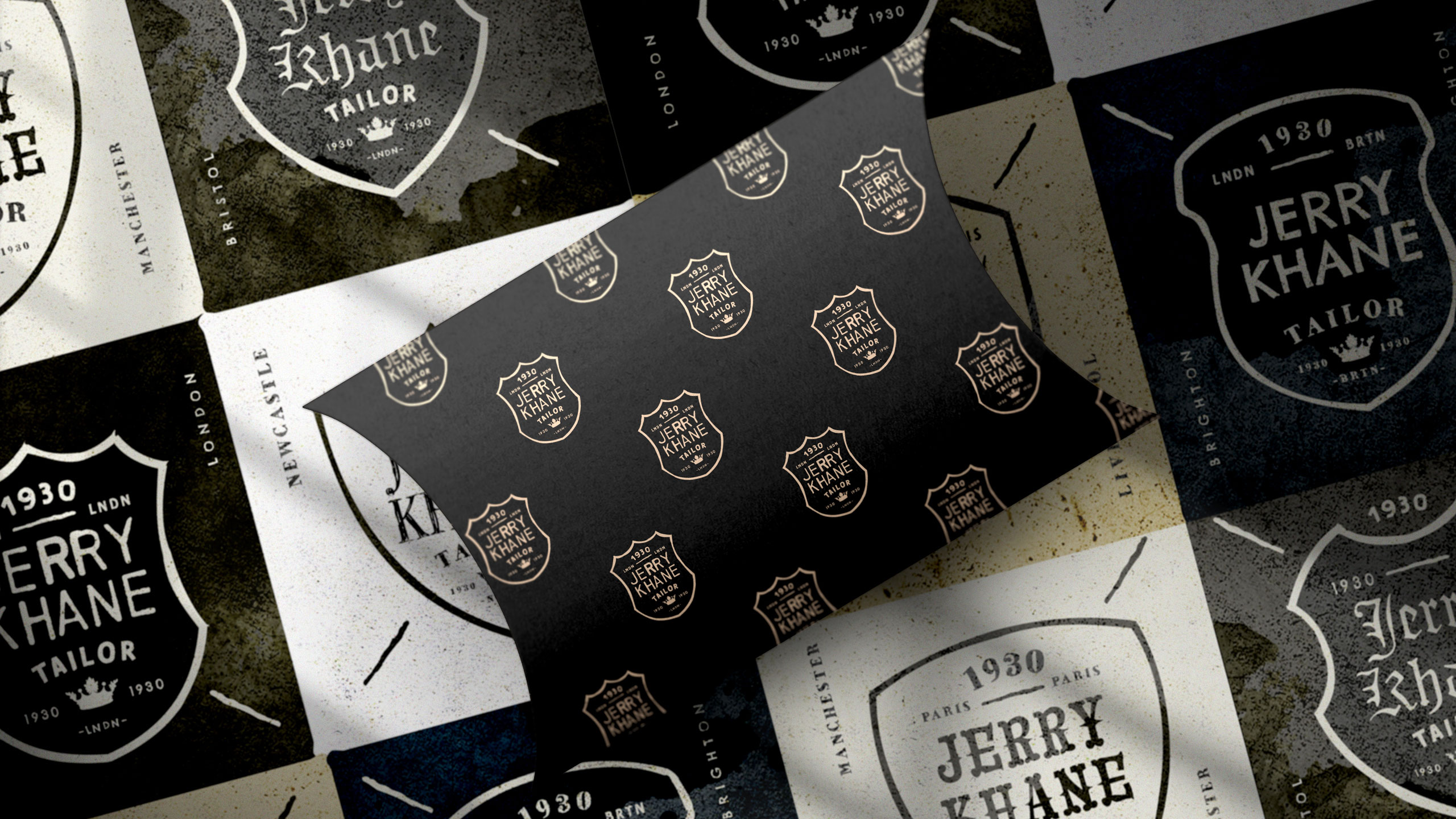
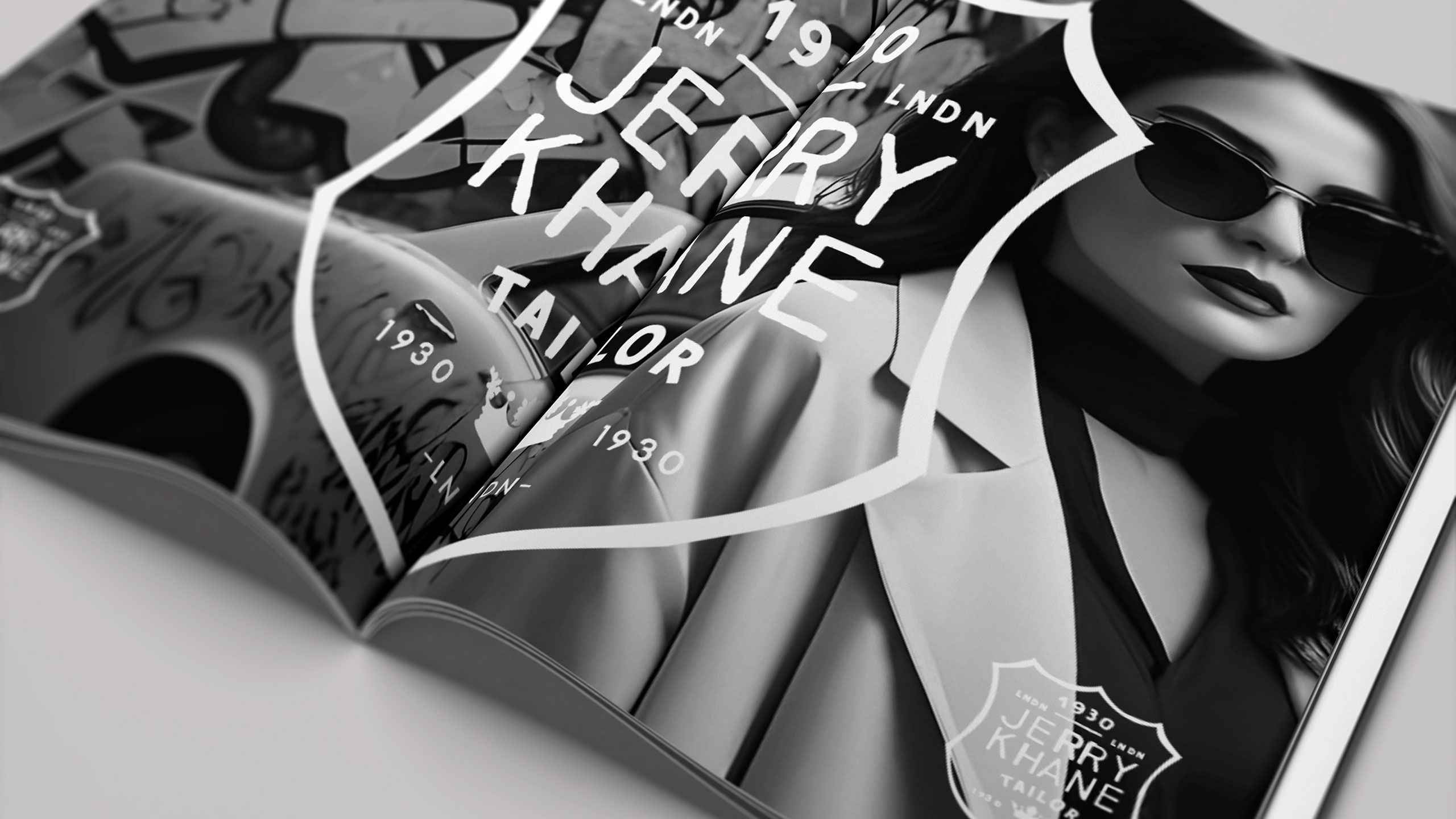
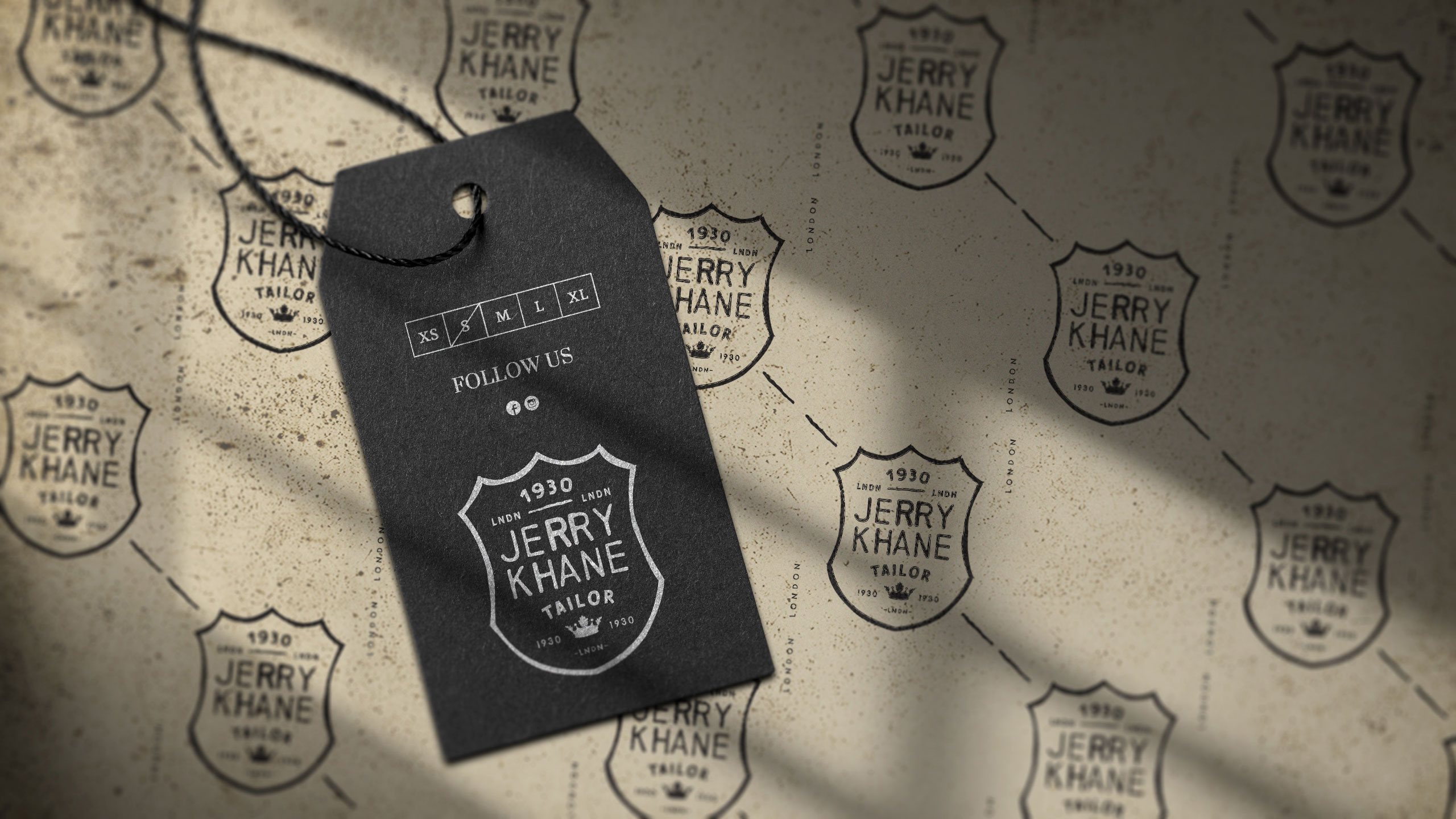
Jerry Khane – Tailor blends vintage elegance with raw authenticity. Using a black and gold color palette, the brand evokes sophistication and discretion. The logo adopts a heraldic crest shape, suggesting aristocratic heritage and exceptional craftsmanship. Yet, hand-drawn lines introduce an artisanal, human touch.
Textures, References, and Name
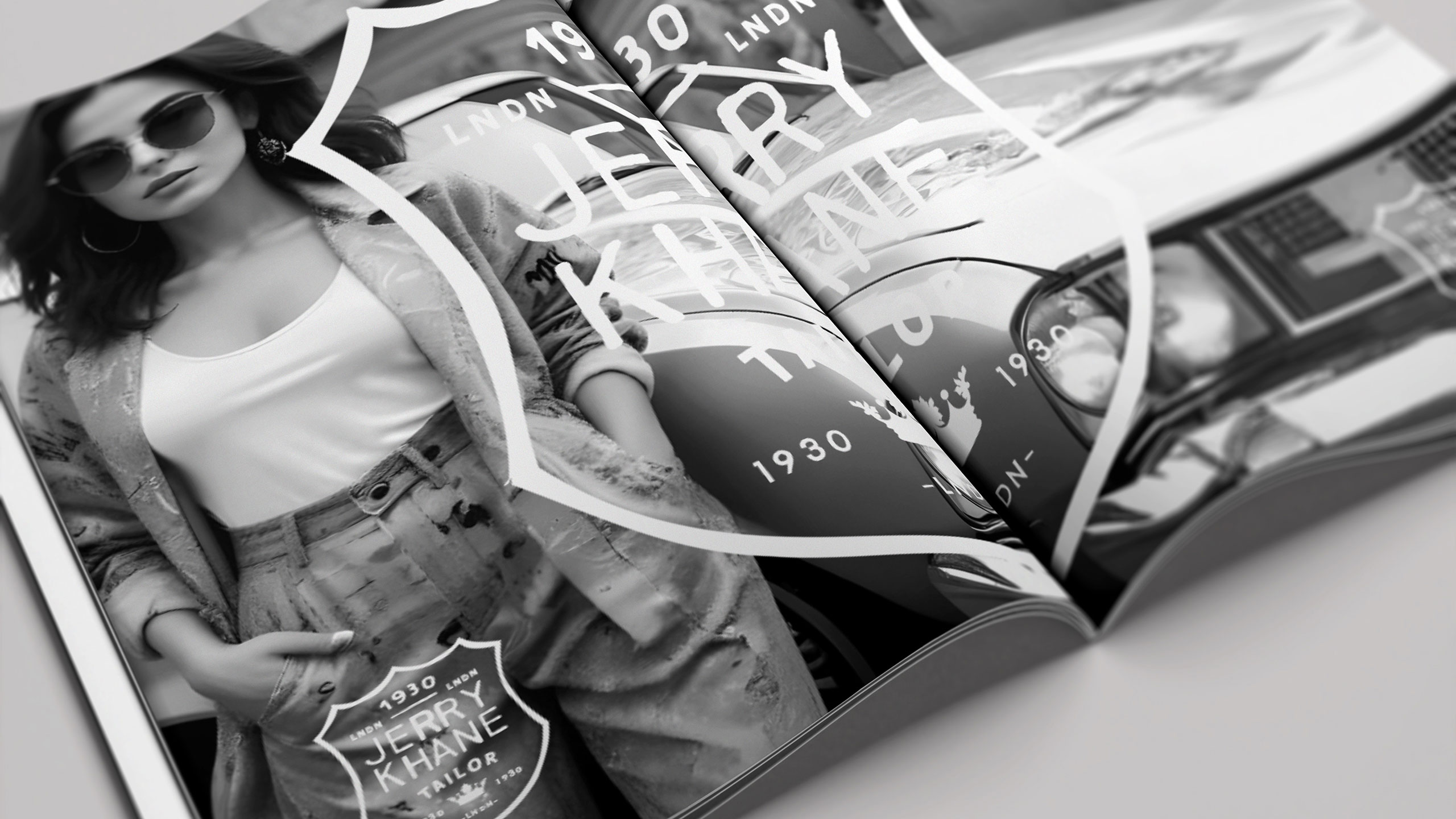
Graphic elements carry the texture of oil-stained paper and workshop grit, aligning with the "garage" trend — a nod to custom culture and retro masculinity. Imagery often places models beside classic cars, reinforcing this aesthetic. Even the name, Jerry Khane, cleverly echoes "jerrican," fusing ruggedness with refinement. A brand where tradition meets tailored rebellion.
Related
03
Whether you prefer a quick call or a detailed message, we're here to listen.

OVER

Café Lenoirs

Blen-Beck

Whare House