


Description
02
The Core Challenge
How can a heritage motorcycle clothing brand visually bridge its 1924 origins with a modern 2024 audience, balancing vintage authenticity with contemporary appeal across digital and physical supports?
Visual Language and Palette
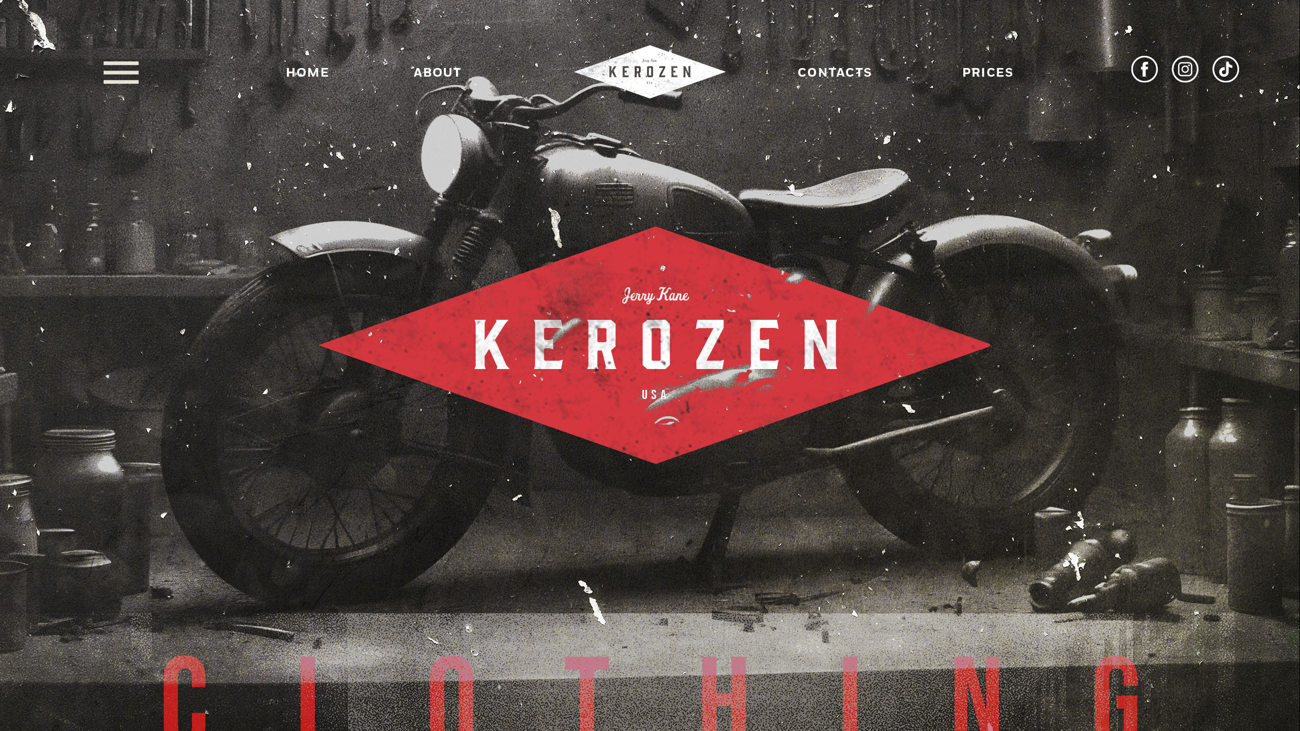
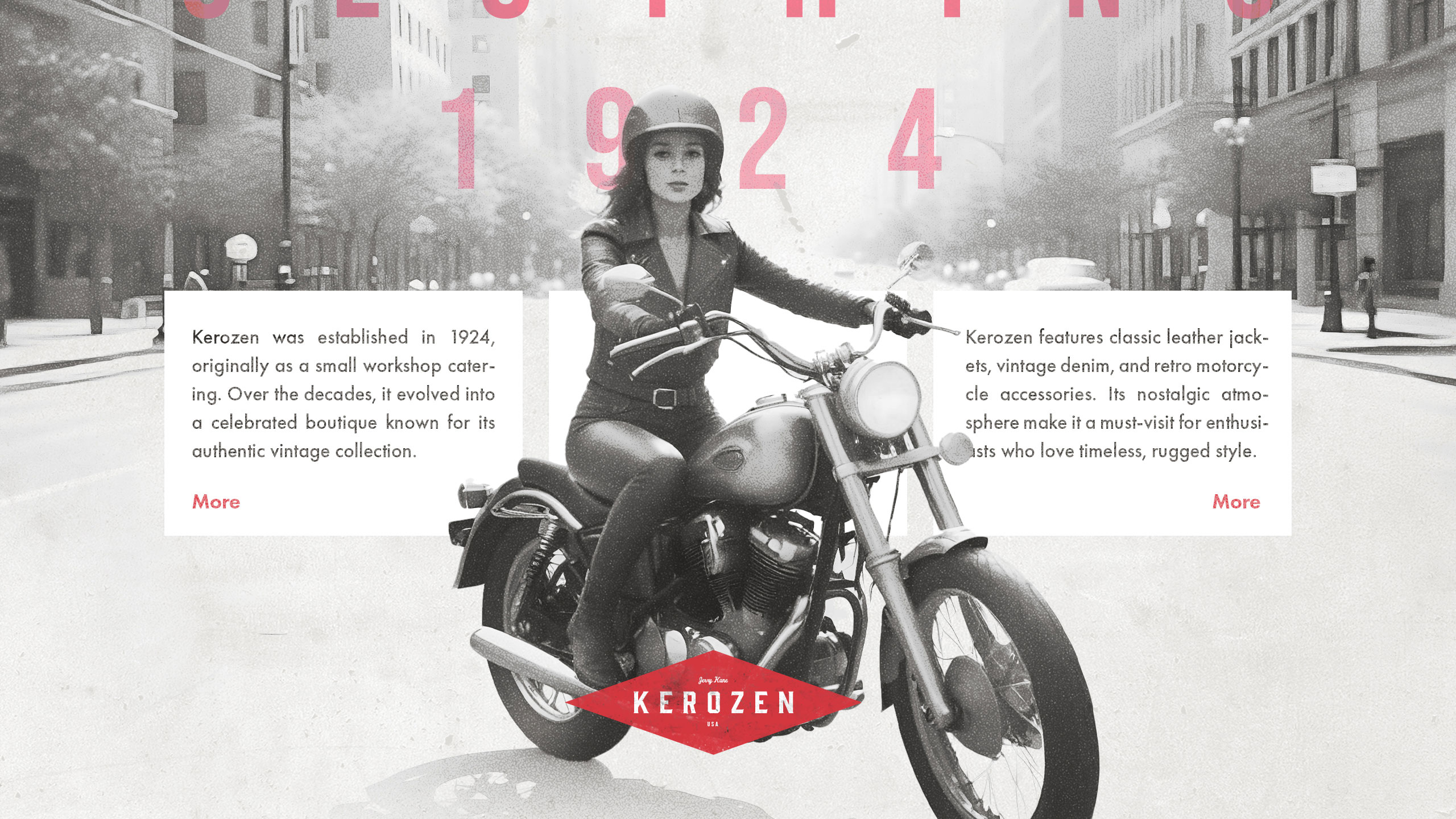
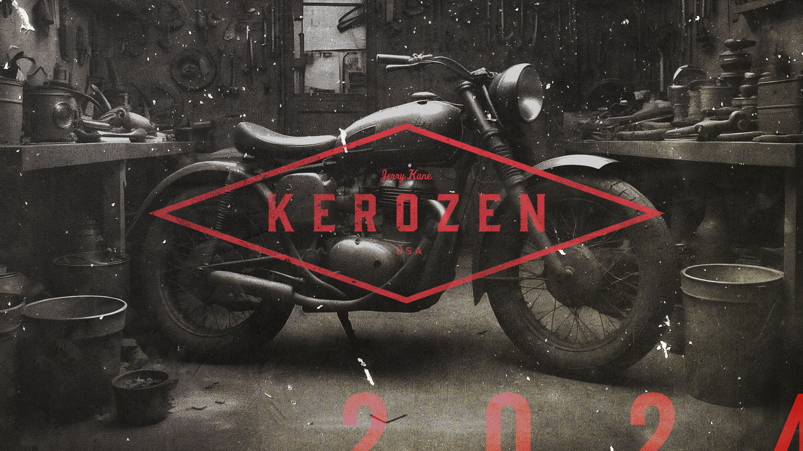
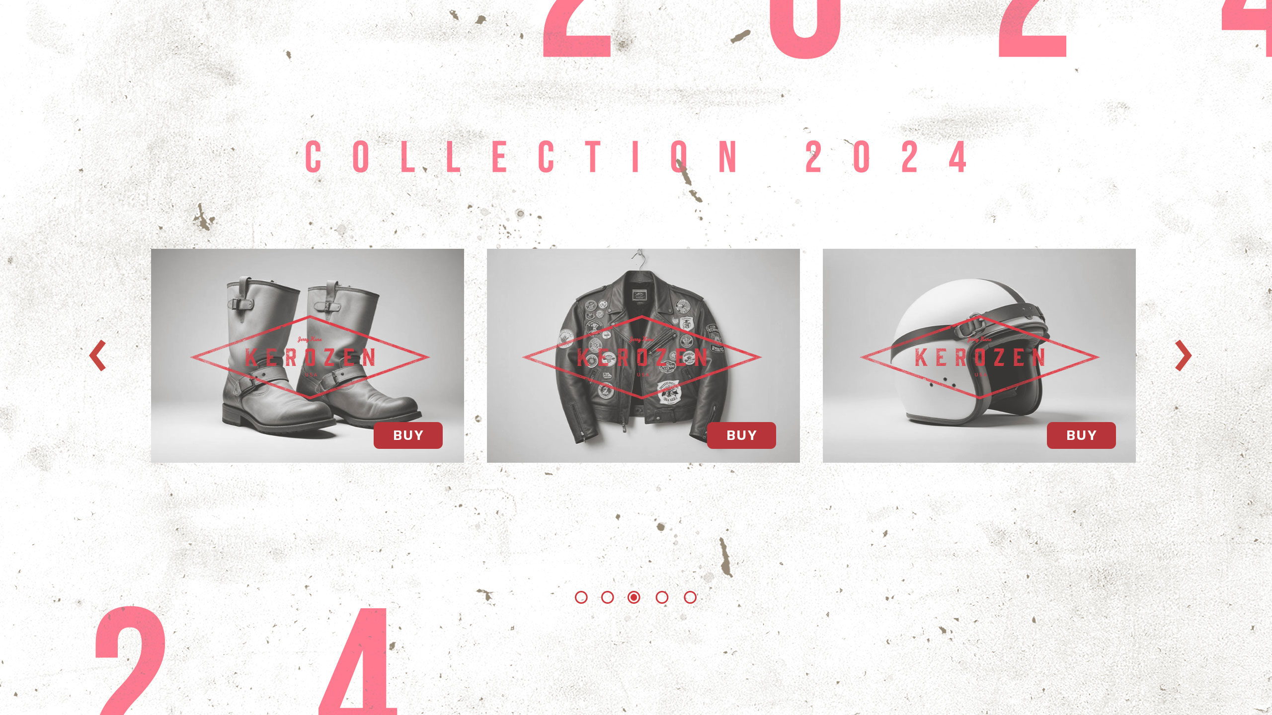
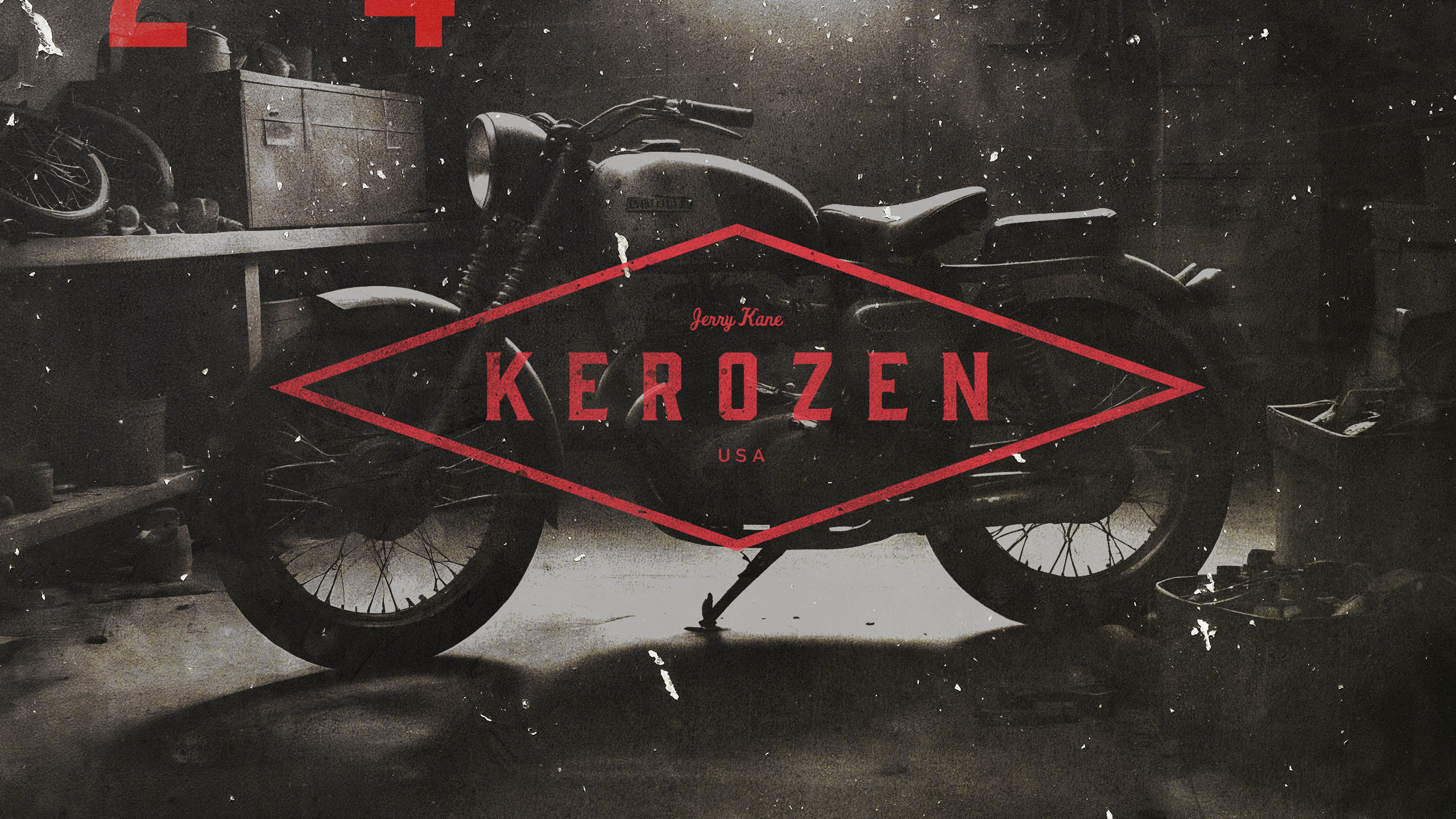
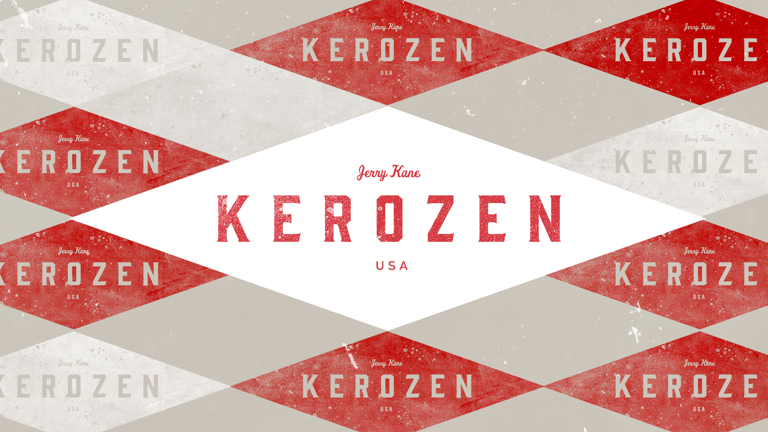
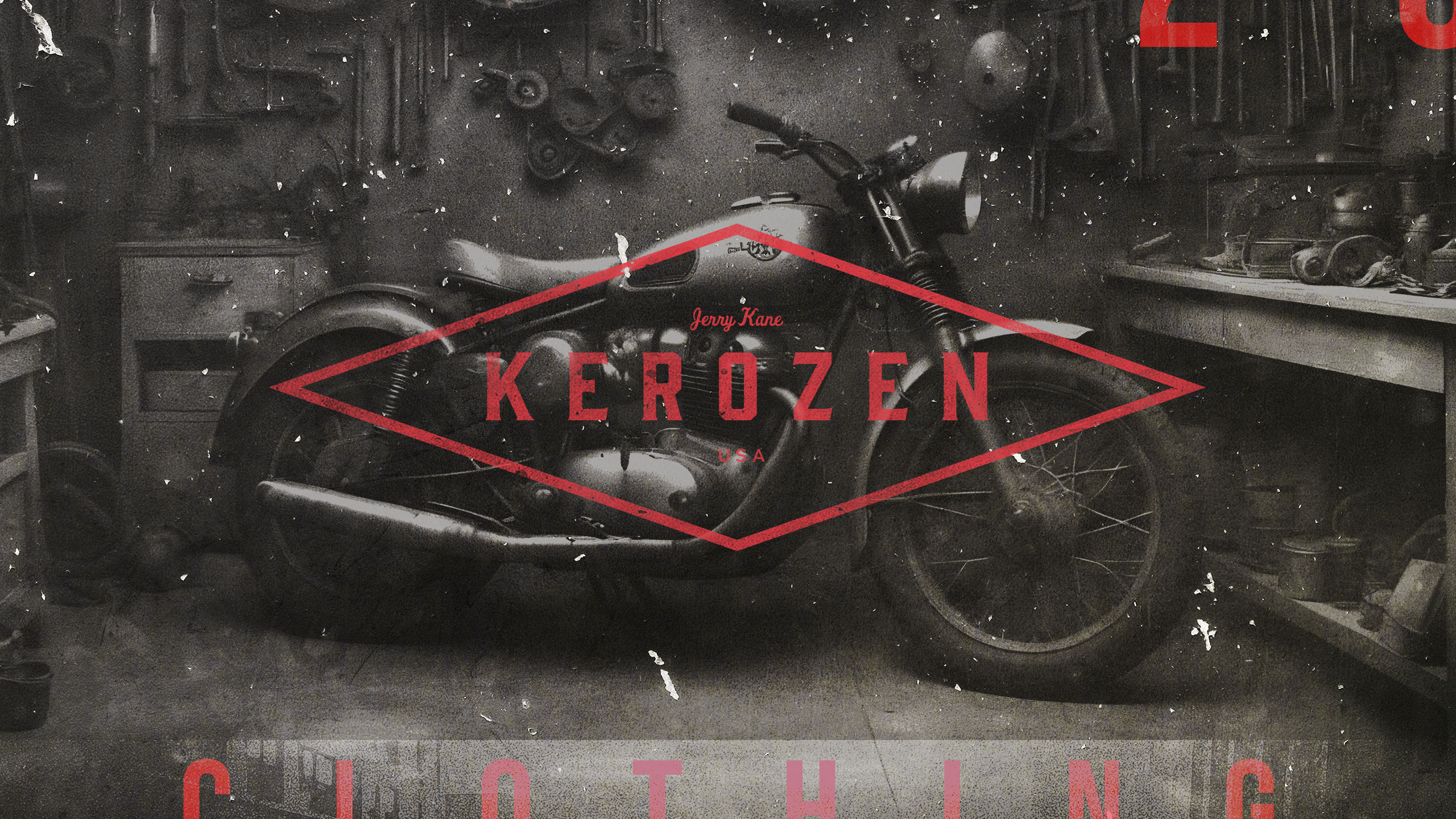
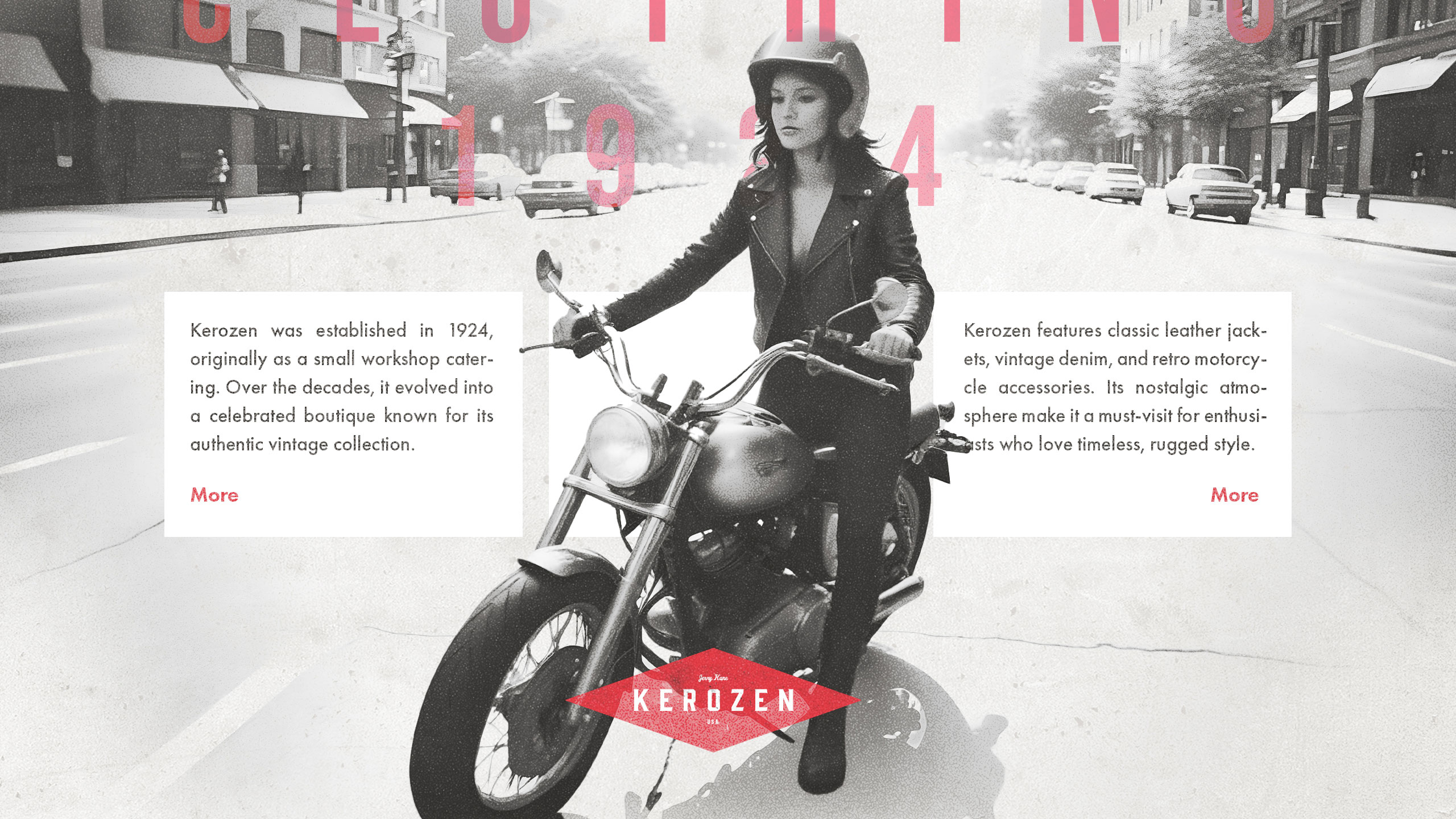
This graphic design presents a bold and vintage-inspired branding for the clothing brand "Kerozen." Dominated by monochrome tones with striking red accents, the visuals blend retro photography and modern typography. The brand identity pays homage to its 1924 origins, emphasizing craftsmanship, leather jackets, and motorcycle heritage.
Application and Positioning
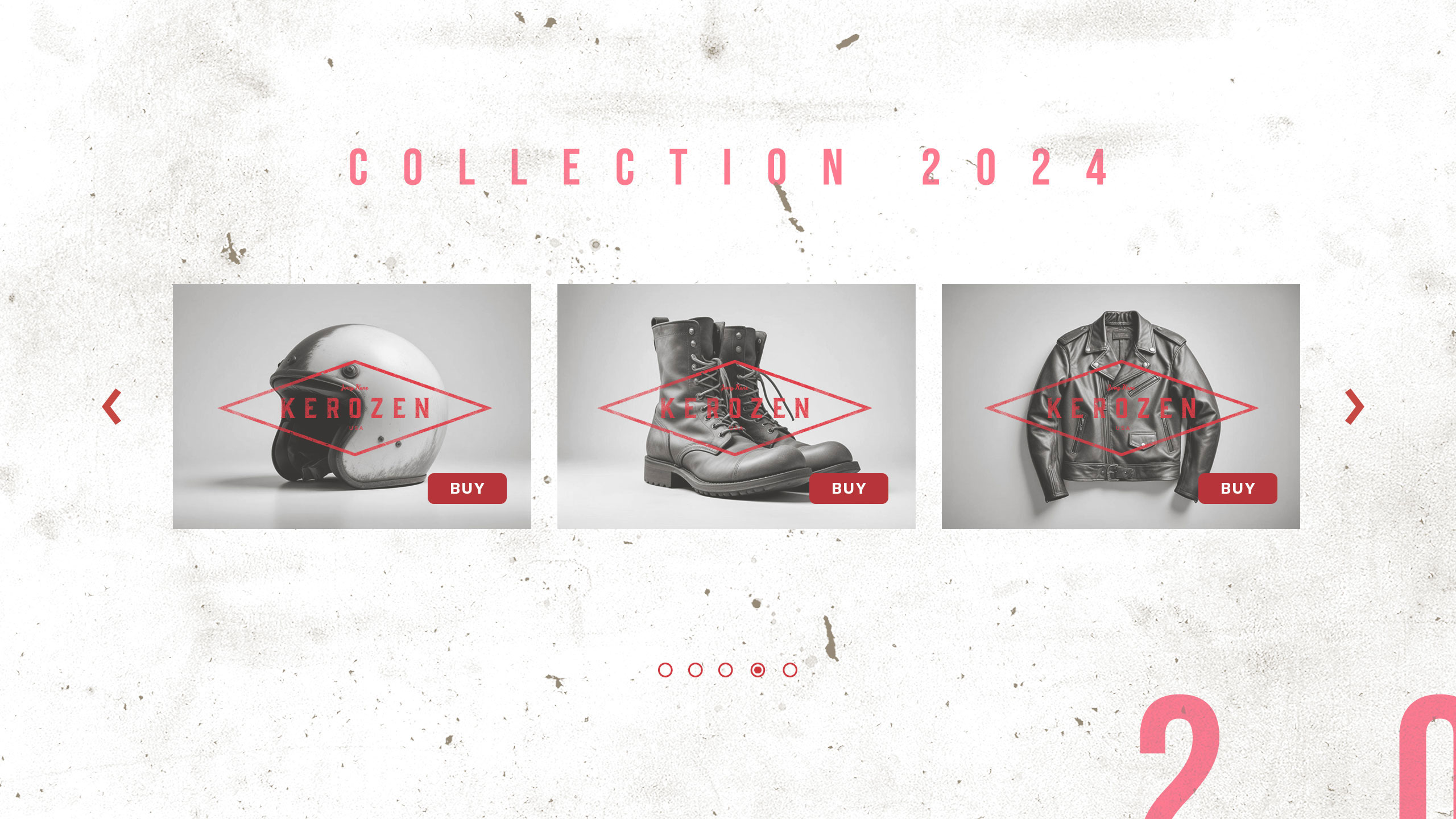
The design is applied across multiple supports: website, product catalog, and promotional visuals. The red geometric logo anchors the composition, evoking strength and precision. The mix of gritty workshop imagery and timeless street scenes positions Kerozen as both nostalgic and contemporary, appealing to vintage enthusiasts and modern riders alike.
Related
03
Whether you prefer a quick call or a detailed message, we're here to listen.

Bombyx

HoverSpeed

Kerozen

Eighteen