


Description
02
The Core Challenge
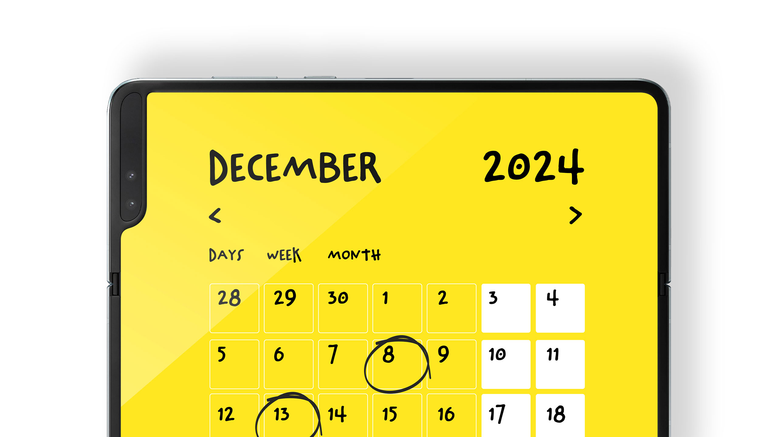
How can design make task management fun and personal? KIM's lively yellow and black palette, with handwritten scribbles and highlights, creates an energetic identity that inspires creativity, joy, and organization.
Visual Language and Style
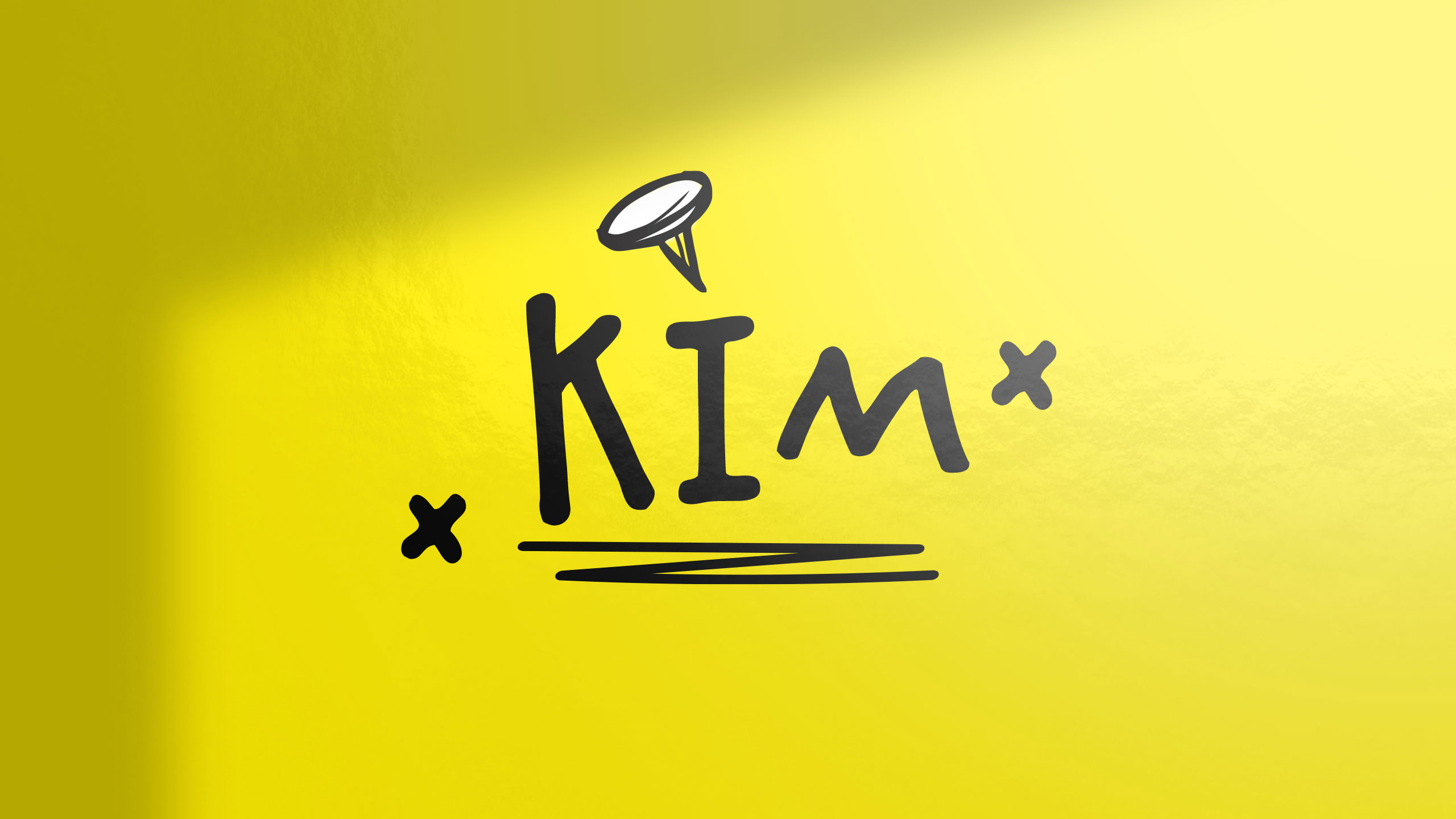
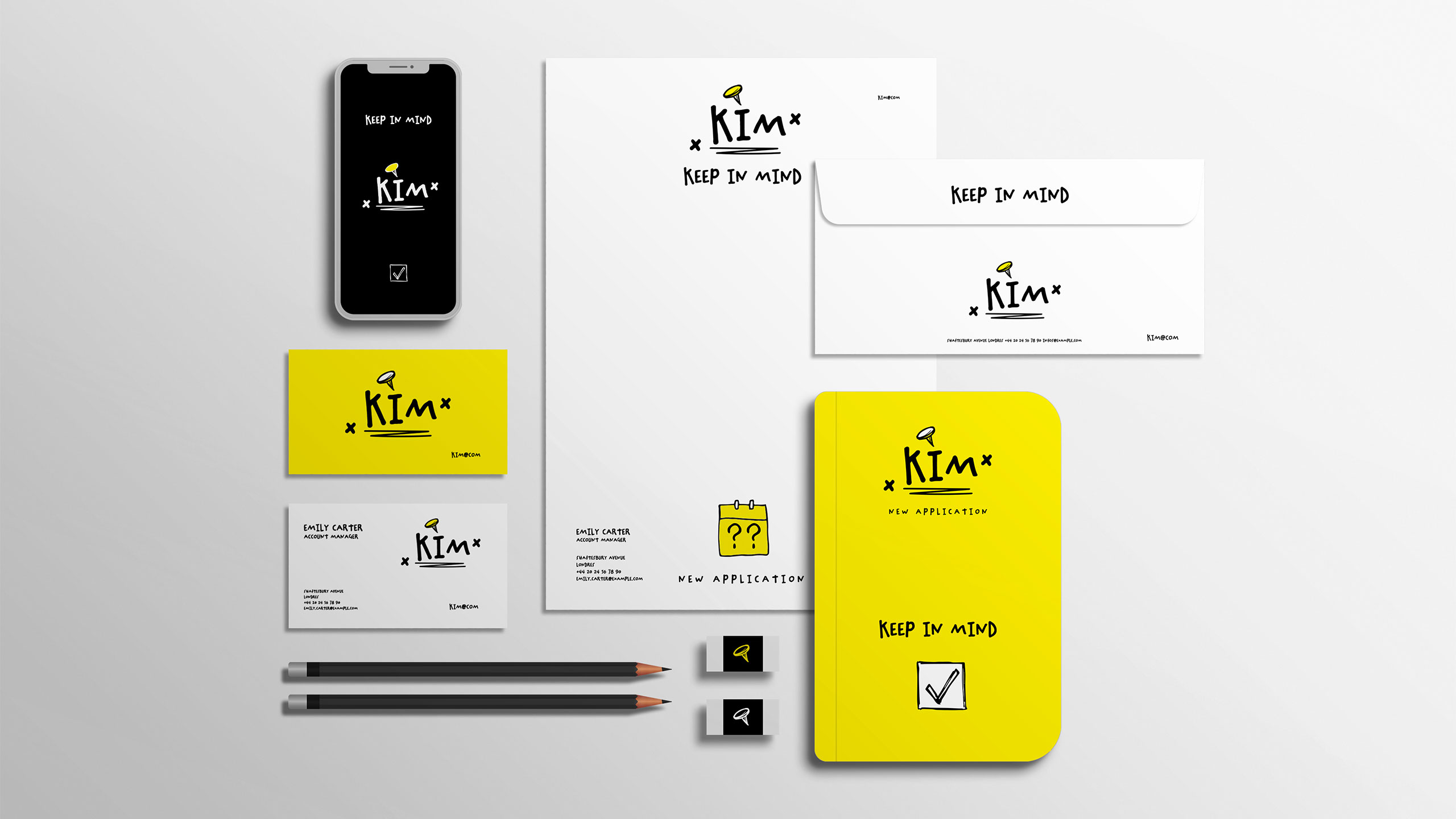
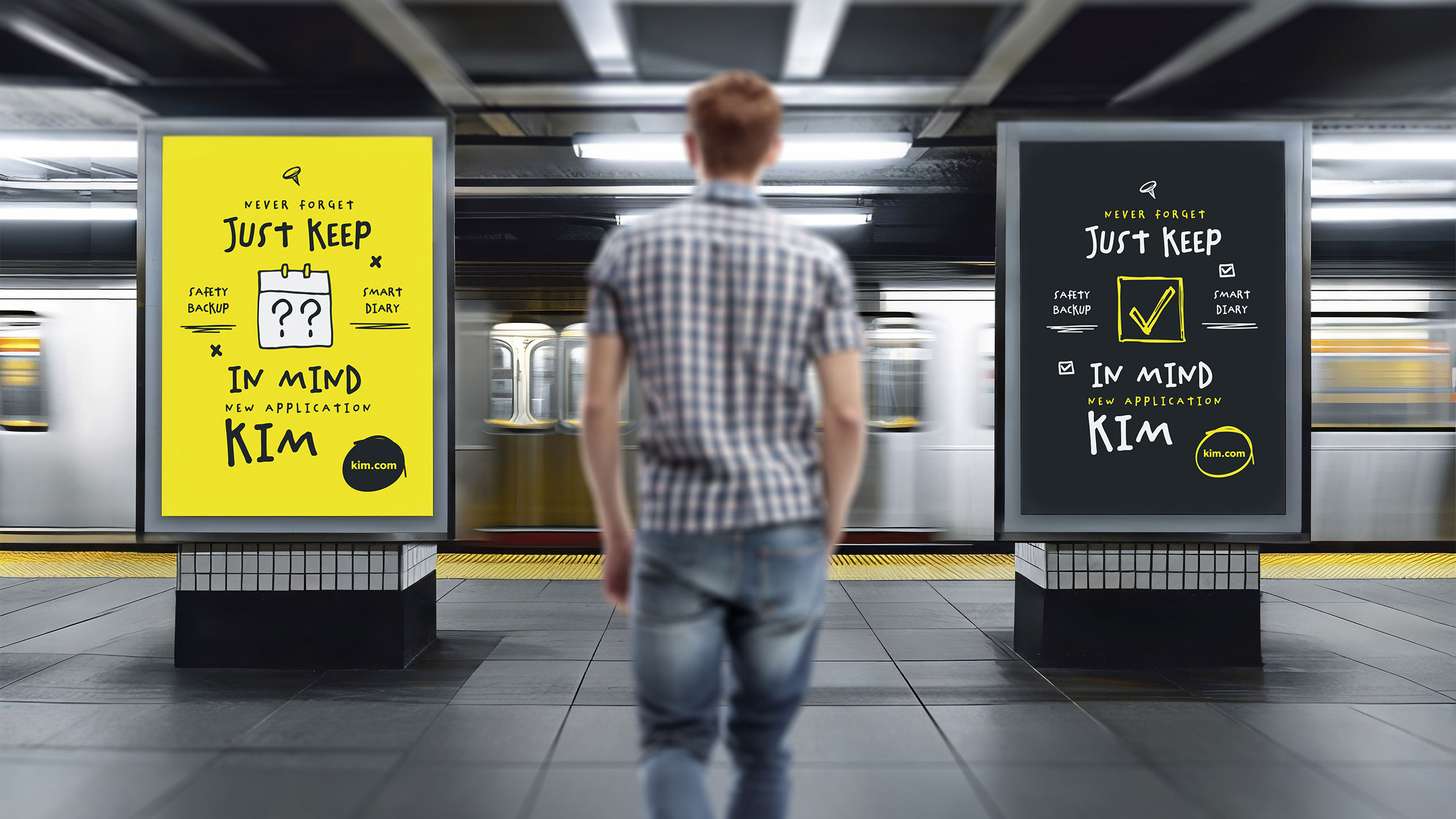
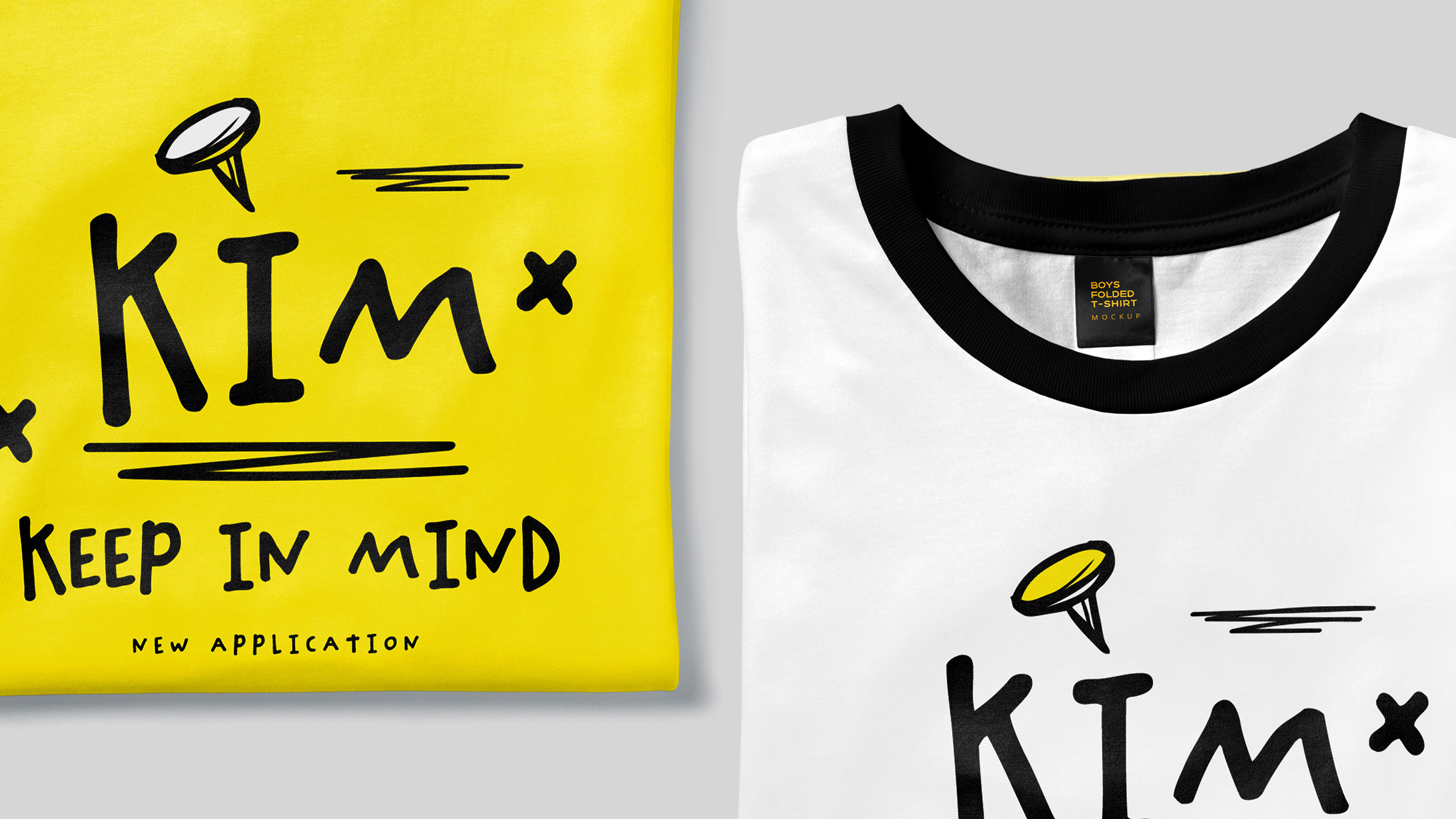
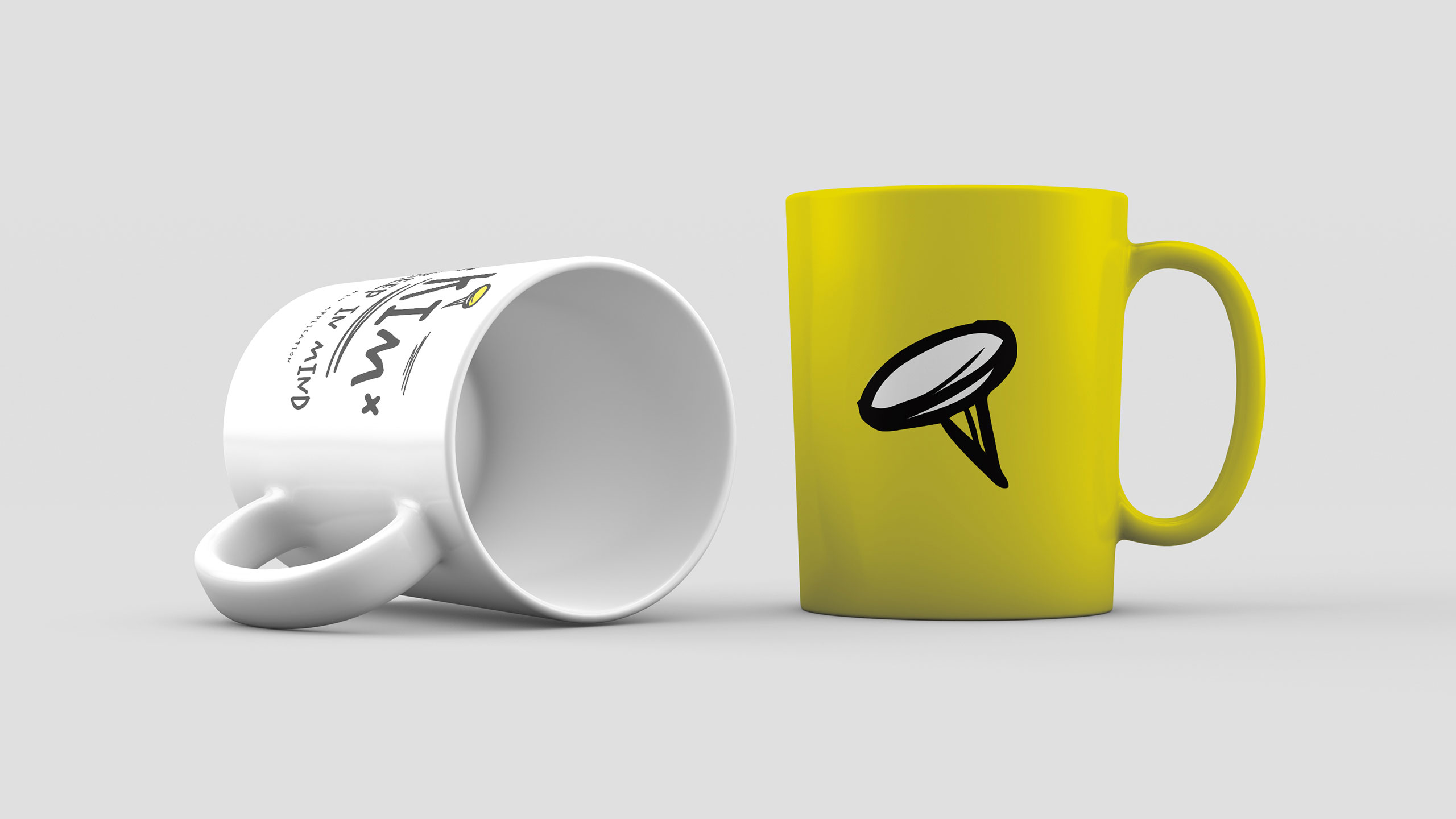
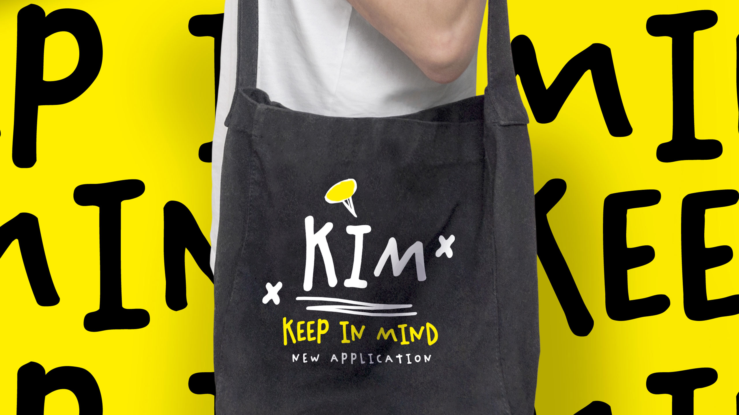
The graphic design for KIM (Keep In Mind), a to-do and agenda-style app, embraces a handmade, playful aesthetic. Dominated by dynamic yellow and black tones, the visual identity captures the spontaneity of notes jotted in physical planners. The design features scribbles, highlights, circles, and pins—just like a memory scrapbook.
Application and Tone
Applied to stationery, mugs, tote bags, and t-shirts, the brand radiates energy and optimism. KIM transforms task management into a cheerful ritual, making users feel organized and inspired. The tone is casual yet clever, appealing to those who value creativity, joy, and a human touch in their daily planning experience.
Related
03
Whether you prefer a quick call or a detailed message, we're here to listen.

OVER

Café Lenoirs

Blen-Beck

Whare House