


Description
02
The Core Challenge
How can Kube's graphic design use simple geometric forms and minimal color to communicate artisanal authenticity and purity in a bold yet understated way?
Visual Language and Symbol
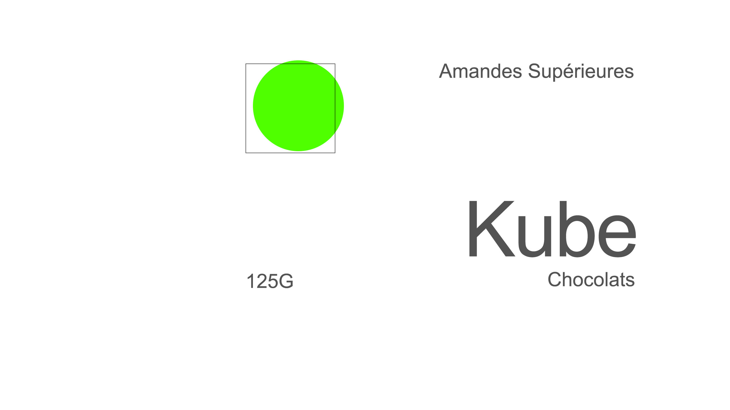
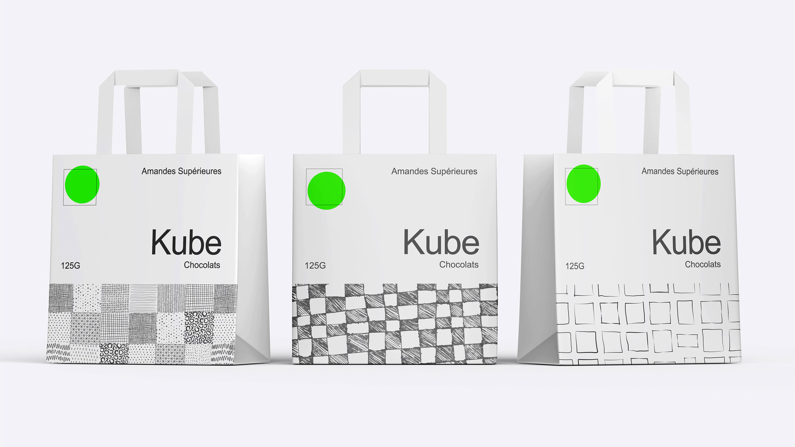
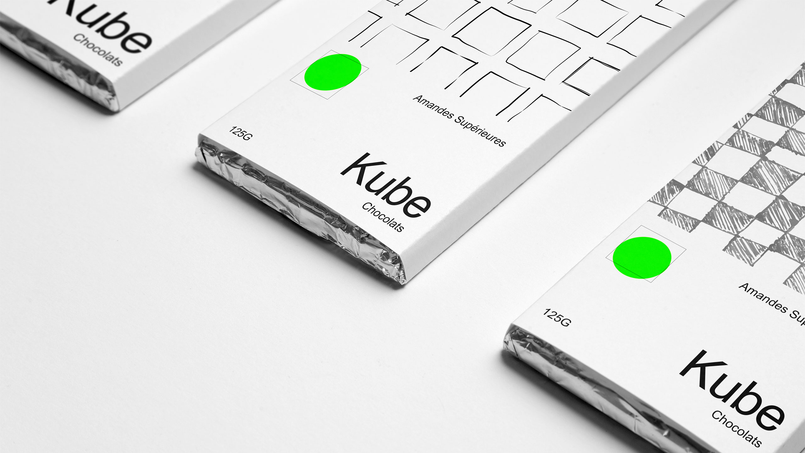
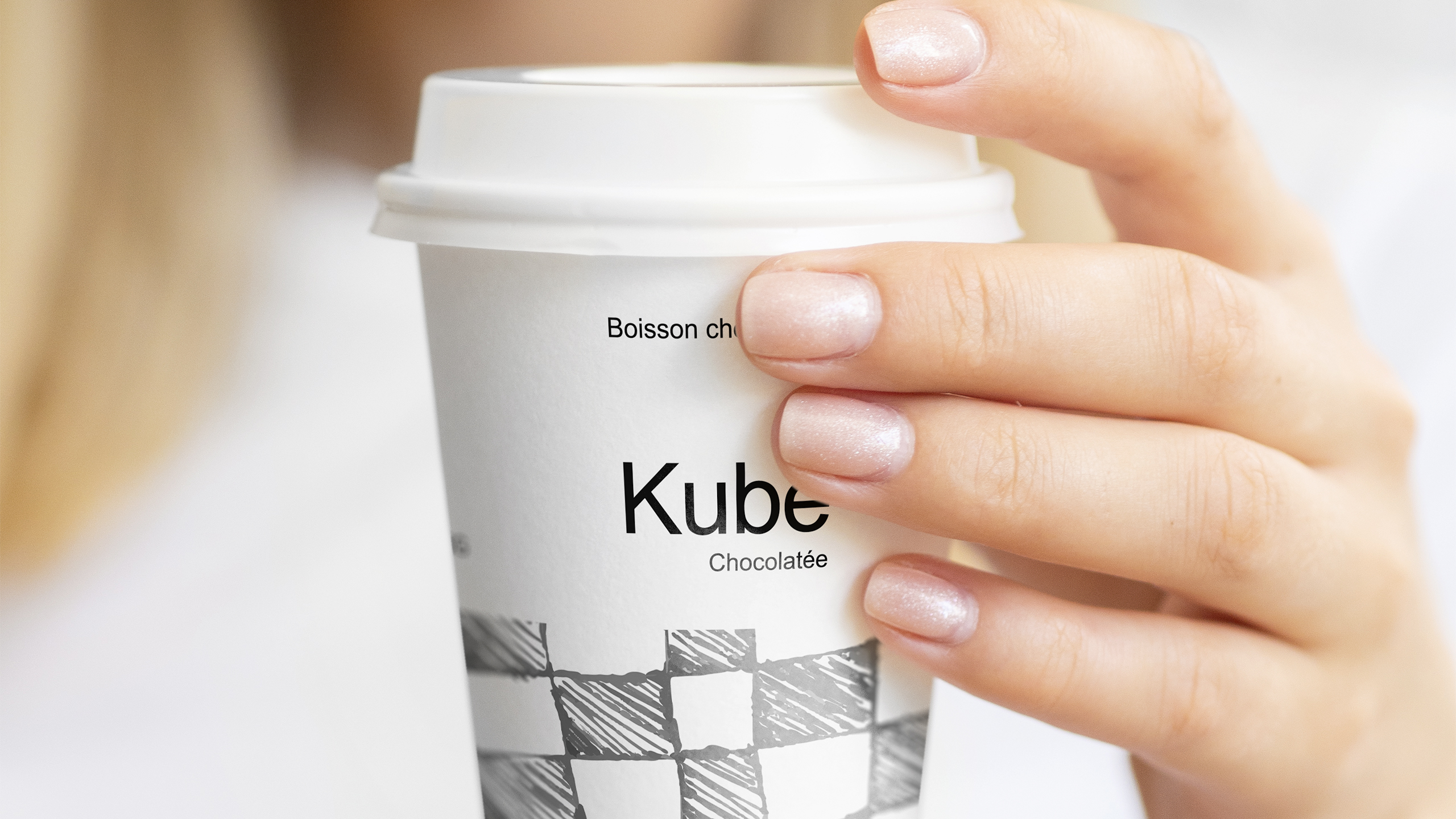
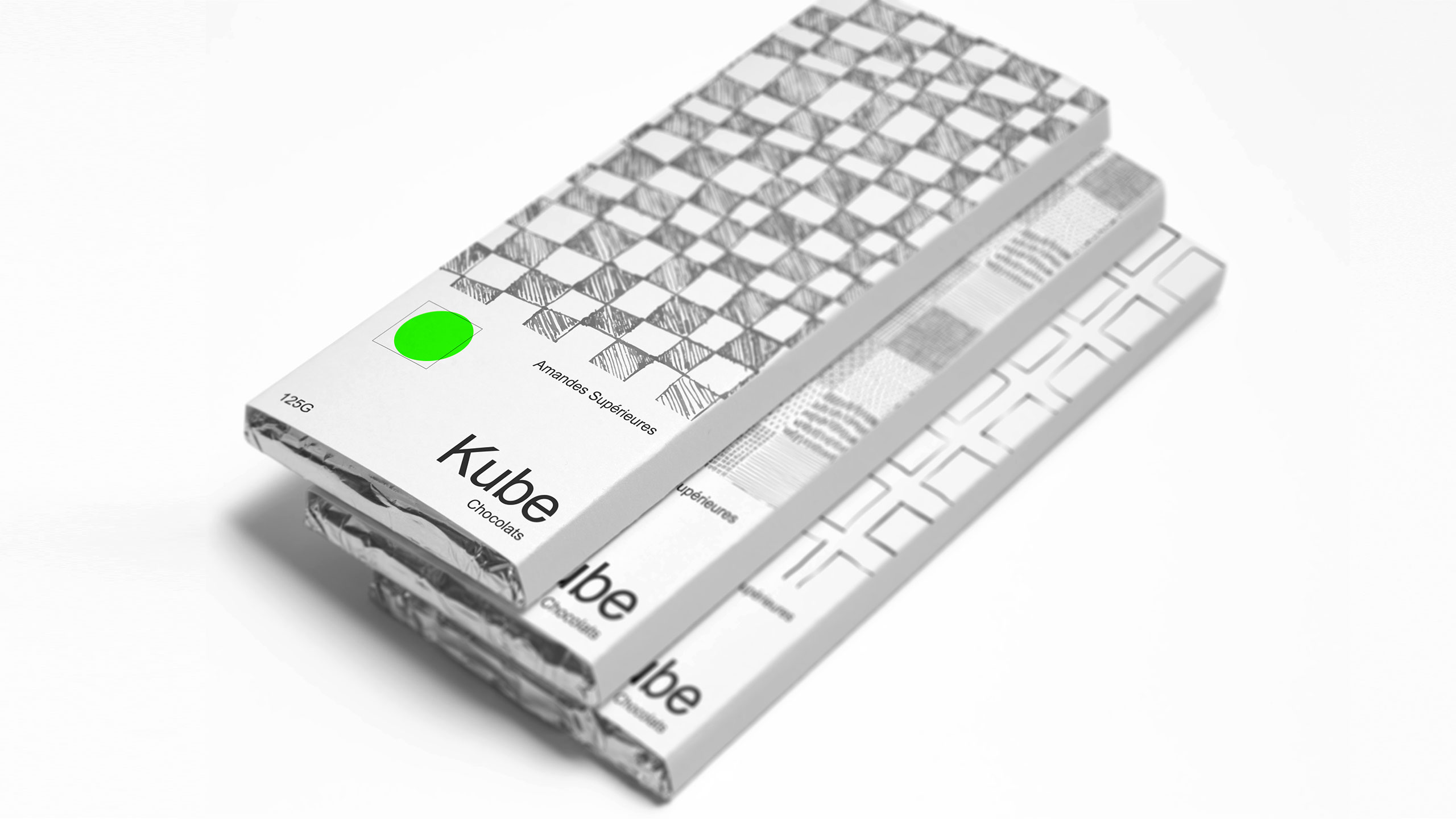
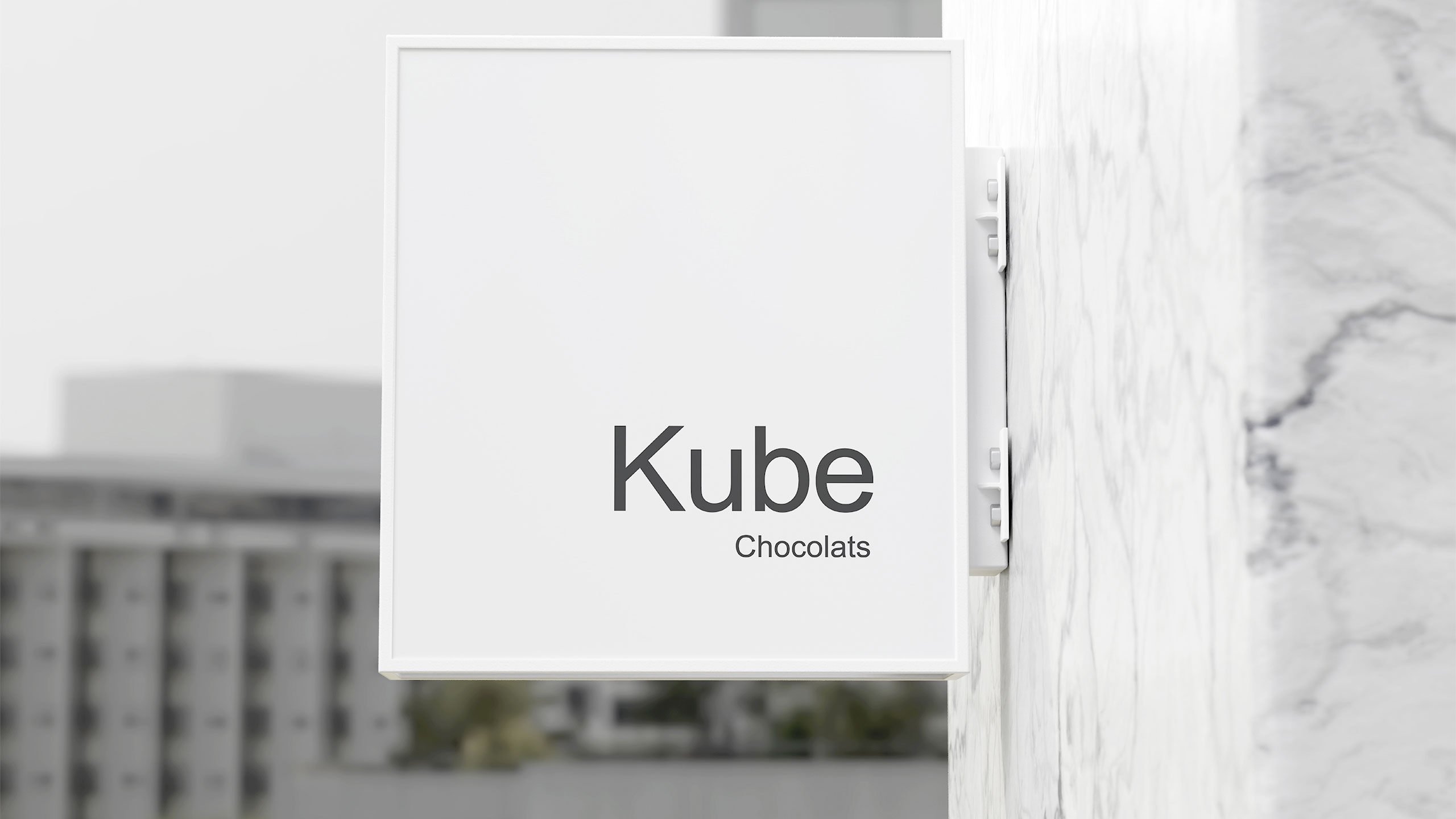
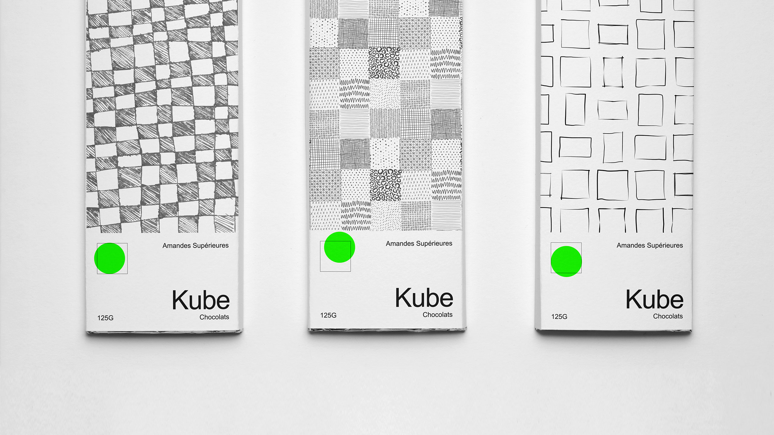
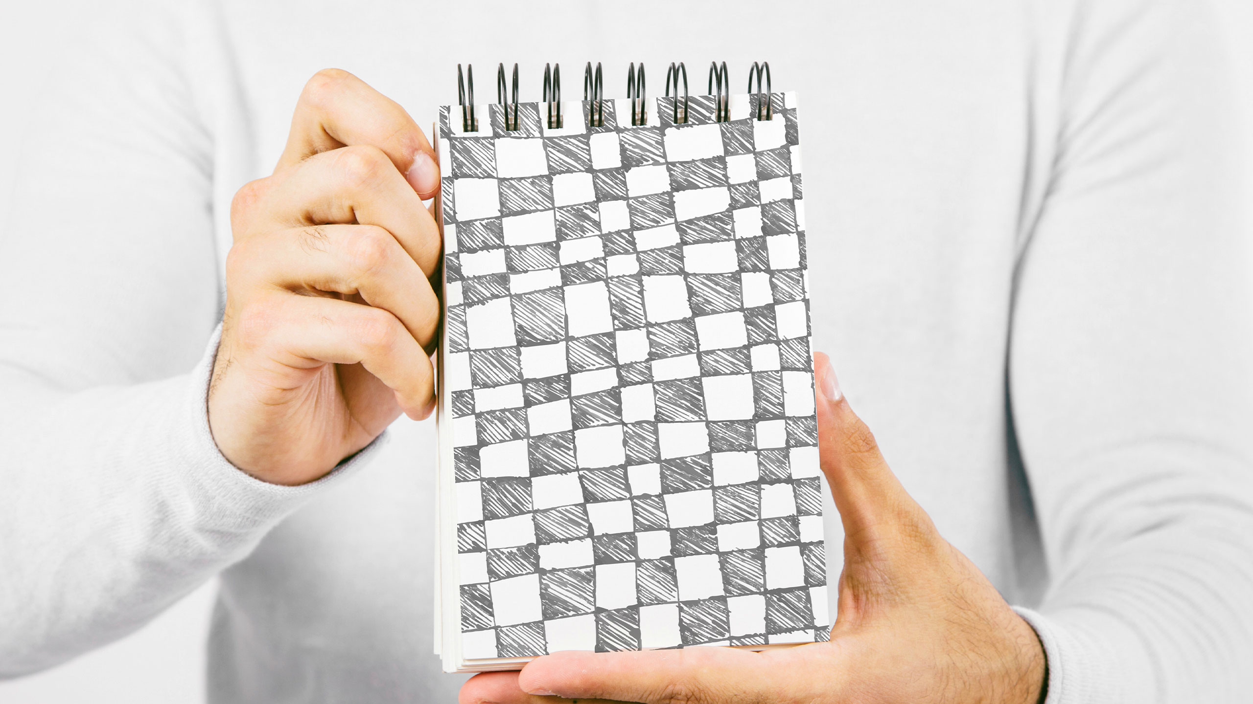
Bold in simplicity, the identity of Kube centers on the square—both as form and symbol. Hand-drawn square motifs echo the shape of chocolate pieces, expressing authenticity, warmth, and artisanal origin. These visual elements appear on chocolate bars, notebooks, tote bags, hot chocolate cups, and signage, reinforcing a handcrafted aesthetic.
Palette and Concept
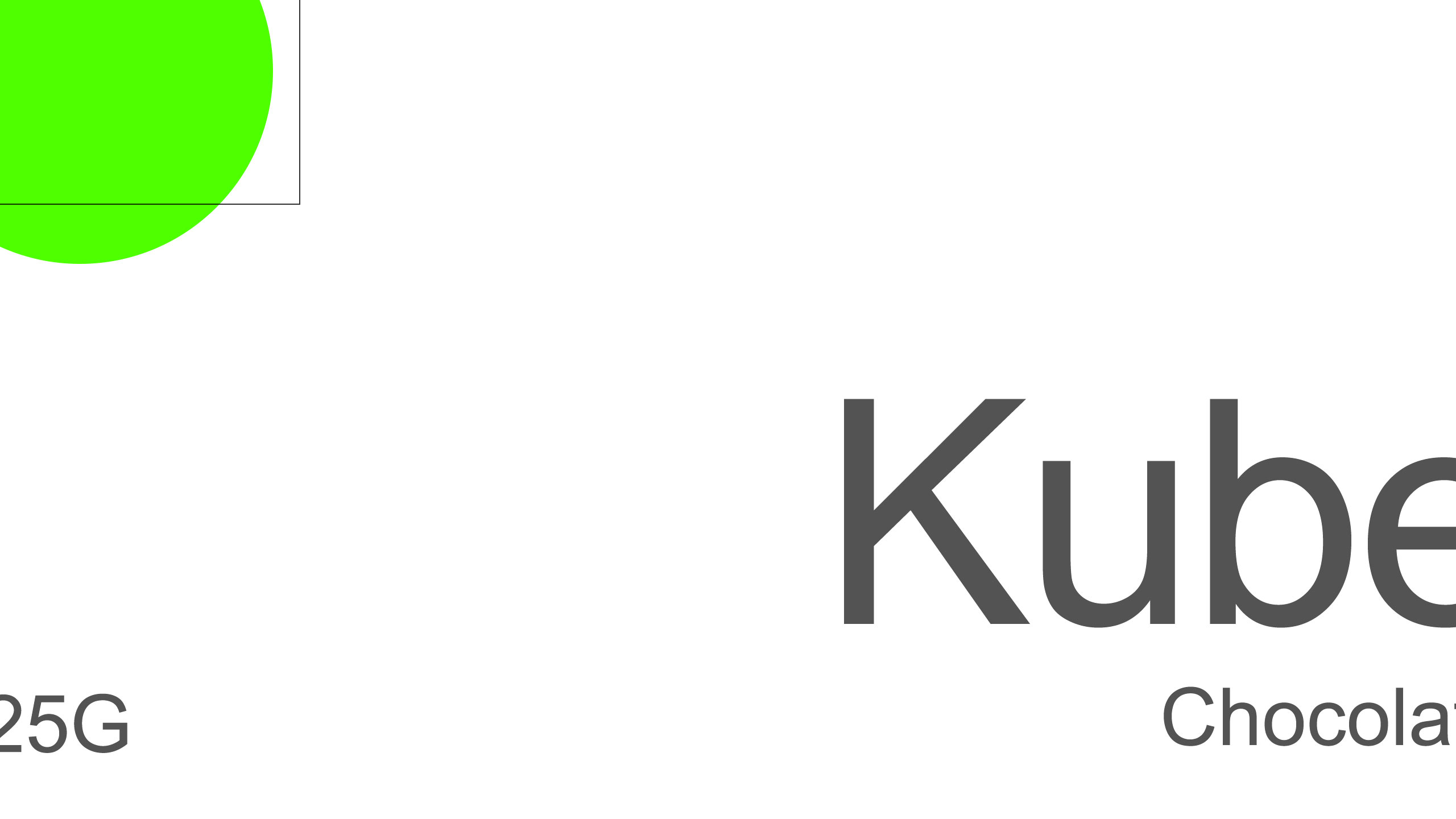
The overall design remains minimal and clean, with black and white dominating the palette. A single touch of neon green signals the chocolate's nature and origin, coded for clarity. Artistic yet restrained, Kube presents itself with quiet confidence: the best, nothing more—letting the purity of its product speak for itself.
Related
03
Whether you prefer a quick call or a detailed message, we're here to listen.

OVER

Café Lenoirs

Blen-Beck

Whare House