


Description
02
The Core Challenge
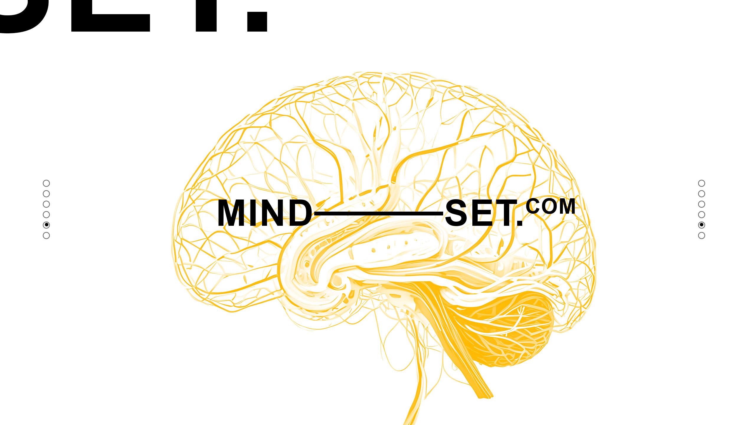
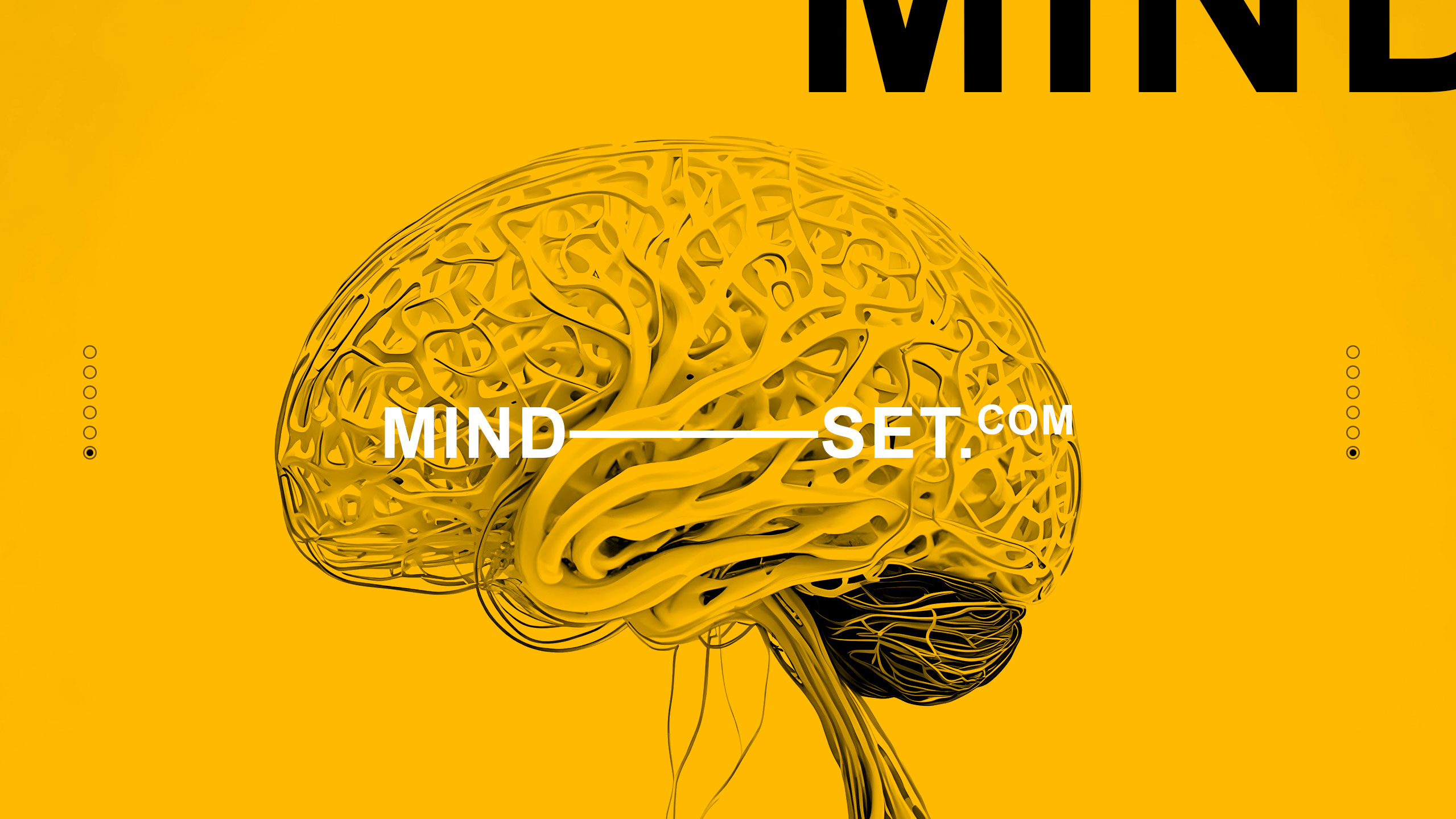
How can design embody creativity and human connection? Mindset's bold yellow and brain-inspired visuals explore how branding symbolizes idea generation, adaptability, and energetic communication in a people-focused agency identity.
Visual Language and Motif
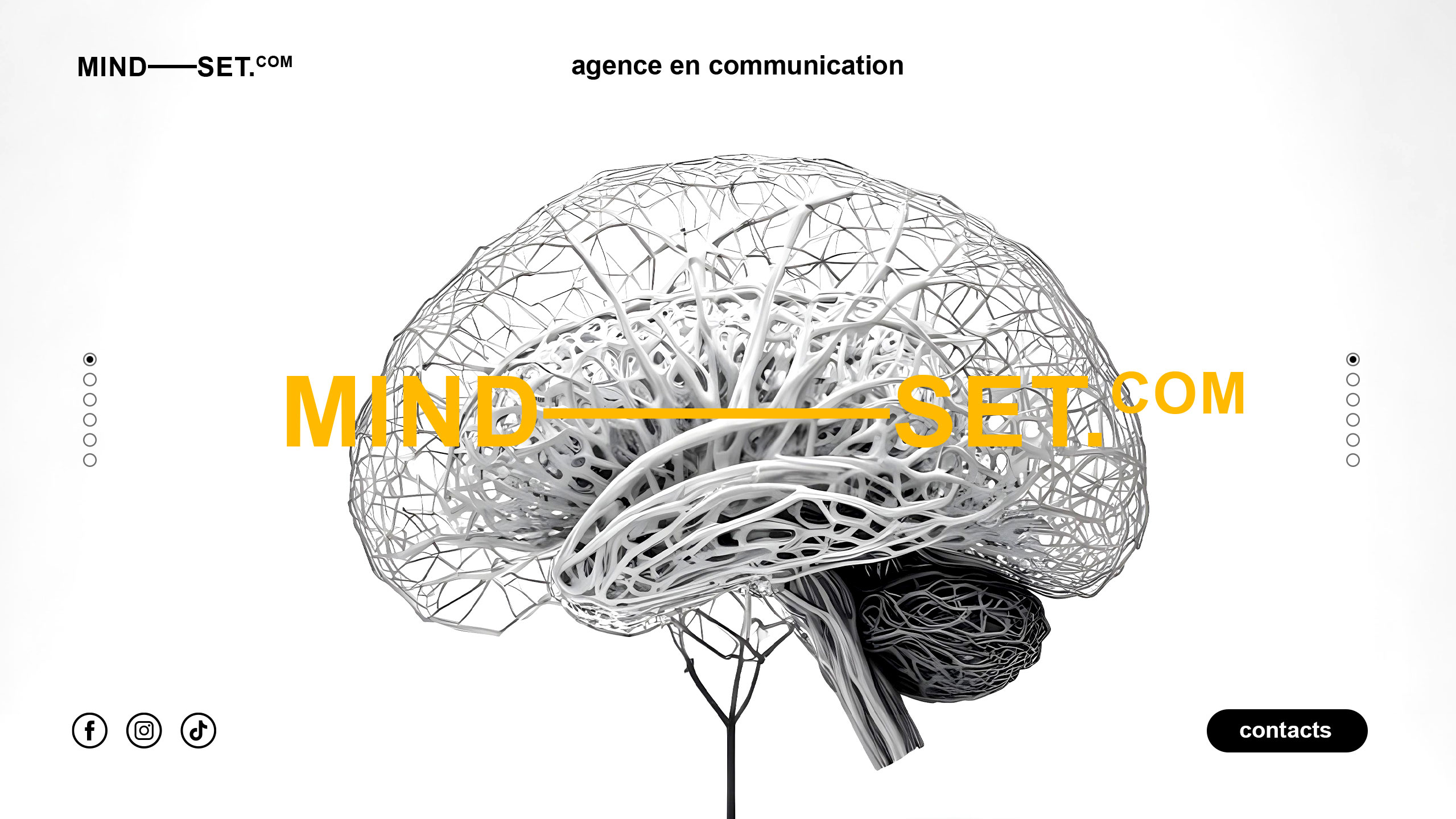
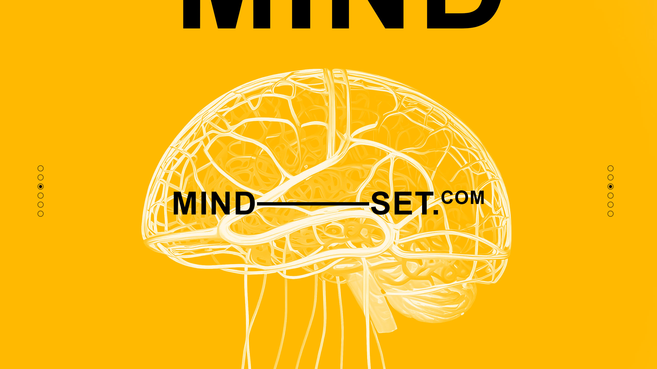
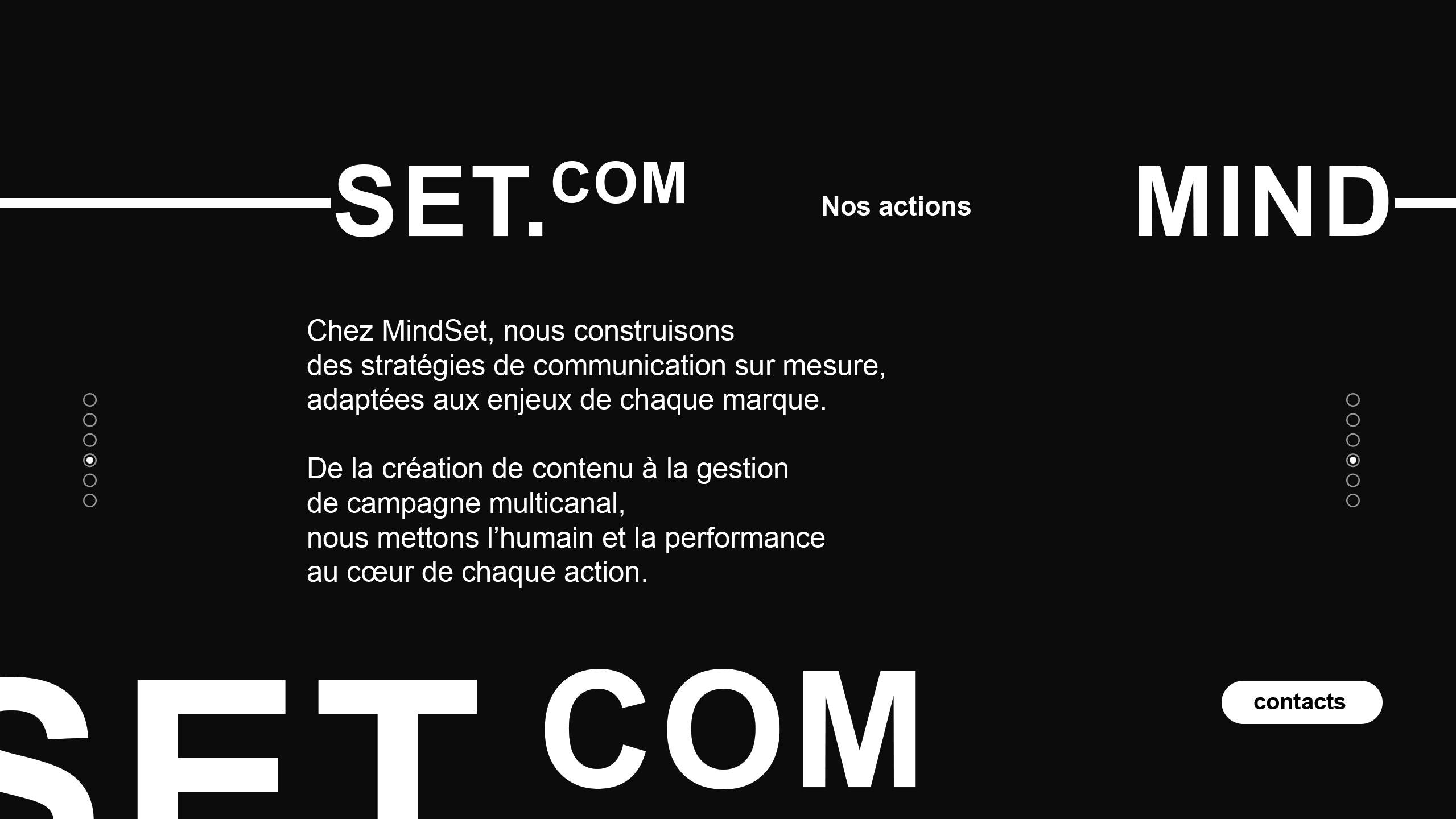
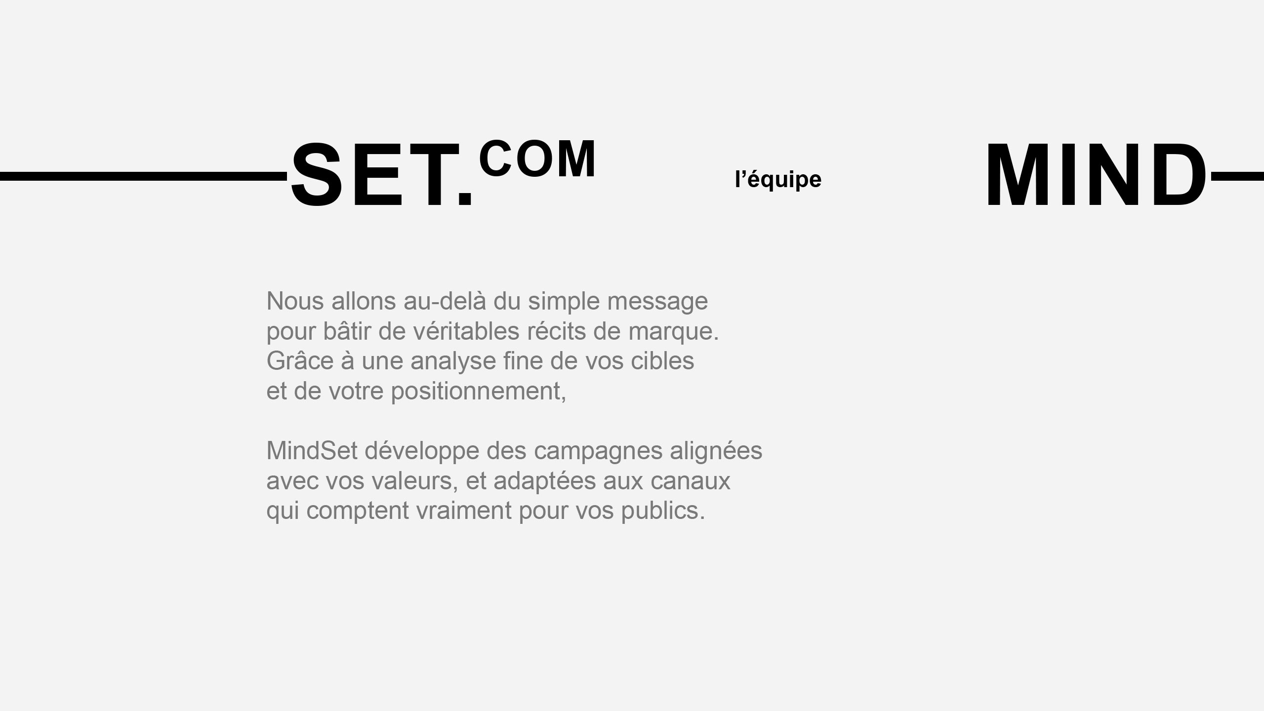
The graphic design for Mindset, a communication agency, uses bold yellow and stylized visuals of the human brain to emphasize its people-centered approach. Featured across signage, stationery, presentation books, and clothing tags, the identity highlights the agency's core activity: infusing and spreading ideas. The brain motif showcases neural networks, symbolizing the development and dissemination of concepts across platforms, including social media.
Color and Name
The bright yellow reinforces energy, clarity, and creative stimulation. The name "Mindset" also reflects the agency's adaptability—its ability to align with clients' values and thought structures, capturing their essence to craft precise and meaningful brand communication strategies.
Related
03
Whether you prefer a quick call or a detailed message, we're here to listen.

Bombyx

HoverSpeed

Kerozen

Eighteen