


Description
02
The Core Challenge
How can a visual identity empower teenage girls through design? "-18" turns diary scribbles, irony, and soft tones into a playful code, creating a youthful, exclusive world that joyfully excludes adults.
Visual Language and Concept
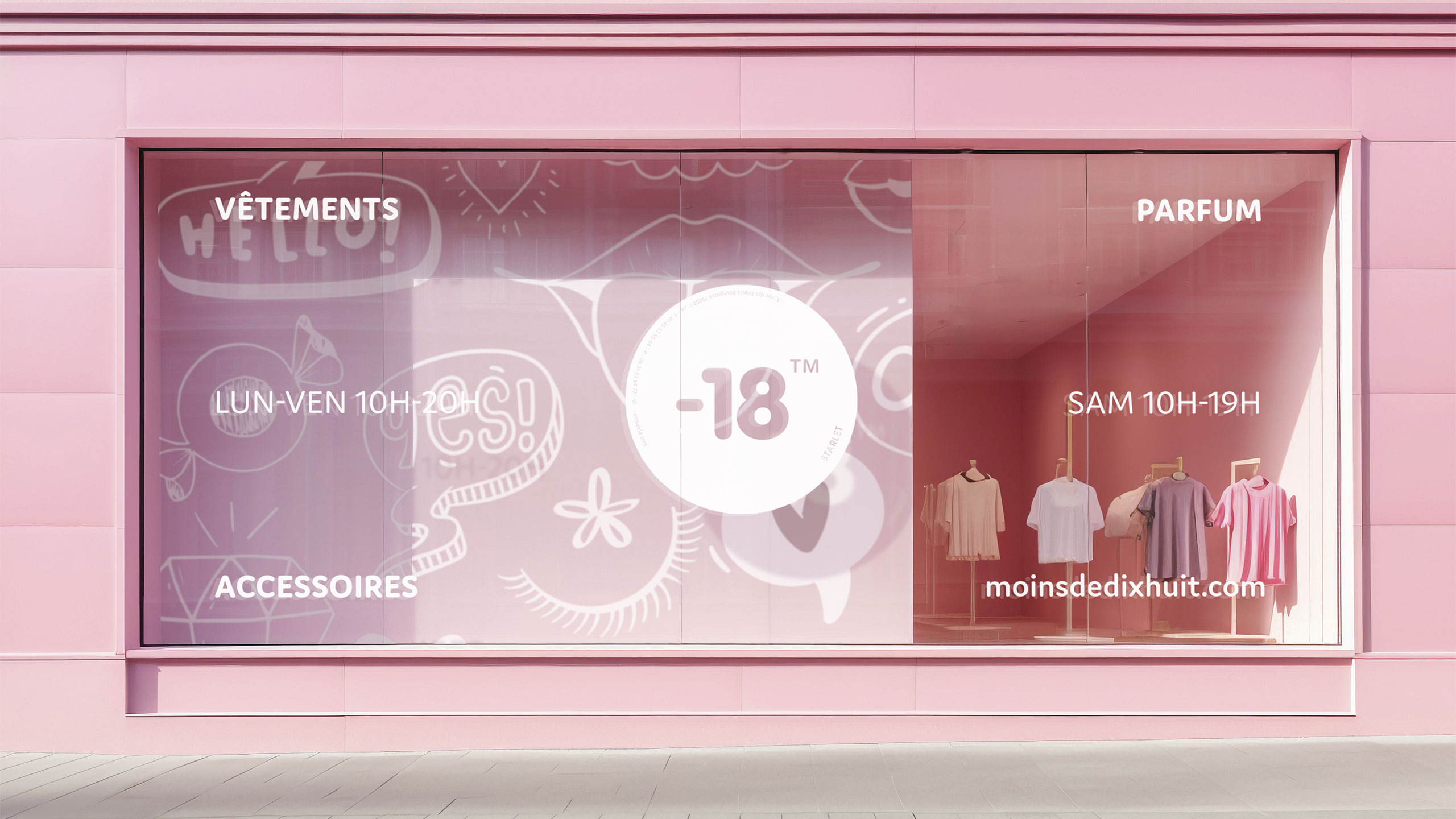
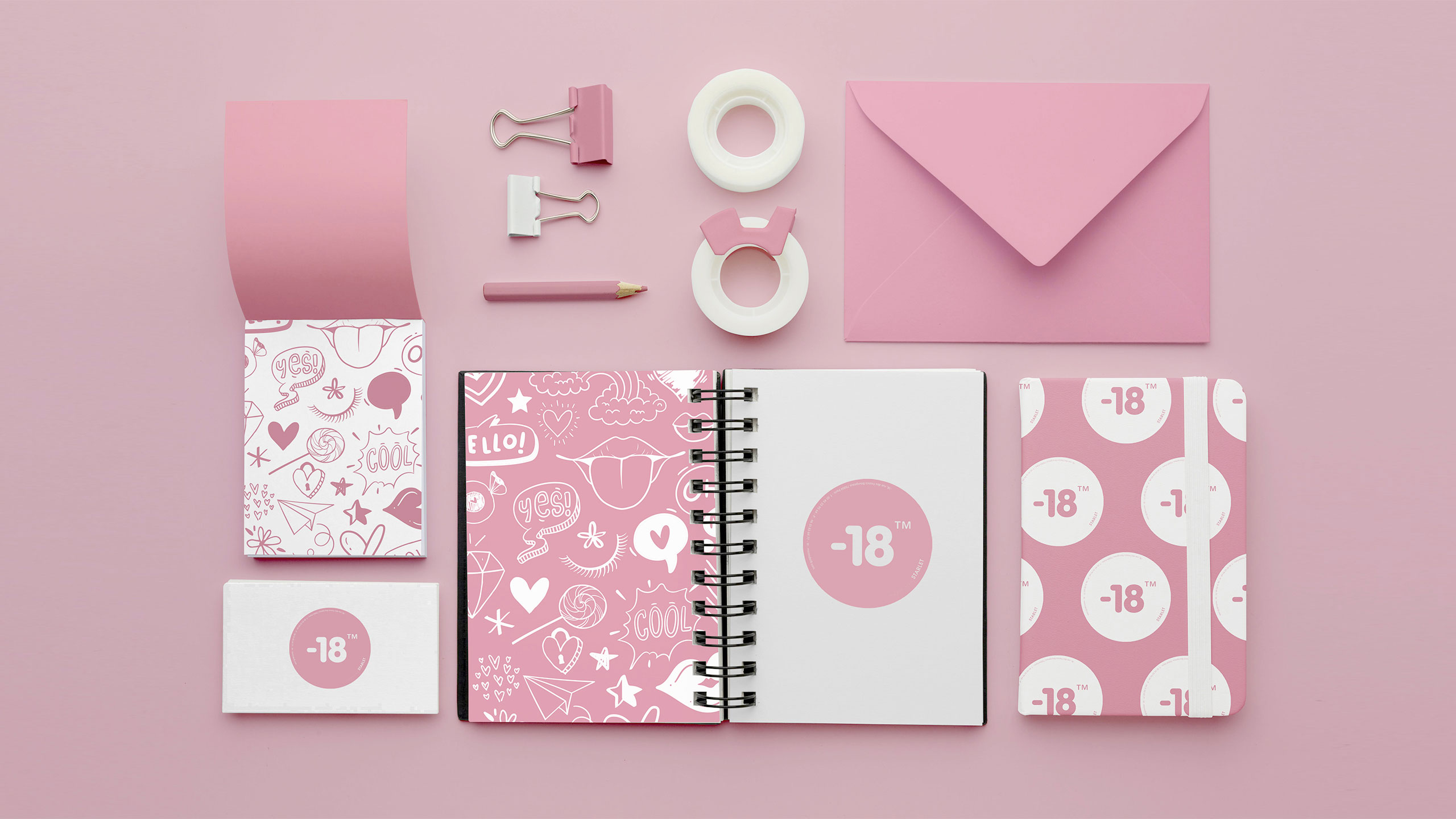
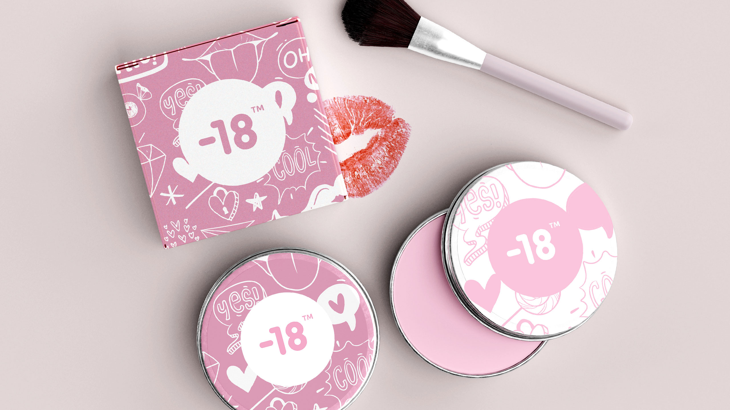
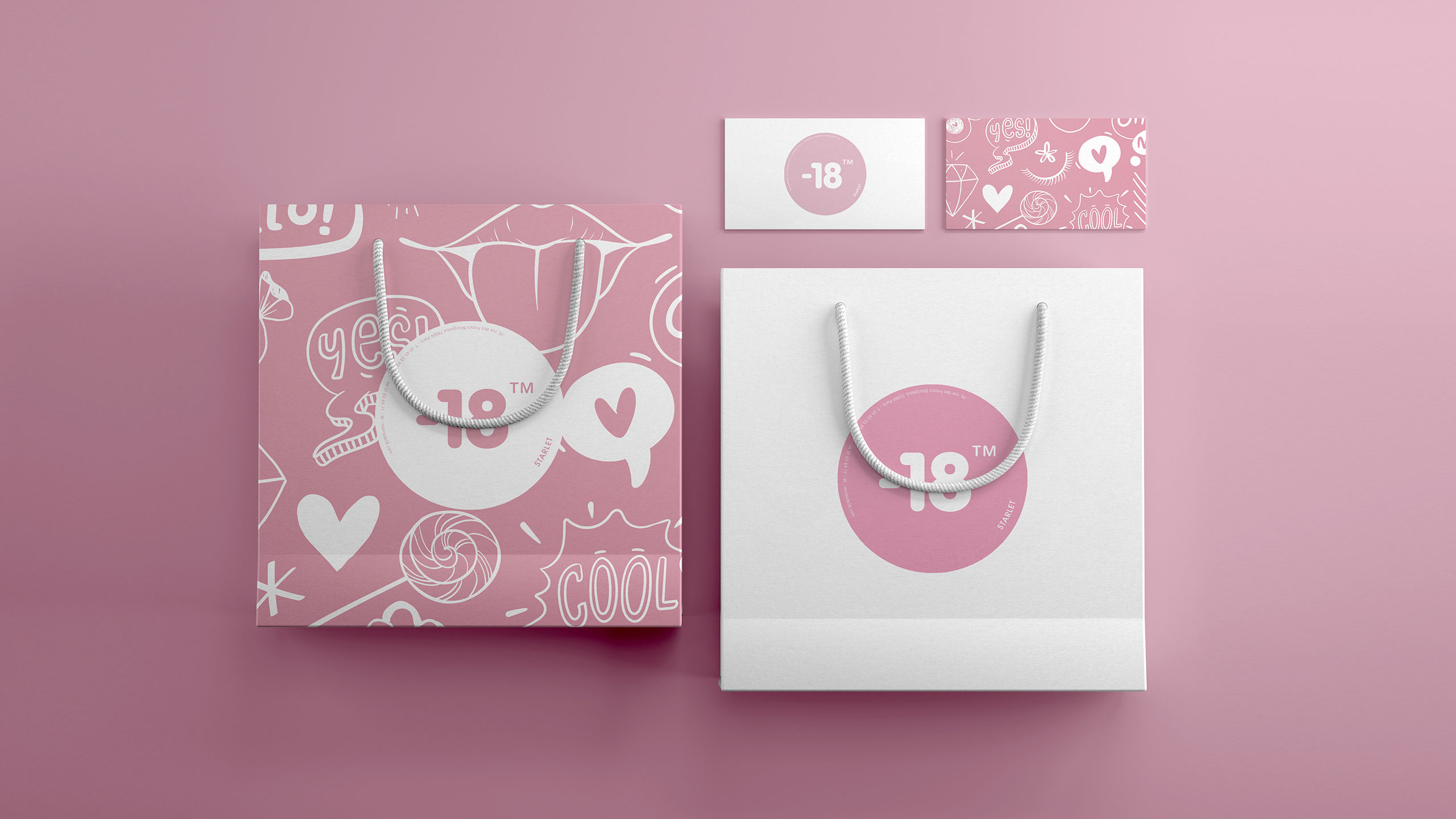
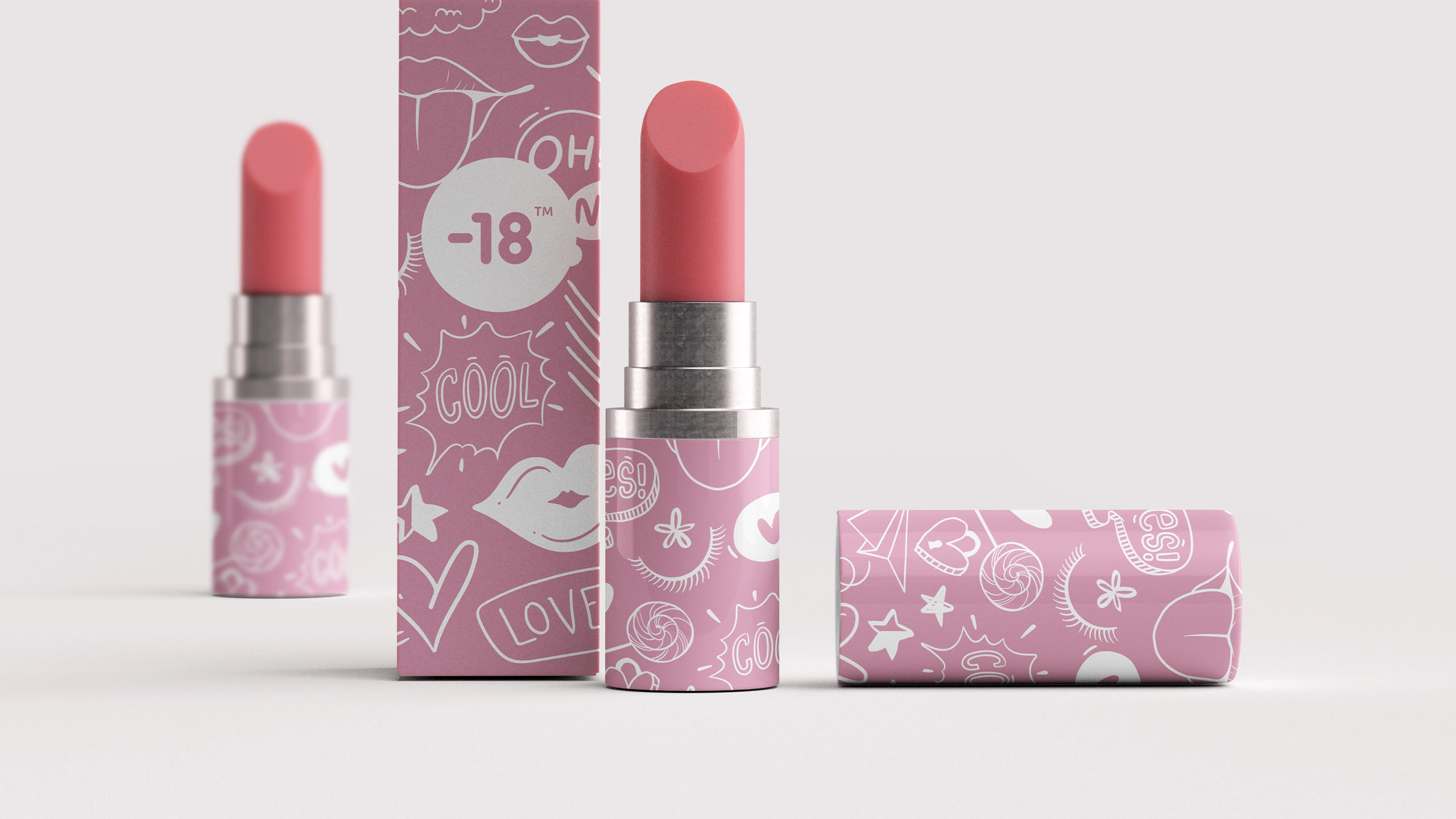
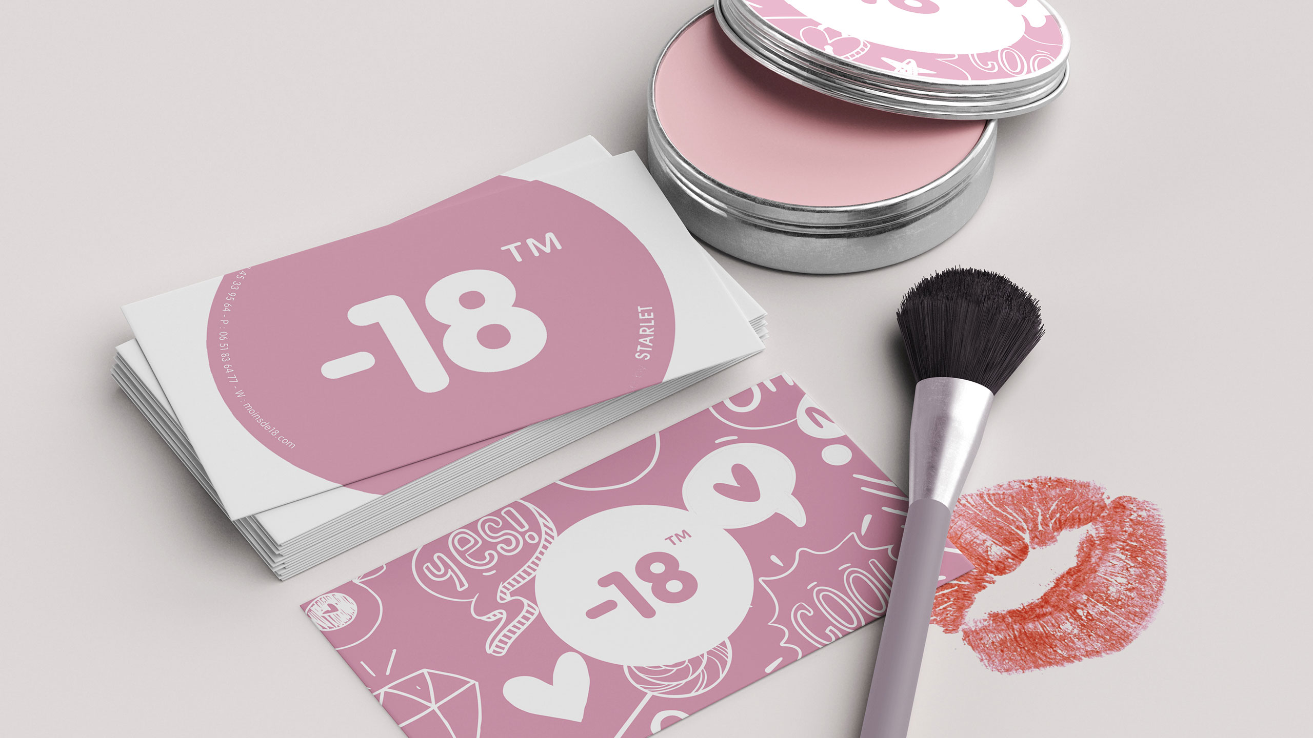
The graphic design for the brand "-18" is playful and rebellious, inspired by teen diary doodles. It features soft pink and white tones, appealing to young girls. The logo, resembling an age restriction sign, flips the concept: instead of barring minors, it humorously prohibits adults. This ironic twist creates a fun, exclusive space for youth.
Application and Tone
The design appears on T-shirts, cosmetic packaging, badges, bags, and stationery. Every item reflects a personal, intimate vibe, like a secret club. With its hand-drawn aesthetic and cheeky messaging, "-18" claims a whimsical world where only the young are allowed. Adults? Sorry, you're not invited.
Related
03
Whether you prefer a quick call or a detailed message, we're here to listen.

OVER

Café Lenoirs

Blen-Beck

Whare House