


Description
02
The Core Challenge
How can a tea salon brand visually express both the refined quality of its products and the joyful diversity of its flavors through a simple, elegant, and timeless graphic system?
Visual Language and Logo
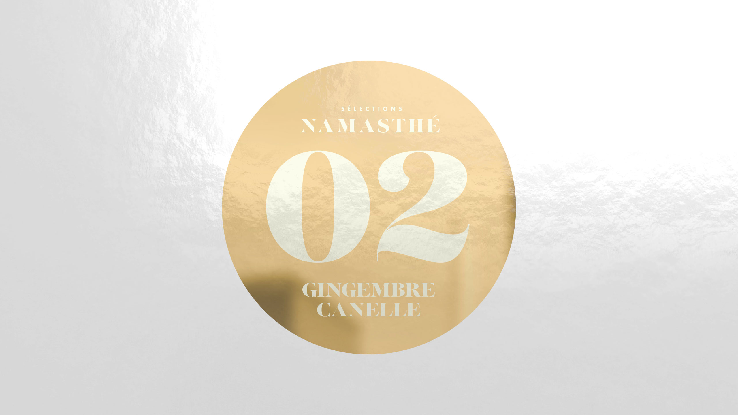
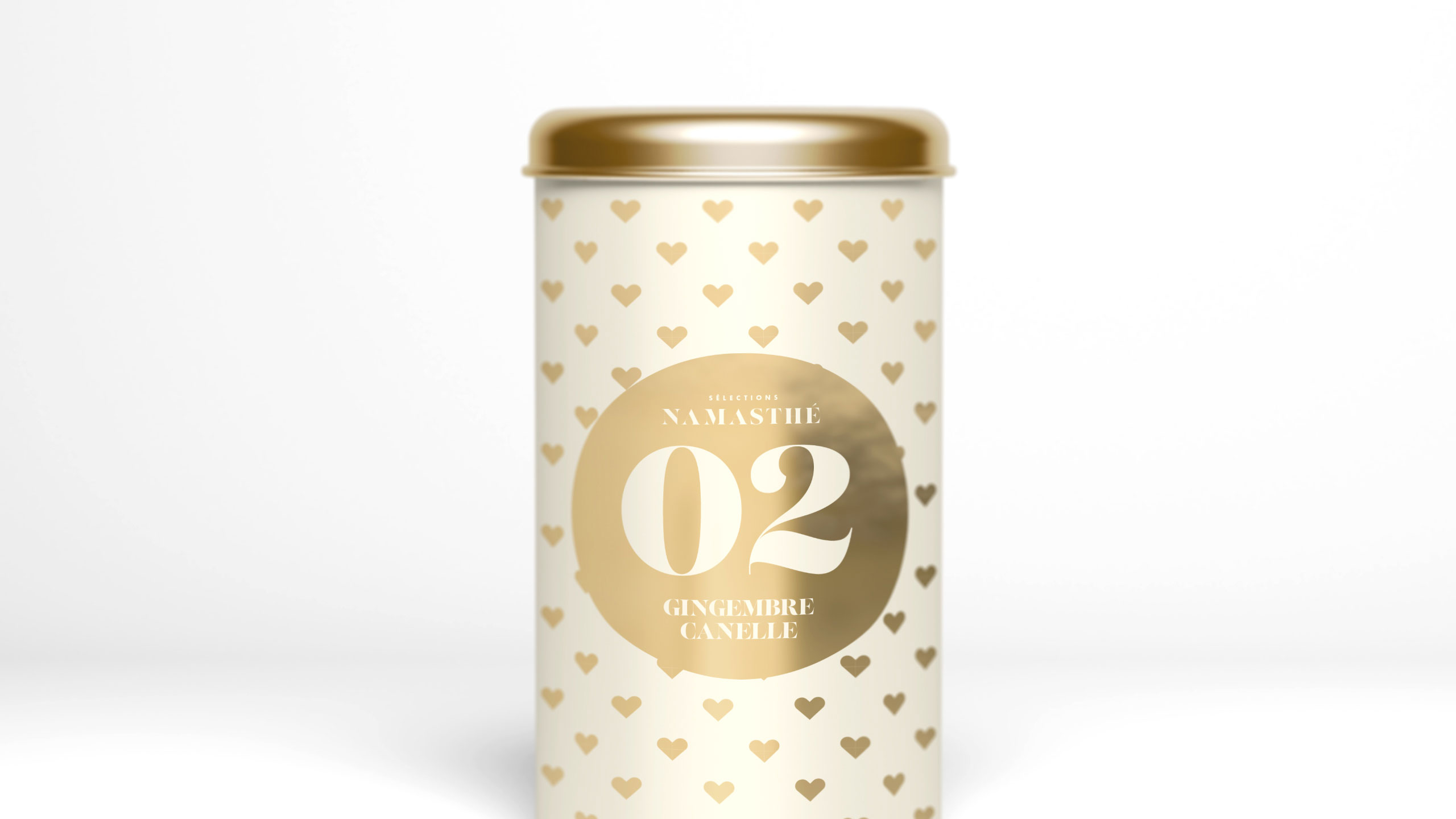
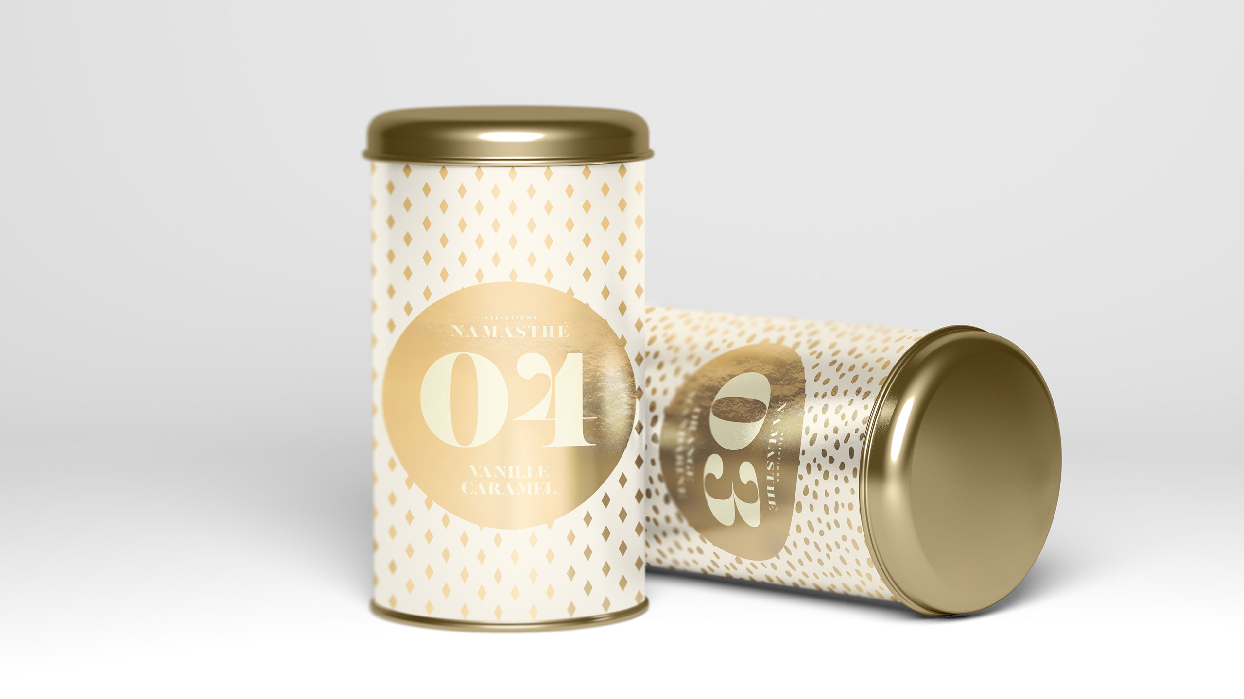
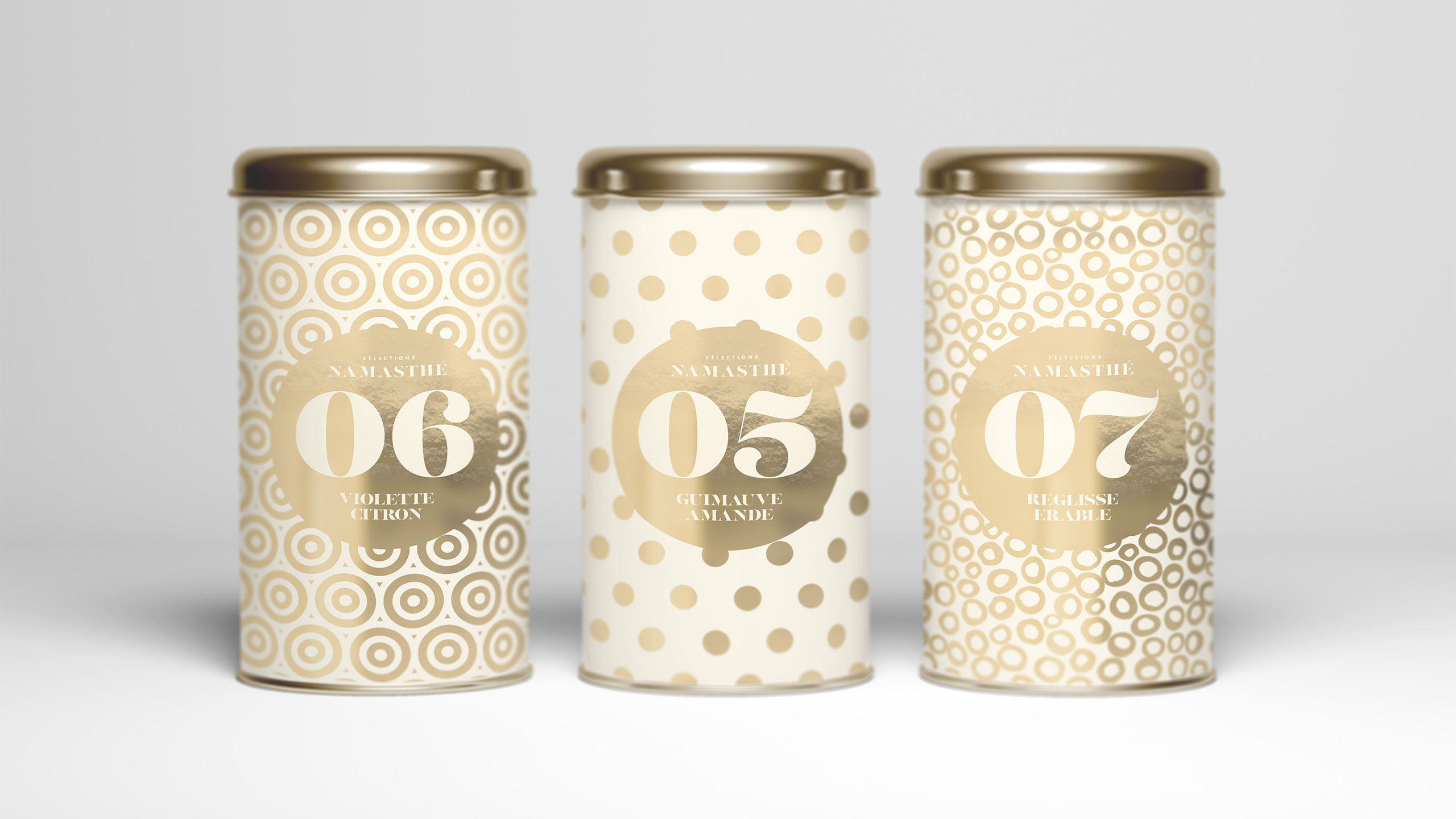
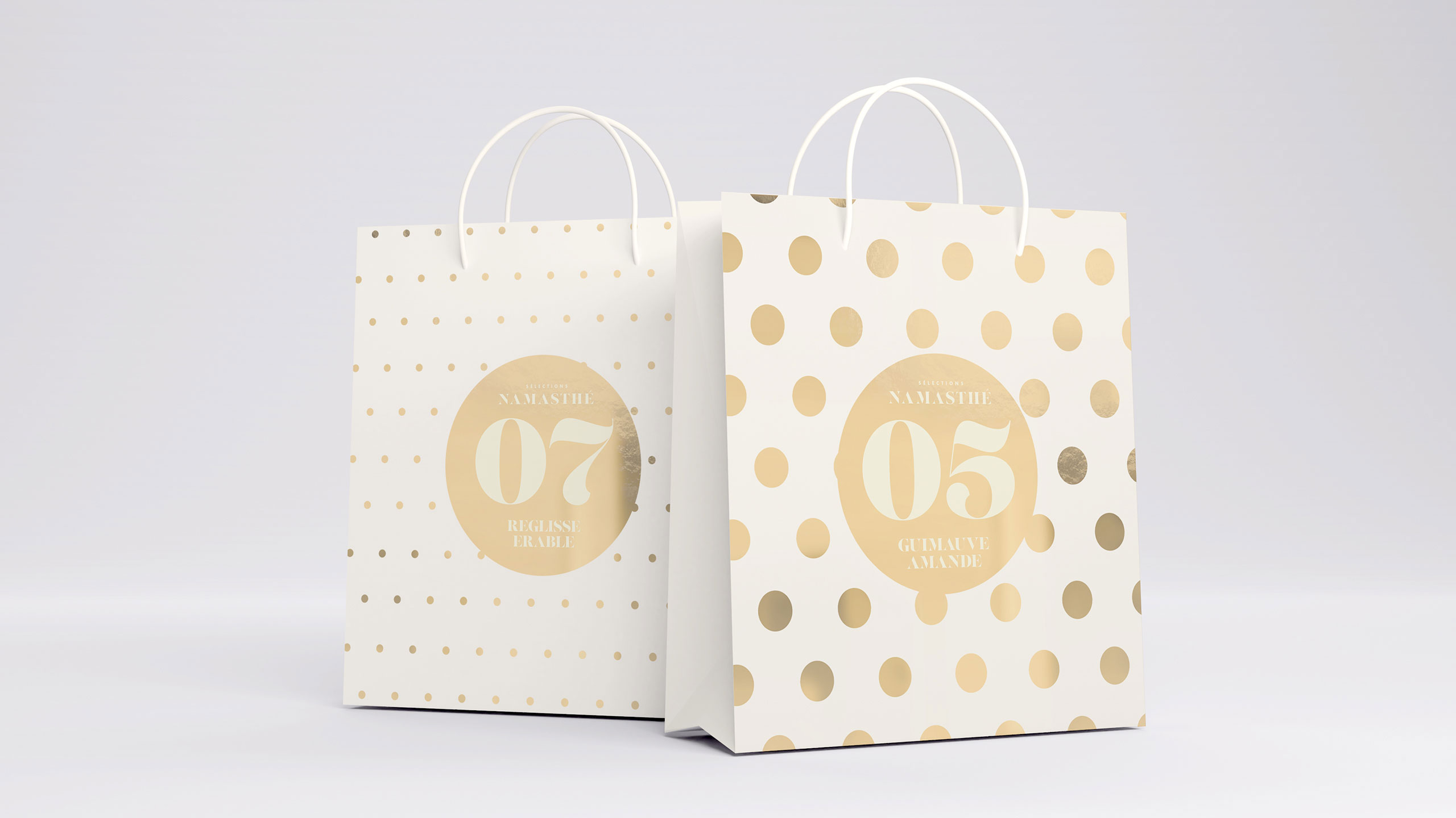
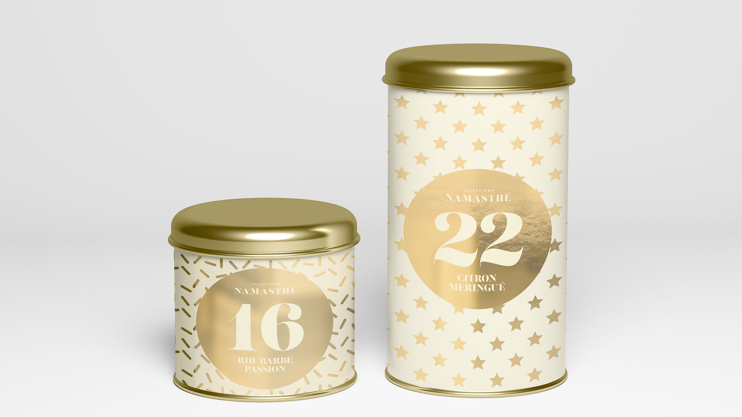
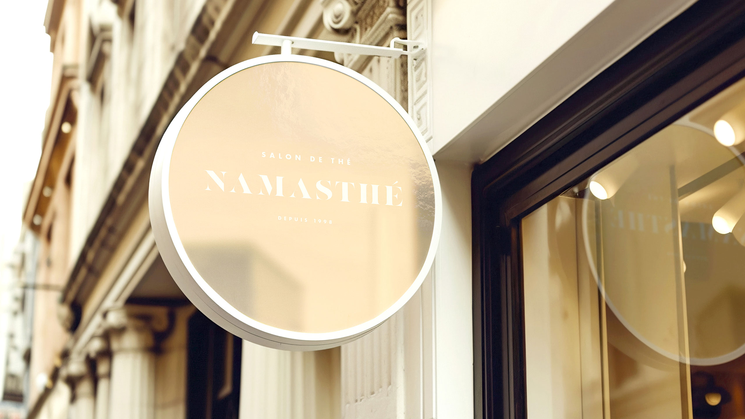
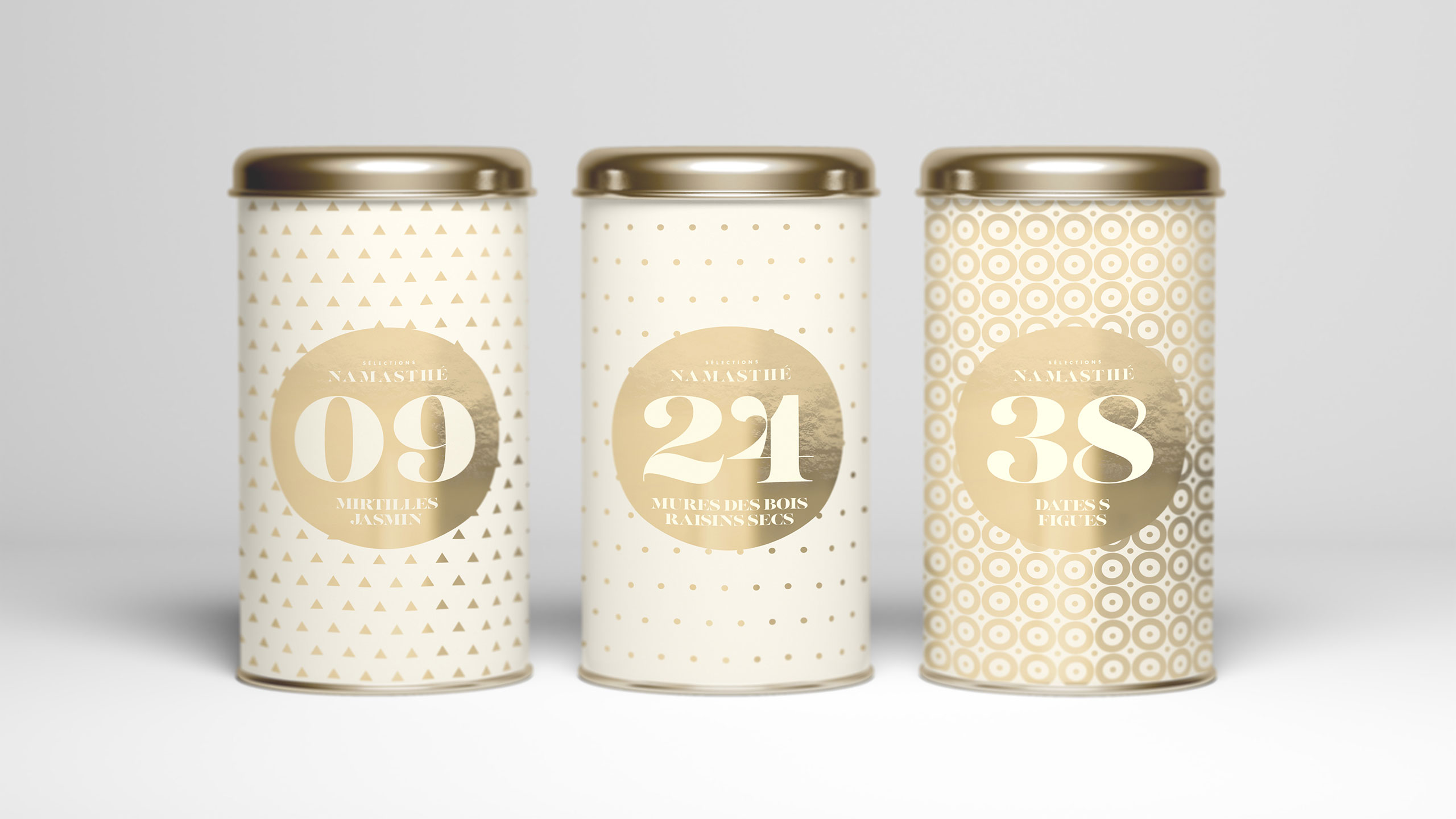
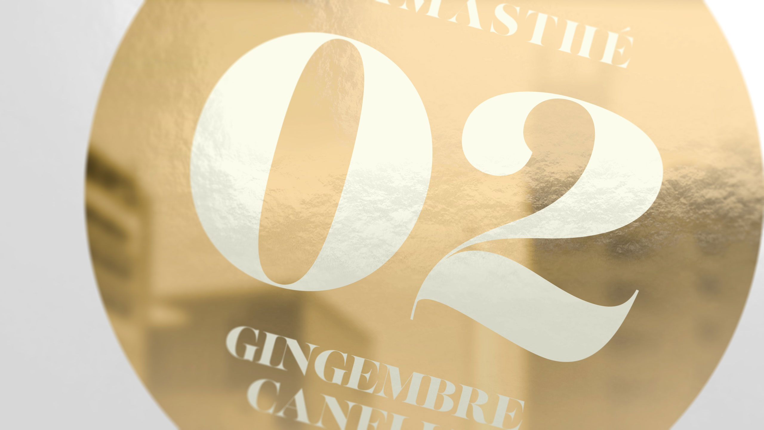
The graphic design for Namasthé teahouse brand blends joyful expression and timeless elegance. Applied across signage, stationery, bags, and packaging, the design features a white and gold color palette, symbolizing purity, luxury, and quality. At its core is a round logo, encircled by simple patterns that represent the variety of flavors offered.
System and Identity
Each pattern, like a numbered motif, forms a visual collection, suggesting richness and diversity. The gold detailing elevates the minimalist aesthetic, while the white background provides balance and clarity. This design approach reflects both the refined experience of tea tasting and the vibrant personality of each blend.
Related
03
Whether you prefer a quick call or a detailed message, we're here to listen.

OVER

Café Lenoirs

Blen-Beck

Whare House