


Description
02
The Core Challenge
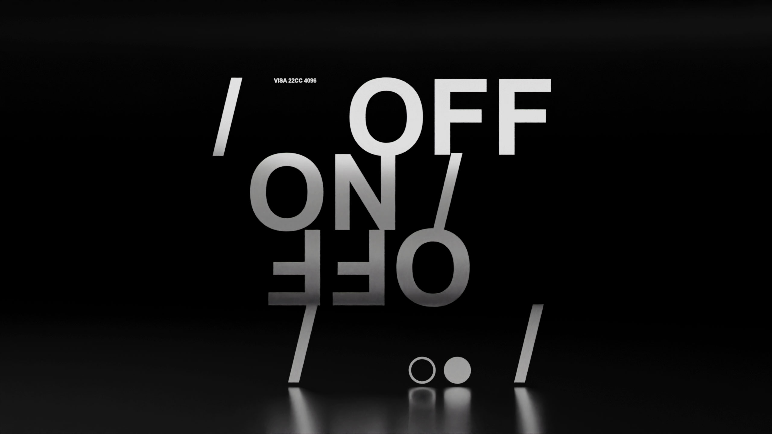
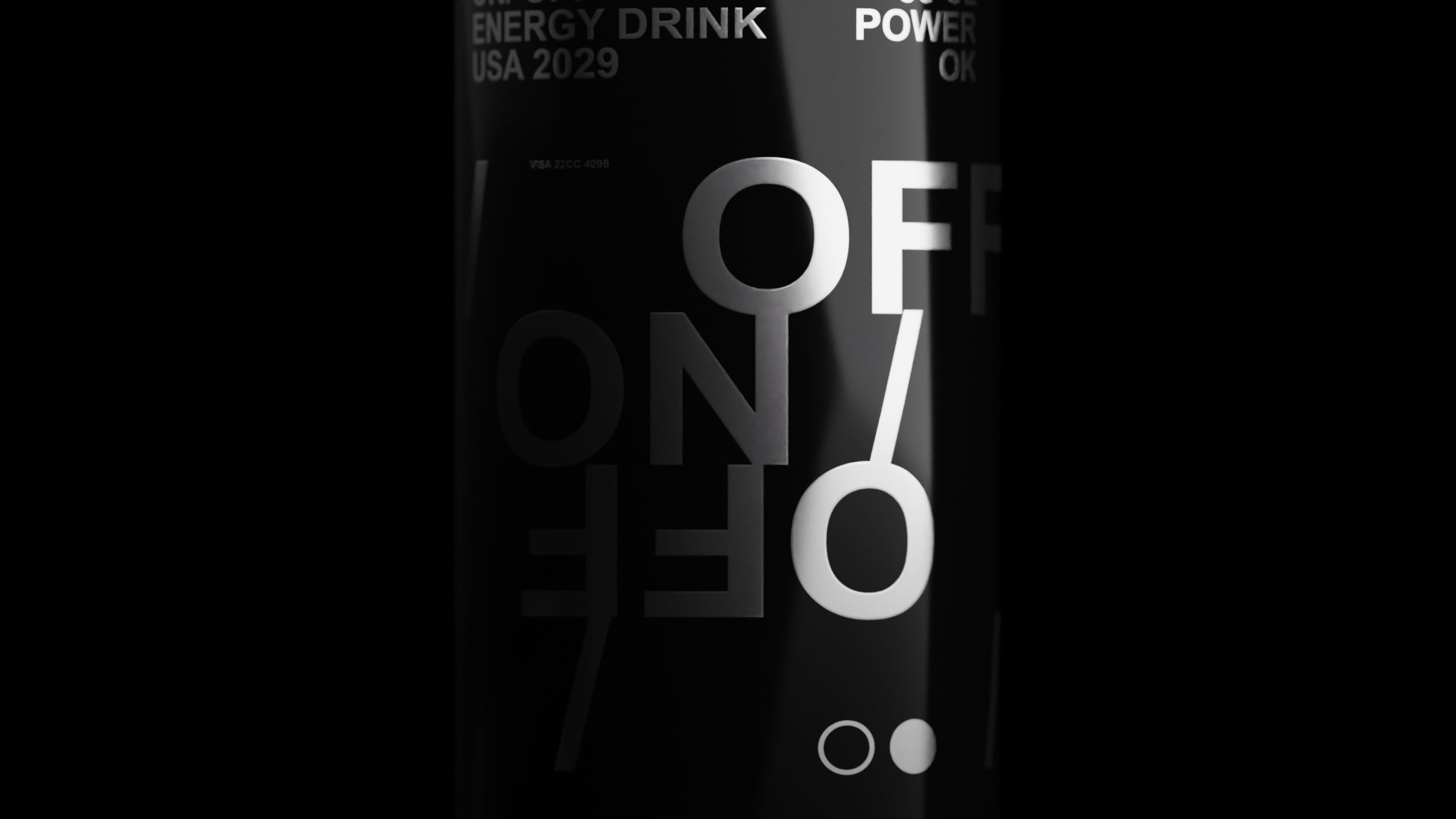
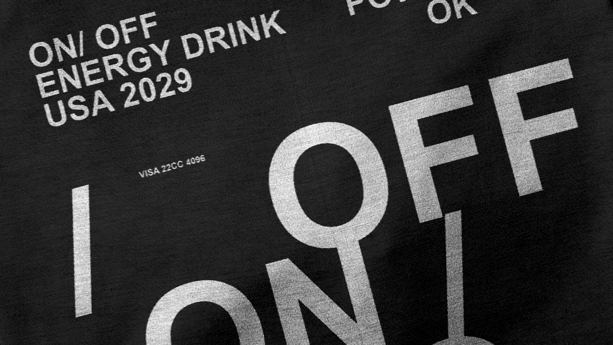
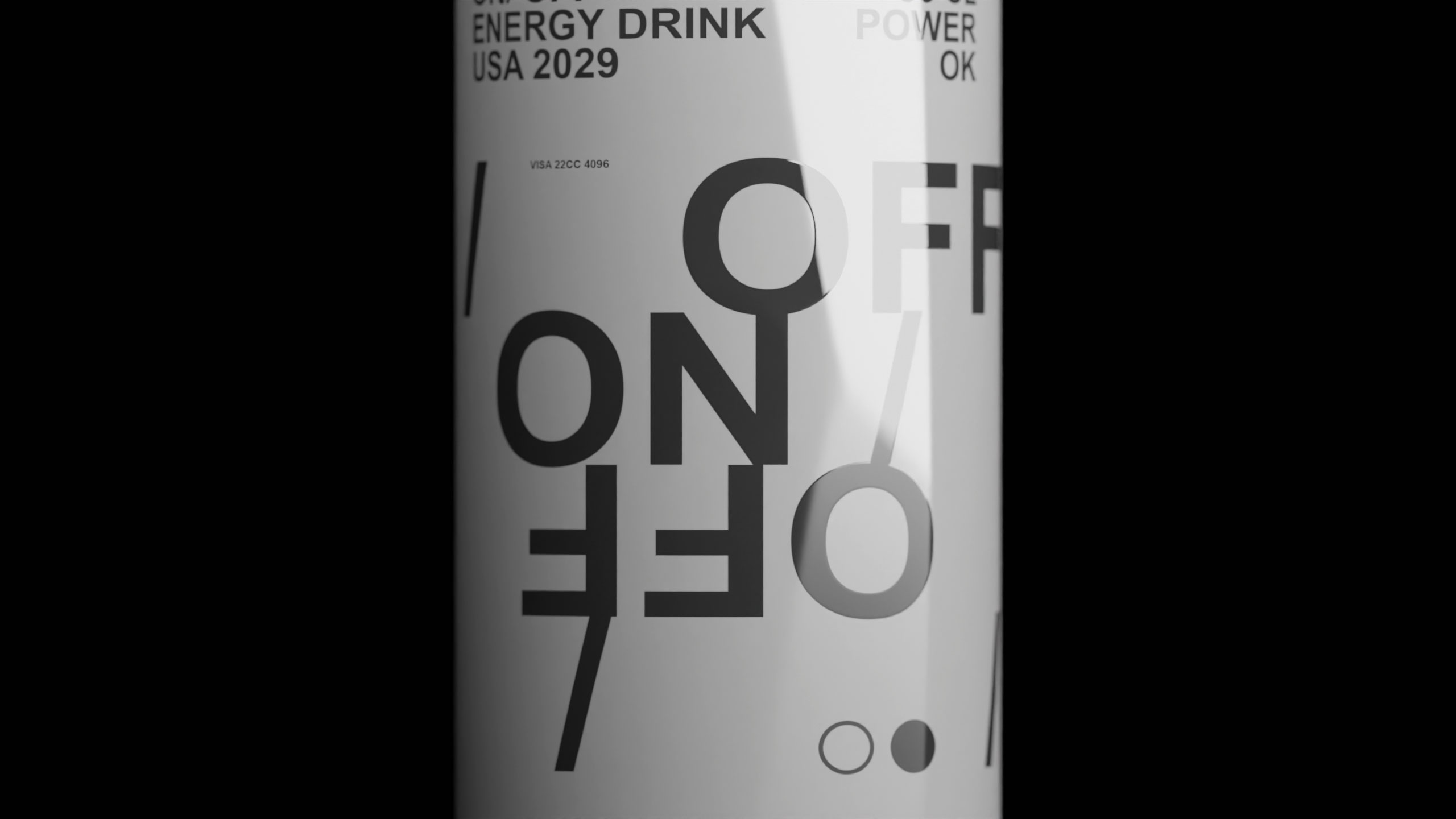
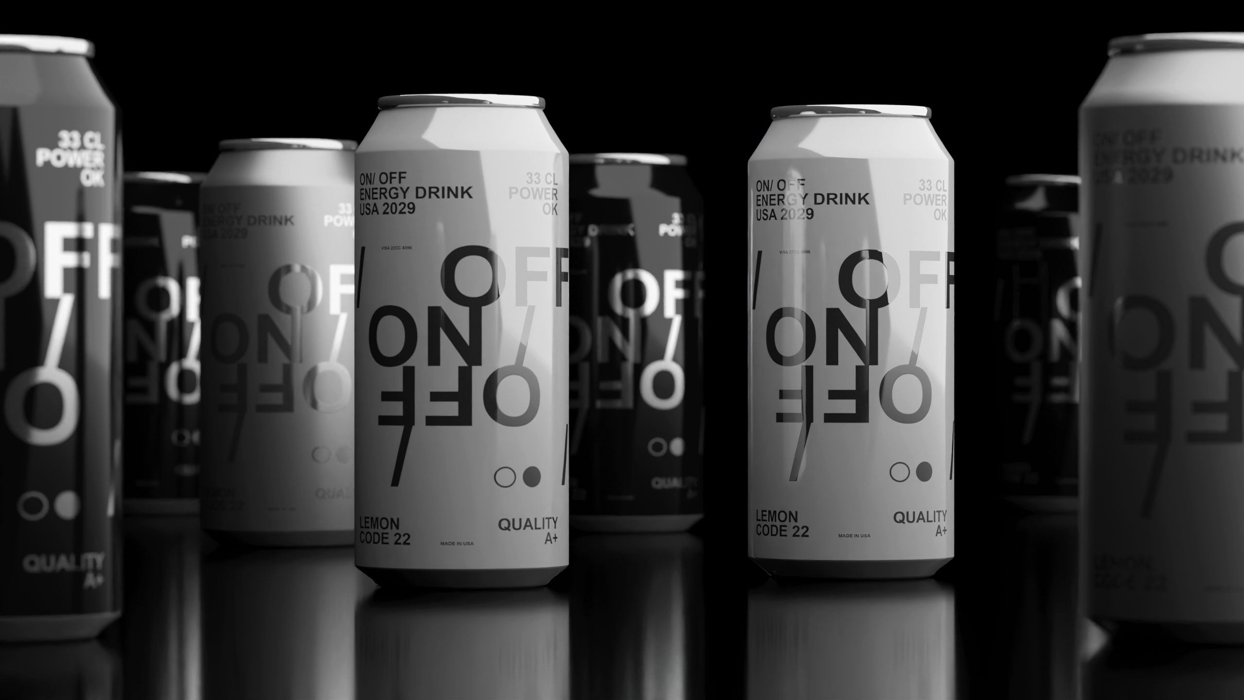
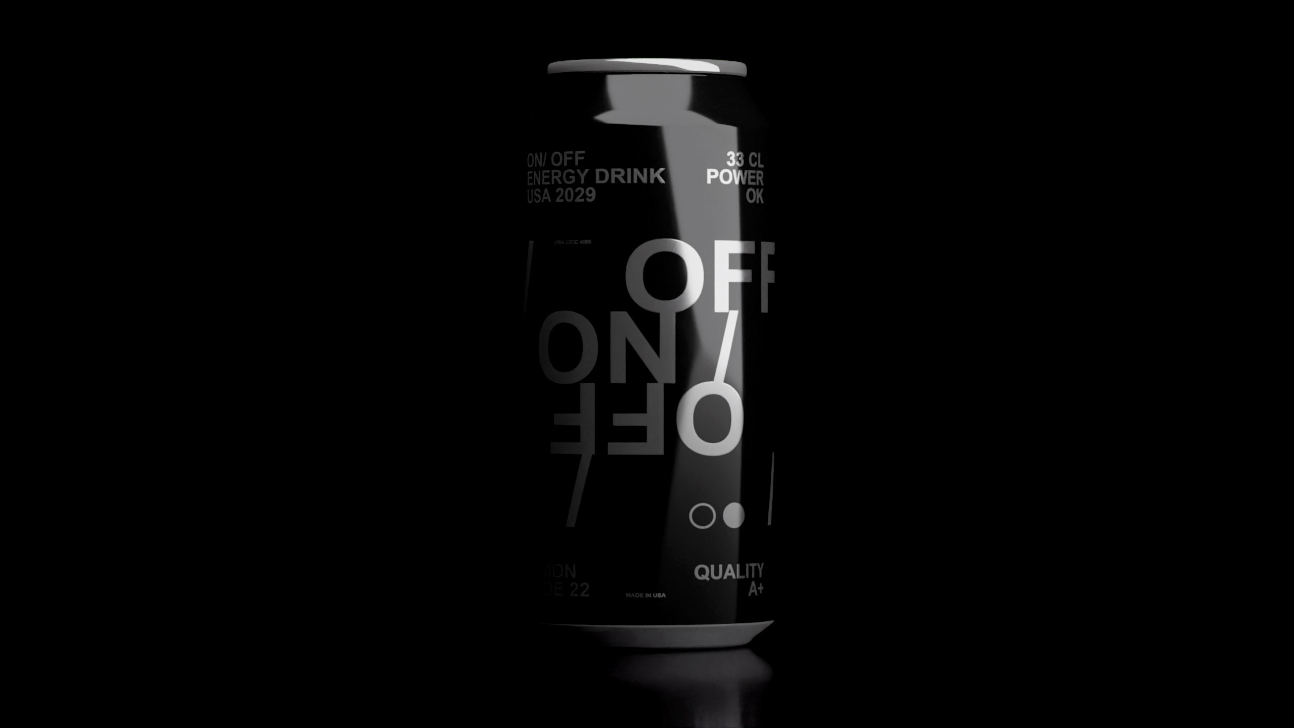
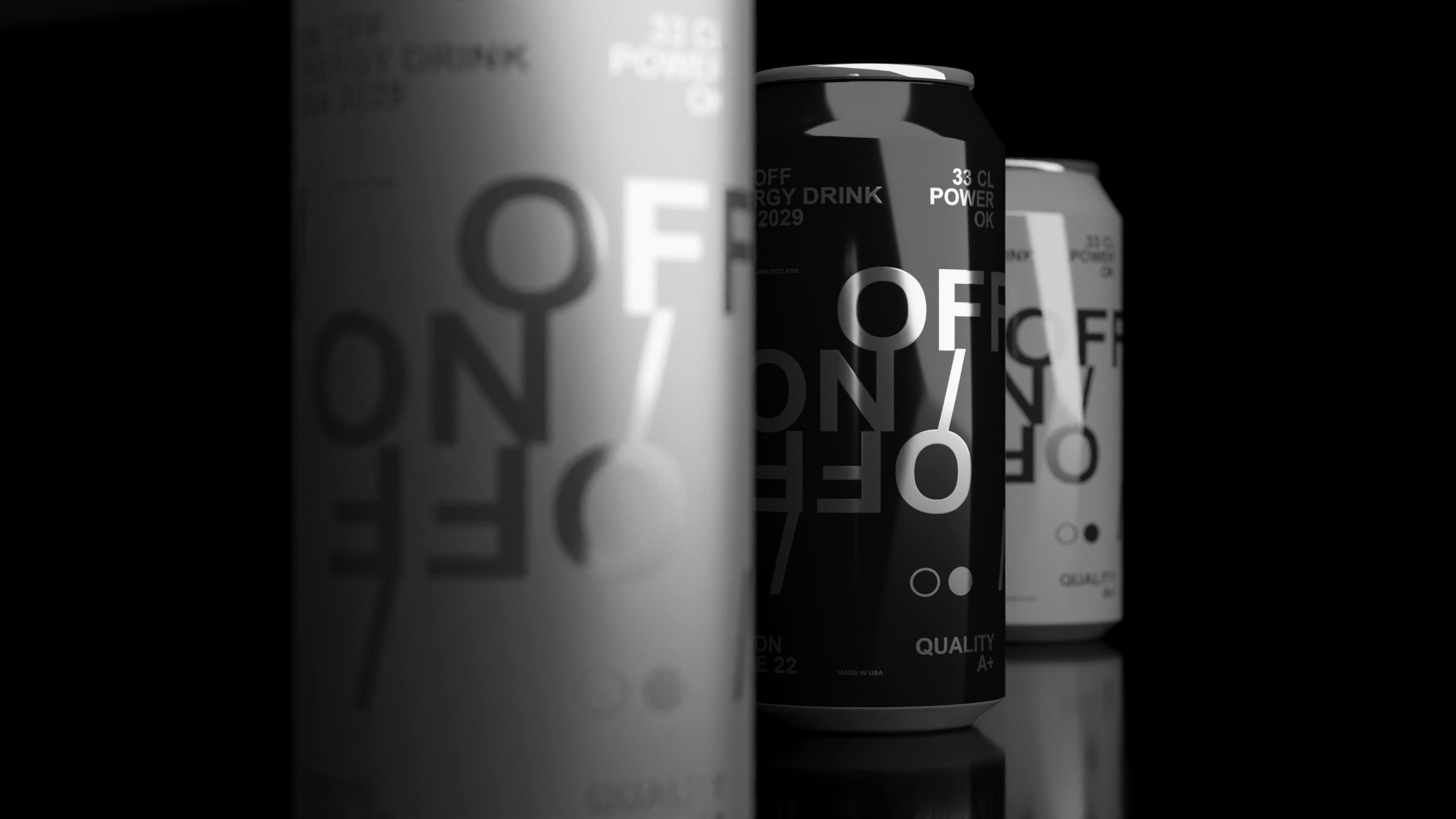
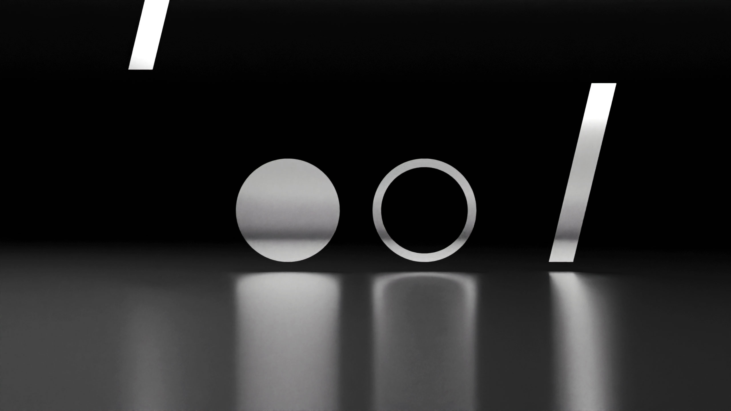
How can design express modern masculinity and energy? On-Off's sleek black-and-white cans with subtle Helvetica typography reflect raw power and elegance, matching a bold soda flavor that energizes body and mind.
Visual Language and Flavor
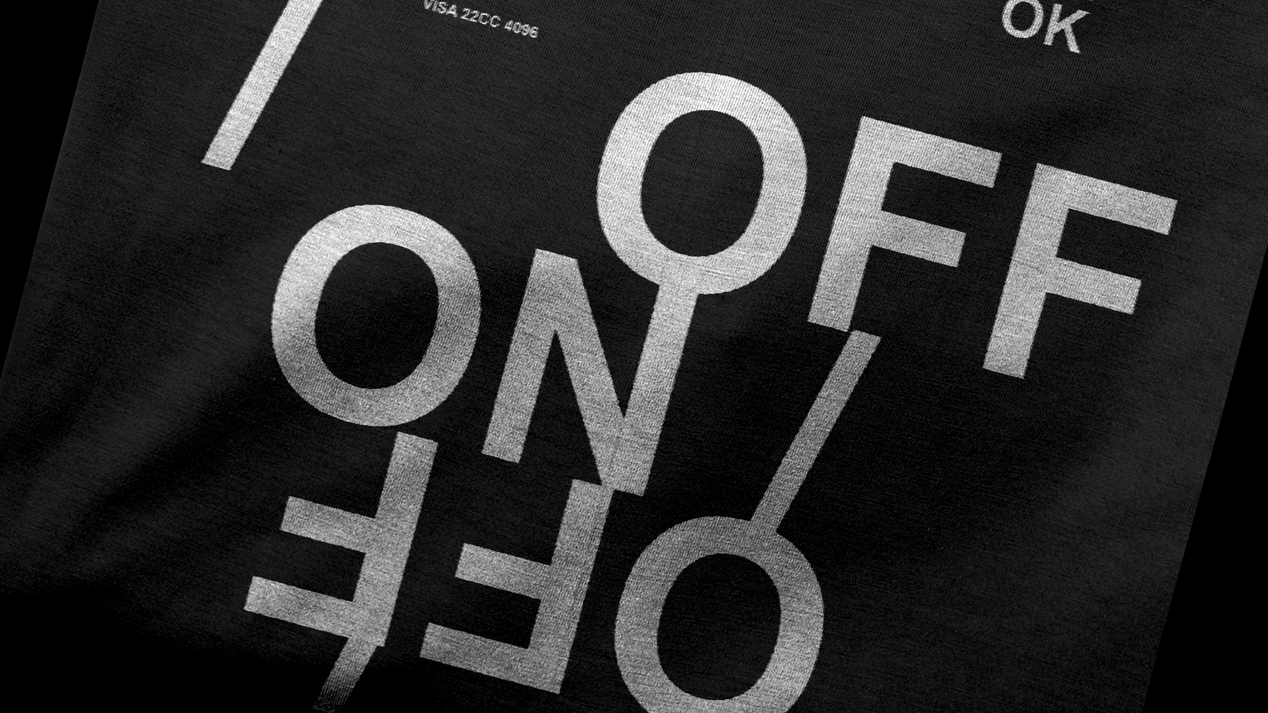
"On/Off" is a soda graphic design branding. The black and white "On/Off" can embodies modern masculinity and energy. Its sleek design, highlighted with subtle Helvetica typography, captures the essence of raw power and refined elegance. With each sip, vibrant licorice and lively ginger intertwine for an invigorating experience, complemented by a touch of fresh mint.
Identity and Concept
This energy elixir awakens both body and mind, ready to tackle challenges. "On/Off" encapsulates American dynamism, combining captivating packaging and distinctive graphic design with a unique flavor. It's a switch to vitality – one sip, and you're in "On/Off" mode, embracing a masculine brand image with energizing graphics.
Related
03
Whether you prefer a quick call or a detailed message, we're here to listen.

Unbrake

Flo

Factory

Blackjack 8