


Description
02
The Core Challenge
How can Over's graphic design express the spirit of authentic, joyful exploration through a warm, personal, and vibrant visual language that breaks from conventional travel norms?
Visual Language and Application
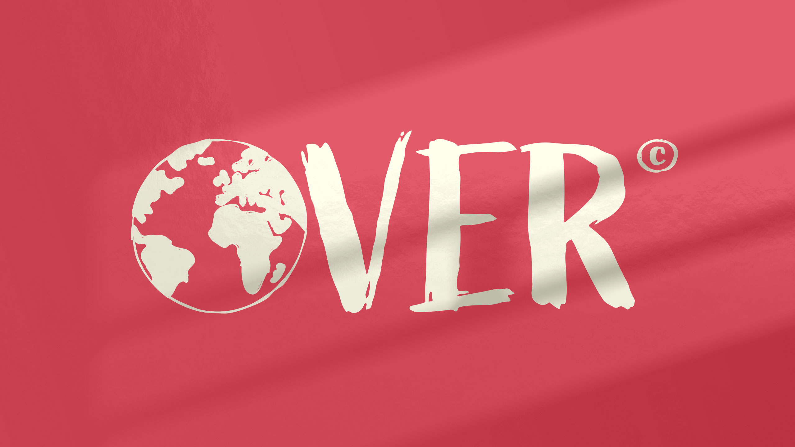
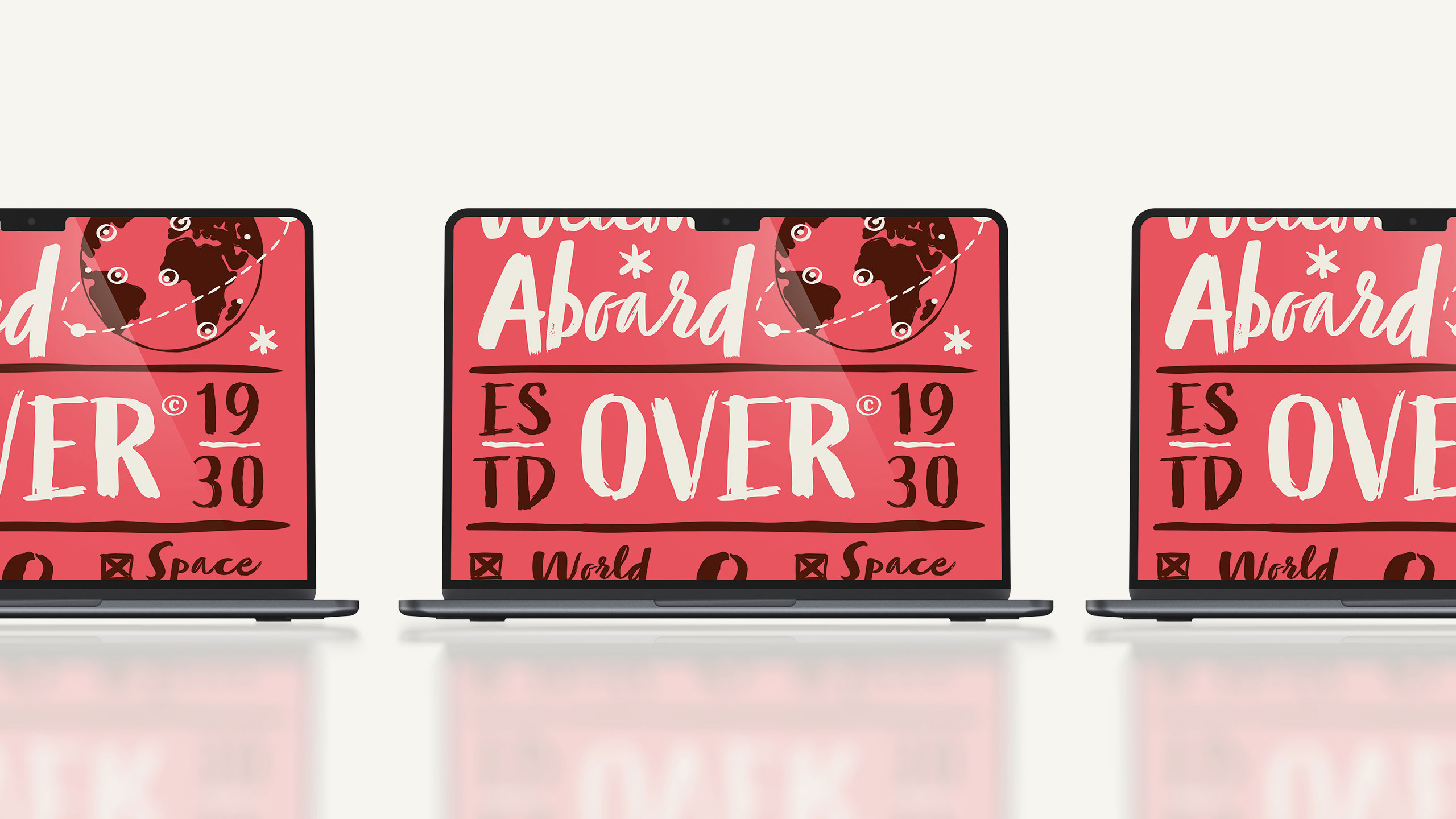
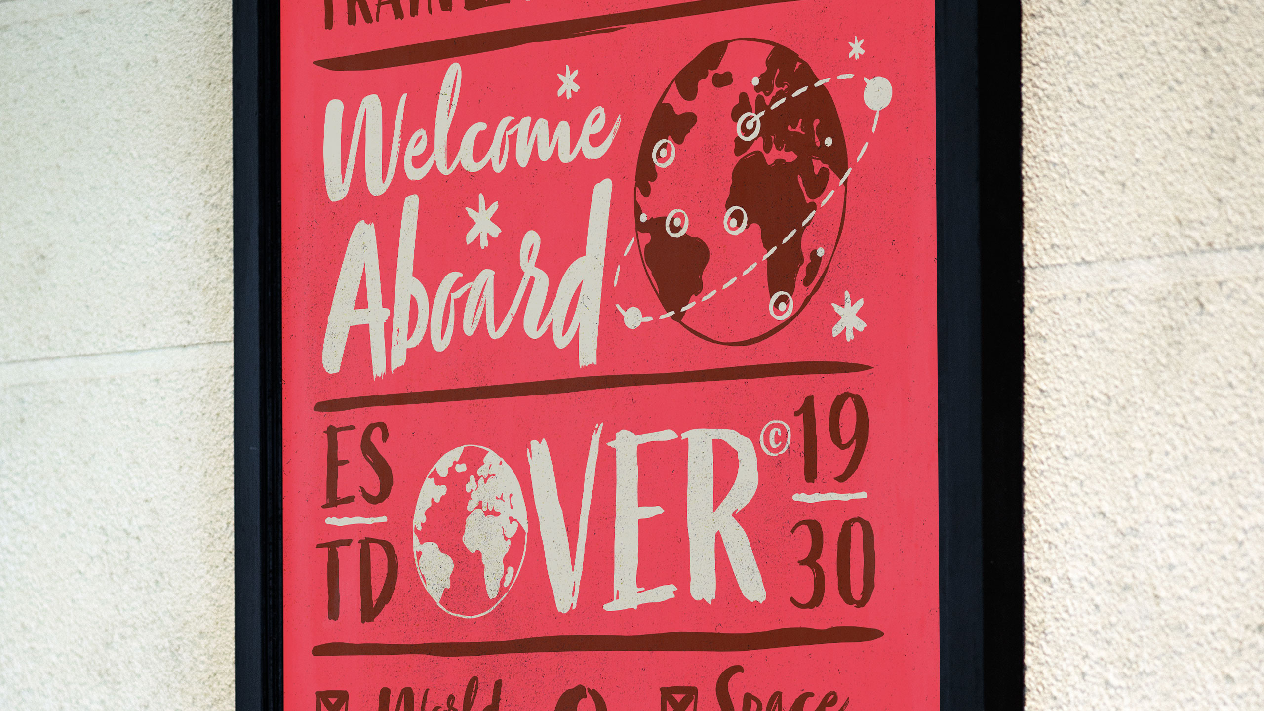
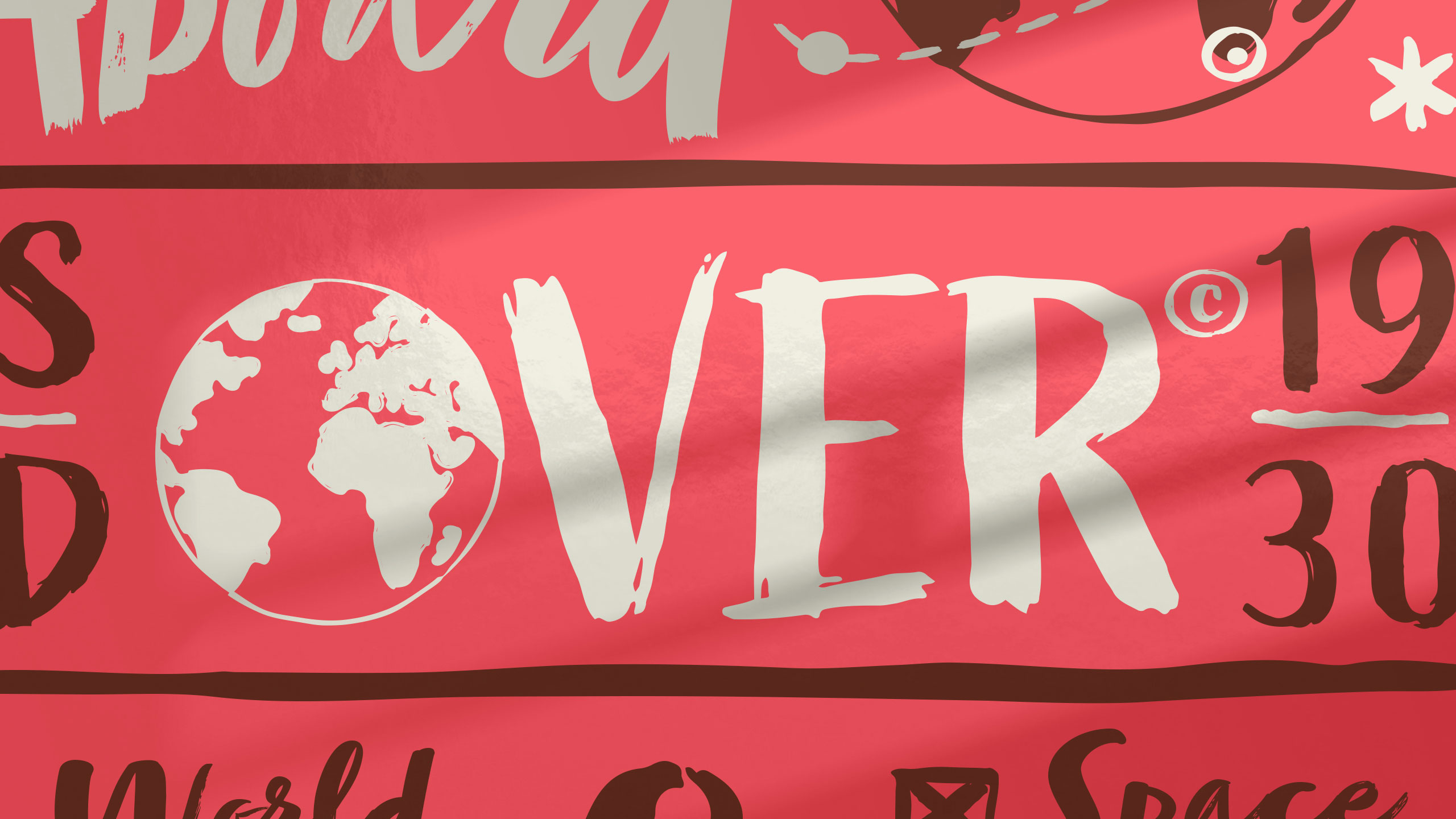
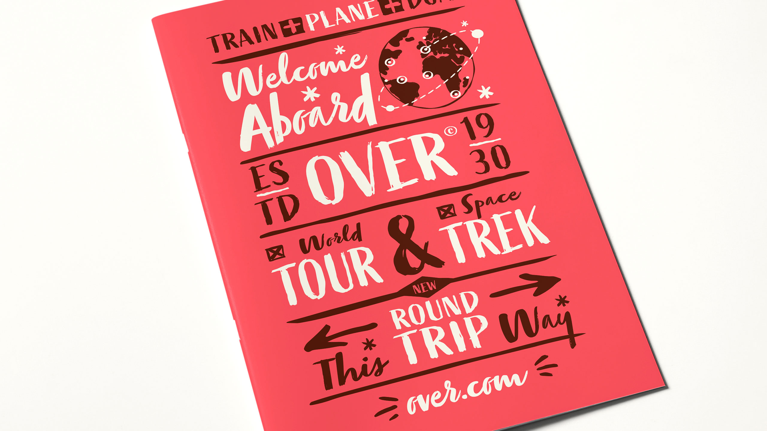
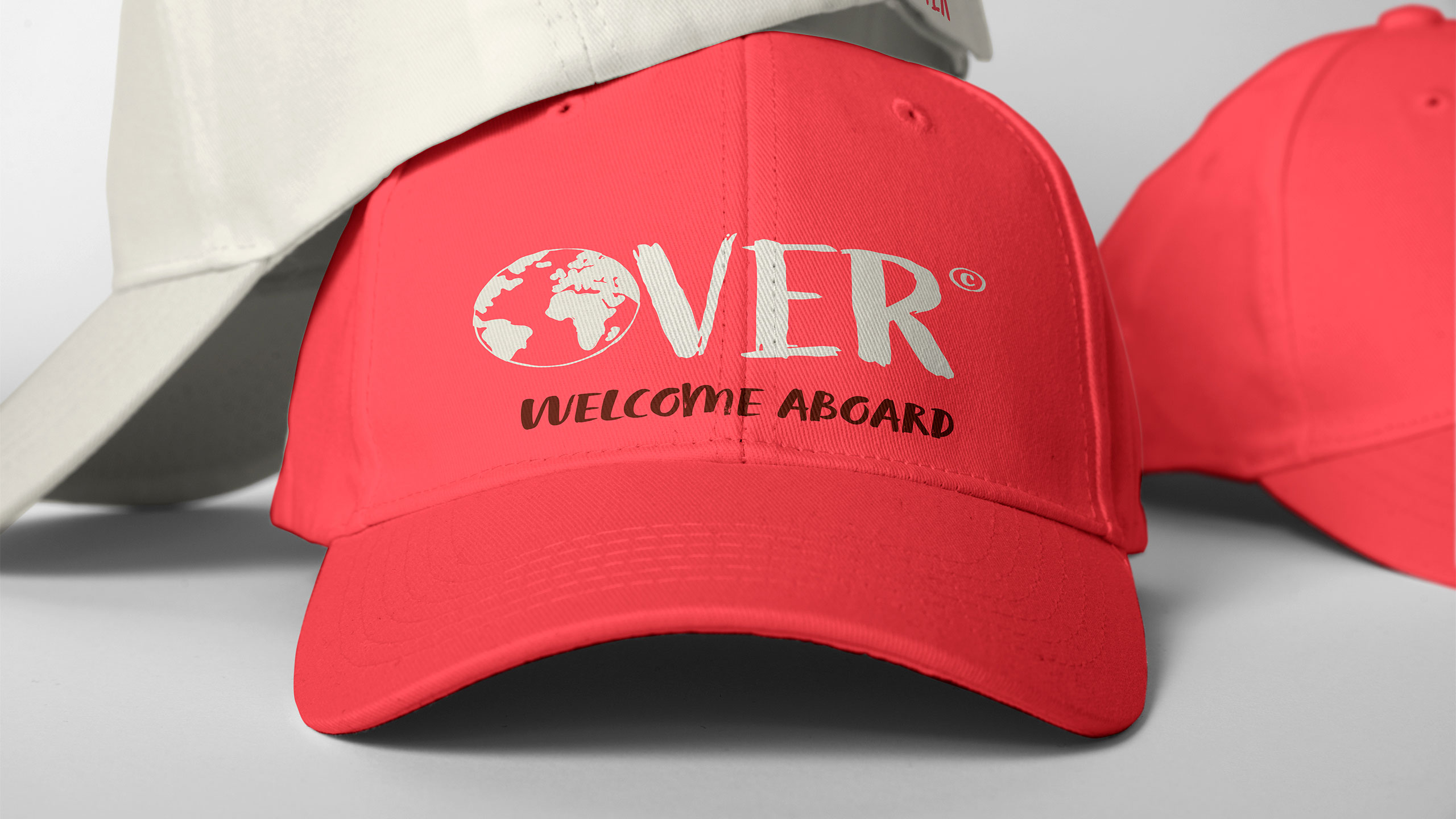
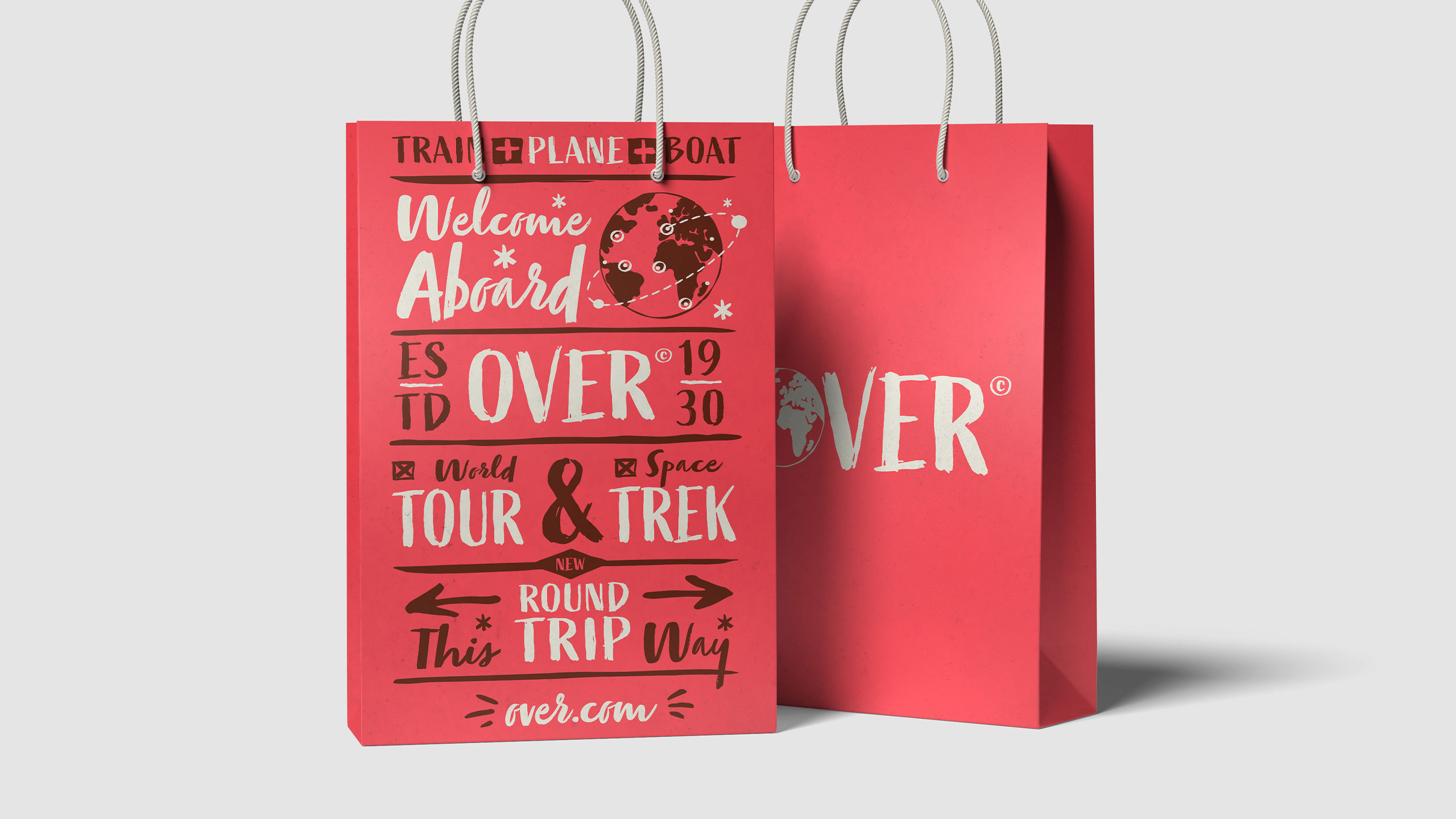
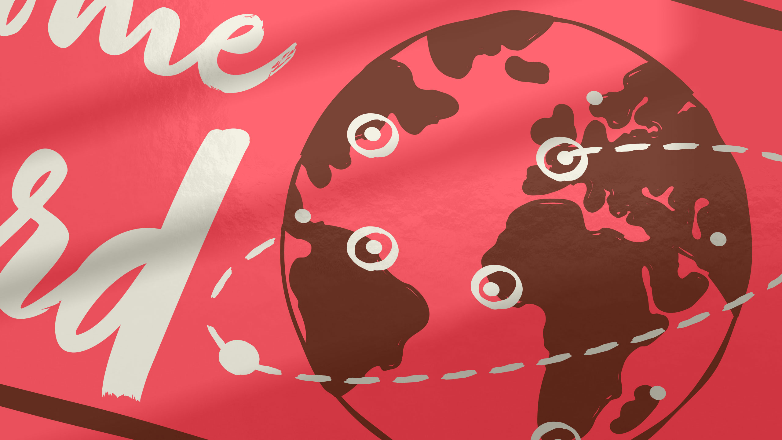
The graphic design for Over, a travel agency, captures a free-spirited and adventurous identity. Featured on the presentation website, posters, badges, bags, and caps, the design uses a vibrant pink and soft beige color palette that feels both lively and warm. A handwritten-style typeface brings a personal, joyful, and human touch to the brand, evoking a sense of spontaneity and authentic exploration.
Concept and Audience
Far from traditional, organized tourism, the visual identity reflects a globetrotter mindset—independent, curious, and connected to the world. The overall style feels rooted, emotional, and crafted for those who travel to truly experience, not just to visit.
Related
03
Whether you prefer a quick call or a detailed message, we're here to listen.
OVER

Café Lenoirs

Blen-Beck

Whare House