


Description
02
The Core Challenge
How can design unite industry and sustainability? Planity's green-white palette and eco-inspired visuals explore how graphic identity communicates environmental commitment while maintaining professionalism and clarity in construction branding.
Visual Language and Concept
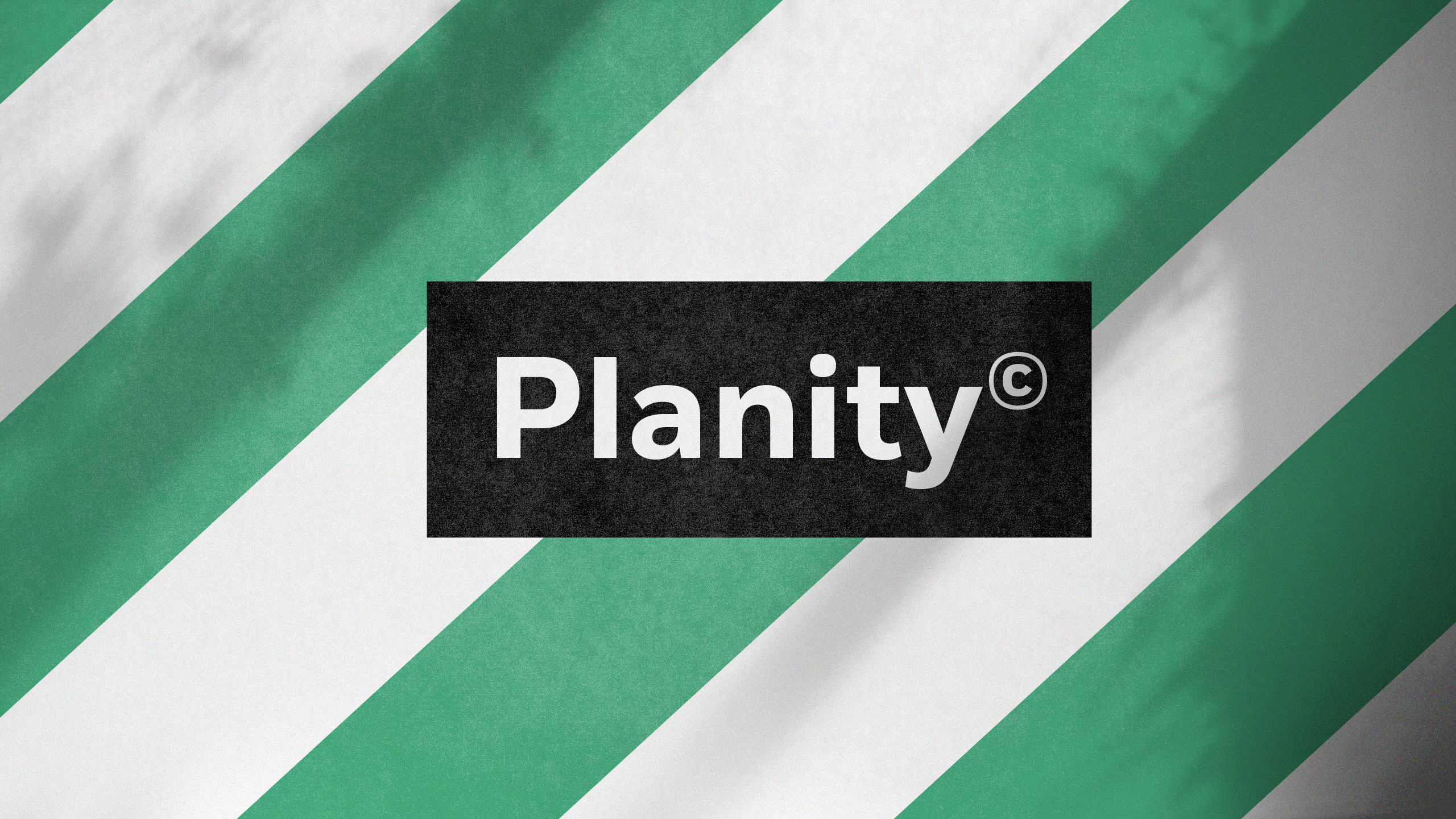
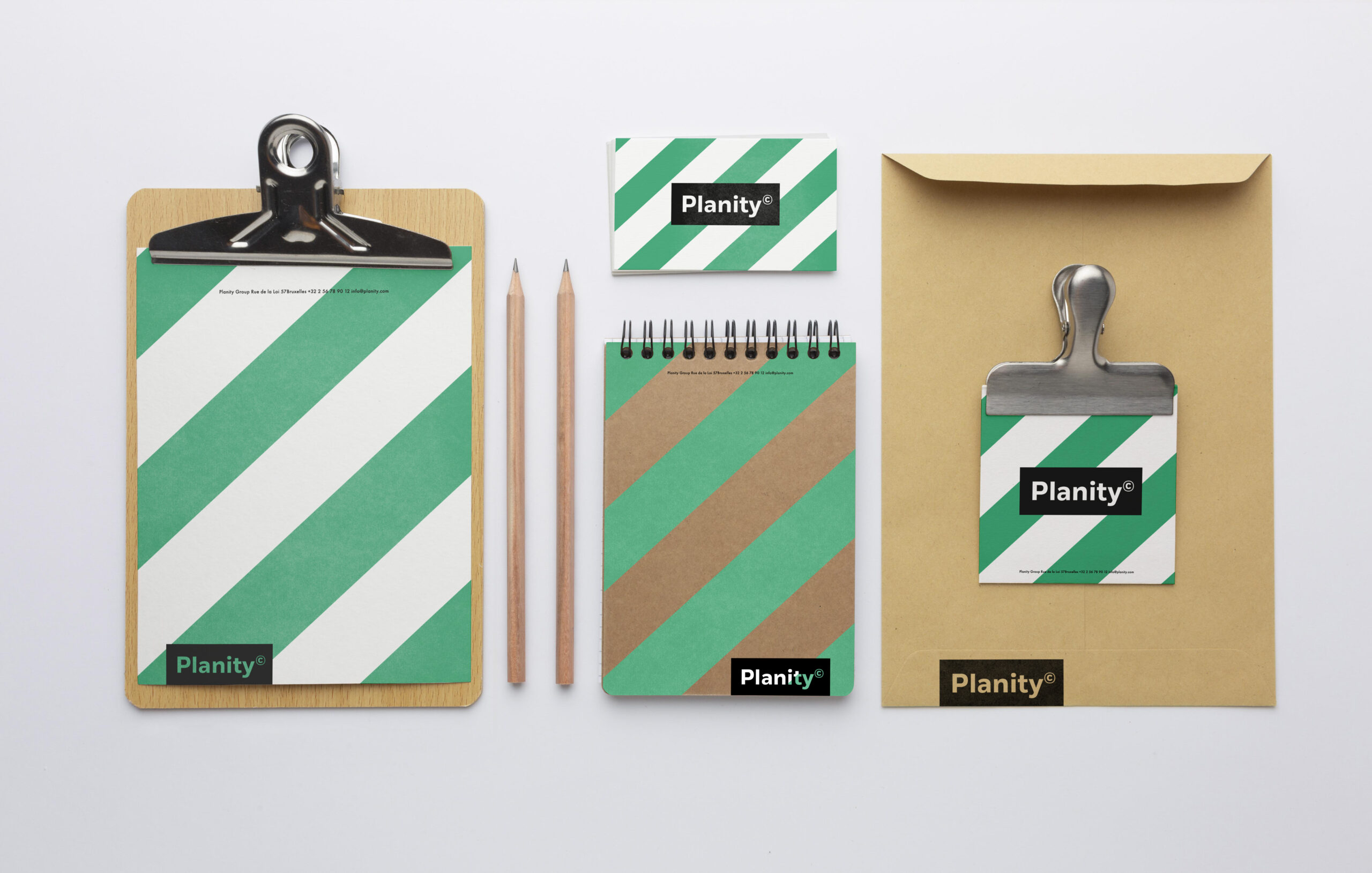
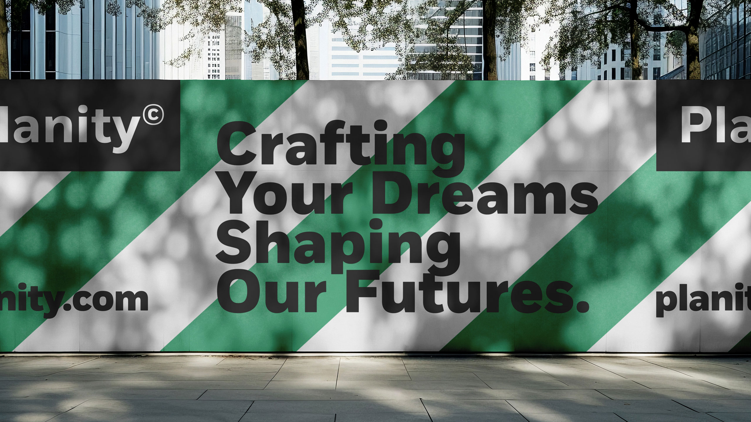
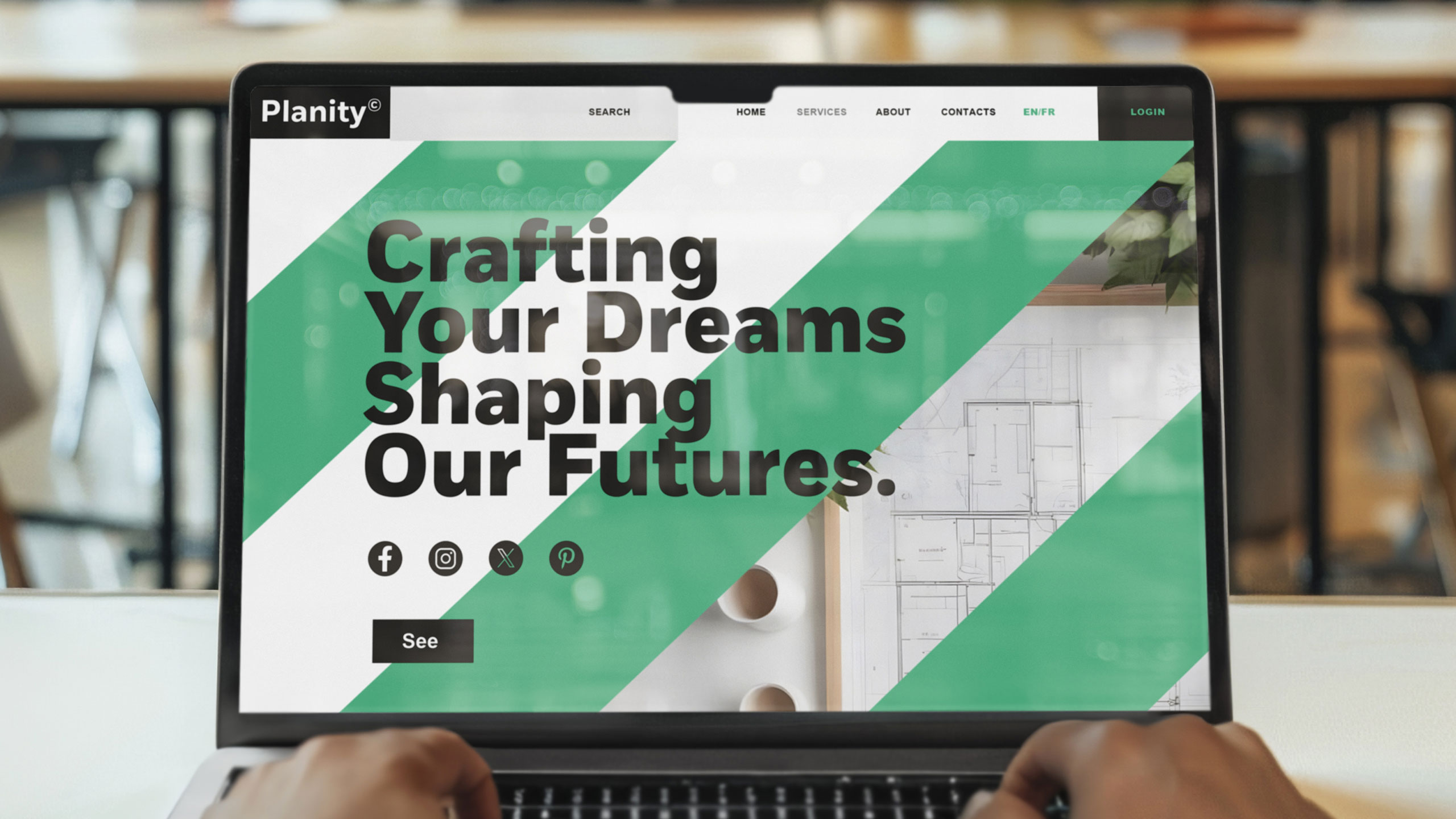
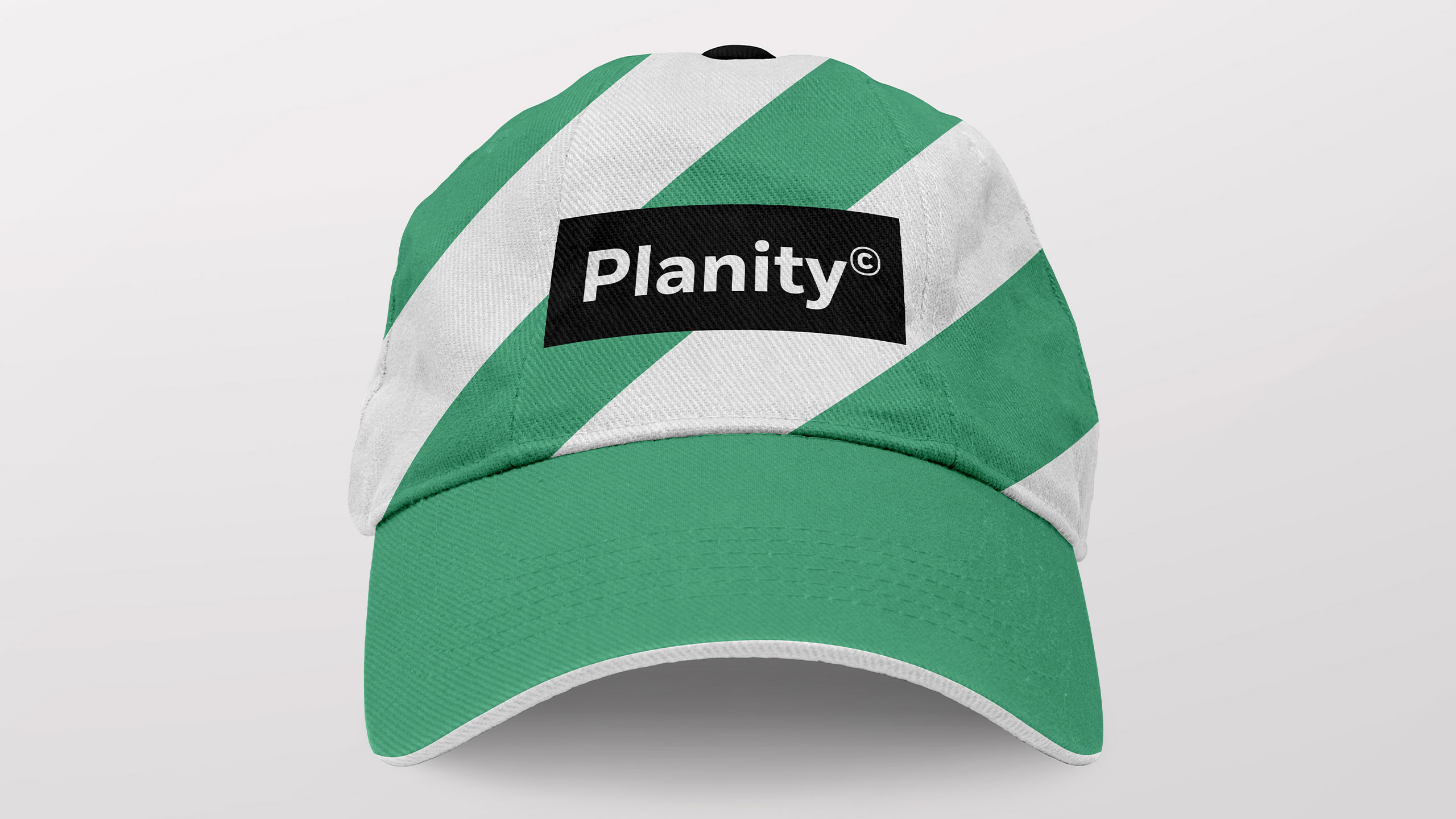
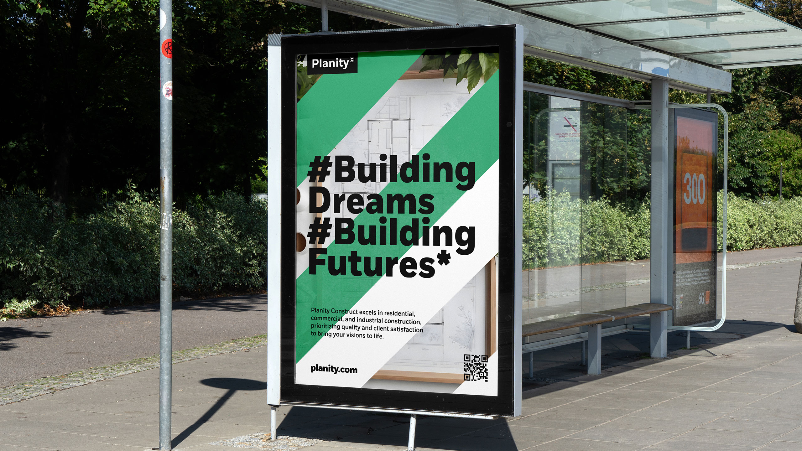
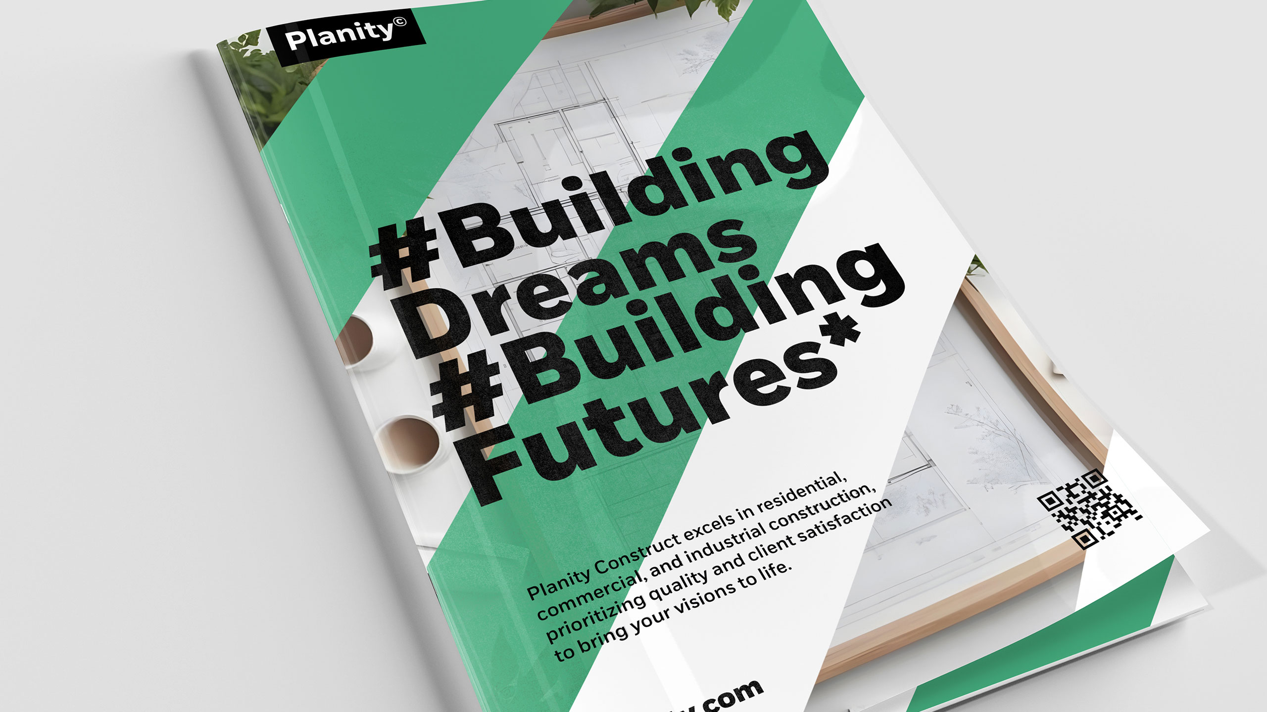
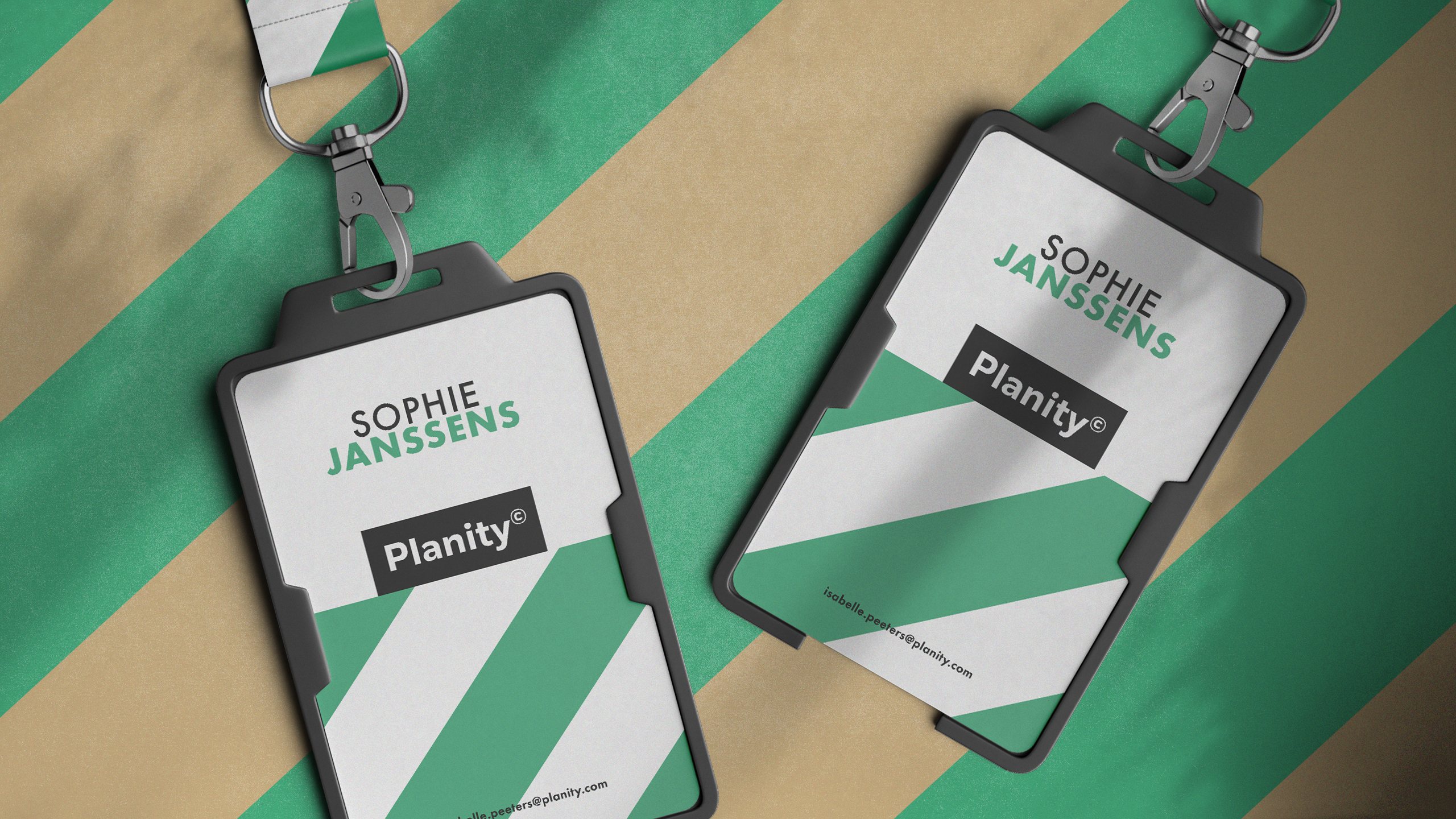
The graphic design for Planity, a sustainable construction company, blends ecology and industry. Featured on safety vests, visitor badges, catalogs, the website, caps, stationery, and posters, the identity adopts a clean white and green palette symbolizing environmental commitment. A key visual element is the reinterpretation of traditional construction warning stripes—typically orange and white—into green and white, clearly signaling the company's eco-conscious approach.
Materials, Name, and Identity
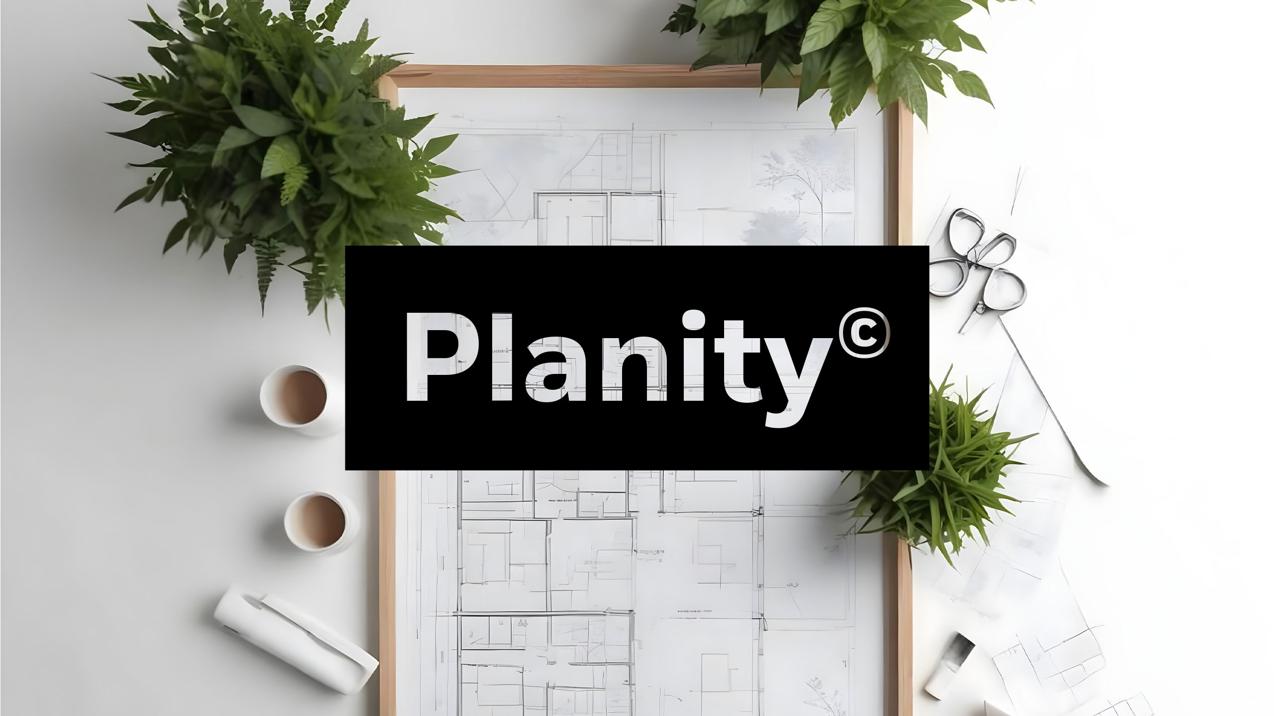
The use of recycled paper for all printed materials reinforces this message. The name Planity, evoking both the planet and planning, is supported by a modern, structured design that combines clarity, professionalism, and respect for nature.
Related
03
Whether you prefer a quick call or a detailed message, we're here to listen.

OVER

Café Lenoirs

Blen-Beck

Whare House