


Description
02
The Core Challenge
How can ice cream packaging evoke nostalgia, glamour, and space-age adventure? Popstar's graphic challenge is to turn a simple treat into a retro-futuristic journey through identity and imagination.
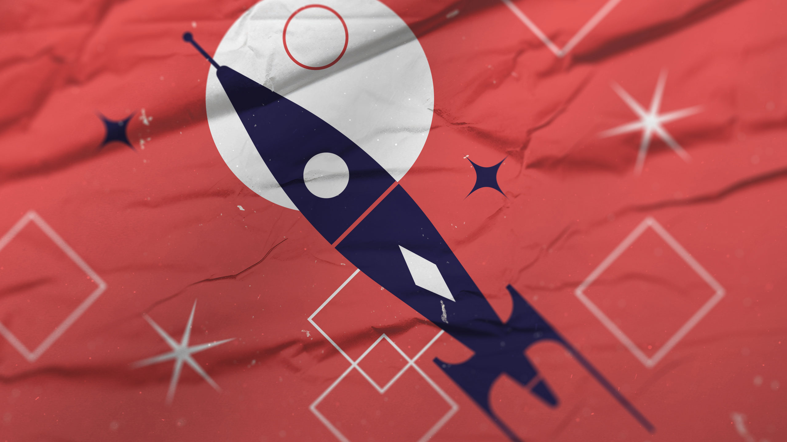
Visual Language and Concept
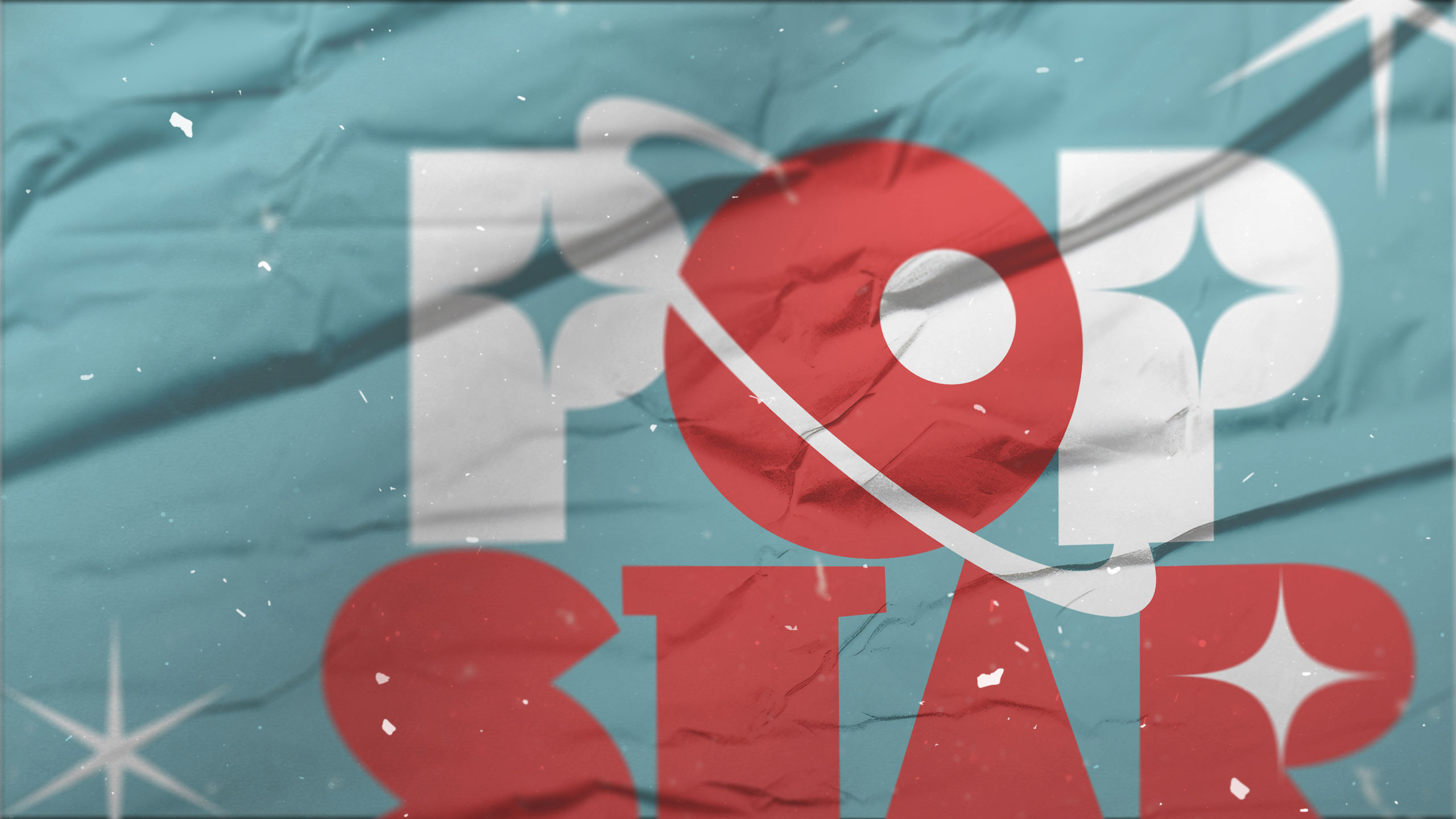
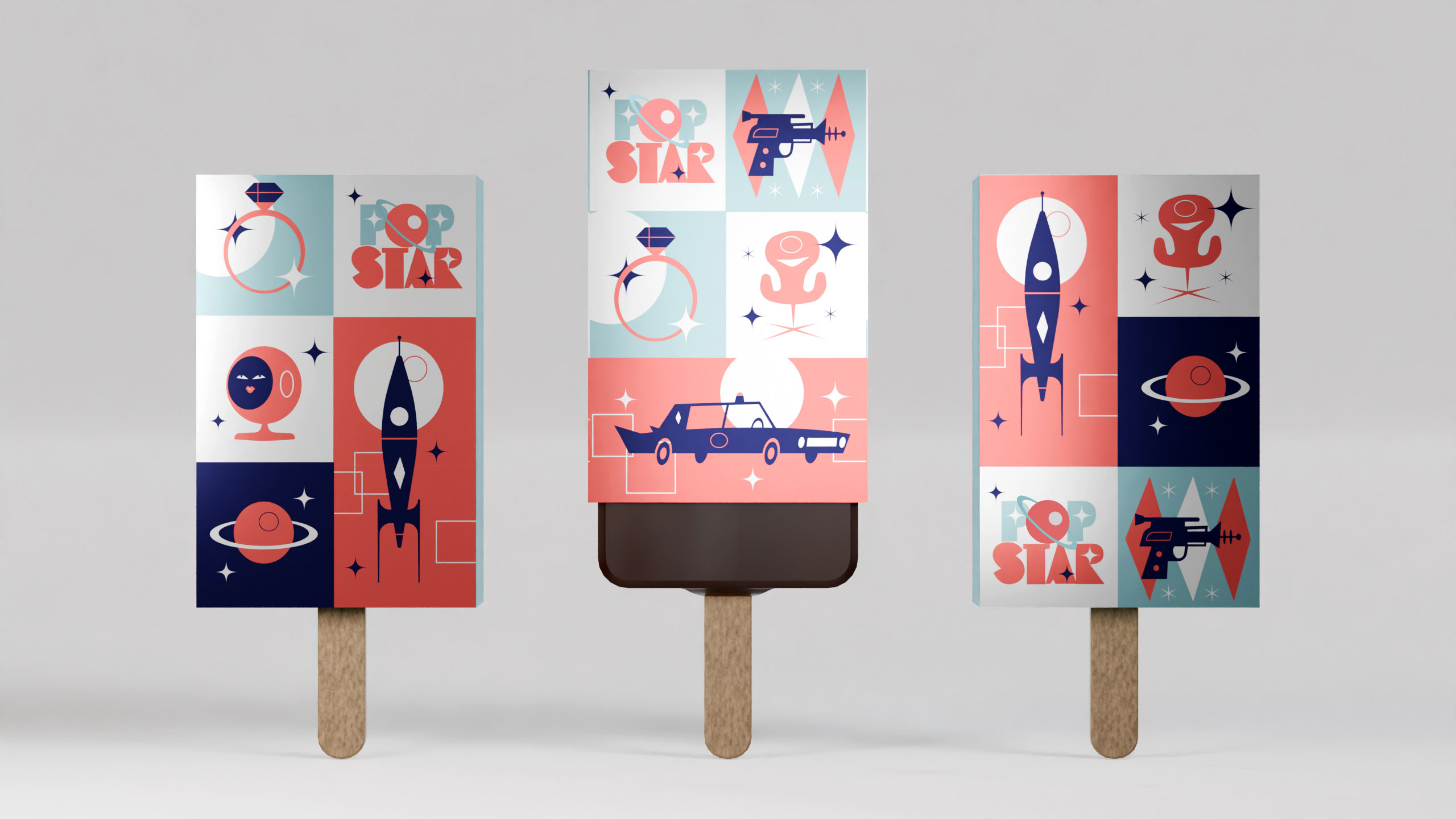
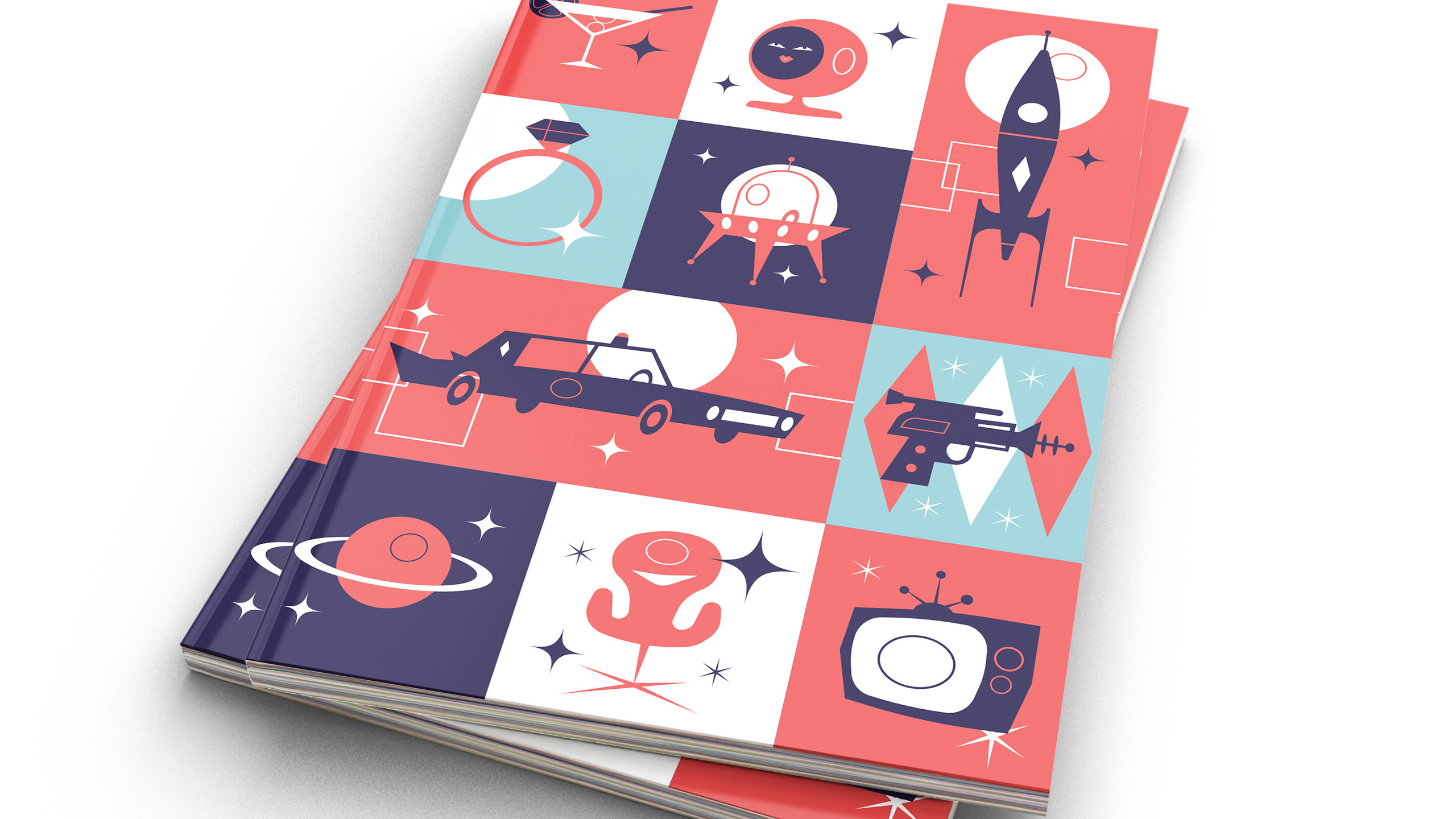
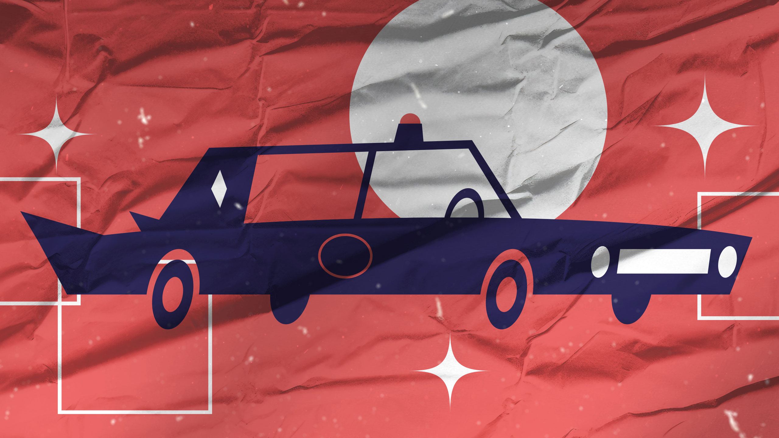
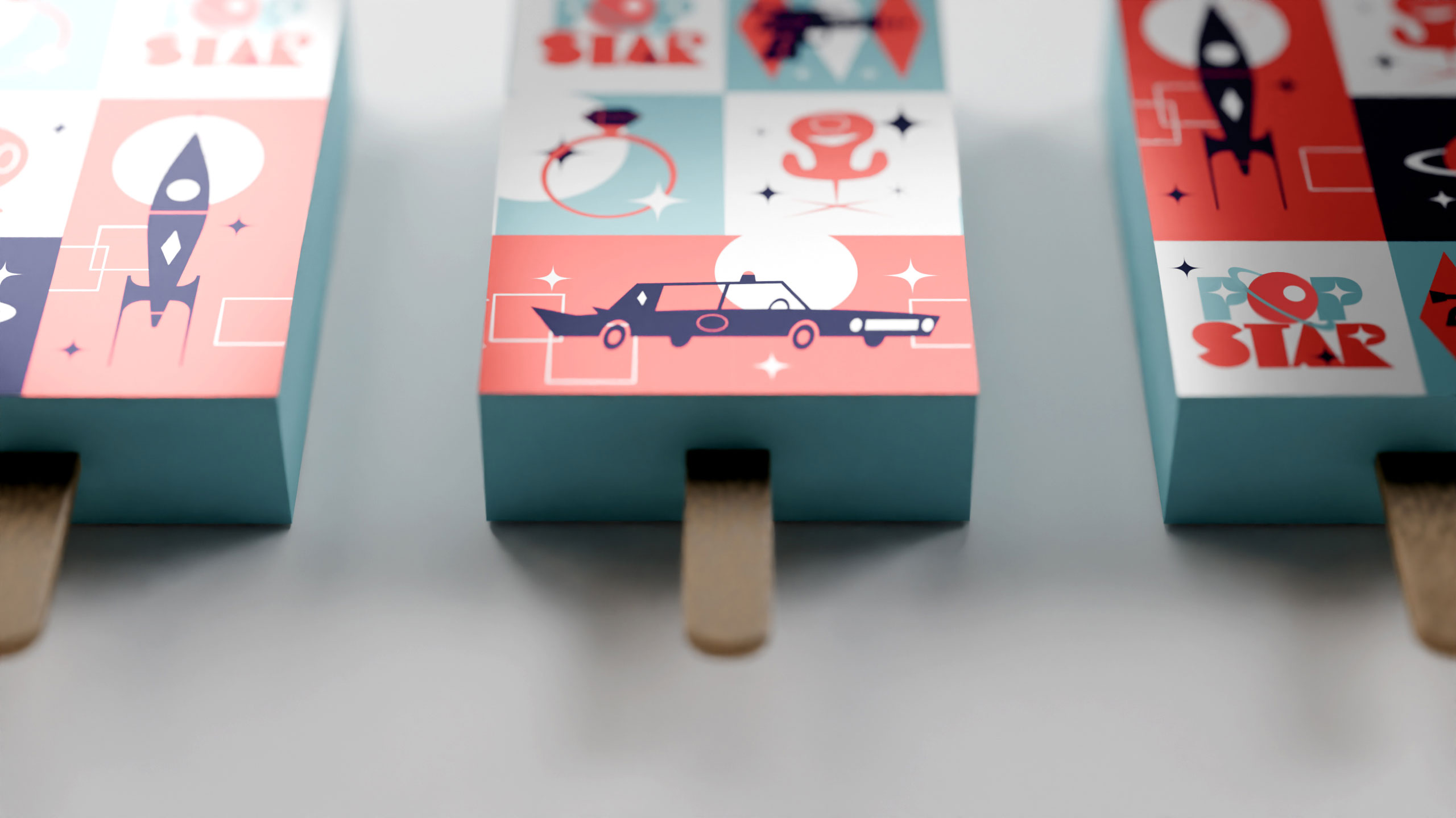
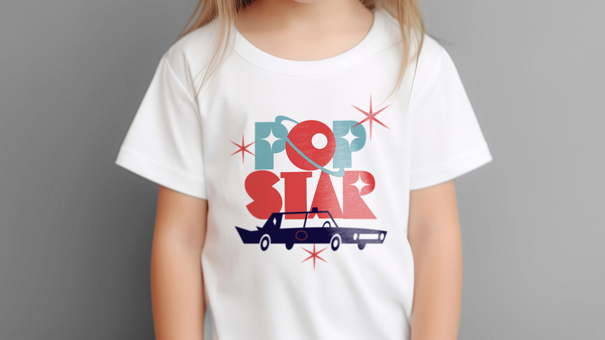
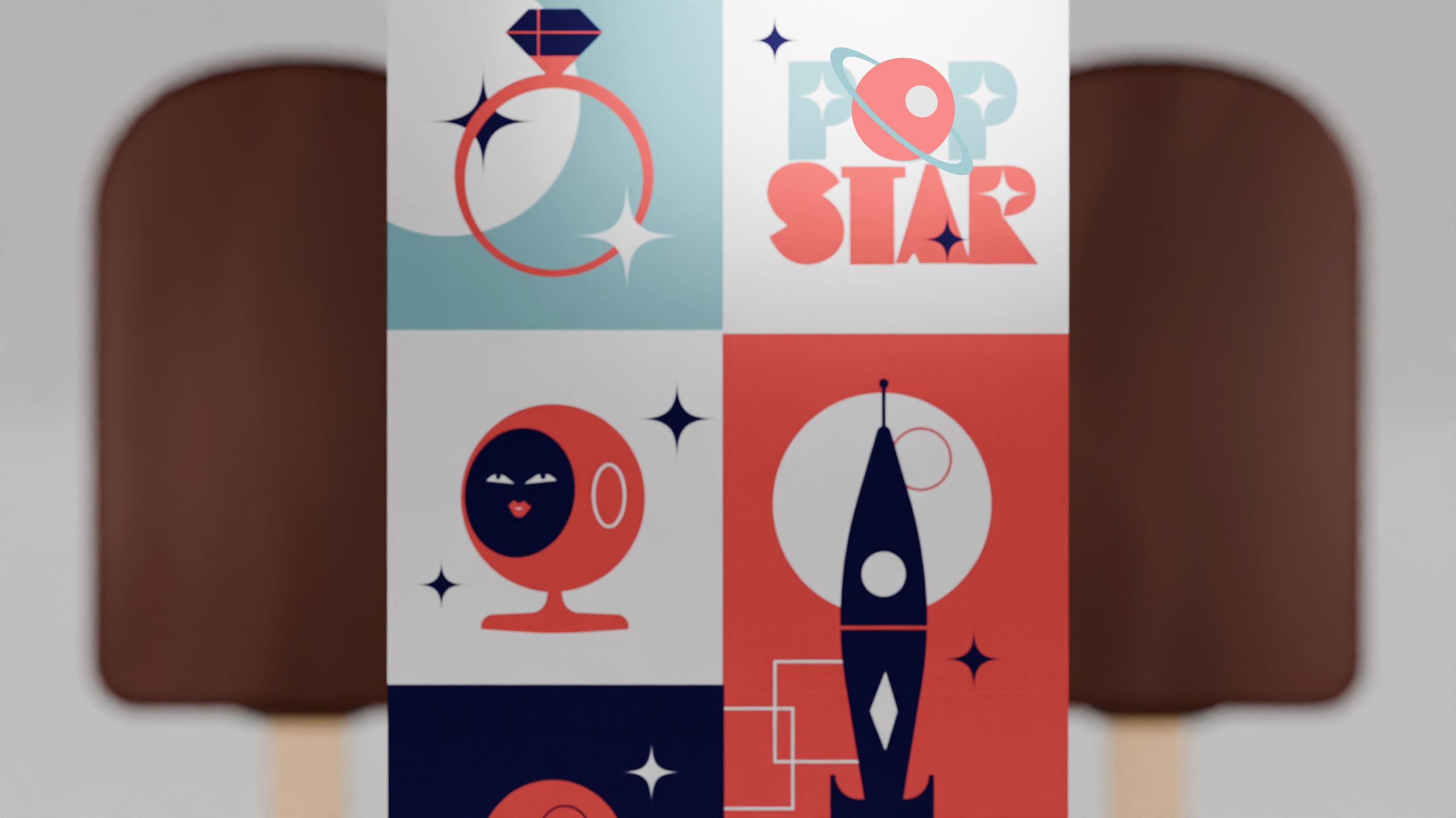
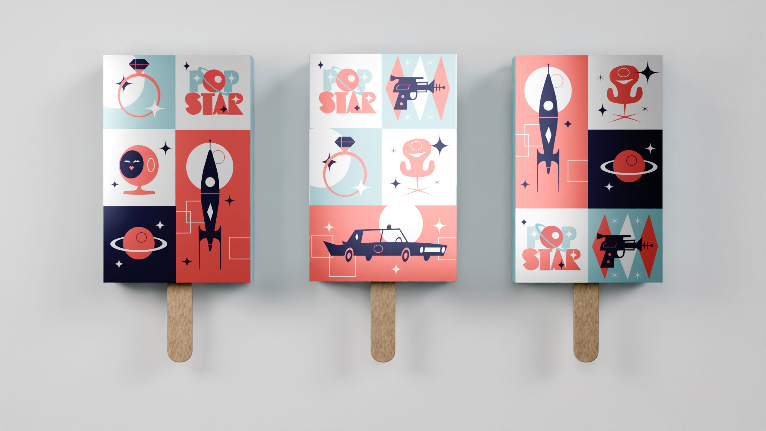
Popstar's graphic design blends 1950s–60s vintage charm with cosmic flair. Used across packaging, T-shirts, and books, the visuals feature retro-futuristic illustrations: pastel rockets, sparkling stars, and bold, playful fonts. The brand name—Popstar—combines "popsicle" and "star," turning ice cream into an interstellar experience.
Identity and Emotion
Each bite becomes a journey through glamour and mystery, inviting the consumer to feel like a modern icon. Eating a Popstar isn't just indulgence—it's transformation. It's glitter, adventure, and nostalgia in one. Popstar positions itself as more than a dessert: it's a pop-culture dreamscape, where every flavor launches a heroine into her own galactic fantasy.
Related
03
Whether you prefer a quick call or a detailed message, we're here to listen.

OVER

Café Lenoirs

Blen-Beck

Whare House