


Description
02
The Core Challenge
How can fashion design speak without shouting? Pr/vate challenges graphic design to express elegance, strength, and identity through silence—using minimalism to honor discretion as a powerful visual statement.
Visual Language and Typography
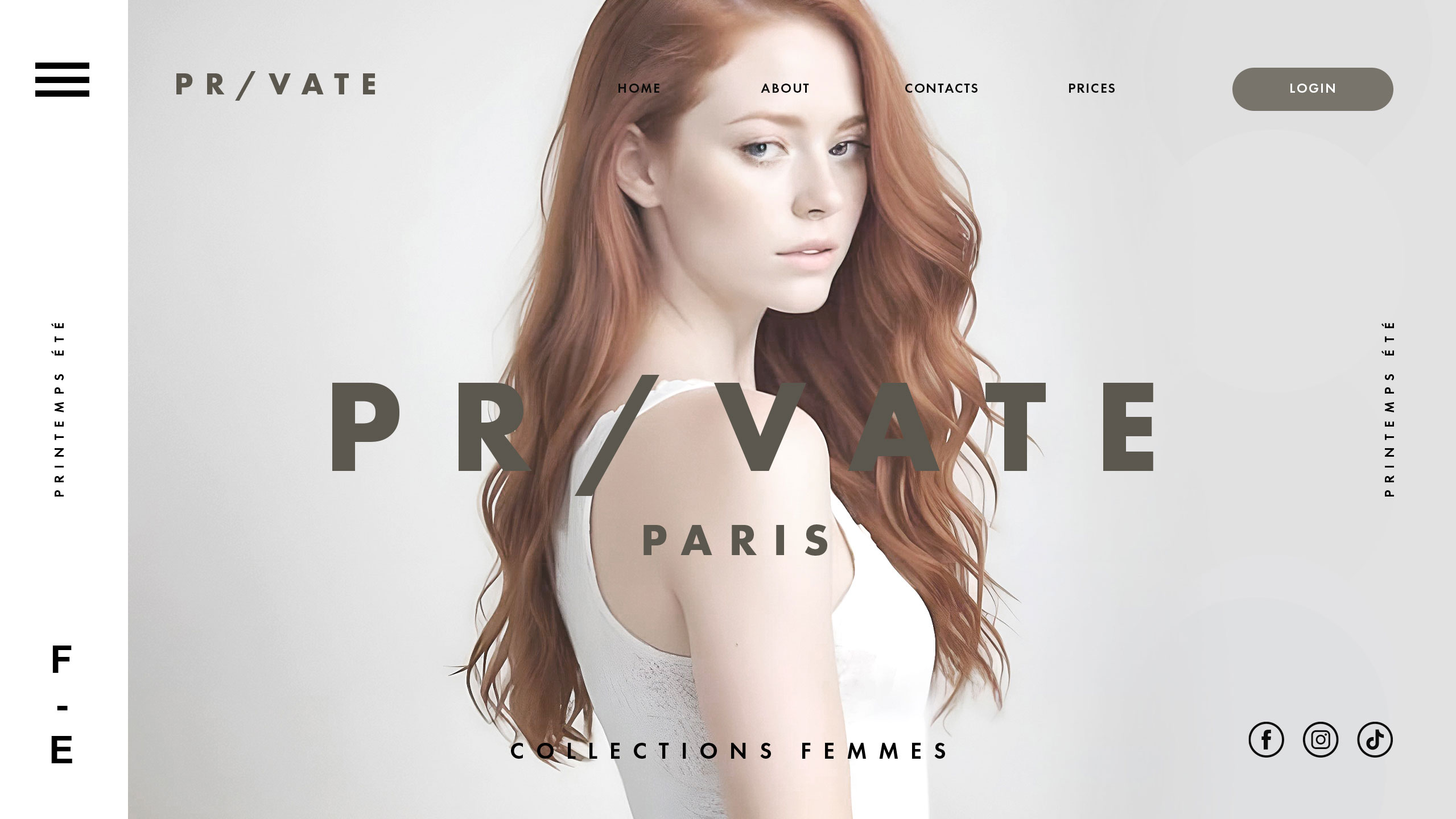
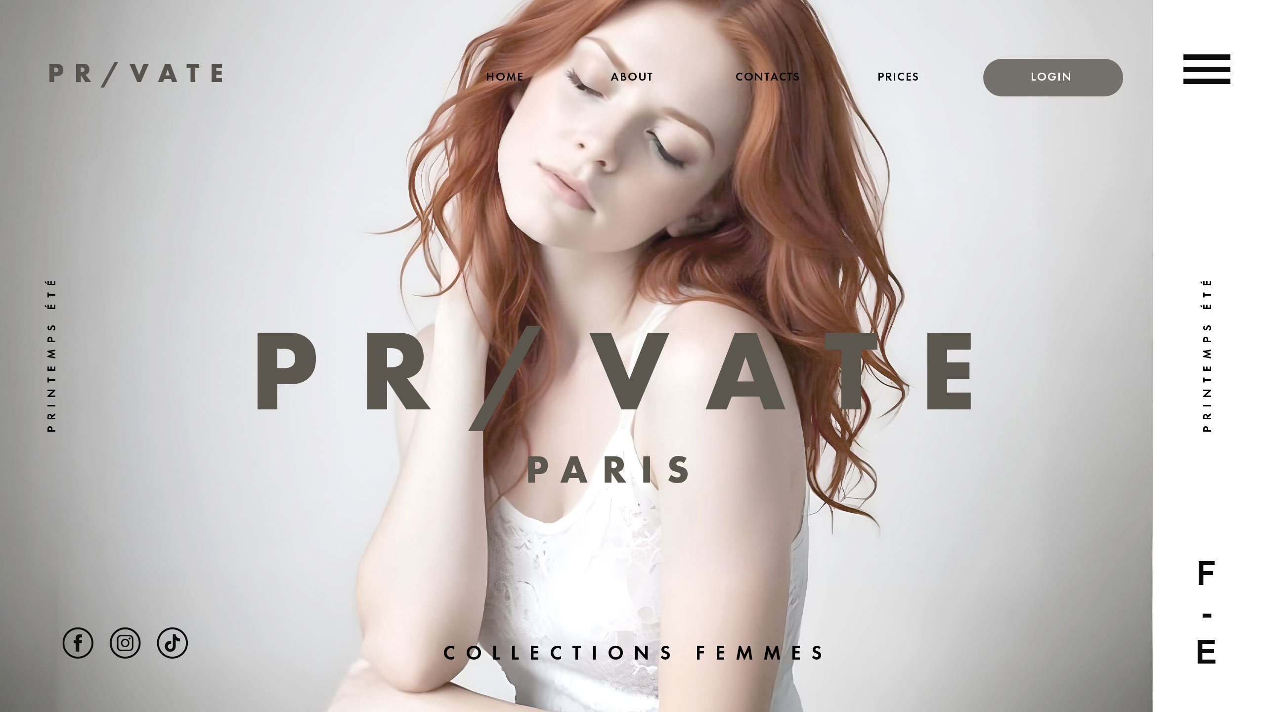
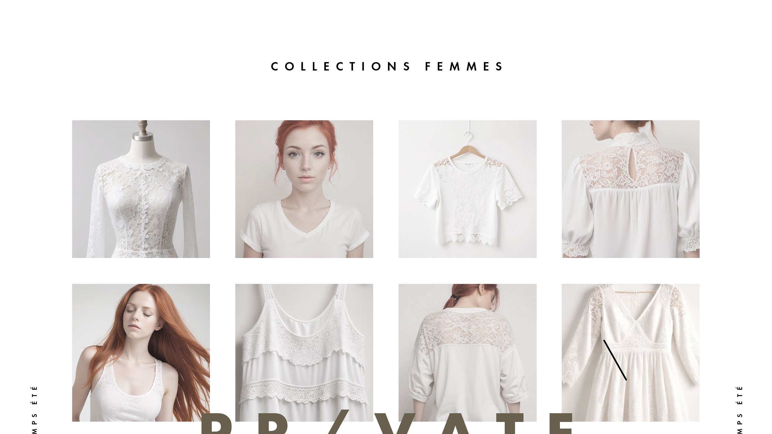
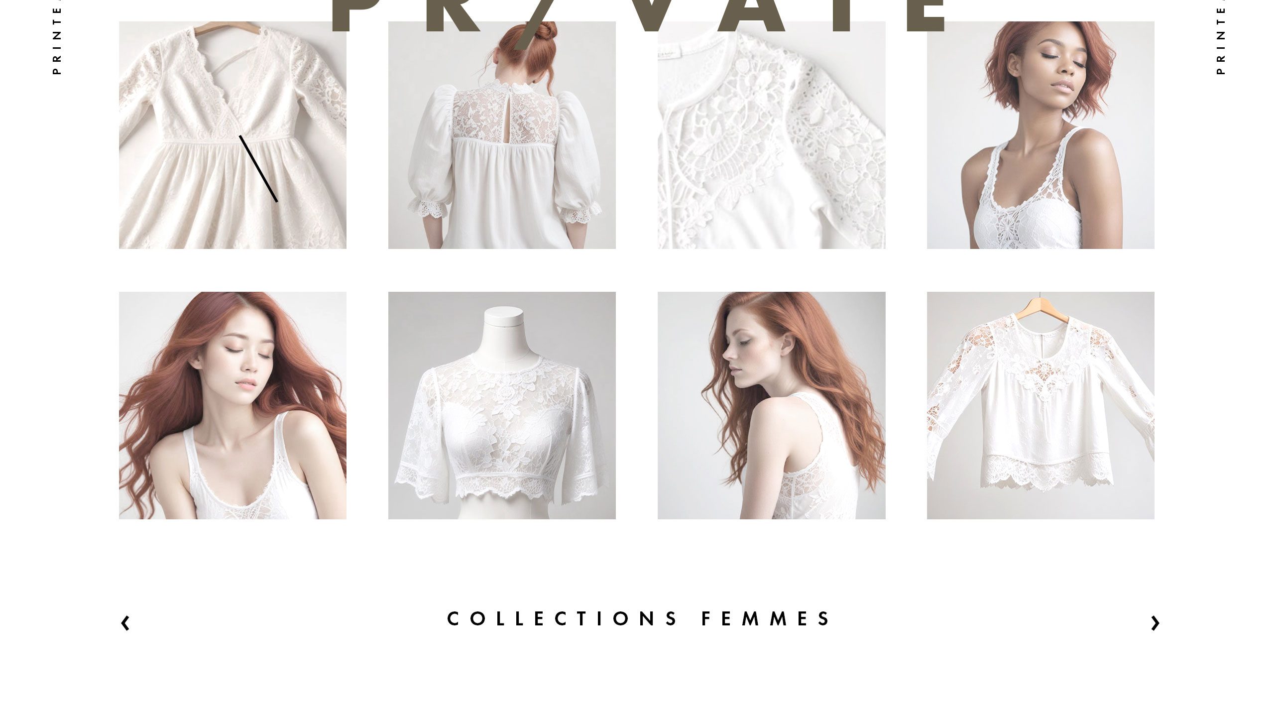
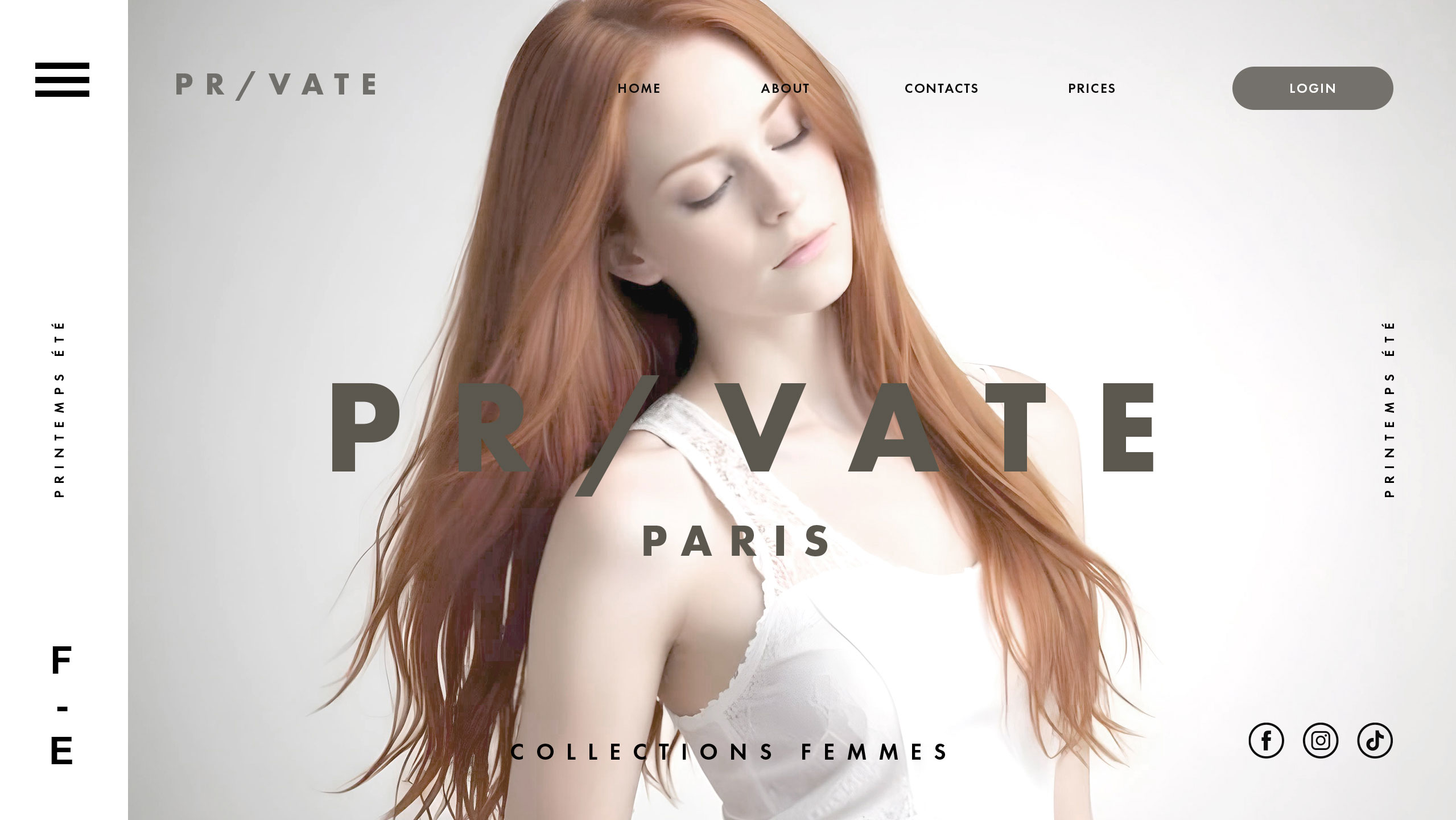
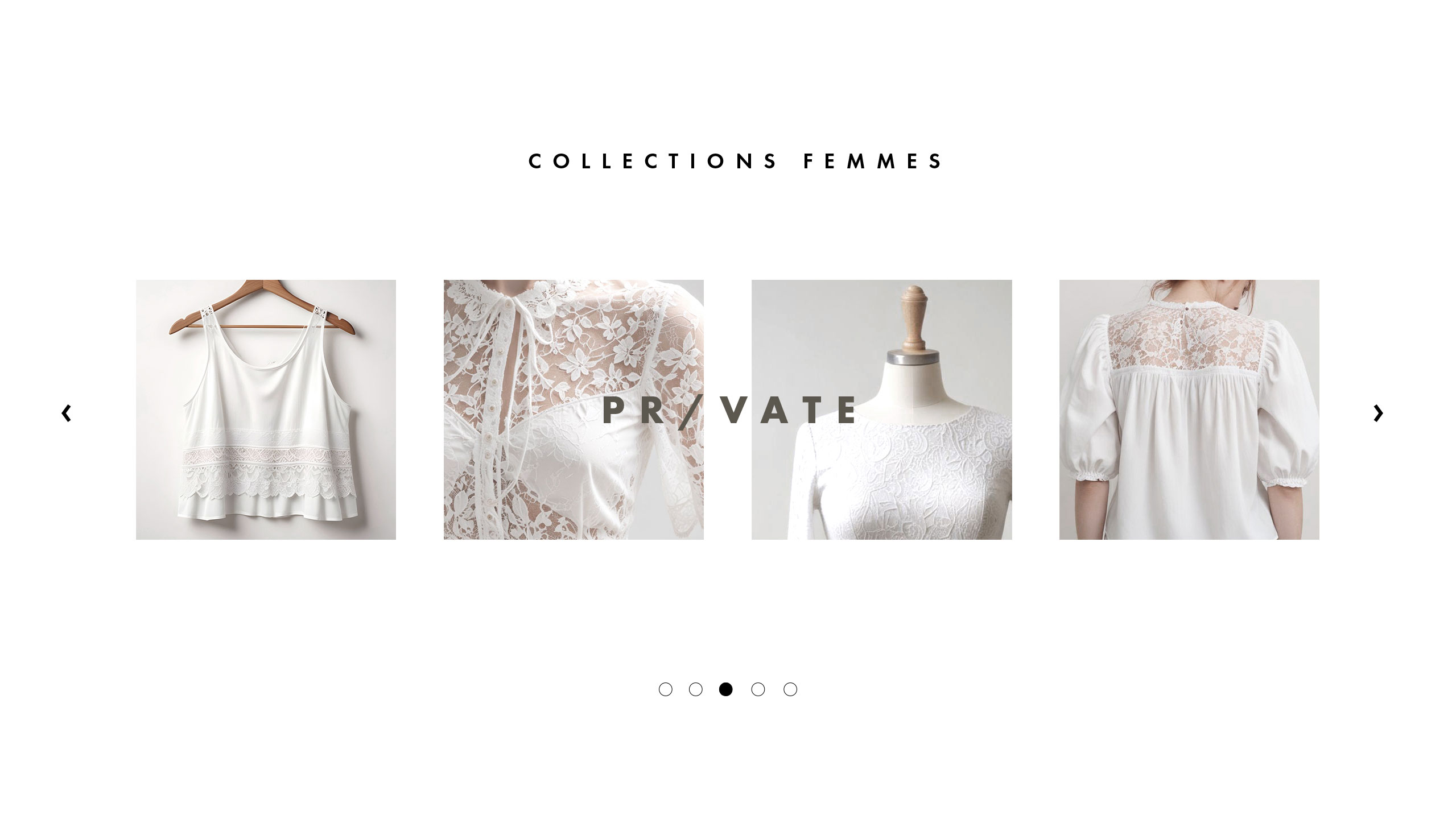
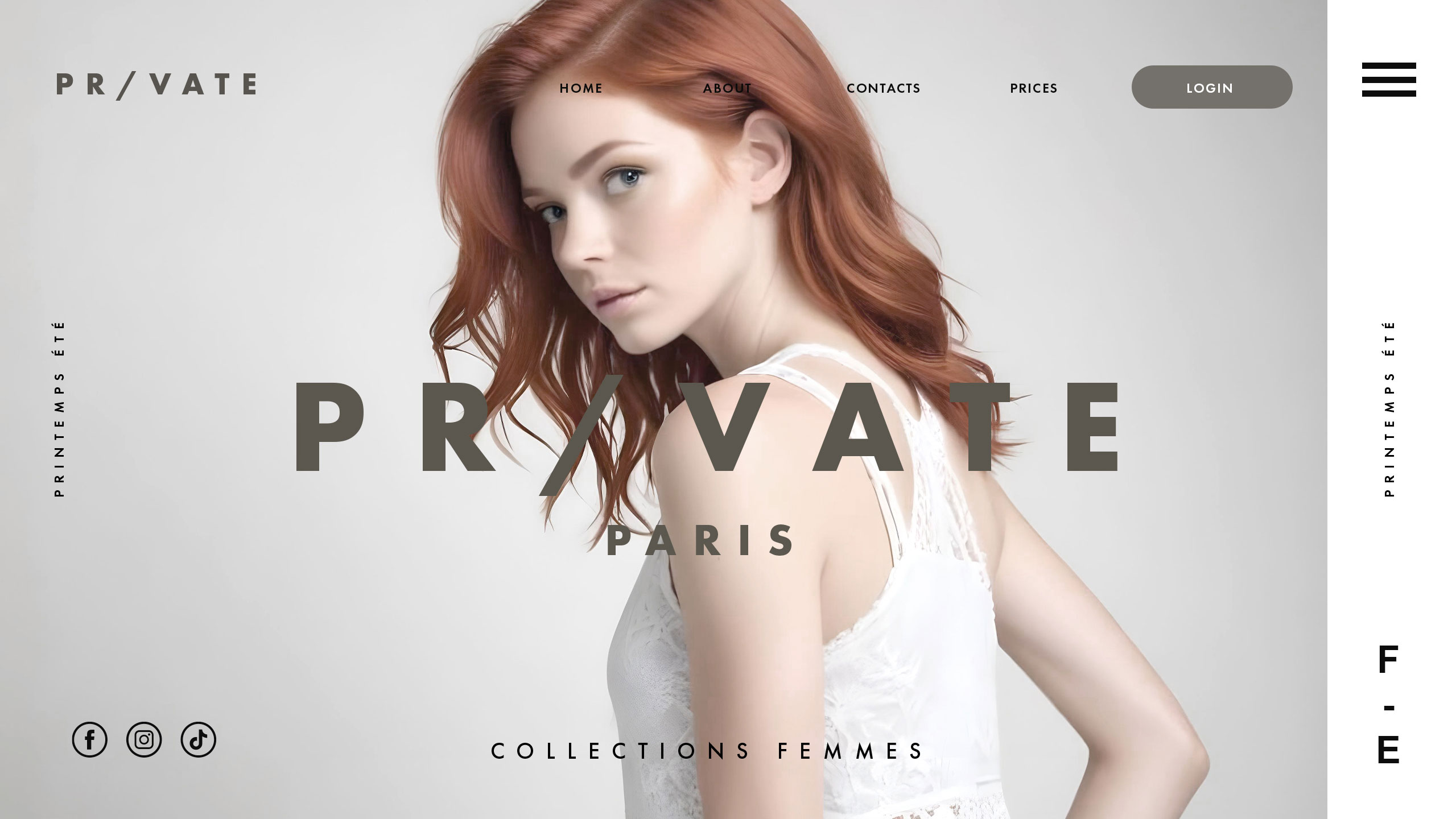
Pr/vate's website uses minimal graphic design to reflect a philosophy of quiet strength and subtle femininity. Dominated by white, the layout suggests purity, nature, and gentle introspection. The brand name itself—where the slash replaces the "i" in "Private"—evokes a duality: front/back, seen/hidden, public/self. This typography detail reinforces the brand's message of modesty, both physical and emotional.
Concept and Identity
There's no need for spectacle here; the clothing exists to reveal character through restraint. Pr/vate doesn't shout. It whispers with elegance, offering garments that empower women to express who they are without performing it. Simplicity becomes a silent form of confidence.
Related
03
Whether you prefer a quick call or a detailed message, we're here to listen.

Bombyx

HoverSpeed

Kerozen

Eighteen