


Description
02
The Core Challenge
How does S7UDIO 7's graphic design embody the essence of cinema through typography and color? The bold use of the number 7 and energetic palette highlights creativity and cinematic power.
Visual Language and Typography
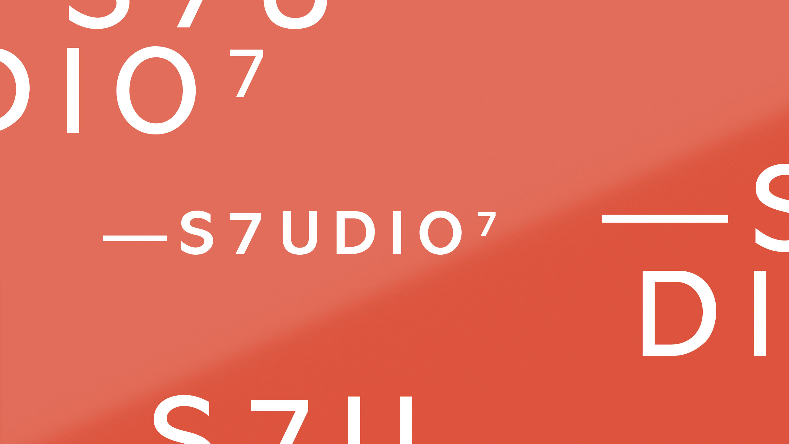
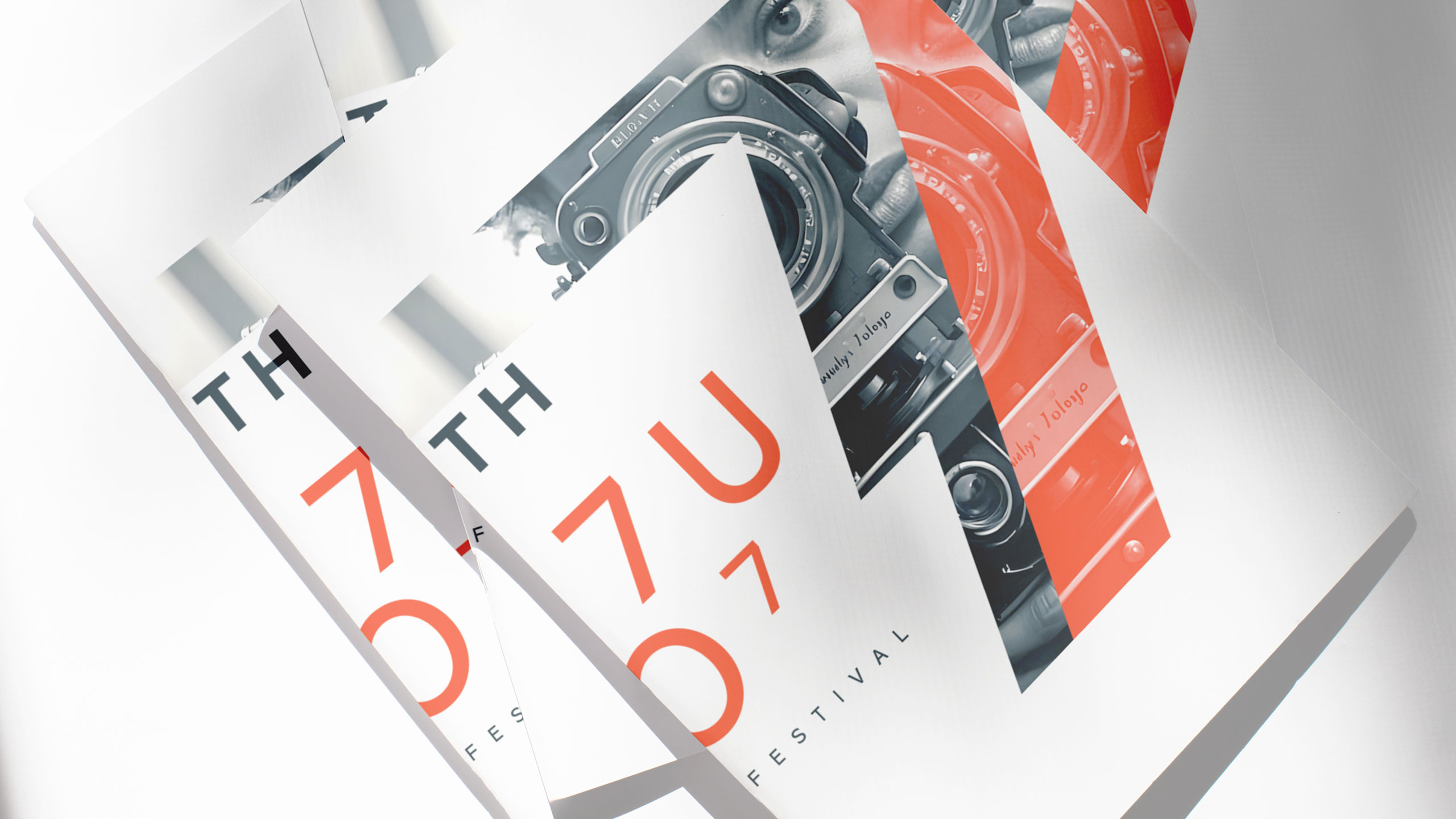
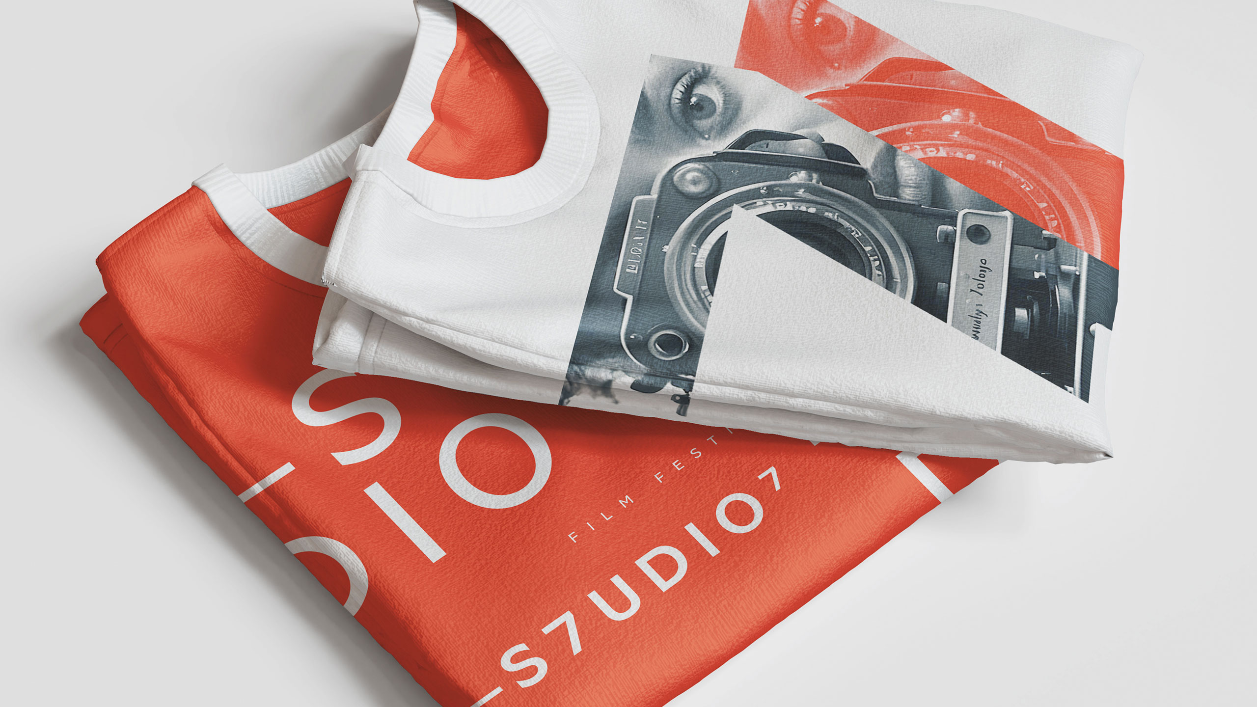
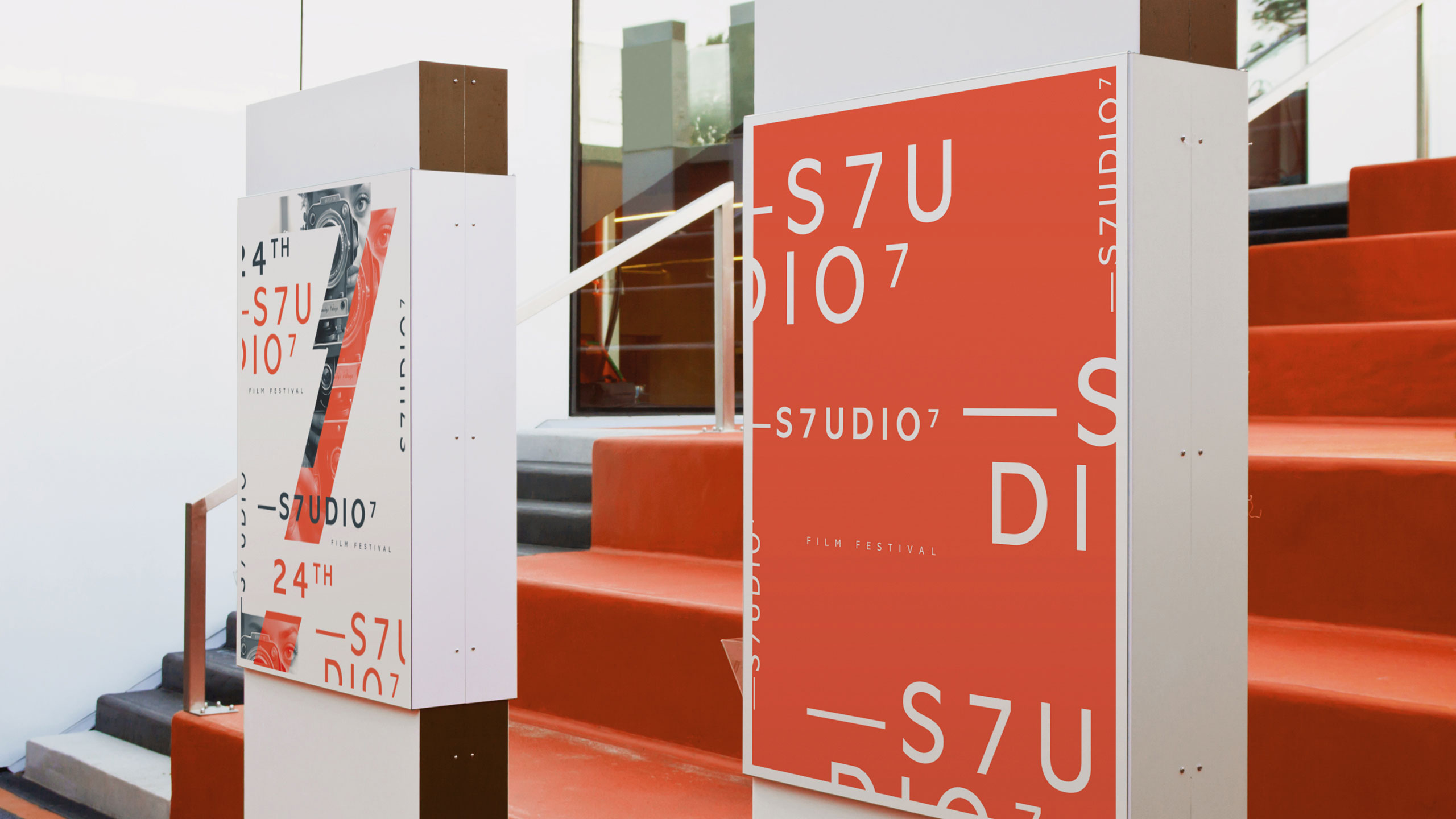
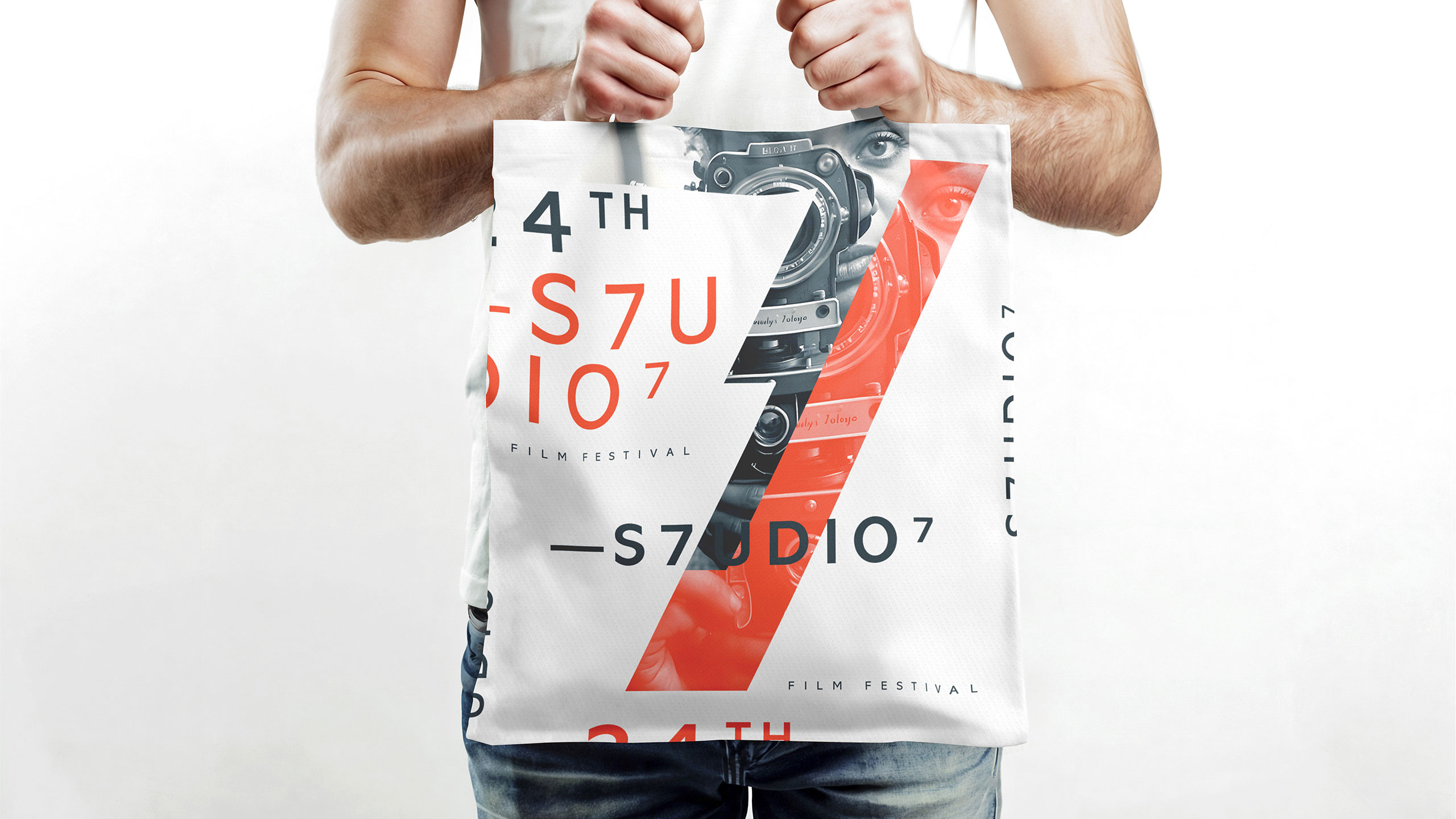
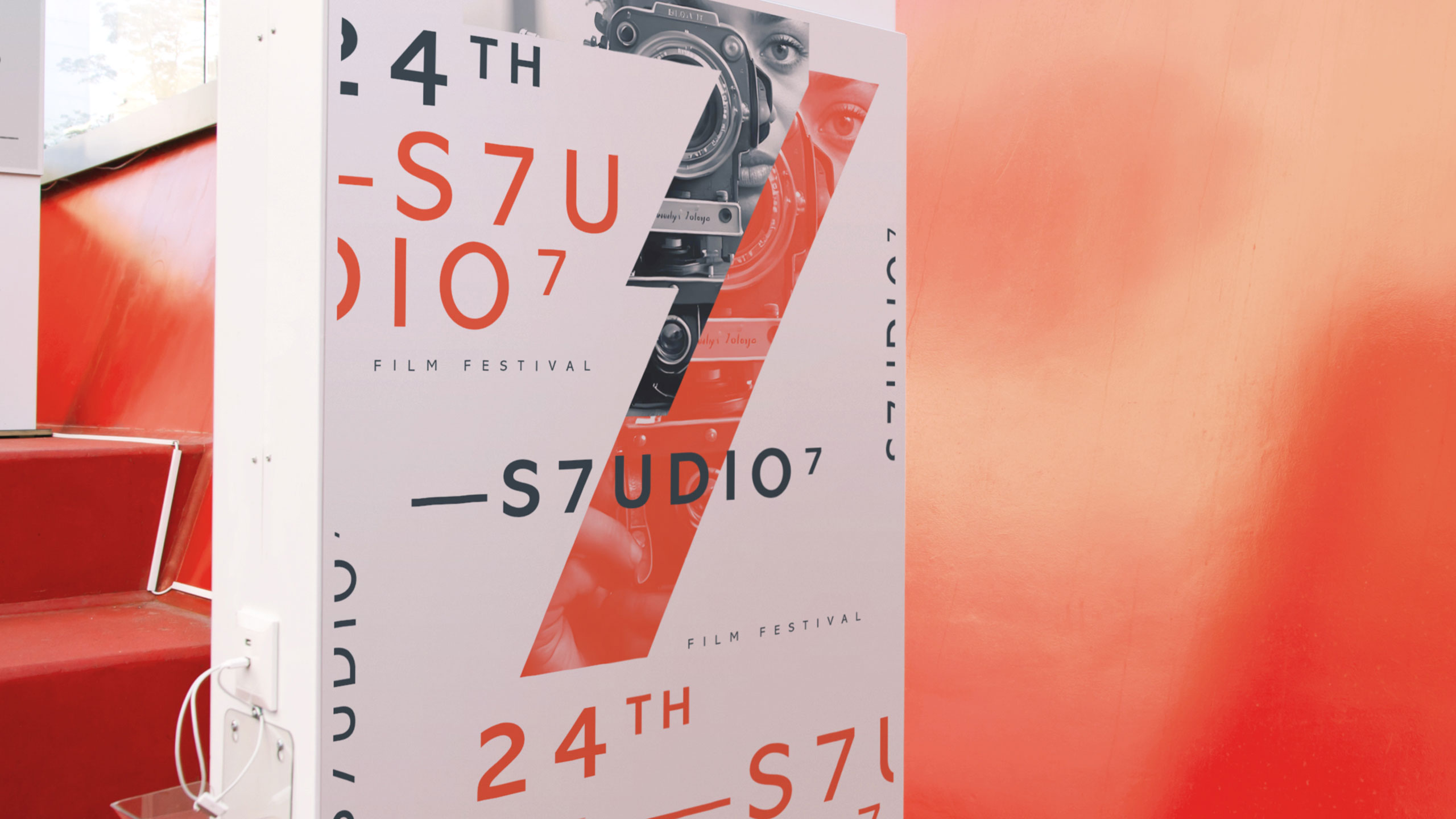
The visual identity of S7UDIO 7, a film festival, is bold and conceptual, centered around the number 7 to emphasize its connection to the seventh art—cinema. The typographic treatment replaces the "T" in "Studio" with a "7", while a second "7" appears as a superscript at the end, suggesting a festival "raised to the power of 7." The color palette—orange, black, and white—adds energy and contrast.
Key Visual and Application
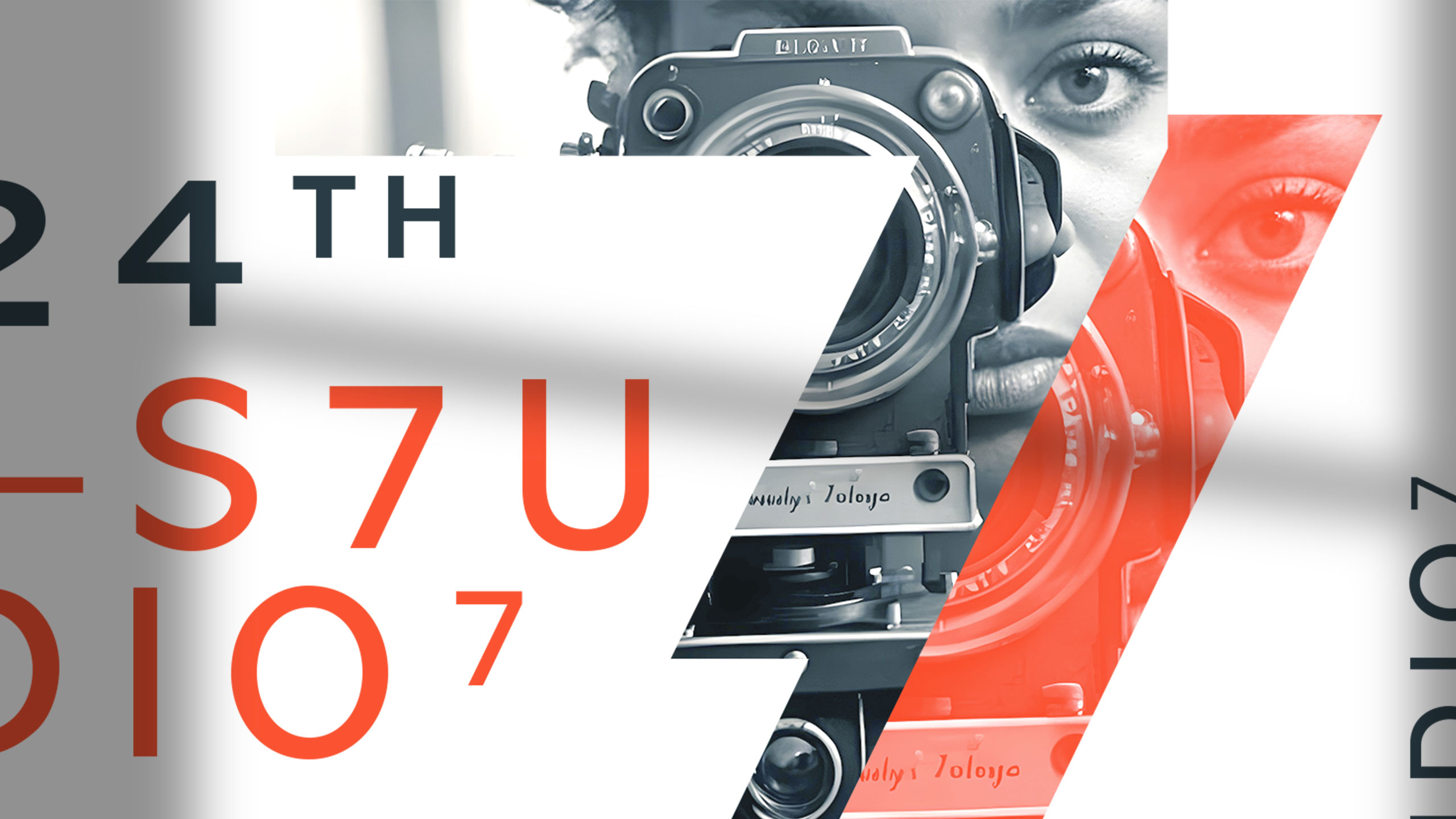
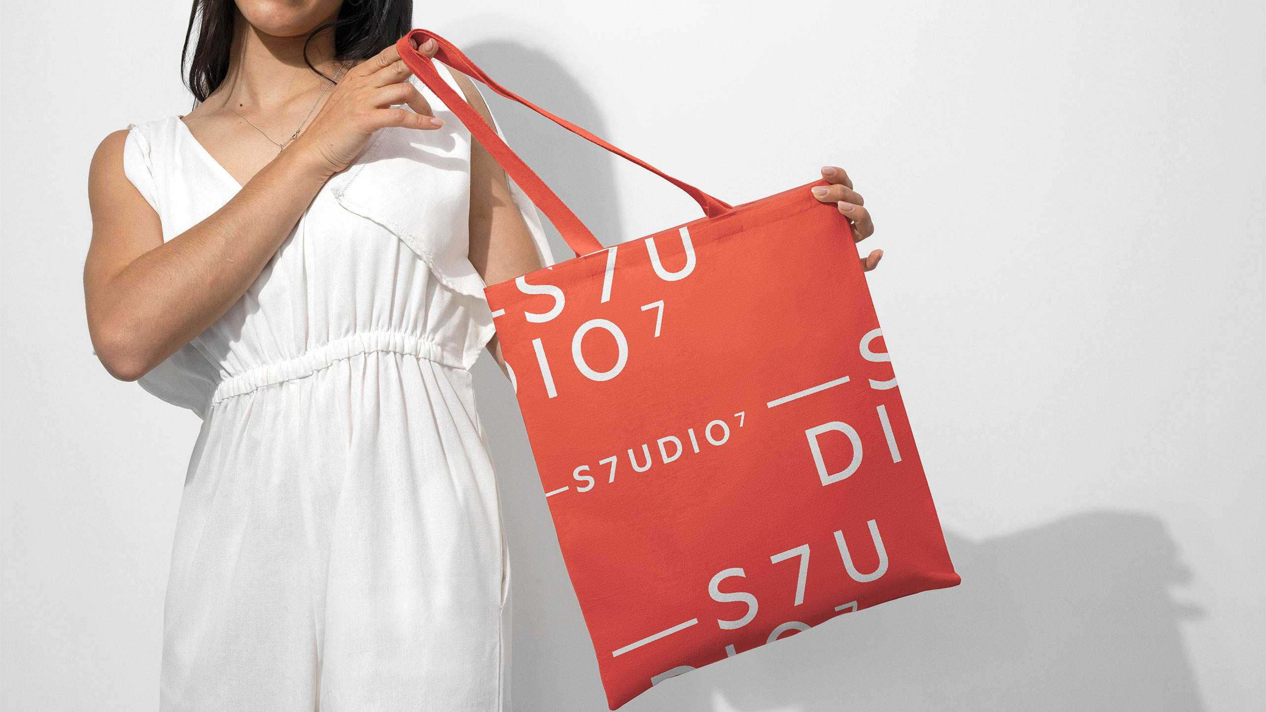
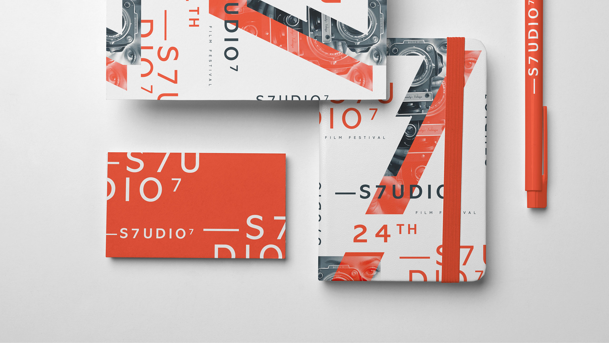
The key visual features a large, graphic number 7 framing a black-and-white photo of a filmmaker's face, half-hidden, as if filming the viewer from behind the camera. The identity spans posters, t-shirts, bags, stationery, and programs.
Related
03
Whether you prefer a quick call or a detailed message, we're here to listen.

OVER

Café Lenoirs

Blen-Beck

Whare House