


Description
02
The Core Challenge
How to create a warm, energetic sushi brand? SushiSushi uses bold red, hand-drawn logos, and playful sushi icons to build a friendly, approachable identity that's both professional and fun.
Visual Language and Logo
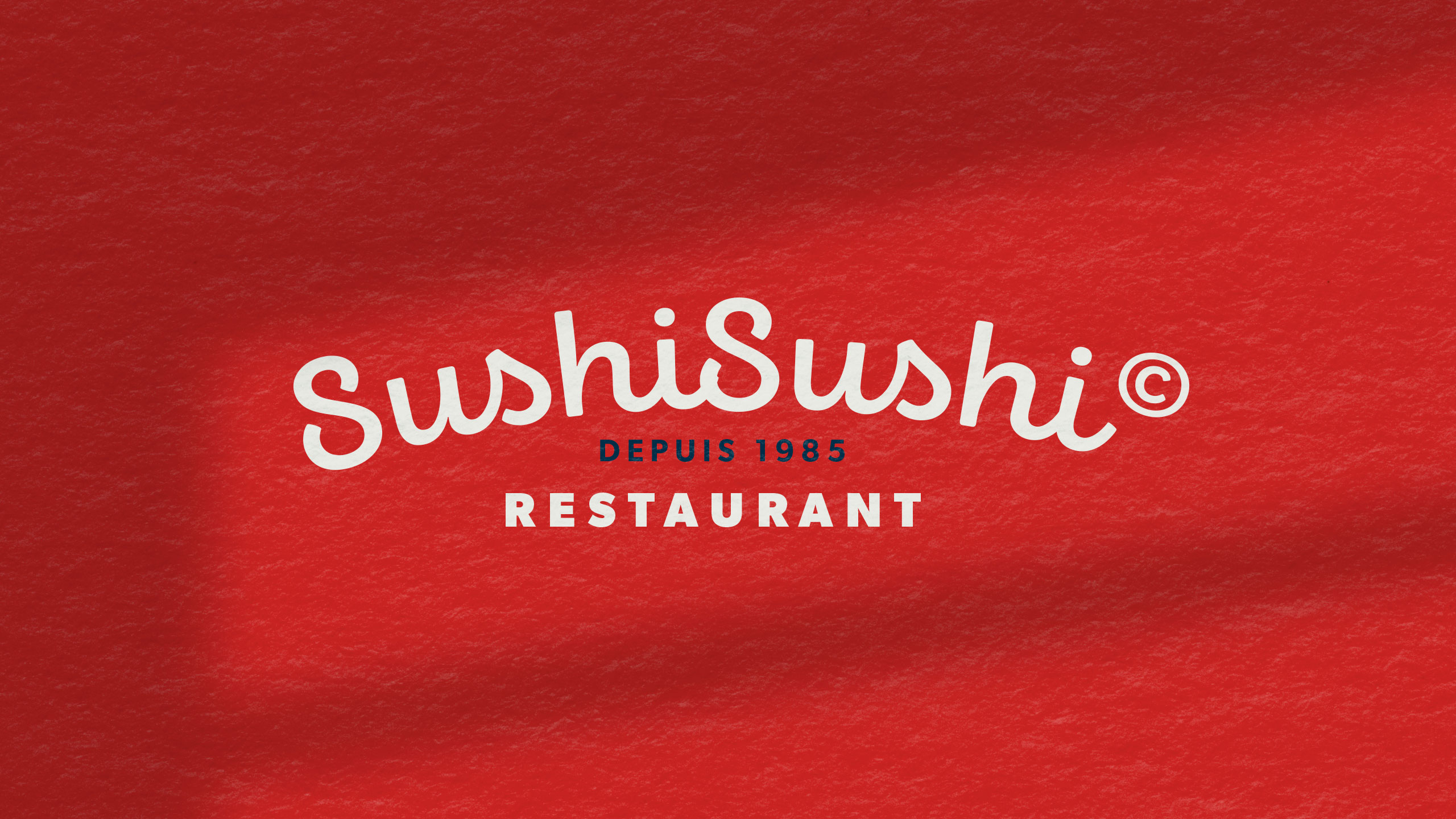
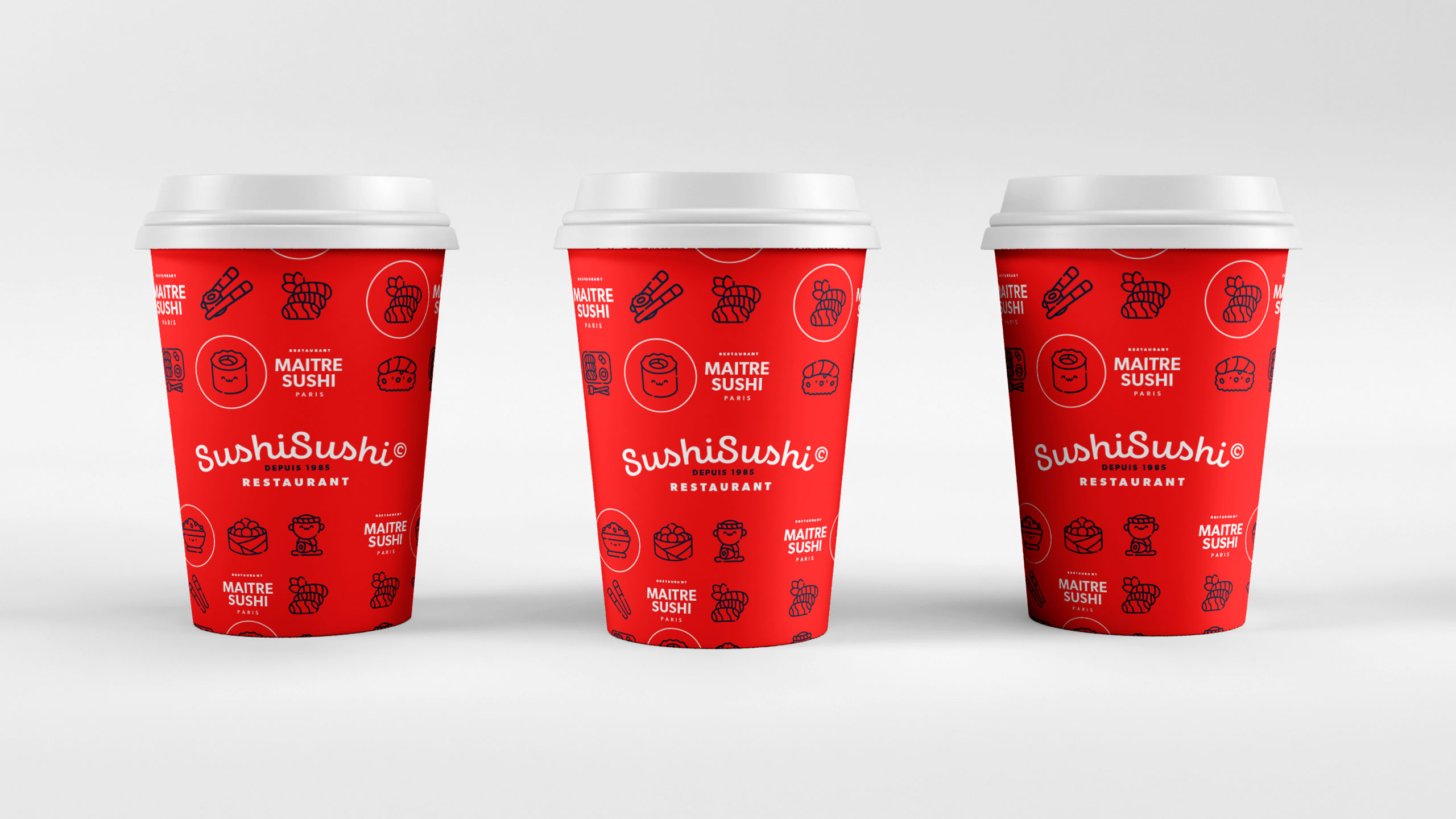
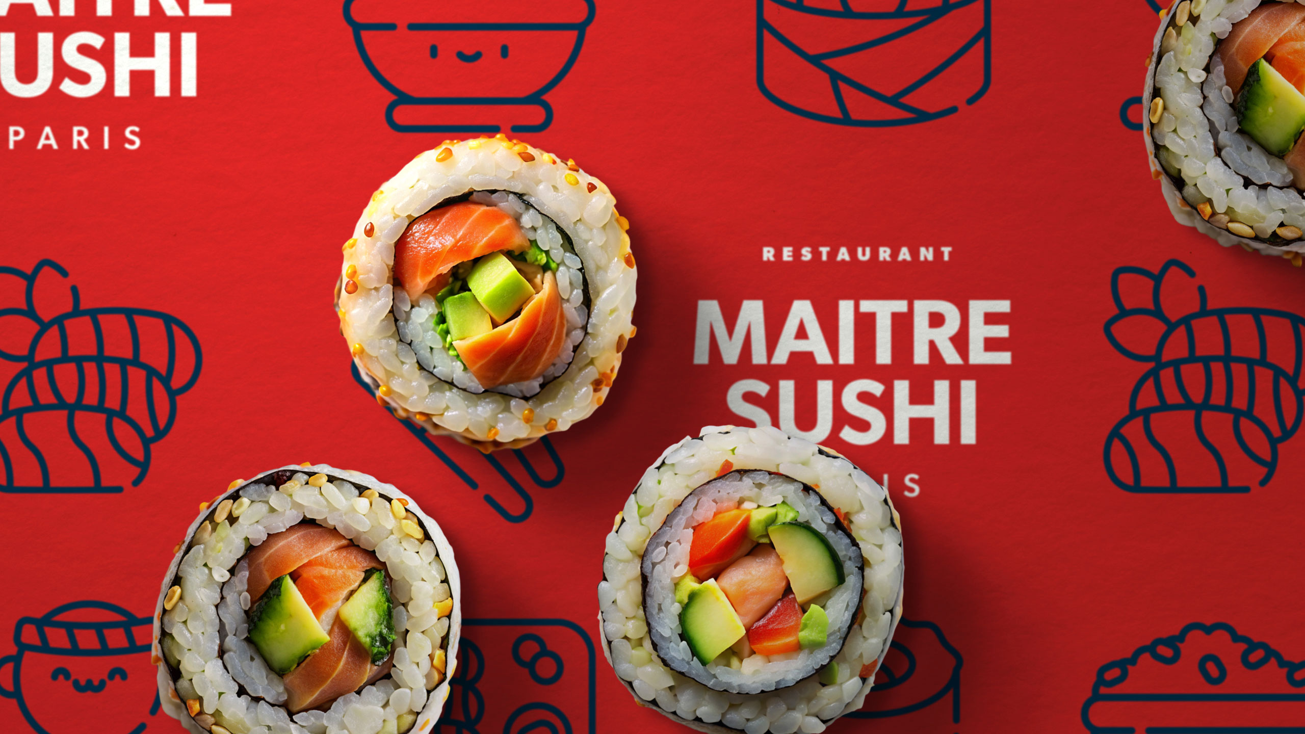
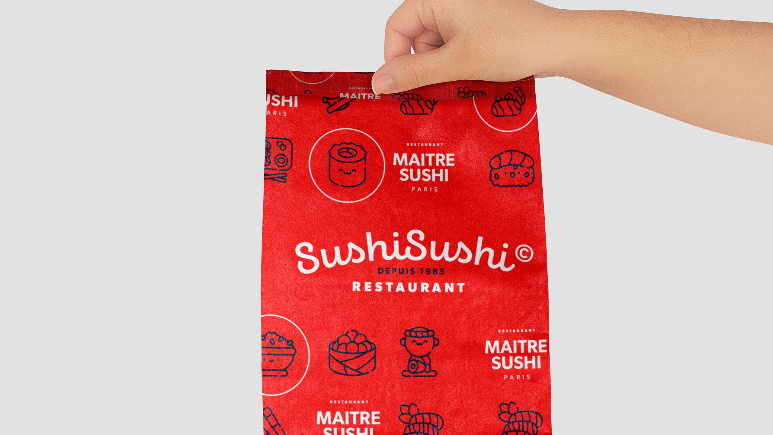
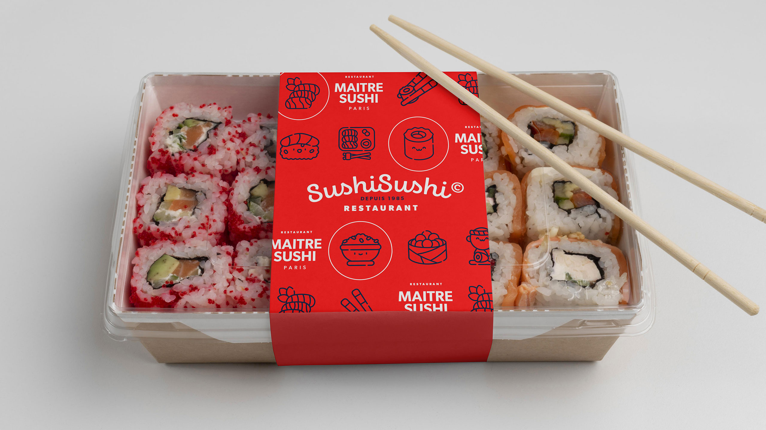
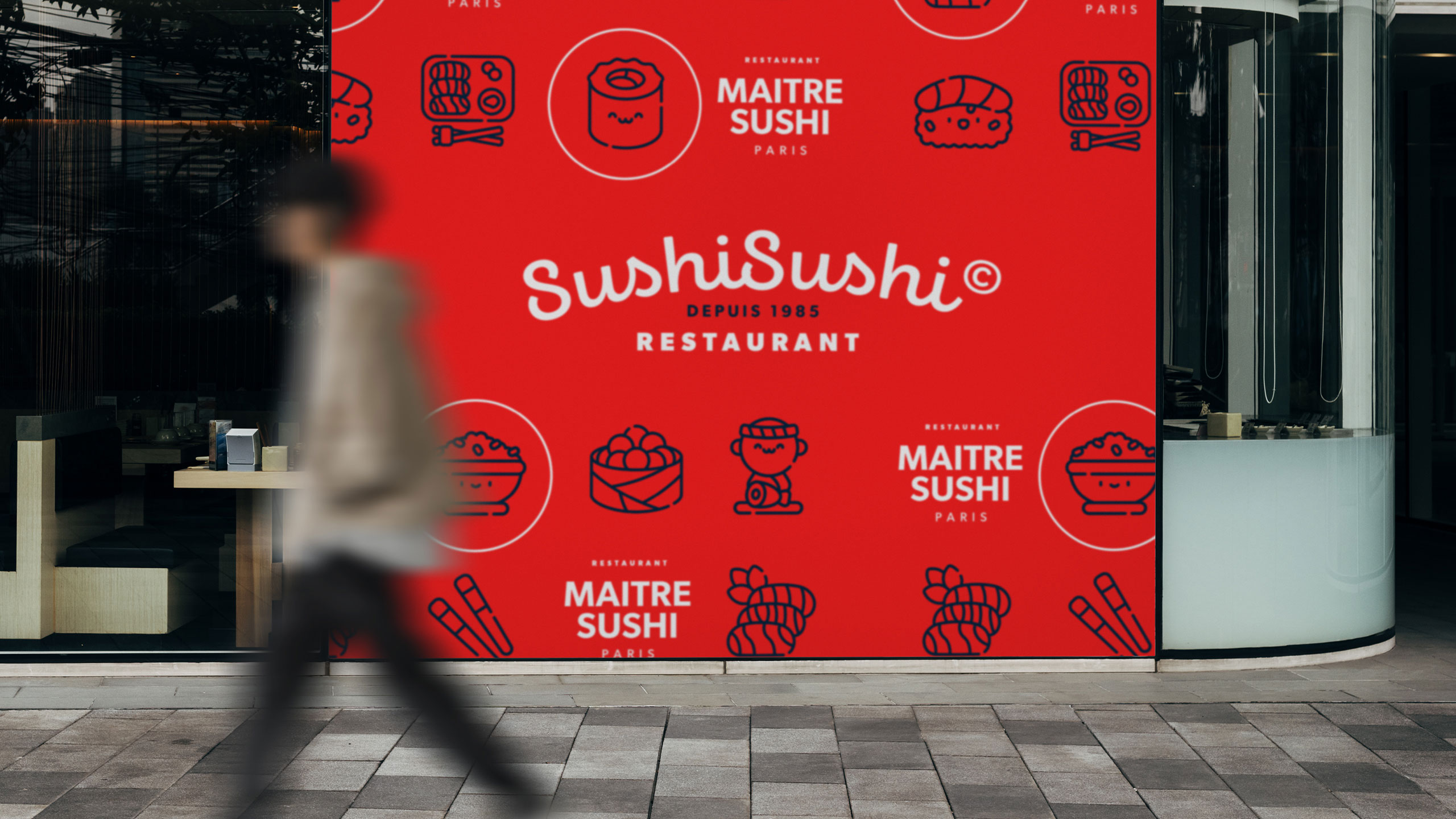
The graphic design for SushiSushi, a sushi delivery restaurant, features a bold, friendly identity centered around the color red—a tone that evokes appetite, energy, and warmth. The name playfully references "moshi moshi," adding an approachable, international flair. The logo uses a rounded, hand-drawn style, complemented by cute sushi icons, reinforcing the brand's accessible and cheerful personality.
Application and Appeal
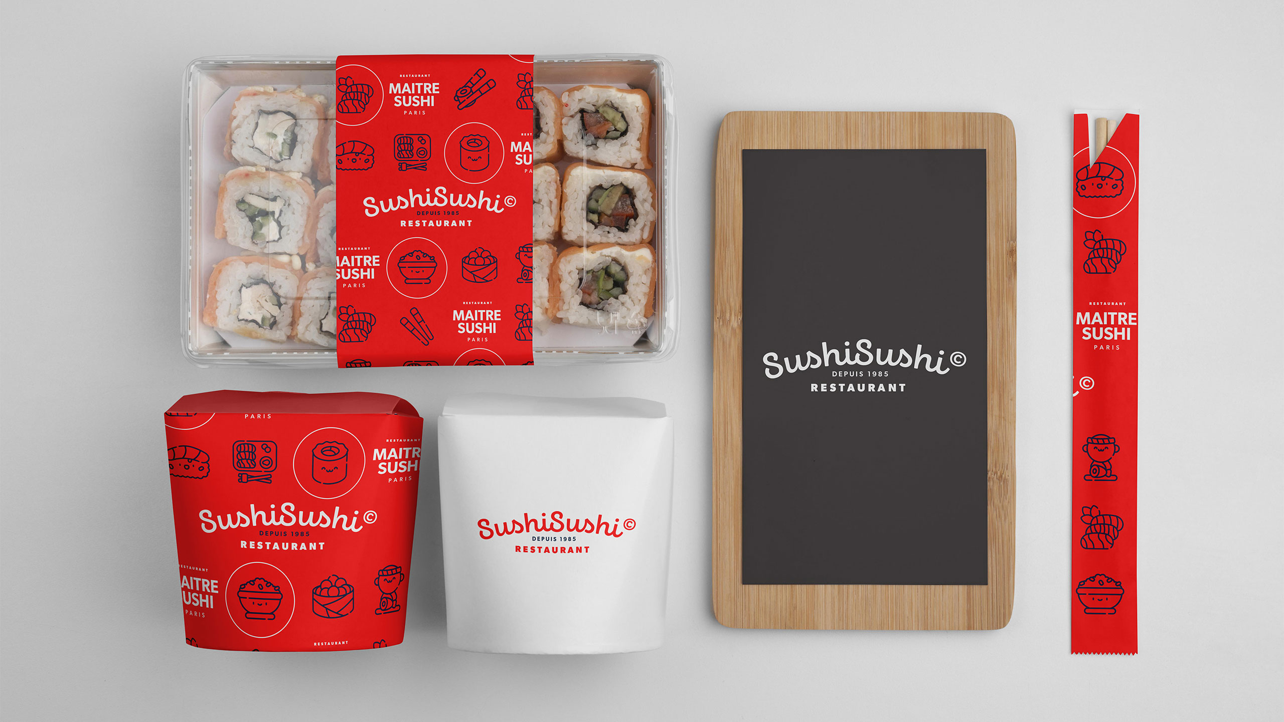
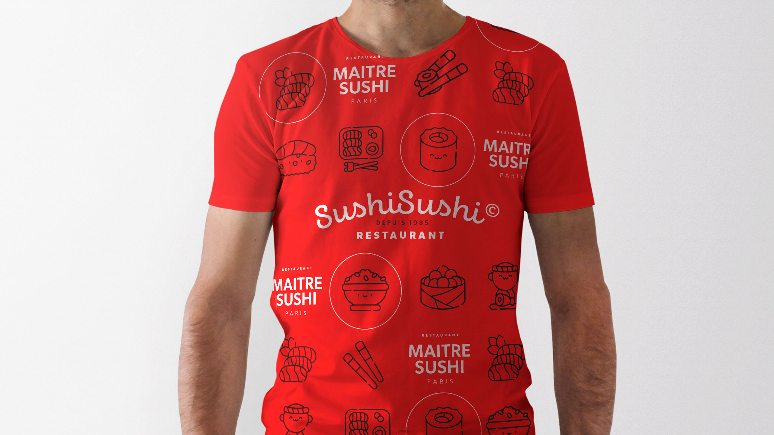
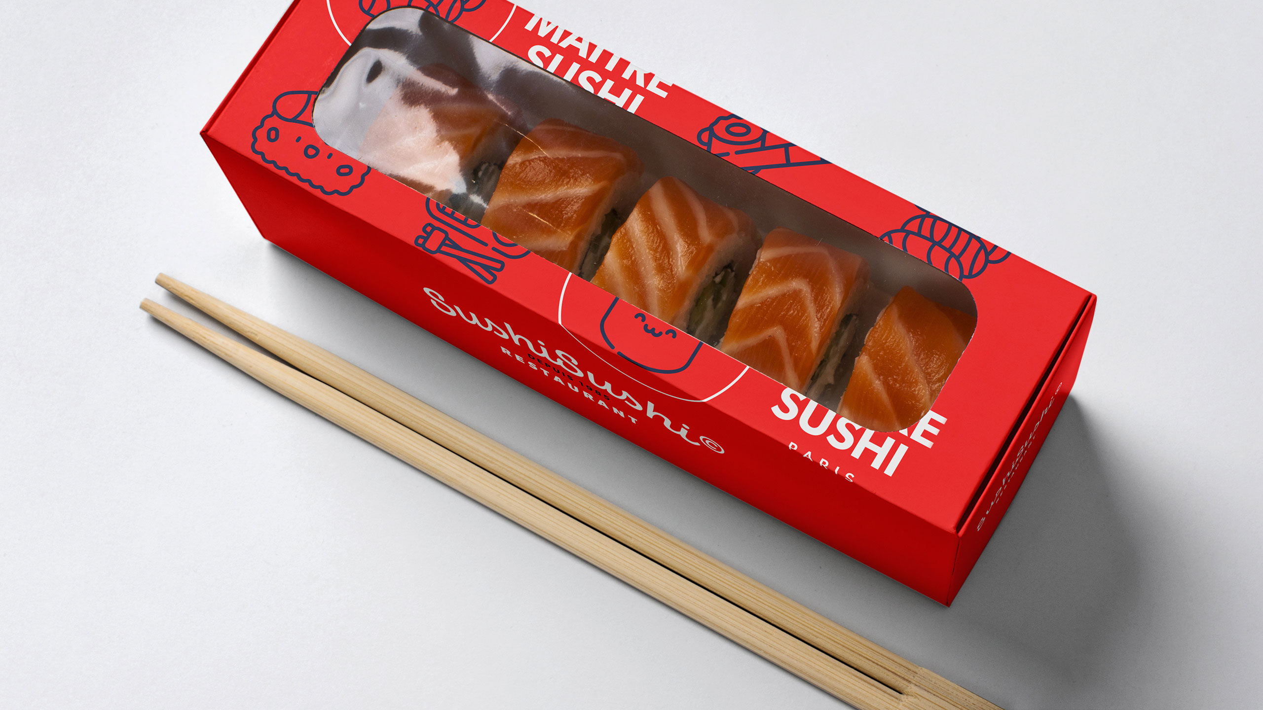
Applied to bags, cups, stationery, aprons, and packaging, the identity is cohesive and inviting. The overall tone is lighthearted yet professional, appealing to a broad, urban clientele seeking quality sushi with a fun, memorable twist in both service and visual experience.
Related
03
Whether you prefer a quick call or a detailed message, we're here to listen.

OVER

Café Lenoirs

Blen-Beck

Whare House