


Description
02
The Core Challenge
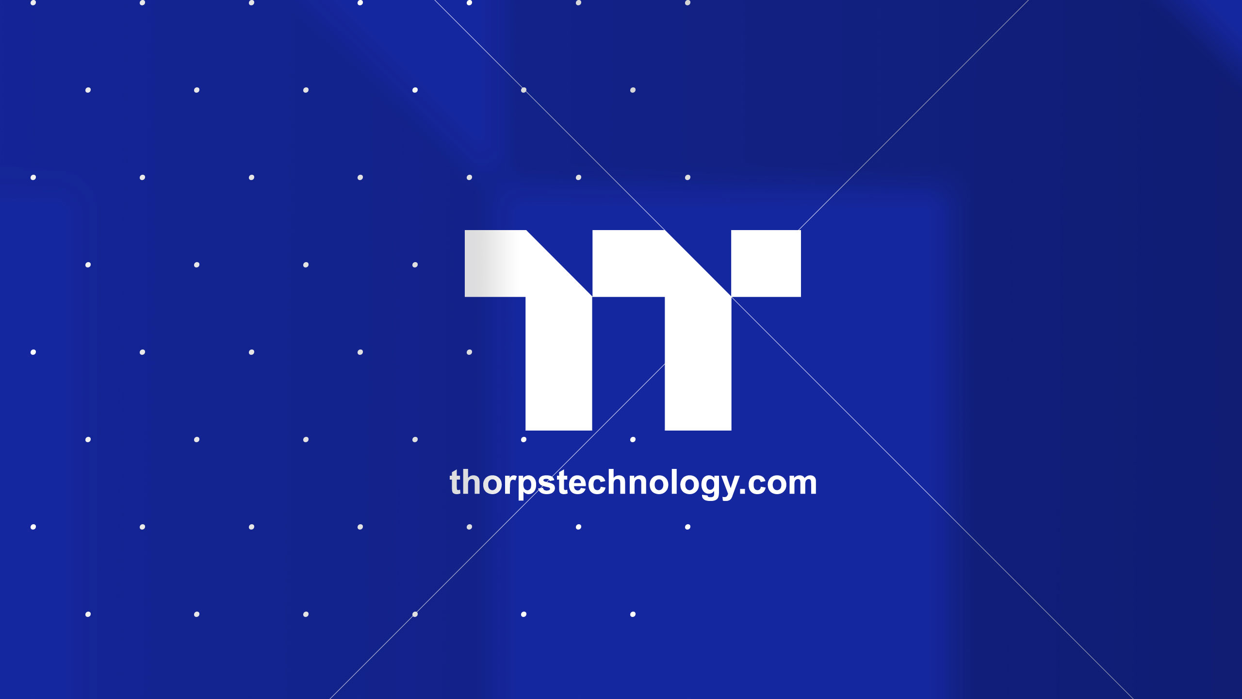
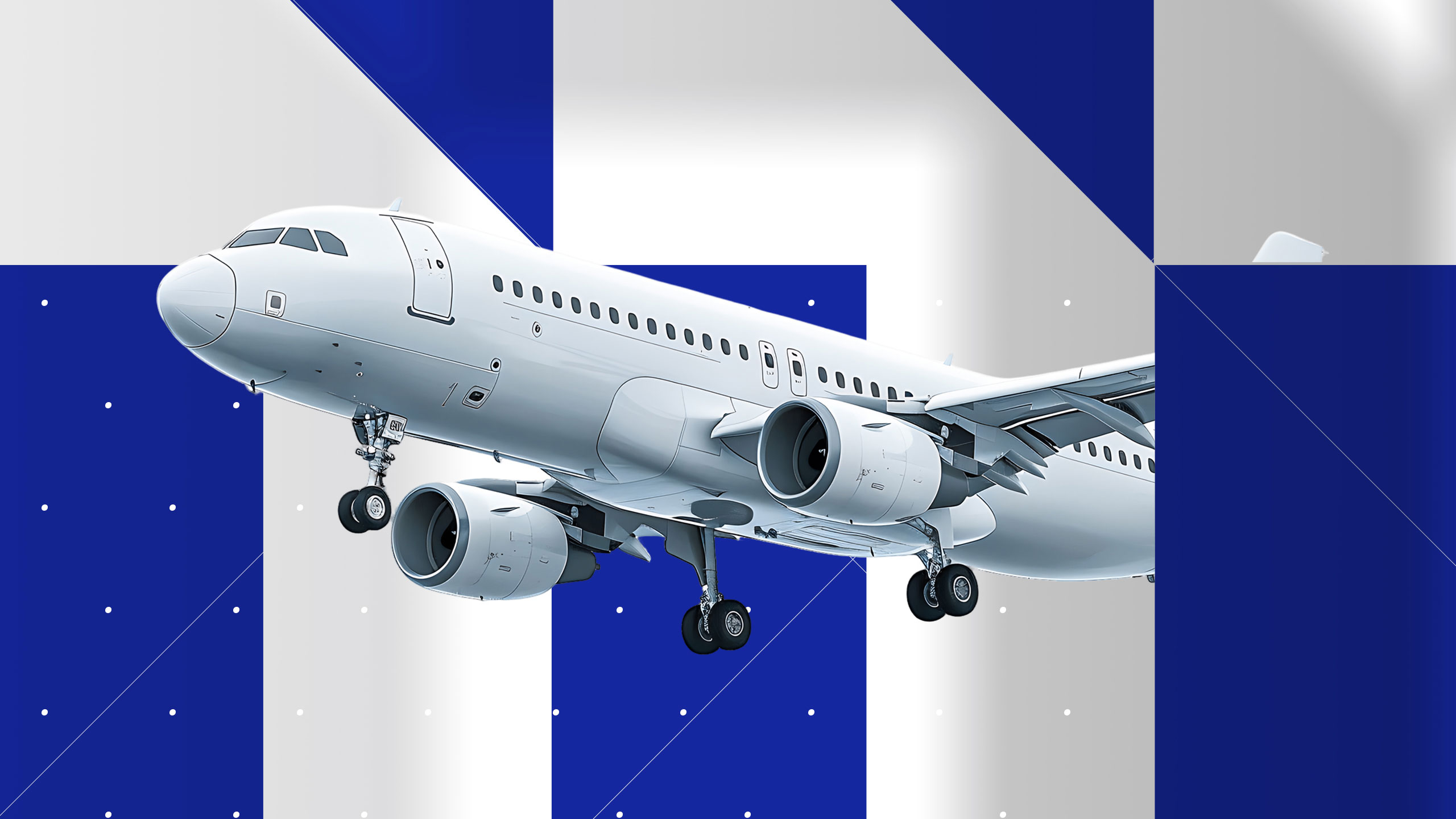
How can graphic design convey innovation and precision for an aviation engine manufacturer? Thops Technology uses a blue palette and a turbine-inspired double "T" logo, projecting reliability and cutting-edge expertise.
Visual Language and Logo
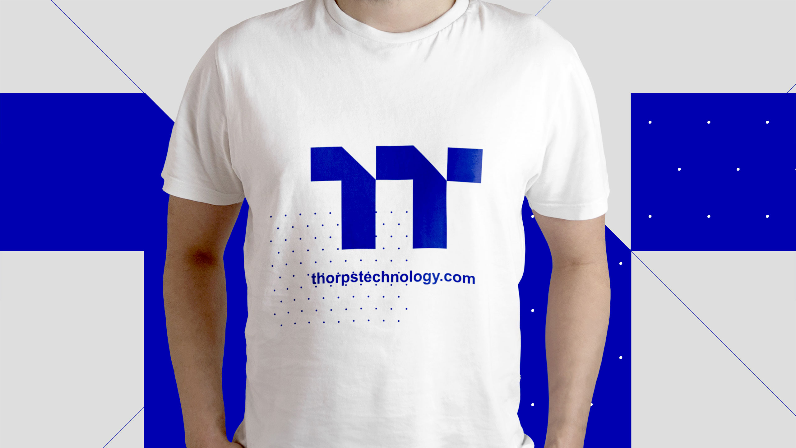
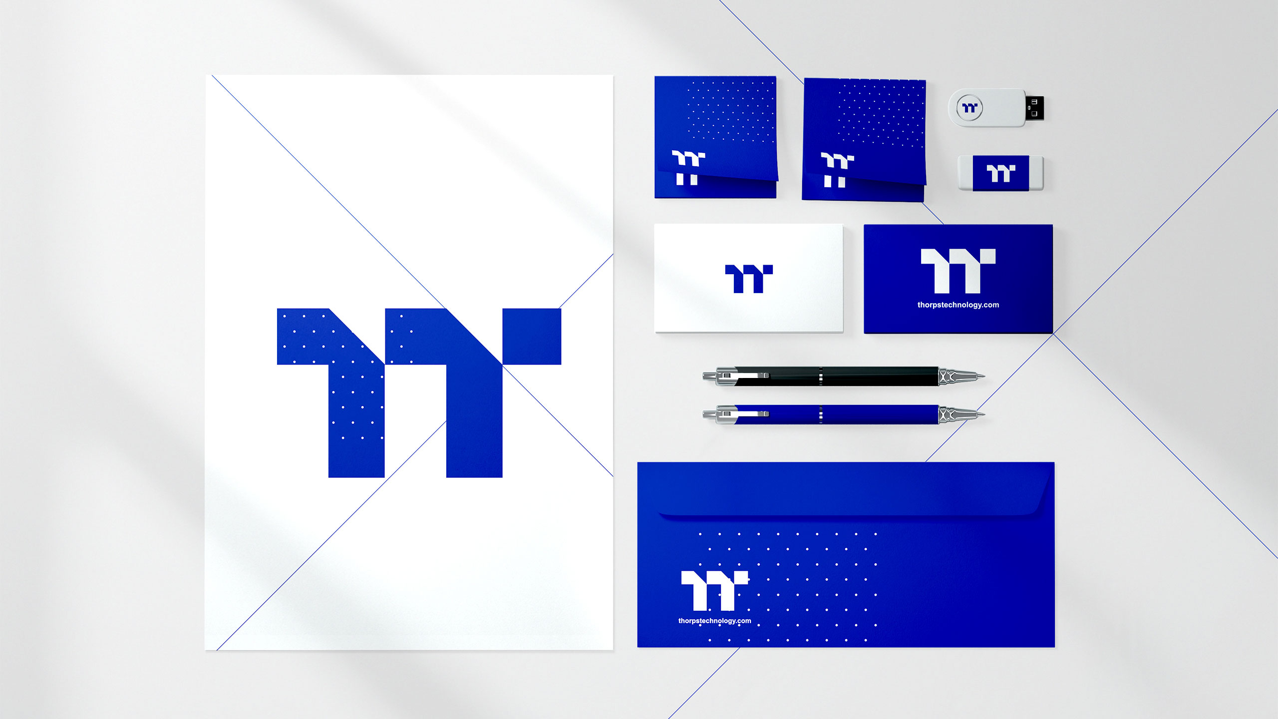
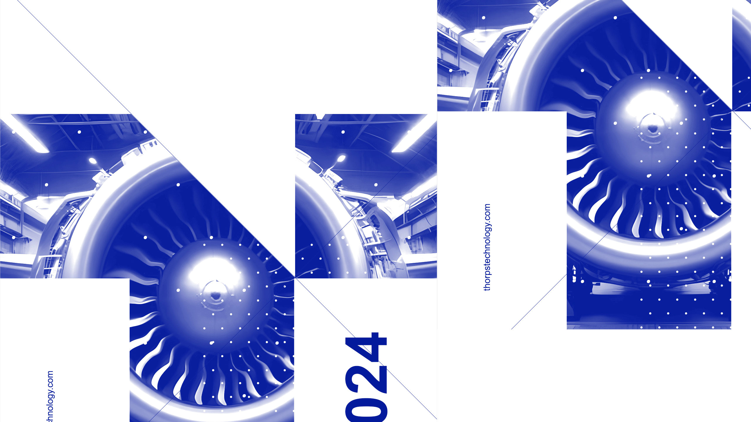
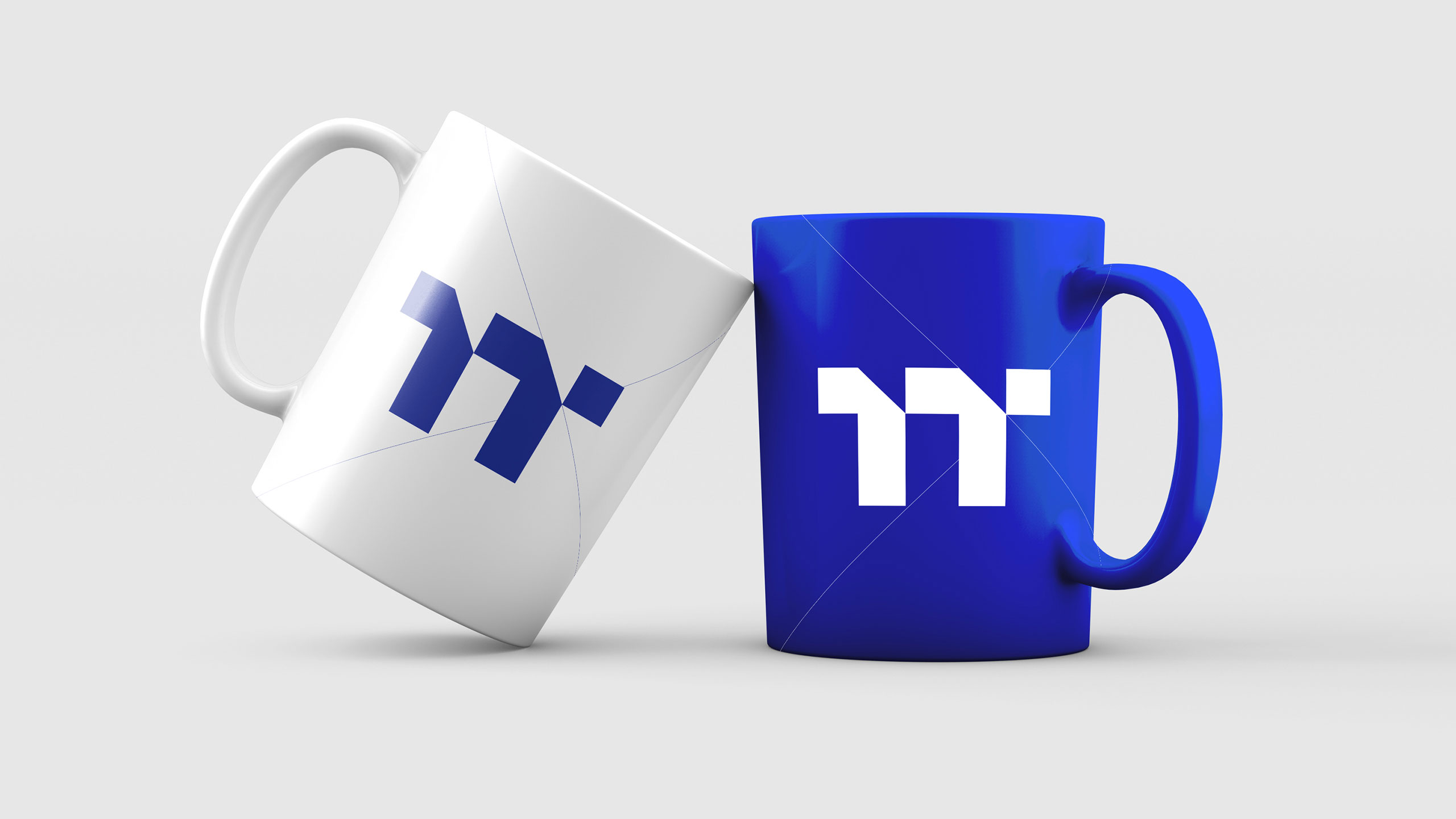
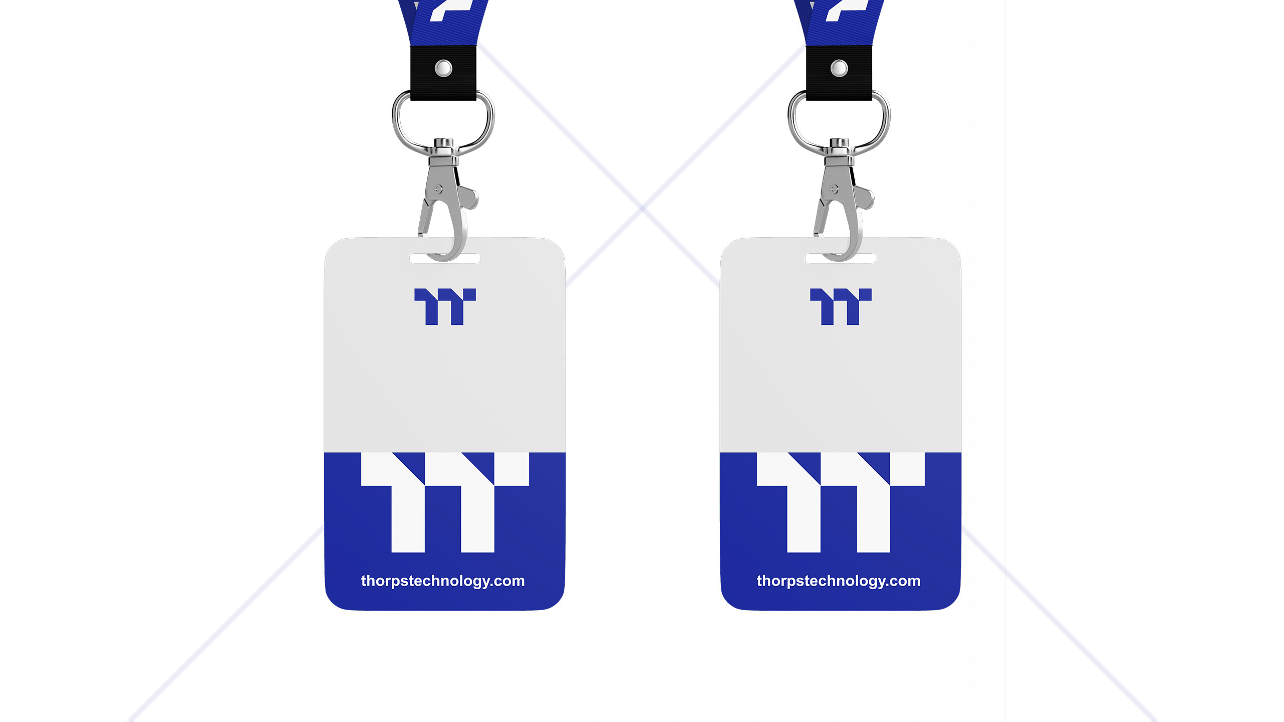
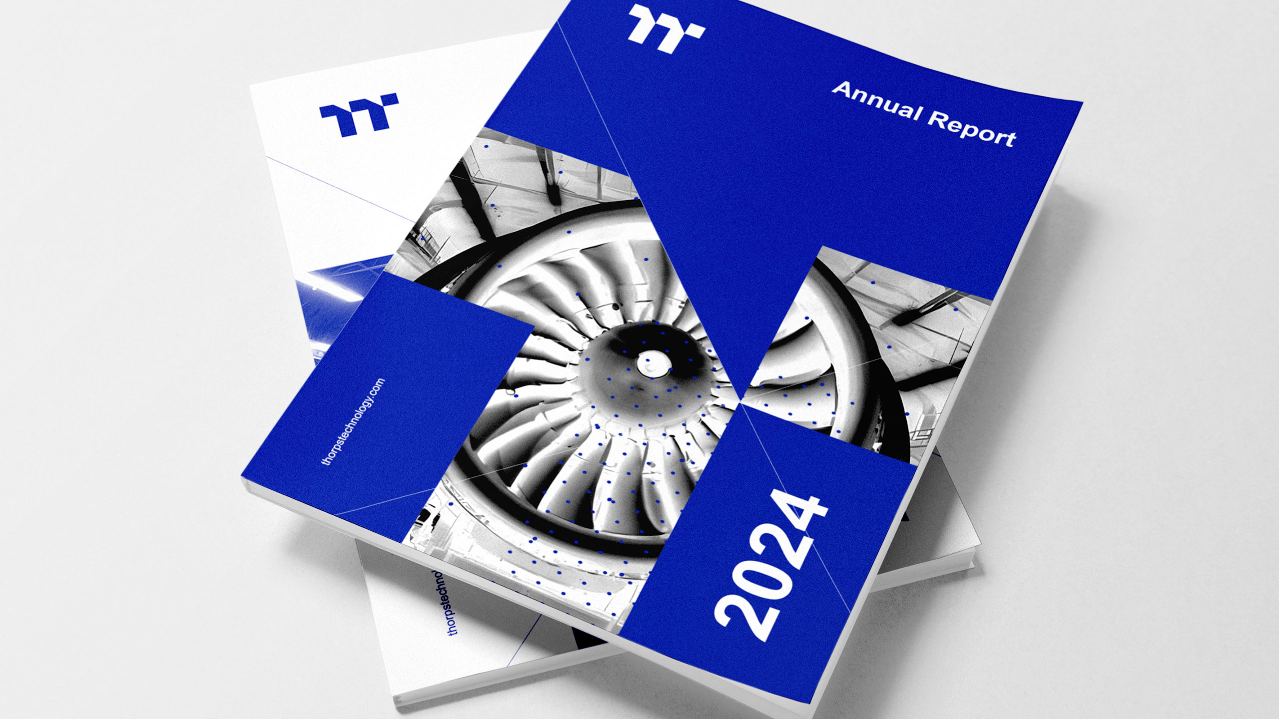
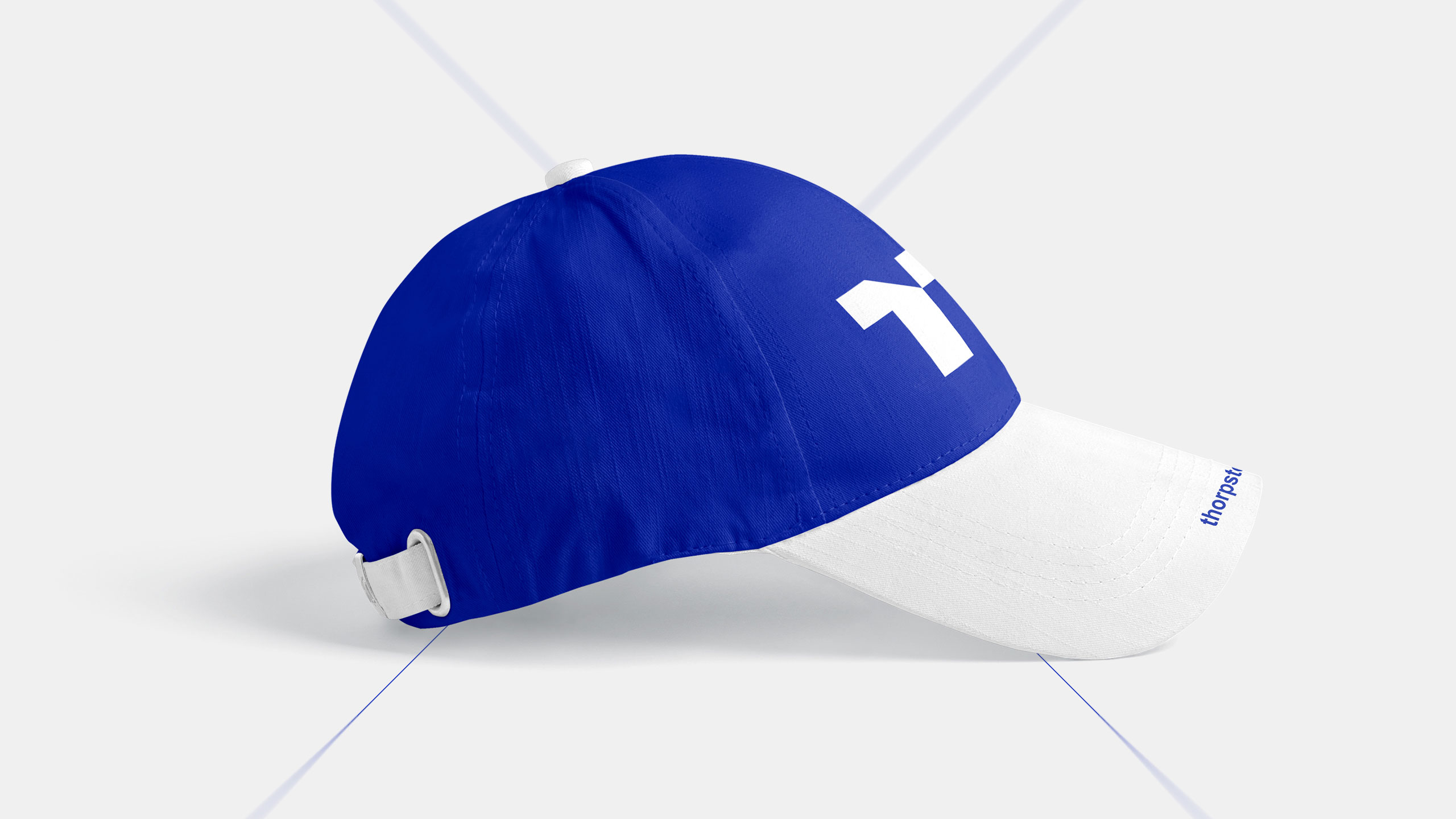
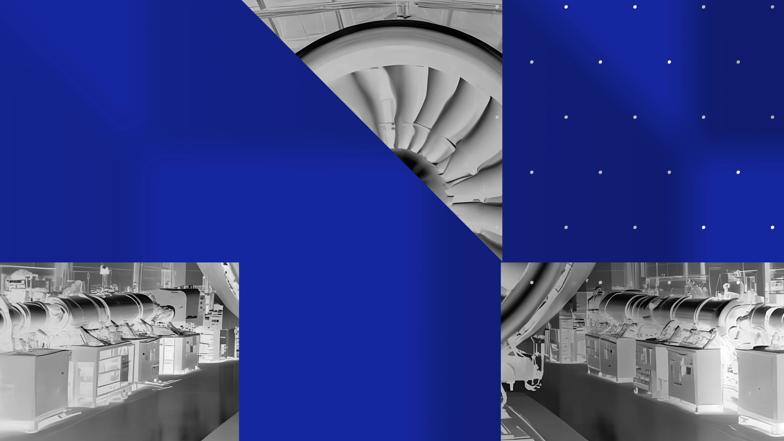
The graphic design for Thorps Technology, an aviation engine manufacturer, adopts a clean, corporate style. Dominated by blue, it evokes both sky and advanced technology. The logo is structured around a double "T" (Thorps Technology), abstractly resembling the profile of a turbine blade or propeller, reinforcing the brand's aeronautical identity.
Application and Positioning
The visual identity is applied across various supports—T-shirts, mugs, annual reports, caps, ID badges, and stationery—with consistency and technical precision. The design communicates innovation, reliability, and engineering excellence. It positions the brand as a serious, high-tech player in the aerospace sector, while maintaining clarity and visual strength in all formats.
Related
03
Whether you prefer a quick call or a detailed message, we're here to listen.

OVER

Café Lenoirs

Blen-Beck

Whare House