


Description
02
The Core Challenge
How can graphic design visually translate the rhythm, spontaneity, and structure of jazz? The challenge: create a bold, cohesive identity that feels as alive and dynamic as the music itself.
Visual Language and Forms
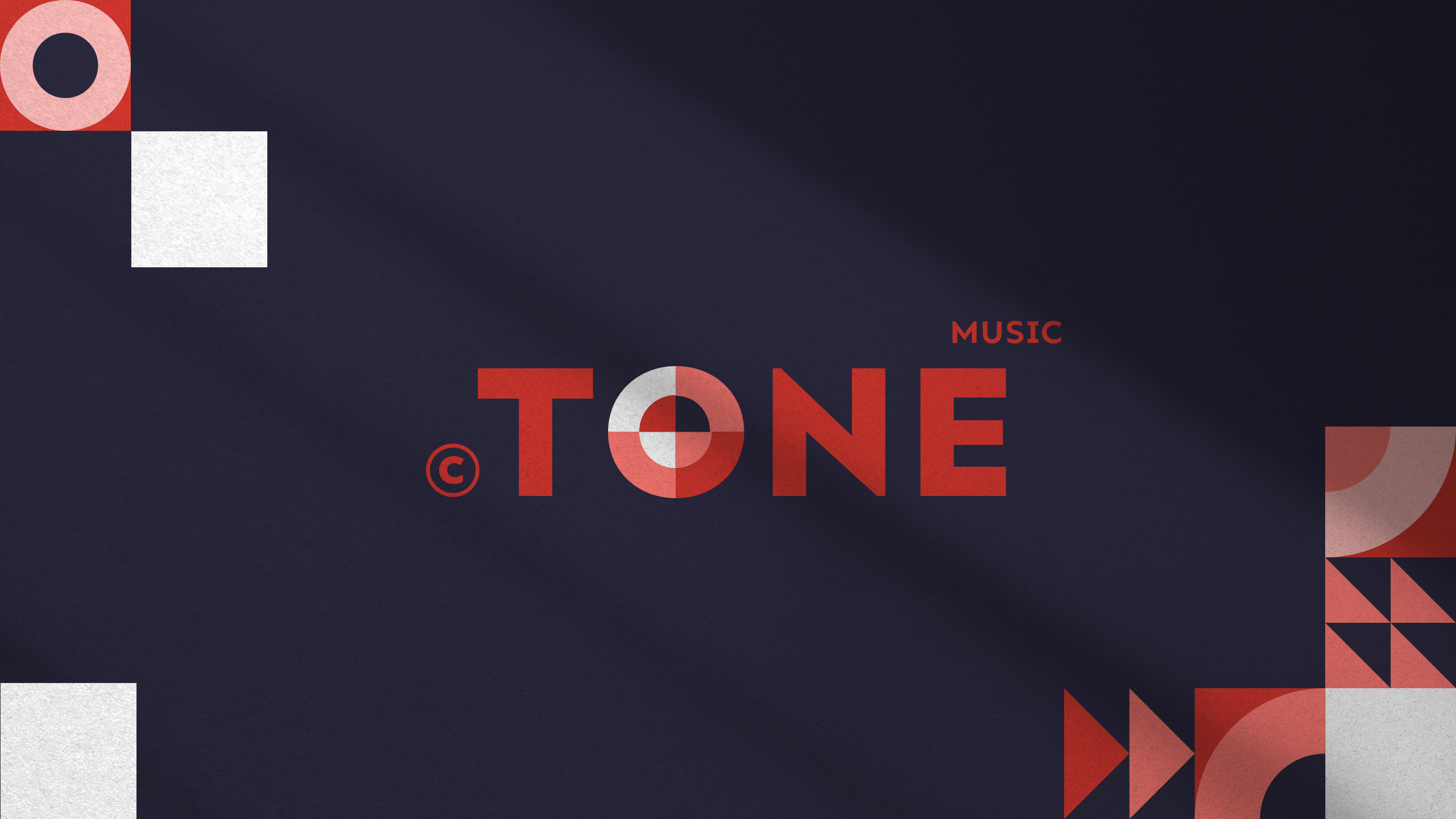
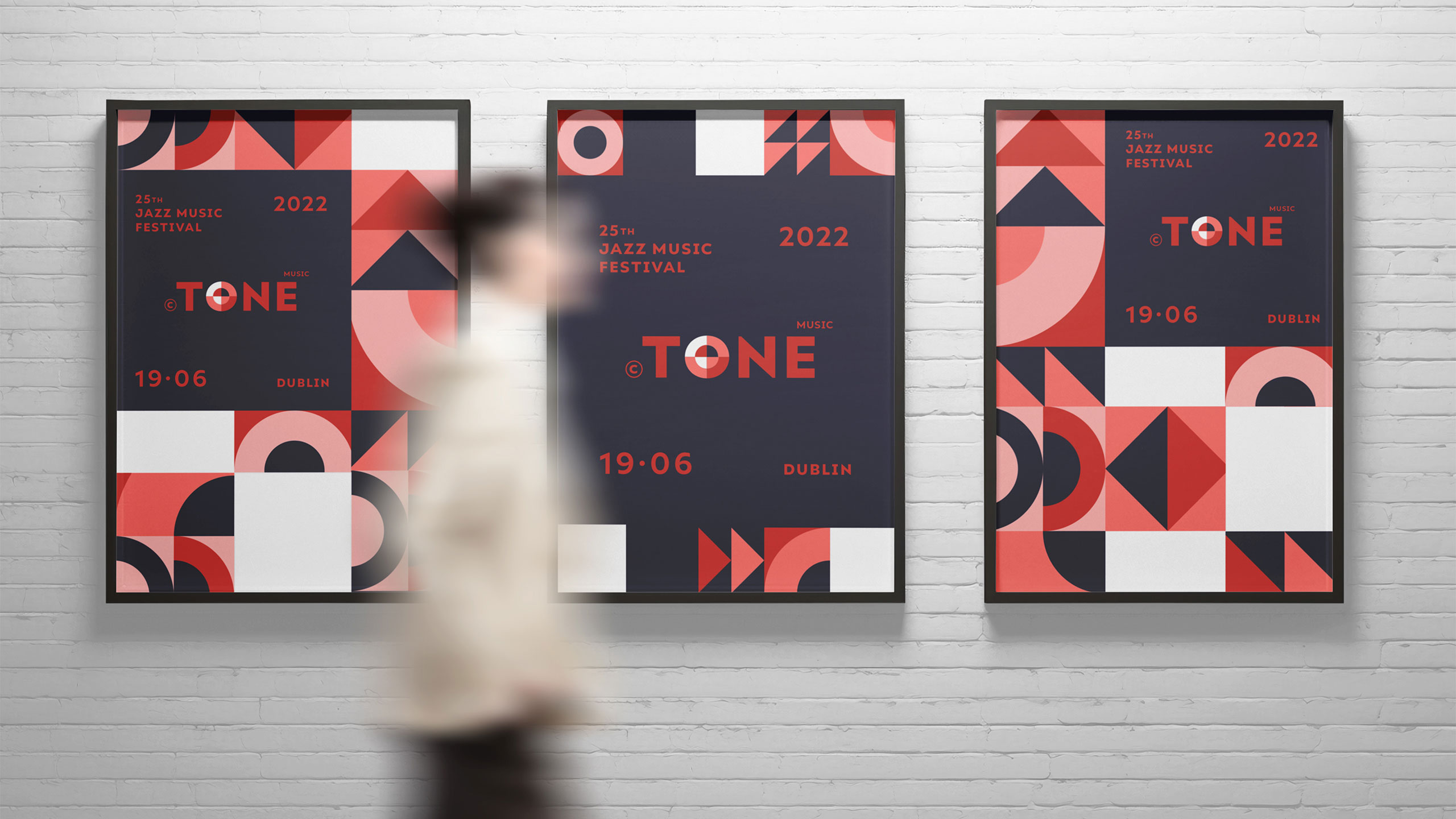
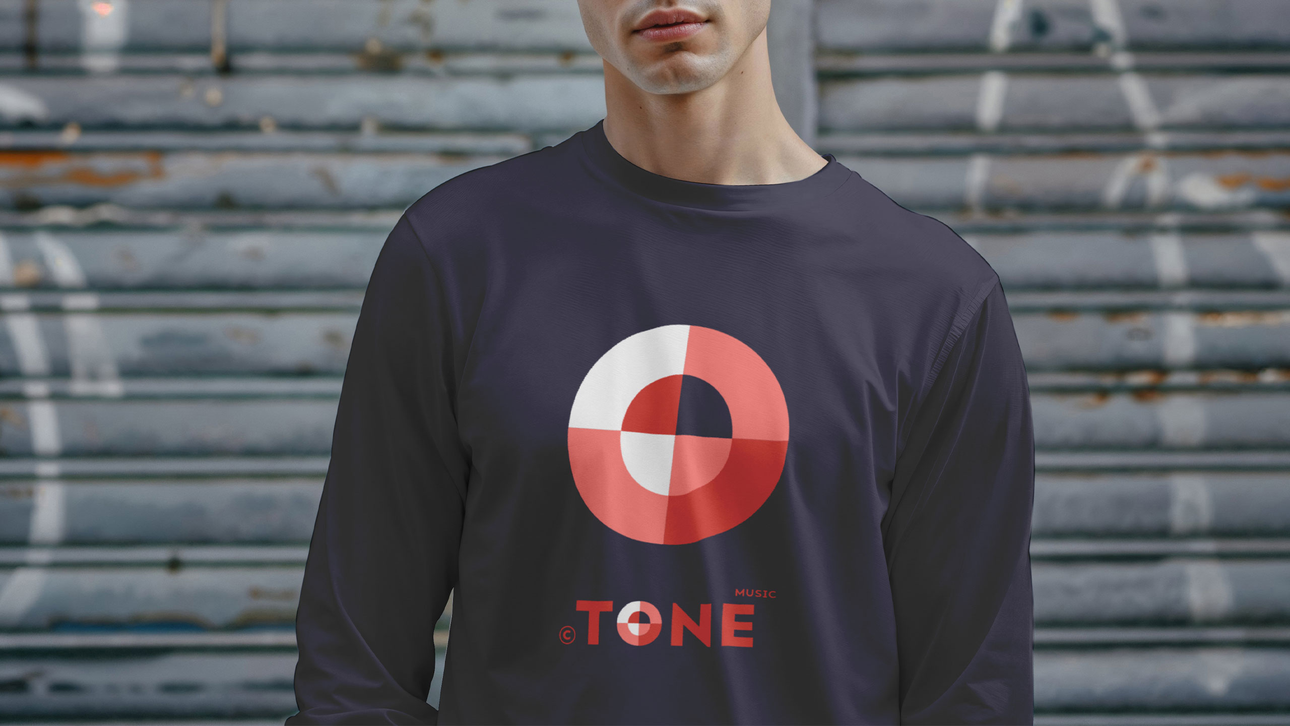
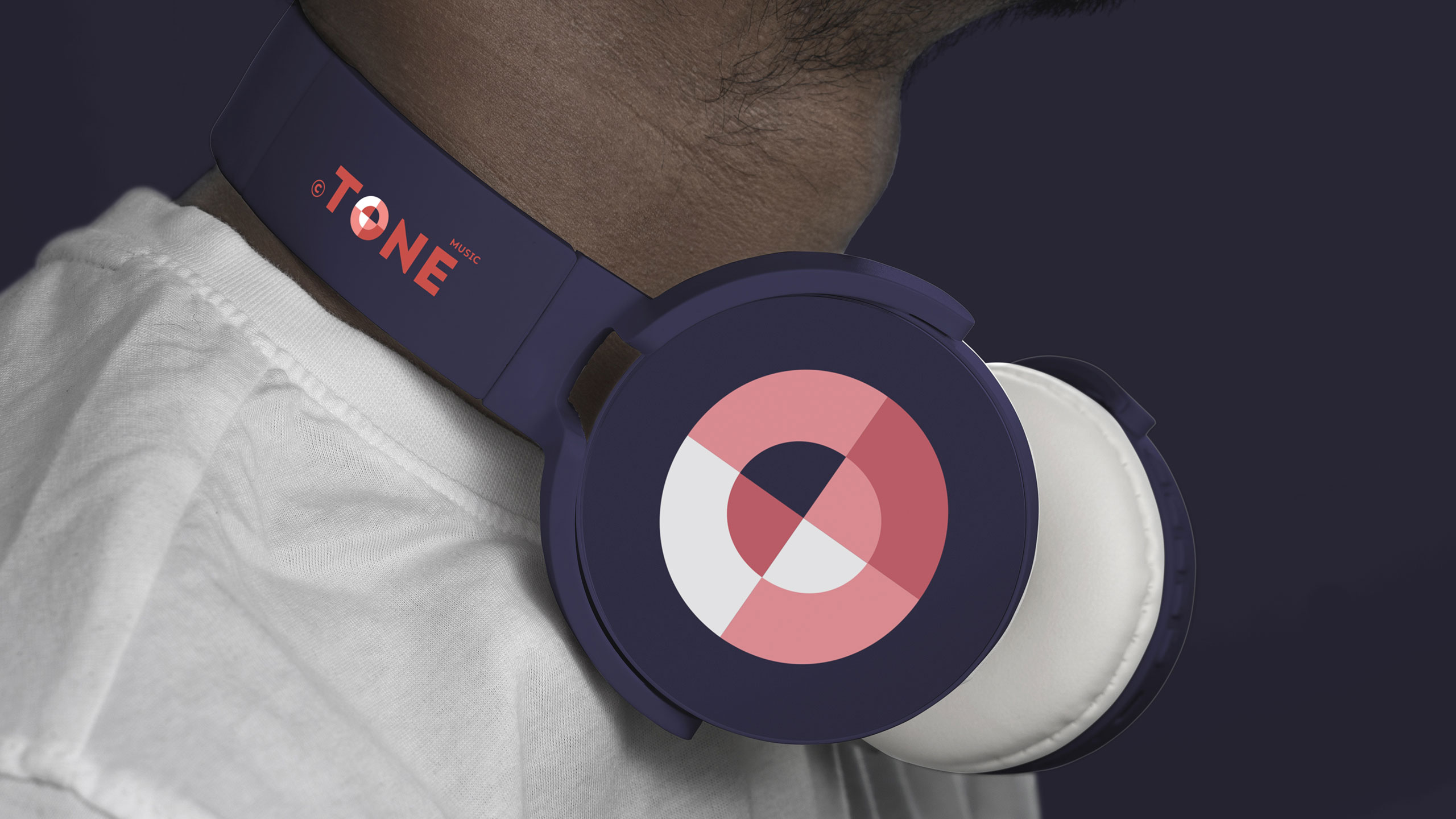
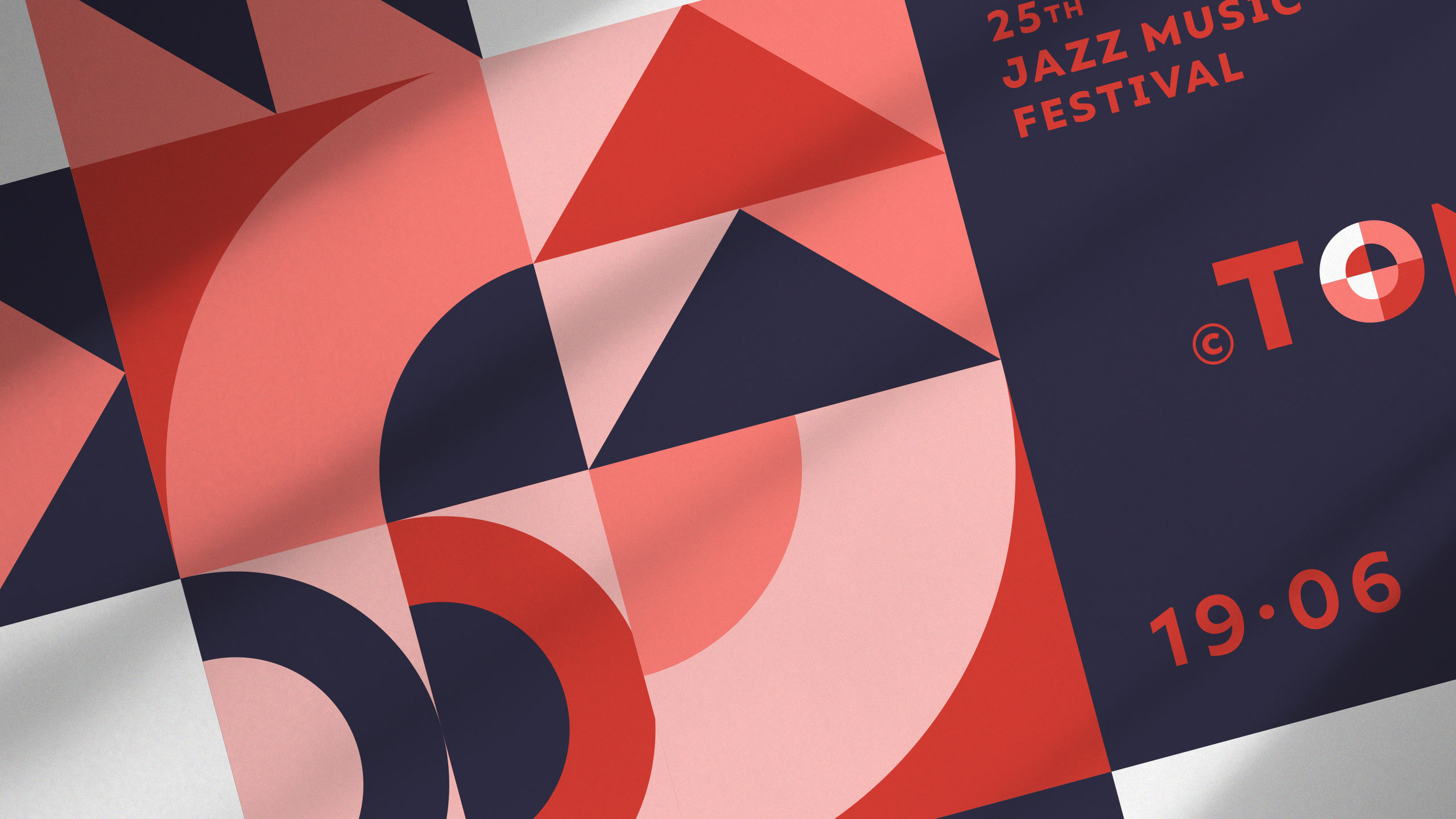
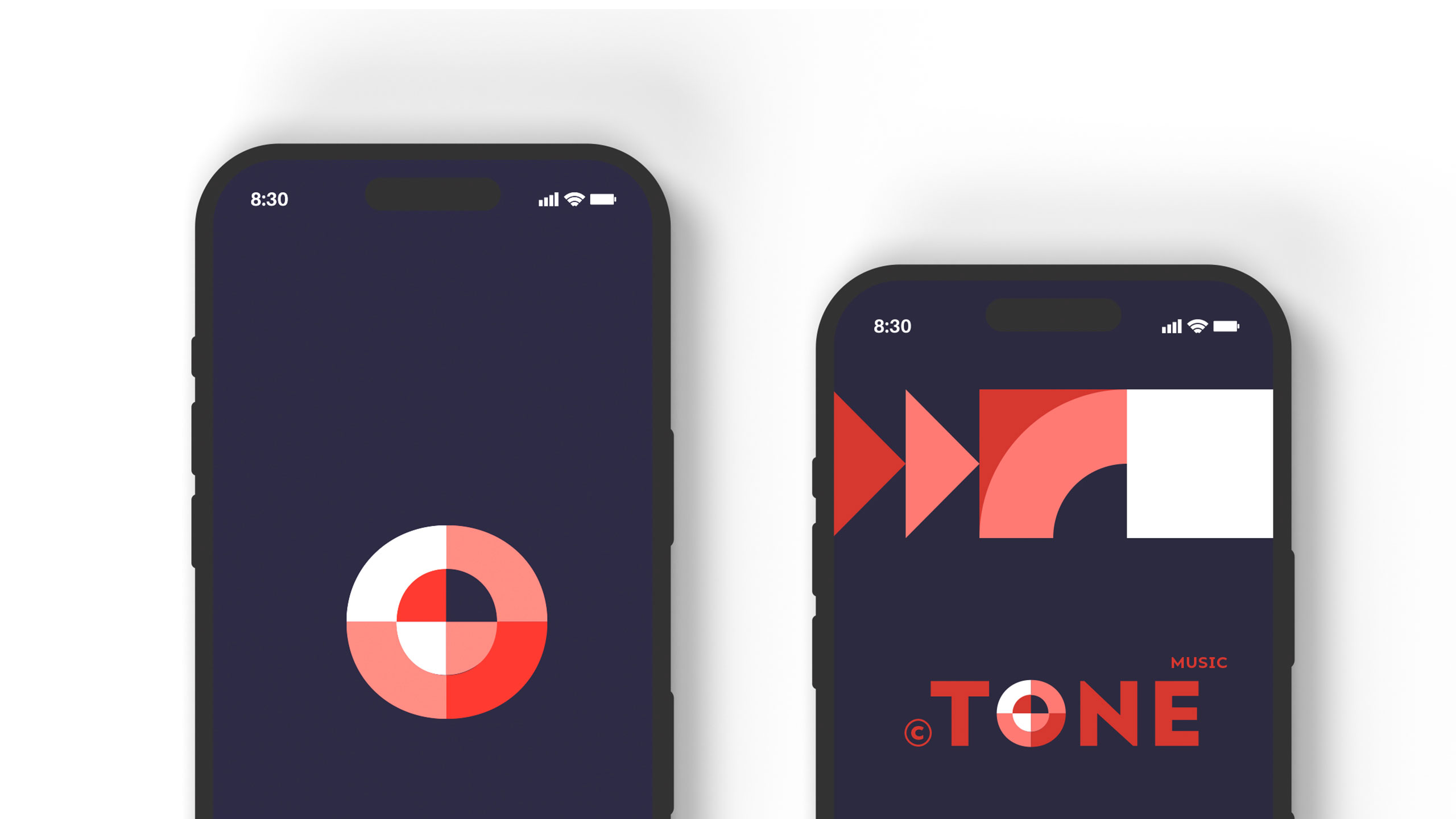
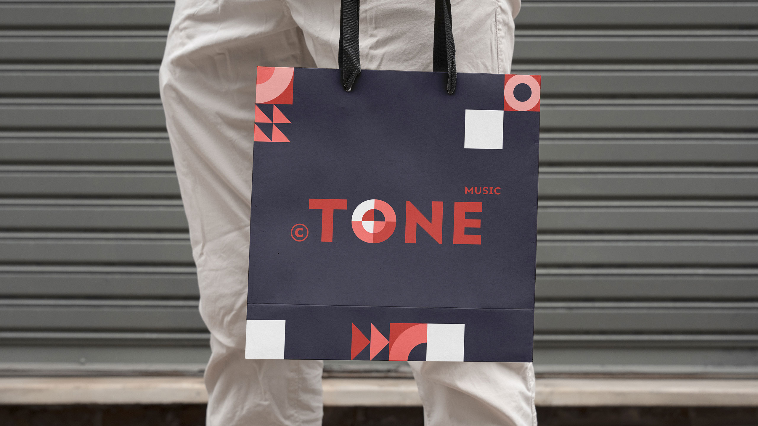
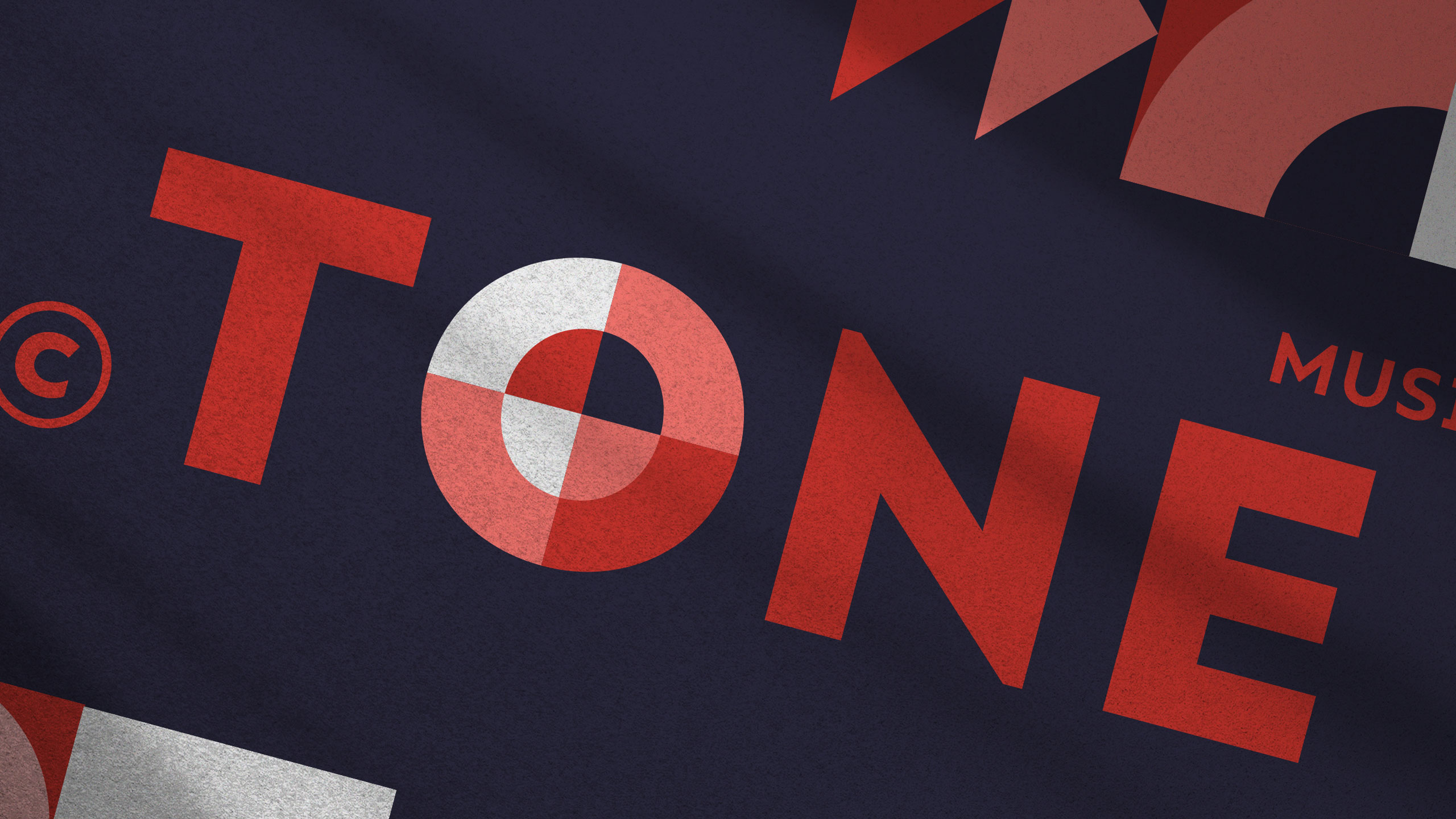
The graphic design for the "TONE" Jazz Music Festival combines modernism with retro geometric flair. Displayed across a trio of posters, the visual identity uses bold blocks of red, navy, white, and pink to create rhythm and movement—mirroring the musical theme. Circular, triangular, and angular forms evoke vinyl records, sound waves, and architectural precision.
Typography and Identity
The typography is clean and assertive, with the letter "O" playfully turned into a visual beat. This system of shapes and grids delivers a striking, consistent branding that is both festive and sophisticated. It celebrates jazz as structure and spontaneity—music in graphic motion.
Related
03
Whether you prefer a quick call or a detailed message, we're here to listen.

OVER

Café Lenoirs

Blen-Beck

Whare House