


Description
02
The Core Challenge
How can graphic design communicate both craftsmanship and eco-conscious professionalism? Whare House uses vintage textures, natural kraft tones, and a clear system to reflect heritage, authenticity, and refined coffee expertise.
Visual Language and System
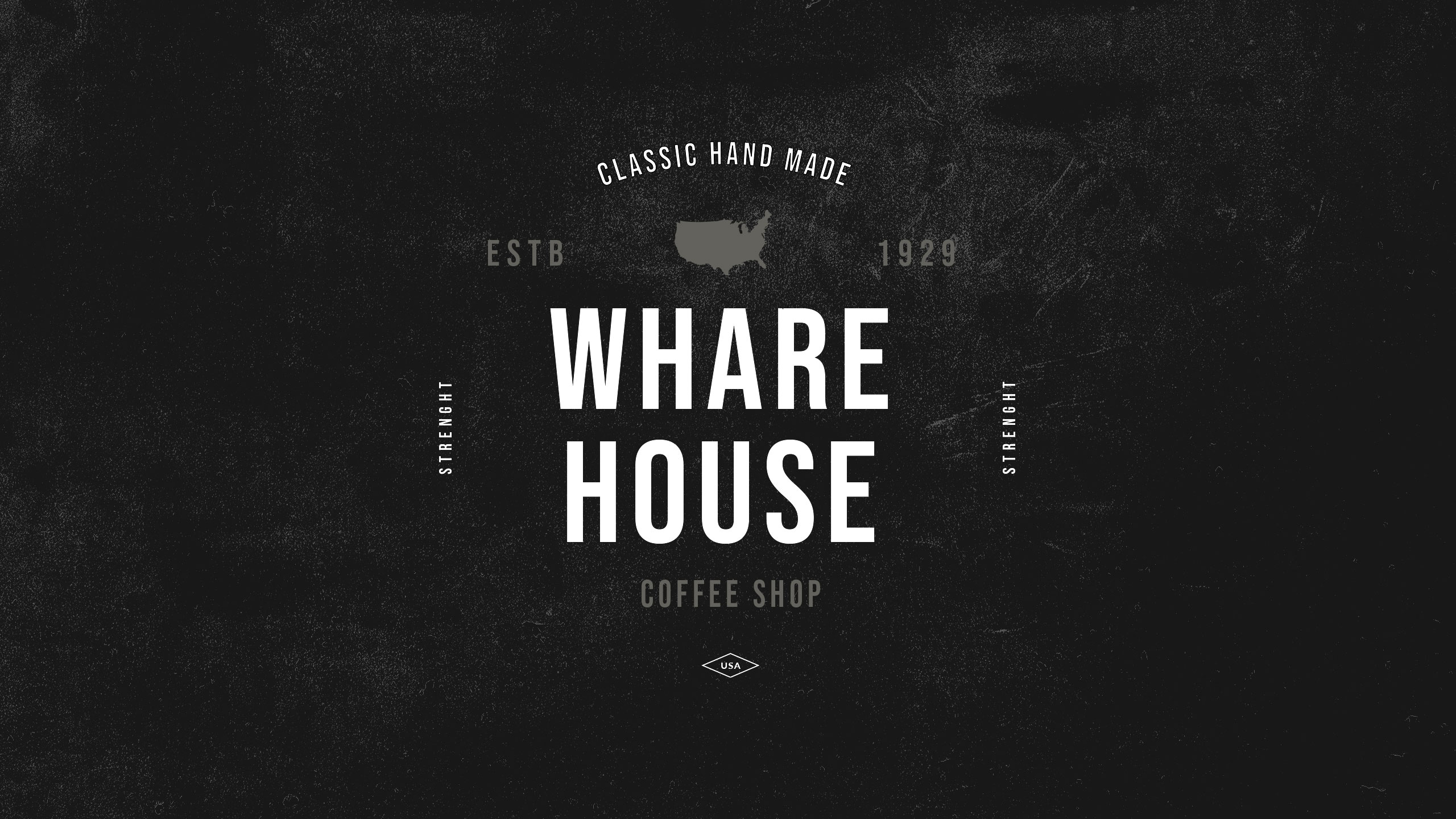
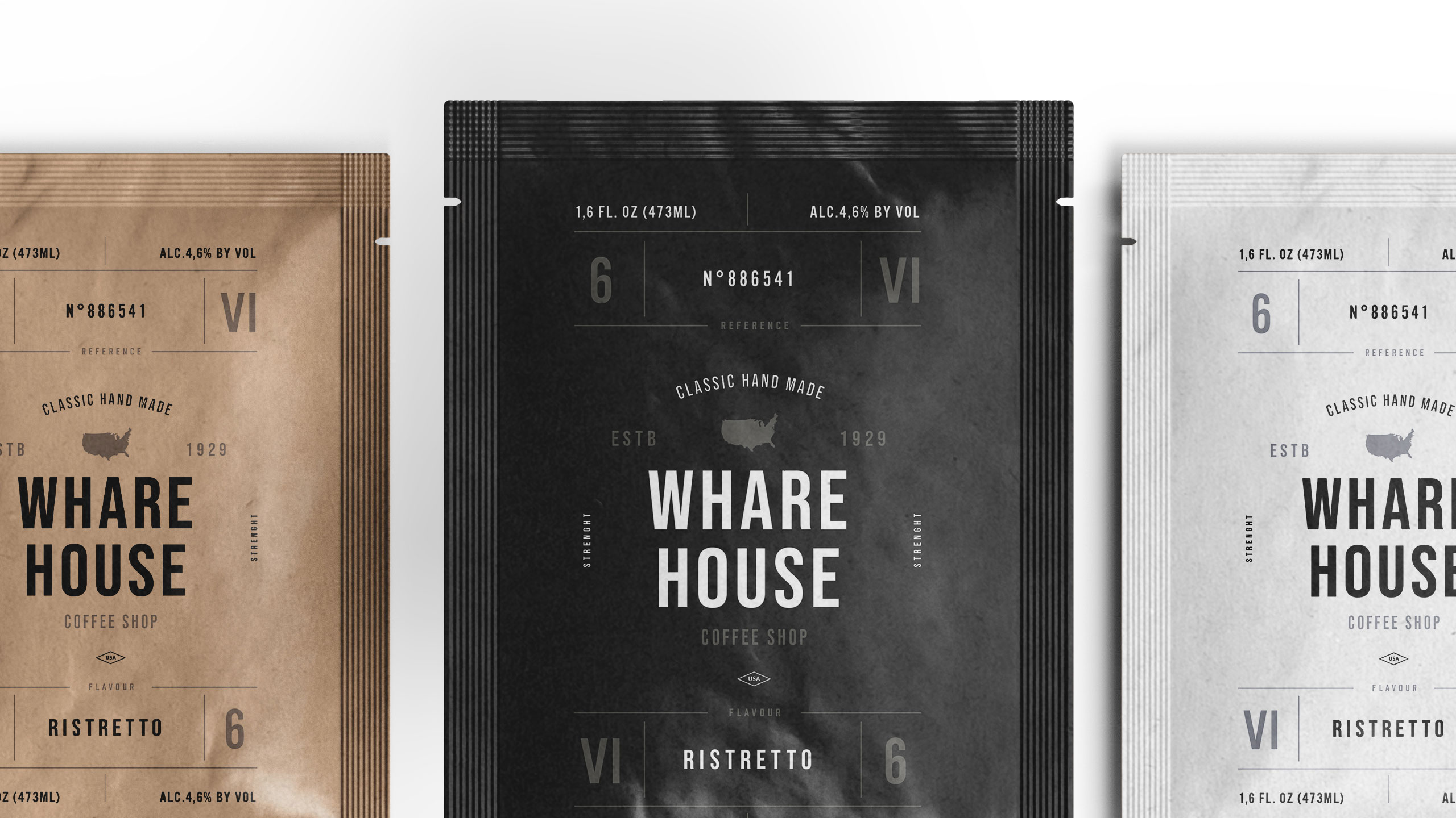
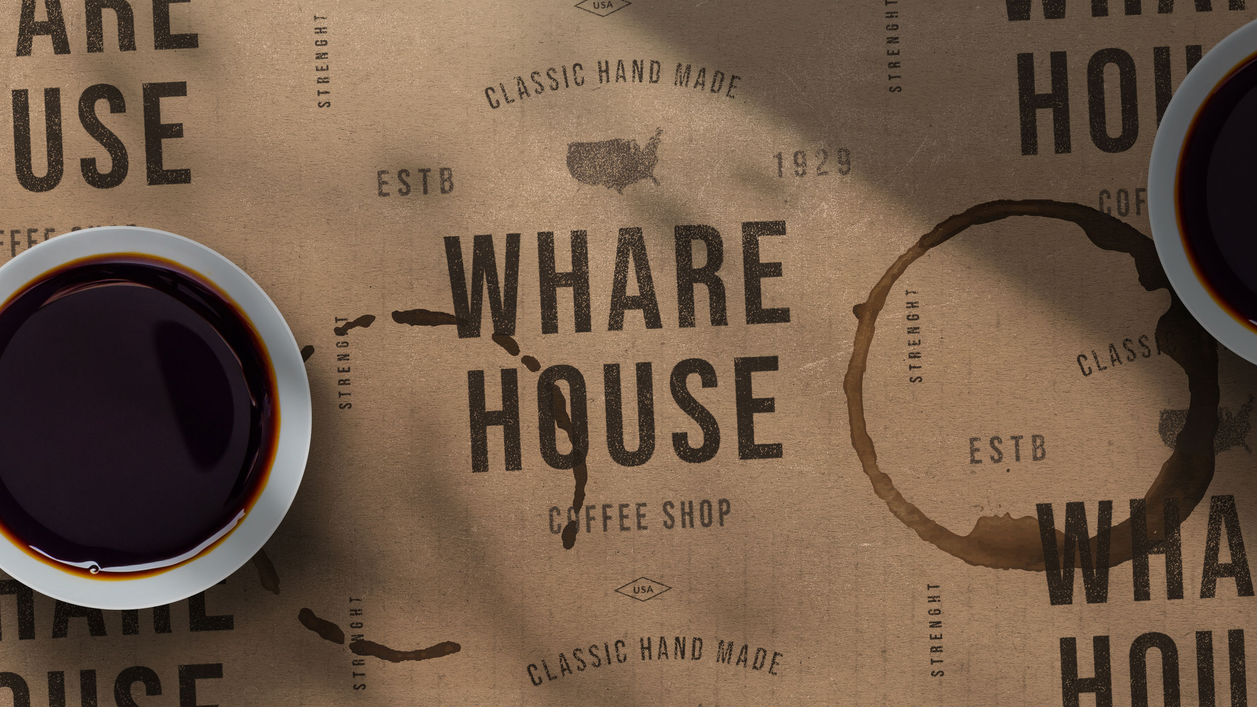
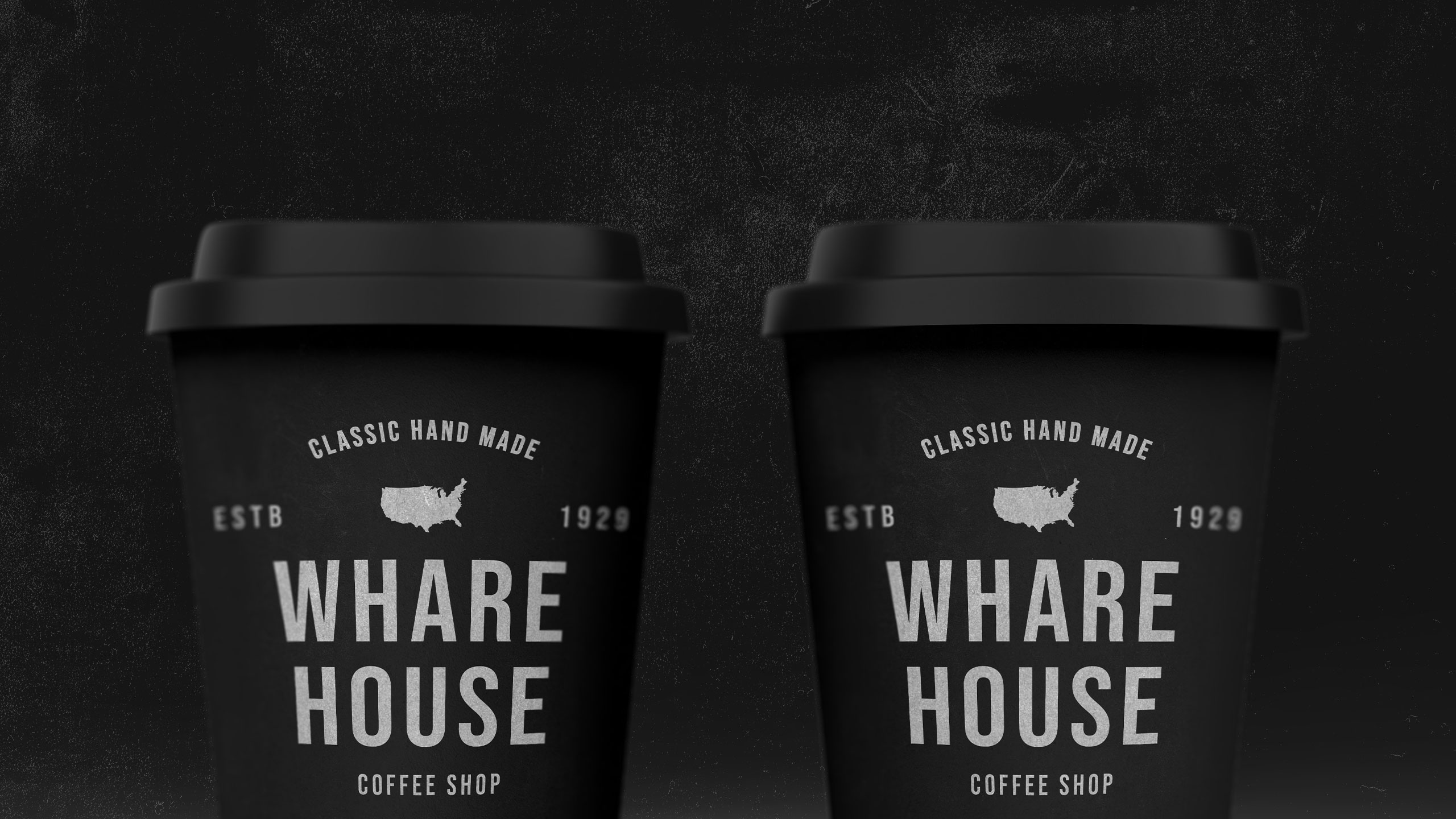
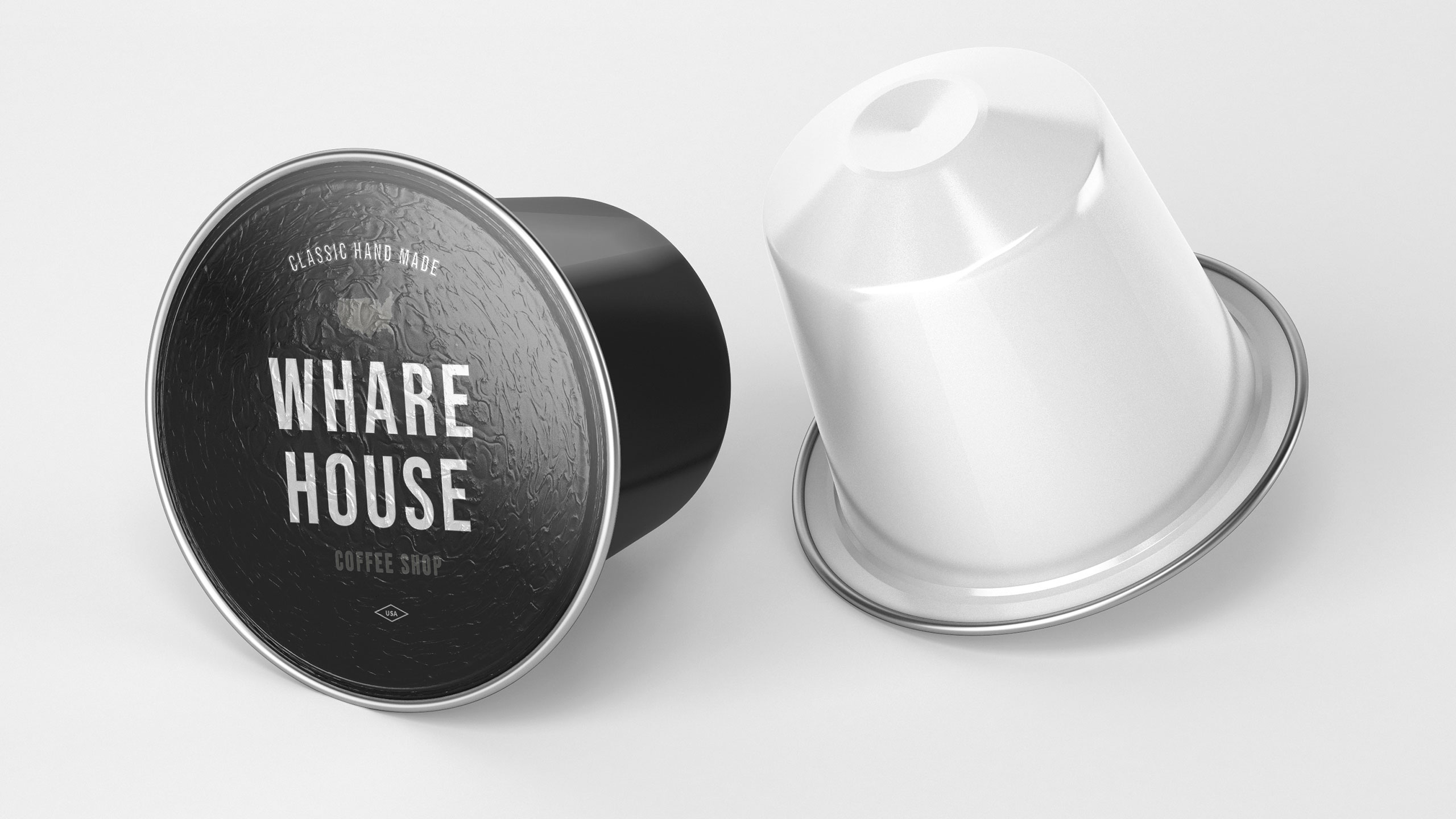
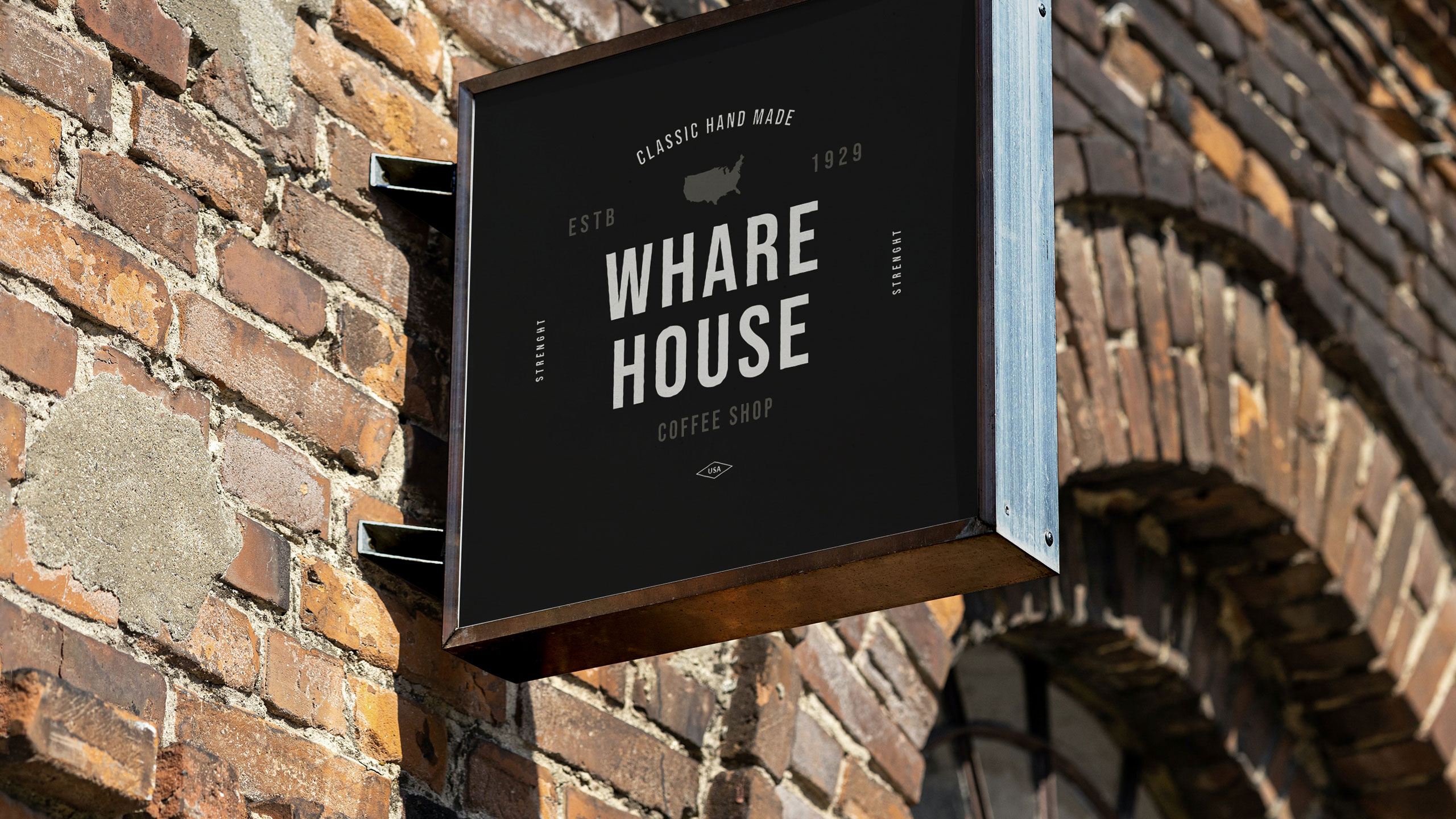
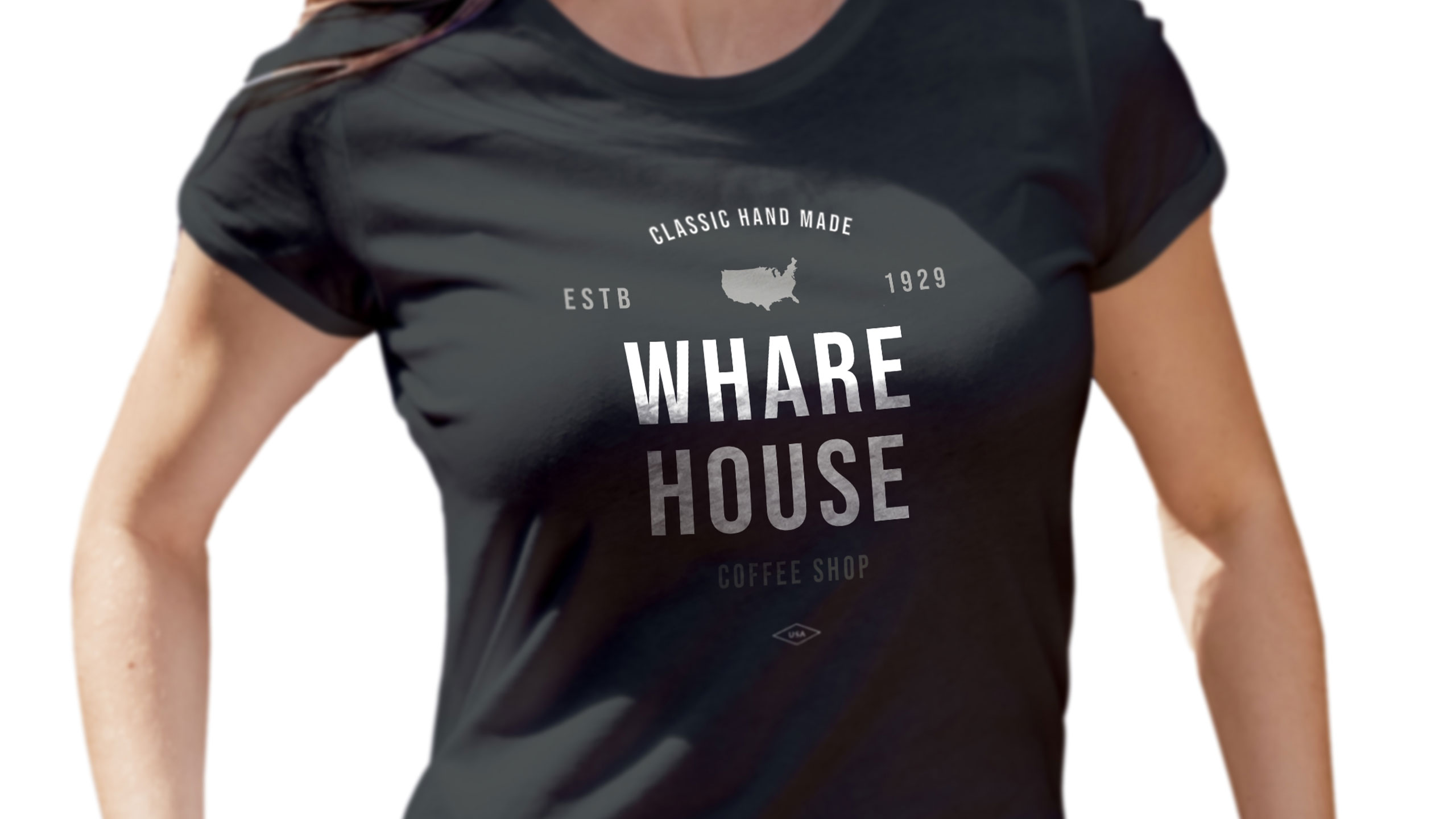
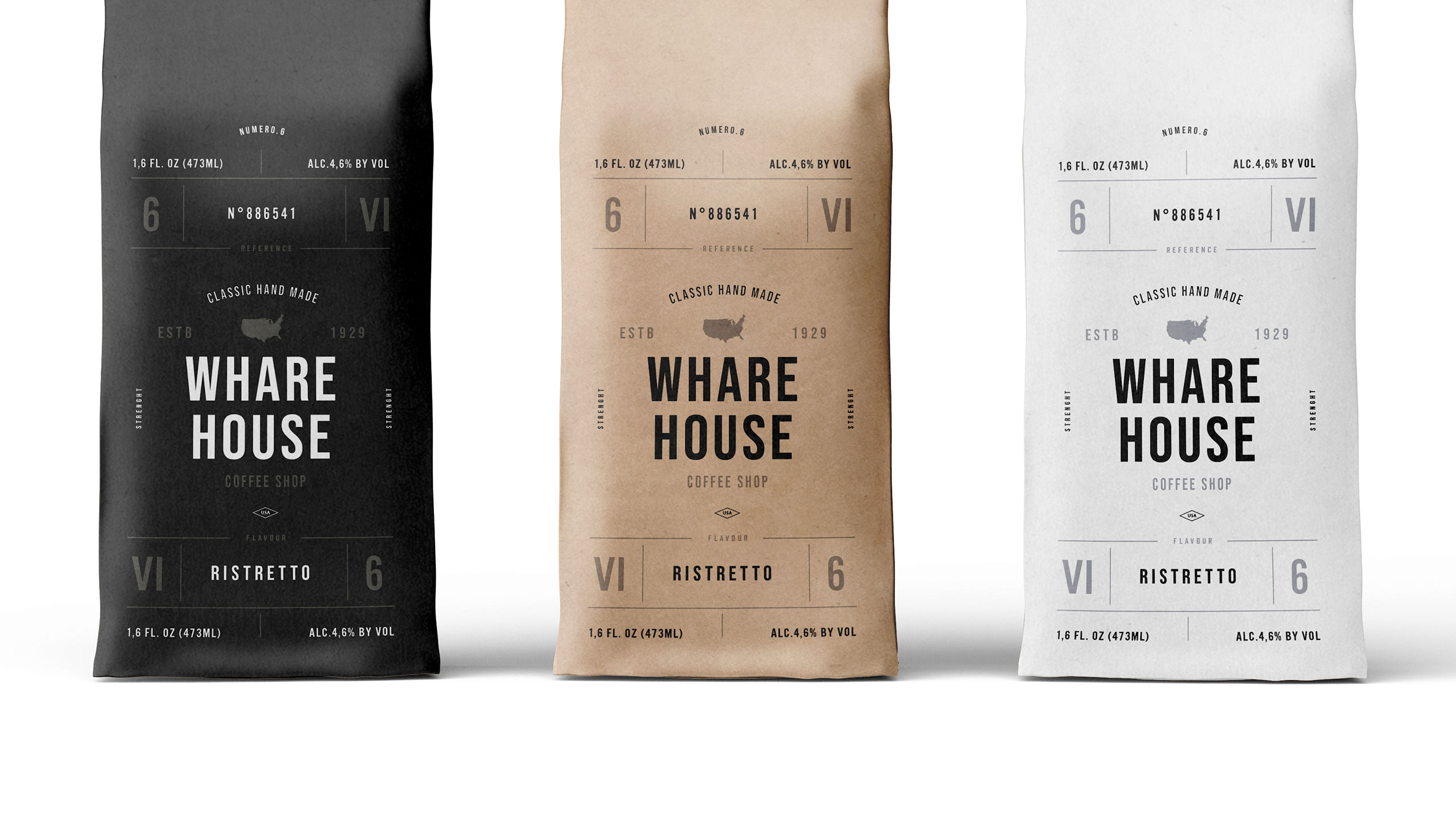
The graphic design of Whare House evokes the world of docks, cargo, and storage sheds, aligning with the brand's identity rooted in craftsmanship and logistics. Dominated by natural kraft, black, and white, the visual language reflects an artisanal, eco-conscious ethos. The branding blends vintage textures with modern minimalism, suggesting heritage and professionalism. Coffee products are clearly structured using a numbered and color-coded system based on intensity.
Application and Identity
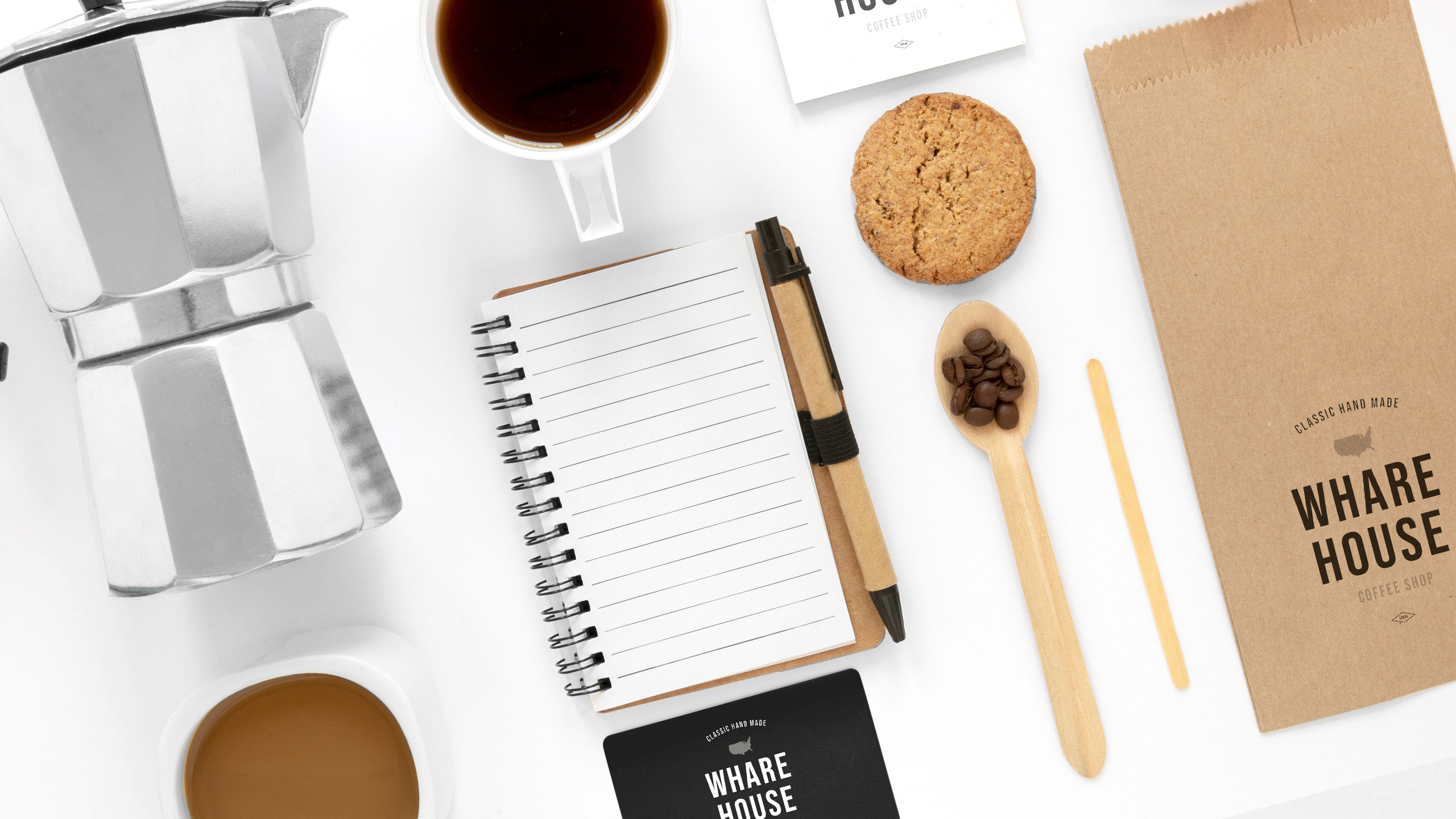
Applied to bags, cups, aprons, and stationery, the design communicates consistency and authenticity. Whare House aims to bring the expertise of a leading coffee distributor directly to the customer in an accessible and refined form.
Related
03
Whether you prefer a quick call or a detailed message, we're here to listen.

OVER

Café Lenoirs

Blen-Beck
Whare House