


Description
02
The Core Challenge
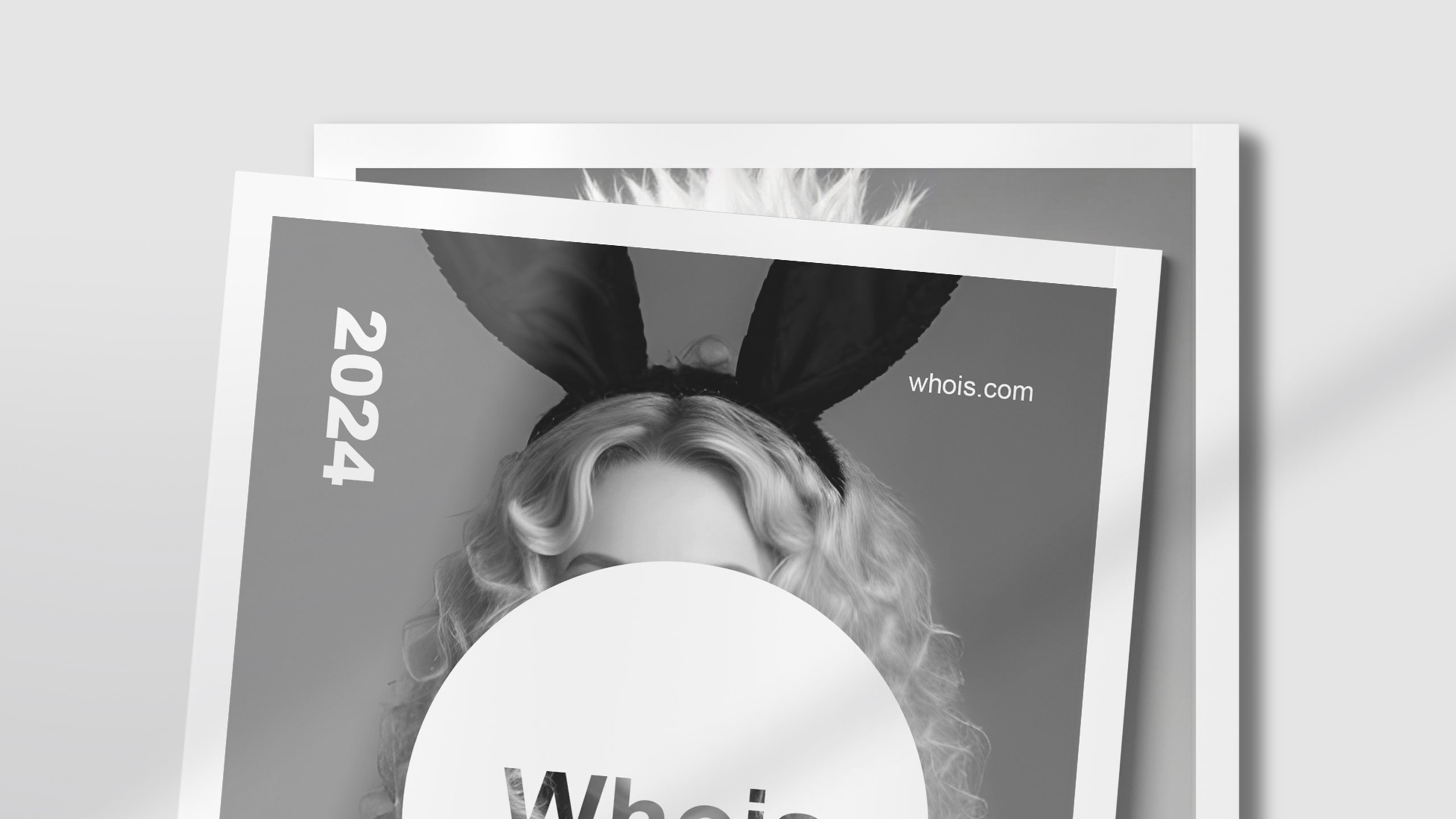
How can graphic design challenge conventions while preserving clarity? Whois magazine uses black-and-white contrasts and subtle distortions, turning its logo into a visual riddle that provokes curiosity and questions identity.
Visual Language and Structure
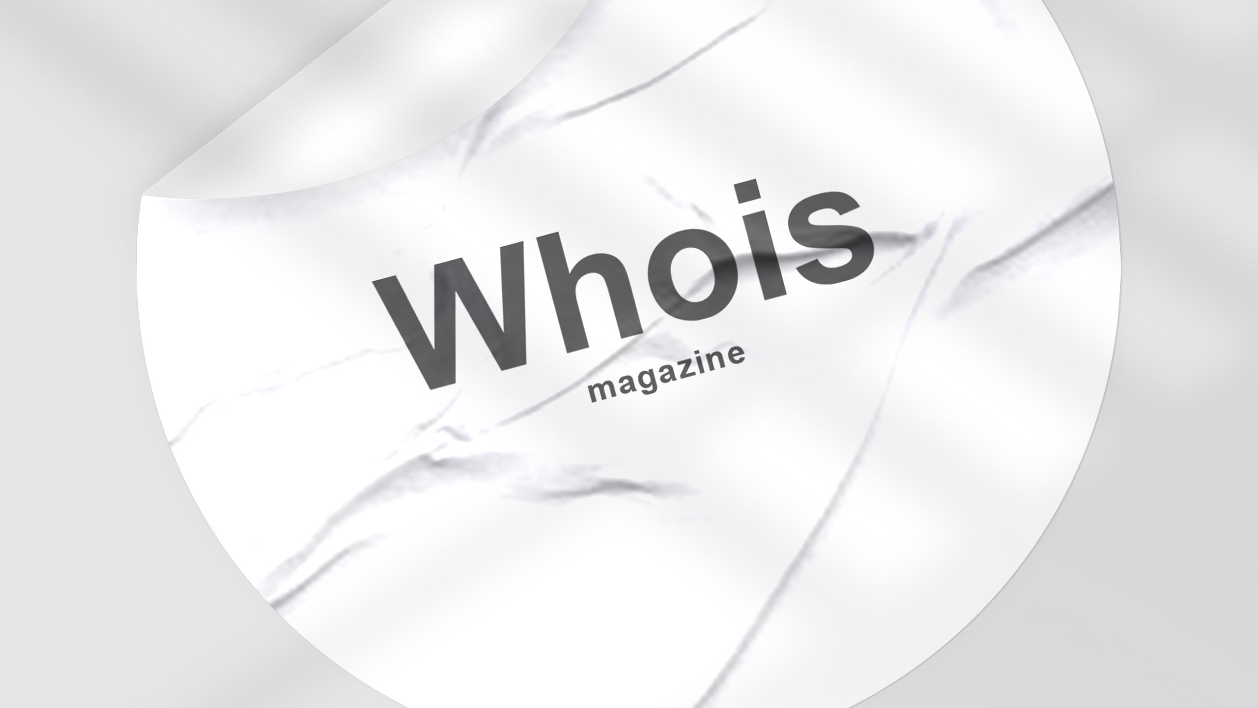
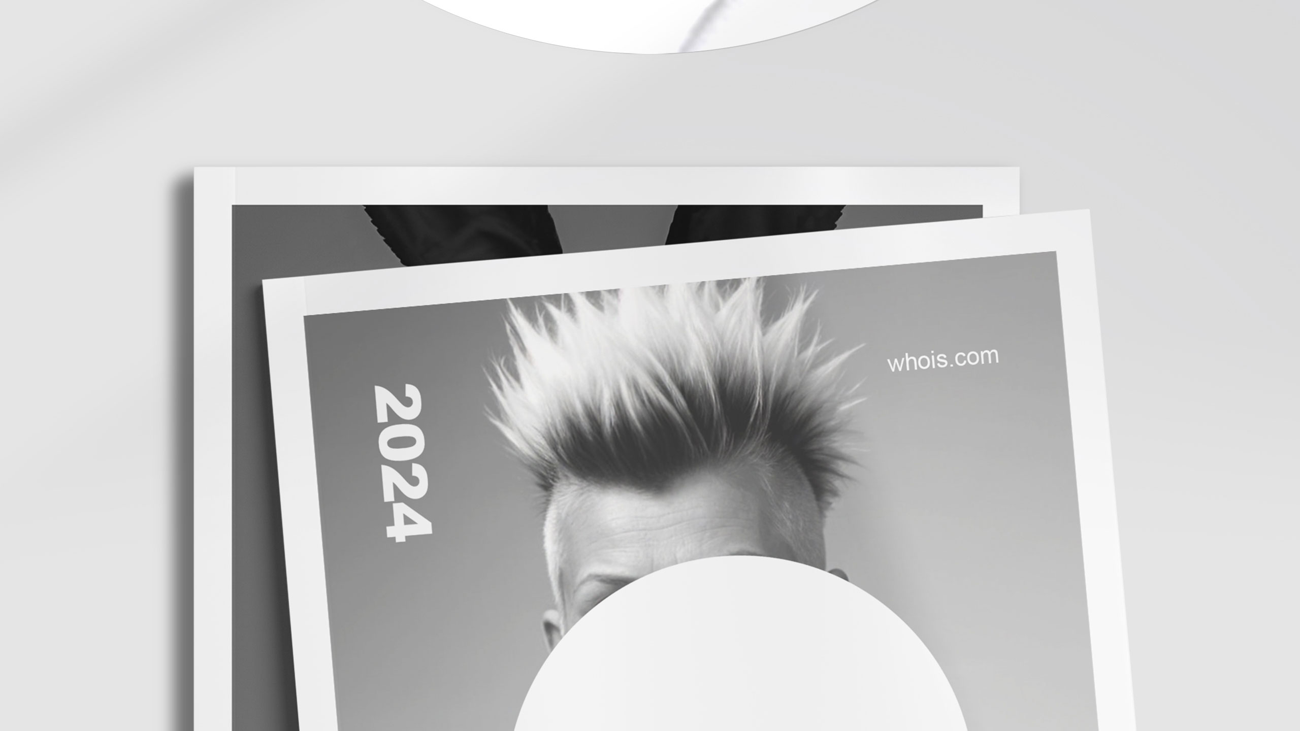
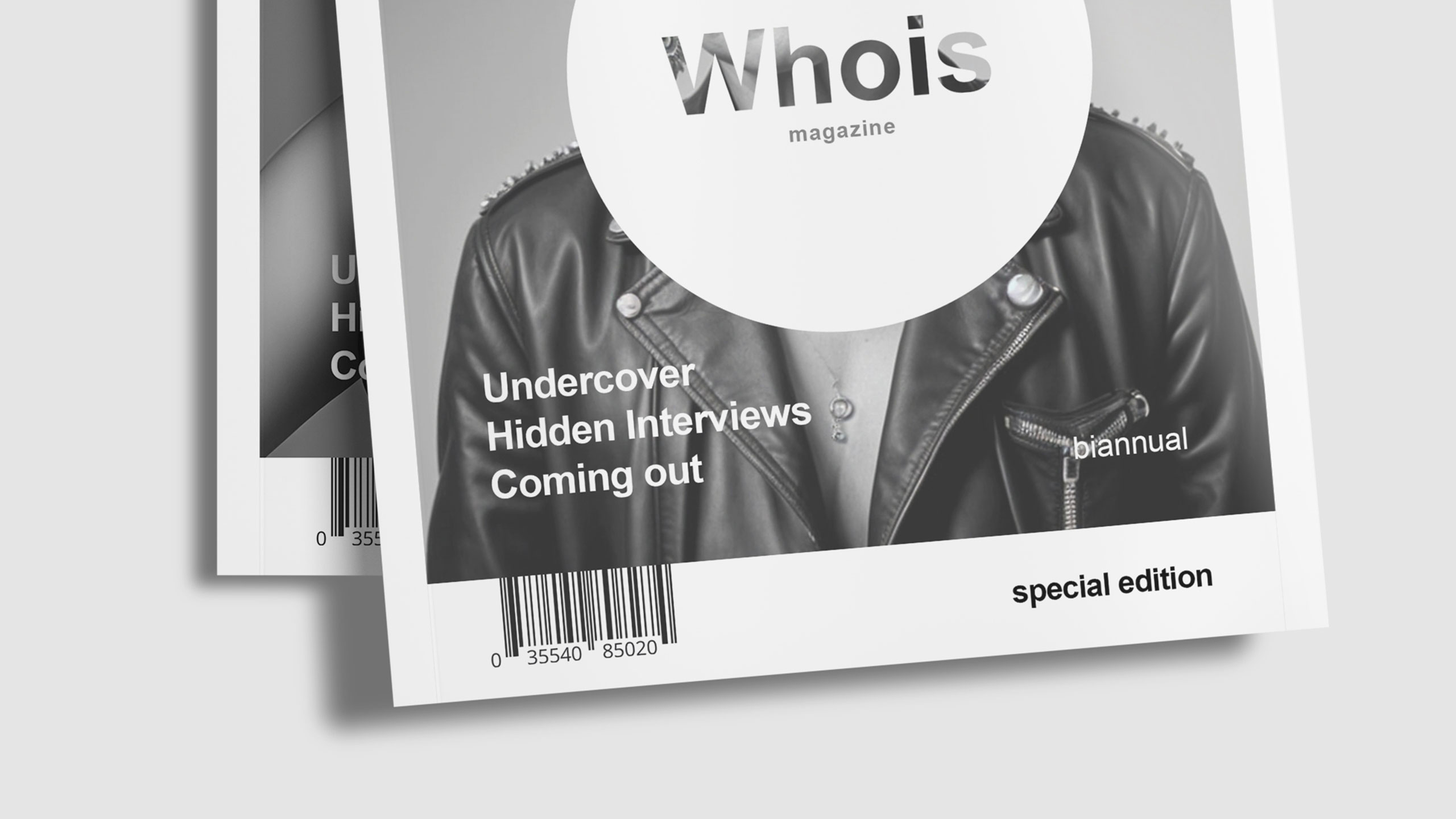
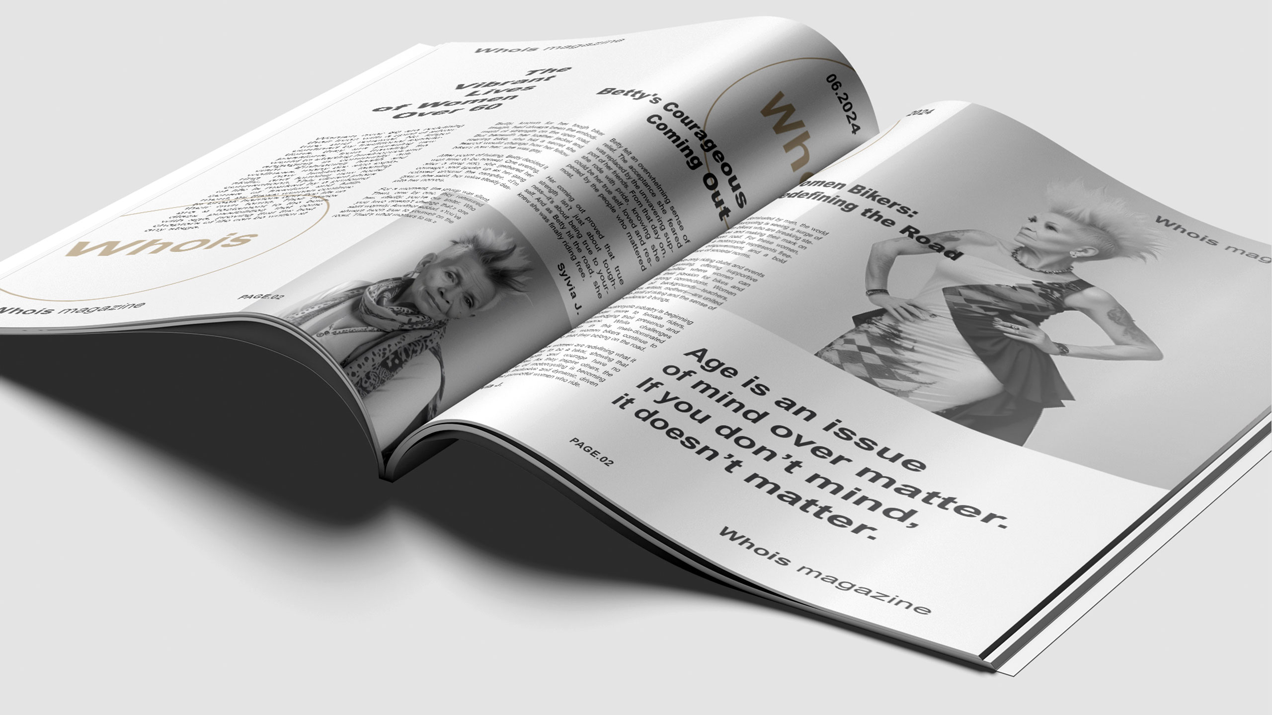
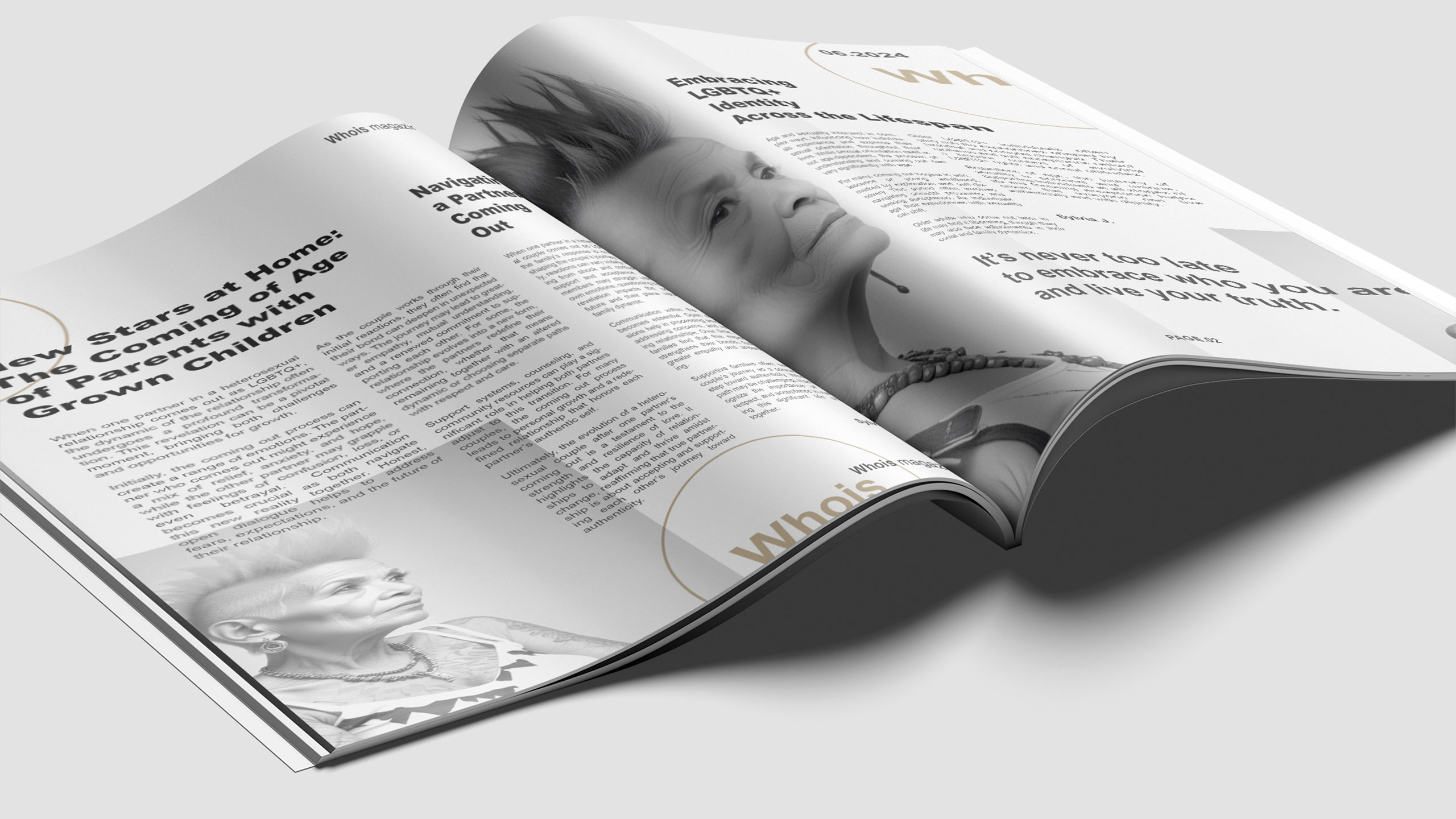
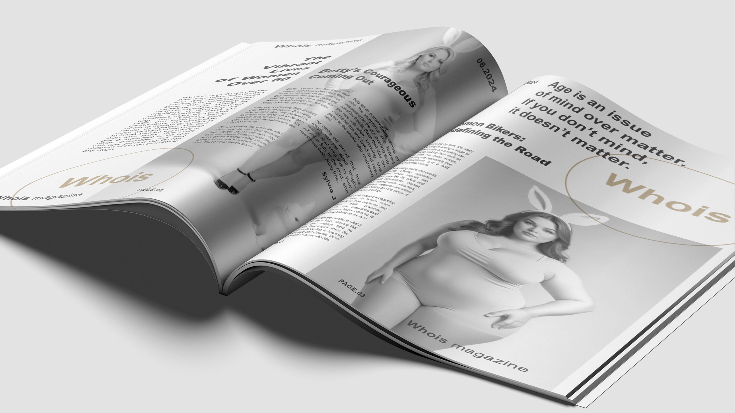
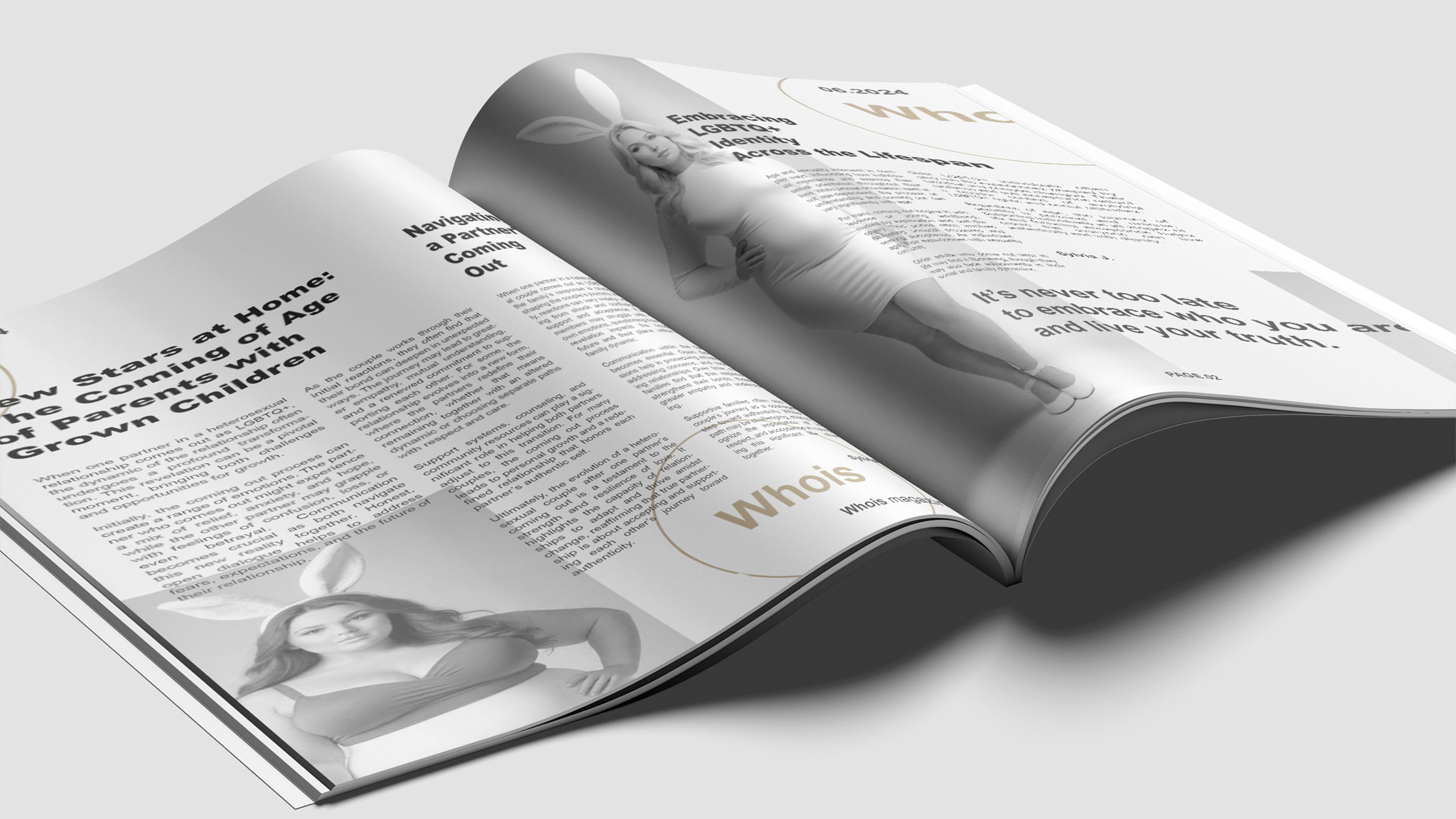
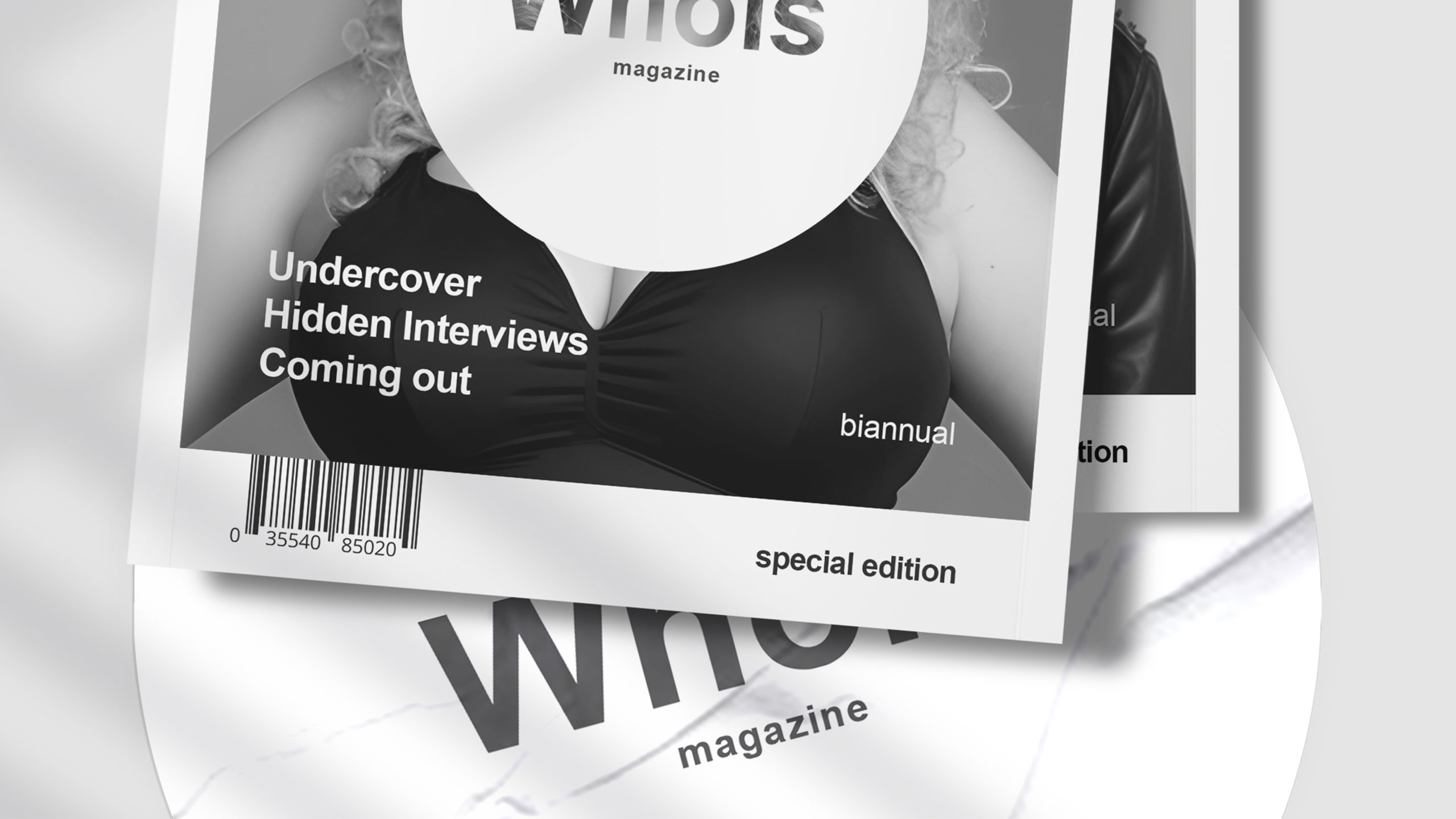
The graphic design of Whois magazine, a publication focused on minorities and singularities, uses a predominantly black and white color palette. The layout follows a classic column structure but subtly distorts it, suggesting a challenge to conventional norms.
Logo Concept and Mission
The logo "Whois" on the cover is placed inside a solid circle, resembling a no-entry traffic sign, partially censoring the visual beneath. This bold graphic choice transforms the title into a riddle — "Who is?" — sparking curiosity. The magazine's design plays with codes, hinting at disruption while maintaining readability, aligning with its mission to question, reveal, and provoke.
Related
03
Whether you prefer a quick call or a detailed message, we're here to listen.
Whois

White Spirit

Inkonito

X-Ray