


Description
02
The Core Challenge
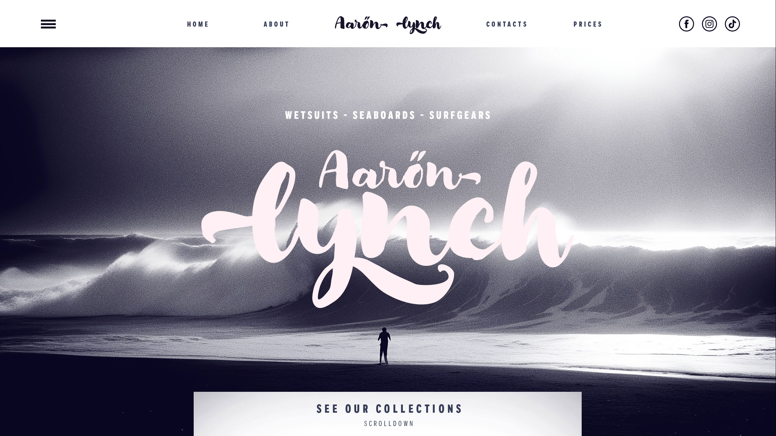
How to capture raw surf culture digitally? Aaron Lynch's site blends pale pink and mauve with handwritten brush typography, creating an authentic, laid-back vibe that celebrates freedom and artistic spirit.
Visual Language and Layout
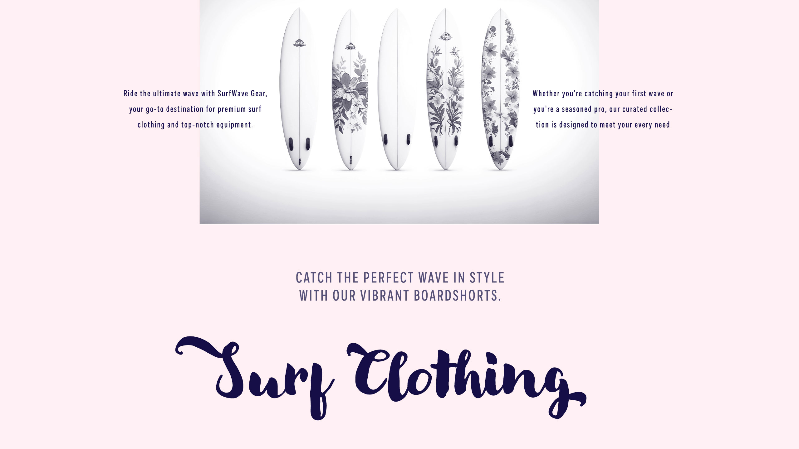
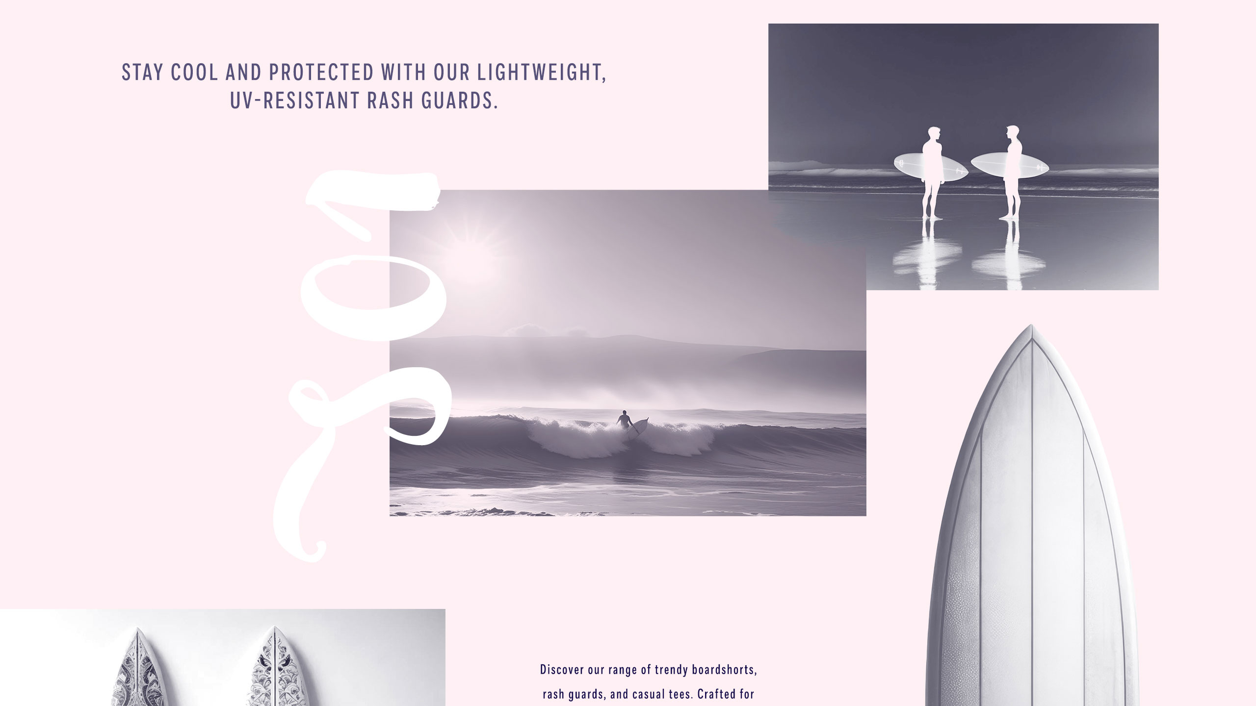
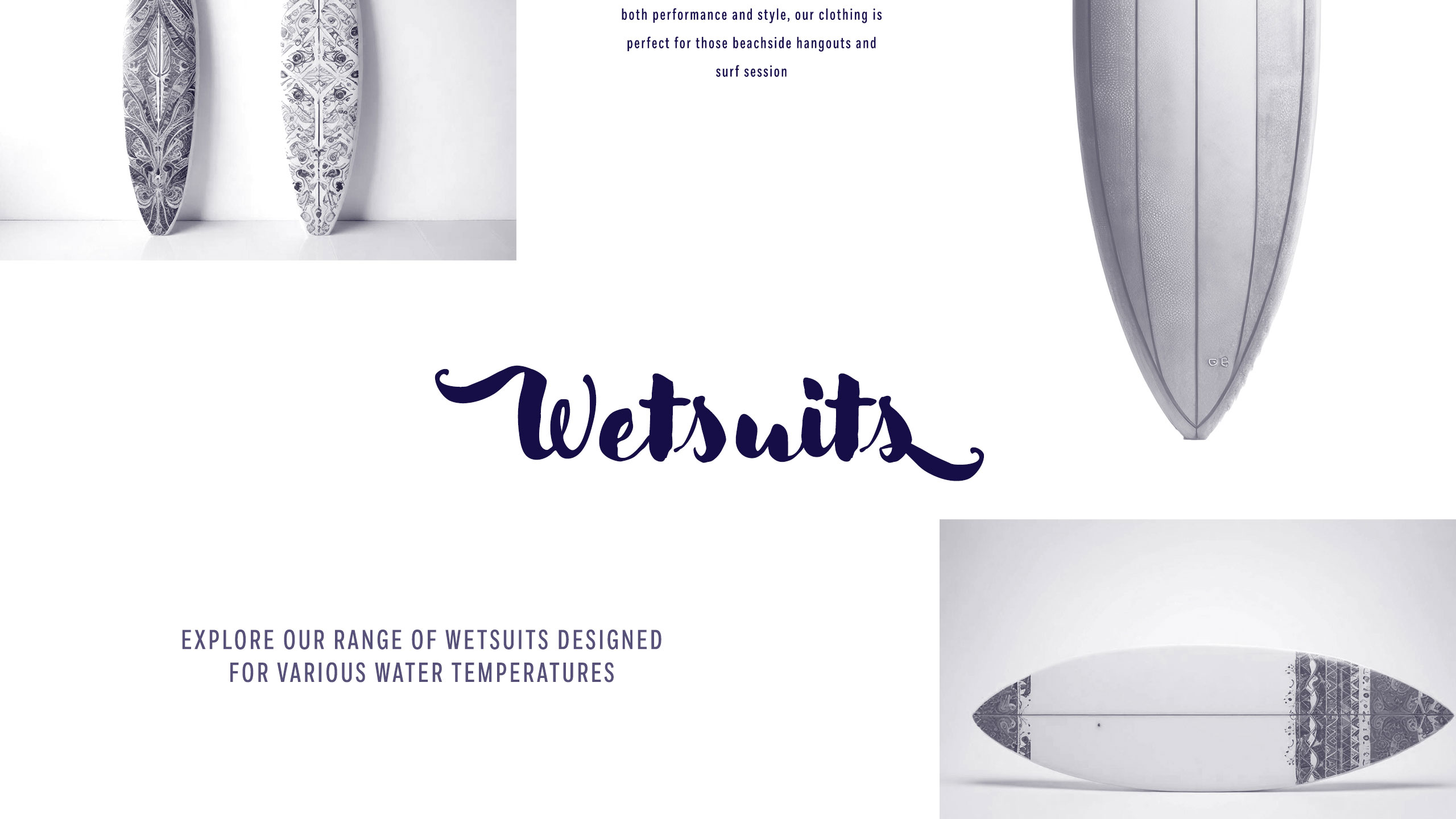
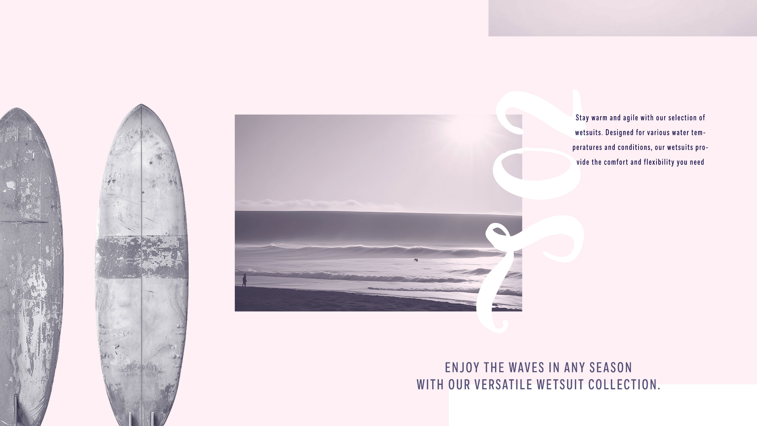
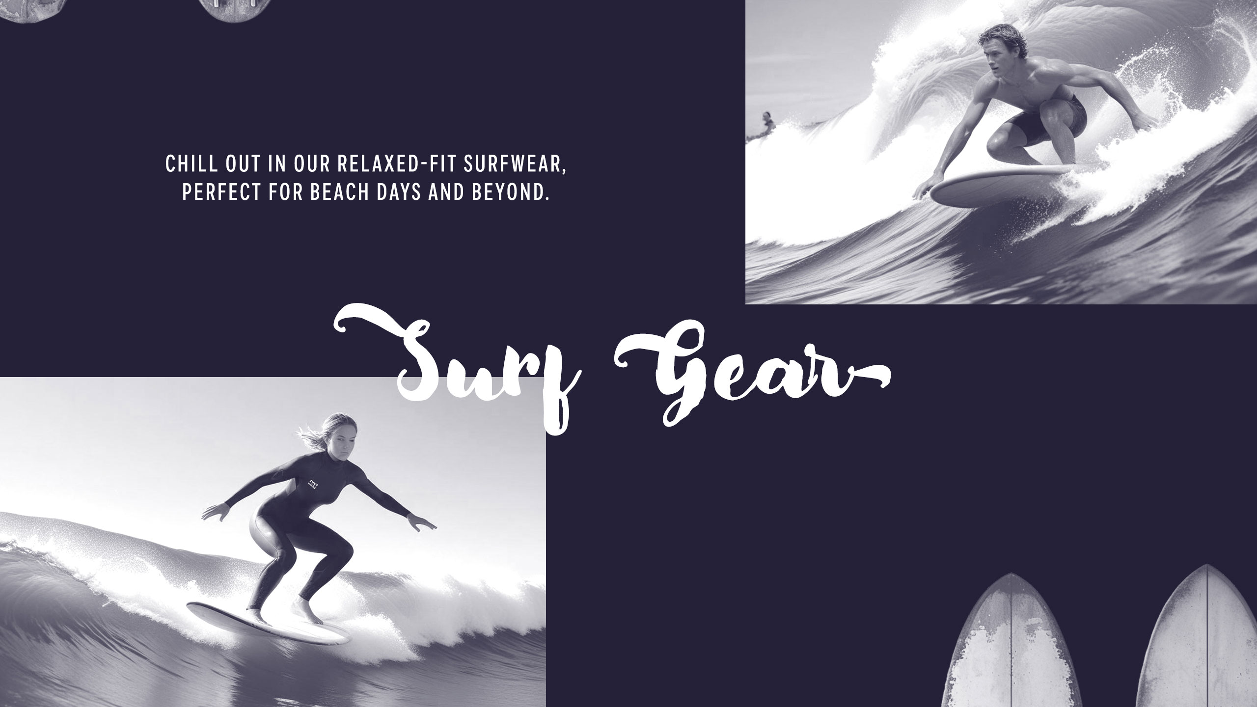
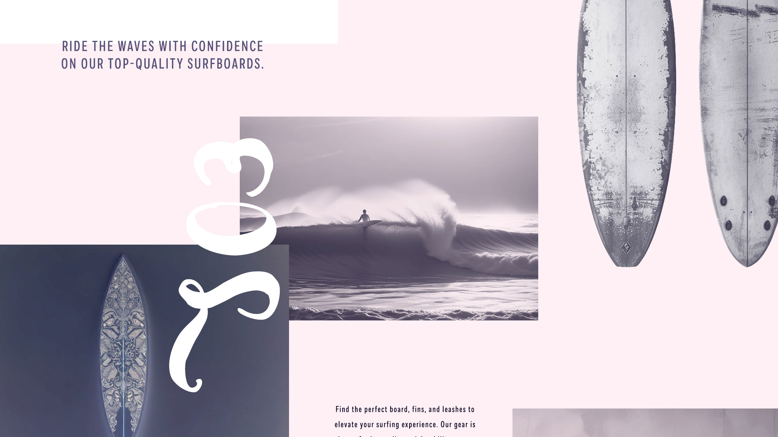
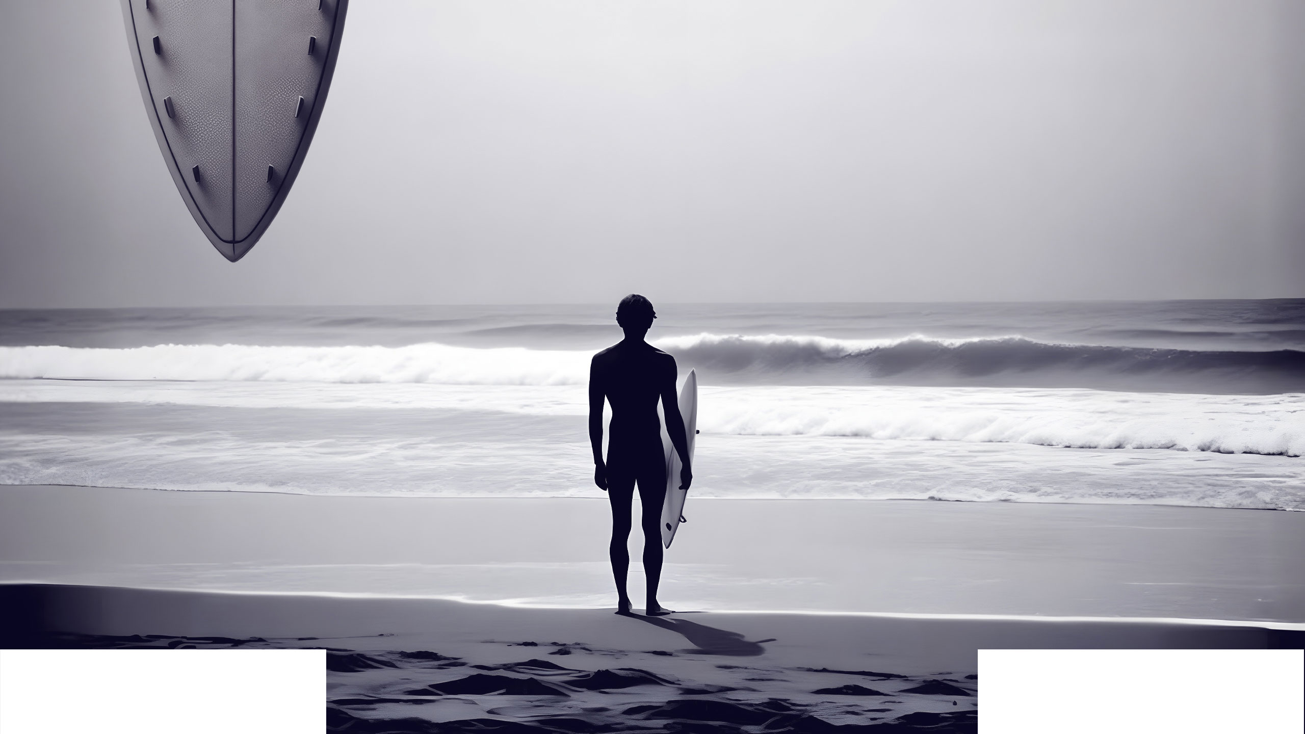
The graphic design of Aaron Lynch's showcase website reflects the brand's laid-back, authentic surf culture. Using a very pale pink and deep mauve color palette, the site features surfboards displayed like spontaneous snapshots—scattered casually across the canvas like fridge memories. This creates a carefree, effortless vibe.
Typography, Boards, and Identity
The logo and headings use bold, handwritten brush typography, reinforcing the idea of a personal, artistic signature—Aaron Lynch's mark of freedom and authenticity. The boards themselves feature tribal, minimal, or intentionally worn-out graphics, suggesting heavy use and soulful experience. Nothing flashy—just real, raw surf spirit. It's simple, it's cool, it's Aaron Lynch.
Related
03
Whether you prefer a quick call or a detailed message, we're here to listen.

Bombyx

HoverSpeed

Kerozen

Eighteen