


Description
02
The Core Challenge
How can Kerozen's graphic design balance rugged military heritage and nostalgic elegance to evoke adventure, bravery, and authenticity across diverse branded materials?
Visual Language and Application
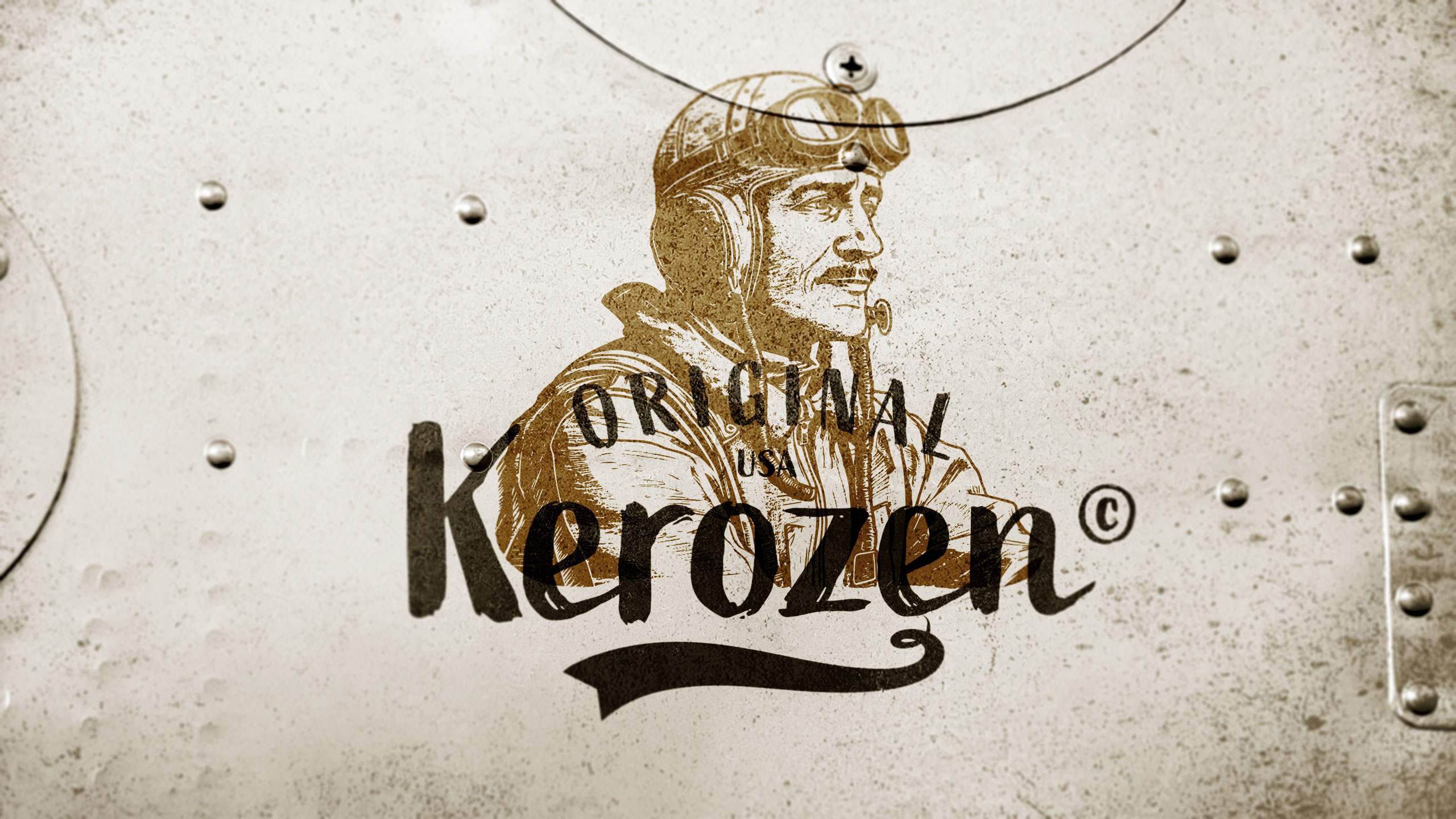
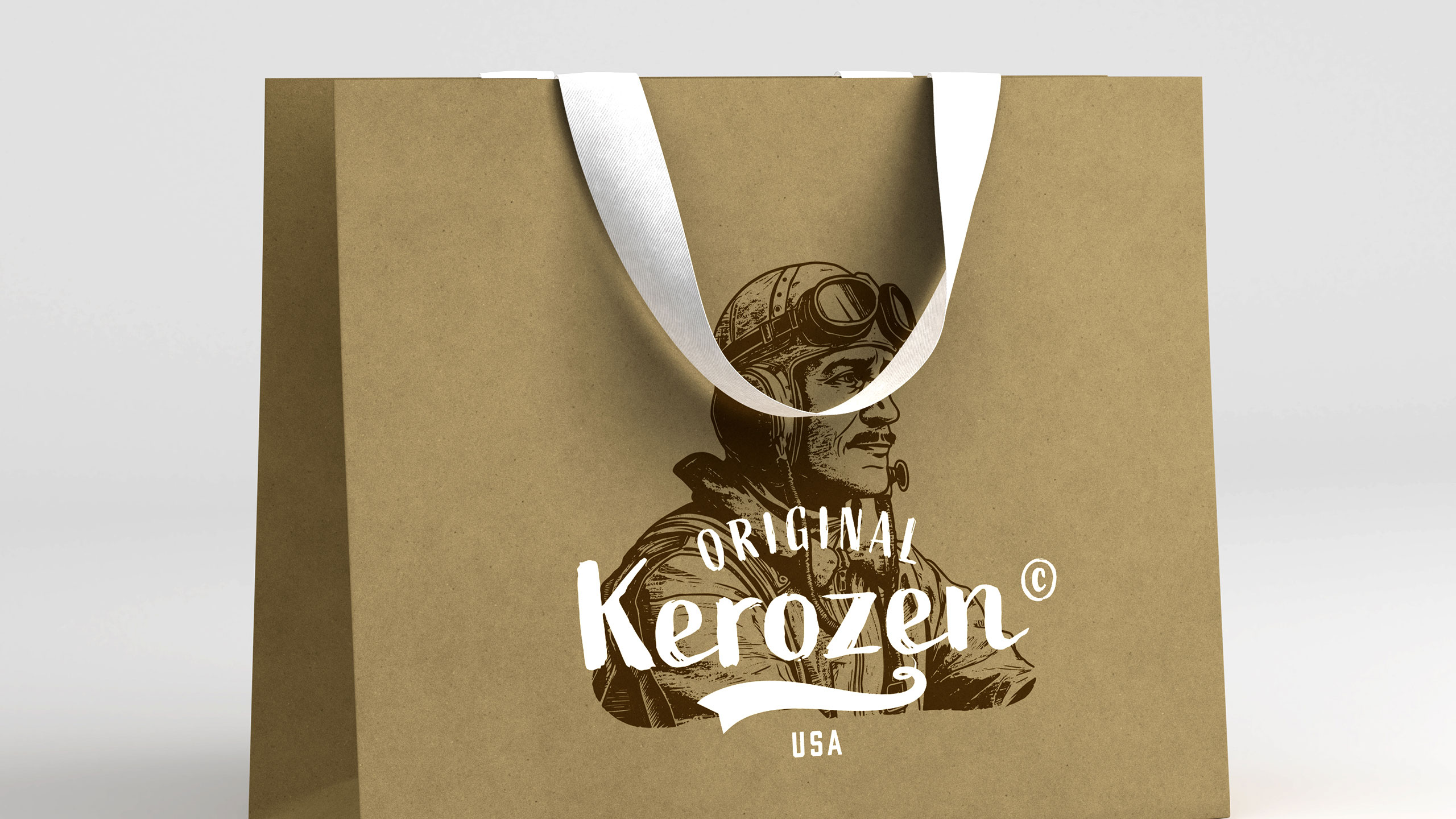
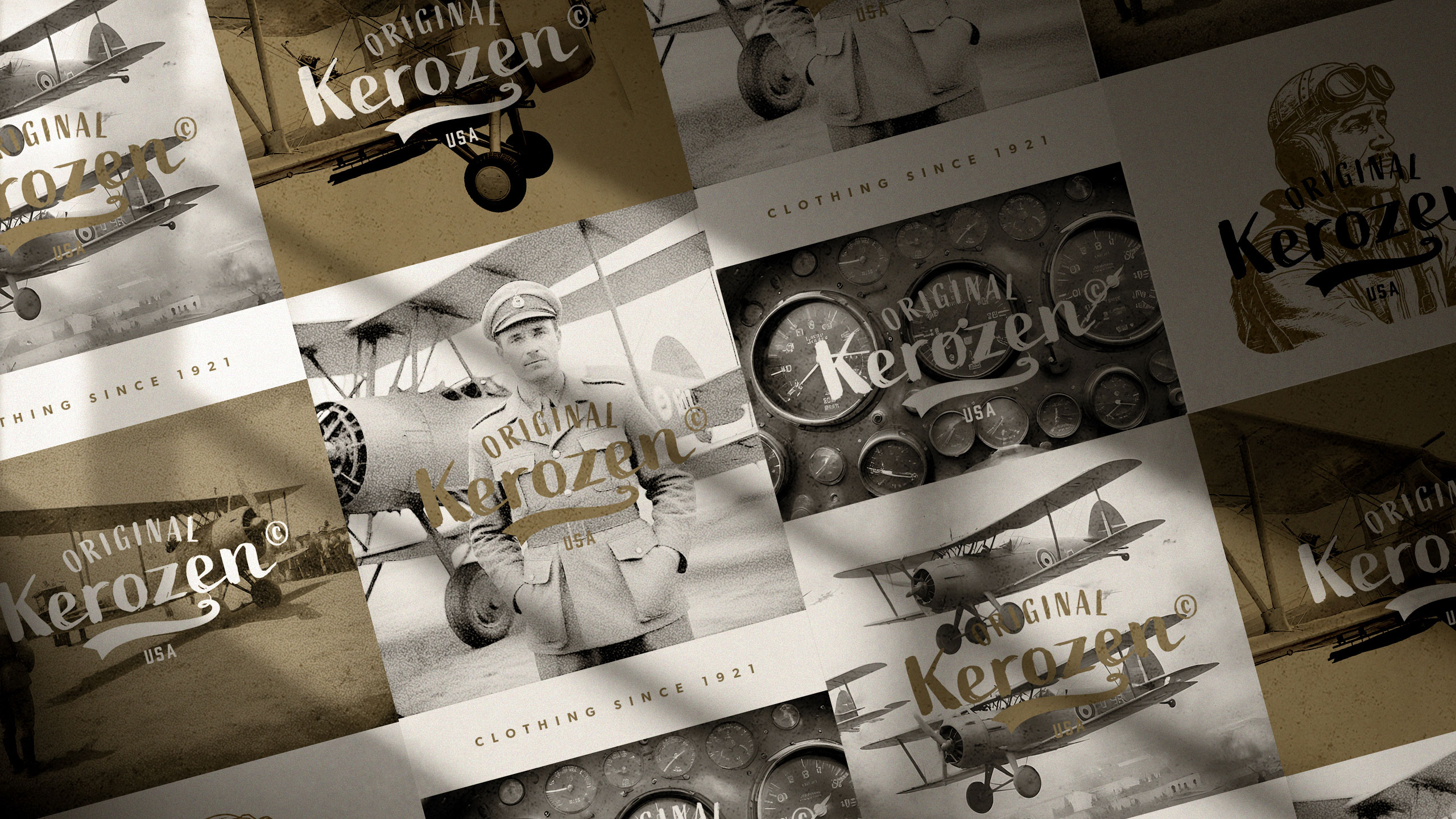
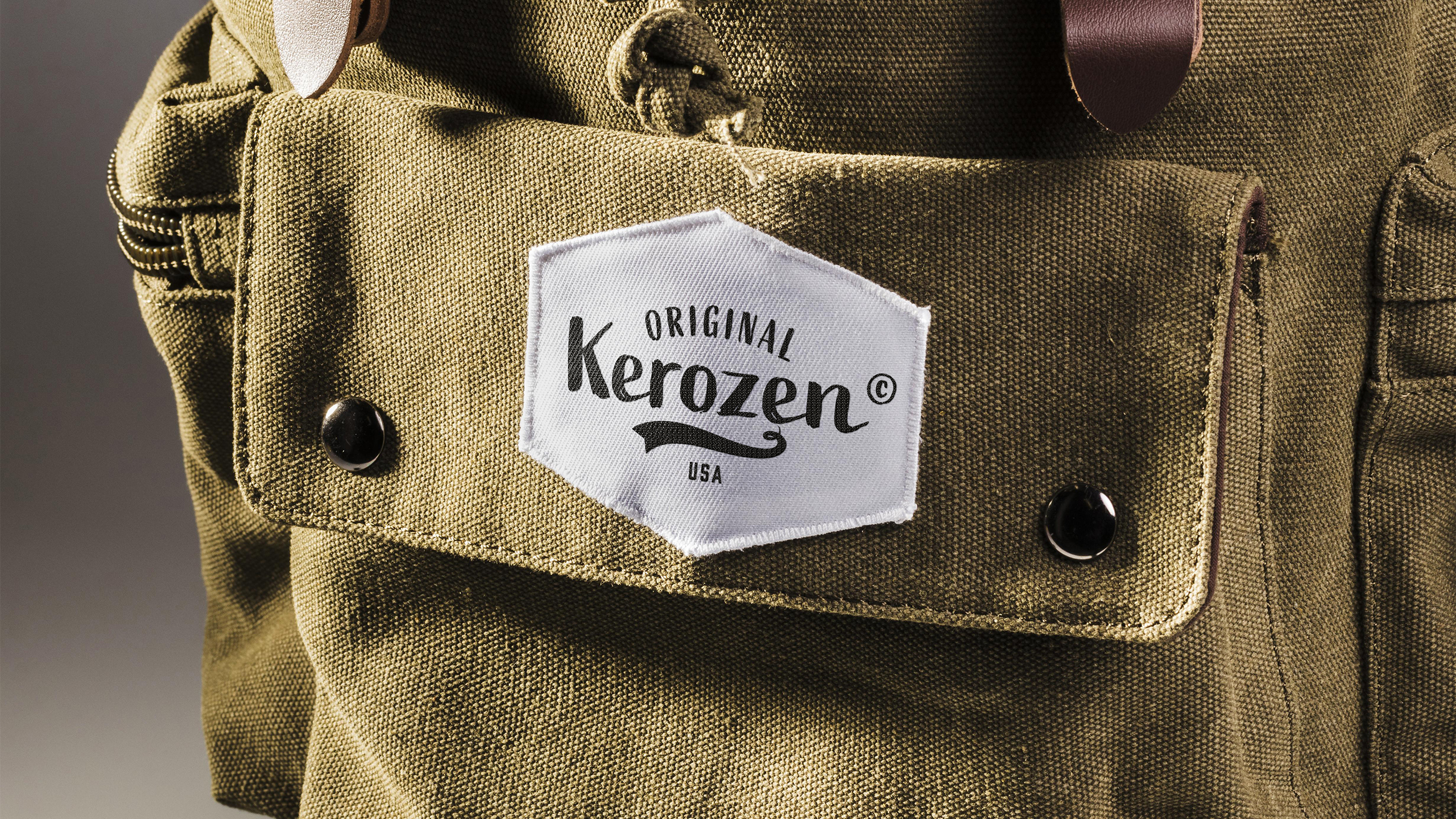
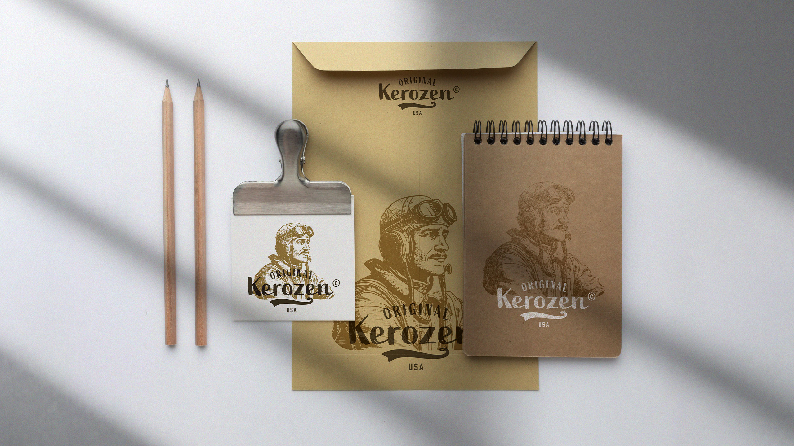
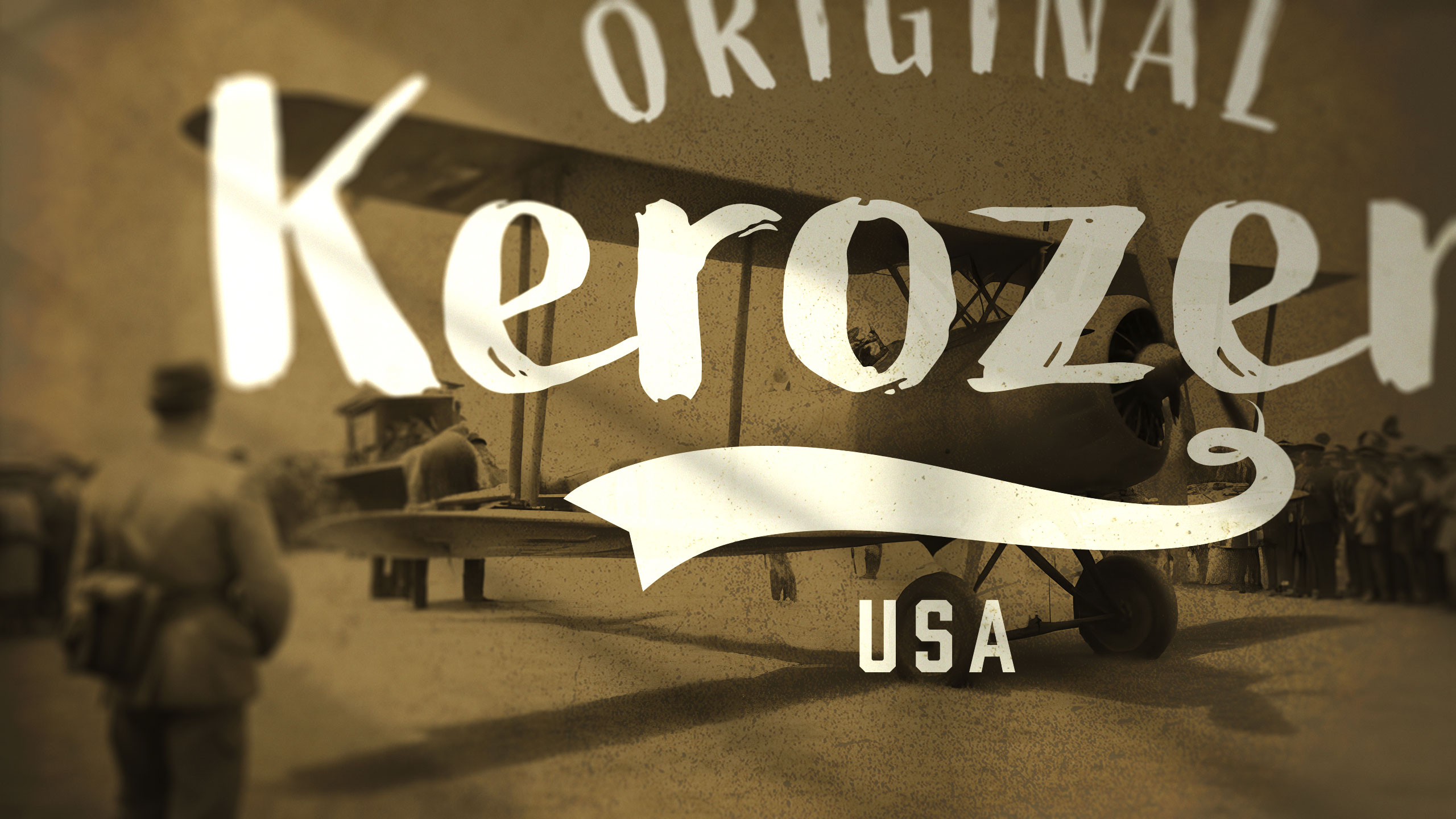
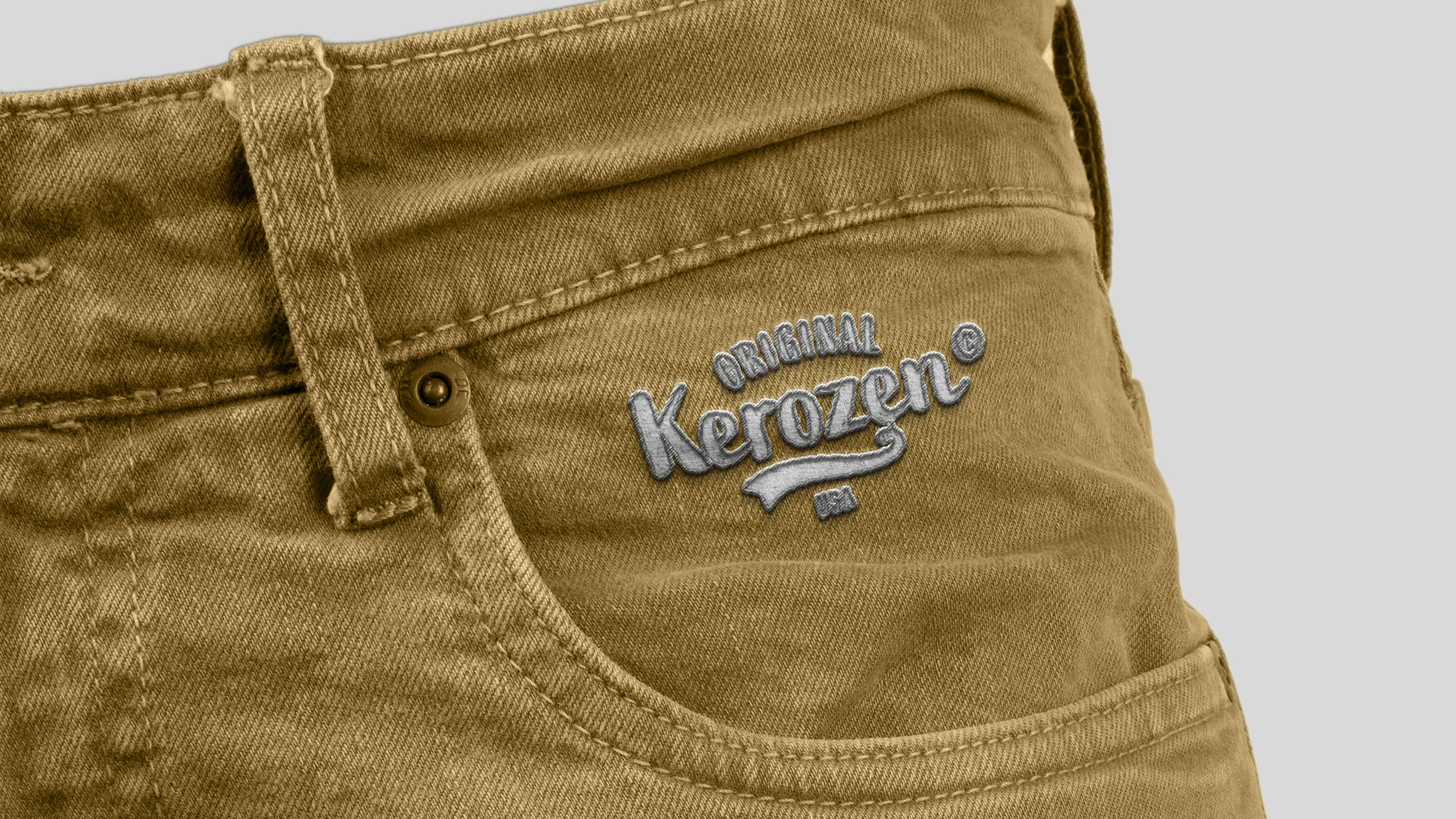
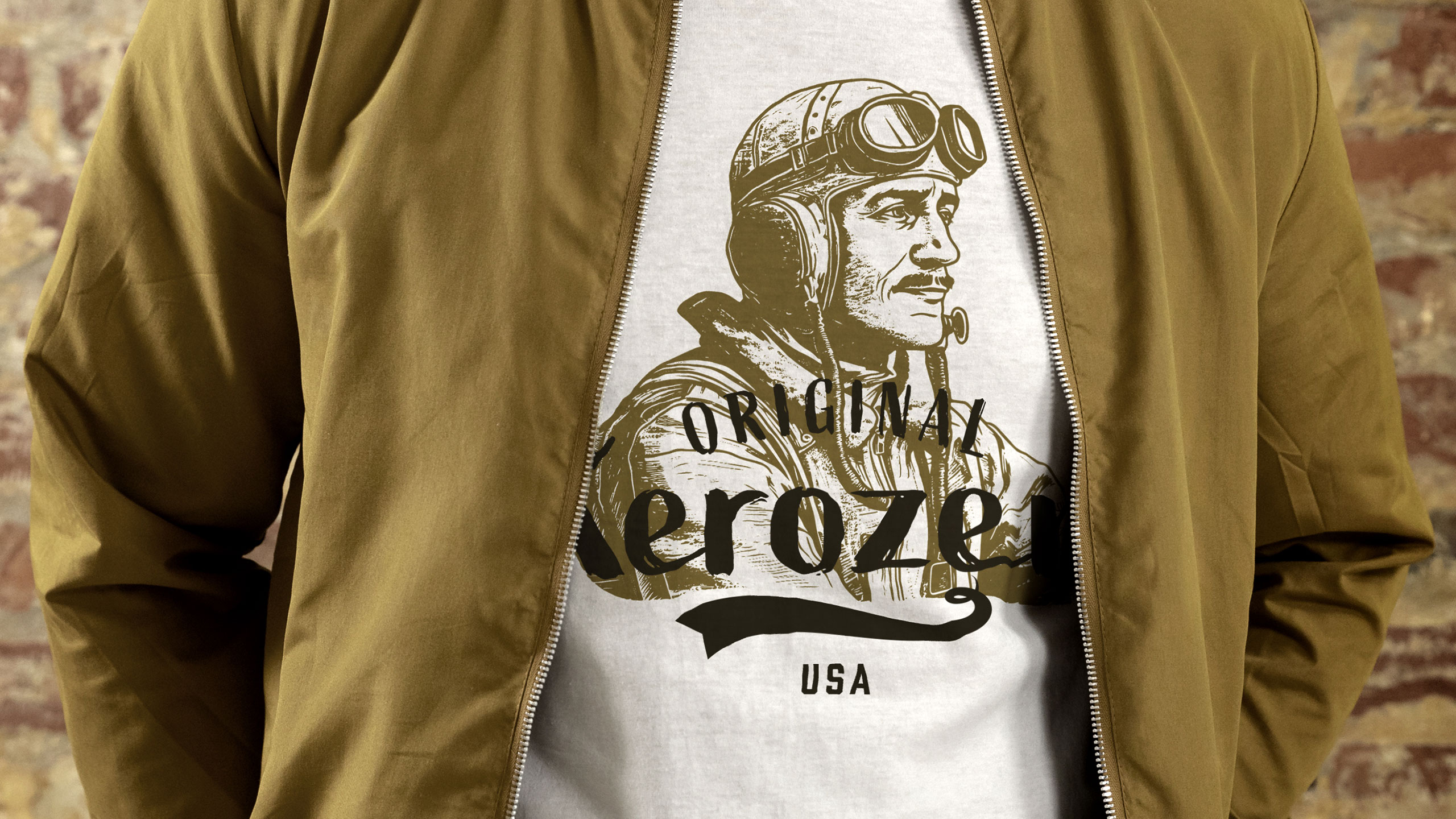
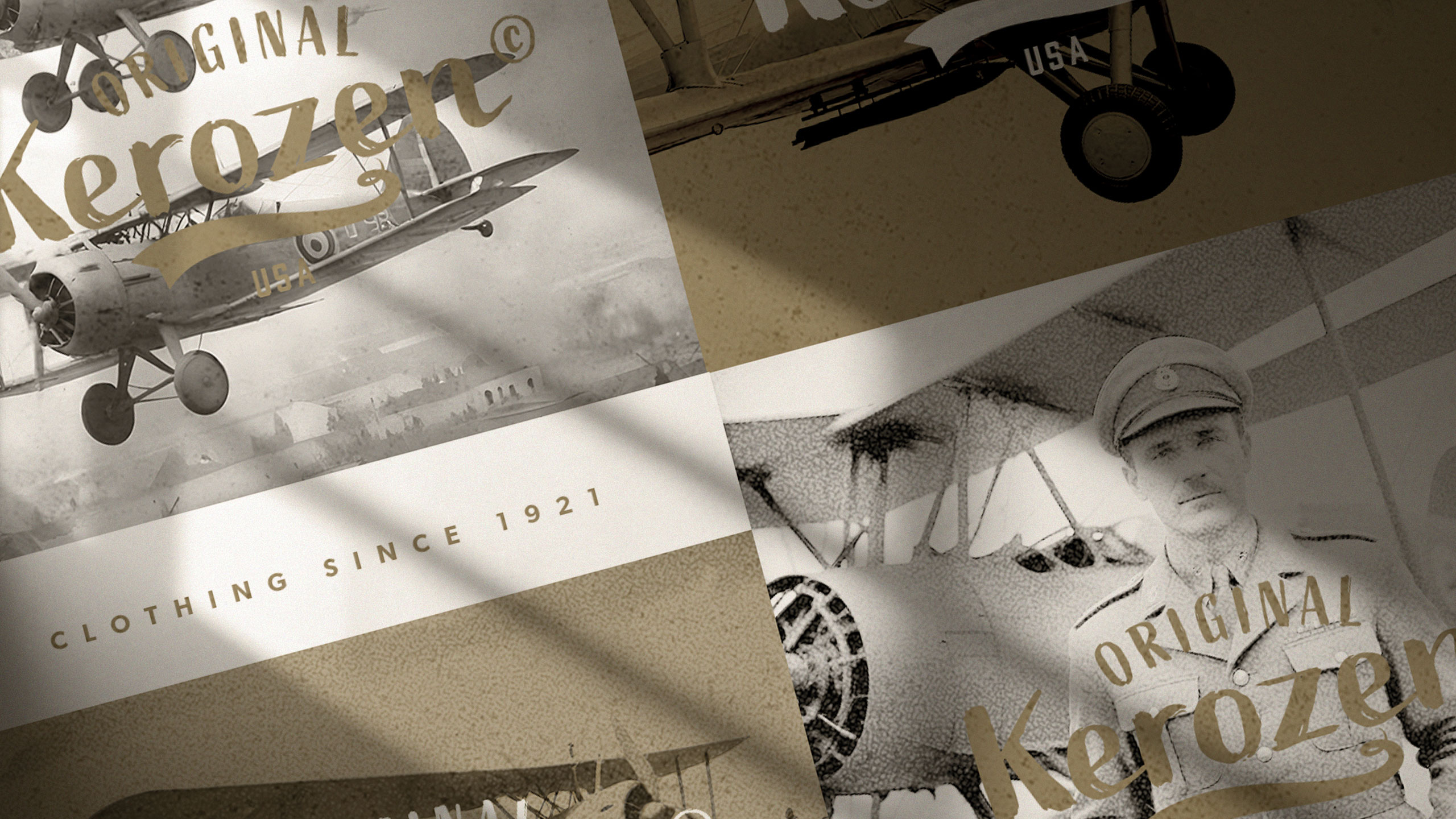
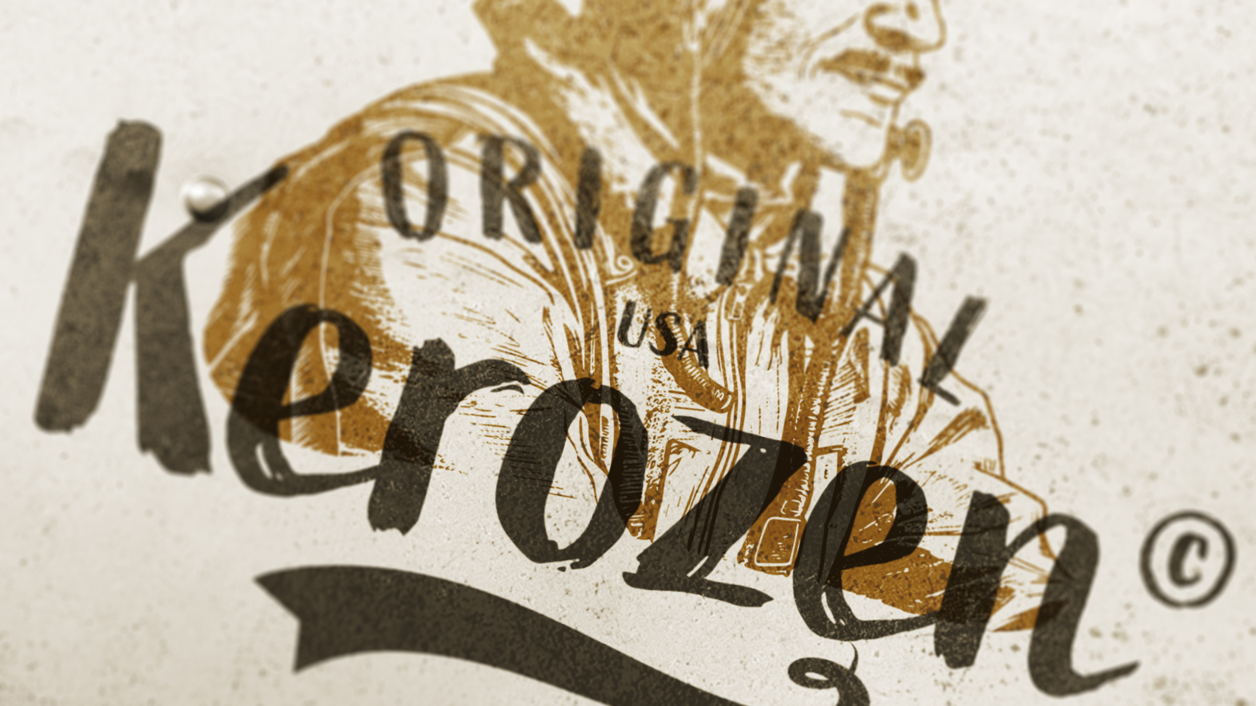
The visual identity for Kerozen is deployed across stationery, paper bags, travel bags, clothing tags, and t-shirts. Inspired by aviation fuel, the brand name evokes the bold spirit of early military aviators. The graphic design combines a vintage logo—styled like aircraft fuselage markings—with detailed engravings of pioneering pilots, reinforcing a narrative of authenticity and adventure.
Palette and Heritage
Dominated by khaki and beige-yellow tones, the visuals suggest reliability, bravery, and a rugged, time-worn elegance. The design pays homage to WWI flying aces, blending military heritage with a fashionable edge, creating a unique and nostalgic style that celebrates courage, resilience, and the thrill of the skies.
Related
03
Whether you prefer a quick call or a detailed message, we're here to listen.

OVER

Café Lenoirs

Blen-Beck

Whare House