


Description
03
The Core Challenge
How can a brand in energy distribution convey both innovation and eco-responsibility? Cloverfield answers with a bright, modern film that blends clean visuals, symbolism, and rhythm to express sustainable mobility everywhere.
Visual Language and Logo
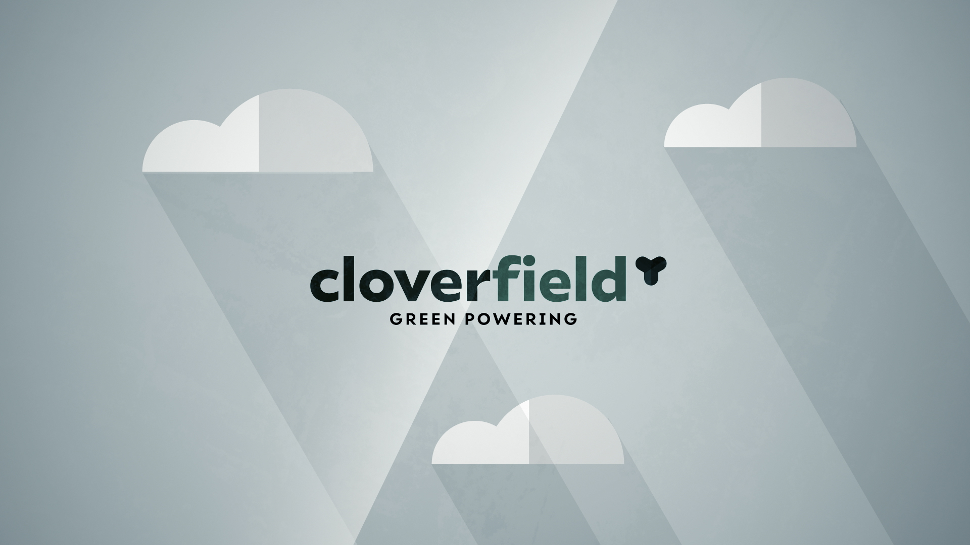
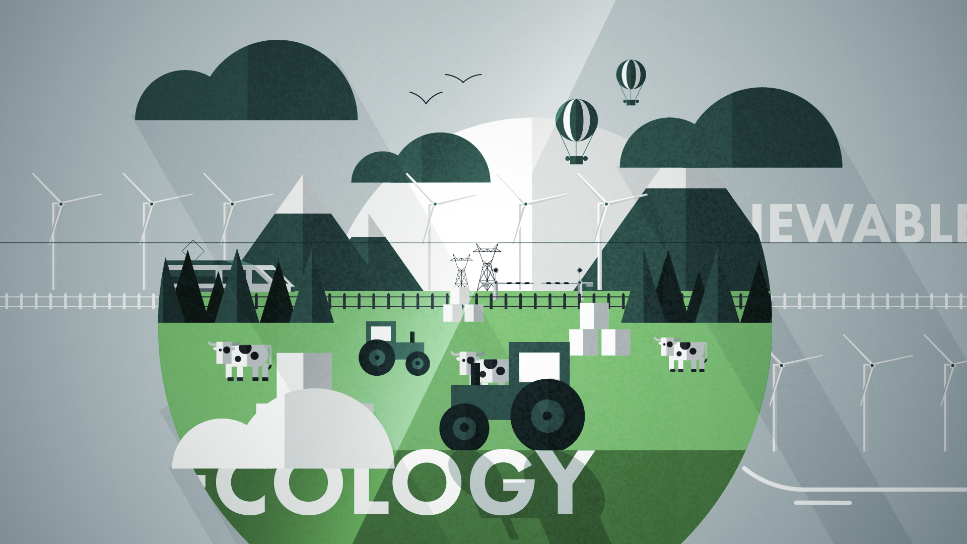
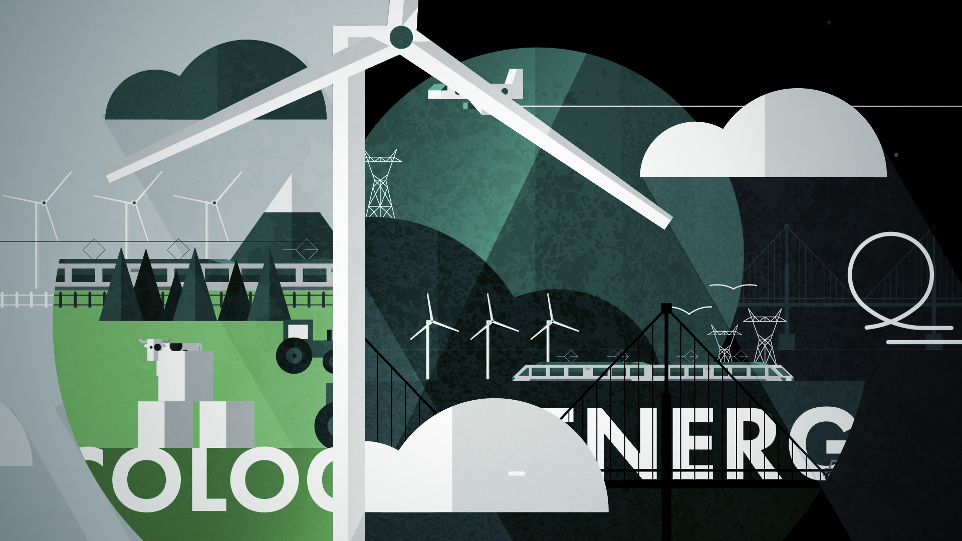
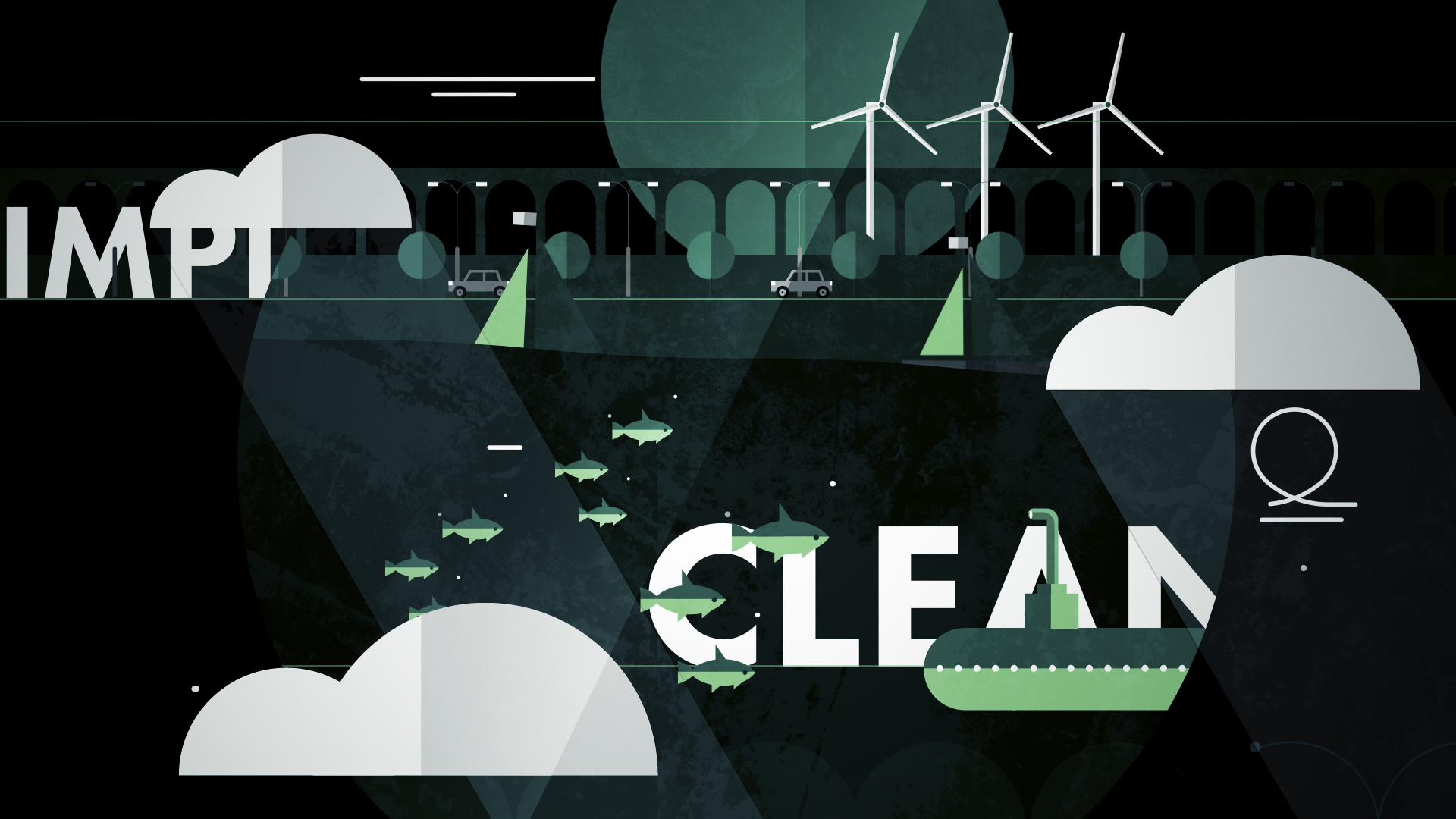
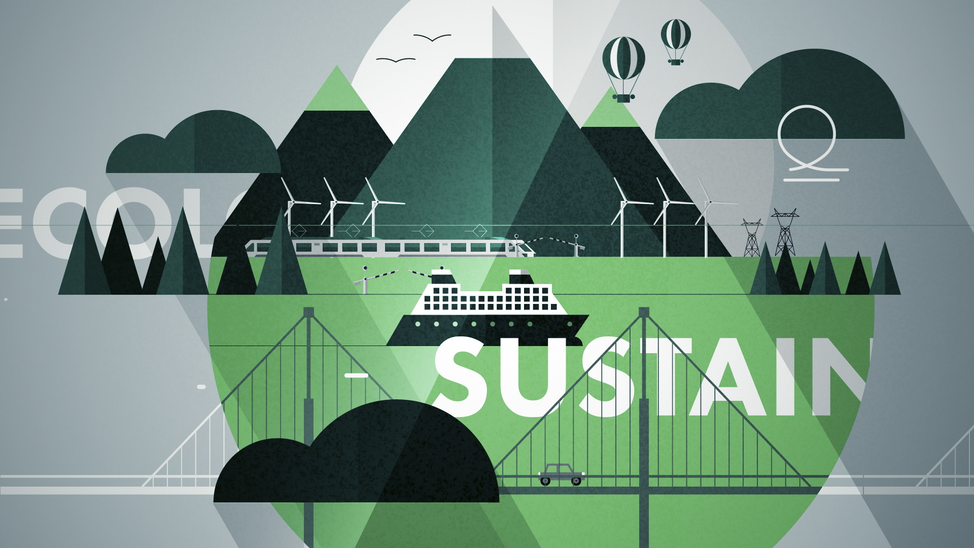
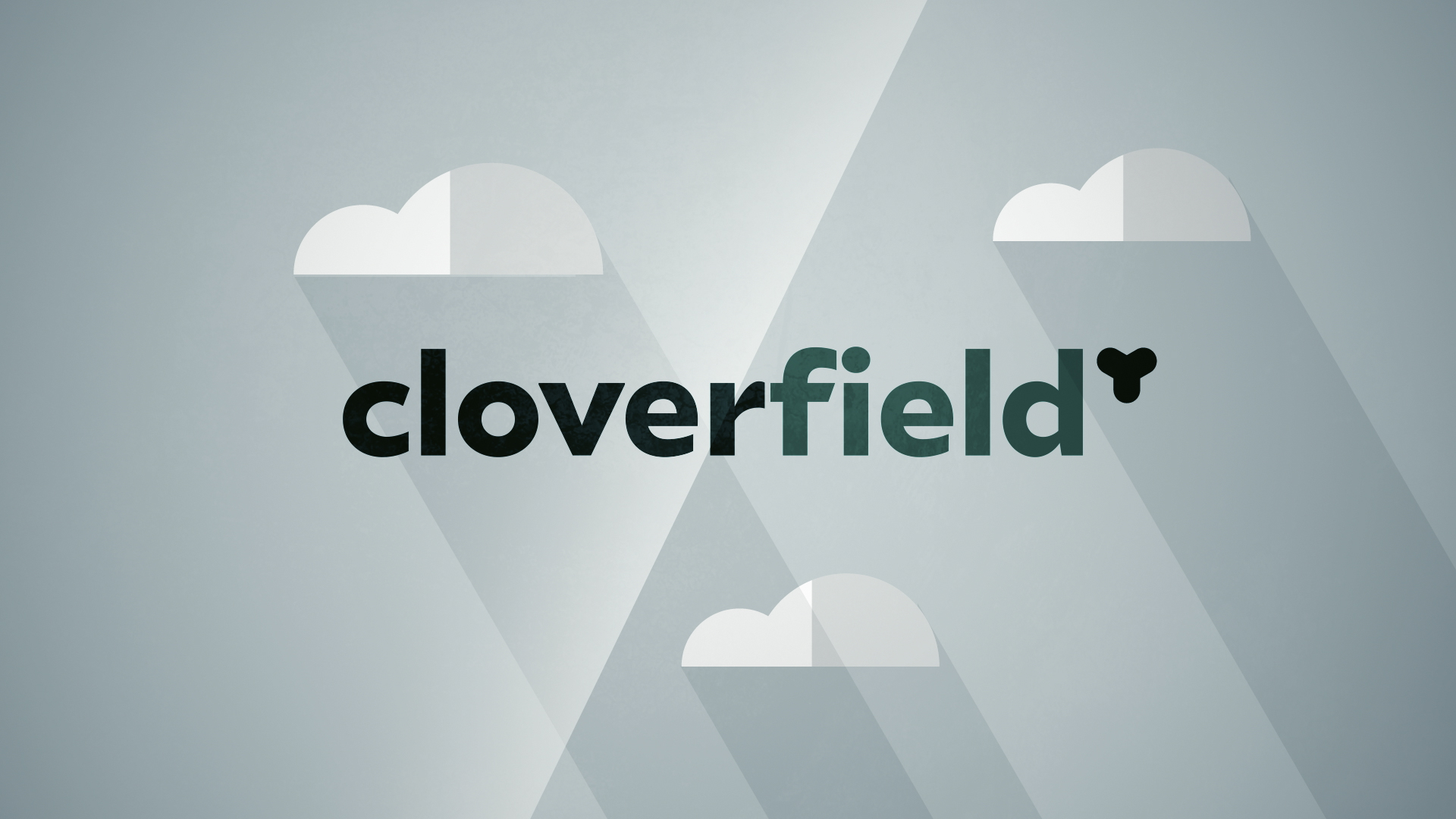
The advertising film for Cloverfield, a company specializing in energy distribution for transportation, features a clean and modern graphic design using a flat style. Dominated by green, symbolizing eco-friendliness (linked to the name "Cloverfield" and fields of clover), the logo combines the shape of a clover and wind turbine blades, referencing the company's initial focus on renewable energy.
Film Narrative and Message
The film follows various vehicles—land, sea, and air—through diverse landscapes (countryside, city, sea, underwater), all to the beat of an upbeat, catchy soundtrack. It conveys the message that Cloverfield is with us, supporting our mobility at every step, emphasizing accessibility and proximity.
Related
03
Whether you prefer a quick call or a detailed message, we're here to listen.

Surf1rst

Bombyx

One

Acropolis