


Description
02
The Core Challenge
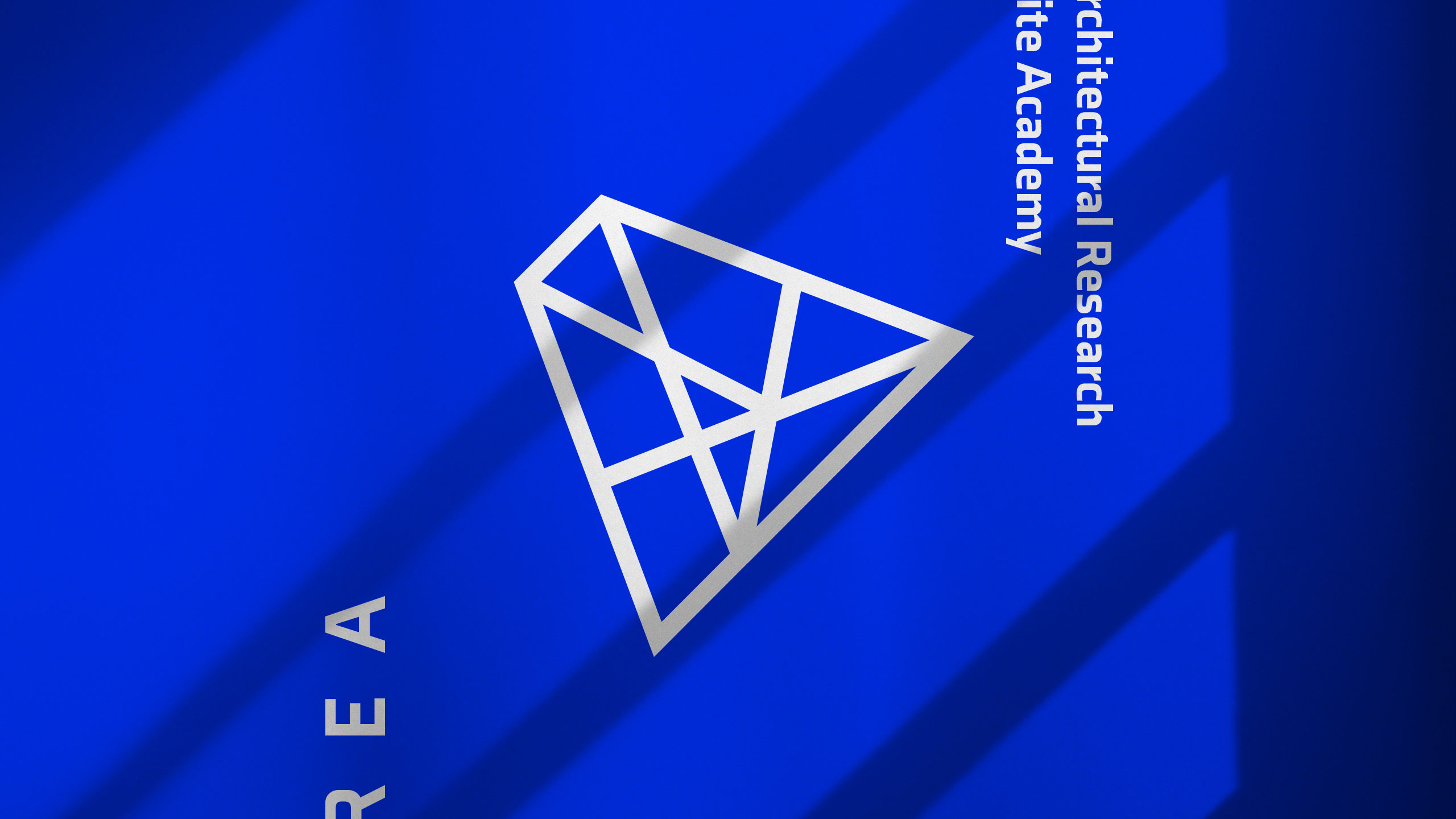
How can design symbolize innovation and collaboration? AREA's minimalist blue-and-white identity uses a suspended "A" logo referencing pyramids to embody timeless architecture and interconnected ideas within a modern school brand.
Visual Language and Logo
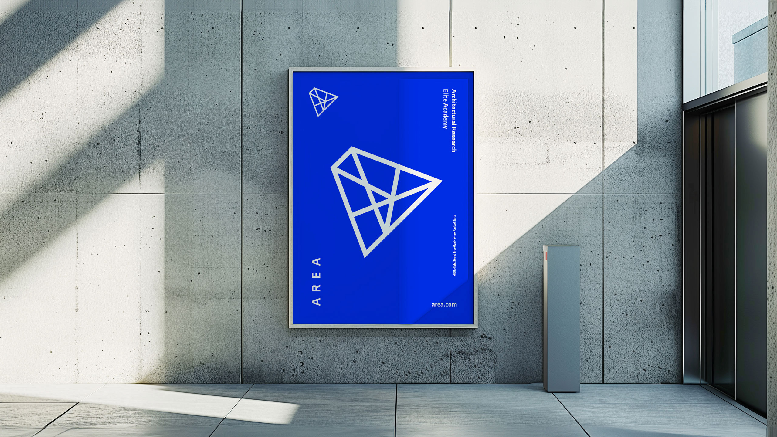
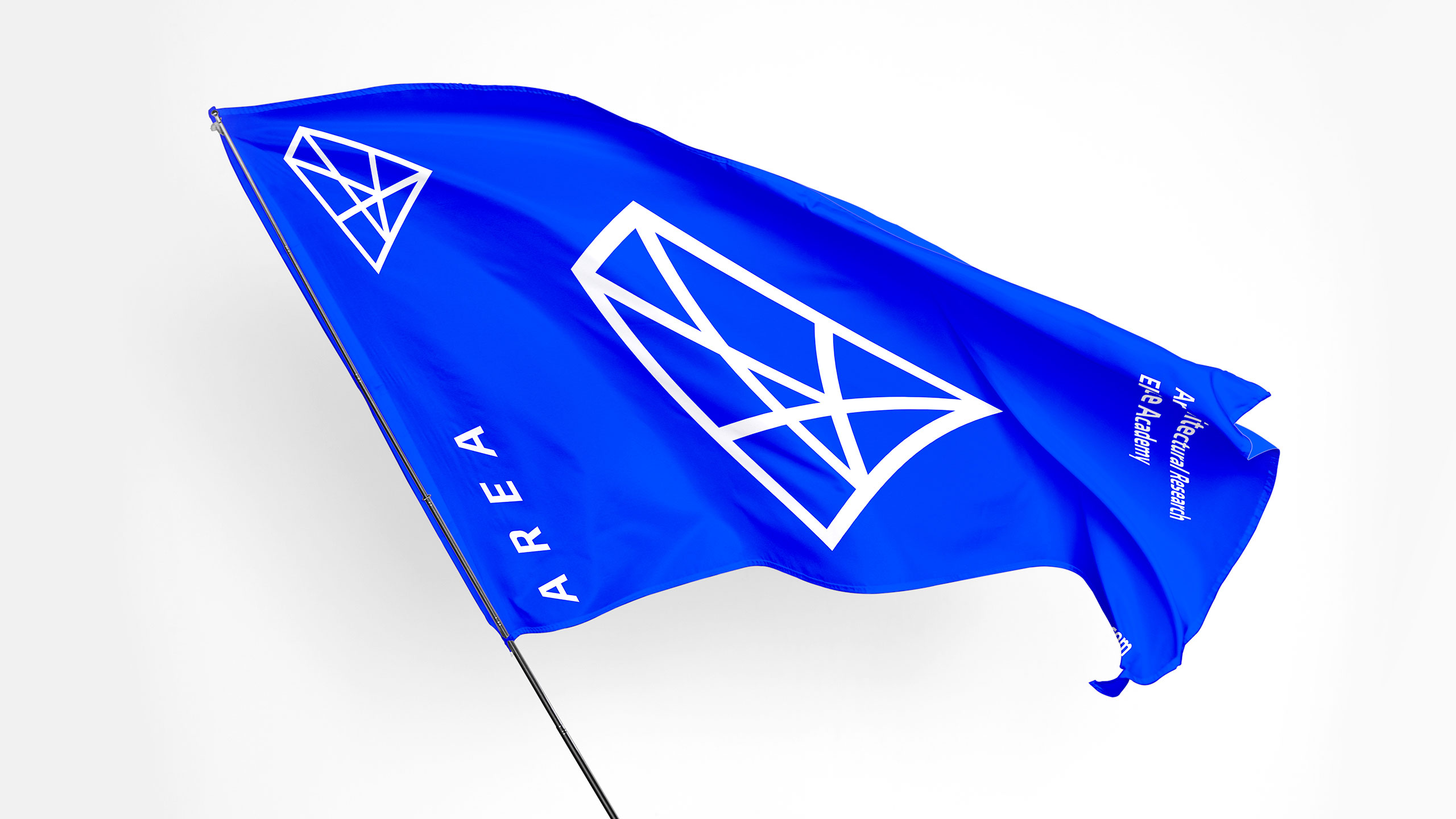
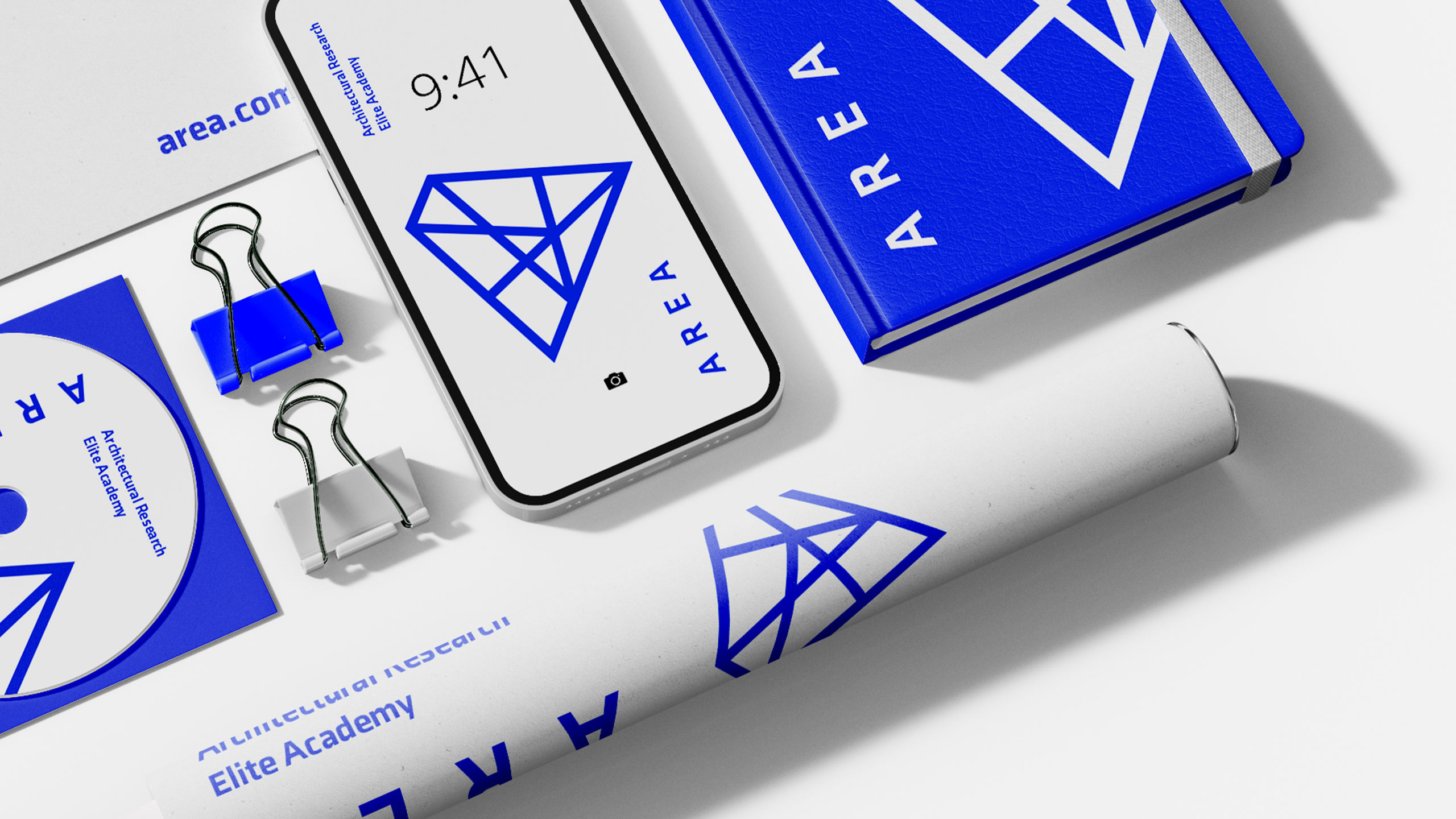
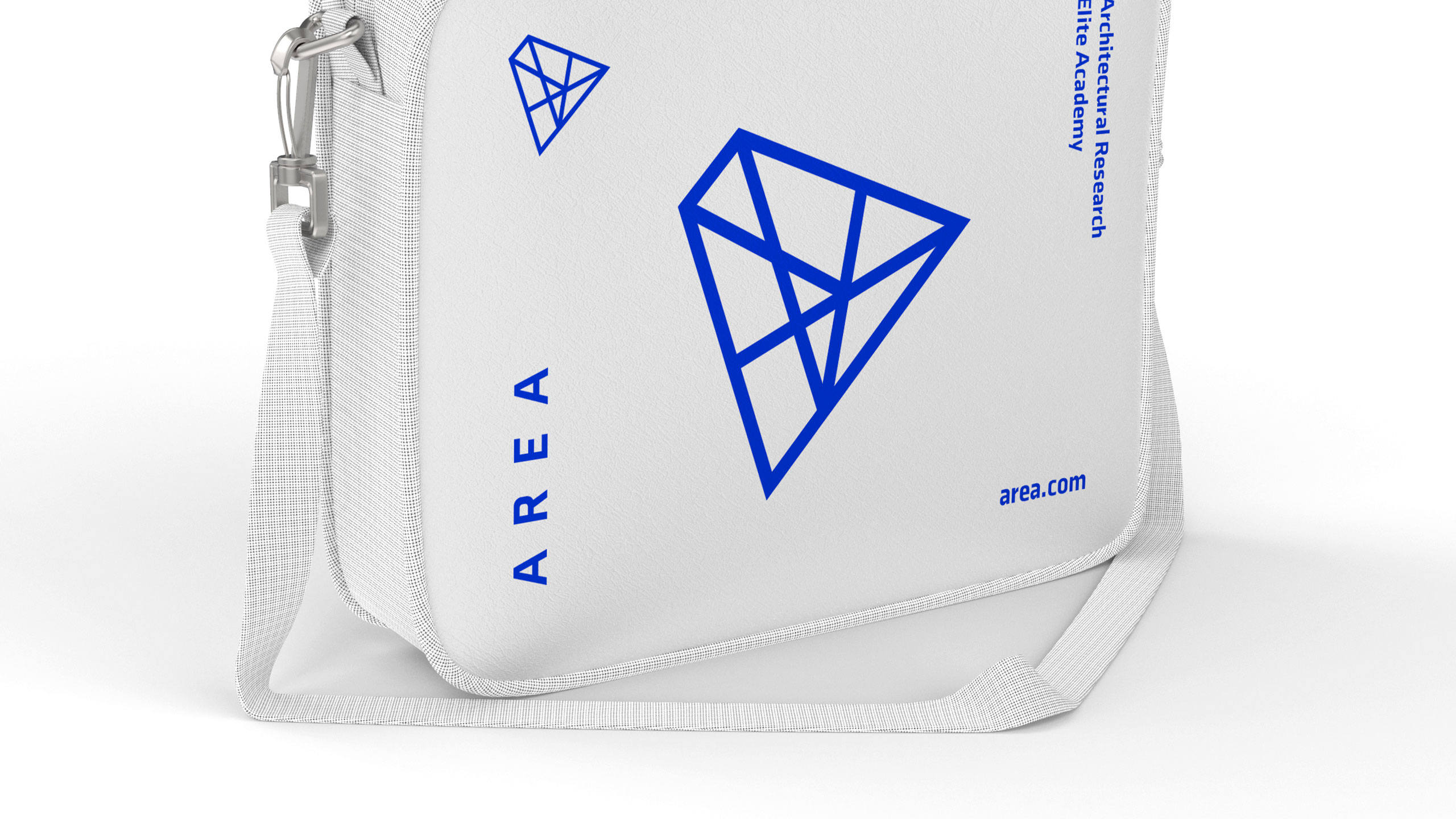
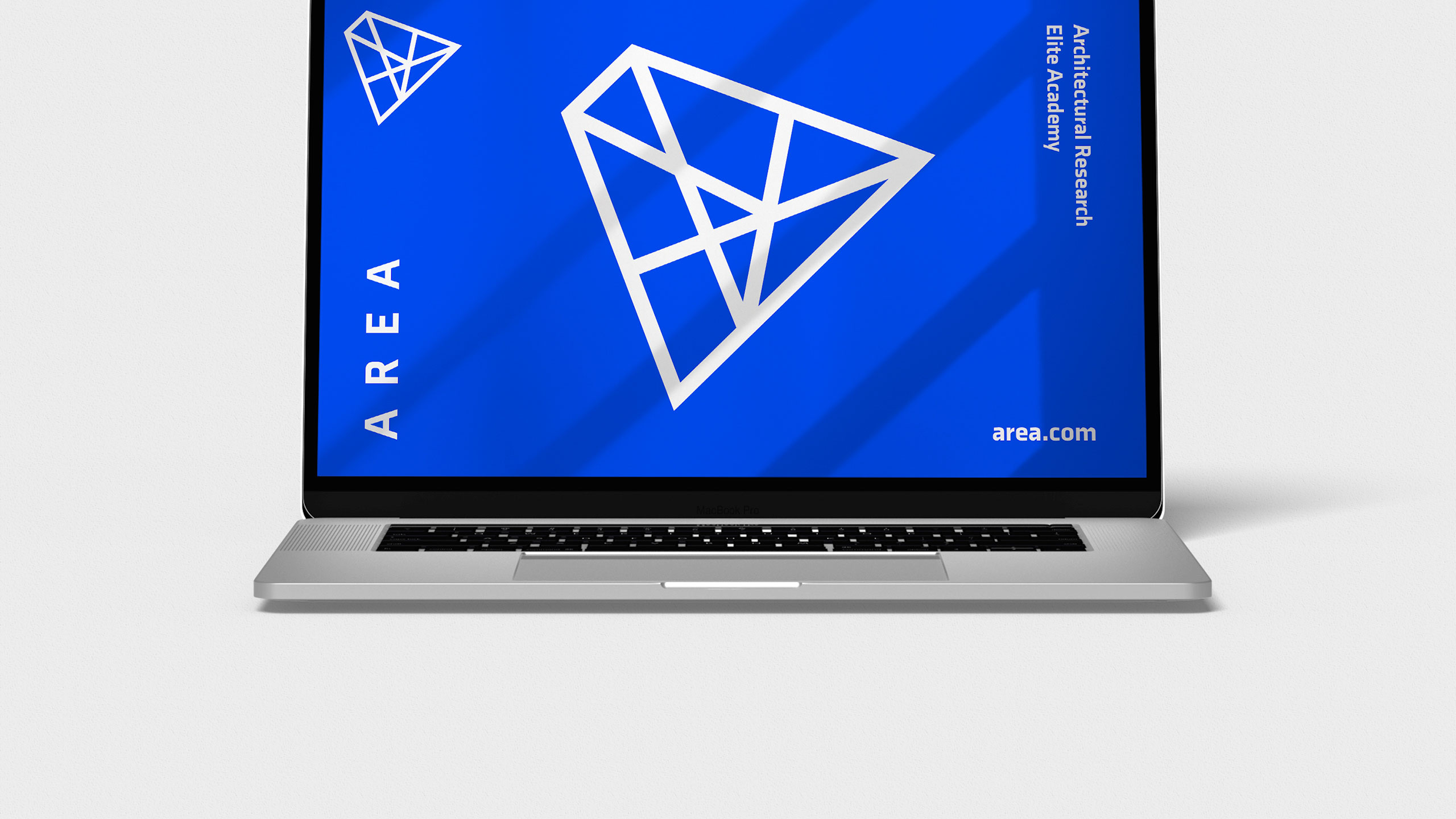
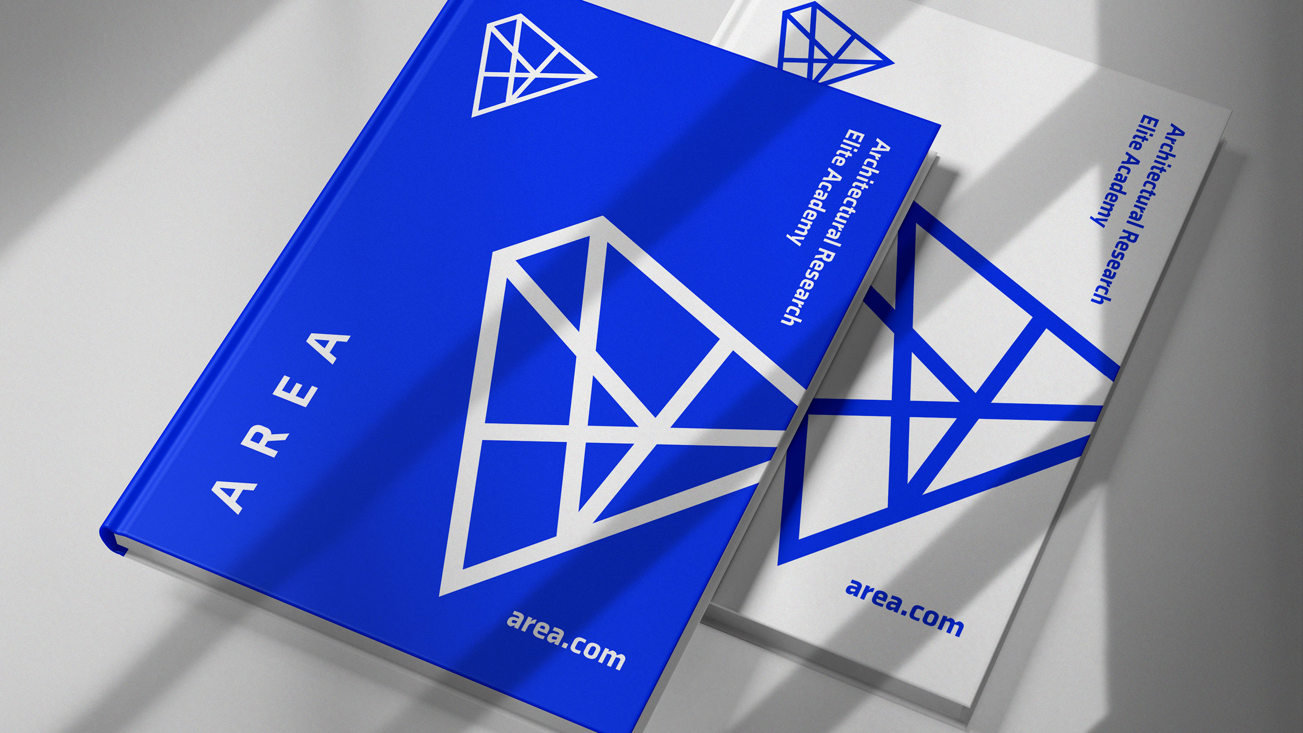
The graphic design for AREA, an architecture school, is modern, minimalist, and sleek, with a dominant color palette of blue and white. The logo, designed as an extruded "A" structure suspended in space, symbolizes architectural innovation. It subtly references pyramids, tying the school's design philosophy to timeless architectural wonders.
Concept and Application
The logo's structure also represents a network of interconnections, a core strength of the school, emphasizing collaboration and the integration of ideas. This clean, contemporary design is applied across various communication materials, including posters, t-shirts, bags, mugs, books, websites, and flags, creating a cohesive and impactful visual identity.
Related
03
Whether you prefer a quick call or a detailed message, we're here to listen.

OVER

Café Lenoirs

Blen-Beck

Whare House