


Description
02
Concept and Visual Language
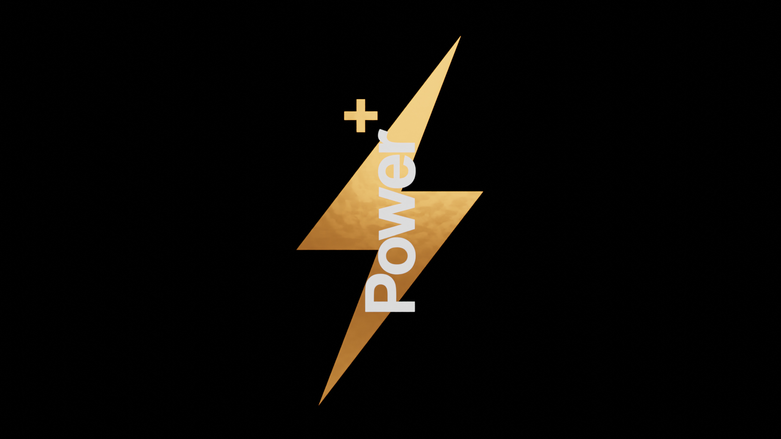
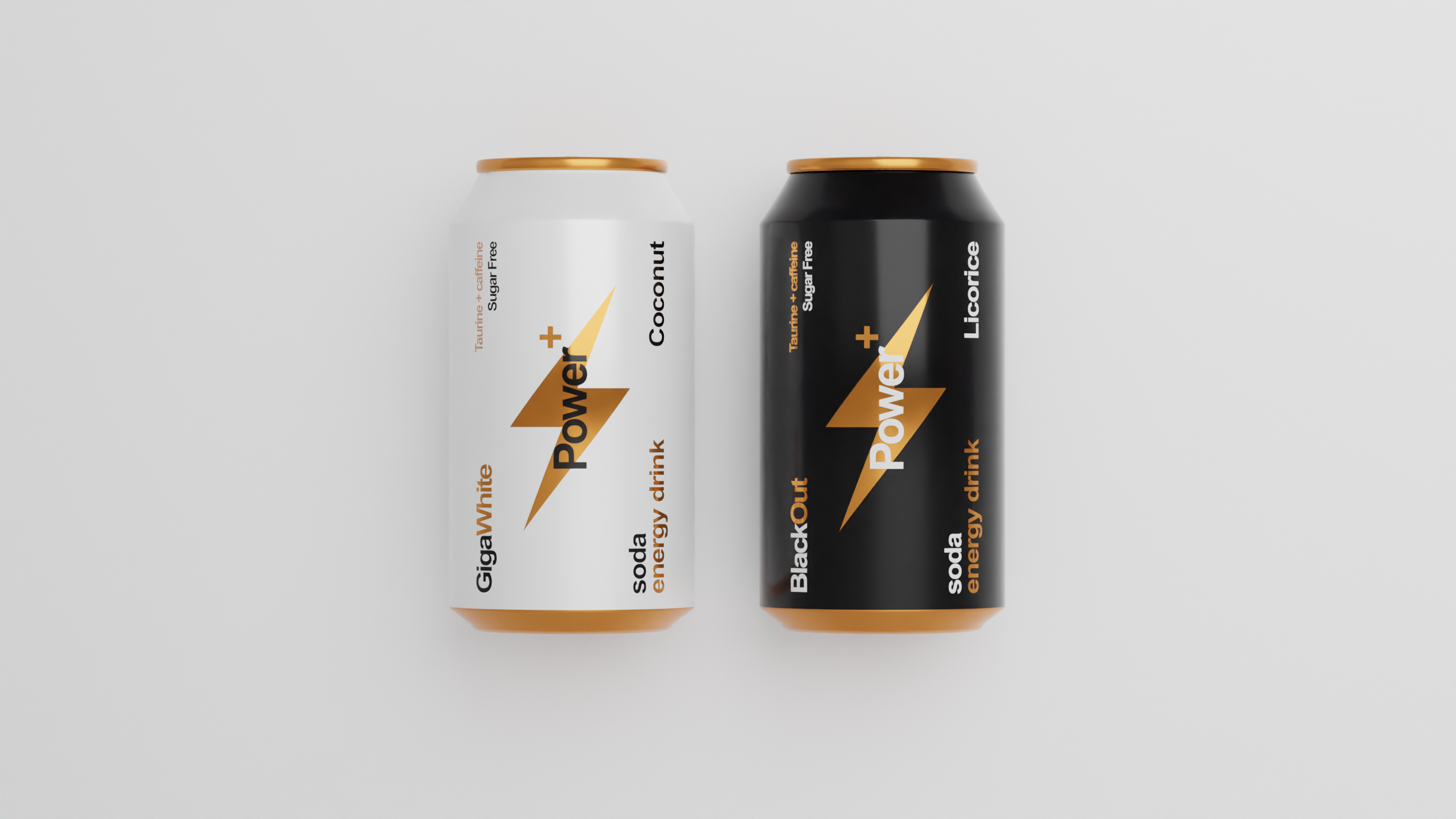
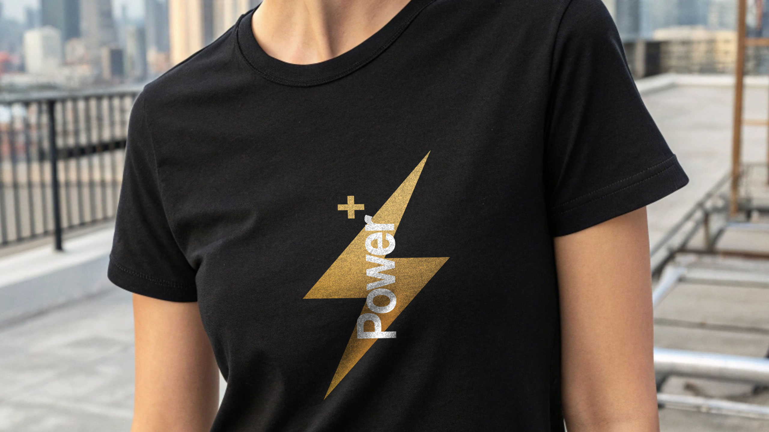
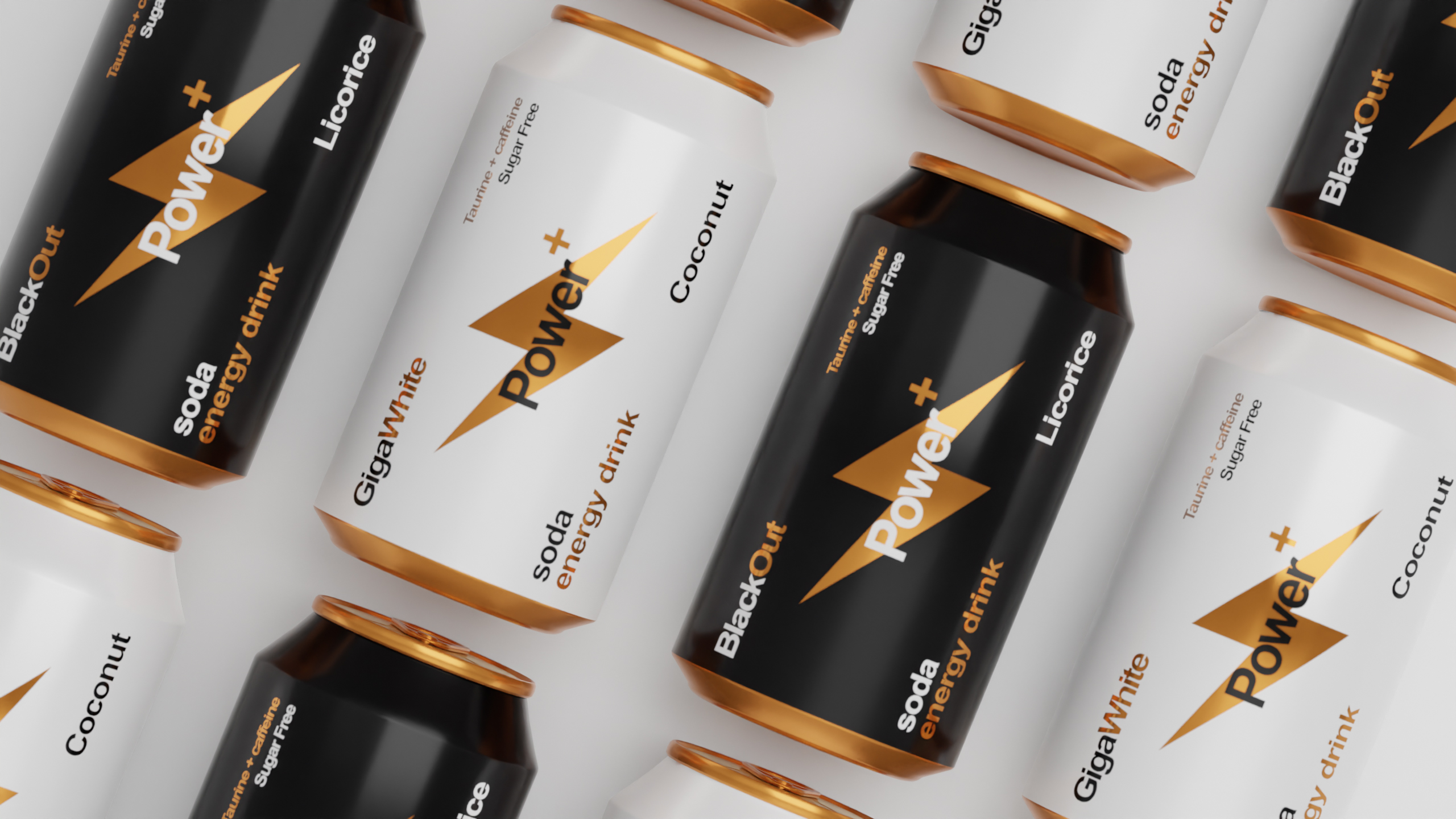
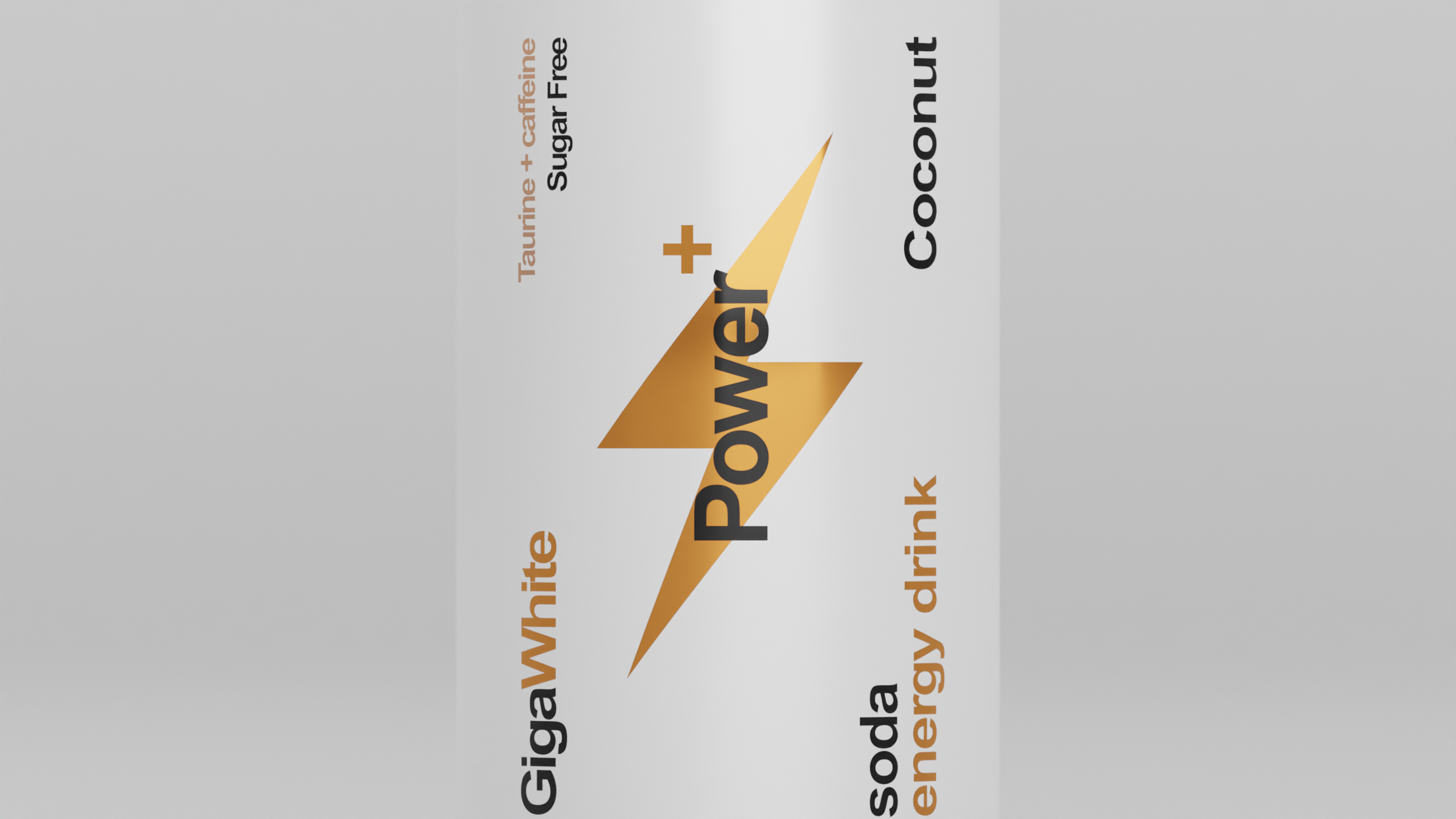
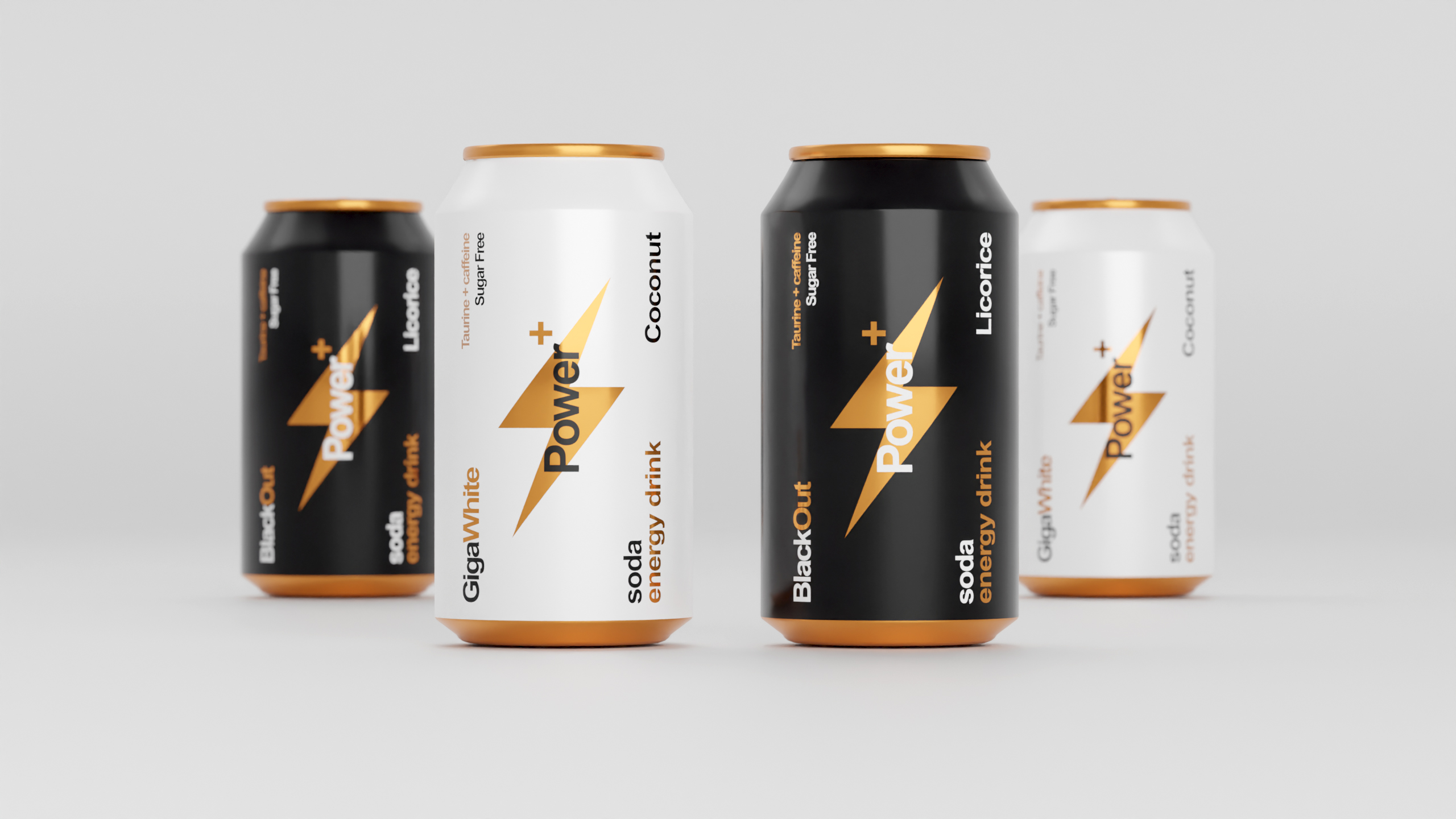
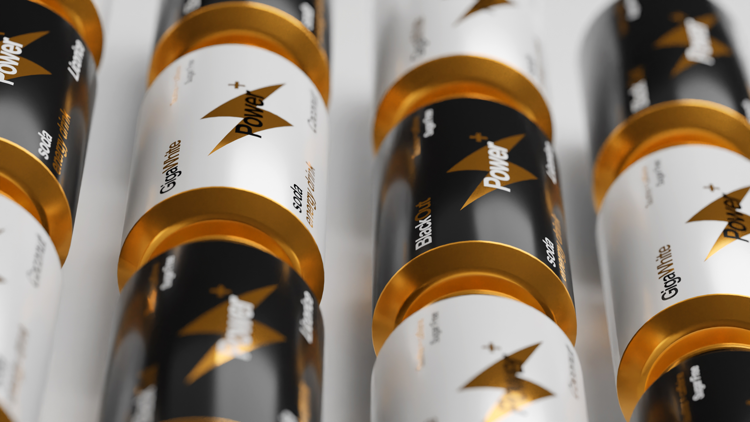
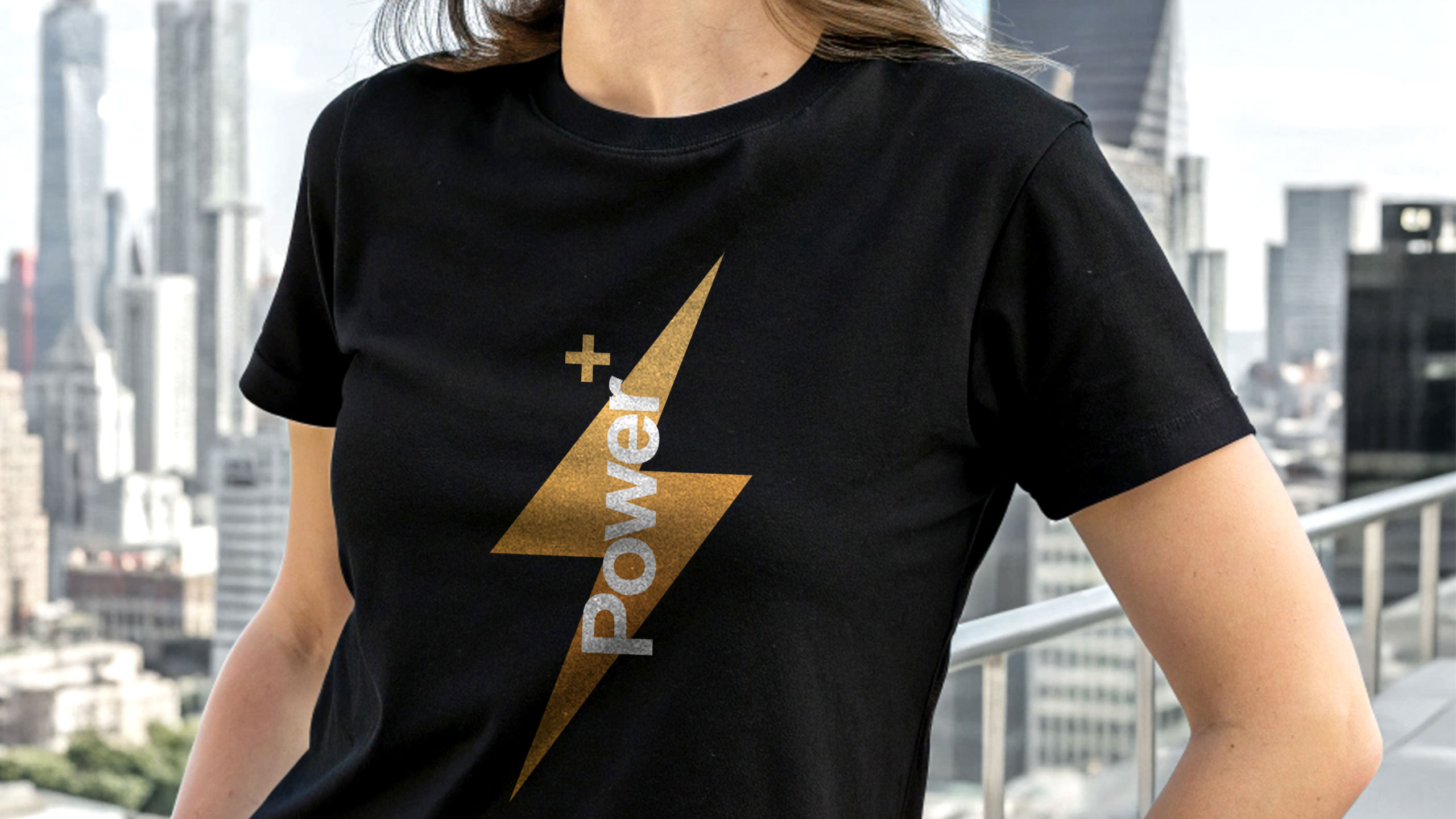
Power+ cans evoke sleek Swiss design with a battery-inspired motif symbolizing energy. Black, white, and gold accents highlight premium flavors, combining minimalism, clarity, and strength for an efficient, sophisticated look.
Design Logic and Palette
The 33cl aluminum can for "Power+" energy drink features a simple, informative Swiss-style graphic design, emphasizing clarity and precision. The can is designed to resemble a battery, symbolizing energy and power. The dominant colors—black and white—vary depending on the flavor, while gold accents provide a premium touch, reminiscent of high-quality battery variations.
Identity and Appeal
The minimalistic design is sleek and functional, aligning with the brand's focus on energy and performance. The overall aesthetic conveys a sense of reliability and strength, while the clean, modern look appeals to consumers seeking both efficiency and sophistication in their energy drink.
Related
03
Whether you prefer a quick call or a detailed message, we're here to listen.

OVER

Café Lenoirs

Blen-Beck

Whare House