


Description
02
The Core Challenge
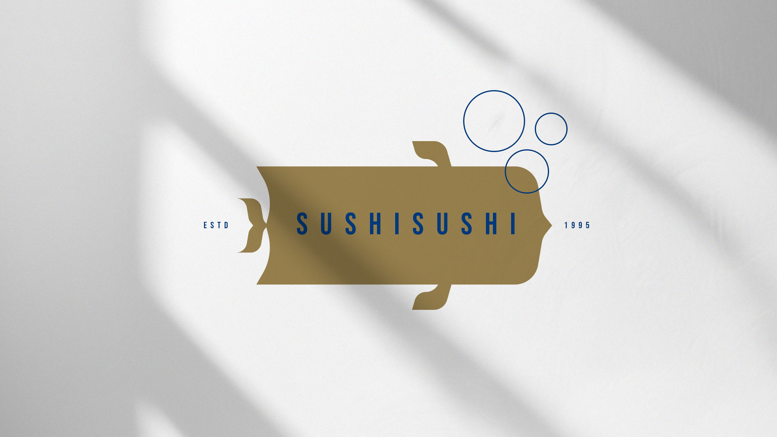
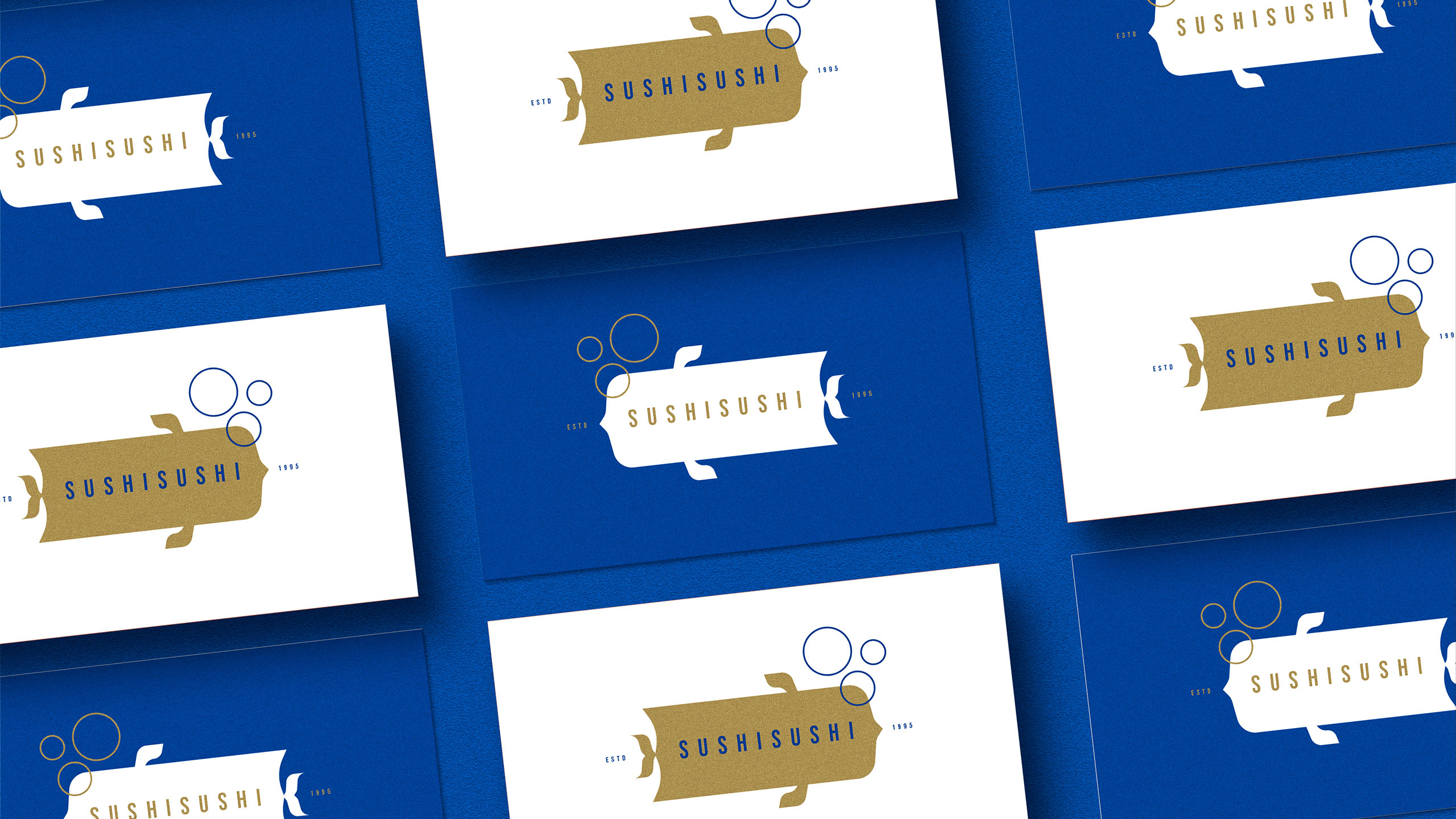
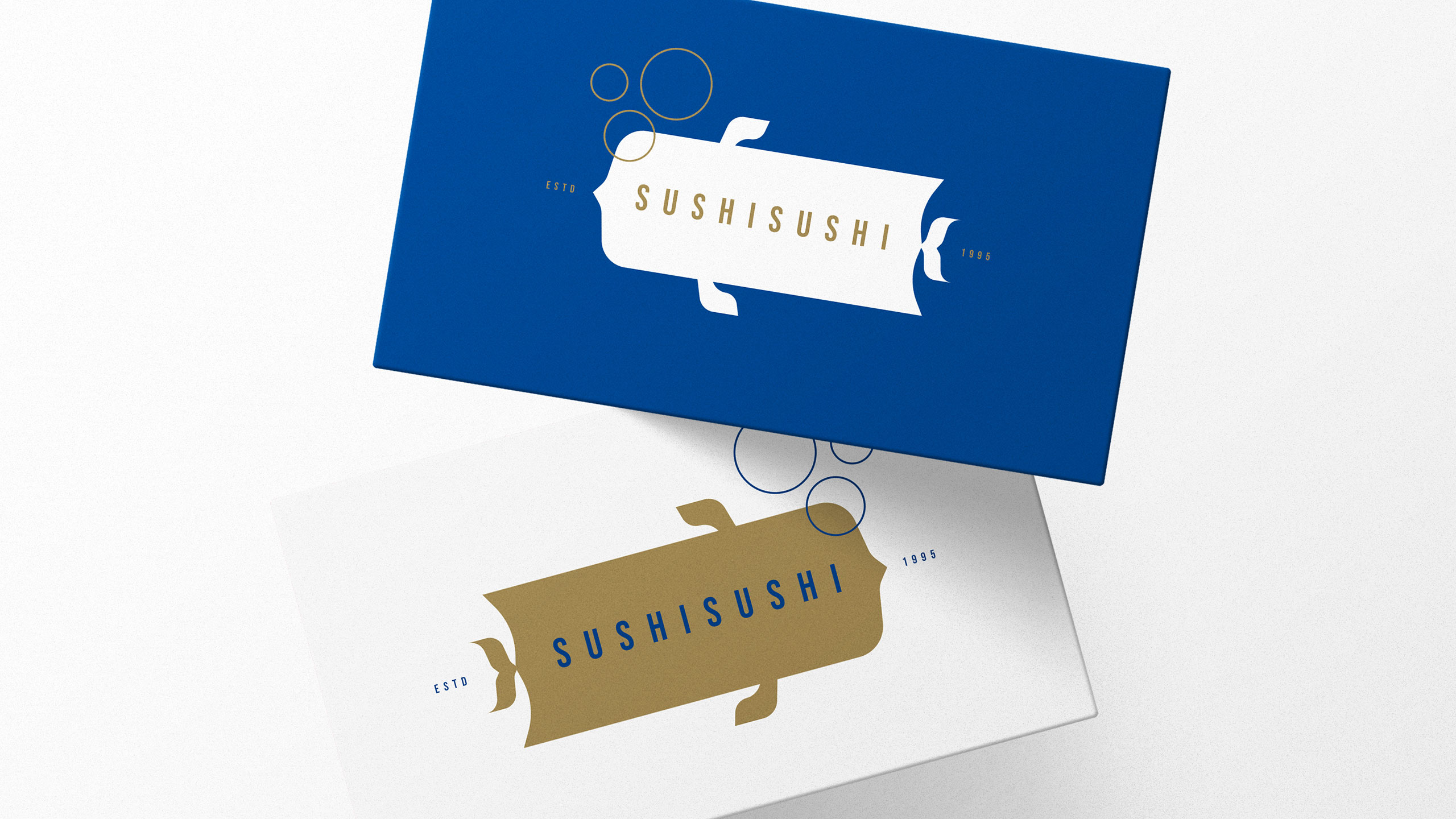
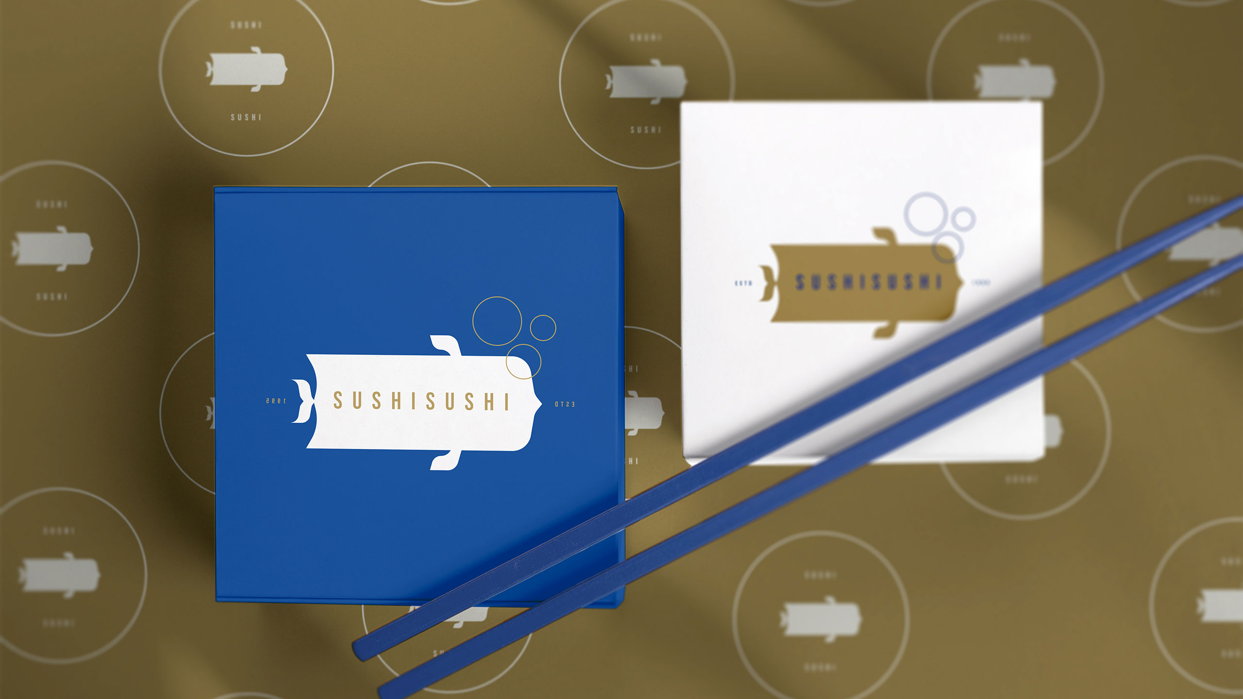
How to balance elegance and playfulness in sushi branding? SUSHISUSHI uses deep sea blue and gold with minimal fish-inspired logos and bubbles to evoke freshness, quality, and friendly delivery service.
Visual Language and Name
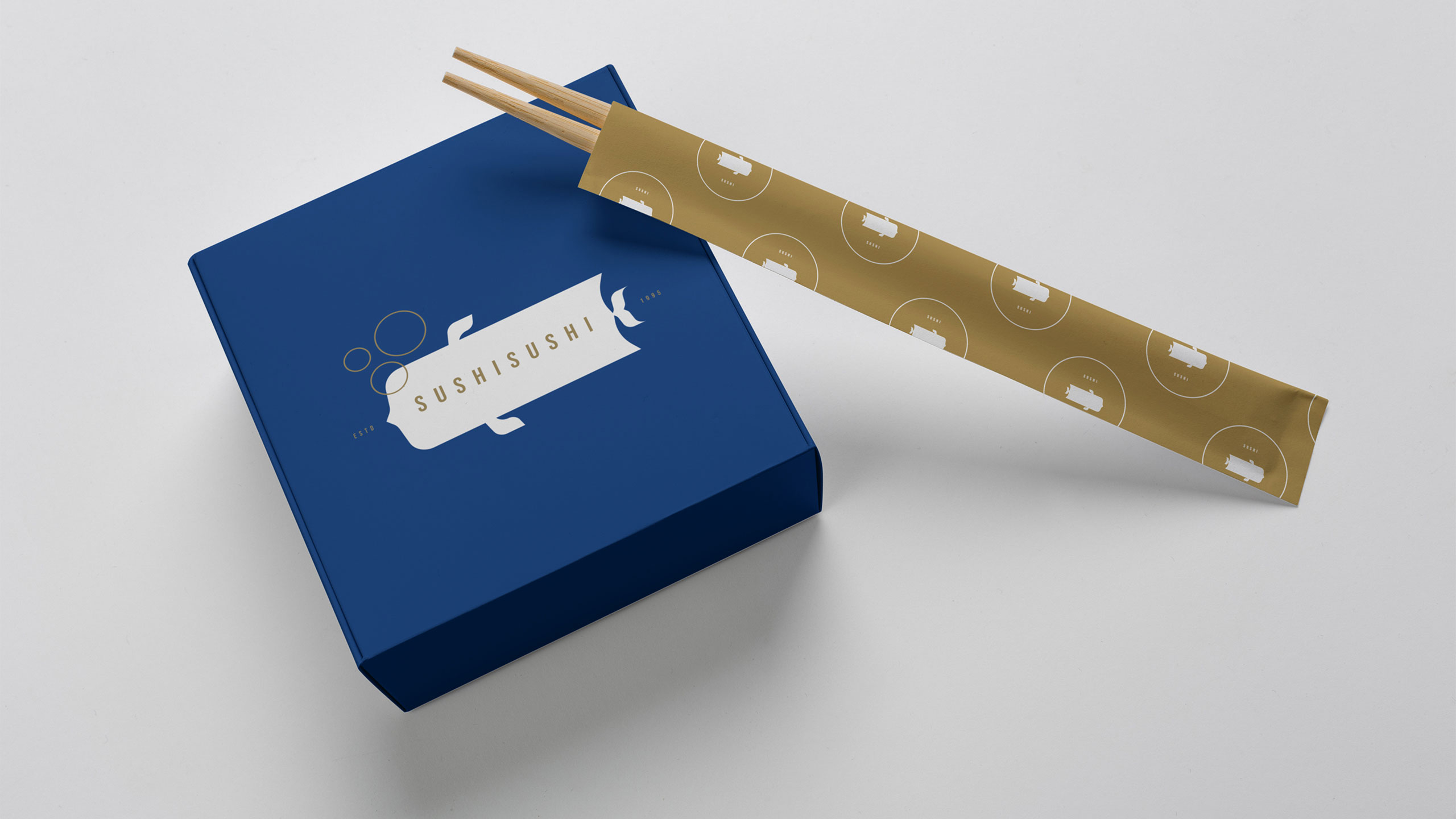
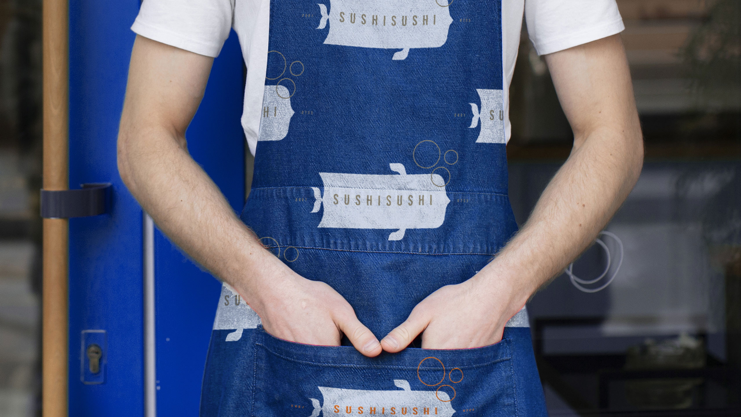
The graphic design for SUSHISUSHI, a sushi delivery restaurant, blends elegance with a playful identity. The name echoes "moshi moshi," referencing Japanese phone etiquette, emphasizing friendly service and a delivery-first model. Dominated by deep sea blue and golden licorice, the color palette evokes freshness, quality, and a premium feel. The logo resembles a stylized fish or sushi roll wrapper, adding a touch of minimalism and cultural flair.
Application and Identity
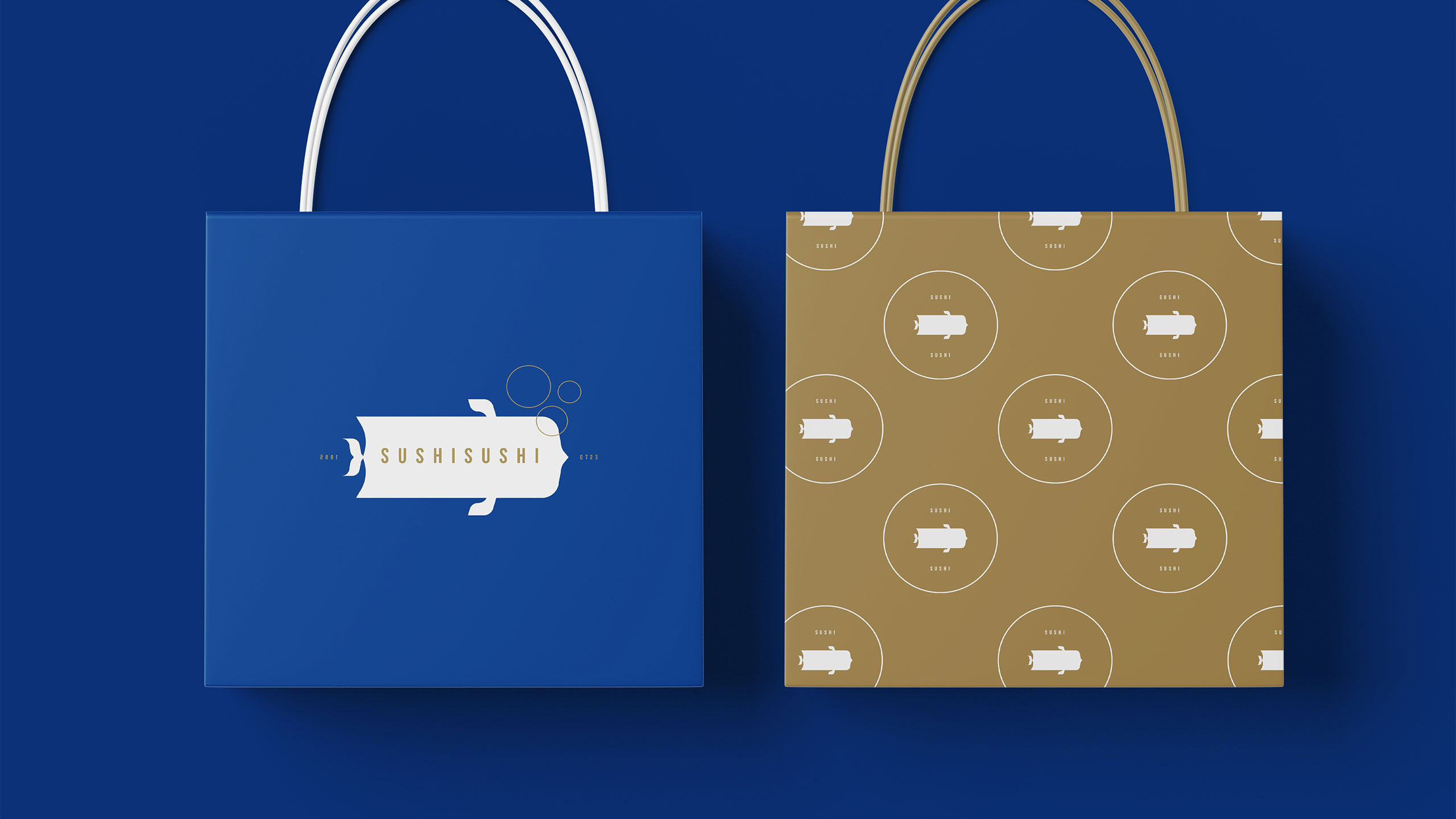
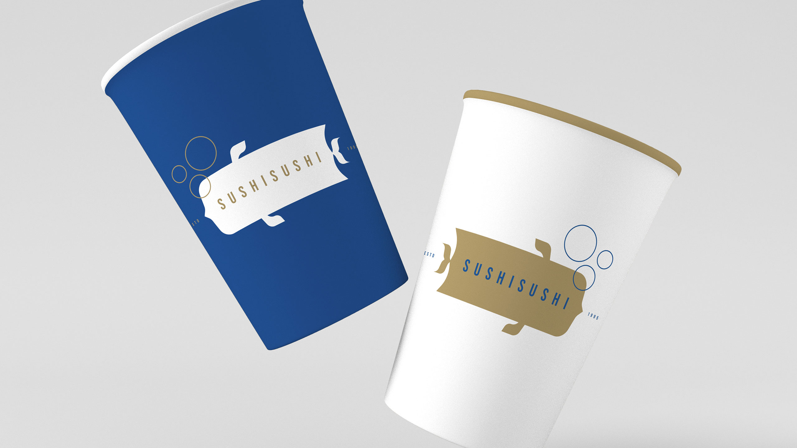
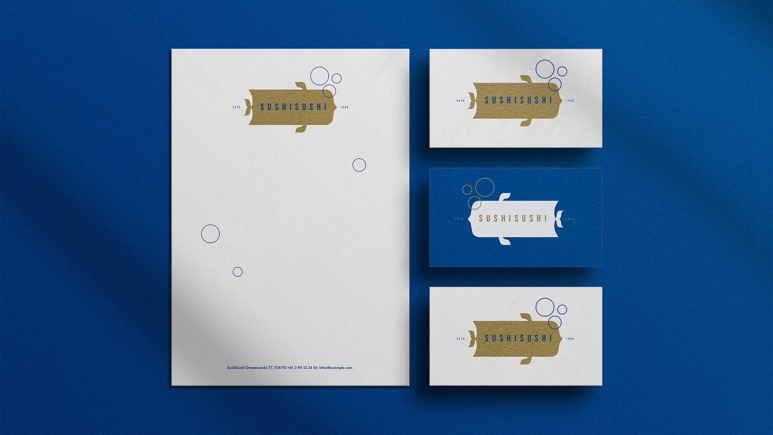
Applied across bags, cups, stationery, aprons, and boxes, the identity is both modern and memorable. Bubbles add a marine, lighthearted tone, reinforcing the oceanic freshness of the product and the brand's accessible sophistication.
Related
03
Whether you prefer a quick call or a detailed message, we're here to listen.

OVER

Café Lenoirs

Blen-Beck

Whare House