


Description
02
The Core Challenge
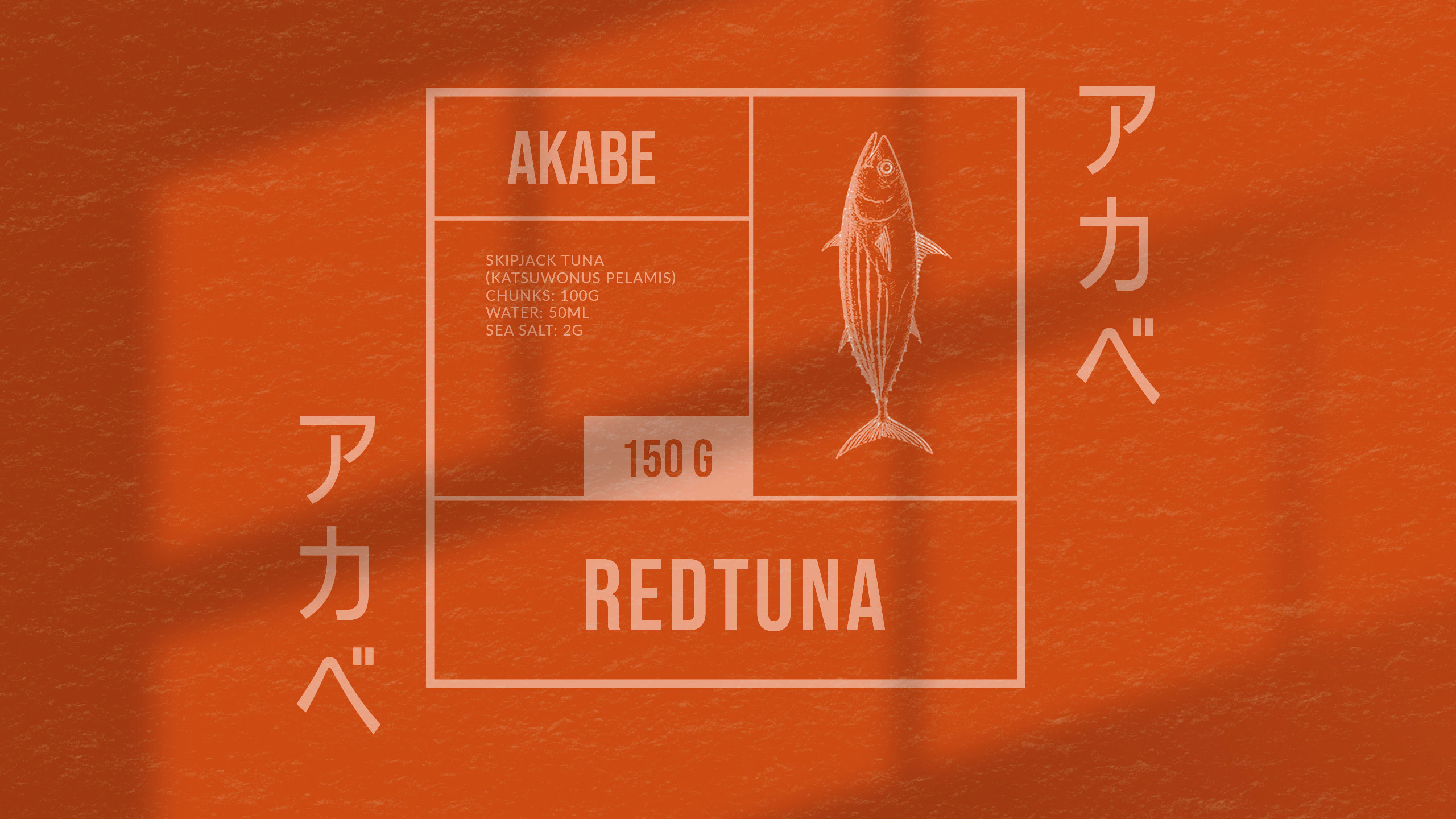
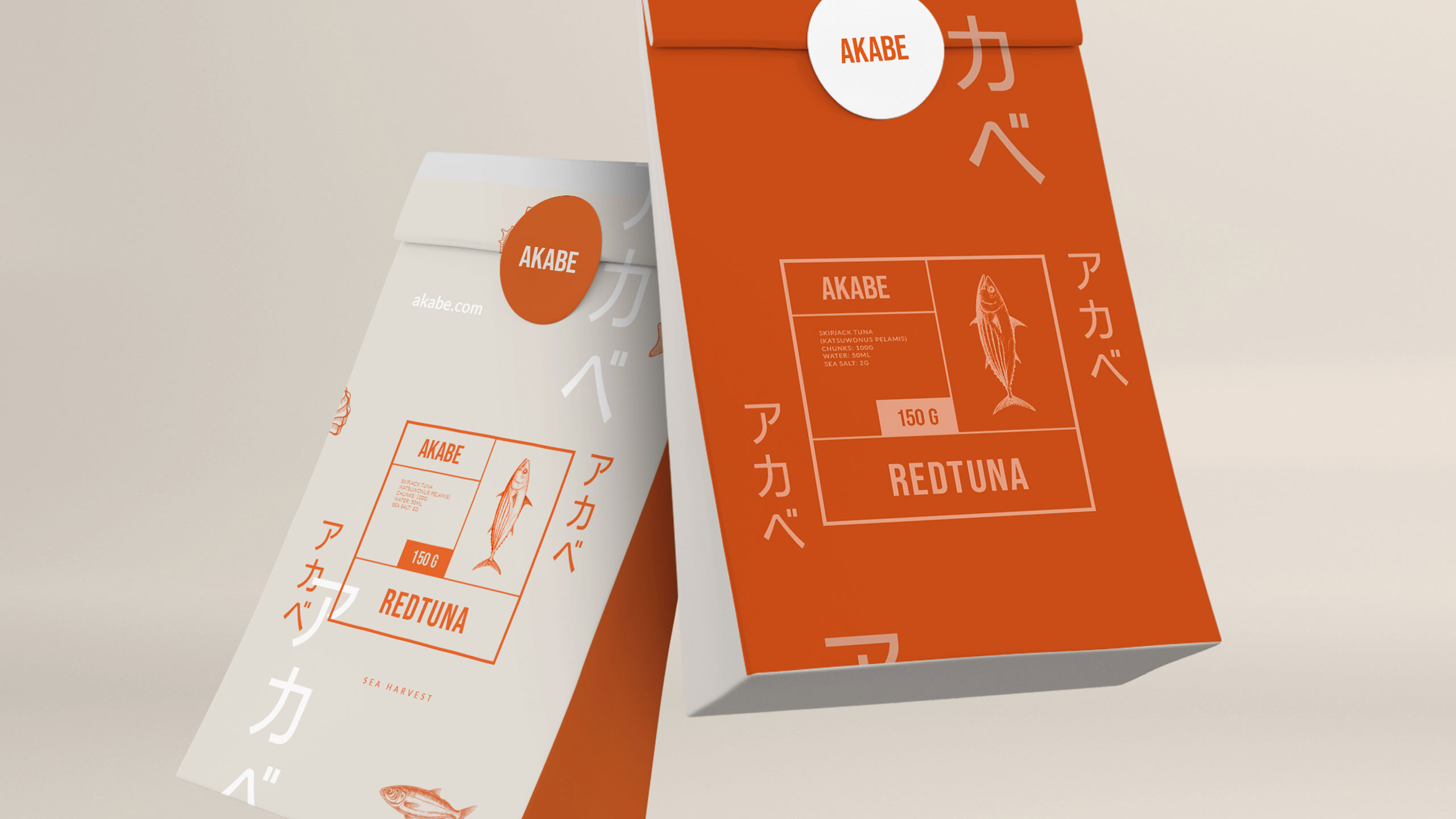
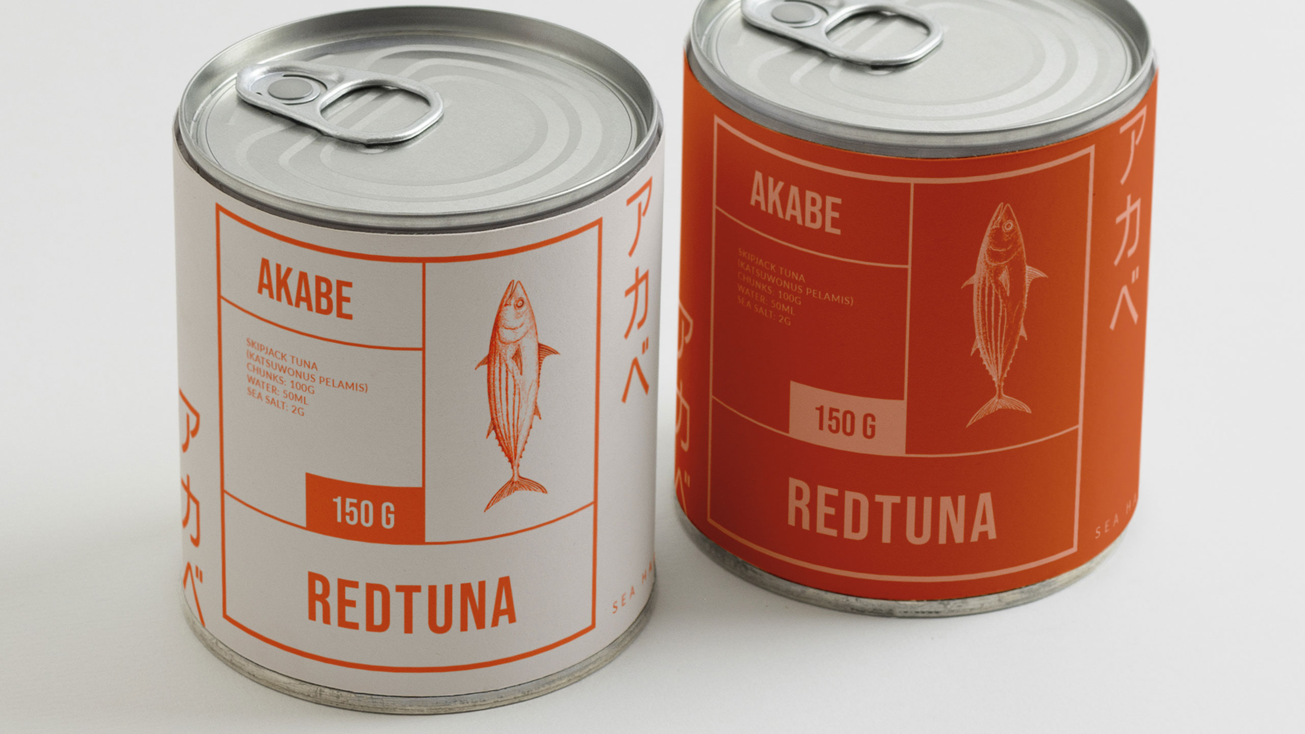
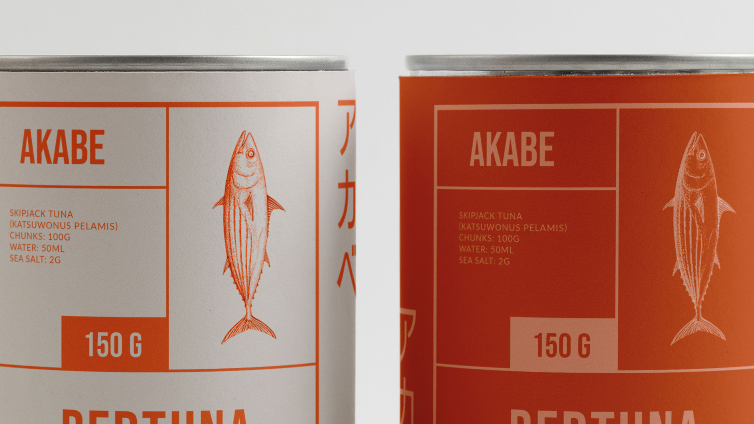
How can canned seafood feel both luxurious and disciplined? Akabe's graphic identity fuses Japanese minimalism with maritime heritage—using coral hues and compartmental layouts to express artisanal quality through elegant, functional design.
Visual Language and Structure
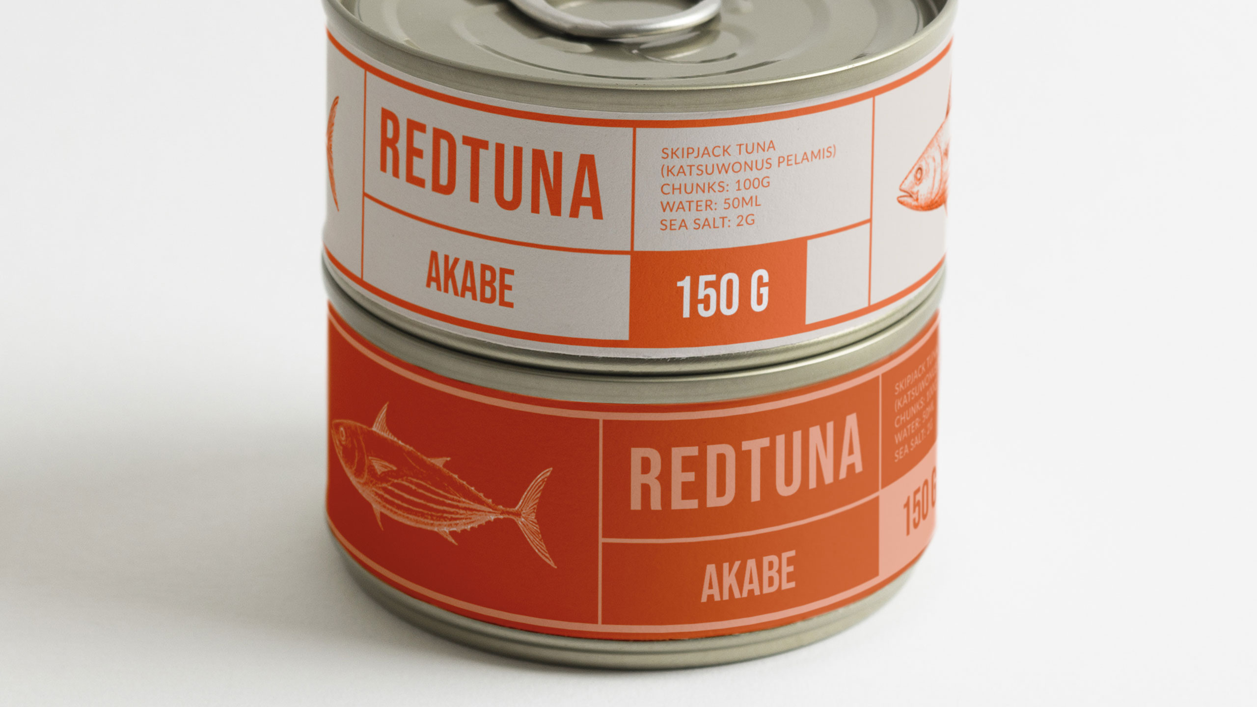
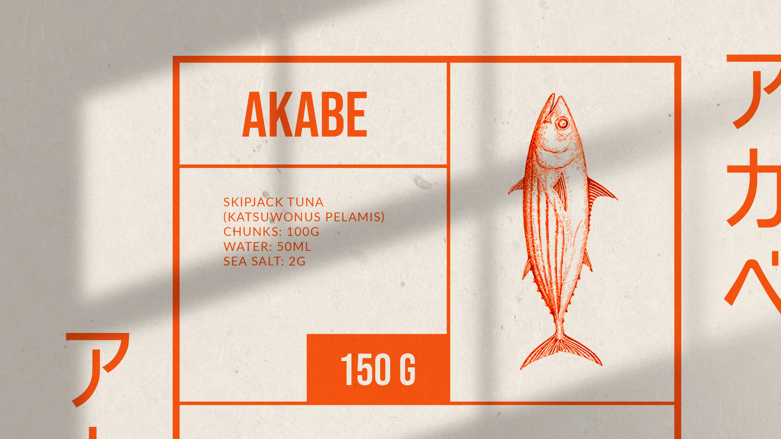
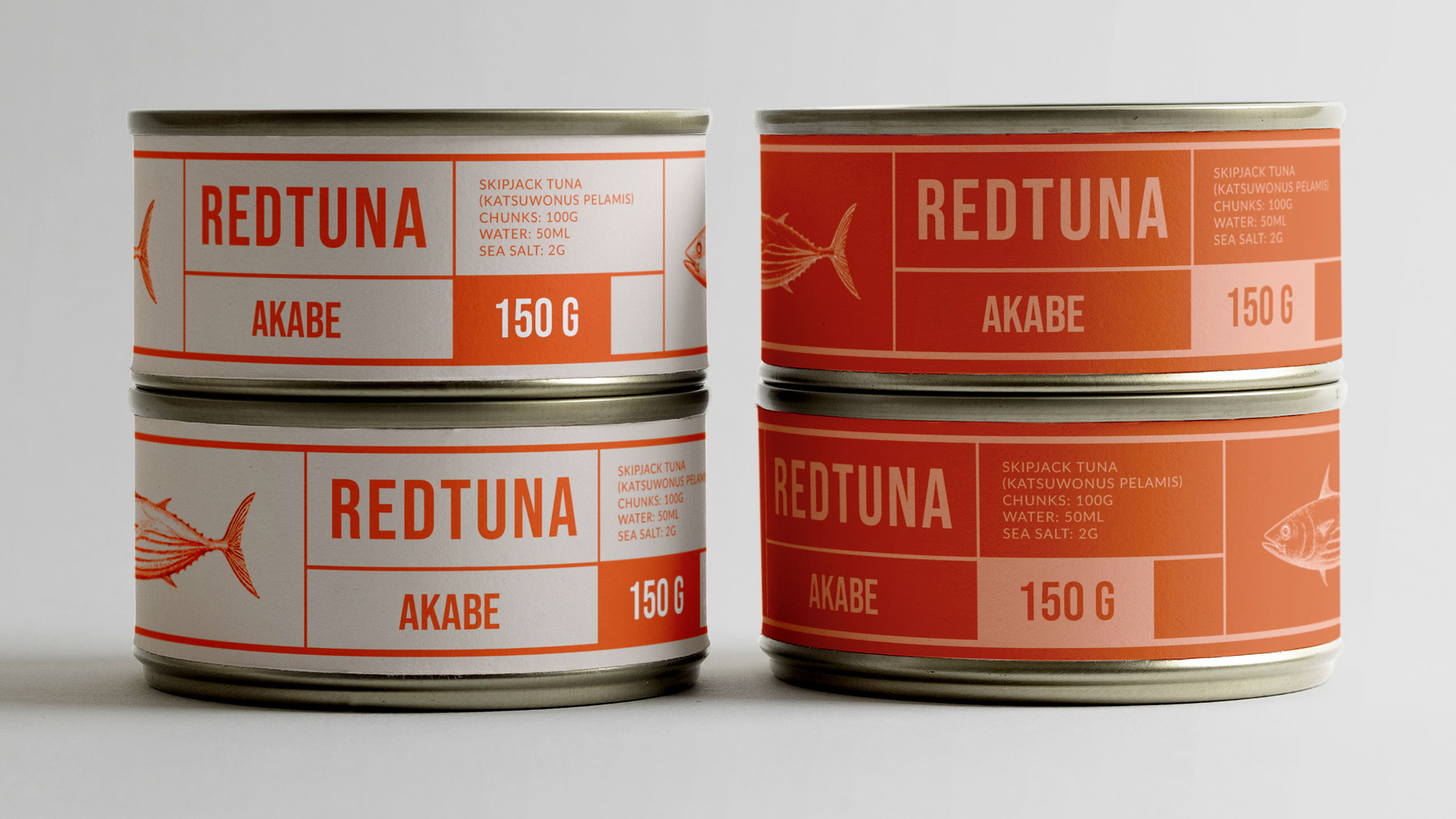
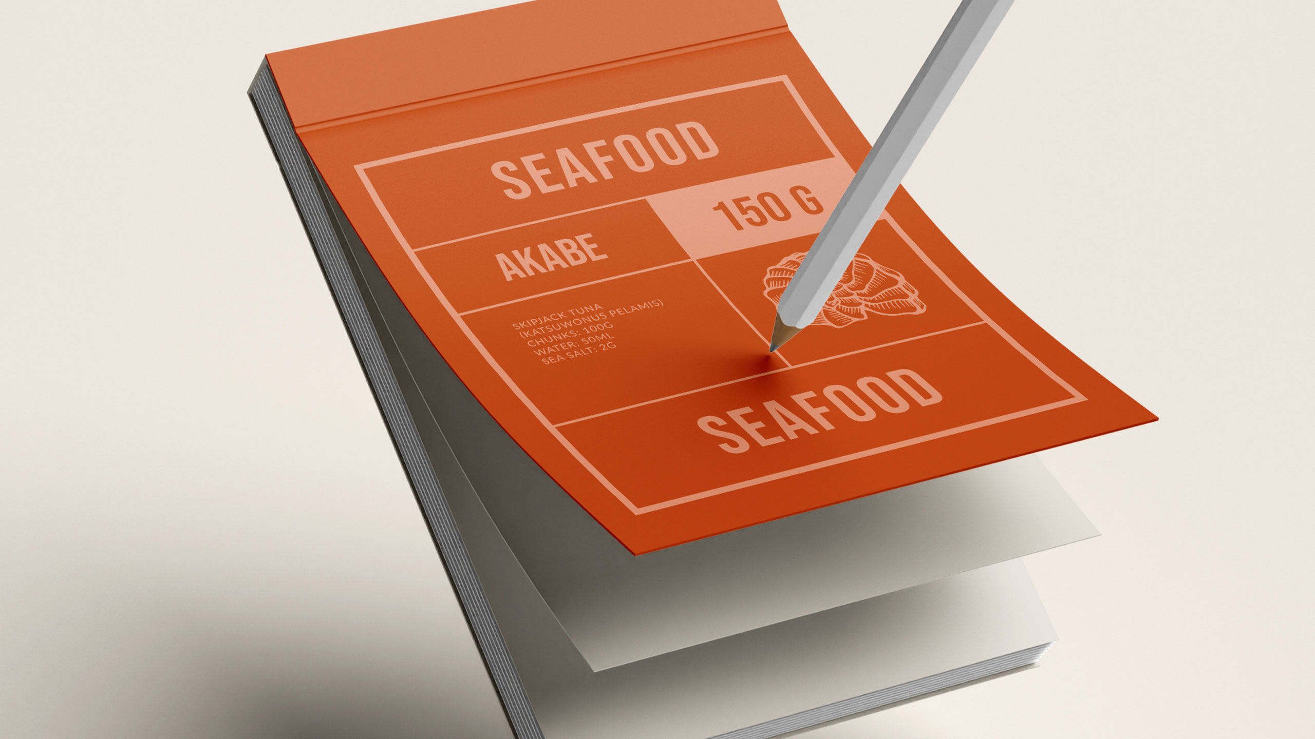
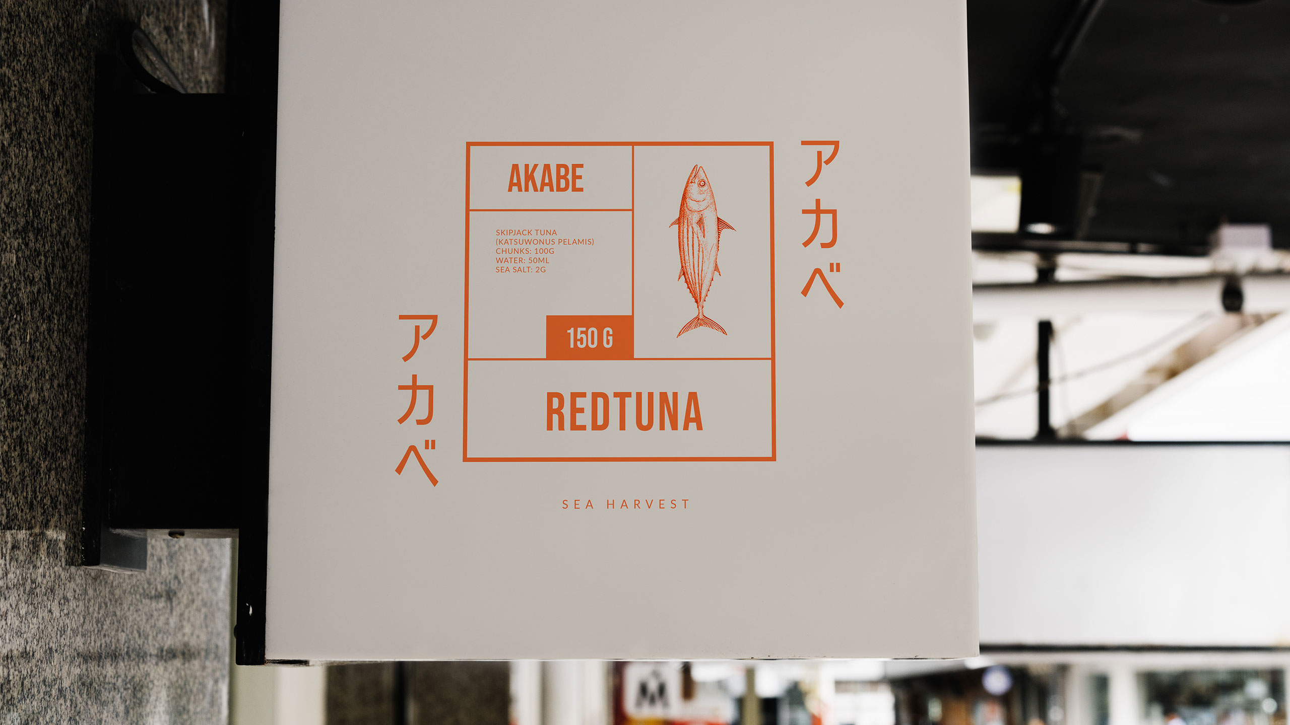
The graphic design for Akabe, a premium seafood cannery, blends modern Japanese minimalism with artisanal precision. Inspired by both maritime heritage and the sound of its name—a nod to Captain Ahab—the brand uses salmon and coral hues, breaking away from traditional sea blues. The packaging and visuals, applied to cans, notebooks, signage, bags, and aprons, feature clean lines and a rational layout. Information is delivered in neat compartments, like labels in a bento box.
Identity and Storytelling
The result is refined yet functional, evoking both craftsmanship and discipline. Akabe tells a story of the sea through elegant design, structured simplicity, and bold color choice.
Related
03
Whether you prefer a quick call or a detailed message, we're here to listen.

OVER

Café Lenoirs

Blen-Beck

Whare House