


Description
02
The Core Challenge
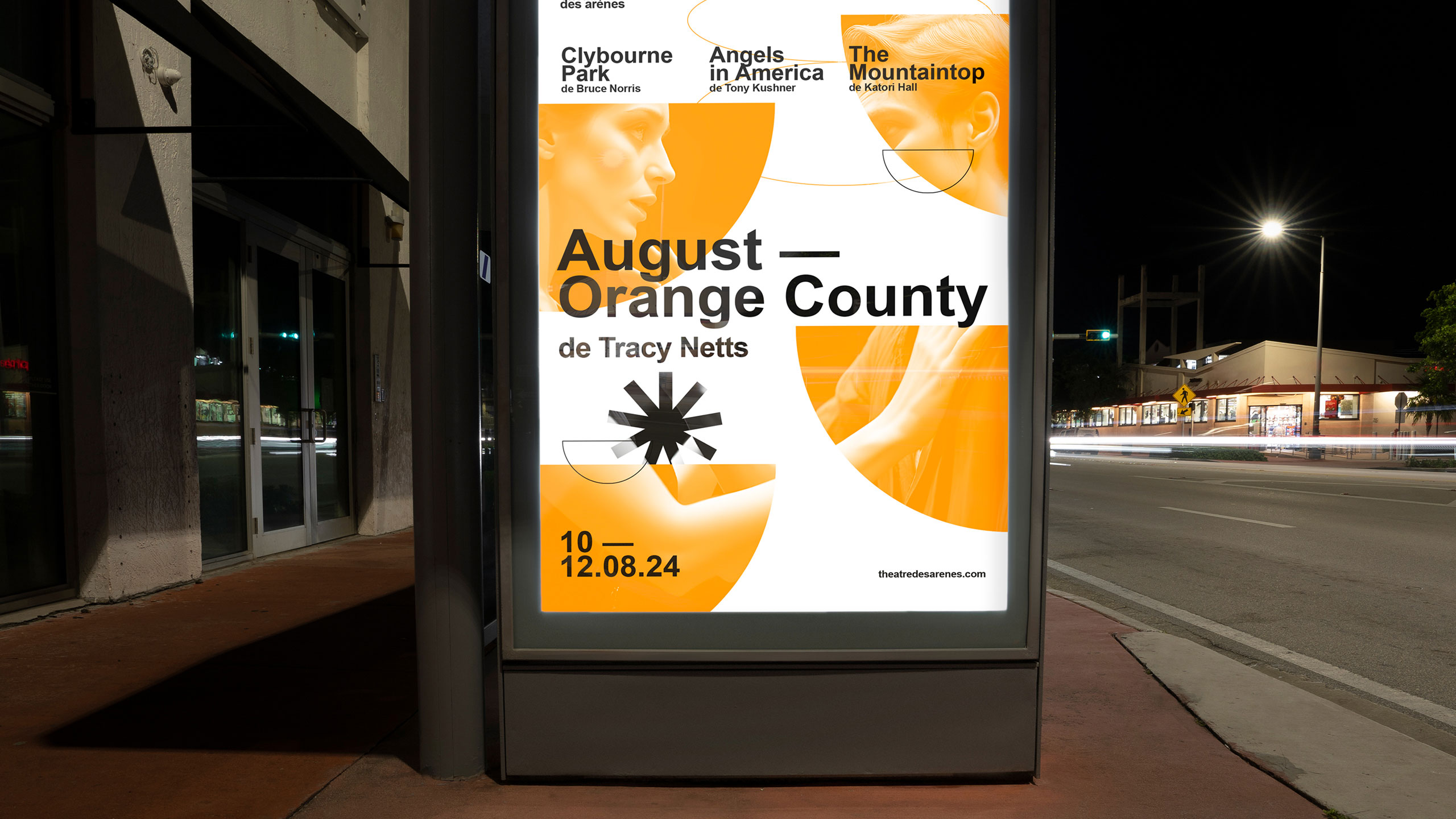
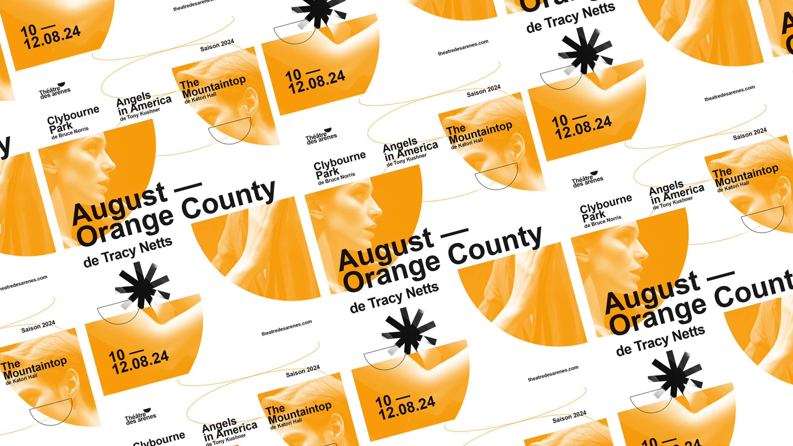
How can graphic design balance tradition and modernity? Théâtre Les Arènes uses vibrant yellow and geometric motifs to explore how visual identity combines architectural heritage with contemporary clarity and dynamic creativity.
Visual Language and Logo
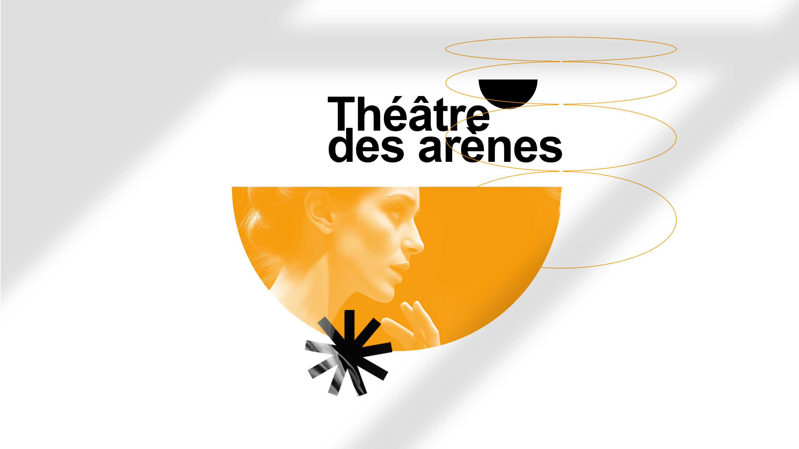
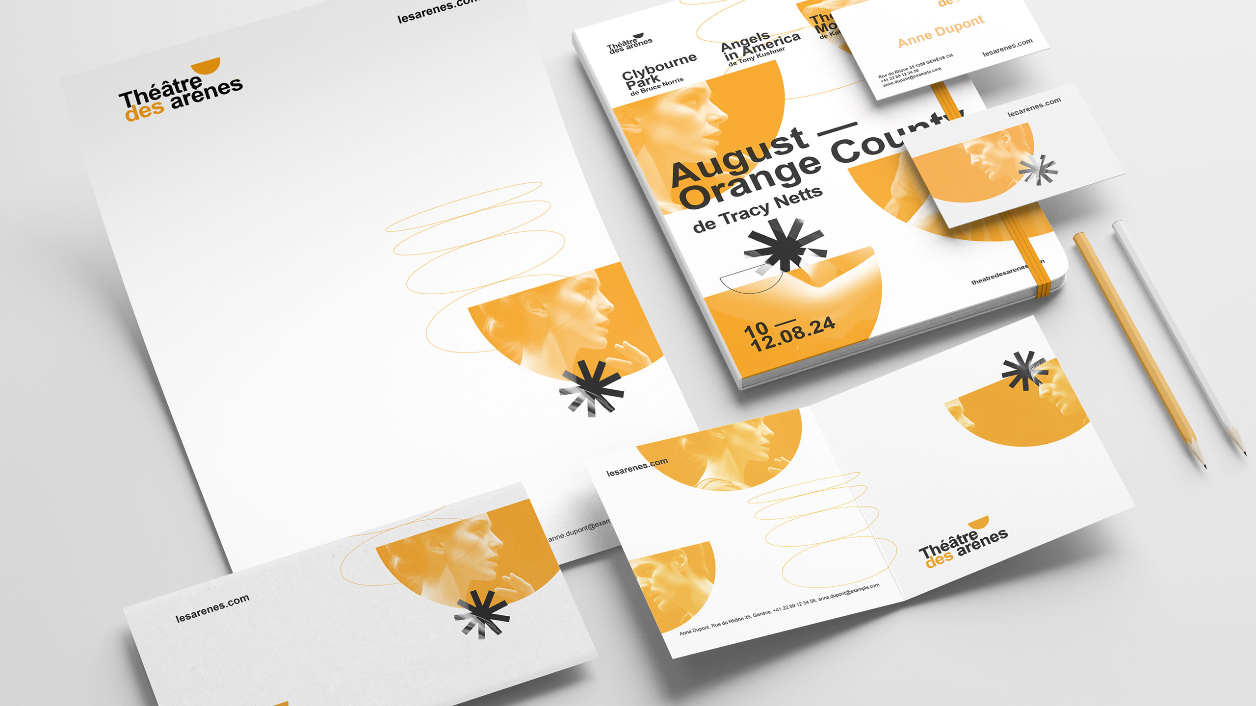
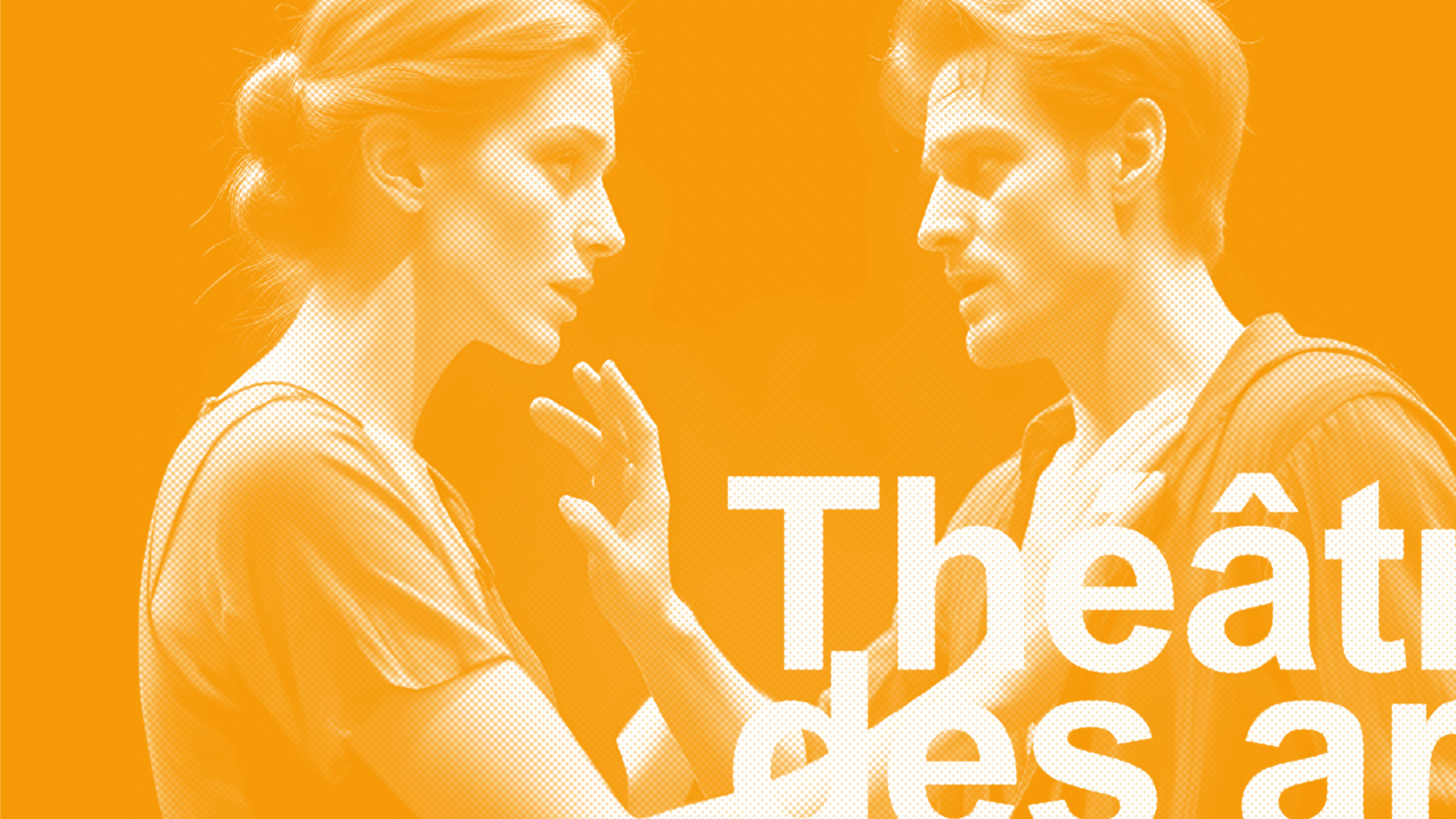
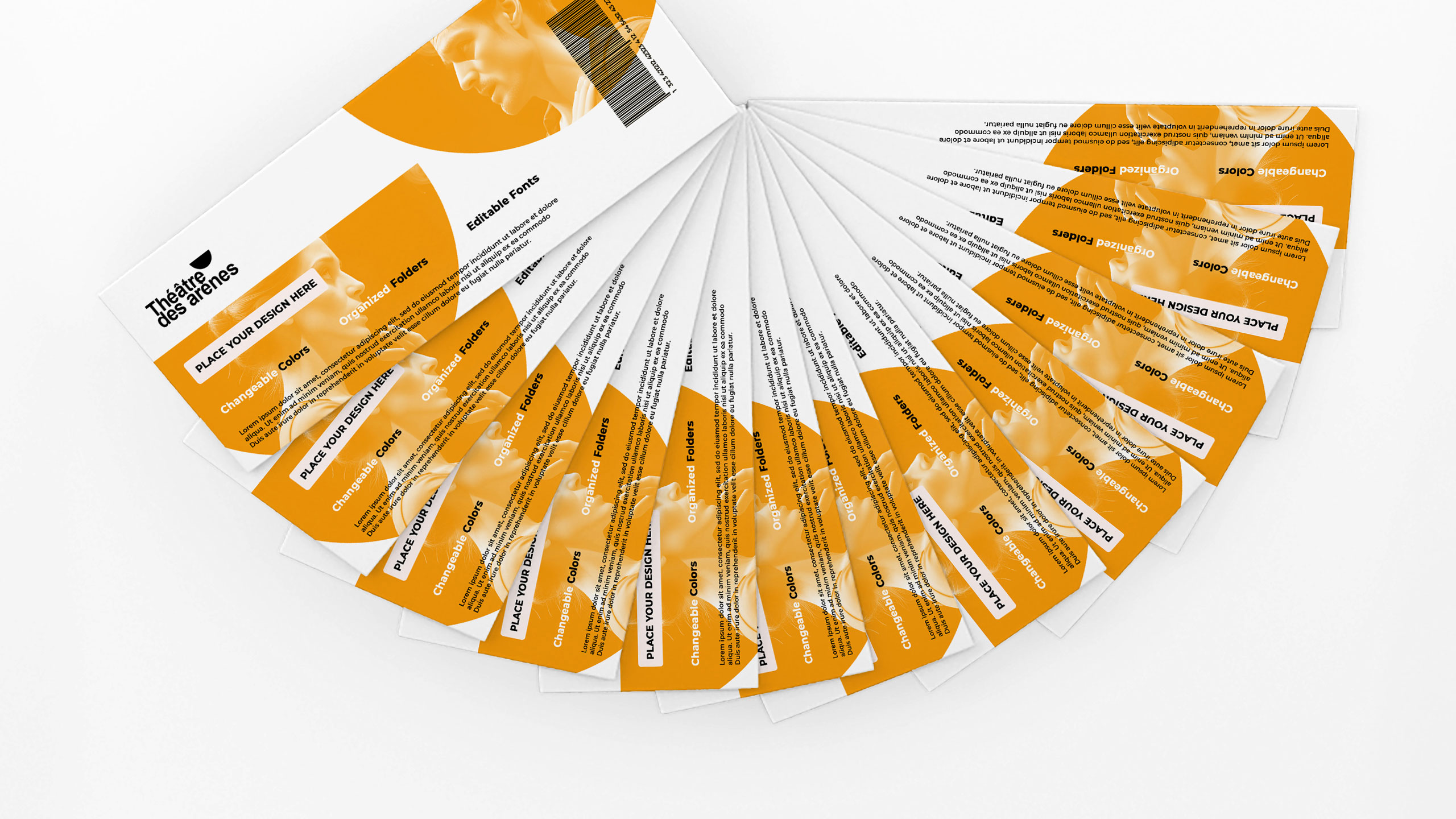
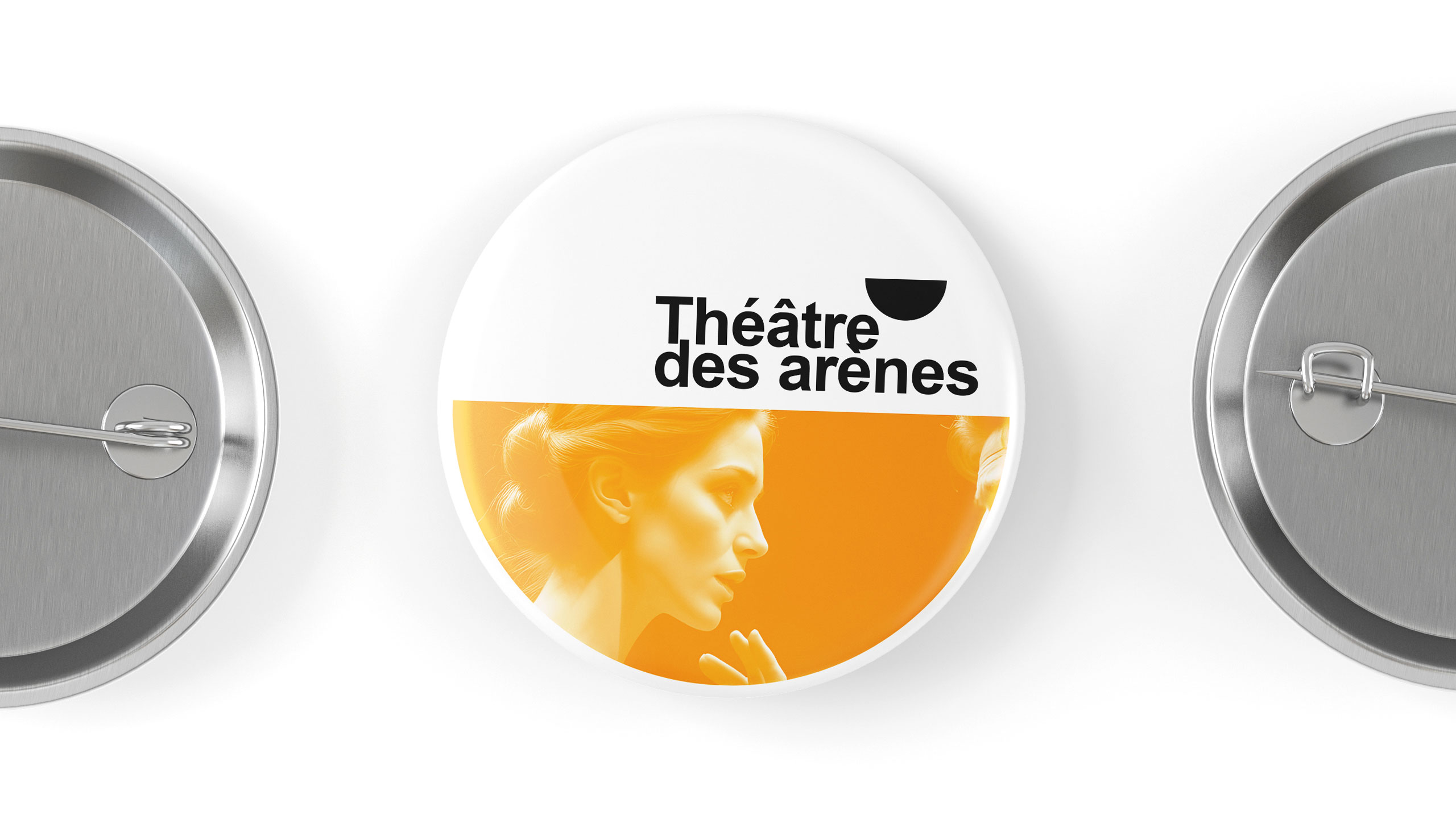
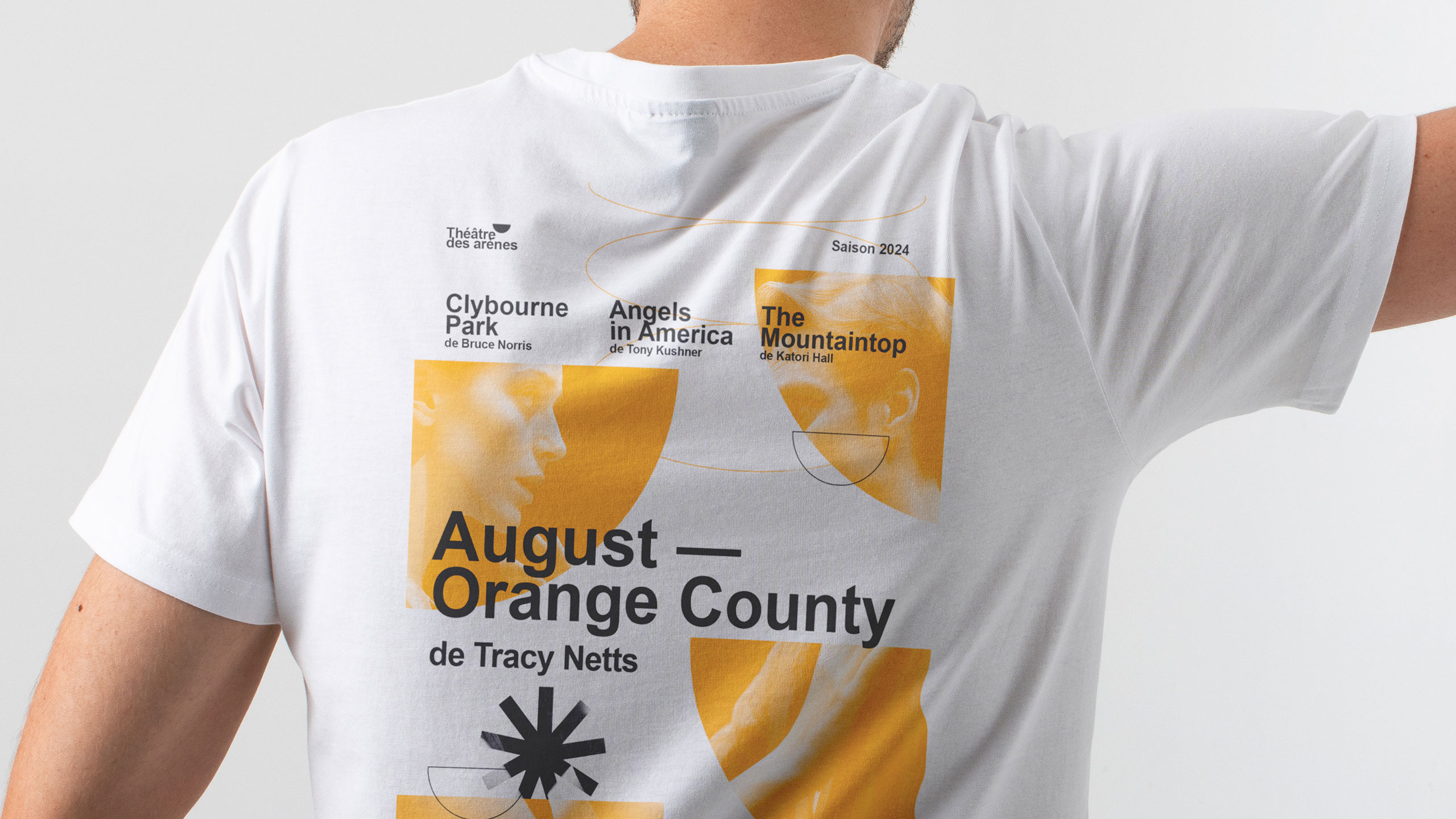
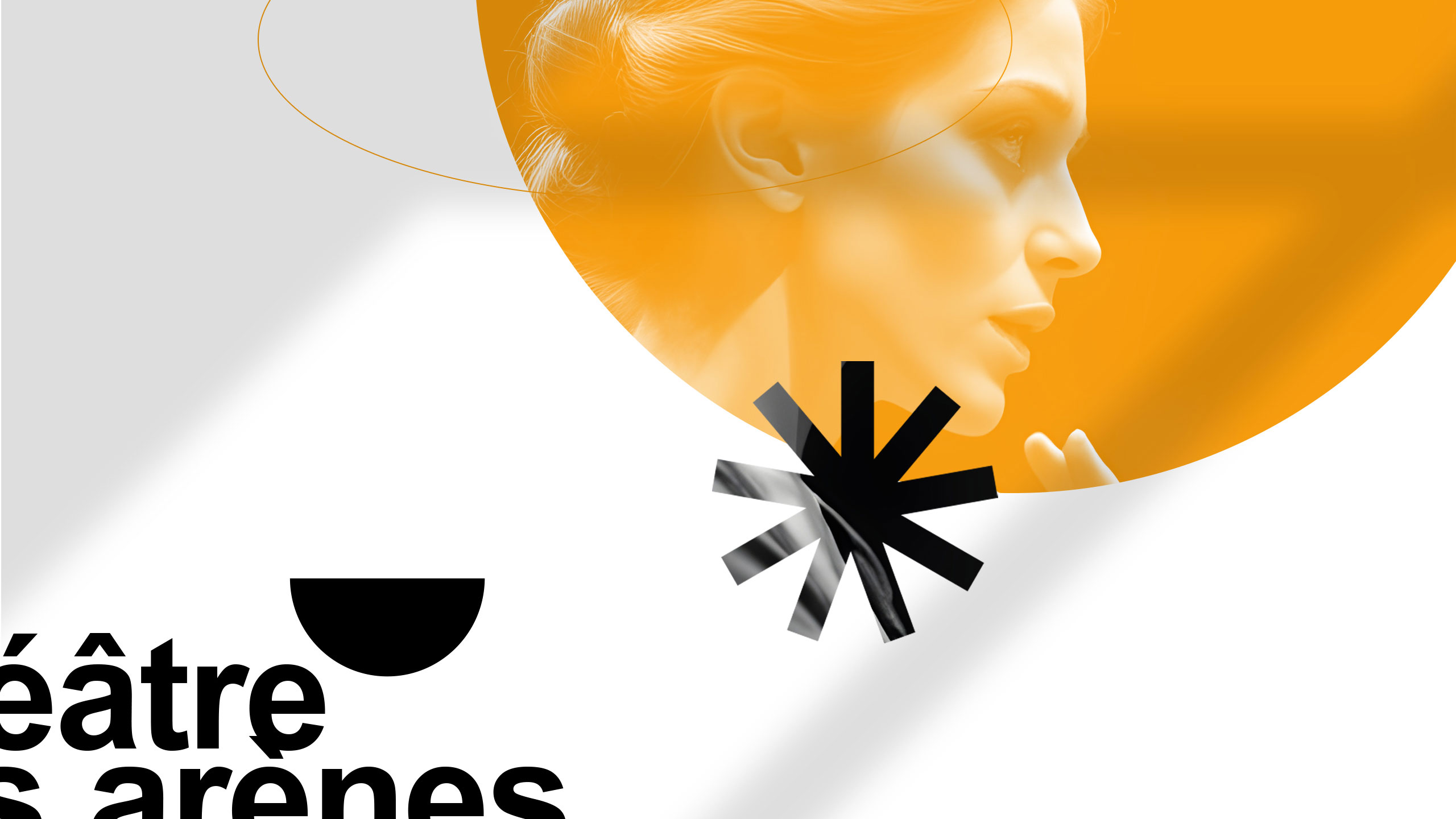
The visual identity of Théâtre Les Arènes features a bright, solar yellow as its dominant color, evoking energy, creativity, and visibility. The communication design is applied across posters, t-shirts, tote bags, badges, and stationery. A key graphic element is the use of the theater's half-moon logo shape—echoing the architectural form of ancient arenas—which frames current production visuals and brings a dynamic rhythm to the layouts.
Typography and Balance
This bold, circular motif is contrasted with a clean, structured typographic layout inspired by Swiss design, offering balance between contemporary vibrancy and classical clarity. The result is an identity both striking and elegant.
Related
03
Whether you prefer a quick call or a detailed message, we're here to listen.

OVER

Café Lenoirs

Blen-Beck

Whare House