


Description
02
The Core Challenge
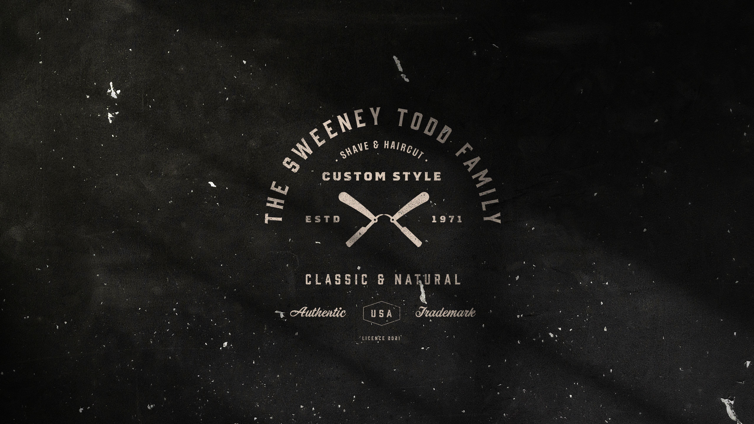
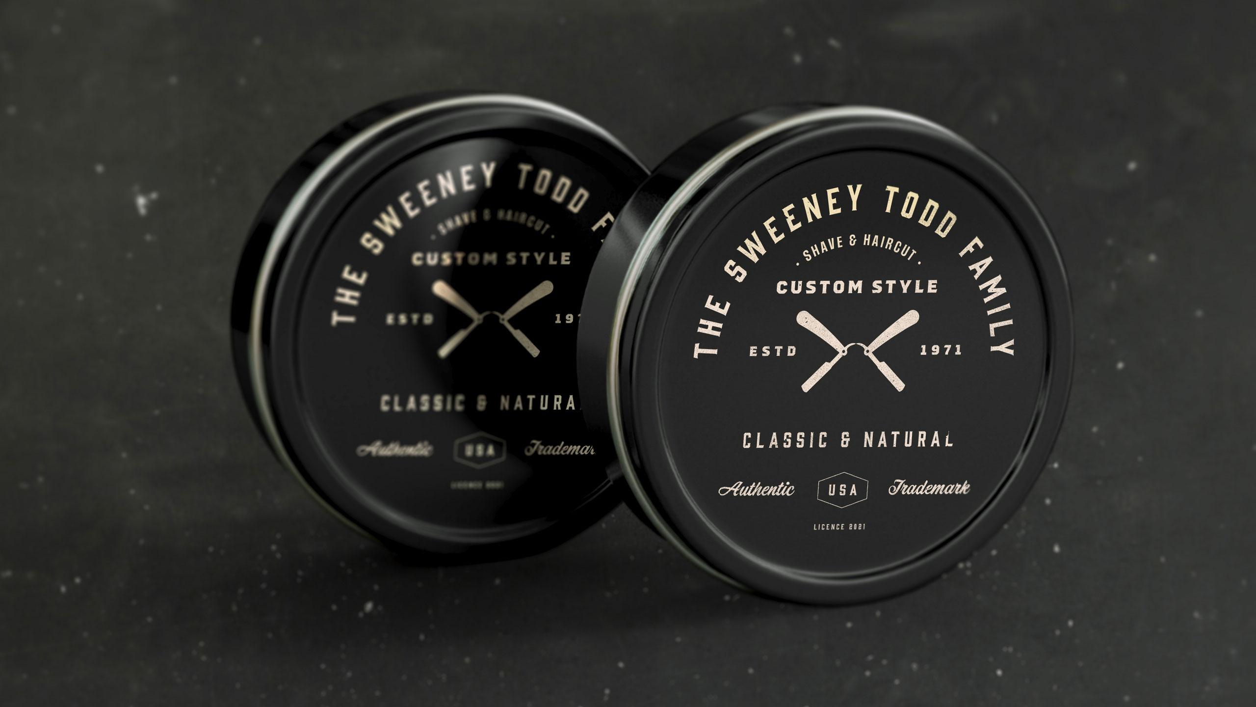
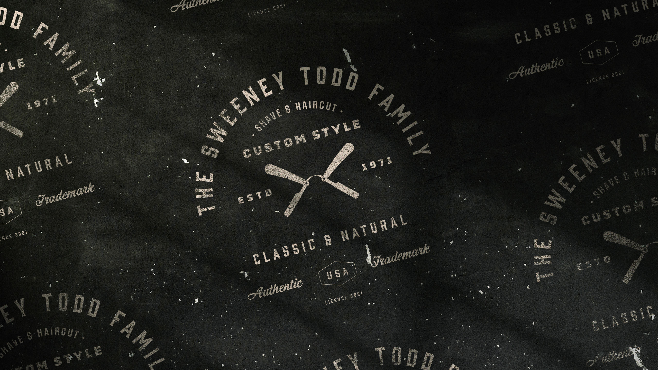
How can graphic design balance tradition and modern irreverence for a men's cosmetics brand? The Sweeney Todd Family uses vintage black and gold tones with playful irony to convey elegance and humor.
Visual Language and Name
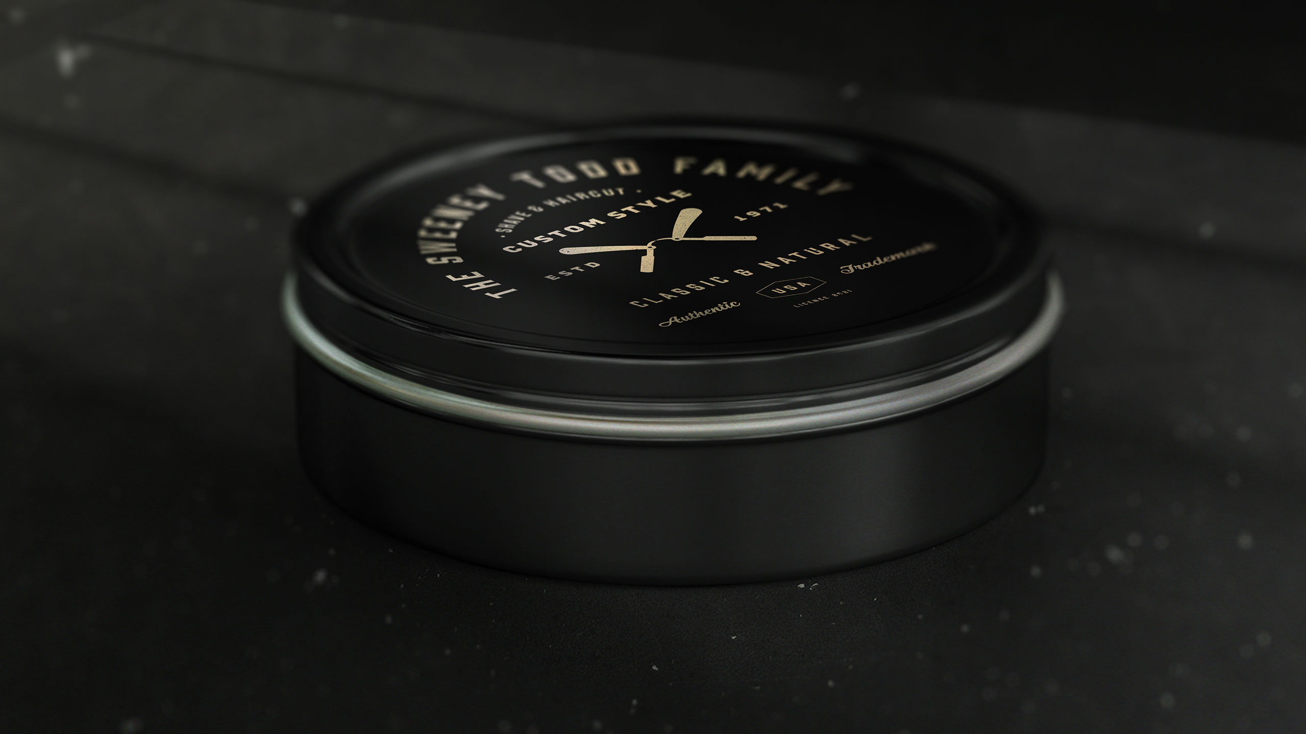
The graphic design for The Sweeney Todd Family, a men's cosmetics brand, embraces a vintage masculine style rooted in tradition and expertise. Dominated by black and gold, the visual identity suggests elegance and confidence. The name cheekily references the infamous barber, hinting at the brand's "razor-sharp" effectiveness while injecting humor and irony.
Application and Audience
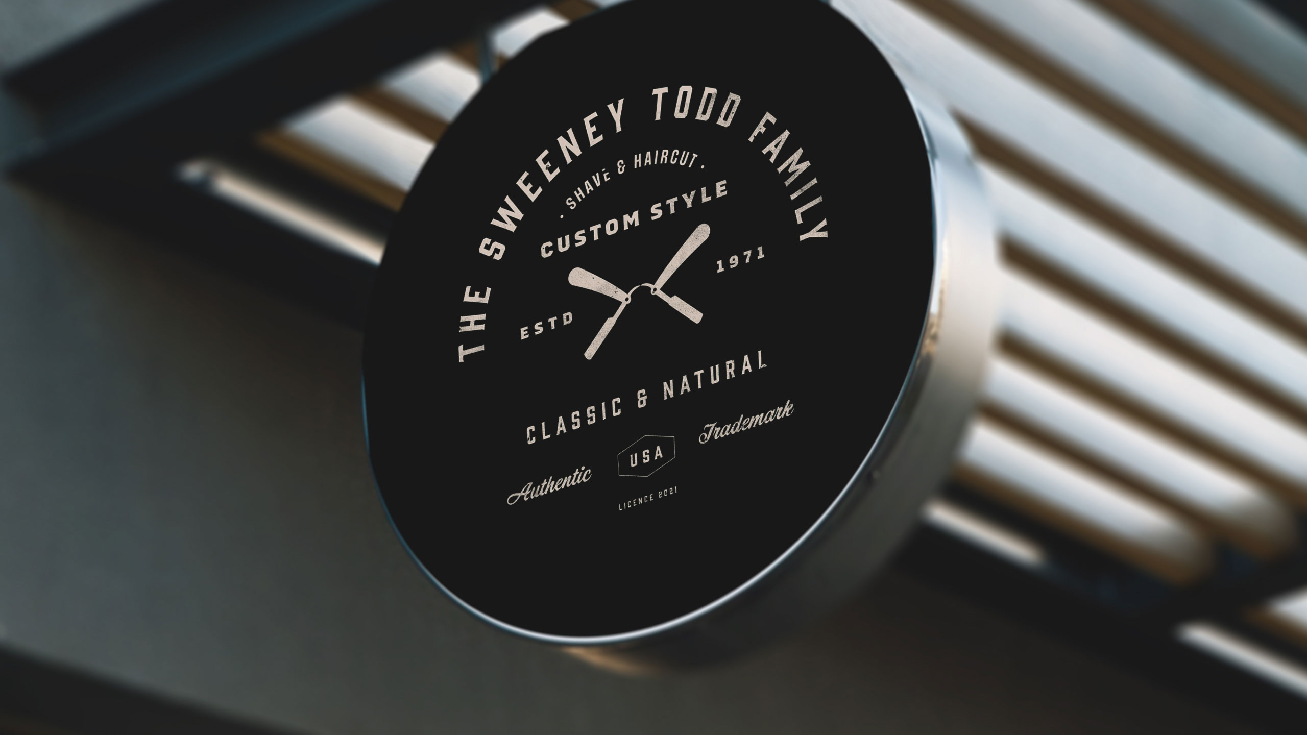
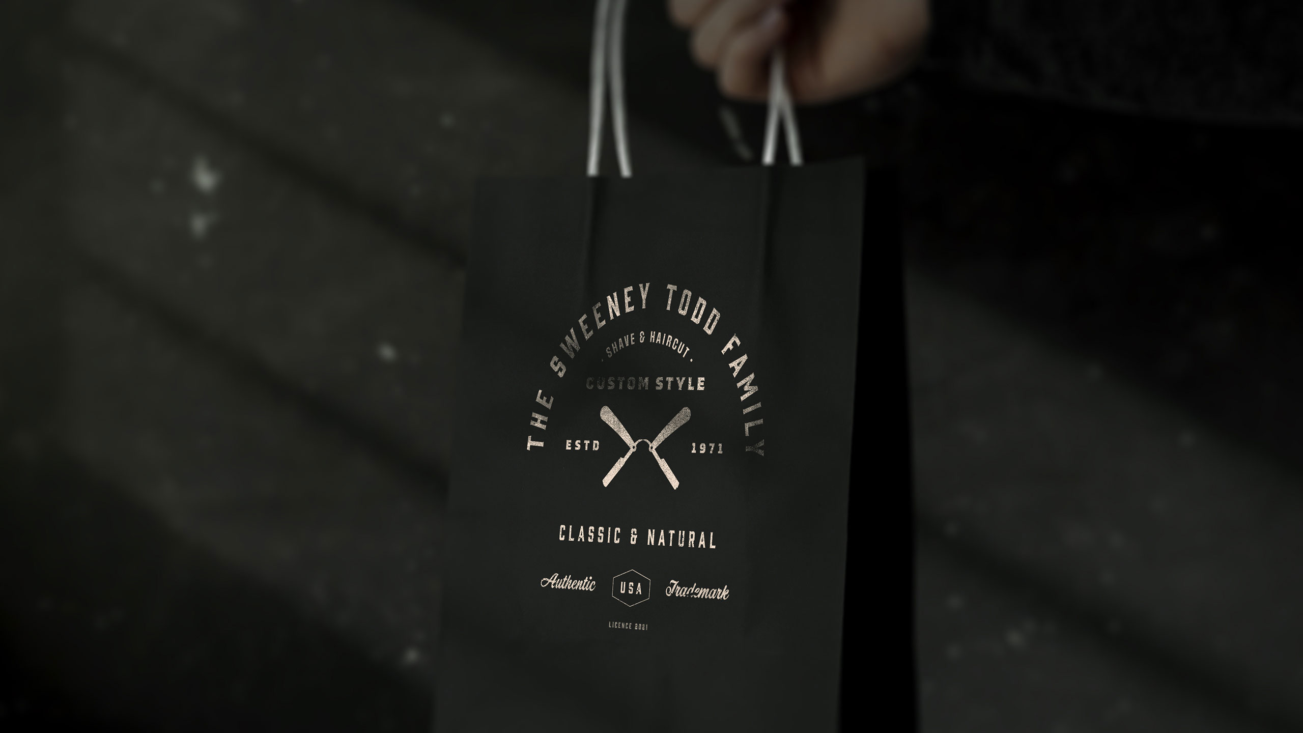
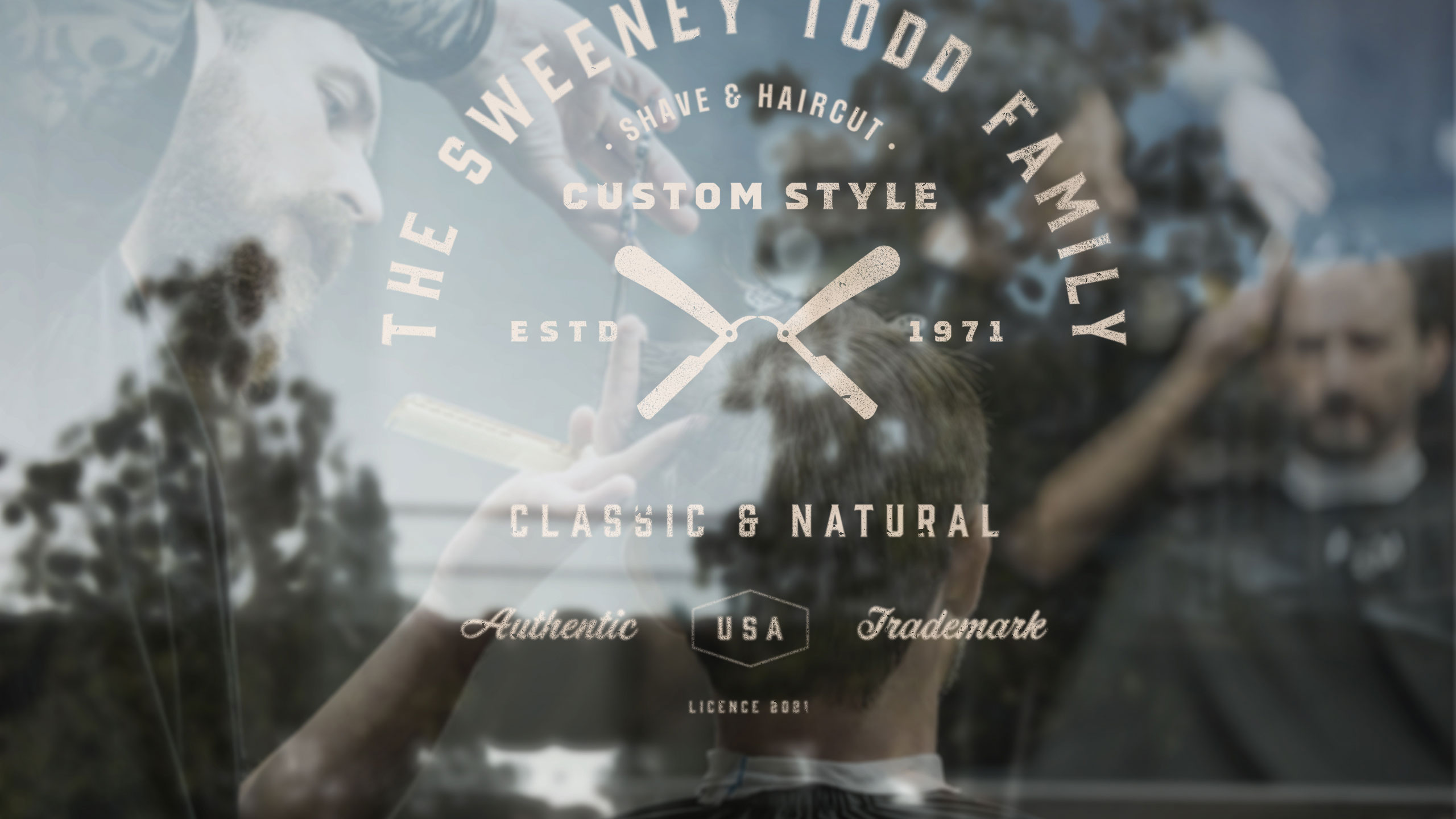
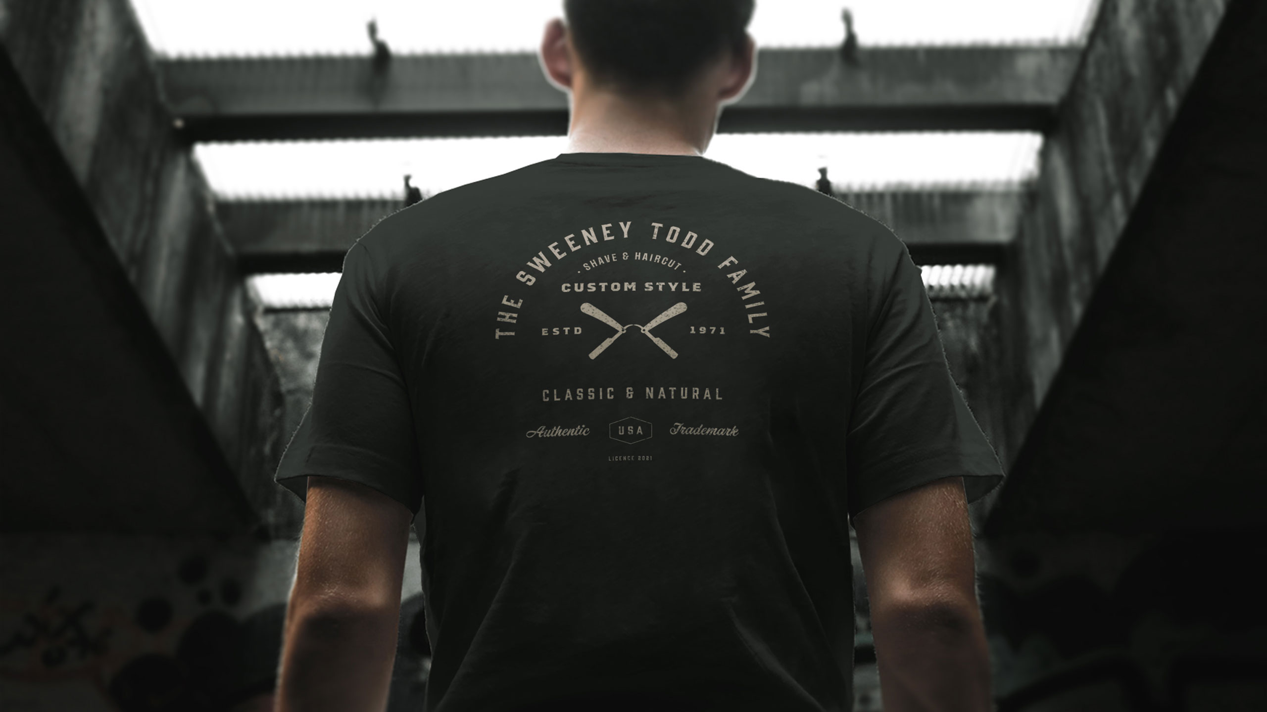
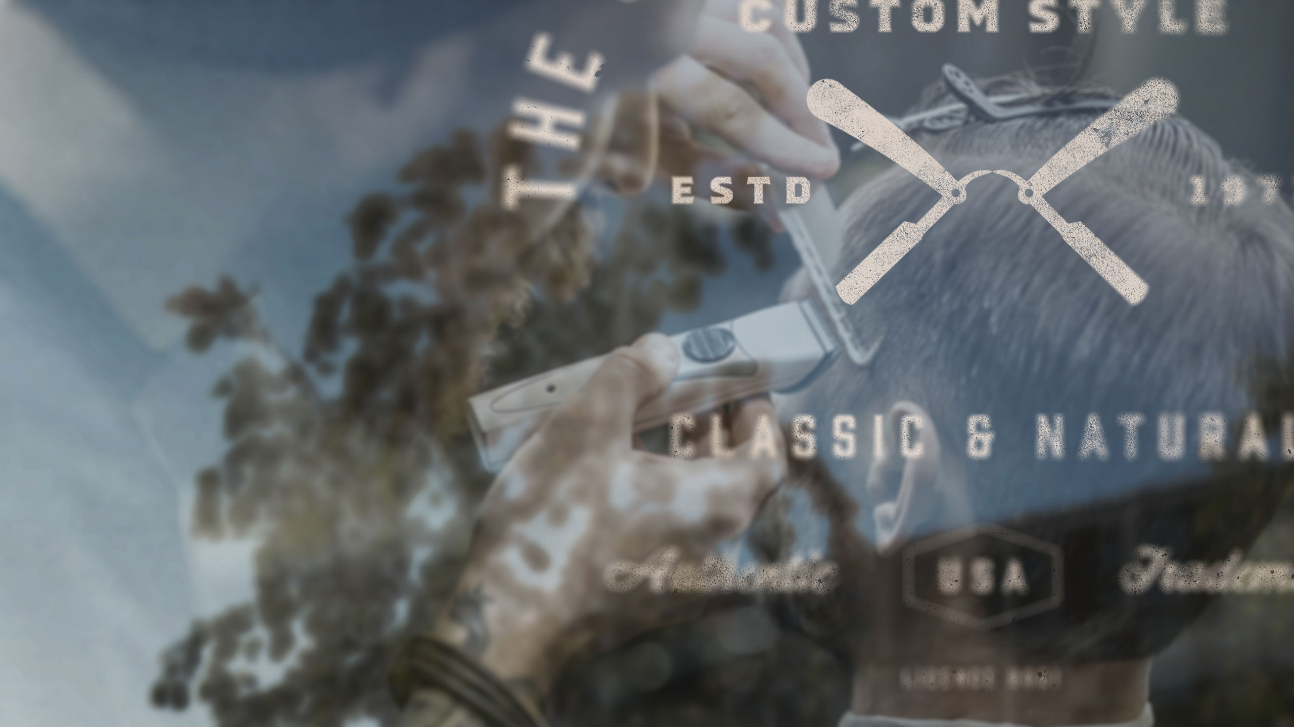
Applied to T-shirts, aprons, shop windows, bags, signage, and packaging, the design strikes a balance between classic barbershop aesthetics and modern irreverence. It appeals to a discerning clientele with a strong sense of humor—men who value quality but don't take themselves too seriously.
Related
03
Whether you prefer a quick call or a detailed message, we're here to listen.

OVER

Café Lenoirs

Blen-Beck

Whare House