


Description
02
The Core Challenge
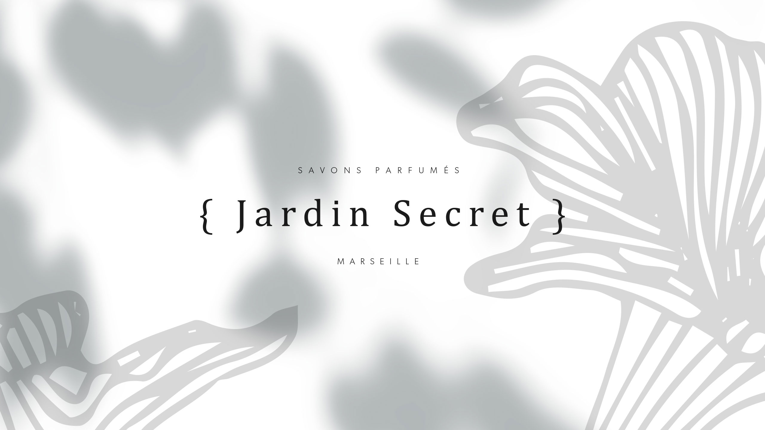
How can Jardin Secret's graphic design balance vibrant natural imagery with intimacy and exclusivity, creating a fresh, radiant identity that evokes a personal sensory escape in eco-friendly packaging?
Visual Language and Symbolism
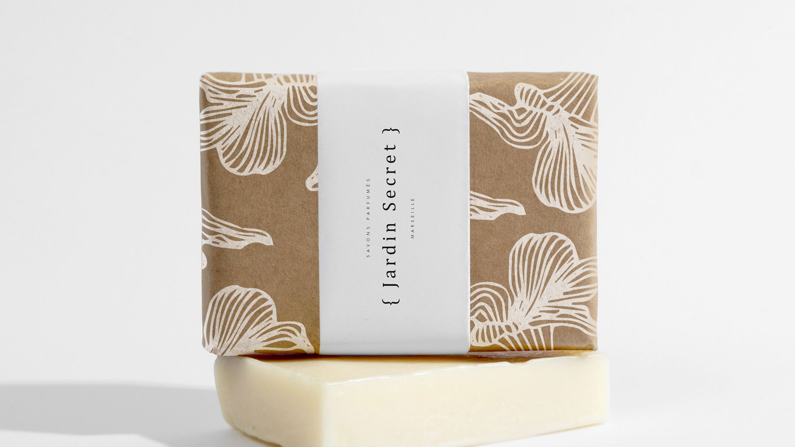
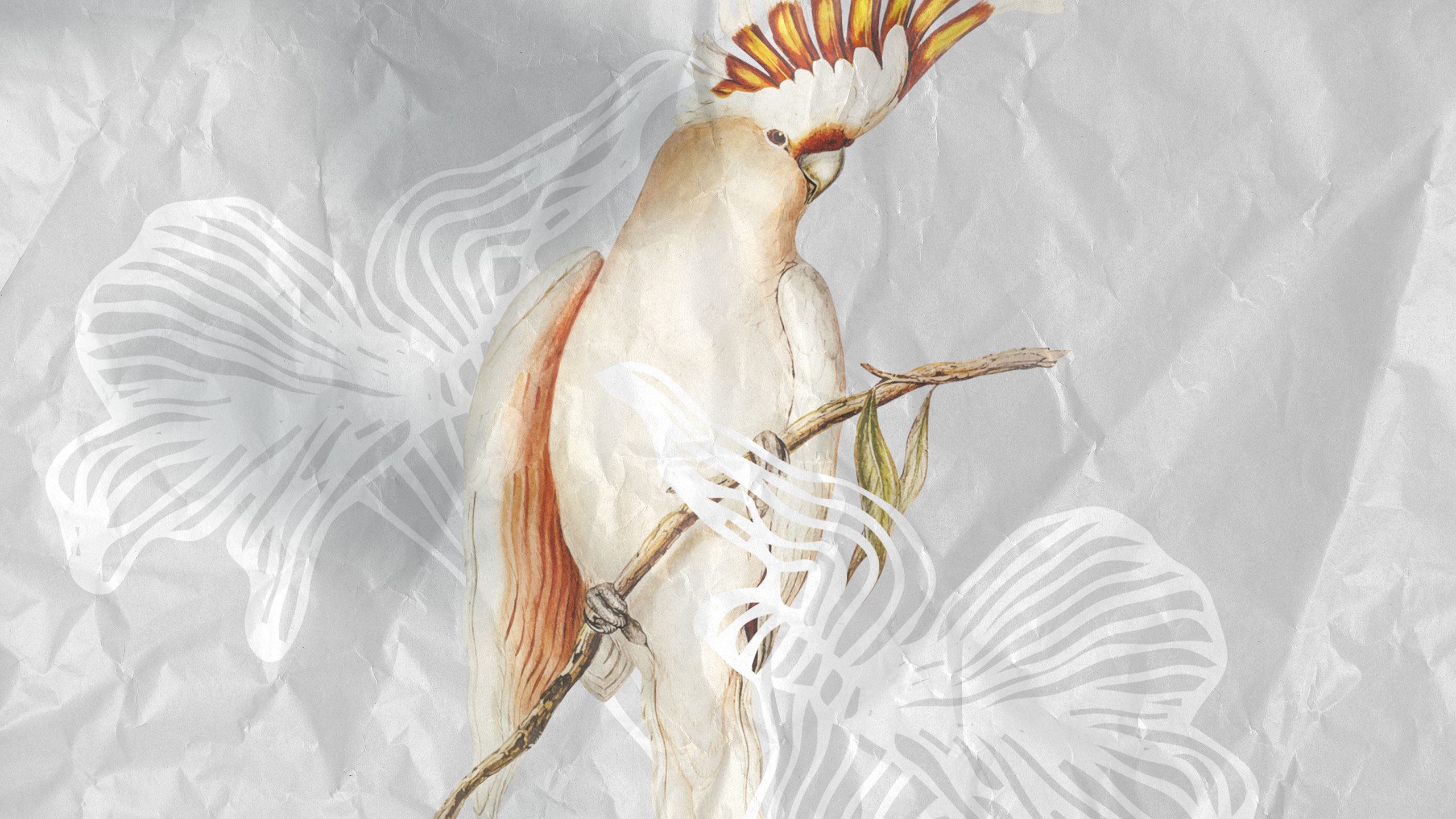
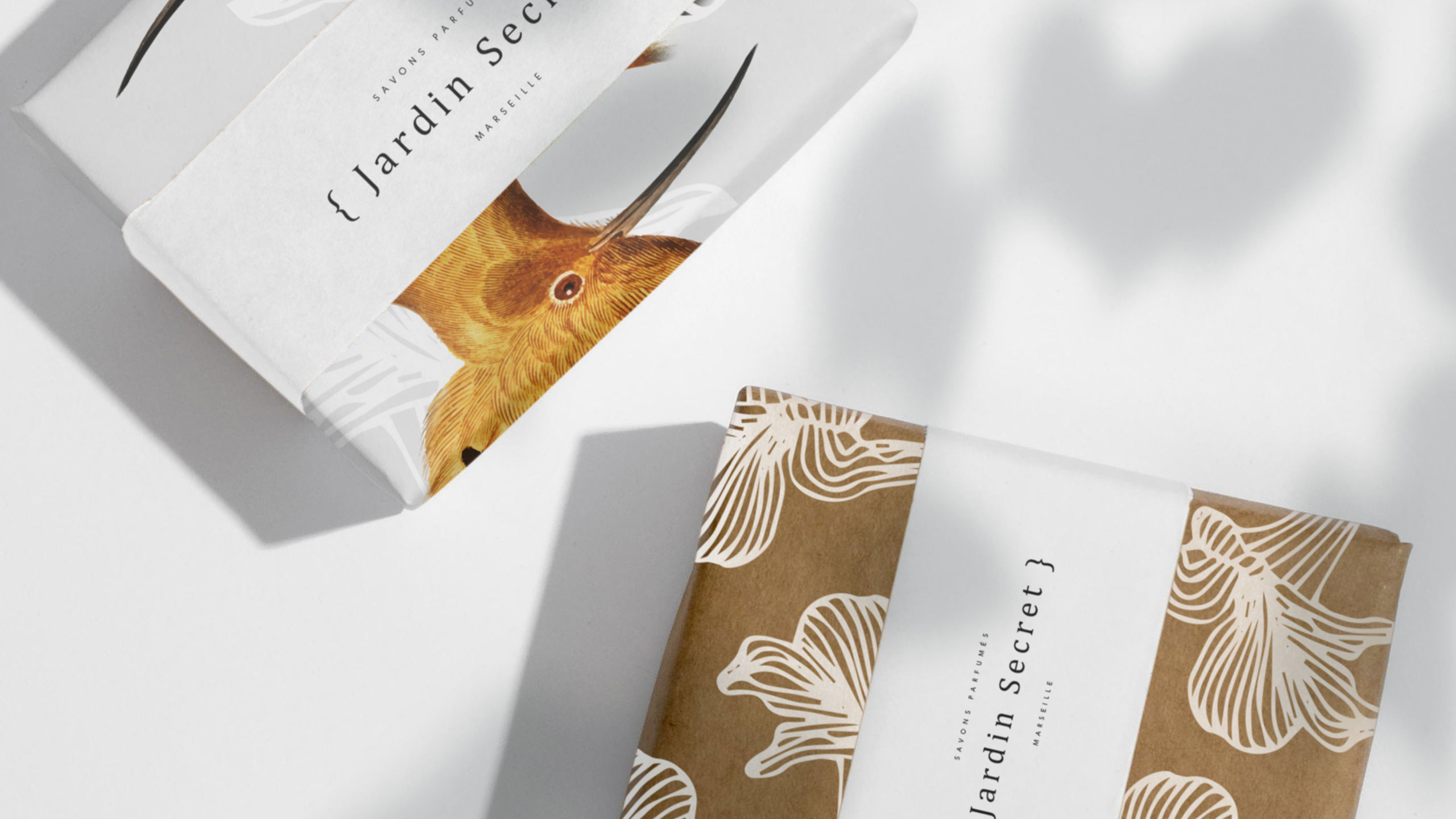
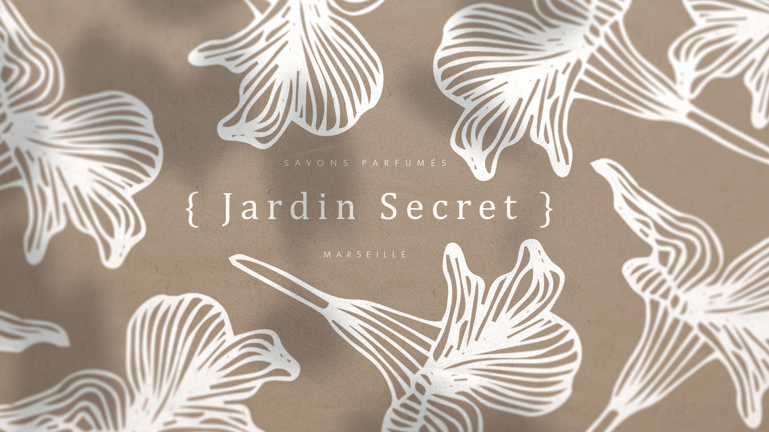
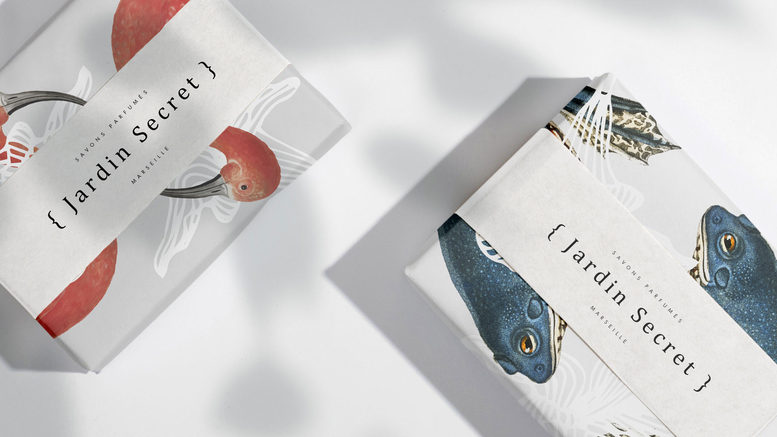
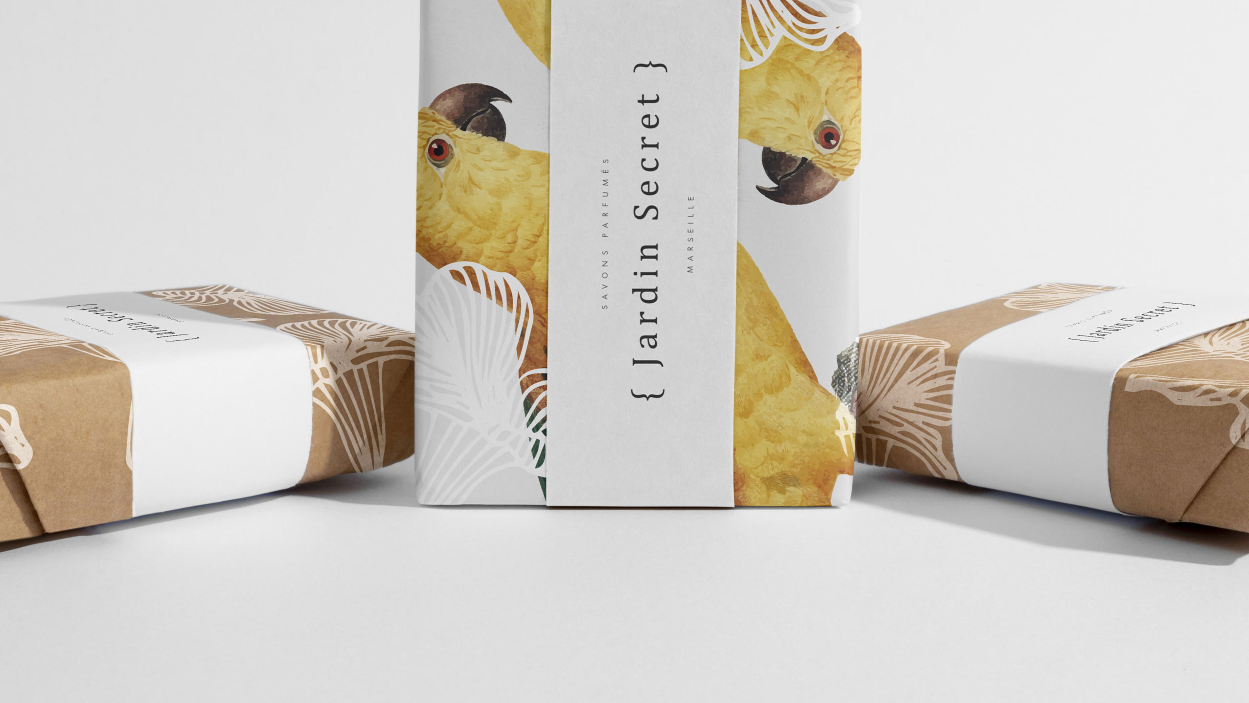
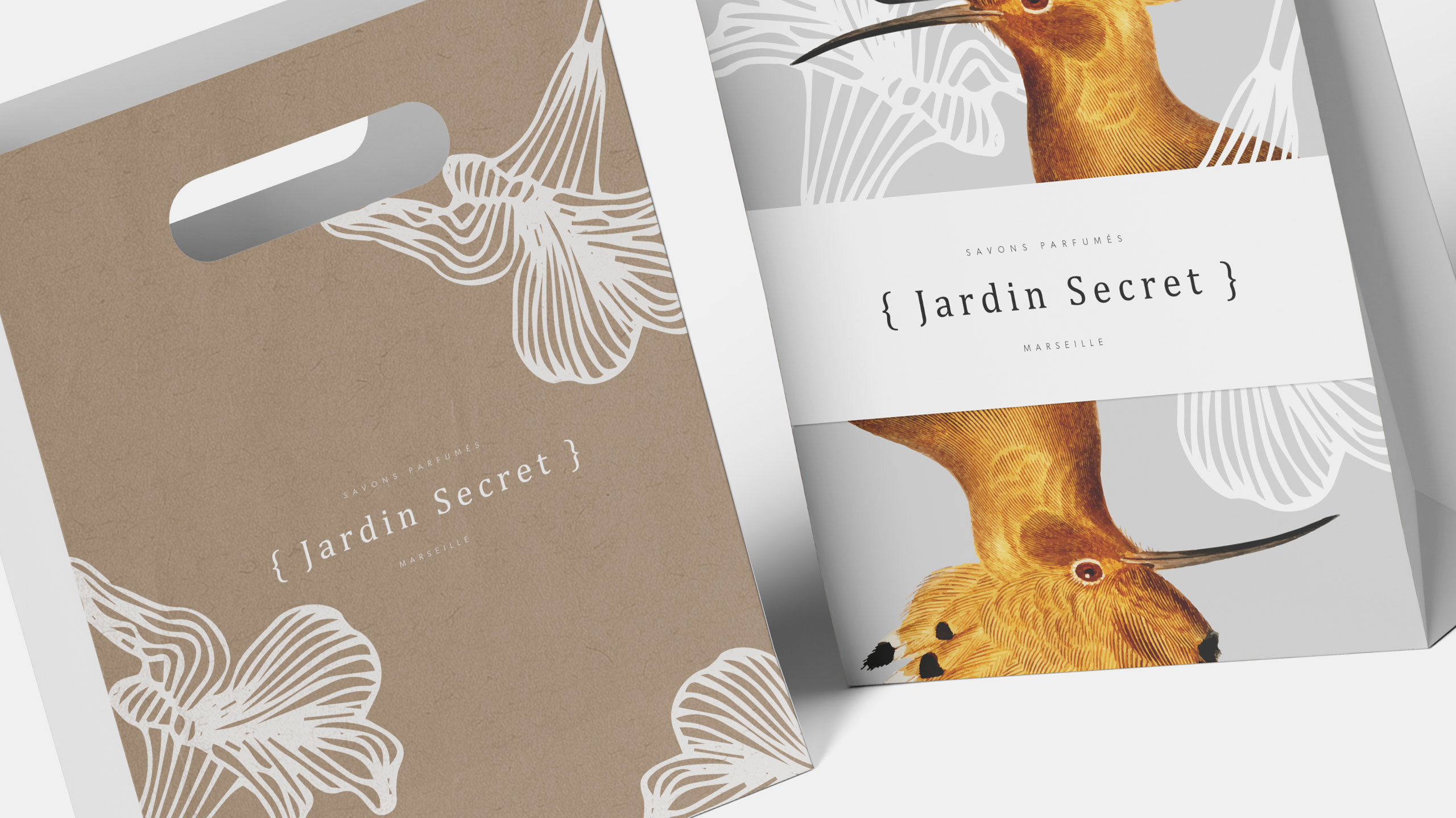
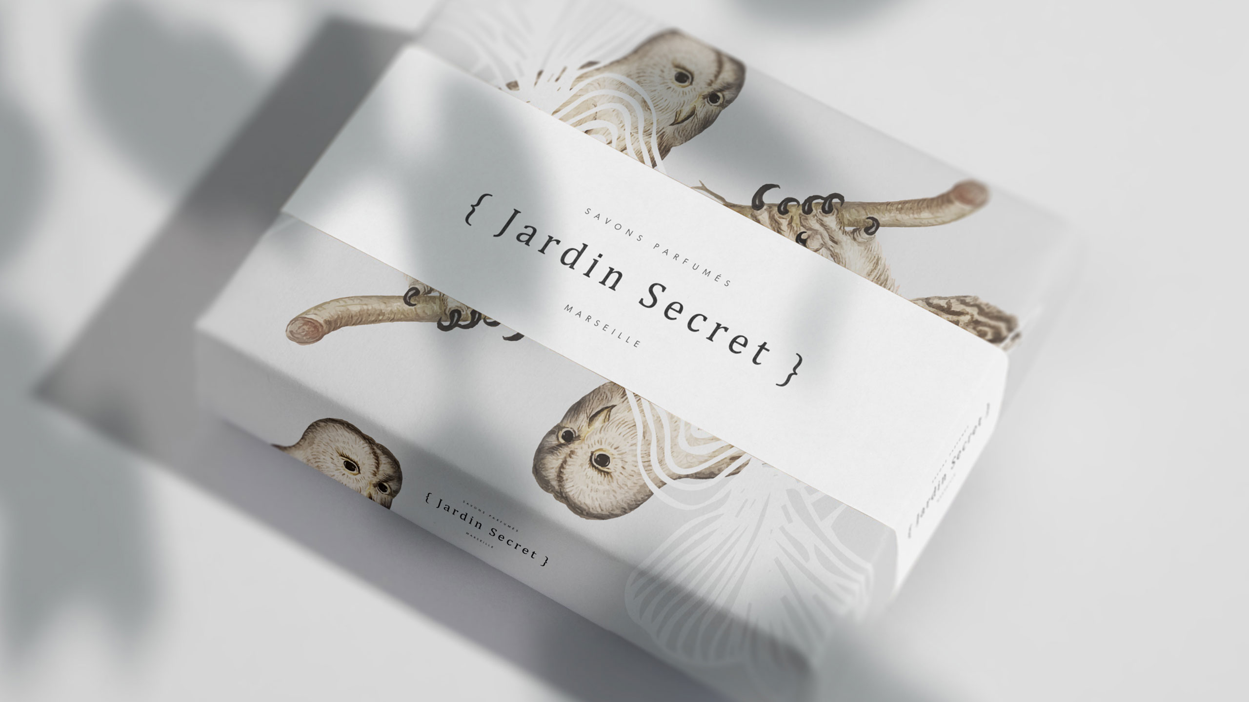
Bright and lush, {Jardin Secret} by La Savonnerie Marseillaise wraps each bar of soap like a treasure from a personal Eden. A typographic bracket encloses the logo, suggesting intimacy and exclusivity, as if each product were a private note or gift. Printed on natural recycled paper, the packaging features colorful engraved-style illustrations of exotic birds and floral motifs.
Concept and Sensory Identity
Each soap is paired with a unique bird and scent, reinforcing the idea of individual character and sensory escape. The vibrant palette, combined with the purity of white and natural tones, conveys a promise of freshness, radiance, and nature's gentle care.
Related
03
Whether you prefer a quick call or a detailed message, we're here to listen.

Unbrake

Flo

Factory

Blackjack 8